A complementary colour scheme can sound confusing at first, as it involves a scheme made up of contrasting colours that sit opposite each other on the colour wheel.
The latest paint trends provide new and innovative ways to use colour in our homes, but complementary colour schemes have been around for some time. Complementary colours are a foolproof method for coming up with timeless colour combinations that add character and visual interest to a room.
'Bold contrasts and complementary colour schemes are great for experimenting with your home interiors,' says Suzi Samaddar, Room Styling Expert, furn.
We've spoken to the experts and done a deep dive on the question, what is a complementary colour scheme, so you could find out everything you need to know about how to use them in your home.

What is a complementary colour scheme?
Paint ideas aren't in short supply at the moment, but there's a lot to be said for bringing it back to basics with a complementary colour scheme. The experts have provided a detailed breakdown of what these colour schemes consist of, and how to go about creating them in your own home.
'A complementary colour scheme is all about pairing colours that sit opposite each other on the colour wheel to create vibrant and dynamic contrasts,' explains Samuel Platt, Creative Manager, Homebase.
As the name suggests, a complementary colour scheme combines two or more colours that complement each other and when paired, create a cohesive look in interiors. Usually, contrasting colours are chosen because they help accentuate each other.
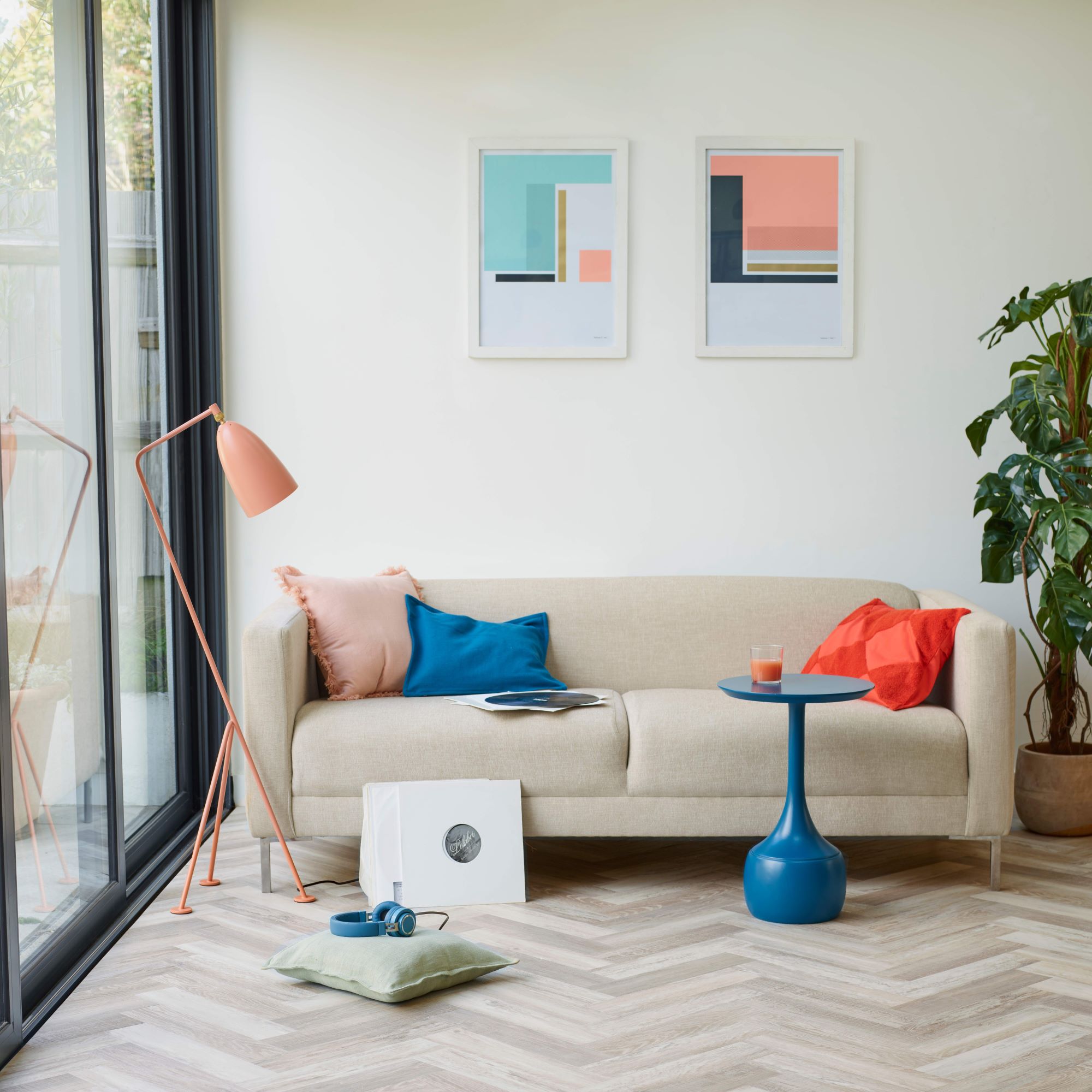
'Complementary colour schemes are all about creating bold, contrasting spaces using colour theory,' says Lorna Williams, Head of Product Design & Visual Creation, Amtico. 'The rule is that any colours that are opposites on the colour wheel are deemed as complementary and can be used to create contrast and harmony in interior design when used correctly. For example, red and green, blue and orange, and yellow and purple.'
Complementary colour schemes are an opportunity to experiment with new colour combinations that you haven't tried before, and you don't need to stick to rigid guidelines to make it work. The experts encourage choosing a complementary colour scheme that will suit your own taste, as well as the space you're working with.
How to create a complementary colour scheme
Now we've had a brief look at the question - what is a complementary colour scheme - it's helpful to look at some examples of how to bring this design method into practice. If you are thinking of creating a complementary colour scheme in your own home, make sure you have a colour wheel handy.

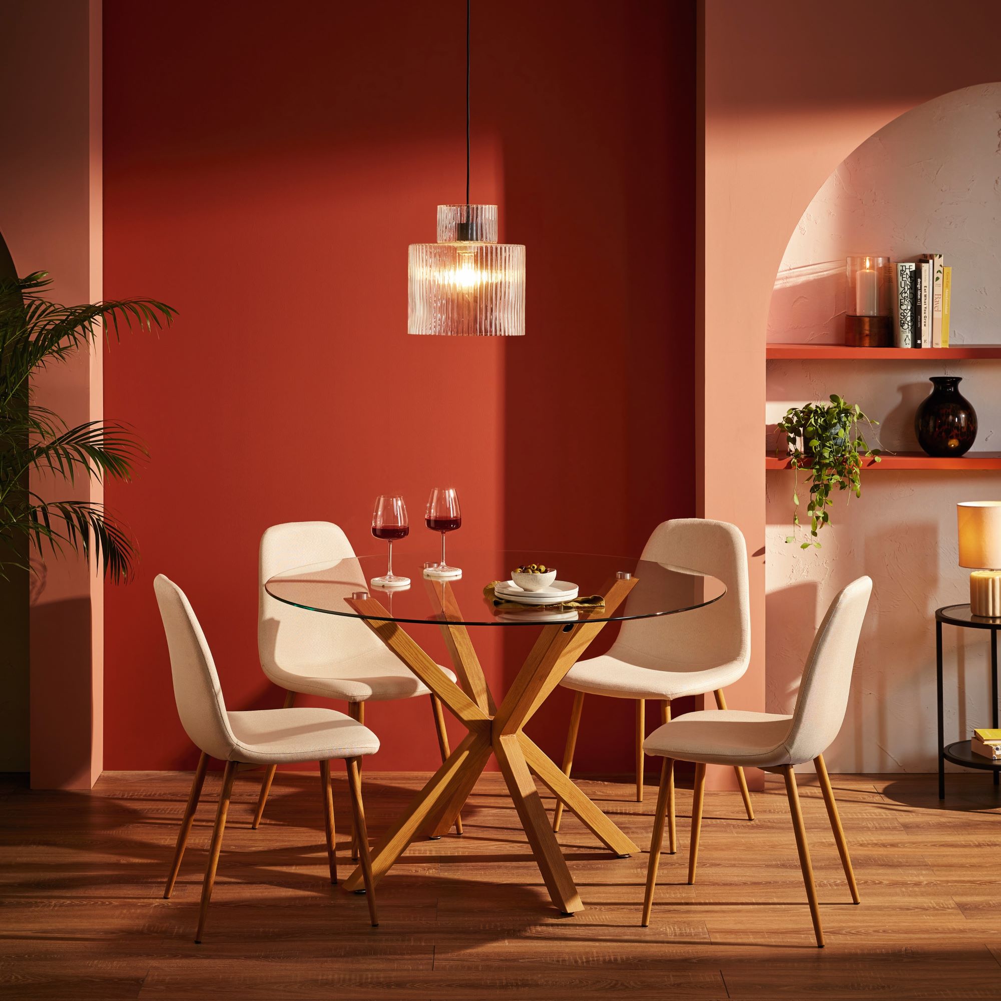
Choose two colours that sit opposite each other on the colour wheel, that you think would work nicely in your chosen room. One example of a complementary colour scheme is pink and terracotta. The soft hues of pink pair together beautifully with the earthy warmth of terracotta.
'When painting a room, such as a living room or bedroom, use terracotta on one wall to add depth and richness,' says Samuel from Homebase. 'This could be your focal wall, creating a warm, inviting atmosphere. Complement it with soft pink on the remaining walls to create a serene balance and a modern twist on traditional colour schemes.'
'Consider playing with different shades of pink for variety, such as a pale blush or a deeper rose, to enhance visual interest,' Samuel adds. 'You might also experiment with paint techniques, like an ombré effect where pink fades into terracotta, to create a seamless and artistic transition.'
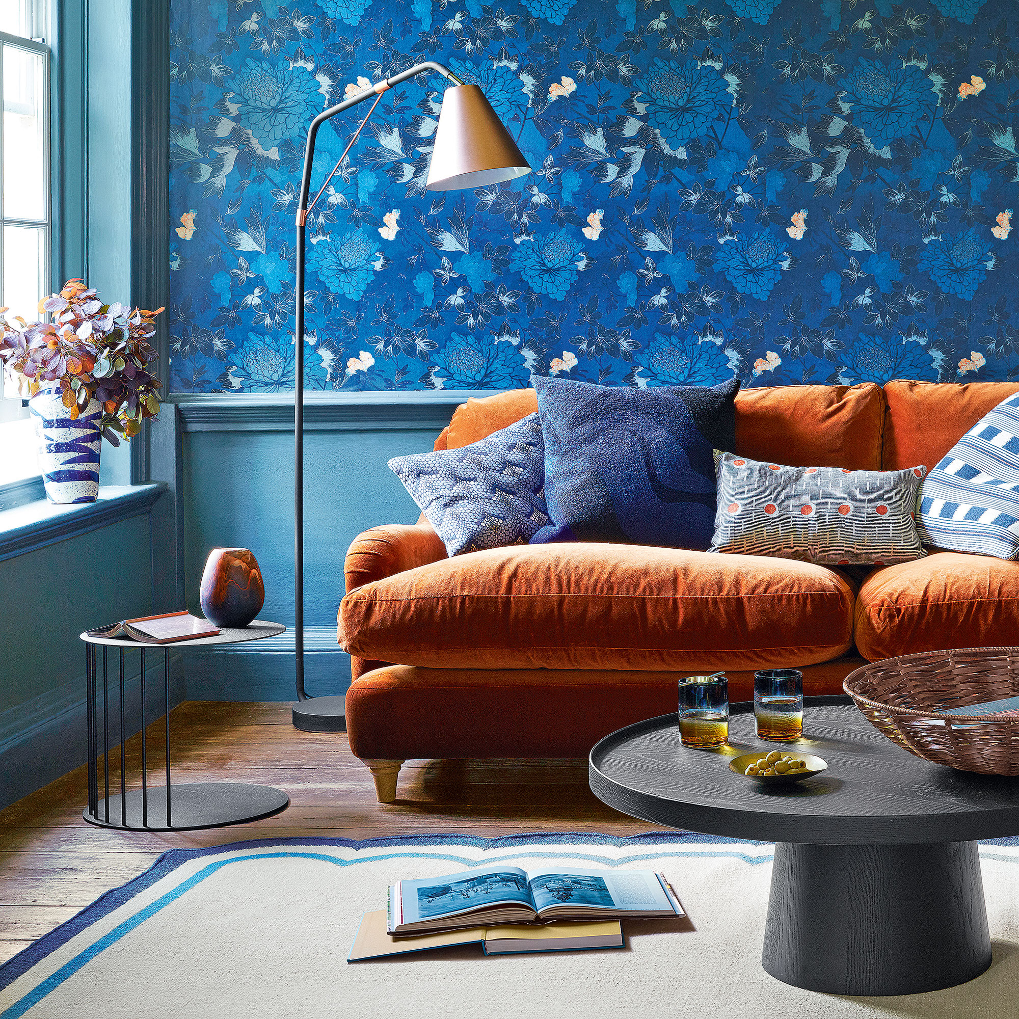
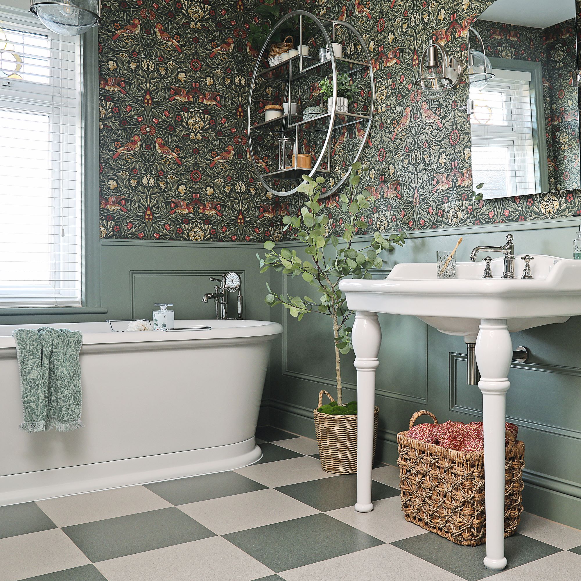
Though paint often creates the foundations of a complementary colour scheme, other elements play an important role too. Living room wallpaper ideas for example are a creative way to contrast your chosen colours and incorporate pattern if you're feeling more bold.
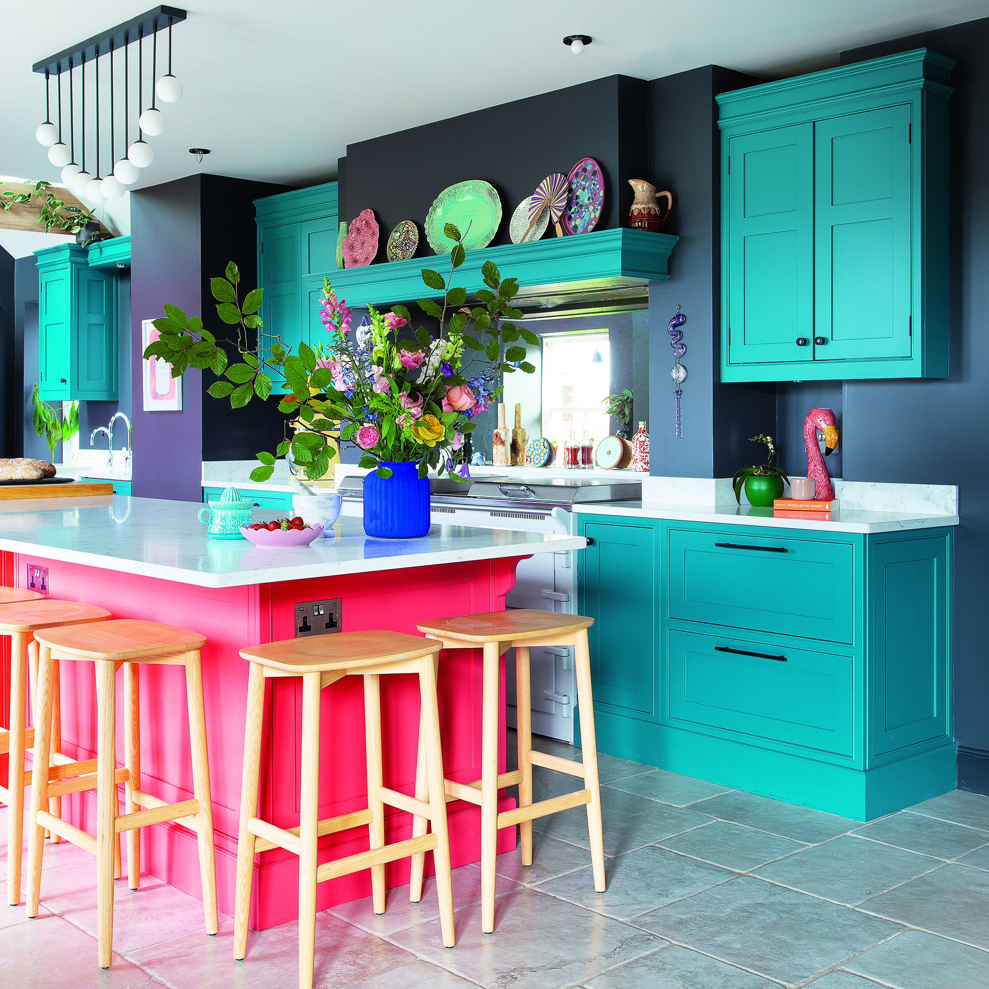
You can also use structural elements and key pieces of furniture to solidify your chosen colour scheme. 'In the kitchen, you can pair complementary colours or textures to define individual working zones,' says Sophie Devonald, Designer, Crown Imperial. 'For example, on-trend blues and greens are ideal to add a vibrant colour accent to an island centrepiece. Match your cabinetry choices with their corresponding colours to achieve a balanced feel.'
The beauty of a complementary colour scheme is that it can be completely unique. The only rule is that it should contain two colours that sit opposite each other on the colour wheel. If you want to, you can layer in more accent colours alongside, as long as the complementary colour pair forms the basis of the scheme - whether that's for your living room colour scheme or bedroom colour scheme.
'Embrace a playful and eclectic colour palette that resonates with your style, by mixing bold and bright colours to create interest,' advises Suzi from furn. 'You can also combine various patterns – like stripes and florals to add layers of personality to your interiors.'
FAQs
What is an example of complementary colours?
'Complementary colour schemes tend to consist of groups of colours that contrast yet emphasise each other,' says Suzi from furn. 'These are often colours on the opposite end of the colour wheel, like red and green.'
Red and green is an example of a complementary colour pair, but this extends beyond their basic, or original tones. All the shades and hues of red, from pale pink to deep maroon, complement all the shades of green, from soft pine to dark forest green.
This example can be applied to any other complementing colours on the colour wheel, such as blue and orange, yellow and purple.
What does a complementary colour scheme involve?
A complementary colour scheme involves using two contrasting colours as the primary colour palette in a room, for example red and green, or yellow and purple. Other accent colours can be incorporated into the scheme, but the two opposing colours should be the focal point.
'A complementary colour scheme should be colourful and fun, however, your approach can be gentle,' Suzi says. 'Contrasting colours are ideal for creating a colourful boost, but you can use these in softer tones if you are worried about overpowering your space. Adding pops of colour with your cushions and throws can be a great way to do this.'
You can use paint, wallpaper, furniture, furnishings and accessories to create a complementary colour scheme. As long as the two contrasting colours are used in conjunction with each other, there aren't any strict rules. You can use a complementary colour scheme in any way that suits your home.
So now we've answered the question what is a complementary colour scheme, which two-tone pairing will you be opting for in your home? Complementary colour schemes can be used in any room, and in any way you like - start getting creative!