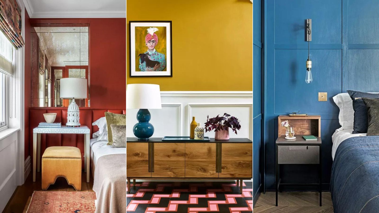
Using color to make us feel happier at home has never been more needed. With everything going on in the outside world, our homes have become havens like never before, with every room's design and room color ideas able to contribute positively to our mental well-being.
Questioning our color choices to ensure they promote happiness isn't a new concept, but it's come to the fore in the past months, with 'happy room ideas' a priority for homeowners and renters alike.
Using everything from color psychology to the color wheel, our team has curated a collection of color trends and color combinations for rooms guaranteed to make you happier at home.
What colors should you not paint a room? 5 colors that make a room feel unhappy
When it comes to our happiness at home, choosing colors that make a room feel happy couldn't be more pivotal. Color has the power to impact not only the aesthetic of a room, but also affects our deepest feelings, personal memories, thoughts, and behavior.
‘If you want a positive personal change of any sort, you must first address your environment,’ says Michelle Ogundehin in her book Happy Inside. 'We all need homes that support, rather than undermine, our wellbeing.’ The first place to start with is color.
Here, color psychologists, decorators, and interiors experts reveal what colors make a room feel unhappy, and what variations to use to create a scheme that won't overwhelm.
1. Be cautious of red
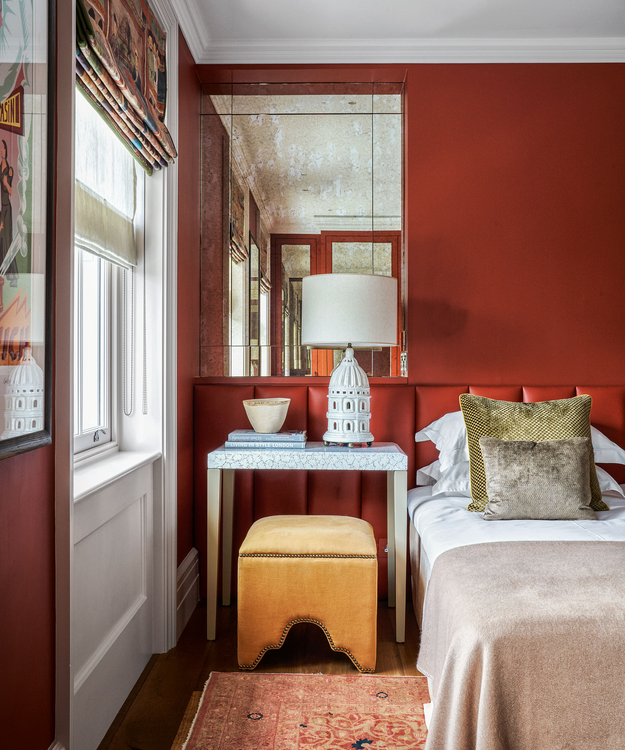
Red room ideas affect us physically and can be too intense for most people. It reminds us of danger and is a color that makes you angry, as well as one of the most stressful colors in history.
Red can activate the 'fight or flight' instinct: the physiological reaction that occurs in response to a threat. Physically, red can induce reactions in the body that are similar to stress responses, such as increased heart rate, heightened senses, and higher body temperature.
However, decorating with red isn't all bad, especially when used as an accent color in the home. It has many positive connotations, too. Red is the color that represents love, power, and motivation. This hue has the ability to grab attention, and evoke passion and sensuality – and has also been known to stimulate the production of melatonin and help with memory.
Our advice is to use red with caution. Be mindful of how this color makes you feel, and react. For some, this energetic hue could be making your feel unhappy at home.
2. Yellow can stimulate emotional responses
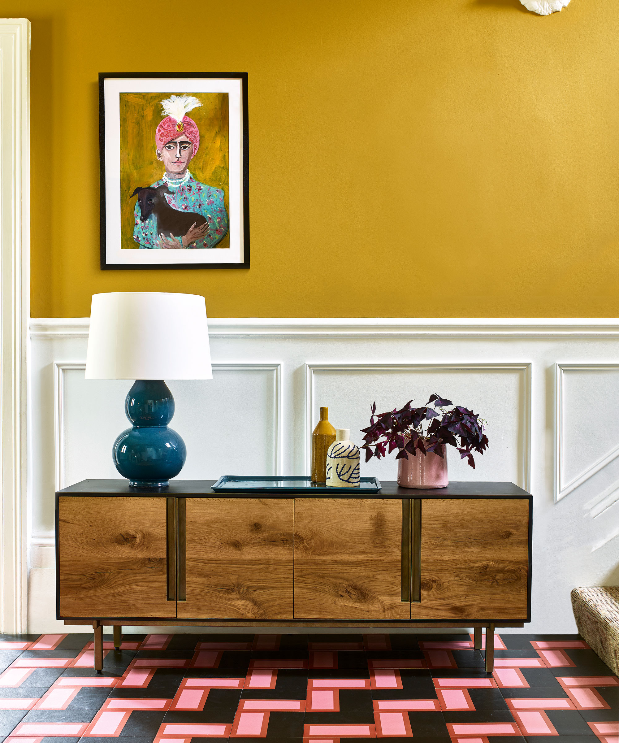
For all its decorating potential, yellow should be used with due consideration and care. 'Yellow primary action in to trigger emotional responses,' says Karen Haller, color psychology specialist, teacher, and best-selling author of The Little Book of Color. ' It has an impact on the nervous system – a system that transmits signals from the brain to the rest of the body.' As a result, yellow is the strongest color in psychological terms.
While yellow is a color to use with caution, decorating with yellow has a relatively long wavelength and is emotionally stimulating, making us feel confident, positive and optimistic. The unfavorable effects are, of course, the exact opposite. 'The wrong tone of yellow can lead to feelings of irritation, nervousness and depression,' explains Karen Haller.
3. Blue triggers mental responses
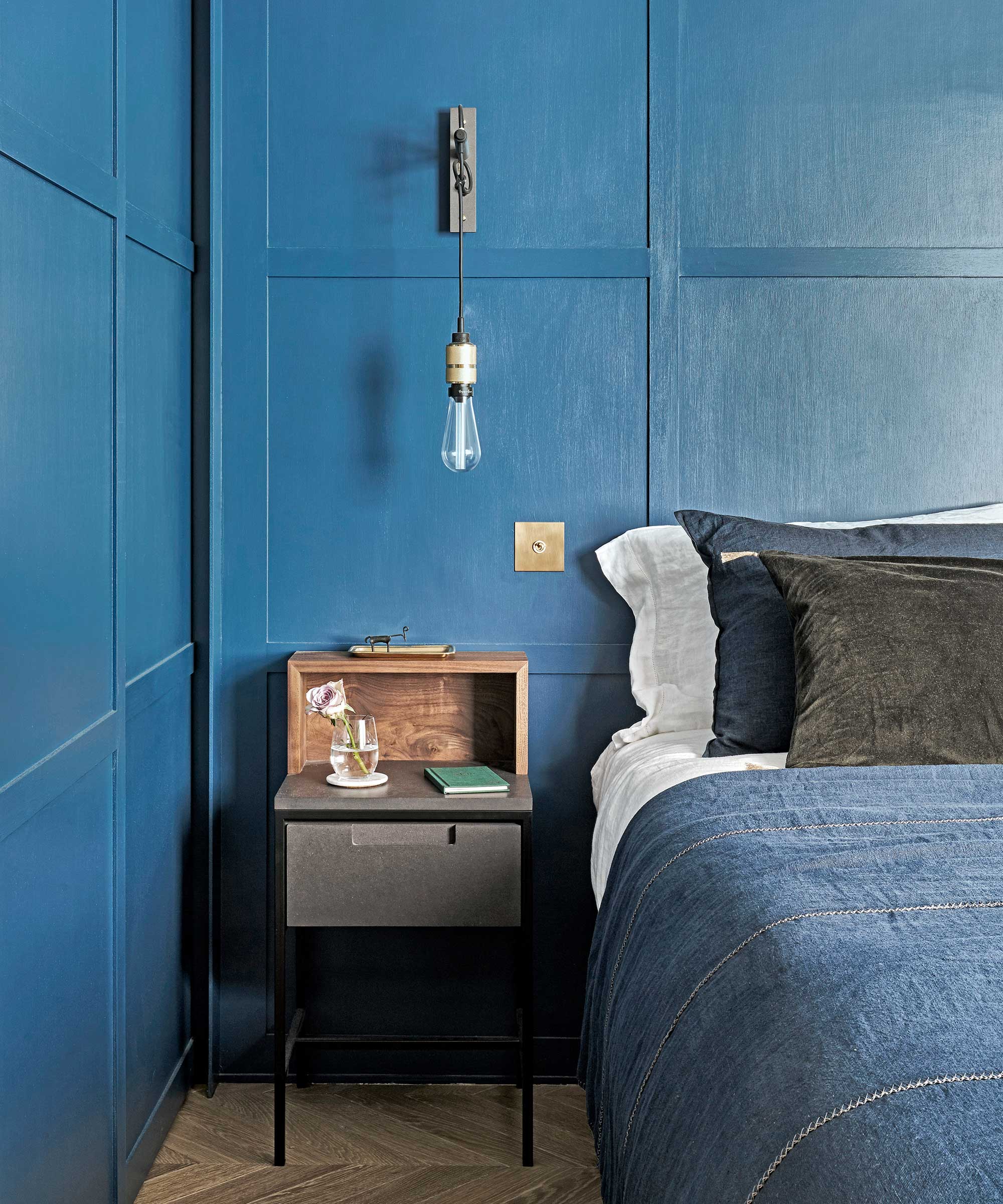
Blue affects our minds and creativity. Its primary action is to trigger a mental response. Too much blue or surrounding yourself and your home with the wrong tone, and you could find yourself feeling sad and coming across aloof and uninterested. 'Even though blue is the world's most favorite color, used in the wrong context we can become wary of its cold nature,' says color psychologist Karen Haller.
Blue is also best avoid in a dining room. When we see blue food, for example, we instinctively respond to it as spoiled or unsafe. Blue is the color most likely to suppress the appetite. However, blue is a smart choice for a home office. It is the color of communication and intellect. Think of Facebook, LinkedIn and many banking companies. Depending on the tone, blue can help you stay focused, and increase concentration and awareness.
4. Be aware of the adverse psychological traits of gray
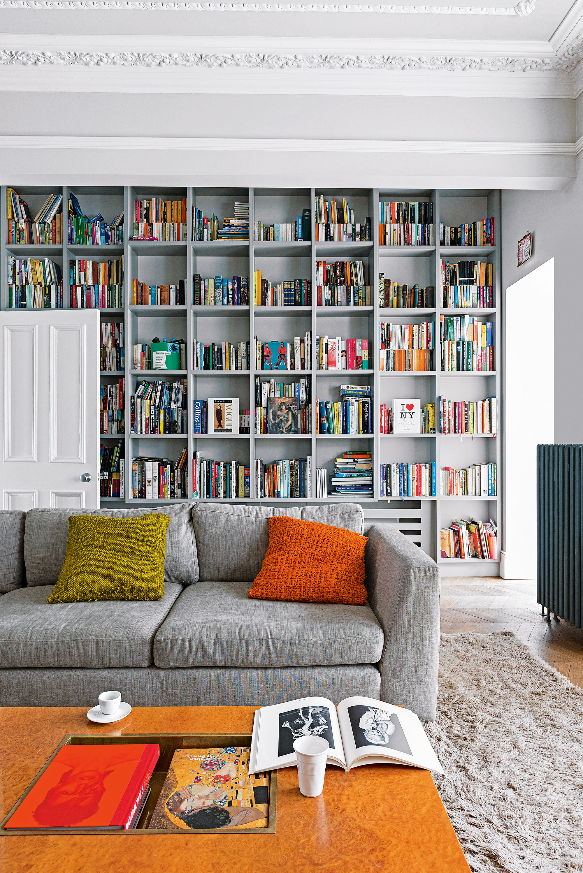
Psychologically, pure gray doesn't have any positive qualities or benefits. While calming for some, for most of us, gray can make us feel low and want to hibernate and hide away from the rest of the world. 'How often have you heard someone say, "I just love gray days"?' explains Karen Haller.
So why is gray so popular, not just when it comes to fashion trends, but also in the home? The answer may be more simple than first thought. Karen argues that the rapid shift towards gray has a lot to do with the rapid pace of change in the modern world. When life feels confusing, we do whatever we can to minimize the overwhelm and confusion. Many people decorate with gray to quieten down a busy or chaotic space. If we are unconsciously using gray to make ourselves feel safe and secure, then why would we want to give it up?
Interior designers aren't quite ready to put down the paintbrush when it comes to decorating with gray either: ‘Grey is enormously versatile. Depending on the underlying tones within it and on the depth of color, it can be partnered with almost any other hue,’ says interior designer Victoria Wormsley of French-Brooks Interiors. It's a minimal-effort color – gray goes with every other color and can be used to add depth to any room.
5. Don't overuse deeply saturated colors
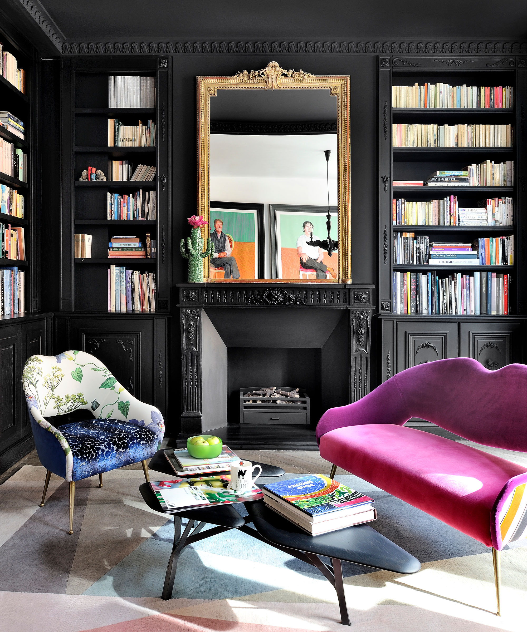
The saturation – and chromatic intensity – of a color can make a room feel unhappy in the same way as using any of the specific colors mentioned above.
Whether a color is stimulating or soothing to us depends on its chromatic intensity. It is a deeply saturated color, it is likely to be stimulating, and, if it has a low saturation, it is likely to be soothing.
Darker, more intensely saturated blues stimulate the mind, for example, while lighter, less saturated blues can soothe and calm the mind.
A strong, dark red is physically exhilarating, but a soft, light red is physically soothing and comforting.
The deeper the yellow the strong its emotional effect, but use a subtle or pastel variation and it might conjure up memories of happier times and warm, sunny days.
When using color to influence behavioral change, it is important to think about the positive as well as the negative associations with each color. Remember, not everyone sees or feels color in the same way. Using the right tone in the right proportion and in the right place is paramount if you want to create the effect you intend.


