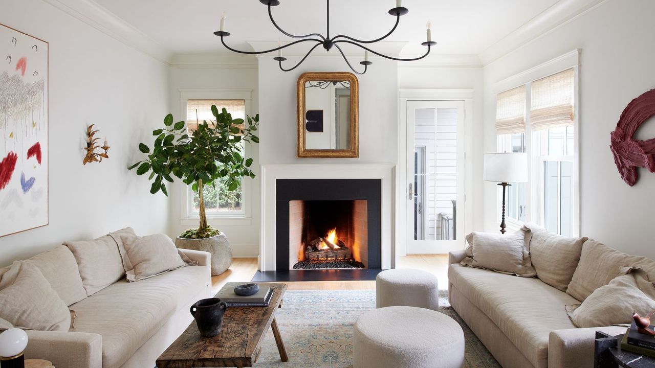
Believe it or not, the secret to making a room look more expensive isn't always about investing in costly furniture; it can be as simple as choosing the right paint colors.
According to interior designers, there are certain shades that tend to give off a more expensive-looking, elevated feel than others. Generally speaking, these colors seem to fall into two camps: soft, considered neutrals that create a calm backdrop, or rich, warming tones that feel cocooning and refined.
Here, you can browse the exact colors designers recommend as a cheat code for making a home look more expensive. While paint ideas are perhaps the most impactful, you can also incorporate these hues through decor for a more subtle approach.
1. Rich and Earthy Neutrals
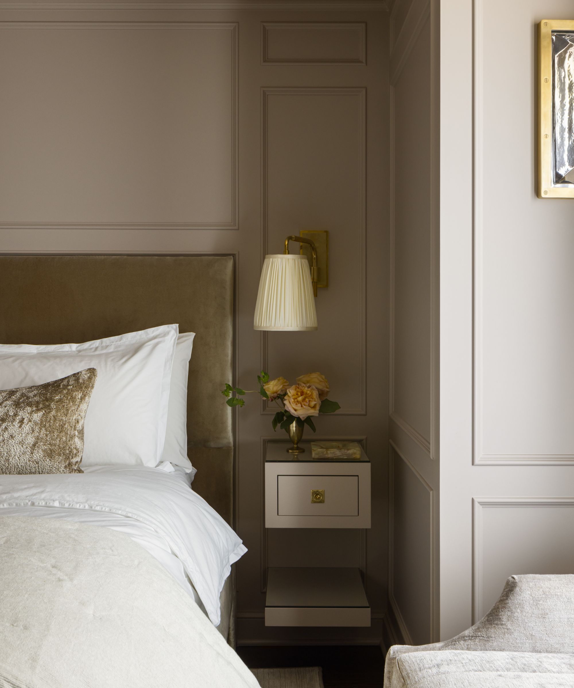
Decorating with neutrals is timeless, and the right tone can quietly elevate a room with sophistication and calm. Warm beige tones in particular are said by designers to feel expensive, but consider going for a slightly deeper shade than you might usually, such as Sherwin-Williams' Renwick Beige, which was used in this bedroom.
'We chose this deep, enveloping tone for its high level of complexity, with layered undertones that subtly shift as the light changes throughout the day,' explains designer Mallory Robins of Kobel + Co. 'Rather than reading flat, it creates depth and dimension, allowing light to pool softly across the space in a way that feels intimate, elevated, and reminiscent of a boutique hotel.'
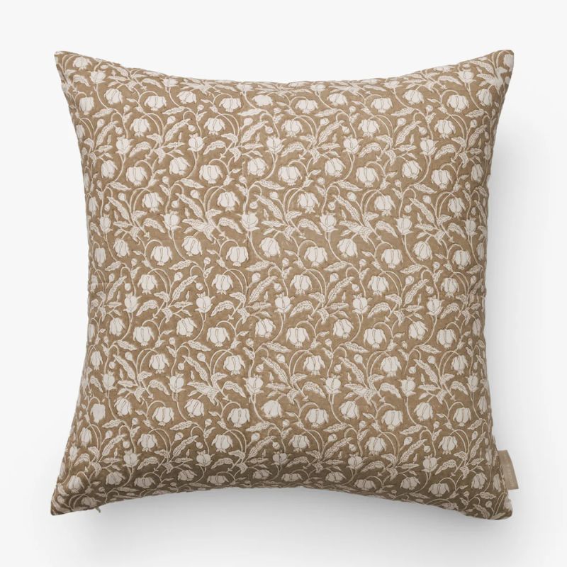
The timeless pattern on this pillow cover would work well to add interest and movement to a neutral scheme.
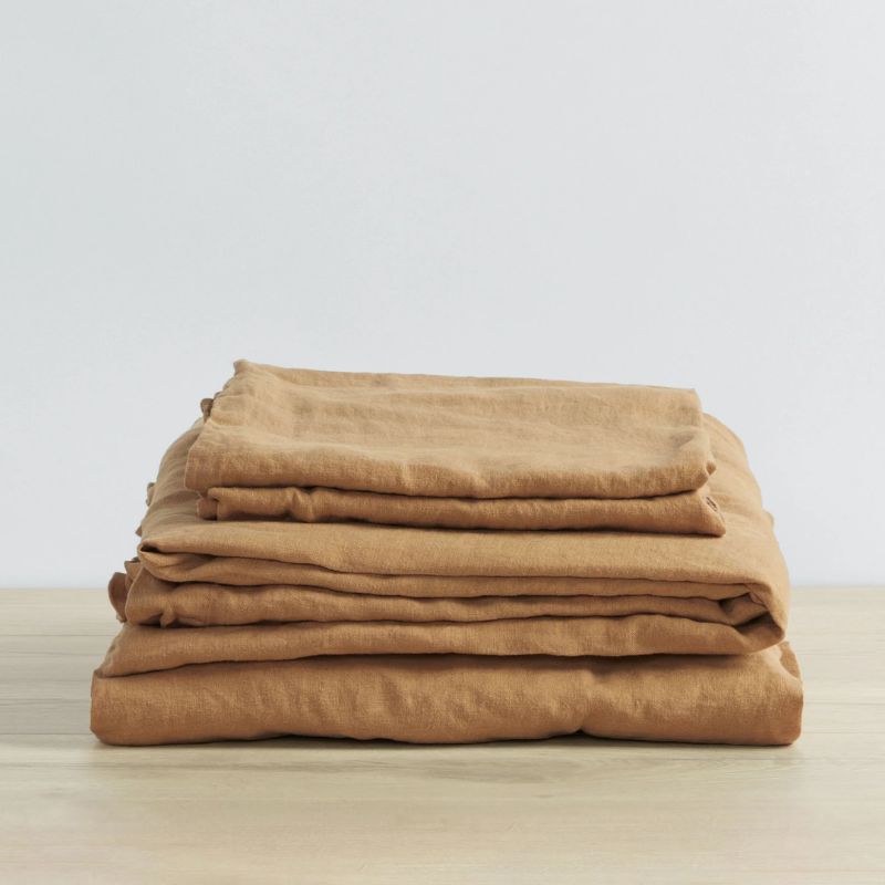
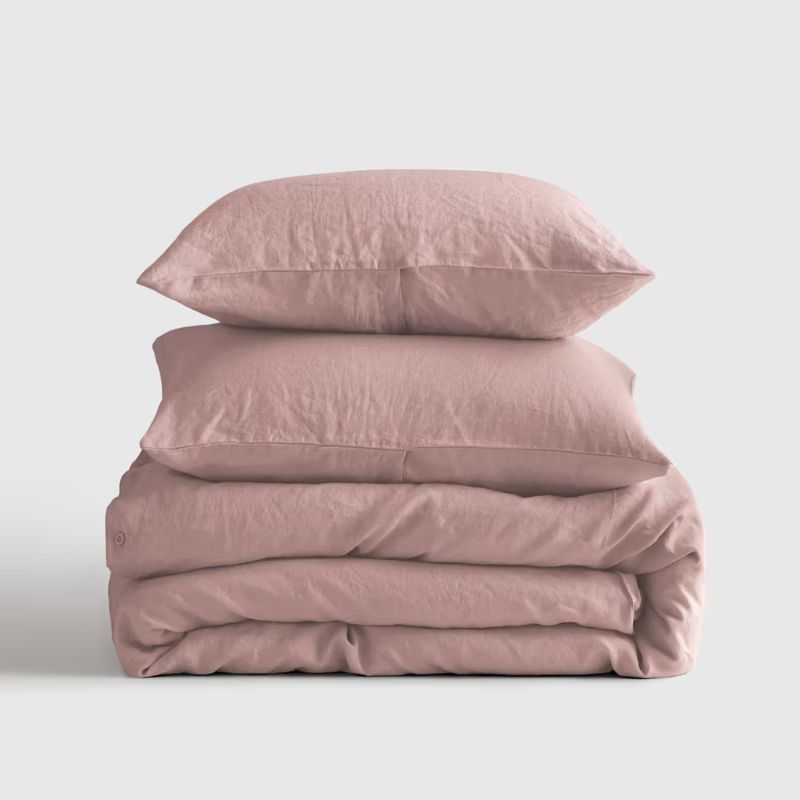
Go for this warm neutral bedding set for a timeless look. The linen material makes a practical choice for spring, too.
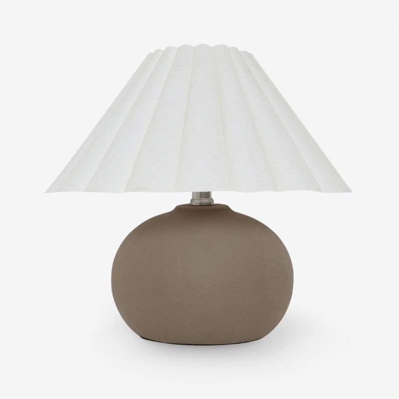
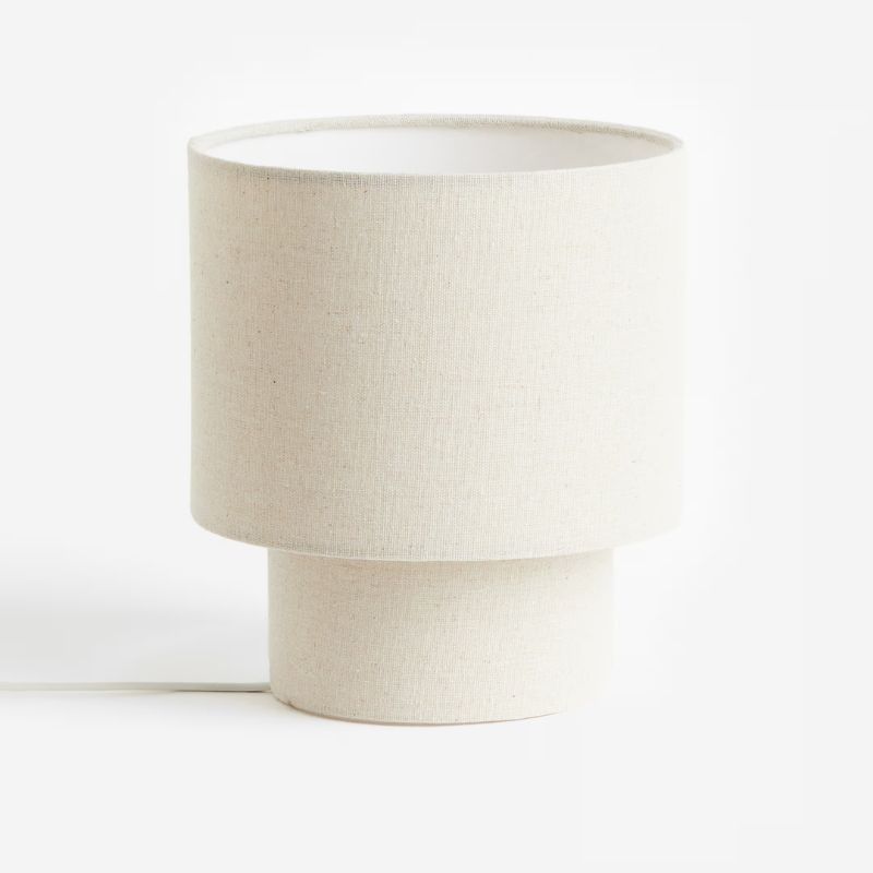
Add depth to your space with this dark neutral table lamp, whether in bedrooms, living rooms, or entryways.
2. Deep Olive Green
Much darker colors can create an equally expensive-looking scheme, especially the darkest of olive greens. 'To me, dark greens, browns, and blues are wonderful colors for elevating any interior,' says designer Gabrielle Bove of Opaline Interiors Studio. 'These rich jewel tones and earthy hues feel dramatic yet sophisticated and bring a luxurious feel to any space.'
Paint shades such as Sherwin-Williams Ripe Olive work especially well to create an elevated look in small rooms, says Gabrielle: 'This deep olive color is rich in black and blue undertones, so it feels sophisticated and rich as the backdrop for a small room, especially layered with warm wovens to create a very chic space.'
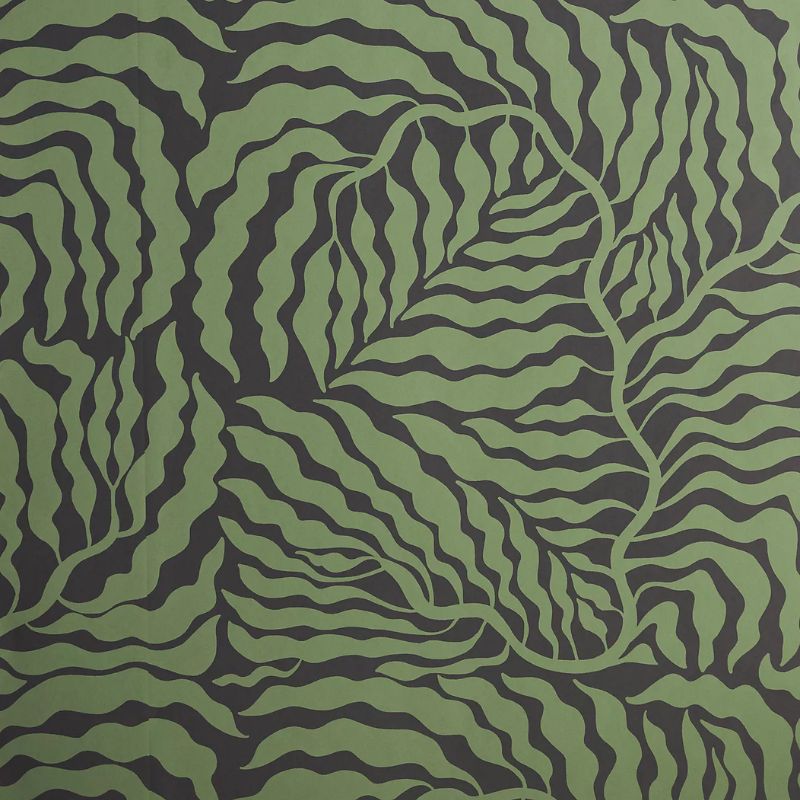
Instead of decorating with paint, bring olive tones to your room with this fern-patterned wallpaper.
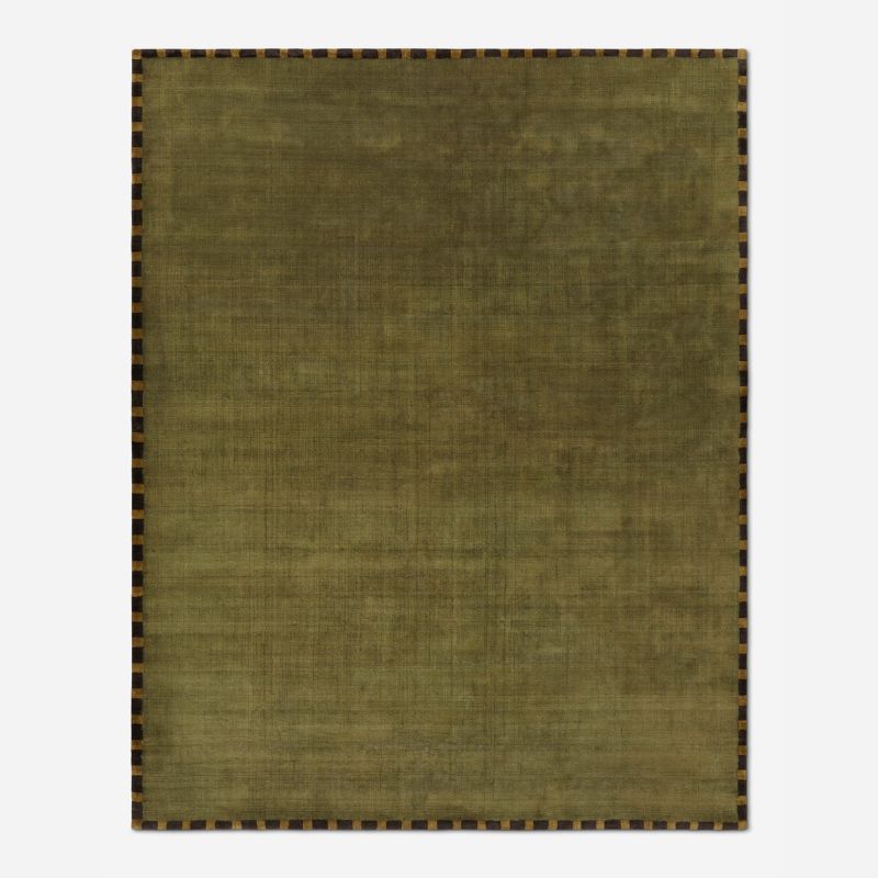
The warm tone of this olive green rug make it feel modern and elevated.
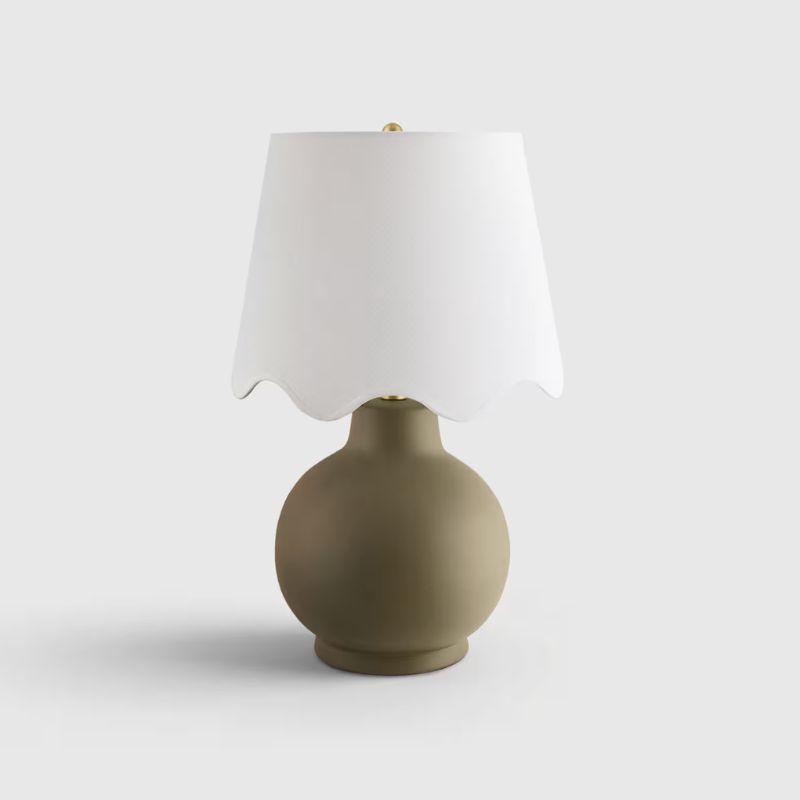
For a smaller addition of olive green, go for this versatile table lamp with a scalloped shade.
3. Delicate Off-Whites
If you're looking to create an expensive-looking scheme that's also light, airy, and tranquil, consider decorating with white. 'Warmer whites tend to feel more elevated than stark or cooler-toned whites because of the way they reflect light,' explains designer Aileen Warren of Jackson Warren Interiors. 'They make a space feel softer, more inviting, and generally easier to live in.'
When using white paints, choosing a variety of paint finishes can help to add movement, according to Aileen. 'Typically, the walls are matte, the trim is satin, and the ceiling is flat,' she says. 'Even though the color stays consistent, the different sheens catch and reflect light differently, which gives the room a more layered, nuanced feel.'
The designer Sabah Mansoor also enjoys using white to make a room look expensive. 'Off-white tones have a way of making a space feel instantly elevated because they bring warmth, softness, and depth without overpowering the room,' she says. 'Softer whites create a quieter backdrop that allows architecture, materials, and furnishings to really shine.'
'When decorating with off-whites, layering is key,' adds Sabah. 'Incorporating natural textures like linen, oak, stone, plaster, and woven materials adds richness and keeps the palette from feeling flat. We also love mixing tonal whites and creams throughout a space to create dimension and a more collected, refined feel.'
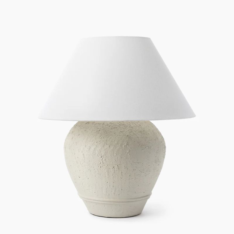
Texture is key when decorating with white, and the base of this table lamp brings a rustic feel.
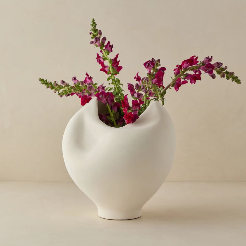
The sculptural form of this vase would also help add interest to white rooms, and would look wonderful with colorful blooms.
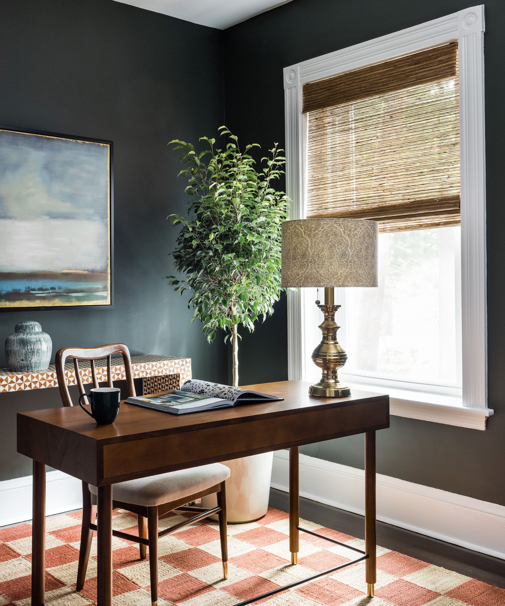
Keep things classic and understated with this table lamp – a great choice for home offices or bedrooms.
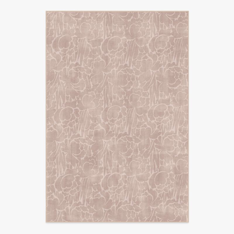
4. Soft Mauve
If you're looking for something slightly more colorful that still reads as muted and easy to live with, consider a soft shade of mauve. 'The color I chose for this room, with soft mauve and gray undertones, feels low-key and sophisticated,' says the designer Christy Allen of Christy Allen Designs.
Benjamin Moore's Desert Light was used on the walls, which is so delicate that it can come across as a neutral paint. 'The color doesn't hit you over the head, but you notice it immediately for the way it makes you feel: easy and relaxed,' says Christy. 'It's a refined and subtle color that almost feels like a neutral but is so much more interesting. The sophisticated color palette and the considered furniture choices help make this feel elevated and high-end.'
This bedding set is perfect for the summer months with its natural material and mauve color.
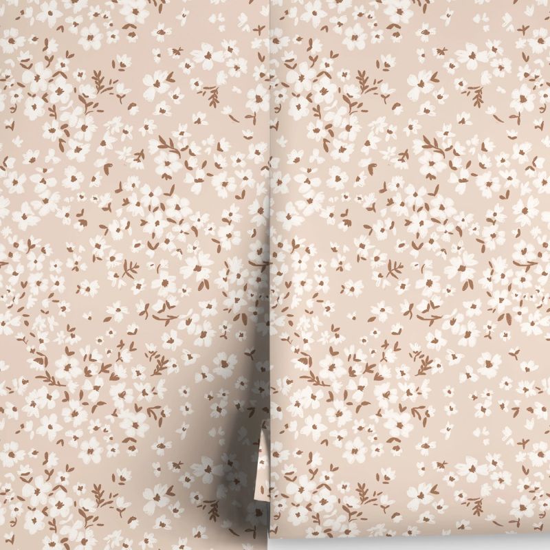
For a more traditional look, go for this floral wallpaper that would bring a hint of mauve to a room.
Perfect for bedrooms, this lightly patterned rug brings mauve to your space without feeling overly colorful.
5. Rich Burgundy
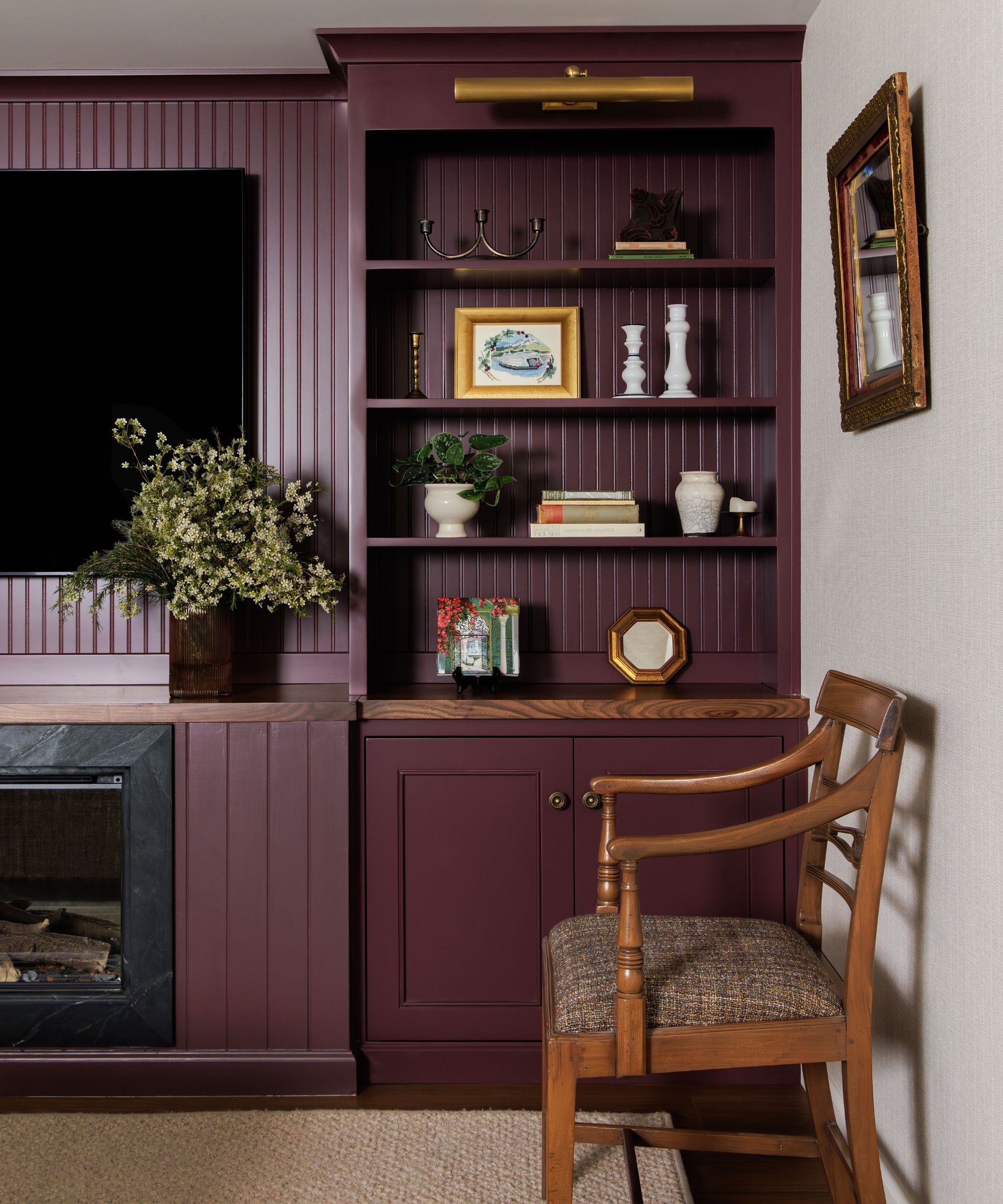
For a moodier take on elevated schemes, burgundy can work well, especially in rooms you also want to feel cozy and cocooning. 'Jewel-toned purples have a long history of feeling expensive,' says designer Rebecca Letwin of Full Bloom Interior Design.
In this living room, Benjamin Moore's Dark Walnut was used on the joinery, a rich purple-ish red paint that feels immersive and dramatic. 'I chose Dark Walnut to instantly elevate the built-ins and anchor the space,' says Rebecca. 'This deep, rich plum color magically makes the room feel sophisticated, luxurious, and a little whimsical all at the same time.'
When using a shade as rich as this one, contrast in interior design is key, according to Rebecca. 'You want to use decor that stands out against the dark background and really catches your eye,' she explains. 'A deep color like this is especially great for displaying lighter objects that would otherwise get lost on a basic white bookcase. For these built-ins, I used warm brass accents and fresh pops of white to contrast against the rich plum.'
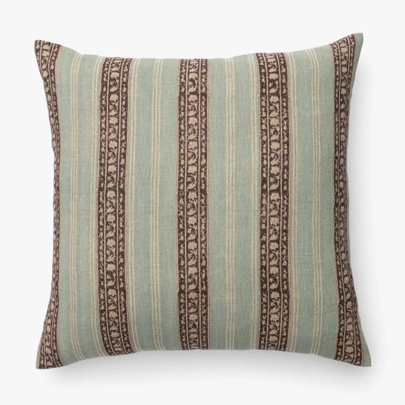
To make burgundy feel relevant for the summer months, go for this cushion that combines it with the lighter sage green.
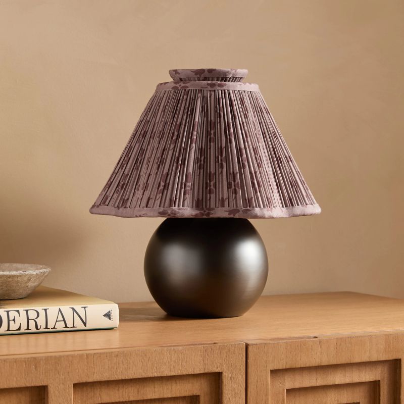
This table lamp allows you to bring a small touch of burgundy to your space, while the patterned shade adds movement and interest.
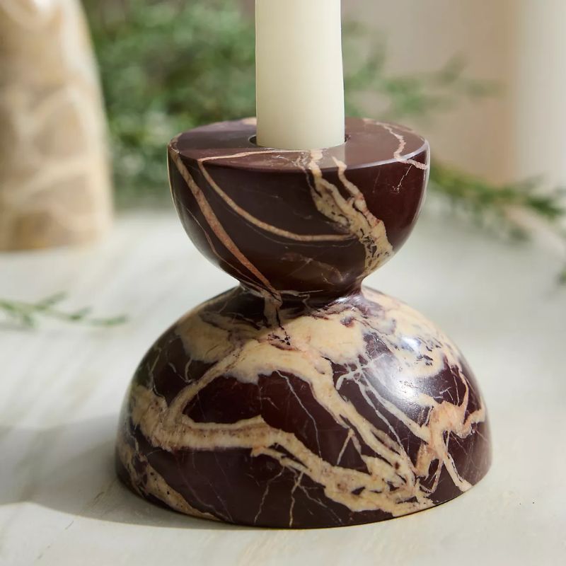
Even a small addition of burgundy can help to elevate your space, such as this marble taper candle holder.
Making a room look more expensive isn't just about choosing the right colors, but also about how you use them. For an elevated look, contrast, texture, and layering are key to keeping the whole room feeling interesting and considered. Whether you're drawn to soft neutrals that feel timeless and quietly confident or much richer tones, your colors should feel in sync with the overall mood you're trying to create.
Love beautiful design ideas, expert advice, and inspiring decor trends? Sign up for our newsletter and get the latest features delivered straight to your inbox.