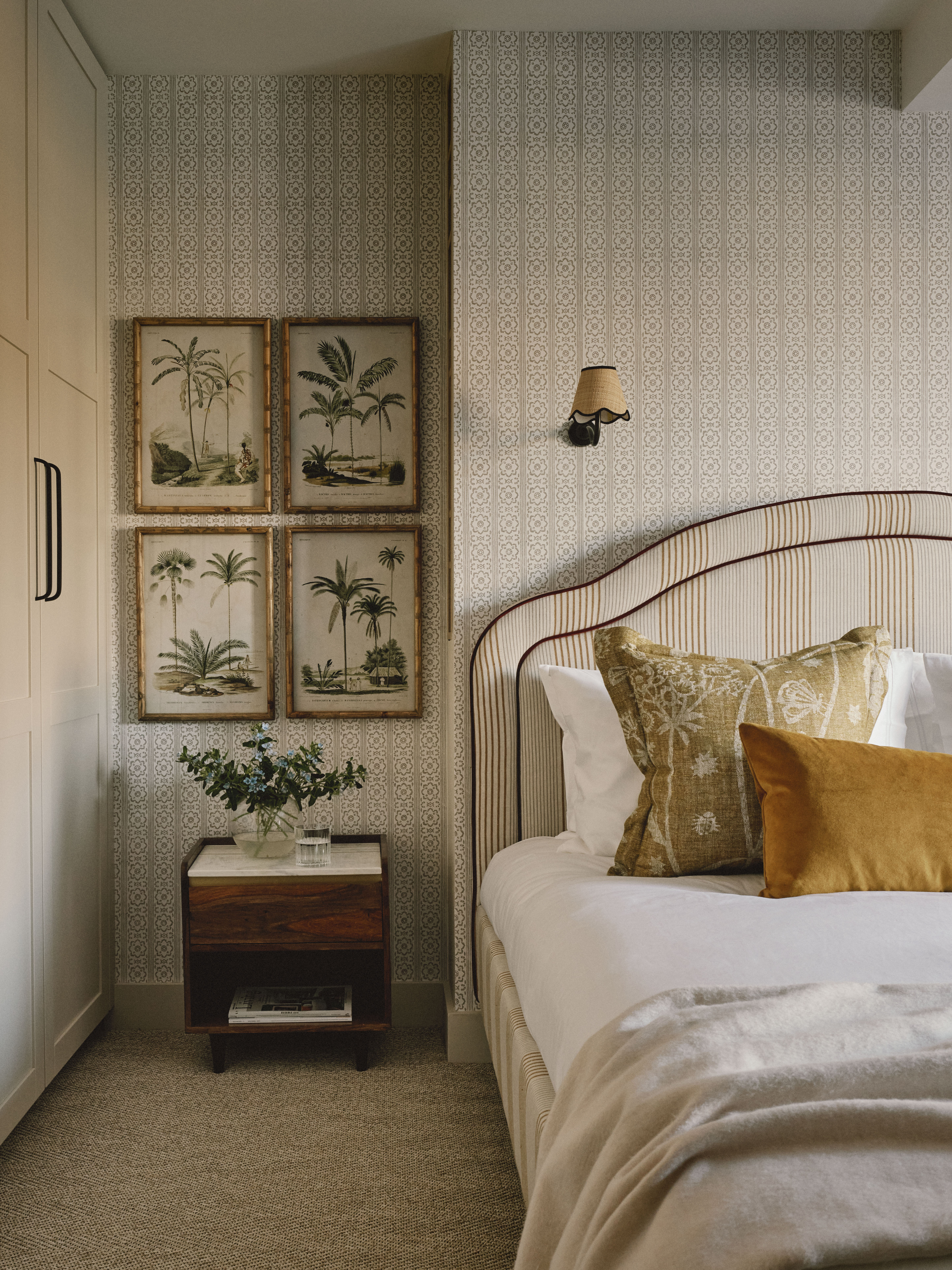
Adding gold to your interiors is a chic way to elevate any scheme. Although it has a metallic finish, deciding what colors go with gold is not as hard as it may seem, as it's actually considered by many designers to be an upscale neutral.
Where it can be a little bit simpler to choose colors that go with silver, one thing to be aware of when choosing colors that go with gold is the tone and finish of the gold you're using. "Gold comes in a range of tones, from rich antique golds and buttery brass colors to warm rose-tinted gold and gentle soft gold shades," Philippe Desart, from contemporary wall covering brand Arte, explains. "The nature of the gold you choose, how vivid it is, how warm in tone and even how reflective the finish will affect the atmosphere that you create, as well as which color will complement the shade."
We turned to a host of top designers and experts to find out what colors go with gold for an aesthetic that's modern as well as elegant. Here are some of their favorites...
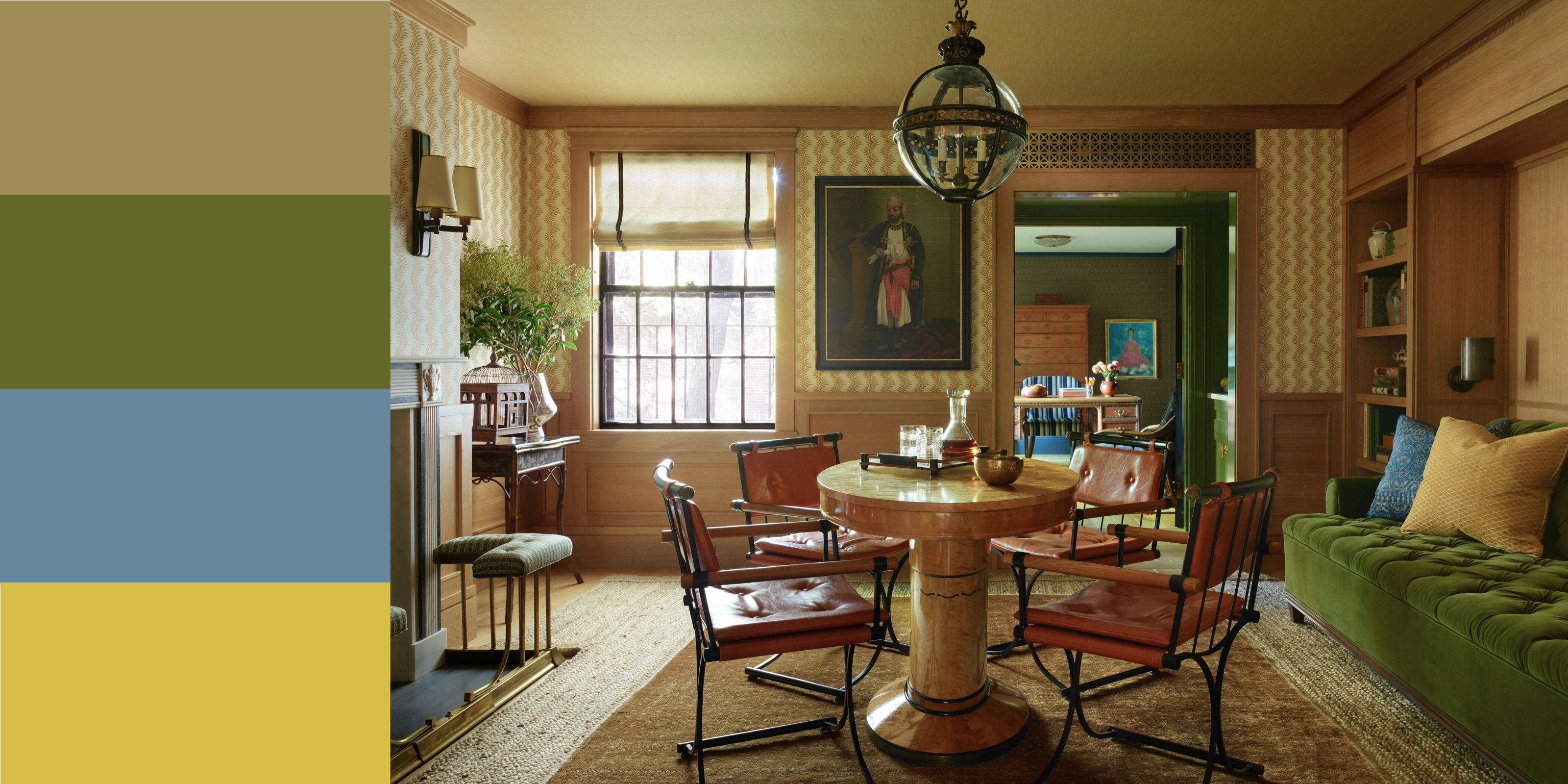
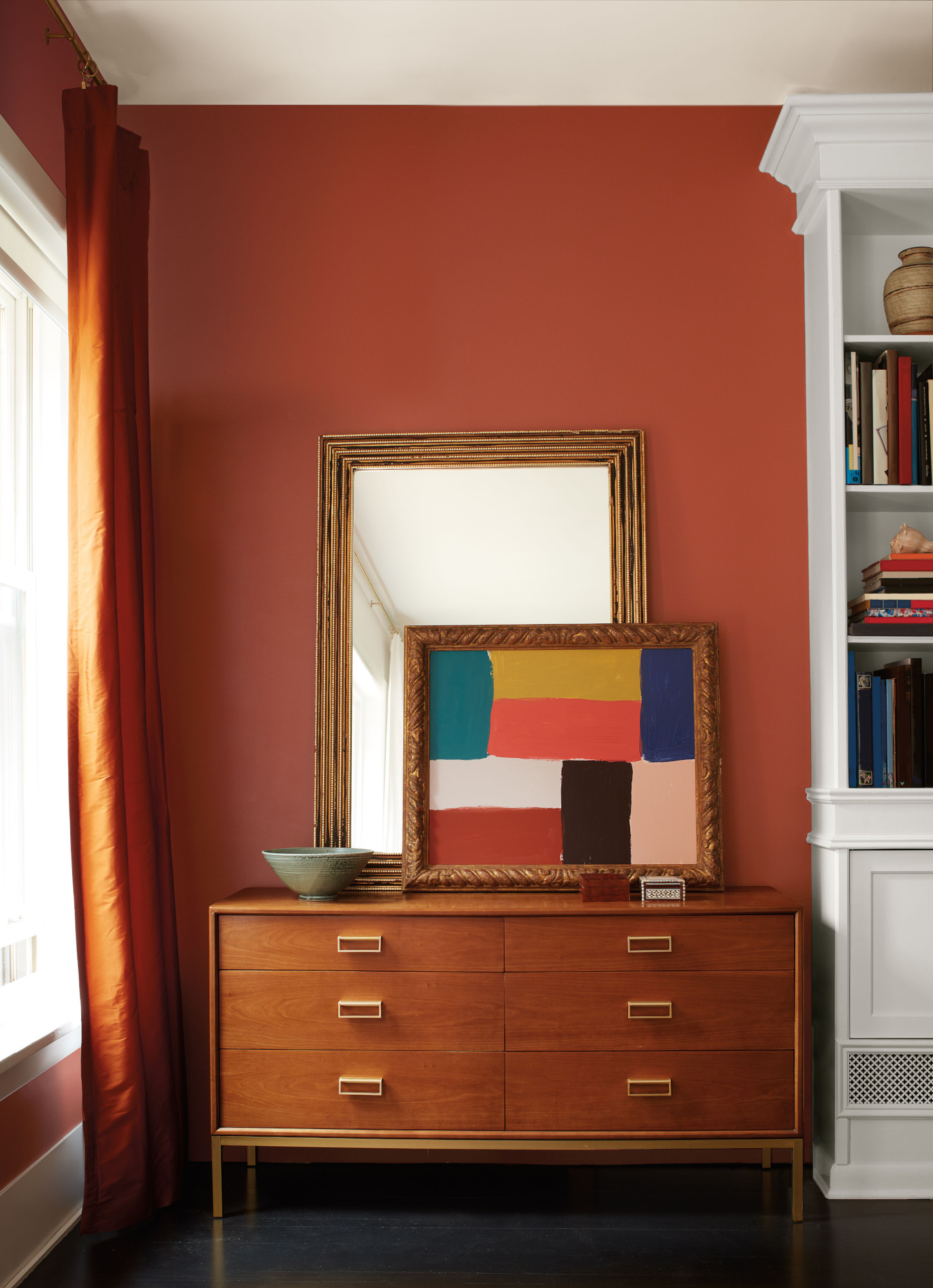
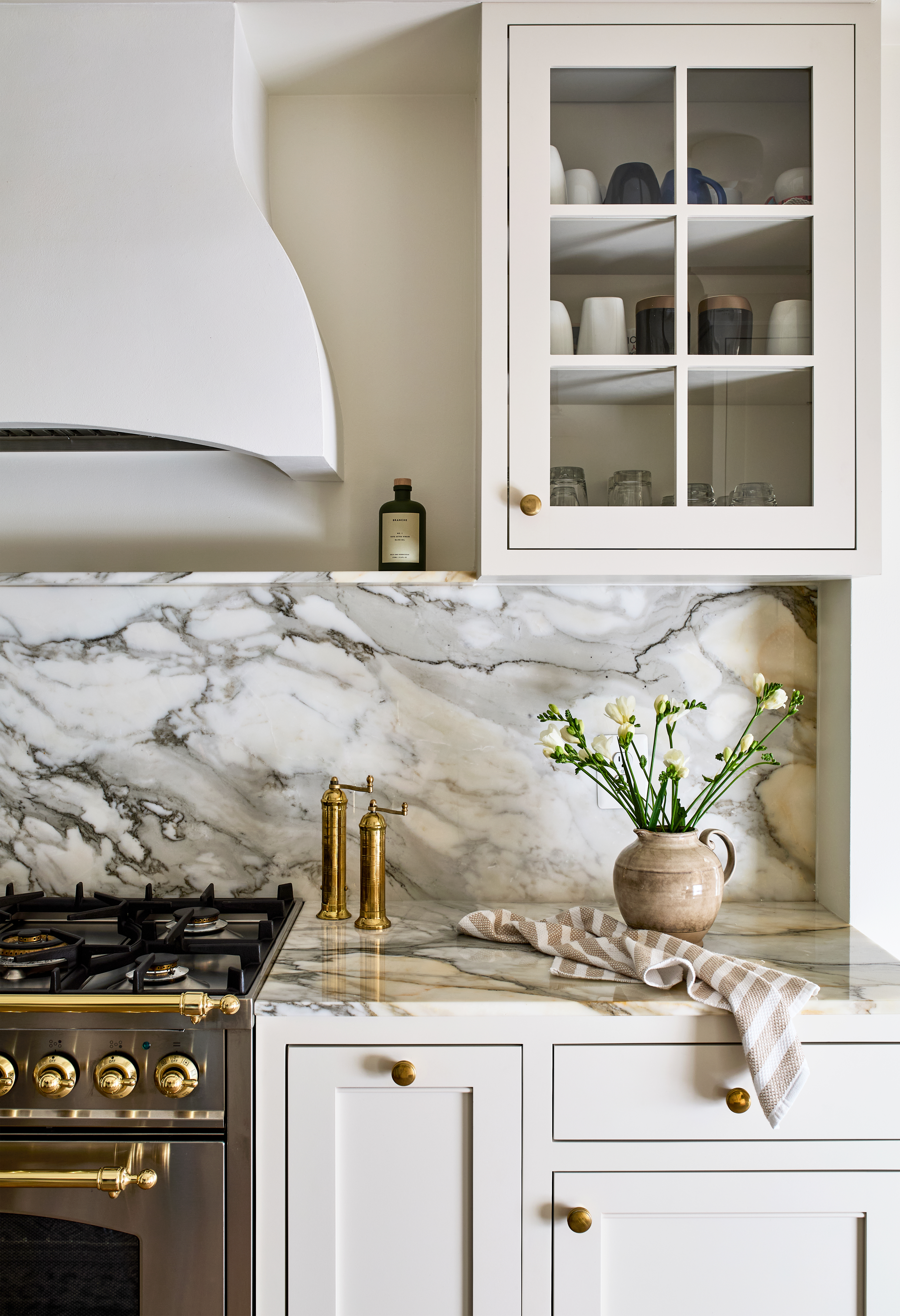
1. Greige
Often considered a 'neutral' by interior designers, gold sits really comfortably with other neutrals and is a color that goes with beige, cream, gray and greige, yet works to elevate the palette with its metallic finish.
"Gold pairs beautifully with greige — that soft blend of grey and beige — because both tones share a warm, muted quality that complements rather than clashes," explains Jenna Choate and Mariana Ugarte, co-founders of design studio Interior Fox.
"In this space, the mix of patterns and textures, from the detailed wallpaper to velvet and linen cushions, adds depth and makes the palette feel layered and intentional. Texture is key to tying everything together and allowing gold to feel integrated, not just decorative."
The rich texture and color of the mustard velvet cushion really ties the gold to the room and helps it subtly stand out from the greige wallpaper.
"It’s a perfect example of how an earthy, restrained palette can still feel rich and elevated when styled with care," adds Jen and Mar.
2. Turquoise
The beautifully vivid yet calming hue of turquoise makes it the perfect partner for the warmth and luxury of gold.
When looking at colors that go with light blue, gold, with its yellow and orange tones, is ideal as the two shades sit opposite each other on the color wheel, making them extremely complementary.
Turquoise is almost opposite gold, and is a great choice for an upscale pairing, as seen in the chic space by DATE Interiors above.
“The pairing of light blue or turquoise and gold works so well because it's a balance of cool and warm tones," explains Molly Torres Portnof, of DATE Interiors. "They're opposite colors on the color wheel, which also makes them highly complementary. The combination feels soft, delicate, and sophisticated.”
The main image (top) shows how other shades of light blue perfectly complement gold. The bold choice of light pendant pairs beautifully with the duck egg blue curtains for an inviting yet indulgent feel.
"My client chose a blue Indian hand blocked fabric for the curtains to highlight the grandeur of the windows," explains Beth Dadswell, Principal, Imperfect Interiors. "We didn’t want the room to feel too safe, so opted for a contemporary brushed brass pendant as a focal point, along with a dusky pink linen armchair and bedspread to tie in with a lovely painting that she already owned.
"Indigo, black and bronze were also brought in to create darker contrasts and atmosphere."
3. Pink
Pink and gold have always been a classic color pairing. In fact, it's one of the best colors to go with pink because it feels playful while still taking its place as a modern classic. Soft blush and dusty shades of pink are your best bet.
"Warm, lighter tones such as blush pink can look very modern," adds Tom Rutt, director of architecture firm TR Studio. For a more unusual combination, try a flash of something unexpected, like a dusk pink or vivid turquoise — this could go on something as simple as a single chair or oversized vase.
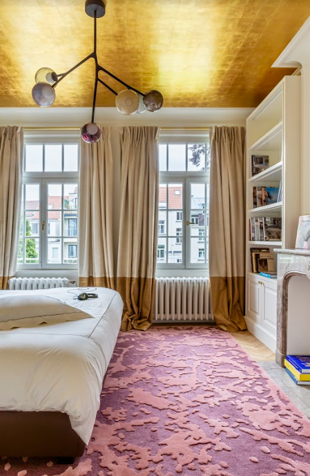
4. Purple

In a similar vein, the metallic finish can be one of the colors that go with purple too. "Blush pink, lavender and terracotta are some of my favorite colors to accent gold," says Grace Baena, an interior designer at online pre-loved furniture marketplace Kaiyo. "They really complement each other in a way that feels sophisticated without being too serious."
A striking example of the pairing can be seen in the maximalist bedroom shown above, designed by Crosby Studios. A shiny gold upholstered bedhead has been styled alongside vibrant purple bedding for a combination that feels both quite retro and very contemporary, all at the same time.
Price: £5.50 per sample pot.
This regal purple will add a fun and luxurious splash of color.
5. Black
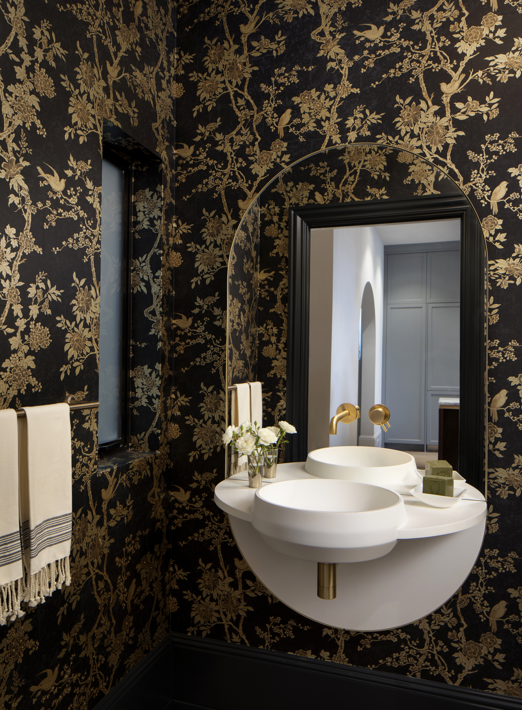
Often associated with luxe schemes — but not always the good kind — black and gold can be a tricky pairing to pull off. Get it right, though, and it sings, like in this powder room; a masterclass in how to decorate with black.
"When you say black and gold, it can conjure up some rather terrifying mental images," says Cathy Dean. To tone down the glamor, she recommends layering the colors with other softer, warmer shades for space that feels inviting. "Use gold with chalky off-blacks, inks and caramels to allow the gold to be part of the tonal palette, rather than the stand-out 'pop of color', which can appear brash," she says.
Price: £5.50 per sample pot.
The very subtle red undertones of this black creates the perfect accent colour, perfect for both interior and exterior spaces.
6. White
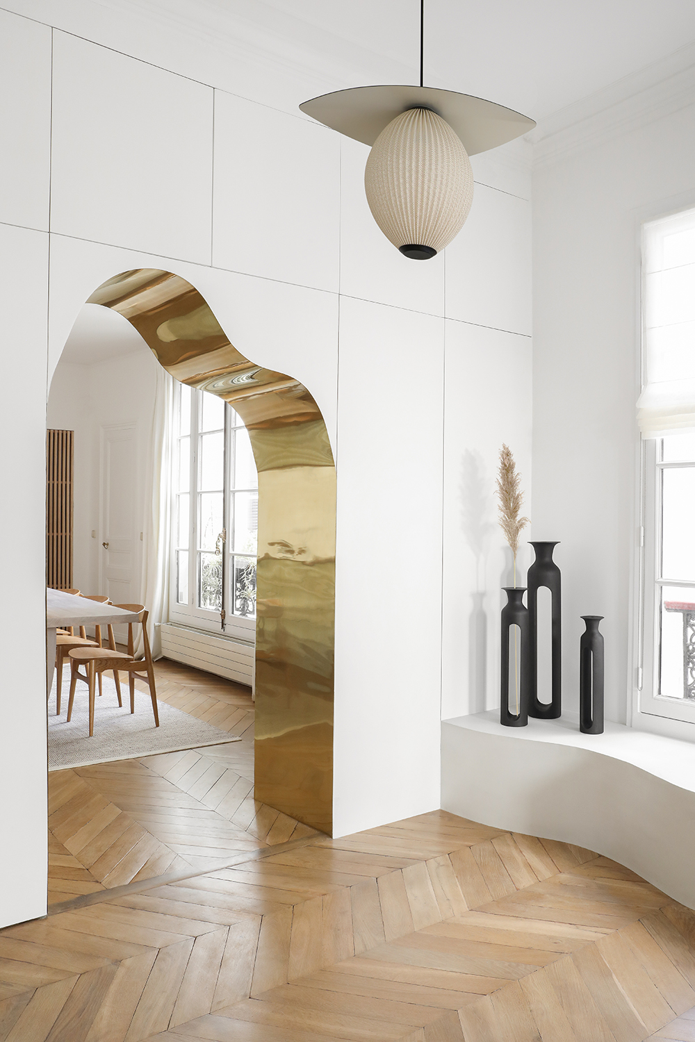
White and gold might evoke images of Regency-era glamor — but used in a modern scheme, it can be a sleek and stylish pairing (particularly when paired with lots of other neutral textures). Case in point: this stunning curved archway by Heju Studio, which is lined with gold.
"For a chic Parisian apartment-effect, keep all other elements super calm to really let the gold take center stage," says Patrick O'Donnell, a color expert and ambassador for Farrow & Ball, who also suggest painting your walls in a "clean but not too cool" white like the brand's 'Wimborne White'.
Price: £5.50 per sample pot.
This white shade's subtle hint of yellow adds the perfect hint of warmth, making it a staple for all interiors.
7. Deep Red
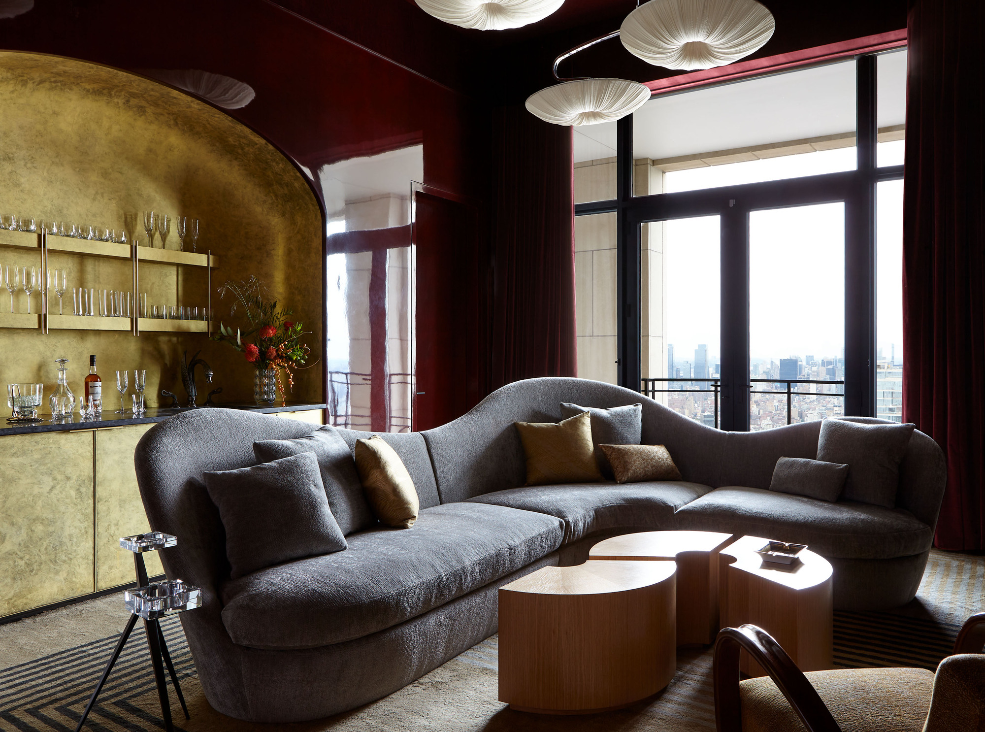
Many of the experts we spoke to advocated for classic jewel tones when selecting colors that go with gold. "Like all metallics, when gold is your base tone it acts as a neutral which means you can pair it with just about any color and it will work," says Megan Dufresne, the founder and principal designer of Californian-based MC Design. "In my personal design, I like to pair gold with deep jewel tones to create a rich and luxurious palette." Enter: red.
Perhaps the color of the year thanks to TikTok's 'unexpected red theory', the fiery shade works with gold too, especially when used in a deep burgundy shade. Stick to an antique gold finish to avoid the scheme feeling too brash, and don't be afraid to mix in other colors too. The red living room shown above has been color drenched in the shade, styled with a charcoal gray sofa and accented with a stunning gold home bar. A winning combination.
Price: £5.75 per sample pot.
This warm, glamorous red is an ideal shade to pair with other dark colours, or on its own as a statement colour.
8. Yellow
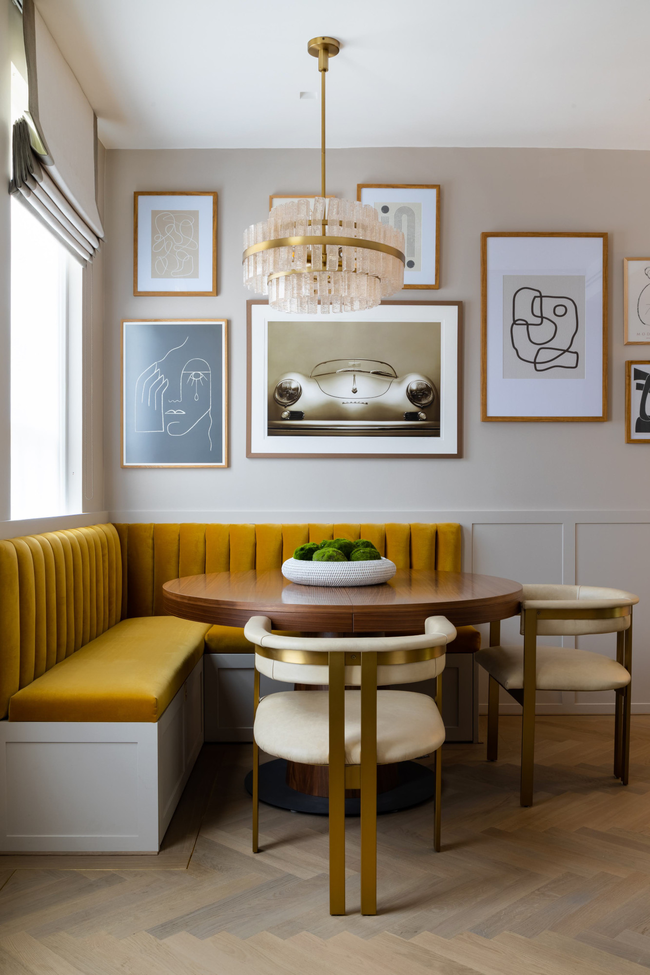
As its closest color match, gold is one of the colors that go with yellow, working well as a way to layer a scheme — creating a subtle glamor that never goes out of style. For this dining area by Honeybee Interiors, designer Sacha Berger opted for an opulent mustard-upholstered banquette seating.
"I wanted to create a warm and inviting feel for the dining area, so used a color palette of taupe walls and natural woods with mustard and gold accents," she explains. "The velvet is actually called 'Omega Brass'. It tonally layers with the metal accent in the lighting and detail in the back of the chairs, whilst also giving a strong pop of color that still balances in the overall scheme."
Price: £5.50 per sample pot.
This modern, bright yellow will brighten up any space, with its richness and depth, the golden tones of this yellow make it such a unique shade.
9. Terracotta
For a grounded, earthy scheme, gold is a color that complements terracotta, as well as its cousin, paprika. "The on-trend color paprika — a more bolder version of terracotta — would be a great match to the warm metallic," says Tom Rutt.
Similar tones like Benjamin Moore's 'Cinnamon' (shown above) also work well with gold. When using it in this palette, consider layering up with warm-toned woods such as teak, and accent the scheme with hints of blue-green — or another one of Tom's suggestions: jade — for a cool twist, and to avoid things feeling too monochromatic.
Price: £5.00 per sample pot.
Koi Carp is a vibrant, deep, rusty red, with tangerine undertones ideal for brightening up any space.
10. Green
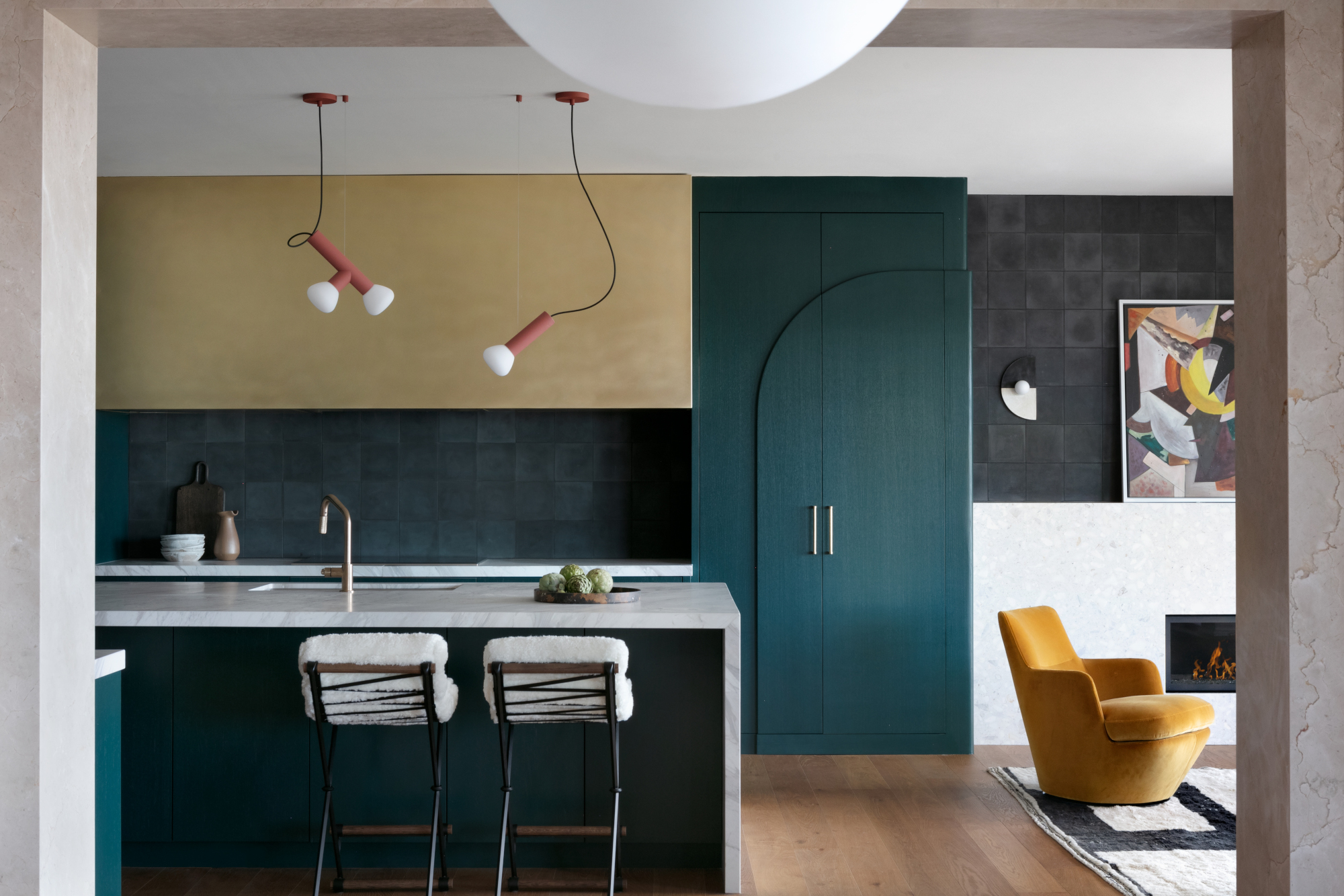
Green and gold took over from navy as a popular scheme, particularly for kitchens — and it's a great way to inject a little glamor into a space, too, as this green kitchen by interior design studio PlaidFox shows. "Deep green really pops alongside metallic gold or bronze touches that will enhance its warmth and give it shine," says Justyna Korczynska.
"Whether it’s a little dash of retro Hollywood chic on a brass cocktail trolley, a beautiful abstract chunk of metal for a coffee table or some judicious use of gold leaf or paint, gold screams glamor – so choose your pairings accordingly depending on the effect you want," adds Patrick O'Donnell. "For a full-on Beverly Hills look, think verdant greens such as 'Calke Green' or 'Emerald Green' to really make the gold accents register."
Cathy Dean also advocates for deep greens with warm tones for a fresh take on the look. "Golds and brass sit comfortably with dark greens, but head for a more forest or olive tone and steer clear of the blue greens with golds for a more contemporary feel," she says. Look, too, to pistachio, a lighter yellowy green that's making its way into modern schemes – and pairs particularly well with the warm tones of gold.
Price: £5.40 per sample pot.
This peaceful, tranquil green creates a calming feel whilst adding an earthy tone to both modern and traditional interiors.
11. Navy Blue
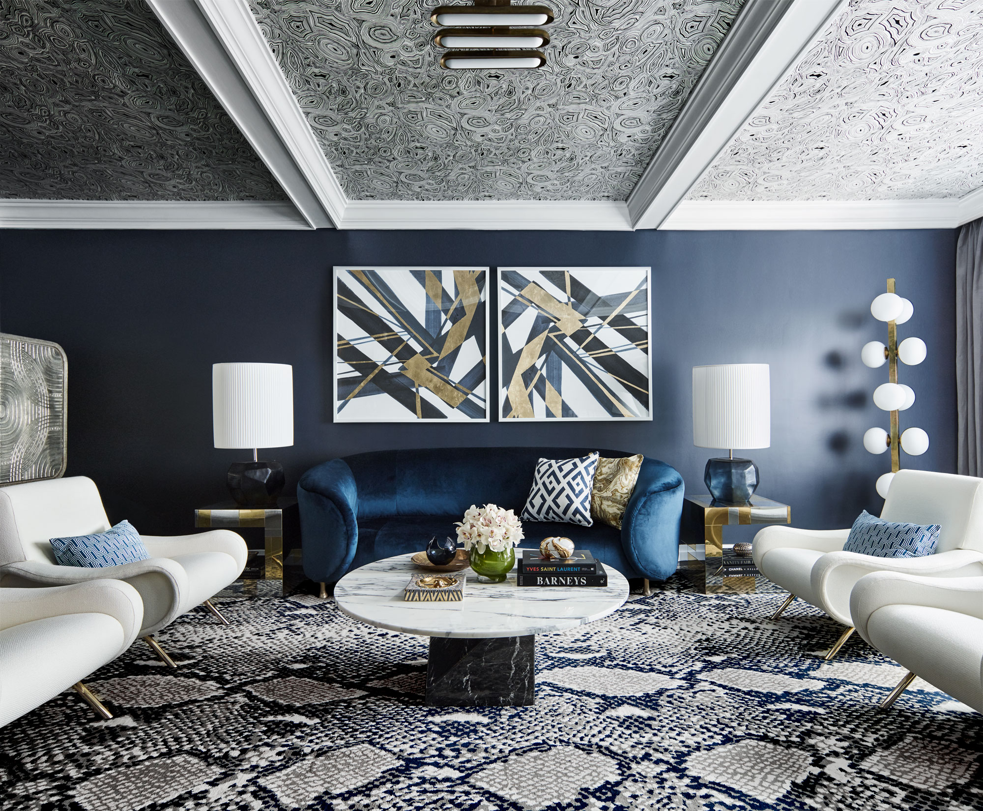
Gold and deep, dark navy blues are a popular choice thanks to blue's ability to make metallics shine, as seen in this blue living room by Australian designer Greg Natale.
"For a more dramatic effect, consider pairing gold accents with deeper, richer tones like charcoal or navy hues," says Benjamin Moore's Hannah Yeo. "The contrast between the warm gleam of gold and the dark, moody base colors creates a striking visual impact. Touches of gold accents add a hint of opulence to the room, creating a look that is both stylish and timeless."
Price: £7.50 per sample pot.
This deep, ocean blue works in all lighting conditions and is an easy, versatile wash of colour.
12. Gray
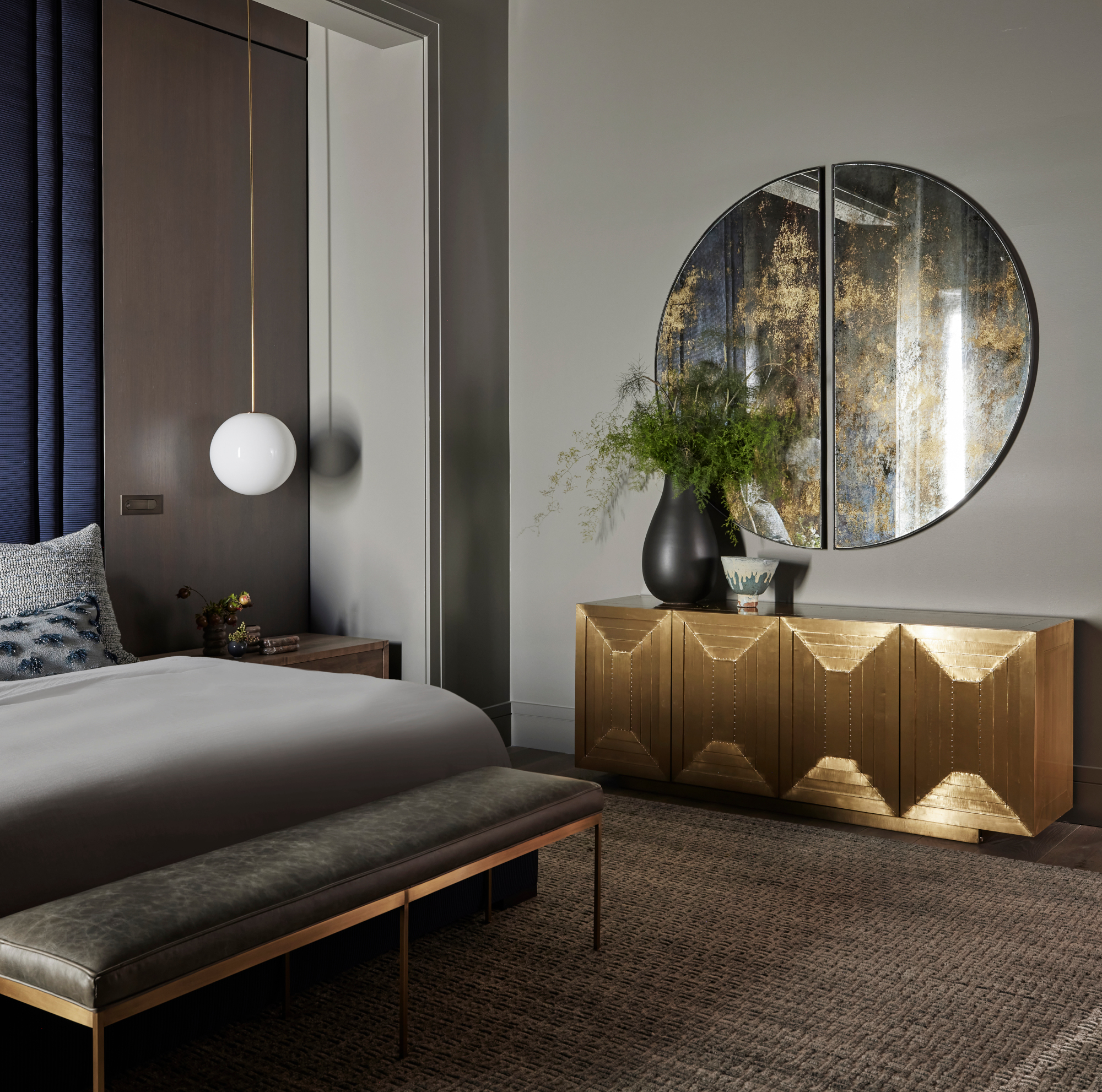
Introducing neutrals into your scheme is a great way to make gold feel like a more natural part of the space. In this room by Chicago and LA-based interior designers Studio Gild, the team steered away from more traditional beiges, instead opting for the unexpected and sophisticated pairing of gold and warm grays.
"We infused bold punches of smoldering brass to intensify the provocative vibe of this moody bedroom," says Melissa Benham, principal at Studio Gild. "The subtle reflection casts a metallic glow on a dark palette that could otherwise have felt somber."
Price: £5.50 per sample pot.
Dove Tale is a beautiful grey shade on the warmer end of the spectrum with gentle lilac undertones, perfect for bedrooms.
13. Beige
"Taupes, greiges and other tonal neutrals welcome gold into their roomscapes happily and the gold can elevate a scheme from relaxed to glamorous," says Cathy Dean. The key is to make sure your colors err on the warmer end of the spectrum. Gold is a color that goes with beige tones particularly well, but a silver-grey might not work quite the same, unless you're opting for a deliberate mixed-metal effect.
Price: £5.00 per sample pot.
This wool coloured neutral is a perfect shade for all spaces, creating a light, open feel whilst pairing seamlessly with other colours.
FAQs
Does Silver and Gold Go Together?
"Surprisingly gold and silver can work beautifully together," says Philippe Desart, MD, Arte. As mentioned above, mixing metals was once avoided, but is now embraced as a way to elevate a scheme without it looking to uniform.
Philippe explains: "The warmth of gold provides contrast to the cool calm of silver whilst their shared metallic finish brings a sense of coordination and cohesion."
Is Gold a Neutral Color?
Gold is considered, by many of the designers and color experts we spoke to, to be a neutral color. "Gold is one of my favorite neutrals to layer in any palette," says Studio Gild's Melissa Benham. "Even the smallest dose elevates a space with incomparable warmth and luminosity."
TR Studio's Tom Rutt agrees: "Gold in many respects can be considered a neutral. It pairs with many other colors, but I think it looks most sophisticated when teamed with very dark tones such as charcoal, chocolate brown or olive green, aubergine and navy."
What Colors Don't Go With Gold?
As a versatile color, there are very few colors that don't go with gold, as you've seen through this article. However, the key is getting the tones right — warmer colors will work better with the natural warmth of the metallic. Paying attention to trends, it's clear that classic pairings like dark blue and gold are falling out of favor, too. (Although, don't let this deter you.)
Some recommend avoiding mixed metals in a scheme, but we've seen an increasing number of designers creating amazing looks by doing just that. It's an upcoming trend we're really enjoying, so we wouldn't rule it out just yet.
One final thing to note is to watch out for your other color combinations — in particular, green and red. It's fine for Christmas, sure — but not something most of us want in our homes for the rest of the year.
How to Decorate With Gold in Your Home
Before we delve in, a few notes on using gold in a color scheme. "Golden hues bring a warm, inviting glow that can transform a room, infusing it with a sense of luxury and comfort," says Hannah Yeo from Benjamin Moore. "Even in small doses, gold can be a striking accent, drawing attention to intricate architectural details such as ornate trim and decorative pieces."
But you need to carefully consider the spaces you style it in. "As with many bright yellow tones, gold can become more intense in direct sunlight," adds Hannah. "Assess the natural light in your space and choose a shade that complements it."
Interior designer Cathy Dean, founder of Studio Dean, also recommends paying close attention to your finish. "Gold can quickly become brash unless used with care," she says. "Opt for burnished and aged finishes to give a sense of authenticity over its shiny counterparts. Place it with matte chalky finishes and low sheen paints and paper to keep things sophisticated."
Read on to discover which colors the experts recommend pairing with gold — and how to use them for a truly contemporary look.