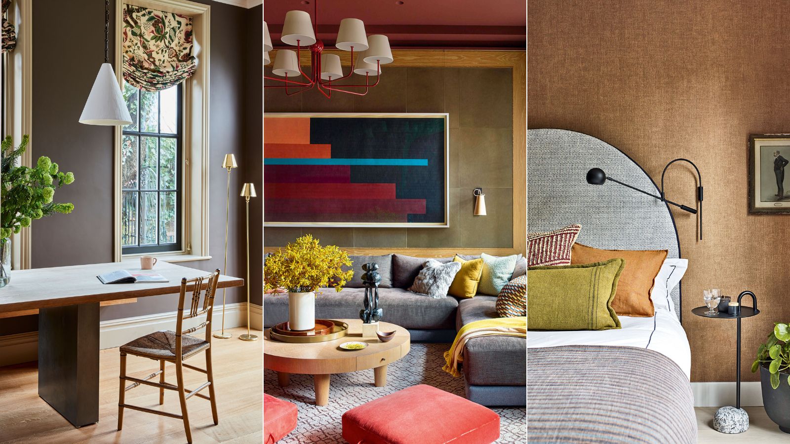
White has always been the failsafe color to use when painting and decorating our homes, but brown is replacing white as the new neutral.
While some decorators instinctively lean towards white, many agree that new neutrals; ones largely inspired by colors emanating from the natural world, will help us to feel grounded in our homes, and should be considered instead of white.
Considered a dark neutral, earthy brown is grounding but also has an elegance that is truly sophisticated. Versatile, it can be striking or allow other hues to stand proudly. Here, experts, color psychologists, and decorators extol the virtues of this once-detested room color idea.
What is the new white in interior design
To say that brown is replacing white in its entirety is certainly a stretch. Decorating with white will always play a pivotal role in interior design and fashion, but it is fair to say that we have grown tired of this no-decision color.
'White is perfection,' says Karen Haller, color psychologist, and best-selling author of The Little Book of Color. 'It is pure and unblemished, and gives a feeling of peace and quiet, however, white can also be perceived as cold, uncaring and sterile.'
It is for this very reason that we are seeing more and more designers ditch pure white surfaces in favor of warmer neutrals. Decorating with brown, in all its variations, is a great foil for pretty much every color, and the darker the tone the sharper the contrast.
‘Tell someone you are painting a room brown and watch them recoil in horror,' says Sarah Brown, director, of Sarah Brown Interiors. 'However, this much-maligned color is a great backdrop for accessories in brighter colors, especially neon pink, canary yellow, or creamy white.’
Is white out of style for 2023?
Like most things, color and home decor trends come and go, so while the popular Brilliant White of the early noughties was hugely popular, we are now seeing a sudden and sharp shift away from cool tones in favor of warmer color schemes. Colors like taupe, beige, amber, brown, rust, and sepia tones are taking over our interiors. It is also a good color to replace gray in the home, too.
'Brilliant White is a man-made color that was developed after the end of the Second World War, explains Karen Haller. 'It is the only color that doesn't appear in the natural world, which is why our bodies find it difficult to calibrate.'
While white will never be completely out of style, we are seeing a resurgence of more earthy tones. The return of the seventies has been influencing interior trends for 2023; with a palette of warm taupes, tan browns and caramel tones seeing a sharp renewal.
'Rustic hues work charmingly in both period and modern properties that have an archival-inspired interior as they have natural dyes which work perfectly alongside more warming and cocooning tones,' says Peter Gomez, lead designer at Zoffany.
What can I paint walls with instead of white?
For a fresher, cozier aesthetic in your home, we suggest swapping white for brown. There are many warm golden browns, beiges and tan, and richer, darker browns like chocolate, chestnut and coffee, and cool browns like taupe and ash brown, so the choices are endless.
The power of decorating with neutrals to add warmth and elegance to a room should not be underestimated. A soft scheme of harmonious browns creates a reflective backdrop to the ever-changing light of the seasons.
The psychology behind brown is positive, too. 'We feel reassured and safe with brown,' explains Karen Haller. 'It is solid, dependable and strong.'
How do you decorate with brown
When it comes to the best color trends, brown is probably not on your decorating agenda, but it's time to rethink this once-loathed shade, as the color is suitable for just about any design style.
1. How to use brown in a living room
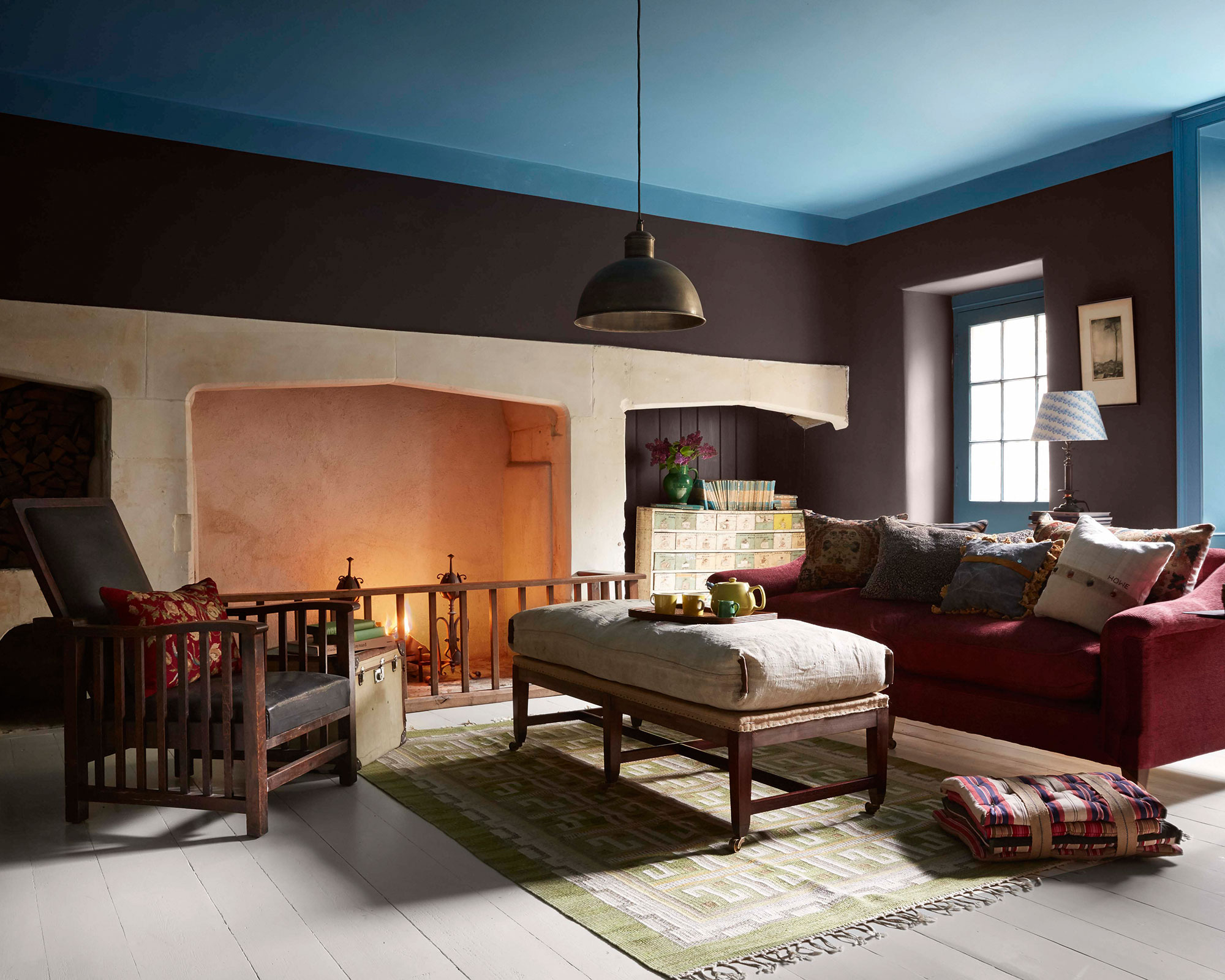
Deep chocolate brown living room walls sound as decadently delicious as they look. A confident hue for all-over color, yet equally perfect for pairing with brights and pastels for a modern take on cozy room decor.
We’re seeing an increase in earthier, grounded tones in interior design. Surprisingly, rustic, rich hues work beautifully in modern properties as a juxtaposition against strong lines and minimalist furniture.
‘A brilliant foil for bold, vivid color, the deeper the tone the stronger the contrast and that’s when I like it best,' says Nicola Harding, interior designer, Nicola Harding & Co. 'Farrow & Ball’s Tanner’s Brown is a great choice. Teaming brown with blue has a particularly electric effect in this cozy corner.’
2. How to use brown in a kitchen
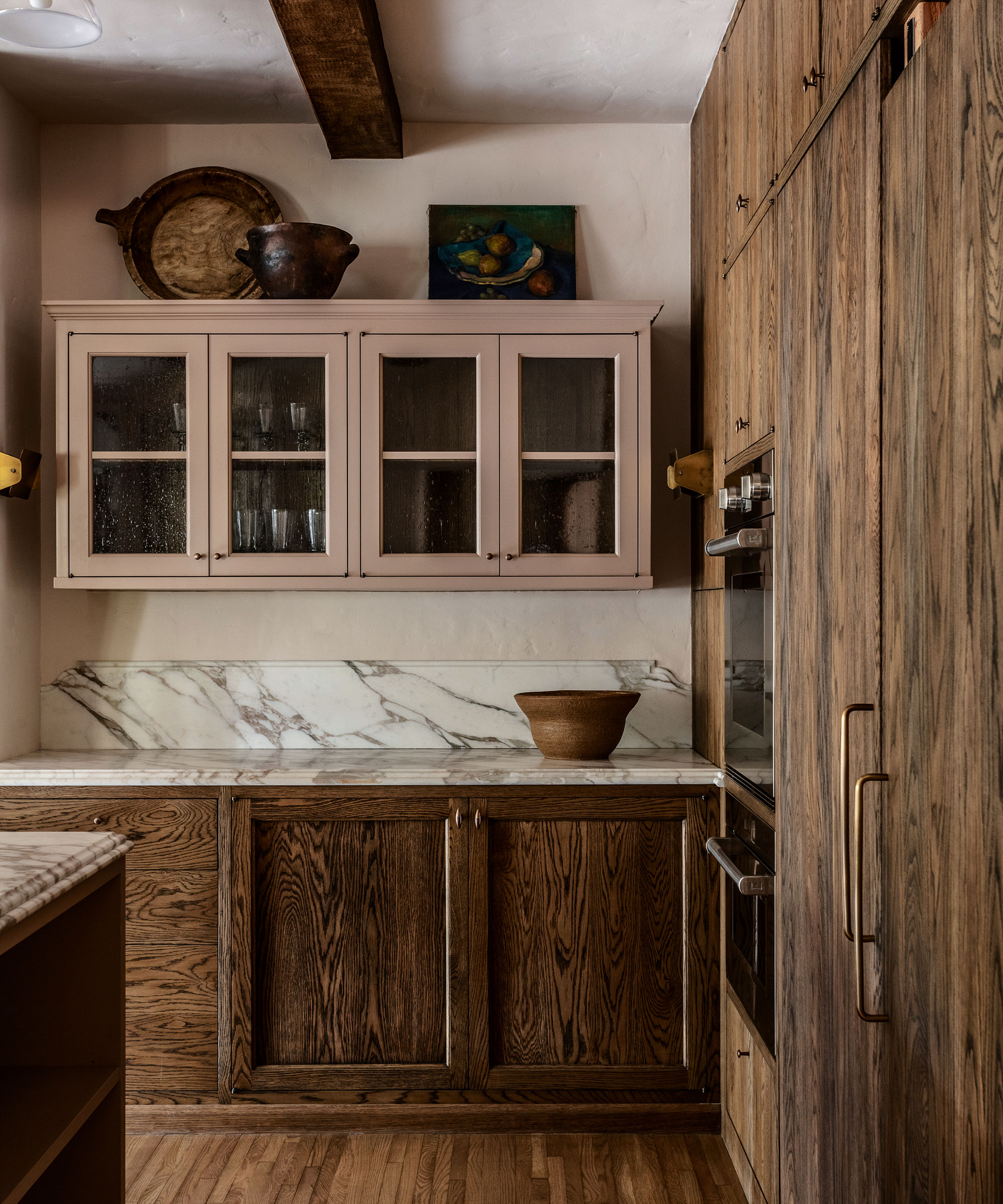
Brown doesn't just have to mean paint, in fact, wood is a wonderful choice for the kitchen. Dark wood kitchen cabinets are a popular choice for those that love a timeless or classic look – not to mention the fact wood gets better with age.
This highly layered kitchen was created by US-based designer Studio Jake Arnold. ‘We wanted to preserve the charm of this Los Angeles home, and this brown kitchen emits an amazing combination of old world and modern elements,’ says Jake.
‘The tones of the dark wood cabinetry and the skinny floorboards are the perfect contrast to the exposed beams, while the taupe-painted kitchen cabinets combined with natural wood create a new, relaxed mood in the heart of the home.
3. How to use brown in a bedroom
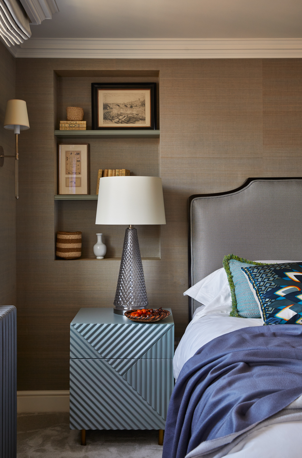
Brown doesn't automatically have to mean dark or dingy. Instead, opt for a calm and reassuring taupe for a contemporary bedroom. Reminiscent of velvety cocoa, this mid-brown taupe is a striking color for any room. Depending on the furniture and accent colors introduced alongside, it has the flexibility to range from looking neat and tailored to soft and inviting.
Interior designer Henriette Von Stockhausen, creative director, of VSP Interiors agrees: ‘For me, neutrals such as taupe are grounding wall colors. It’s important to remember that sometimes a classic interior is just the ticket: calm colors, gentle schemes, traditional furniture and antiques – no pattern clashes, no huge color pops, just comfort and a quiet space to relax in.
4. How to use brown in a dining room
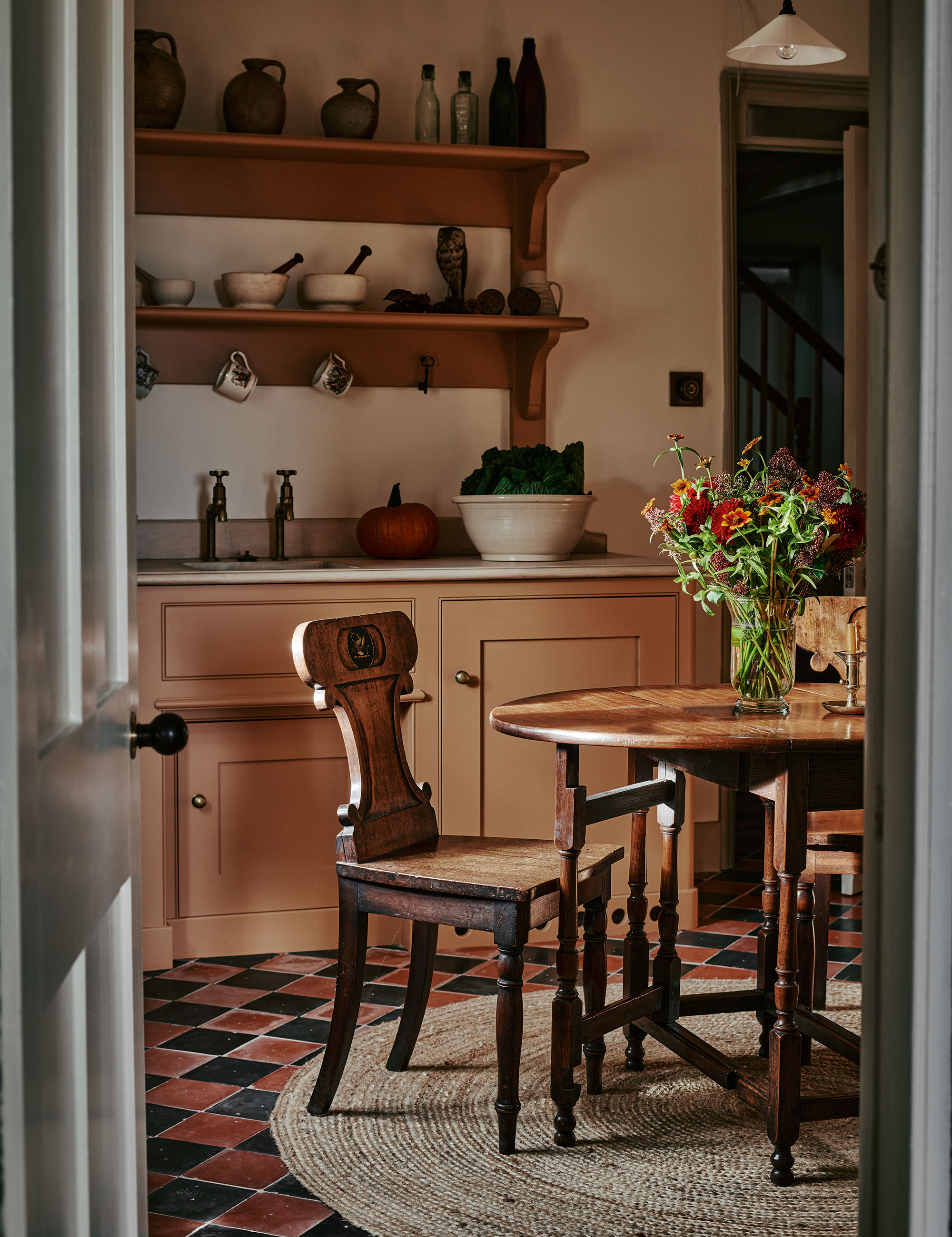
Decorating with new neutrals, inspired by colors from the natural world, adds a gentle and soothing touch to interiors that can be layered with textures and tones to ebb and flow with the seasons.
Colors inspired by nature have an intrinsic calming influence, provoking a similar response to that from gazing out upon a beautiful country or seascape. Here, kitchen designers at luxury brand Artichoke have curated a calm and curated space using a predominantly brown color palette.
5. How to use brown in a home office
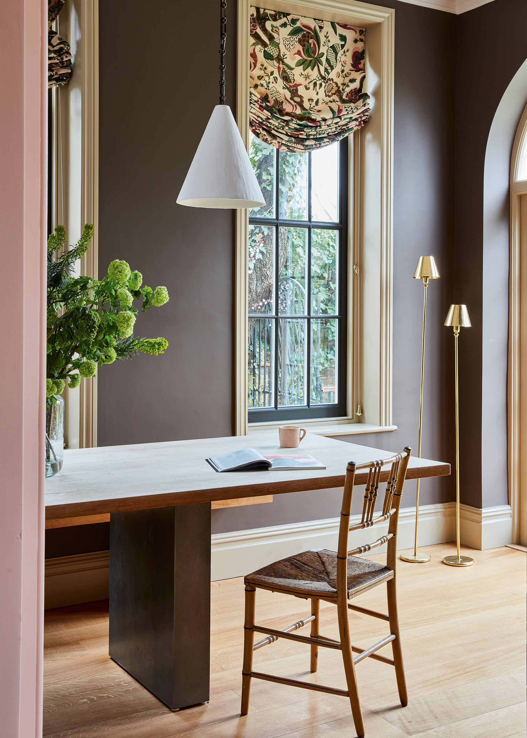
Brown is a supportive and cocooning color, which is why it works so well in a home office. Brown color schemes are noted to be dependable, trustworthy and reliable. It is serious like black, but in a softer, gentler way.
Here you can feel comfortable and relaxed, and you won't be rushing to escape anytime soon. Though you can just move from one brown room to the next.
Finally, before painting or decorating with brown, it pays to consider the light levels and direction of each room first. Get this wrong and your brown room could turn into a recipe for disaster.
'It's important to consider the brightness of the room and test the shades to see how they perform in different lights. While many gravitate towards using lighter colors in north-facing rooms, dark colors can be wonderfully effective,' says Mike Fisher, creative director and founder, of Studio Indigo.
‘We believe north-facing rooms should be painted a dark or strong color, like brown, to make it more cocooning and those on the south side in lighter tans and beiges. The thinking is where you have darkness, you should bring color, warmth, and joy.’


