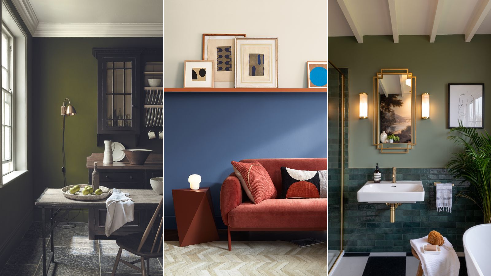
Sitting between green and blue on the color spectrum, teal is a popular and versatile shade for decorating. Evocative of ocean vistas and peacock plumage, the vibrant jewel tone is perfect for creating dramatic, luxurious interiors when used wall to wall, or looks great teamed as an accent in neutral or more muted schemes.
While teal will always be popular, we’re noticing a shift towards greens and blues with an earthy undertone as we seek warmer and more welcoming spaces with a grounding feel. To find out what colors are replacing teal we consulted color experts for their insights into the trending blue and green tones.
What color is replacing teal?
Teal is a popular and versatile color that will never truly go out of style. A vibrant and energizing shade, decorating with teal is a wonderful choice for statement dining rooms and head-turning powder rooms, but over the past couple of years, experts have noticed a move towards more soothing, tranquil shades. Soft earthy greens like sage, dusky olive, and lichen tones are thought to be on the rise, following the general color trends for warm, grounding tones. Alternatively, deep midnight blues alongside olive and forest greens make great alternatives for teal if you’re confident with color and are looking for interiors with impact.
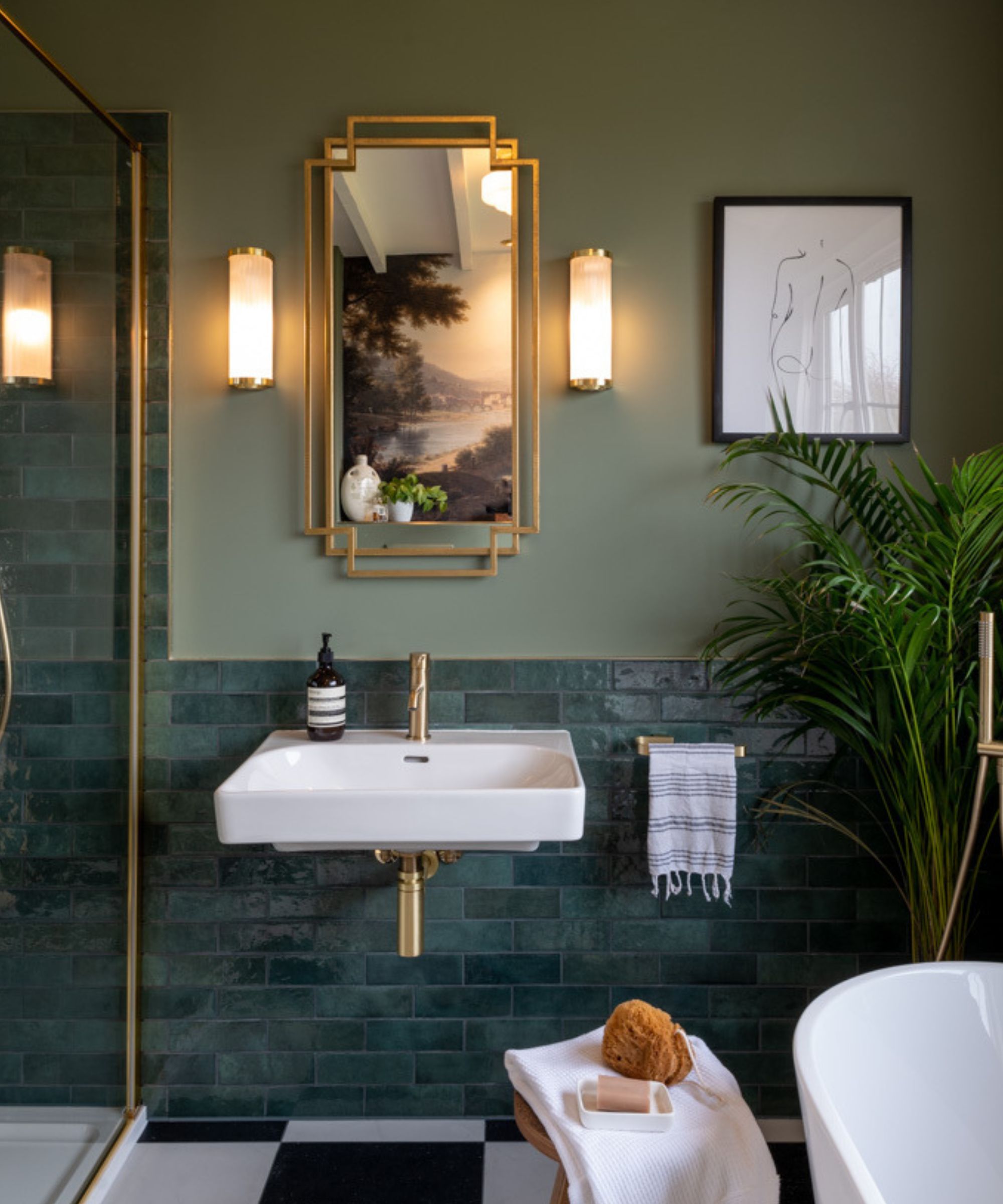
‘Earthy green hues have become increasingly popular as a calming alternative to teal. They pair well with natural materials and create an easy-going and serene atmosphere,’ says Tash Bradley, director of interior design and color psychology at Lick. ‘Green 02 is a soft sage green, with grey undertones which promotes restfulness and contemplation. Just as Teal would have, Green 02 pairs beautifully with the romantic Pink 07 which has complementary cocooning qualities.’
‘Blue 06 is another great alternative to teal, especially for those who appreciate the depth of teal but want a more classic look,' adds Tash Bradley. 'Navy blue offers a timeless feel that works well in both period and contemporary homes.’
1. Go for warmer blues
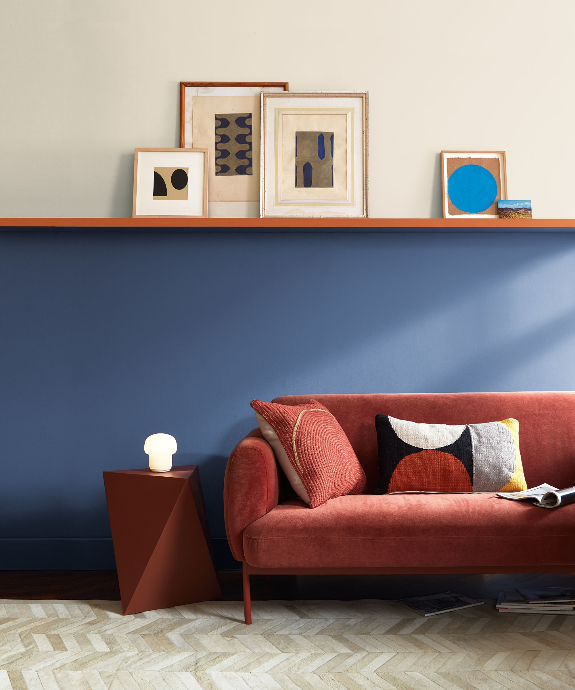
Decorating with blue has always been a timeless choice and it sees no sign of abating as we move towards 2025. For its color of the year 2024, Benjamin Moore championed its Blue Nova shade, a blend of blue and violet, which makes a warmer alternative to green-blue teal tones.
‘Associated with attributes such as trust and responsibility, blue is one of the most universally loved shades and is quickly taking the top spot from teal. An all-time interior classic, blue instantly creates a soothing and harmonious atmosphere due to its connection to the natural world,’ says Helen Shaw, director of marketing (International), Benjamin Moore.
‘Opting for a warmer mid-tone such as Blue Nova 825 will instantly evoke a sense of comfort and reassurance, working well in all rooms in the house. In south-facing spaces, blues will balance the intensity of sunlight, while in north-facing rooms they will provide a warm and cozy feeling – particularly when paired with natural materials or rich terracotta accessories.’
2. Keep spaces serene with sage green
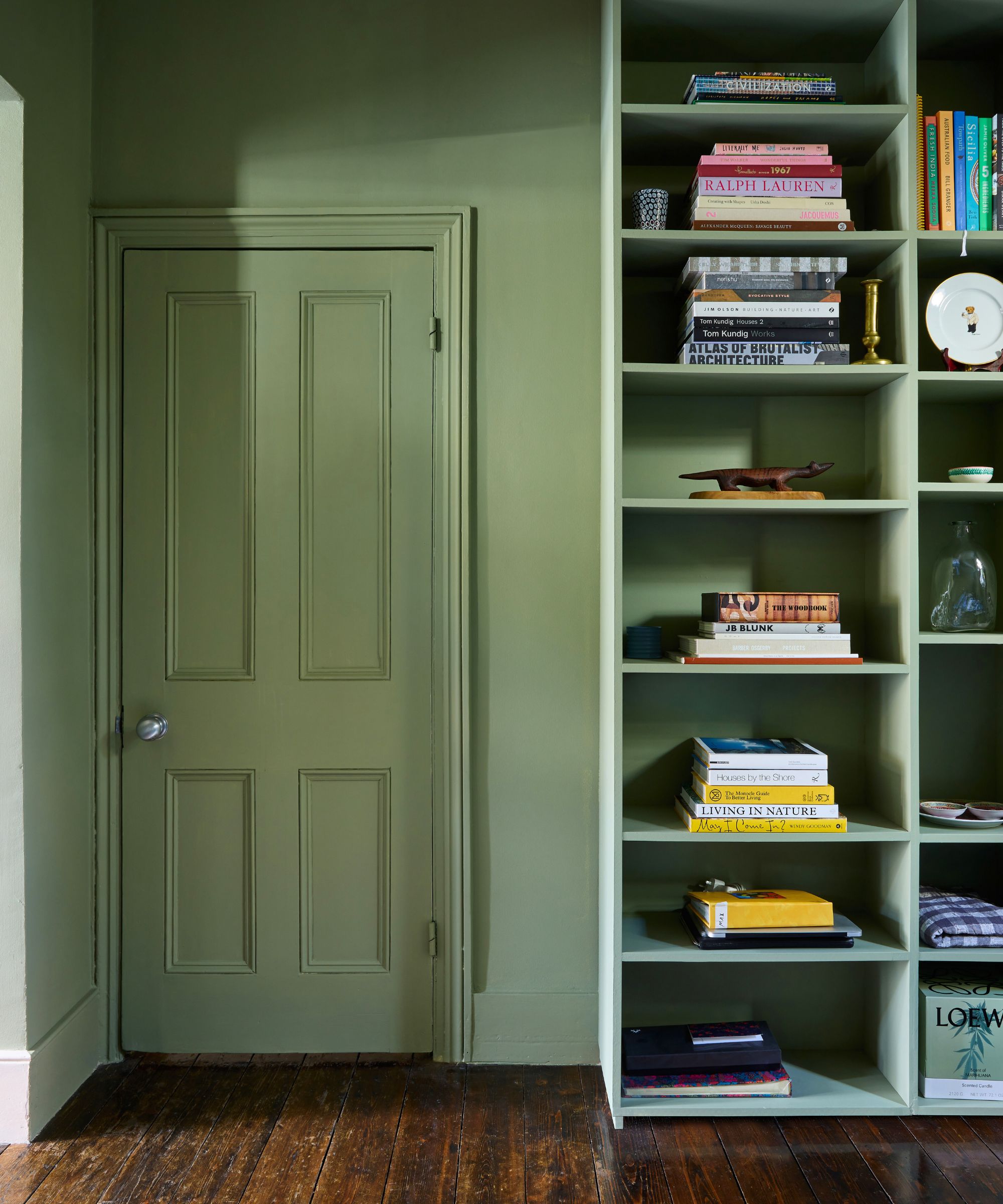
Sage green is having a moment right now, but it has always been perennially popular as a way to introduce the soothing tones of nature. Synonymous with the tranquility and nourishing qualities of the natural world, it's no wonder decorating with green is on the rise as we seek spaces to relax and escape our busy everyday lives.
'Sage Green is such a versatile mid-tone green that can easily create a relaxing bedroom scheme or a timeless living room,’ explains Patrick O'Donnell, Brand Ambassador at Farrow & Ball. ‘ In some lights, it can read grey notes which make it feel effortlessly modern too. As with all greens, Sage green will create a calm and relaxing environment which makes this color also the ideal choice for the home office where the mind can focus on tasks at hand.'
3. Decorate with bold botanical greens
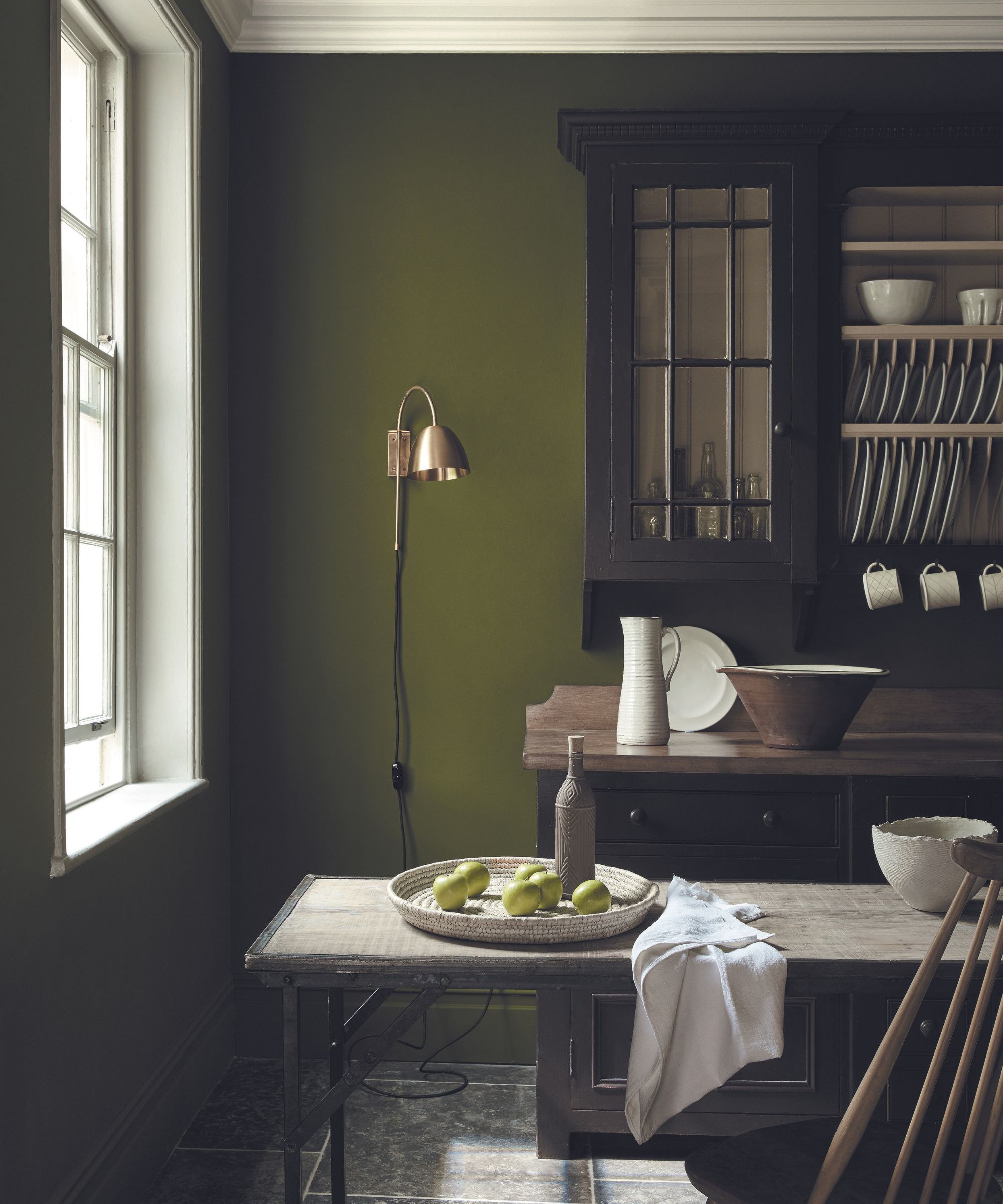
Botanical greens inspired by nature continue to grow in popularity as we seek to strengthen our connection with the natural world, especially deeper tones, explains Ruth Mottershead, creative director at Little Greene.
'It has been fascinating to see how customers have embraced color and pattern over the past few years, with many recognizing the importance of both time spent in the natural world and how transforming the home environment can lift our mood and have a positive effect on how we feel,’ says Little Greene’s creative director Ruth Mottershead.
‘The sense of wellbeing we gain from time outside in the natural world has resulted in a desire to re-create this sense of connection and positivity in our homes, driving a renewed love for greens of all hues.’
Although the muted Sage Green has been a staple of the Little Greene collection for many years, stronger tones have come to the fore, including the lively Jewel Beetle (pictured above) and bold Puck.'
Nourishing and fresh, botanical greens are great for breathing life and energy into everyday spaces like kitchens. Check out our feature on green kitchens for more inspiration.
4. Embrace the new 'grubby' greens
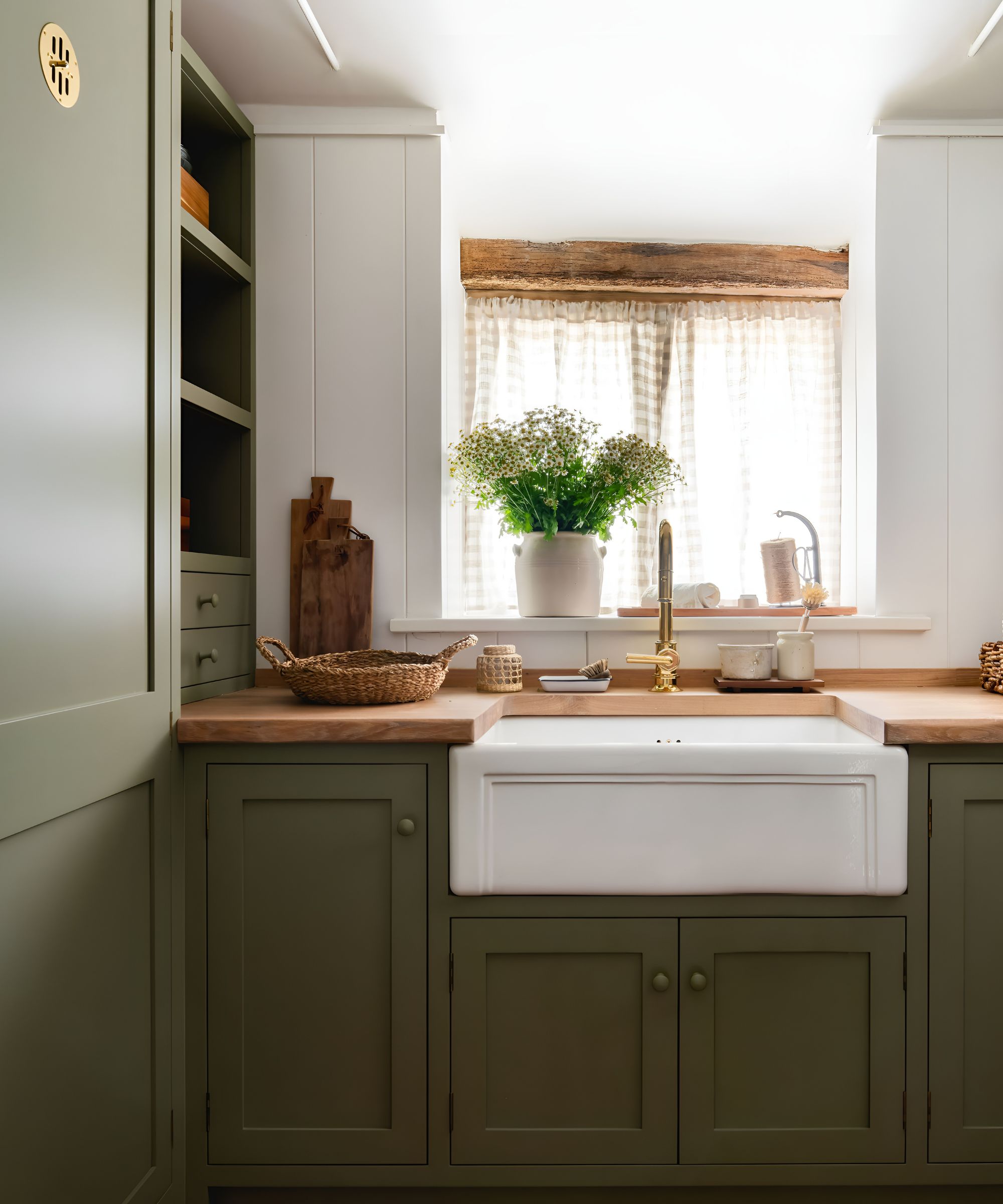
Greens with an earthy, brown undertone are on the rise and they make a lovely alternative to teal and more bluey green tones. Rob Abrahams, CEO and co-founder of paint brand COAT explains how the company has noticed a shift towards ‘grubby greens’ in recent years.
‘COAT has only been around just over three years, but even we’ve seen the shift in popularity from fresh greens to grubbier ones. By "grubby", I mean those green shades with yellow or brown undertones - versus blue undertones, which tend to give a fresher green color,’ says Rob Abrahams.
‘We saw the same shift in whites and neutrals first, with people moving from cooler to warmer tones with an earthy feel. Greens are just following that same shift. A muted green color, whether dark or light, feels quite like a neutral in that it sits comfortably in the background without being too shouty.’
COAT has recently teamed up with interior design studio House Nine to release a brand new Green Collection, the second installment of their collaboration, which includes three verdant shades inspired by nature including the versatile Jojo's green pictured above.
5. Match the drama of teal with deep blues
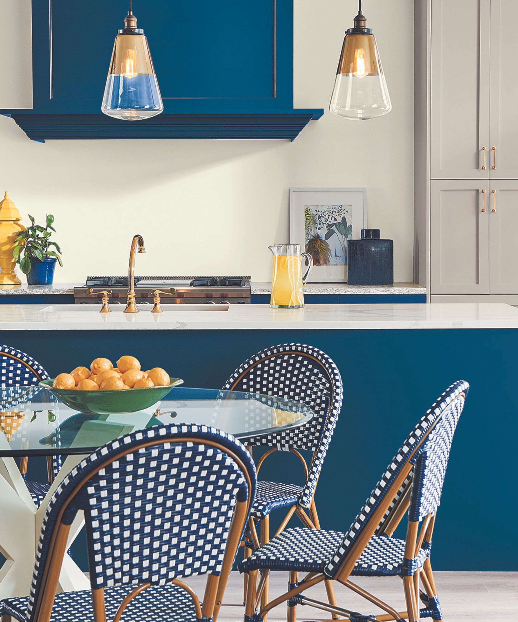
If you love the intensity of teal but want to move away from the blue-green tinge, consider opting for moody midnight and inky blues. According to Emily Kantz, color marketing manager at Sherwin-Williams, these shades are increasingly popular with homeowners. Alternatively, for something warmer try deep berry shades.
‘As consumers continue to seek comfort and stability, as well as that connection to nature, deep midnight blues such as Salty Dog and dark olive tones such as Garden Gate are replacing teal,’ explains Emily Kantz. ‘Deeper tones continue to gain momentum, with their connection to quiet luxury and sense of timelessness, these dark restorative tones exude a confident sophistication and can also provide that dramatic backdrop to any space.’
‘Another dark tone worth mentioning is Carnelian, a deep plum berry, that when applied in a color-drenched application, can create that cocooning space of restful comfort that many seek to achieve within their home.’
While teal will always be loved for its alluring vibrancy, as we've explored in this article, more earthy, muted greens and blues are becoming a popular alternative for those looking for a calming, cocooning atmosphere. Just as general color trends are shifting towards shades with brown and earthy umber undertones, so to are the blue and greens we're decorating with becoming warmer and 'grubbier'.
For those who still love decorating with jewel tones, along with bold, intense hues, then deep midnight and indigo tones, alongside dark olive and forest greens, are fabulous alternatives to teal if you're looking to create an opulent, head-turning look.


