The Los Angeles-based paint brand Backdrop is renowned for its design-led colors, allowing homeowners to fill their homes with personality, whether that's through bold and bright shades or understated neutrals.
A quick glance at the Backdrop website and you'll soon find shades that speak to you, but what exactly do these paint colors look like in situ, and what are the best amongst them? We asked designers and decorating experts for their top picks of the best Backdrop paint colors, which we've rounded up below.
If you're after some steer with your own paint ideas, read on. From warm blues to bold greens, these Backdrop paints are firm favorites among designers for good reason.
Best Backdrop paint colors
Whether you're looking for new kitchen color ideas or bedroom color ideas, these six Backdrop paints are a great place to start, boosting your home with a healthy dose of color, just in time for fall.
Modern Love
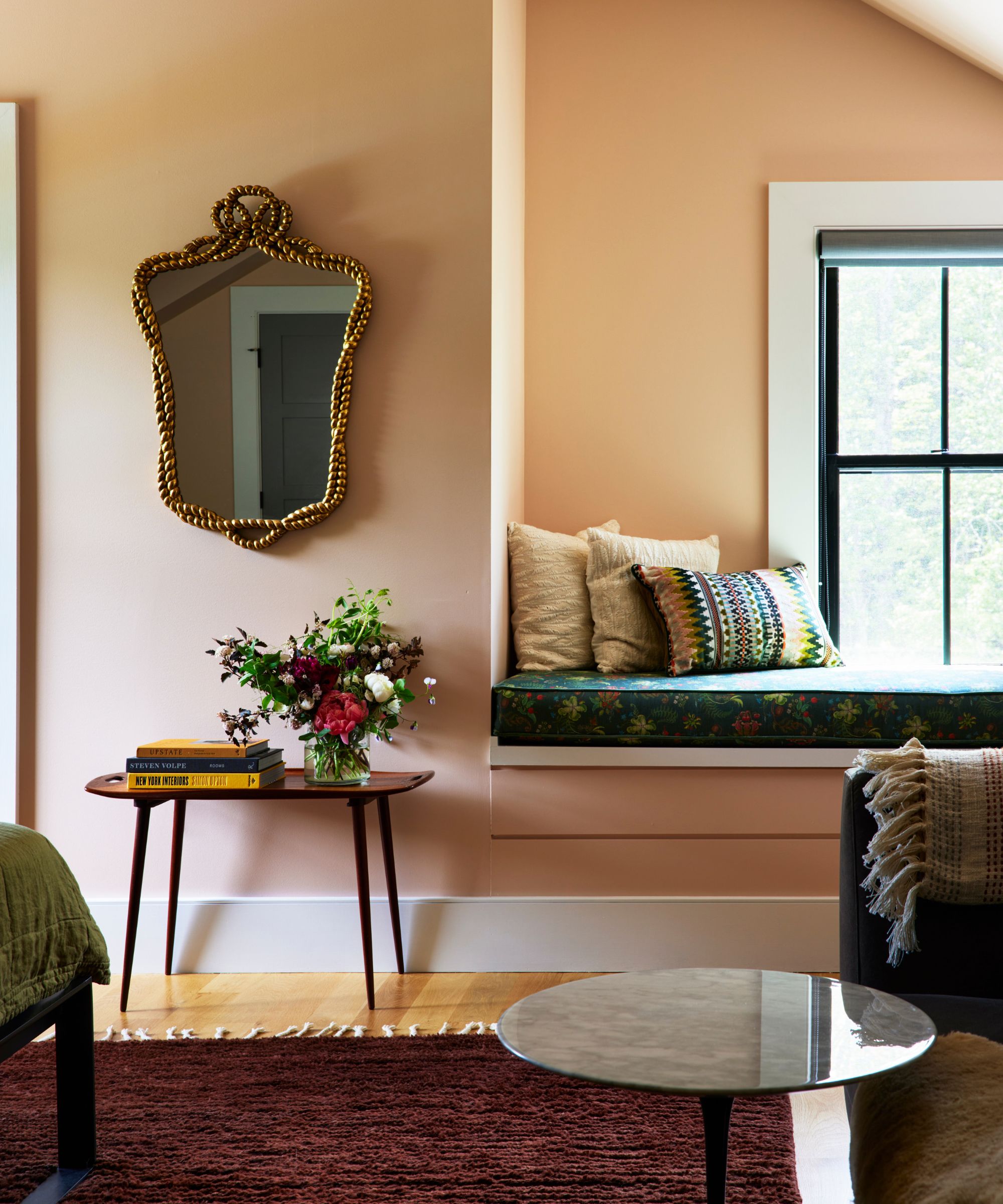
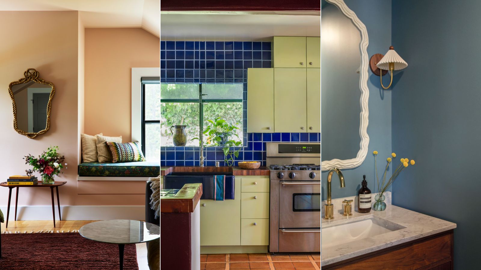
'It's hard to pick a favorite among Backdrop's paint colors, but without a doubt, Modern Love is high on the list,' says Nicole Lanteri, owner and principal designer at Nicole Lanteri Design, who used this pink paint on the walls and ceiling of this calming bedroom.
'It's a flattering pink for both people and furnishings – it works well with other colors and textures, including natural materials, and adds dimension to any room. It adds a soothing warmth to any space, and does not overwhelm when applied to the entire room – including the ceiling!'
Stromboli Chess Club
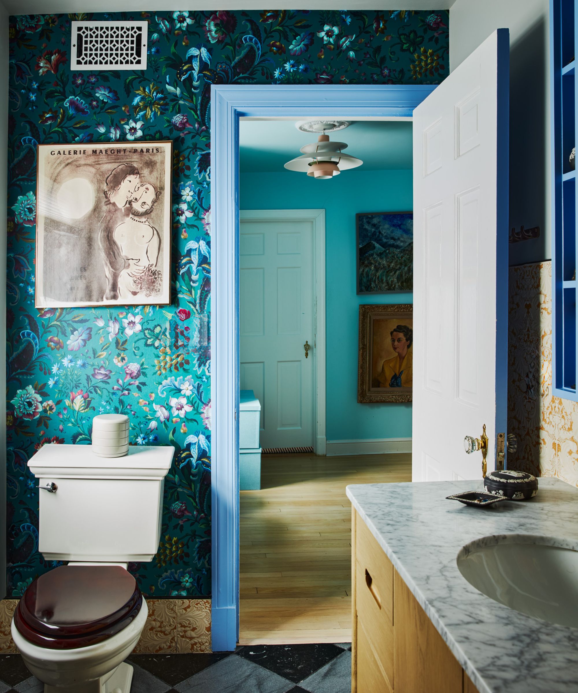
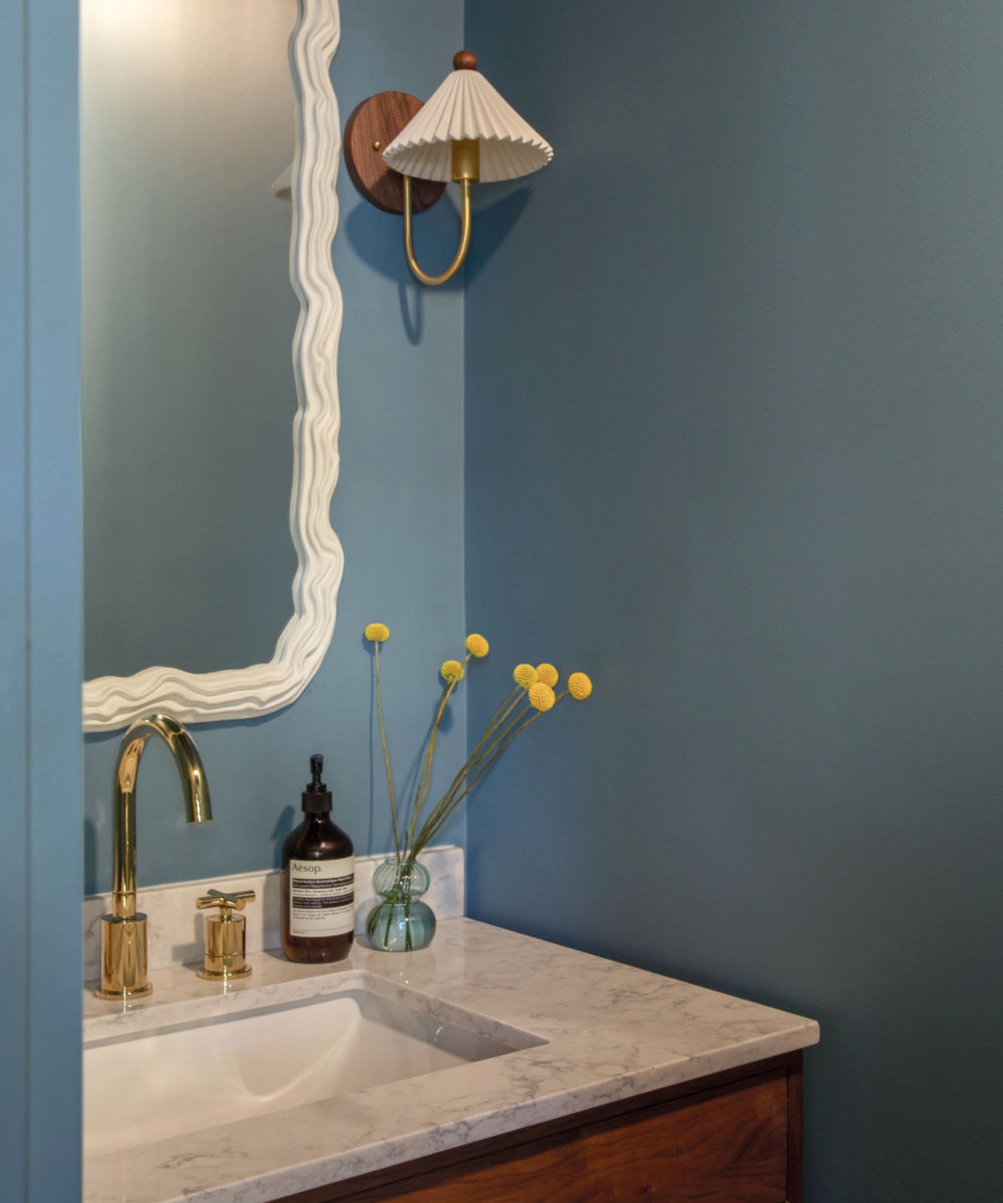
Described by Backdrop as a 'vibrant cornflower blue', Stromboli Chess Club is another top pick for Nicole Lanteri, which she used on the doorframe in this colorful bathroom.
'I'm also a huge fan of Backdrop's Stromboli Chess Club – a vibrant and energizing blue paint. It is stylish and playful, and so effective even when applied in small doses. In my own bathroom at home, I used it on the shelves that frame my vanity mirror, as well as the door's trim and its sides. These little bits of it sprinkle delight and joy – it makes me happy to see it in the periphery as I'm getting ready in the mornings.'
Natural Habitat
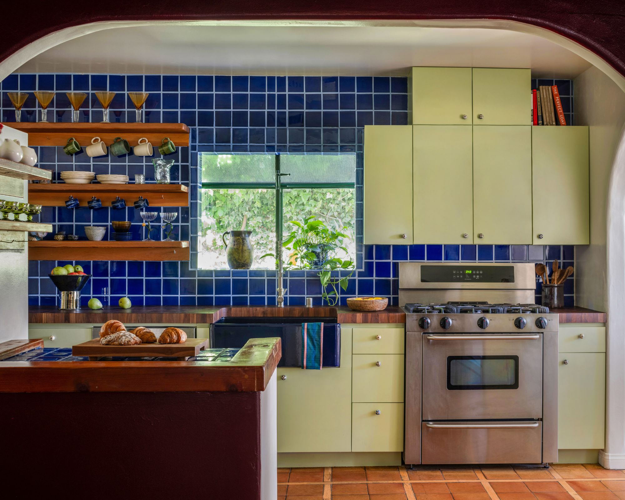
Looking for a green paint recommendation? For designer Kristina Khersonsky, founder of Los Angeles-based STUDIO KEETA, Backdrop's Natural Habitat ranks highly, a light yellow-green.
'We used this color on kitchen cabinetry in our WeHo Bungalow project,' explains Kristina. 'Even though the house was full of color – including the charming cobalt blue kitchen tiles that were installed by the previous homeowner – the avocado green added to the palette of colors without overwhelming.'
Novelty Wave
'Novelty Wave is the perfect warm comforting blue,' says interior designer Nadia Watts. 'It’s one of my favorite “in-between” colors, not too blue, not too green, not too gray… it’s just right.'
'It works as a warm neutral, pairing well with a huge range of colors and design styles. Novelty Wave brings a cool calmness that is the perfect backdrop for patterns and pops of color. It also pairs beautifully with wood tones, making it a great choice for rooms with hardwood floors and wood finishes.'
Porsche Irish Green
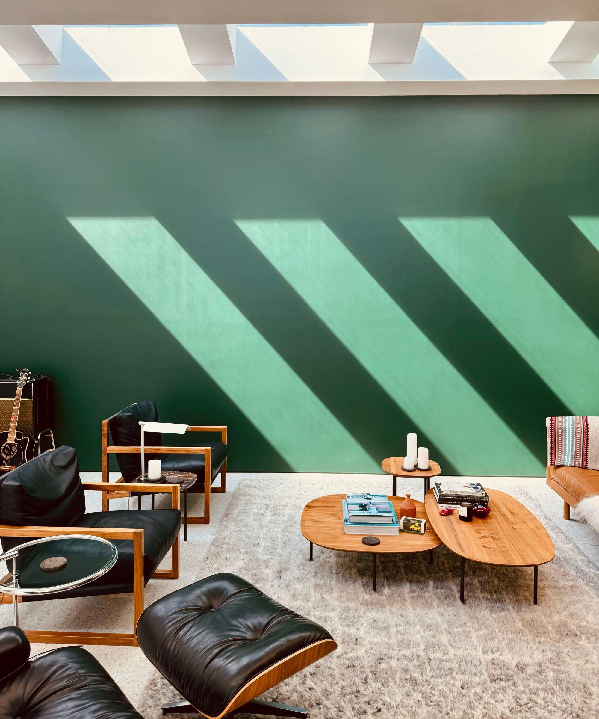
For Amanda Leigh and Taylor Hahn of House of Rolison, an LA-based housing development firm, their favorite paint color from Backdrop is Porsche Irish Green, a dark shade of green created in partnership with Porsche to mimic the color of the renowned sportscar.
The duo describes it as a 'super beautiful rich green color', and we agree. We can imagine this shade working well in small rooms such as powder rooms or home offices with color-drenching ideas to create a playful, unexpected color moment that feels timeless and sophisticated.
Ghost Ranch
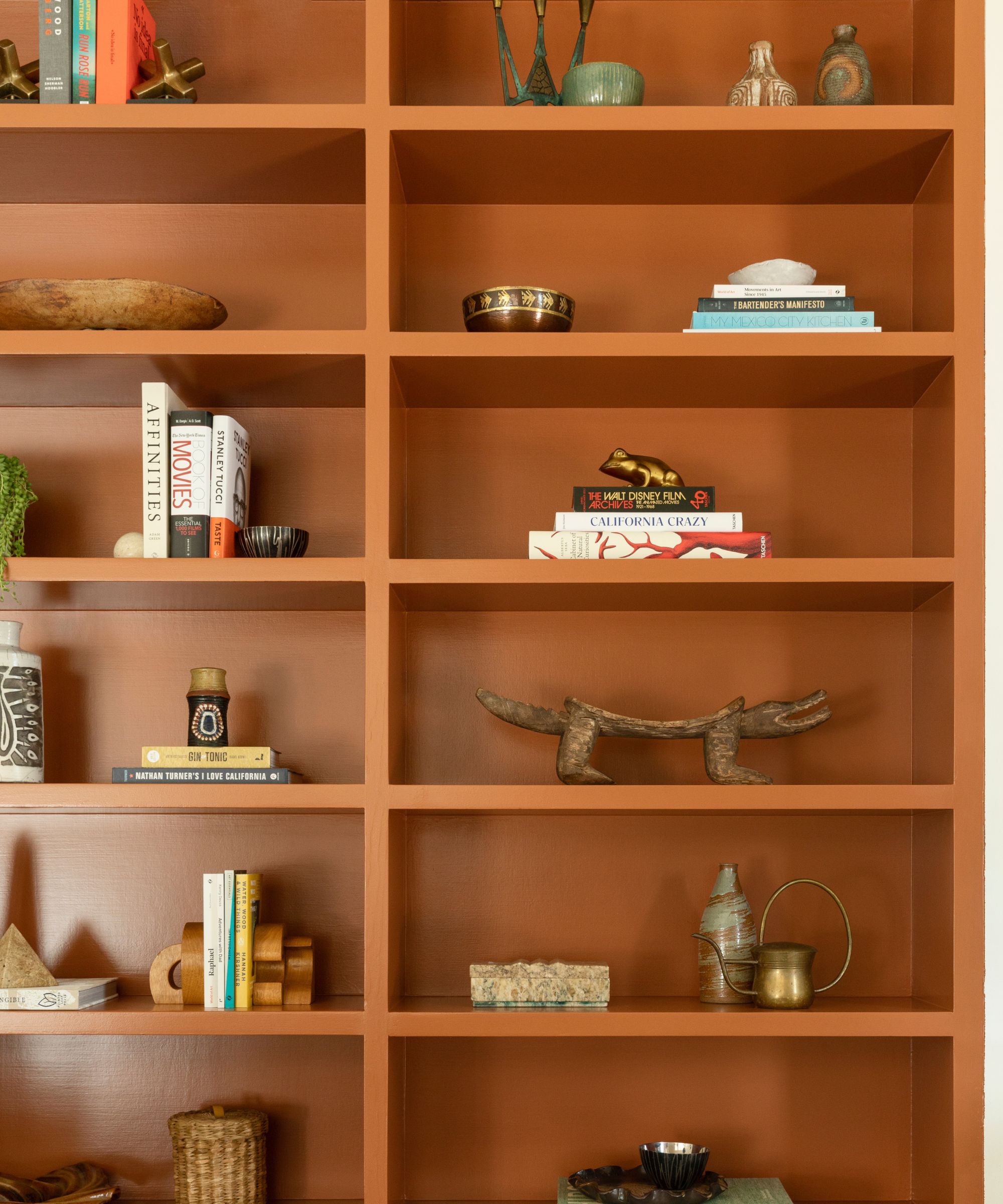
Lastly, Backdrop's Ghost Ranch is a rich terracotta paint color that's a favorite for Michelle Toney, president and co-founder of Morrow Soft Goods.
'I love this color for a dose of warmth,' says Michelle. 'It feels warm and in many ways, a familiar neutral given that it feels adjacent to a natural wood tone.'
Used across the built-in shelving of this workspace, this paint color is a great option if you're used to decorating with neutrals but want to boost warmth and add more depth, without leaning too far into the world of color.
Keen to try out these Backdrop paint colors in your own home? Make sure to order samples first so you can get a good feel of how the color will read in your space as the light changes throughout the day.