Fast food chain Wendy's is rolling out a new restaurant look that's breaking all the rules. Forget about hunger-inducing, attention-grabbing red; Wendy's global chains are feeling blue.
Since the beginning, Wendy's has been associated with red, thanks to its iconic mascot logo design, but it's not alone. With iconic fast food franchises like McDonald's and KFC also repping the rouge, Wendy's new branding direction could be the switch-up it needs to stand out from the crowd.
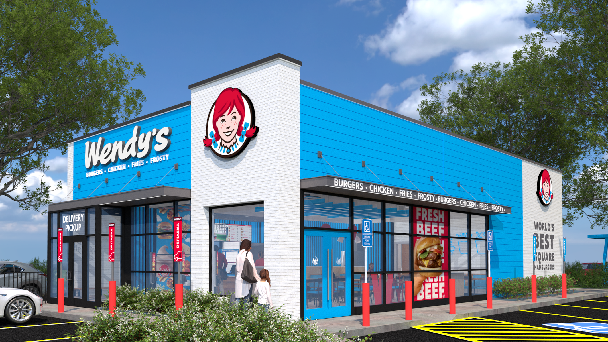
The new blue restaurants were recently introduced as part of Wendy's 'Future Fresh' initiative set to roll out among its global franchises after debuting in the Philippines. Alongside the new light blue colour scheme, the restaurants will feature 'digital-first' layouts with ordering screens, customer loyalty programs and modernised customer experience.
If you're familiar with colour theory, you'll understand why Wendy's embracing the blues is a risky and unexpected move. While red typically spurs on feelings of hunger, the cool, cold aura of blue hues often has the opposite effect on customers' subconscious. Often seen as an unnatural colour in the food world, it's not exactly the mouth-watering palette you'd want for your culinary brand. But given that Wendy's is already a well-established brand, the risk may be worth the reward, as CFO Ken Cook suggested the colour change would help the brand stand out among competitors.
For more design news, check out why the 'dejoying' of McDonald's is losing its customers or take a look at KFC's viscerally disgusting new billboards.