
Accessibility is a vital consideration for every business with a website. By prioritizing accessibility, you ensure all your visitors enjoy using your website. You deliver seamless experiences to conventional users and also people with disabilities. Unfortunately, many websites ignore accessibility and suffer for it.
We’ve put together a detailed beginner’s guide on web accessibility, helping you understand what it entails and how to implement it. This guide will teach you the importance of accessibility and how to apply it to deliver a stellar user experience.
What is web accessibility?
Web accessibility refers to designing websites and content people with disabilities can easily use. Physical disabilities like deafness, blindness, partial vision, and hearing restrict people’s ability to use online services. For example, a deaf person depends on video and audio transcriptions because they can’t hear the content. If you upload videos to your website without transcriptions, the deaf person won’t understand the video.
Accessibility is about designing websites with features that enable people with disabilities to interact with your website like everyday users. It’s critical because a significant percentage of the population has various disabilities, and they need equal access to online services to carry out everyday tasks. That’s why many jurisdictions have formal anti-discrimination laws requiring websites to implement accessibility features or face serious penalties.
Types of disabilities
Web accessibility focuses on five major categories of disabilities, including
Visual: People with limited vision or full blindness. According to WHO estimates, 285 million people worldwide have moderate-to-severe visual impairment and 39 million are blind.
Hearing: People with limited hearing abilities or full deafness. According to WHO estimates, over 430 million people worldwide have disabling hearing loss and over 70 million are deaf.
Speech: People with limited ability to produce speech sounds and communicate verbally.
Cognitive: People with limited reasoning abilities.
Motor: People with partial or total loss of function of a body part, e.g., arm paralysis.
Most people with disabilities use some kind of Assistive Technology (AT) to navigate the web. For instance, people who can’t see a website use a screen reader to navigate it—the software dictates what’s written on the website. Paralyzed people use dictation instead of a keyboard and mouse. Deaf people rely on captions and transcriptions for audio and video content.
Web accessibility focuses on building websites that people with the abovementioned disabilities can navigate as seamlessly as possible. Despite their challenges, they should be able to use assistive technology to navigate your website and enjoy its features.

Web Content Accessibility Guidelines (WCAG)
The Web Content Accessibility Guidelines (WCAG) are a formal set of guidelines developed by the World Wide Web Consortium (W3C). These guidelines provide recommendations for building accessible websites. Most regulators worldwide follow the WCAG guidelines, and so do most businesses. A good grasp of WCAG is compulsory for building an accessible website.
WCAG is based on the four main principles of accessibility – perceivable, operable, understandable, and robust (POUR).
Perceivable: Make your website’s content and interface components presentable in a way all users can perceive. This means the content and interface components can’t be invisible to their senses, regardless of disabilities.
Operable: Make the website’s components navigable and operable for all users. Your site should not require any interaction that disabled persons can’t perform.
Understandable: The website’s user interface should not be beyond the understanding of an average user.
Robust: The website's content should be compatible with various user agents, including assistive technologies.
WCAG 2.0 Guidelines
The first version of WCAG guidelines (1.0) was published in 1999. This was in place until WCAG 2.0 was published in December 2008. Since then, the World Wide Web Consortium has published two minor updates (WCAG 2.1 and 2.2), and the WCAG 2 standards remain what regulators and businesses largely follow.
Let’s dive deep into the 12 WCAG 2.0 guidelines to implement on your website:
1. Provide text alternatives for any non-text content
Your website should have text alternatives for images, videos, audio, and other non-text content. Remember that some people are blind and depend on screen readers dictating text to surf the web. If you don’t provide accurate transcriptions of graphical content, this cohort will struggle to use your website.
Every image should have an alternative text description—a blind user’s screen reader dictates the description to help them understand the picture. Video and audio files should also have transcriptions so that deaf persons can read and understand them. People who are both deaf and blind can also use their Text-to-Braille translator to understand the video.
2. Provide alternatives for time-based media
Time-based media refers to audio or video files with a specified time duration. This guideline requires you to provide text alternatives for such media so that blind or deaf people can understand it. Every prerecorded video and audio content should have captions and, if possible, sign language interpretation.
3. Create versatilely presentable content
Your website’s content should be presentable in various formats without losing meaning or structure. Use the right HTML code to define content pieces and how they’re related. For example, form fields should have the
4. Make it easy for users to see and hear content
Use contrasting colors to separate text and other website elements from the background. This way, people can easily differentiate between foreground and background elements and read your content clearly.
For hearing, allow people to control video or audio volume on your website independently from their device volume. If any audio plays automatically for over 3 seconds, allow users to pause or stop it to avoid inconveniencing people using assistive technology to navigate your site.
5. Keyboard accessibility
All functions on your website should be accessible via a keyboard. Remember that some people can't use a mouse because of their motor disabilities, and this cohort needs to use your website. Hence, implement keyboard shortcuts for users to access all your website’s features.
6. Provide enough time for users to interact with content
Allow users to turn off or adjust time limits on visual content. They should be able to pause, stop, or hide blinking, scrolling, and auto-updating information. Remember that some people have motor disabilities and struggle to interact with content in the same time frame as people without such disabilities. This guideline ensures that people with physical disabilities don’t find using your website or app challenging.
The exception in this case is if the time limit is longer than 20 hours or if extending the time limit invalidates the relevant action.
7. Avoid seizure-inducing content
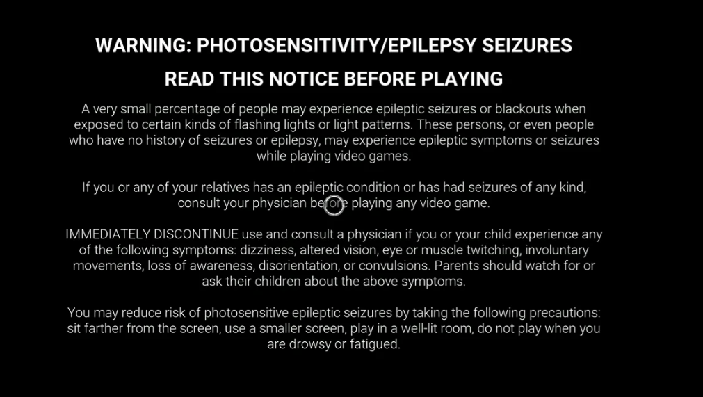
Photosensitivity is a disability that often gets overlooked. Some people show abnormal sensitivity or reaction to rapidly flashing light, with adverse effects including headaches and eye discomfort. Hence, avoid placing visual content that flashes more than three times within a second. If such content is necessary, warn viewers beforehand, as is often the case with video games.
8. Help users navigate your content.
- Provide mechanisms that help users navigate your website easily:
- Web pages should have clear titles describing their purpose.
- Have a navigation menu at the top of your website.
- The purpose of each link should be determined by the link text alone.
Articles should have a heading structure (H1, H2, H3, and so on) to make it easy for assistive technology to decipher.
9. Make text readable and understandable
Your website’s text should be easy to read and understand. It shouldn’t require reading ability beyond the lower secondary education level, except when necessary. If you write any abbreviations, provide the meaning at least once in the article, preferably the first time the acronym is mentioned. This way, people using assistive technology can easily follow your website’s content.
10. Web pages should operate predictably
Your website should maintain uniform navigation across all web pages. The navigation menu should be static across all pages to avoid confusing visually impaired users. Changing any user interface setting should not trigger any “change of context,” referring to something a visually impaired user will likely not notice due to their limited vision.
11. Help users prevent and correct mistakes
Your website should have mechanisms to help users detect and correct errors. For example, if a user inputs the wrong value on a form, they should receive a warning stating “wrong value” or something similar. This warning helps visually impaired people using screen readers understand the error and how to correct it.
Always provide labels or instructions when content requires user input. For web pages involving financial transactions or legal commitments, users should be able to review, confirm, and correct information before finally submitting it. Submitted information should be reversible except in cases where it can jeopardize security.
12. Maximize compatibility with user agents
Your website should be compatible with different user agents, including people navigating via assistive technology.
All elements using markup languages should have start and end tags and be nested according to their specifications. All user interface components should be clearly labelled so that assistive technology tools can decipher them.
WCAG 2.1
WCAG 2.1 was first published in June 2018; another update was published in September 2023. WCAG 2.1 added one major guideline to the 12 guidelines of WCAG 2.0 (explained above).
WCAG 2.1 came with better accessibility adaptions for mobile phones and people with low vision or cognitive disabilities. Its main tenets include:
1. Adapting content to different orientations
Content should not be restricted to only one display orientation, such as landscape or portrait, except where essential. For example, someone with cerebral palsy might be using a tablet attached to their wheelchair—if your website content is only available in portrait mode, they won’t be able to use it.
2. Text spacing
Text on your web page should be spaced sufficiently. WCAG recommends the following:
- Line spacing of at least 1.5 times the font size.
- Spacing after paragraphs to at least 2 times the font size.
- Letter spacing to at least 0.12 times the font size.
- Word spacing of at least 0.16 times the font size.
Well-spaced text is easier to read, especially for people with dyslexia or low vision.
3. Motion animation control
Users should be allowed to turn off any motion animation on your website, except if the animation is essential to the information being conveyed. Some animations can make people dizzy or uncomfortable, so you should provide the option to turn them off except where the animation is necessary.
4. Allow users to undo actions
Provide an option for users to undo actions they trigger on your website. This feature allows people to correct mistakes, such as pressing the wrong button.
5. Content scrolling
Your website's content should not require scrolling in two dimensions (vertical and horizontal) to view fully. Constant scrolling from left to right or up to down can disorient users and make them abandon your website.
WCAG 2.2
WCAG 2.2 was published in October 2023. This version added 9 new success criteria to the existing WCAG standards. Its tenets include:
1. Consistent help mechanisms
If your website has mechanisms for users to get external help, this mechanism should remain steady even as users navigate different pages. For example, if you have contact details in the footer menu, the details should remain there even when a user switches to other pages. If there’s a popup chat module, it should remain uniform across different pages.
Uniformity helps people with cognitive disabilities to access help easily. It also lets general users get help seamlessly.
2. Redundant entry
If a user enters certain information and is required to enter it again, you should provide an auto-fill option. For example, if someone provides their phone number on a form and another form on the next page requires the phone number, they should be able to auto-fill it with the previously entered data. This requirement reduces the time users spend entering information and makes it easier for people with mobility or cognitive disabilities to navigate your website.
3. Dragging movements
Any functionality that requires dragging, such as sliders and drag-and-drop functions, should have non-dragging alternatives. For example, instead of dragging a slider all the way through, the user can simply double-click the slider and use their keyboard to control it. This feature reduces interaction friction for users with disabilities.
4. Target Size
The target size for pointer inputs on your website should be at least 24 by 24 CSS pixels (with a few exceptions). This feature makes it easier for people with large fingers or those with mobility troubles to interact with your website.
5. Accessible authentication
Any authentication step on your website should not require a cognitive function test unless these criteria are met:
- There's an alternative authentication method that doesn’t require a cognitive function test.
- A mechanism is available to help users complete the cognitive test.
- The cognitive test is only for recognizing objects.
- The cognitive test identifies non-text content the user provided to your website.
These criteria make it easier for people with cognitive disabilities to navigate your website.
6. Focus Not Obscured
If a component on your website receives keyboard focus, the focus indicator should be clearly displayed. This practice helps people with short-term memory to remember how to navigate your site.
The visible keyboard focus indicator should meet these requirements:
- A contrast ratio of at least 3:1 between the same pixels in the focused and unfocused states.
- Be at least as large as the area of a 2 CSS pixel thick perimeter of the unfocused component.
WCAG 3.0
The World Wide Web Consortium (W3C) hasn’t formally debuted the third version of WCAG standards. The agency published the first draft of WCAG 3.0 in July 2021 and the latest in July 2023. It remains informal; the W3C expects to spend a ‘few more years’ before releasing formal WCAG 3.0 guidelines.
The W3C has hinted that WCAG 3 will cover more accessibility needs, especially for cognitive disabilities, and be easier to understand. It will have a different structure and a broader scope beyond web content. It will also have a different conformance model instead of the A, AA, and AAA currently in use. Much about it remains speculation, with many issues still being discussed.
WCAG conformance levels
WCAG guidelines are categorized into three performance levels:
- A (lowest)
- AA (mid-range)
- AAA (highest)
Level A is the minimum level and does not achieve broad website accessibility for many situations. Level AA is the mid-range that most regulators require. Level AAA is the highest that you can strive for, but it can be challenging to meet all AAA requirements. Regulators understand this difficulty, making them mostly require Level AA conformance.
Web accessibility regulations
Many countries have strict regulations about web accessibility, with substantial penalties for violations. Let’s examine some of them below:
Americans with Disabilities Act (USA)
In 1990, the United States formally passed a law prohibiting discrimination based on disability. This law requires all private and public organizations to provide "reasonable accommodations" to people with disabilities.
ADA initially focused on businesses with physical locations, e.g., requiring wheelchair access for disabled people. However, this law has been amended several times to include web accessibility. Many people have sued websites for ADA violations and won significant penalties, so the law is clear about websites serving American users needing to adhere to ADA rules.
Equality Act (UK)
The UK government passed the Equality Act in 2010. This Act legally protects UK residents from workplace and societal discrimination. It combined various anti-discrimination laws, including those covering web accessibility, into a single Act that businesses can easily follow.
This law requires organizations serving UK citizens to make “reasonable adjustments” to ensure their services are accessible. Violators can face significant monetary penalties. The good news is that following the WCAG standards keeps you compliant with this law.

Web Accessibility Directive (European Union)
In 2016, the European Union passed the Web Accessibility Directive to give people with disabilities better access to websites and mobile apps. This Directive covers public sector bodies across all EU countries, requiring them to make their websites and apps compliant with WCAG standards.
Private companies aren’t left behind in EU regulations. The EU passed the landmark European Accessibility Act in 2019, harmonizing accessibility laws across all member countries. This law will take effect in June 2025 and require private organizations in EU countries to make their websites and apps accessible.
Disability Discrimination Act (Australia)
The Australian government passed the Disability Discrimination Act in 1992. This law prohibits discrimination against people with disabilities in many contexts, including web accessibility. The Australian government officially states that websites must comply with WCAG 2.0 guidelines, which we’ve explained in this article. Complying with these guidelines means you have nothing to fear.
Référentiel général d’amélioration del’accessibilité (RGAA, France)
The French government passed the RGAA law in 2005, prohibiting discrimination and unfair treatment against individuals with disabilities. This law requires websites and apps to comply with the WCAG standards or face fines or sanctions.
Notable web accessibility legal cases
Many people have sued organizations for non-accessible websites and prevailed, winning substantial monetary awards. We’ll describe some examples to highlight the importance of complying with WCAG laws and avoid acting like these organizations:
1. National Association of the Deaf (NAD) vs. Netflix
In 2011, the US-based National Association of the Deaf (NAD) filed a civil lawsuit against Netflix, the popular web streaming service. The lawsuit claimed that Netflix’s lack of closed captioning for streamed videos violated the ADA Act.
A federal judge sided with NAD, maintaining that online platforms weren’t exempt from ADA requirements. Netflix settled the case with an agreement to provide closed captions on all its videos for two years and was ordered to pay $755,000 in attorney fees and costs that NAD incurred.
2. National Federation of the Blind v. Target Corporation
In 2006, the US-based National Federation of the Blind filed a lawsuit against mega-retailer Target Corp, claiming Target’s website was inaccessible to blind users and violated anti-discrimination laws. This lawsuit, filed in 2006, set a precedent for companies to pay attention to web accessibility.
Target challenged the lawsuit, but a judge sided with the National Federation of the Blind. The mega-retailer settled in 2008, agreeing to pay $6 million in damages and implement changes to make its website accessible.
3. Uber vs. the United States Department of Justice (DOJ)
In November 2021, the United States Justice Department filed a lawsuit against Uber, the popular ride-hailing app, alleging discrimination against users with disabilities. The Justice Department claimed Uber violated the ADA by not modifying its wait time fee policy for riders using wheelchairs or walkers. This cohort spent more time moving from their doorstep to their assigned vehicles, incurring additional wait fees because of their physical disabilities.
The DOJ Uber settled the DOJ's lawsuit by paying $1.7 million to riders who complained about wait time fees because of their disabilities and another $500,000 to other affected individuals. The company also agreed to waive wait time fees for users with proven physical disabilities
4. National Association of the Deaf v. Harvard and MIT
In 2019, the National Association of the Deaf (NAD) filed a lawsuit against Harvard University and the Massachusetts Institute of Technology (MIT), two prestigious colleges, claiming they violated ADA laws by not providing comprehensive captioning for online course materials. The NAD claimed the lack of captioning for video and audio course materials made it challenging for deaf students to learn and complete their required coursework.
Both institutions settled the lawsuit, agreeing to make online content accessible by providing captioning. Harvard was ordered to pay $1.6 million in attorneys’ fees and costs incurred by the NAD.
5. Domino's Pizza, LLC v. Robles
In 2016, Guillermo Robles, a man with visual impairment, filed a lawsuit against popular pizza chain Domino's, alleging ADA violations. His lawsuit centered on Domino's Pizza’s website, which lacked alternative text for images and had empty hyperlinks with no text identifying their purpose.
Domino’s Pizza pushed back and tried to claim the ADA didn’t apply to its website and app. However, a judge voided that claim, and the case went to a California District Court. Domino’s later settled on confidential terms, which likely included correcting the accessibility flaws.
6. National Federation of the Blind (NFB) v. H&R Block
In 2013, the National Federation of the Blind filed a lawsuit against H&R Block, a popular tax filing software, alleging discrimination against people with disabilities. The NFB filed the case on behalf of two blind individuals asserting that H&R Block didn’t make reasonable adjustments to make its platform usable for blind people.
The United States Department of Justice (DOJ) intervened in this lawsuit, marking the first time the agency interfered in a case regarding mobile app and web page accessibility. H&R Block later settled with the DOJ, agreeing to conform to WCAG 2.0 Level AA standards. The company also agreed to appoint a web accessibility coordinator and train its developers and designers on accessibility. The two plaintiffs were awarded $45,000, and H&R Block paid a separate $55,000 civil penalty.
Web accessibility services
It can be understandably challenging to tweak your website to ensure accessibility. You might not even know how to spot accessibility flaws, let alone correct them. However, the good news is you don’t have to walk alone. Website developers and owners have access to many tools to help them build accessible websites. These tools scan your website to detect accessibility flaws and provide recommendations on fixing them.
Examples of web accessibility services include:
Google Lighthouse
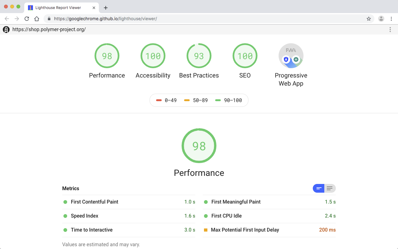
Lighthouse is a free and open-source tool built by Google. It lets web developers audit their web pages for accessibility, performance, search engine optimization, and other features. It gives detailed reports about web access and identifies common errors like graphics lacking alternative text, improperly sized images, and low-visibility text.
Many developers like Google Lighthouse because of its detailed metrics and diagnosis. It detects accessibility-related issues, clearly defines them, and provides suggestions for fixing them, all for free.
ColorBlindly
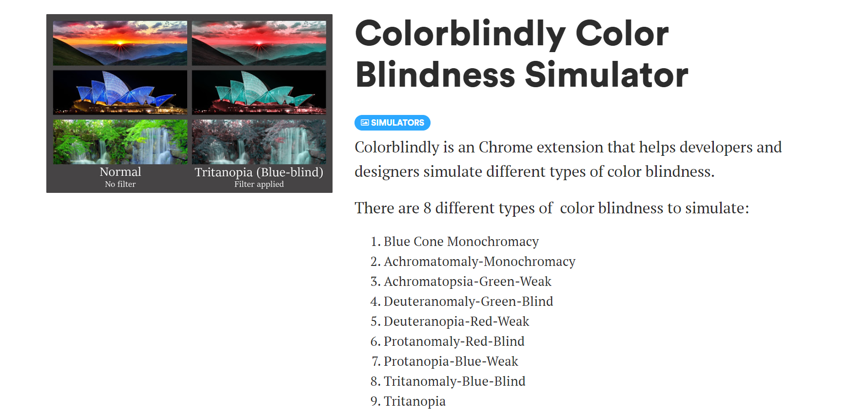
ColorBlindly is a Chrome extension that simulates different types of color blindness on your website. These simulations give you an idea of what color-blind people see and adjust your website's elements to give them a good view. It’s a simple yet very effective tool for building accessible websites.
NV Access
NV Access is free screen reader software for visually impaired people. You can download this tool to understand how visually impaired people interact with your website. Spend ample time familiarizing yourself with using a screen reader and putting yourself in the shoes of visually impaired users. What features would you like on your website? What things make the website most convenient to use? Think of these things and implement them to make your website accessible.
A11y color contrast checker
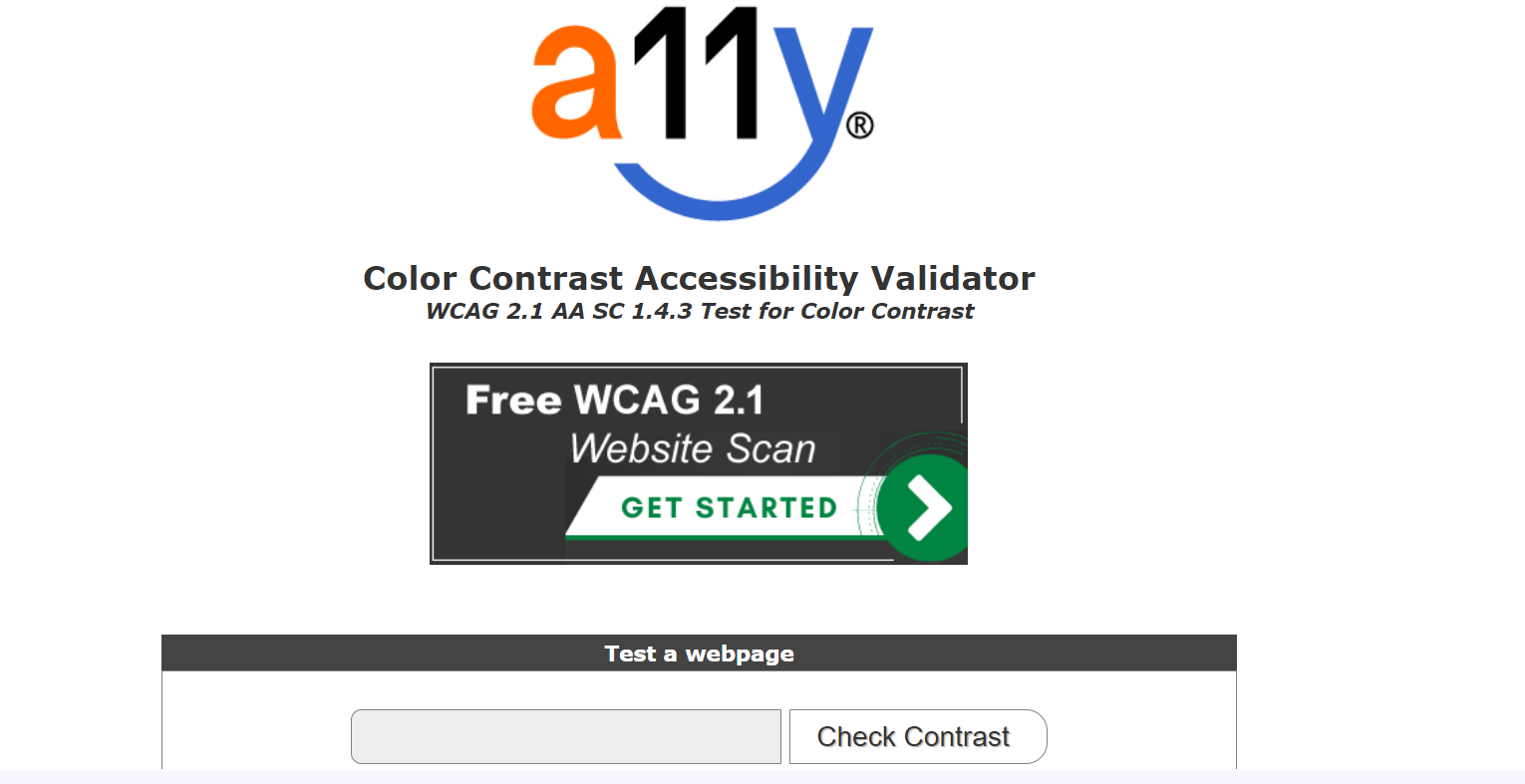
Color contrast is one of the 12 WCAG guidelines. You need clear color contrast between background and foreground elements to make your website easy to read. A11y, a community-driven digital accessibility project, provides a free color contrast tester for web pages. This tool tells you if your web page’s contrast fits the recommended 4.5:1 ratio and suggests ways to fix the page if needed.
tota11y
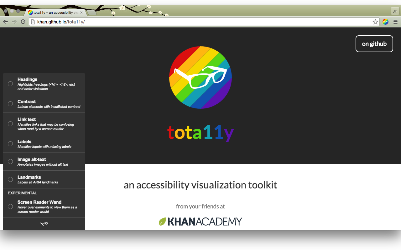
tota11y is an accessibility toolkit developed by Khan Academy, a prominent educational organization. This tool can test your website for accessibility features and ensure it conforms to WCAG standards. It has many functions, including:
- Detecting images without alternative text descriptions.
- Detecting unclear link text.
- Highlighting form fields without appropriate labels.
- Identifying errors in a web page’s heading structure.
- Labelling text with color contrast violations (and suggesting the proper color combinations to give good contrast).
- Label ARIA landmarks to help people using assistive technology (AT) navigate your site. To the uninitiated, ARIA stands for Accessible Rich Internet Applications, which refers to HTML markups that communicate the properties of your website's user interface components to AT tools.
You can download the tota11y Chrome extension for free.
SortSite Desktop
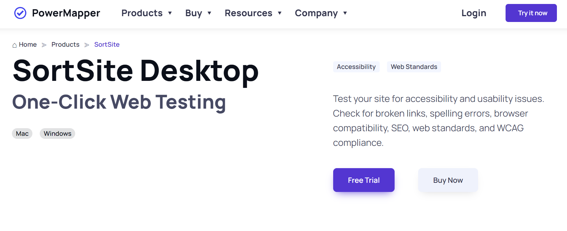
SortSite Desktop is a one-click testing tool that analyzes your website against 1,200+ factors, including broken links, spelling errors, usability issues, and WCAG compliance. It scans your website and outputs detailed descriptions of the errors it detects, helping you correct them.
SortSite Desktop is a great guide for every web designer and developer. After building a new website or making major changes to an existing site, you can scan it with this tool to ensure it is as accessible and easy to use as possible.
Factors to consider when choosing a web accessibility service
These are the critical factors to look at when choosing any web accessibility service:
1. Cost
You need a tool that your business can afford in the long term. Compare the prices of your desired accessibility service with competitors and see what works best for your budget. You can also check if there’s a free option, like most of the services we listed above.
The good thing about web accessibility is that many not-for-profit organizations have released free tools to help web developers build accessible websites. Many companies have also built free tools for the same purpose, and you can utilize them to make your website more accessible without paying a dime.
If you’re choosing a paid tool, fine. Check if there’s a free trial to test the features before making a final decision. Know their refund policy if you’re unsatisfied with the platform after paying.
2. Ease of use
Look for a platform that’s as easy to use as possible. It’ll be ironic if a web accessibility tool has a website or app that isn’t accessible, so start from there. The user interface components should be neatly arranged and easy to understand. You should be able to find and use the features you want without stress. Integrating the tool with your website should be a seamless process.
3. Customer support
Things can go wrong anytime, leaving you needing external help to resolve the issue. Hence, look for a web accessibility service with a responsive customer support team you can contact via email, telephone, or live chat. You should also have access to detailed technical documentation that helps you resolve issues yourself.
Many accessibility services offer manual coding assistance to help website owners comply with WCAG standards—you can take advantage of this to make your website as accessible as possible. You can also check customer reviews to see if there are noticeable support complaints. If so, it’s a signal to look at other tools.
4. Testing capabilities
What testing capabilities does the web accessibility tool have? Does it test the whole website for accessibility or just specific parts? For instance, we mentioned the A11y color contrast checker, which checks for color contrast only, while SortSite Desktop checks for color contrast and hundreds of other accessibility requirements.
An ideal tool should not only test but also give detailed test results. You should get a detailed overview of all the issues the platform detected on your site, enabling you to understand the issues and how to fix them. After fixing them, you can generate a detailed accessibility report of your website to present to external stakeholders.
Some accessibility services offer manual testing, wherein their experts sift through your site to detect and help you fix accessibility issues. They offer design and coding assistance to help your website become as user-friendly and accessible as possible.
5. Reporting
Your web accessibility service should give detailed reports about every flaw identified on your website. The reports should be clear and concise, giving you a deep understanding of the issue identified by an automated or manual review. You should also get helpful recommendations on solving these issues to make your website more accessible.
6. Legal expertise
Earlier in this article, we discussed some major web accessibility regulations to consider across various jurisdictions. Penalties for non-compliance can be steep, e.g., $75,000 for the first violation and $150,000 for subsequent violations of the Americans with Disabilities Act (ADA).
Hence, any web accessibility service you choose should deeply understand the global accessibility regulations. You should be able to scan your website and get alerted if it's out of compliance with important accessibility regulations. The accessibility provider's team should have sufficient knowledge of these regulations and guide you on complying with them.
A good accessibility service provider should also have people with disabilities on staff to provide first-hand knowledge about their experiences and how to improve your website for them.
Accessibility Tax Credits
American businesses have many reasons to make their websites accessible, including lowering their tax burden. The U.S. government encourages businesses to invest in accessibility by offering up to $5,000 annually in tax credits to offset 50% of their accessibility-related expenses. This tax credit is available to all registered businesses with $1 million in annual revenue or less or 30 or fewer full-time employees.
You can invest sizeable amounts in digital accessibility and claim a tax credit. This law is a good example of a government enacting laws to make life better for businesses and their end customers.
Even without tax credits, investing in web accessibility is a wise decision. While it’ll likely incur significant upfront costs, it will increase your business’s value in the long term because better accessibility equals more users.
Final words
We have explained virtually everything a beginner needs to know about web accessibility. We dived deep into the WCAG guidelines businesses are expected to follow and the various regulations to know about. We have also cited notable cases proving the importance of web accessibility for businesses.
Follow our accessibility tips, and you’ll likely attract more users to your website and avoid run-ins with regulatory authorities.


