What you need to know
- A dive into the Pixel Watch's code shows Google is preparing a new app grid view for Wear OS.
- The viewing will show apps in rows of three, but only the icons of the apps will be shown in this grid.
- Wear OS 4 is also preparing to bring a "dynamic theme," courtesy of Material You, to the Pixel Watch.
Google's wearable software is preparing a new change that boosts the quality of life for users when scrolling through apps.
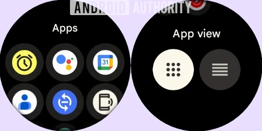
According to Android Authority, following researcher "AA," Wear OS is preparing to redesign the apps section of the Pixel Watch 2 (via 9to5Google). The redesign involves showing apps in a grid view, with the small circular icons listed in rows of three down your display.
After manually forcing the changes to appear in the code, it was discovered that Google will let users switch between views. This means if you're a fan of the current list view on the Pixel Watch 2, you can revert to it. The publication noticed this would be possible by dipping into Settings > General > App view.
Moreover, this grid view would likely help users find an app on their smartwatch much faster — but not without a drawback. In testing, the grid view doesn't offer the name of the app when scrolling through. So, remembering the icon of the app you're looking for will make all the difference.
Wear OS' app view redesign will be coming to the Pixel Watch 2, and it also looks like the original Pixel Watch will grab it, as well.

The latest sneak peek at Wear OS' updated app view seems to be a part of the Pixel Watch's February 2024 security patch. The light patch offered security improvements for Google's smartwatches this month.
Meanwhile, Android Authority reiterates Wear OS's upcoming dynamic theme, courtesy of Material You. The coming support "looks almost ready," meaning we're likely closing in on an update featuring it more prominently. The Pixel Watch was teased to gain Material You's dynamic theme in December. Users reported a blue hue across certain UI elements, such as the quick menu's icons.
Dynamic theme would let users match the color scheme of their watch face, creating a unified color experience across the device.
Google is still testing its March 2024 feature drop as it recently rolled out Android 14 QPR3 Beta 1. Most of the more prominent features for its smartwatches will likely come wrapped in that more considerable drop next month (if all goes well).
The Apple Watch for Android
The Pixel Watch 2 is truly a step up from the original that launched in 2022. The smartwatch offers upgraded and improved heart rate sensors that are more accurate for those interested in monitoring their health. With a new chip, the Pixel Watch 2 much faster and snappier than ever before.


