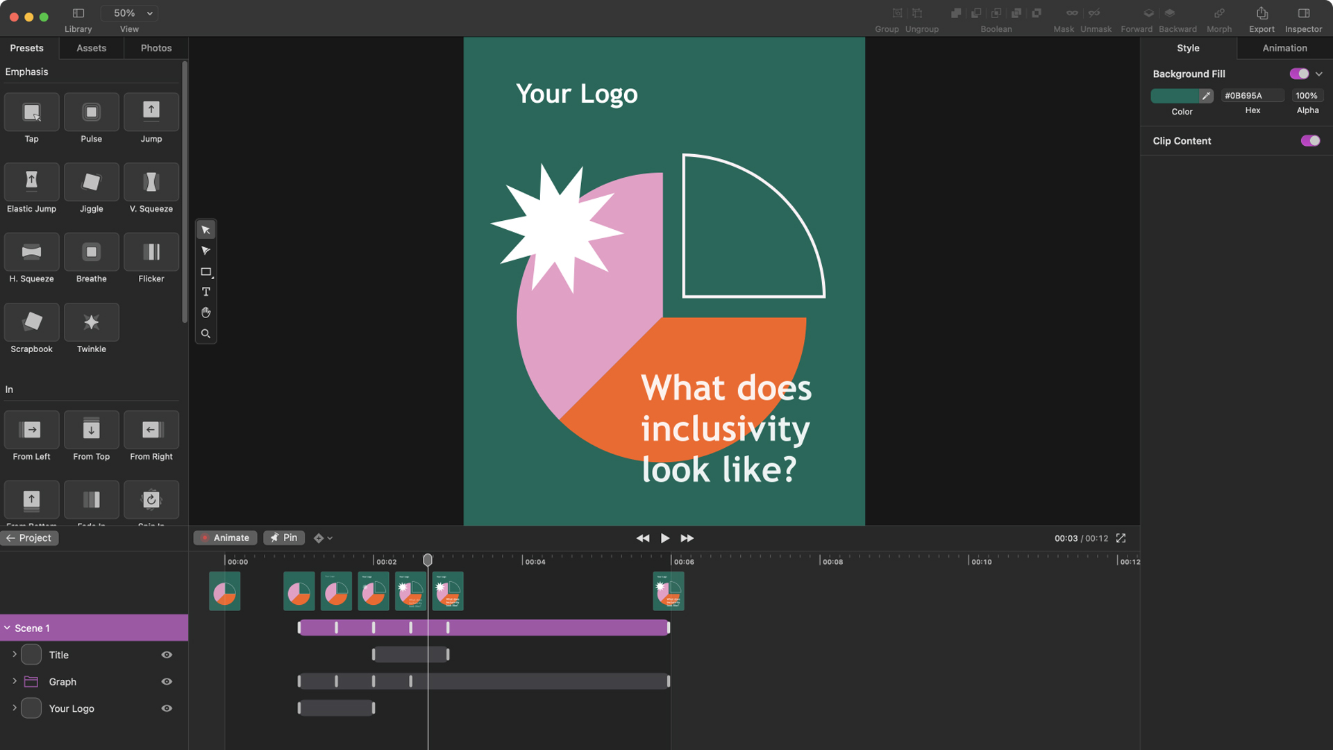
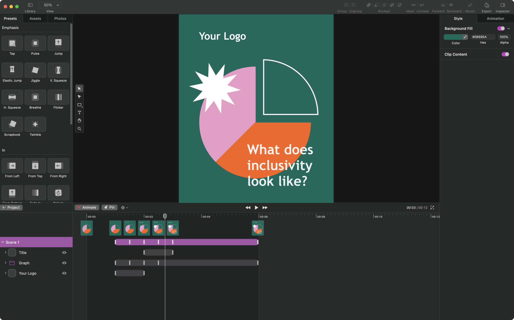
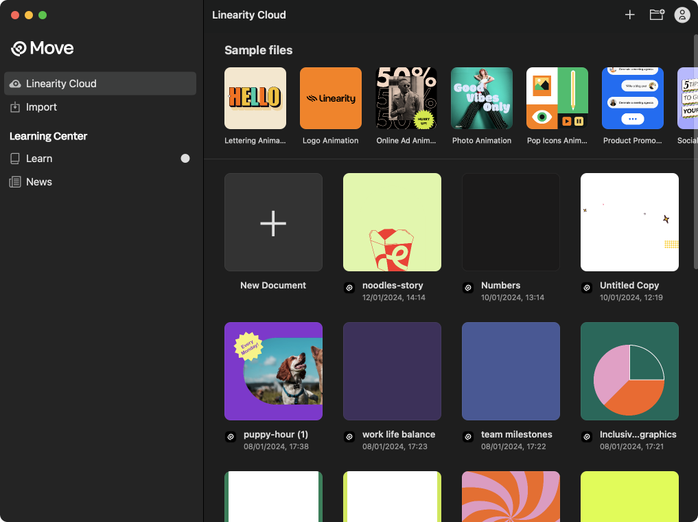
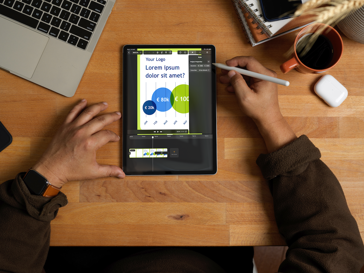
I recently went to the launch event of exciting new animation software, Linearity Move, which is aimed at designers and marketing teams who want to create motion graphics on a Mac or iPad. The software looked easy to use, and sits between simpler tools such as Canva and more complicated software such as After Effects.
What was the thinking behind the product? "The idea has been to make motion design accessible to regular graphic designers who are not necessarily well versed in After Effects," explains Malte Brilatus, head of product at Linearity.
"With Linearity Move, you can take your assets from Figma or Adobe Illustrator and, with a few clicks, bring them to life," says Yash Arora, Linearity's senior product designer. "There’s no steep learning curve like with most traditional motion graphics software. This means that a graphic designer can create dynamic, animated content without having to resort to an agency or freelance animator."
To find out more about the process behind Linearity Move, I caught up with Malte and Yash as part of our How we made series.
What was the creative process when making Linearity Move?
Malte Brilatus: It began with the idea from Linearity’s CEO, Vladimir Danila, who was also behind the original idea for Linearity Curve, previously Vectornator, a vector graphics software that has built a strong fanbase over the years.
He suggested a new motion design product that would complement Linearity Curve, considering the stagnant market for motion design and the steep learning curve of existing tools. It began as a broad vision, leading us to delve into questions like who the target user would be and what kind of animations they would be able to create.
But before even getting into those details, we started exploring the world of animation, which has a rich history full of fascinating stories. We grabbed some popcorn and immersed ourselves in hundreds of animations across different genres. We also talked with various types of creators to understand their pain points and familiarised ourselves with the revered 12 principles of animation.
While becoming familiar with various jargon and processes, we discovered that animators are motivated by beautiful storytelling. However, creating such stories with the current set of tools in the market is a lengthy, high-effort, and meticulous process. Therefore, Linearity Move needed to be simple to use.
Yash Arora: In parallel, the business plan was being drafted, which helped us strategize the segment of the market we want to target. We spoke with marketing designers and learned about the various types of animation assets they would want to create and the process they undergo to tell their stories. Thus, Linearity Move aimed to cater to both large teams and individual designers equally well.
Our vision meetings were a team favourite as they helped us shape the first alpha versions of Move via rapid prototypes. Once we had the vision, we had to break it down into executables and continually validate it to ensure that every piece fits together nicely and remains aligned with the vision. We also reevaluate to tweak the vision along the way.
How did you work together to make Linearity Move?
YA: We put together a small, yet nimble team within the larger Linearity team, focusing exclusively on Move, day in and day out. We stuck to a typical agile development process. We’re a remote-hybrid team, but occasionally, we came together in Berlin for collaboration, which fostered closer team bonds and more effective cooperation.
MB: As a startup with an existing popular product, working on a major new product meant that we had to be thrifty with resources and learn to spread ourselves between tasks.
Our team members had strong opinions on certain aspects, which actually often brought out the best in our brainstorming sessions, given we were all aligned to deliver the best to our users.
How did you use feedback on other tools i.e., After Effects, to help you?
MB: Motion design is an established category in the market, so we're not creating a completely new category of tools. But we wanted to ensure we weren't just copying what's out there, but building a unique product.
We benefited from learning not just from existing tools but also from experts' opinions who use those tools. This helped us identify areas where we could offer a genuinely improved experience by evaluating the pros and cons of existing workflows. Having multiple brand motion designers mention that they only need about 5-10% of After Effects functionality was a major 'aha' moment for us.
Designing a tool for motion design involves many nuances, and it's challenging with just static UIs because things become complicated quickly when multiple system components are interacting with each other. Existing tools helped us validate and discard many ideas that looked great on paper or Figma.
Tell us about the user interface design
YA: We learned early on that existing motion design tools often have steep learning curves. This limits designers and prevents them from fully realising their creative visions and stories. They face a choice: invest heavily in specialised training or express only a fraction of their ideas. This understanding drove us to create an interface that balances powerful features with intuitive simplicity. We believe Move has a strong foundation that enables users to create reliably and quickly, and we plan to continue building on this foundation.
We resonate with the humane philosophy behind Apple's Design Guidelines. Inspired by Jeff Raskin's work, we formulated our guiding principles:
1. Simplicity: Making interfaces straightforward and easy to understand.
2. User-centered design: Designing interfaces that adapt to users' needs and abilities.
3. Consistency: Ensuring design, behaviour, and terminology are consistent to reduce cognitive load.
4. Minimising modes: Reducing modes or states in interfaces to prevent confusion and errors.
5. Eliminating unnecessary complexity: Removing features and complexities that don't add value.
6. Discoverability: Designing interfaces that allow easy discovery of their use without documentation.
7. Direct manipulation: Supporting interactions that mirror real-world counterparts.
8. Feedback: Providing feedback to users to understand the consequences of their actions.
9. Efficiency and speed: Designing interfaces for quick and efficient task performance.
10. Error prevention and handling: Designing to prevent errors and handle them gracefully when they occur.
11. The user interface iceberg: Recognising most of the interface is hidden from the user's view to design more humane interfaces.
12. Keyboard-first interaction: Prioritising efficient keyboard-based interfaces over mouse-based interaction.

What challenges did you come across while making the software?
MB: We faced tons of challenges while developing the software. The most significant was keeping up with the user's imagination, which is a race against time. We aimed to ship as quickly as possible, requiring us to be aggressive with our prioritisation strategy.
Other challenges included scaling and building off from Linearity Curve and seeing many of our conceptual ideas fail. Through all these challenges, we used user feedback to guide us, making sure we delivered on our promises.
Which part of the process did you enjoy most?
YA: The most exciting part was working on the new capabilities we plan to add to Move. Experimenting with possible metaphors and collaborating with the team to bring them to life was fulfilling.
The brightest day in making Linearity Move was when we created our first usable animation. It was a pivotal moment for the team, giving us the confidence to open Linearity Move to users and invite our first batch of alpha testers.
MB: Watching real people interact with Linearity Move has been incredibly humbling. Seeing their eyes light up in understanding or when a feature truly 'clicks' makes it all worthwhile. The feedback, both positive and critical, allows us to directly improve the product and ensure it genuinely solves users' problems.
What’s your favourite part of the finished work?
YA: Our favourite part is getting users' reactions. Positive feedback such as 'Wow, that's magic', 'That's Keynote on steroids', and 'It's super fast' keeps us going. Work is never finished! Linearity Move has a long road ahead.
It's great to see that early users have picked up on exactly what we intended for the software: to be intuitive and not overwhelming, and to offer a sense of autonomy by enabling them to get by without external help.
Find out more about Linearity Move. You can also read our Linearity Move review to see what we made of the software.


