Get all your news in one place.
100's of premium titles.
One app.
Start reading
Creative Bloq
Creative Bloq
Technology
Mabel Wynne

We've summed up the entire Kia logo debacle (so you can finally stop reading about it)

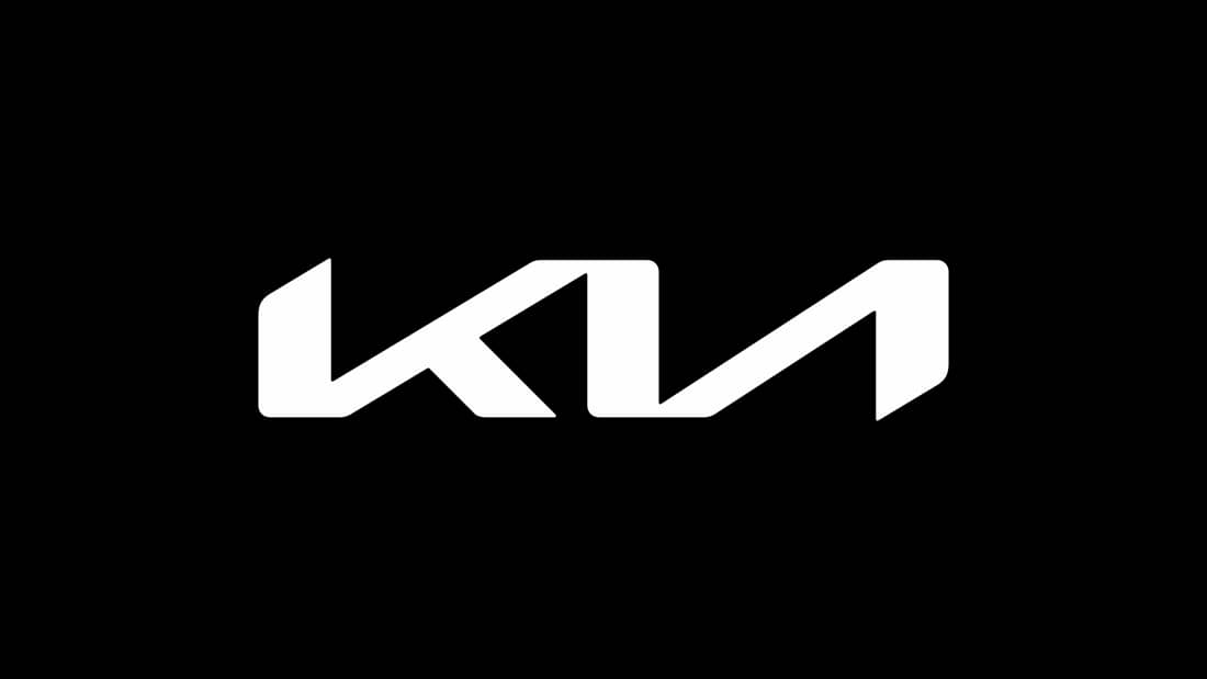
Kia logo.

Car brands occasionally have one-off branding scandals – people hated Audi’s new logo for China and I don’t even need to get started on Jaguar’s infamous rebrand that was all over the internet at the end of 2024. But these controversies fade, and people move on.

The same can’t be said for Kia’s 2021 rebrand, which is still a source of heavy debate. After years of Kia’s well-known red logo that circled its brand name in an oval, its new logo was a simple, geometric, silver shape spelling out ‘Kia’, only for many it appeared to spell out ‘KN’.

Sign up to read this article
Read news from 100's of titles, curated specifically for you.
Already a member? Sign in here
Related Stories
Top stories on inkl right now
One subscription that gives you access to news from hundreds of sites
Already a member? Sign in here
Our Picks
Fourteen days free
Download the app
One app. One membership.
100+ trusted global sources.