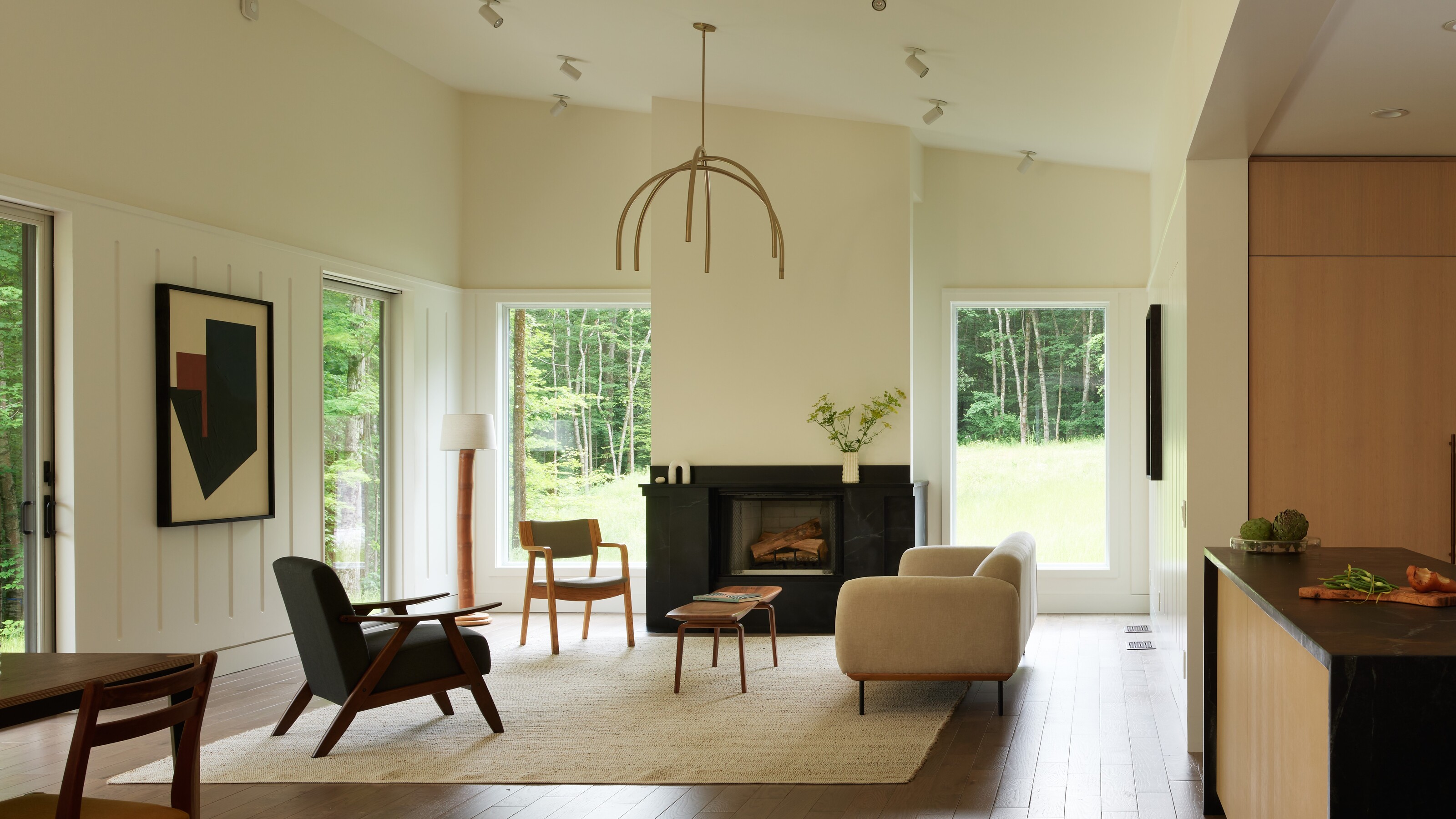
Nestled in a forested 12-acre plot in New York State, this luxurious, minimalist retreat designed by Alepreda Architecture Alepreda looks out onto verdant forested views of the Harvey Mountain State Reserve.
The choice in natural materials and neutral colors create such a cocooning feeling of refuge, with pared-back decor so as not to compete with the spectacle of the changing seasons taking place outside.
It's the unique wall paneling that really helps the home come into its own. Cleverly drawing the eye upwards, the panels reflect the shape of the surrounding trees, vertical lines mirroring the sculptural trees outside, mimicking the landscape and reminding the visitor that the real decorative feature is the view from this modern home's windows.
'The interior recognizes that the landscape is far more interesting than the architecture could ever be,' explains head designers, Alessandro Preda. 'The idyllic site varies so much throughout the year and we have ensured that the residents can experience the full spectrum of drastic seasonal changes: from thick snow covering in the winter to the spring wildflower to the lush green of summer meadow grasses.'
We speak to the designer to find out the multiple ways this was achieved, including through the use of unusual and creative wall paneling that brings interest and texture to the walls.
Blending interior and exterior spaces
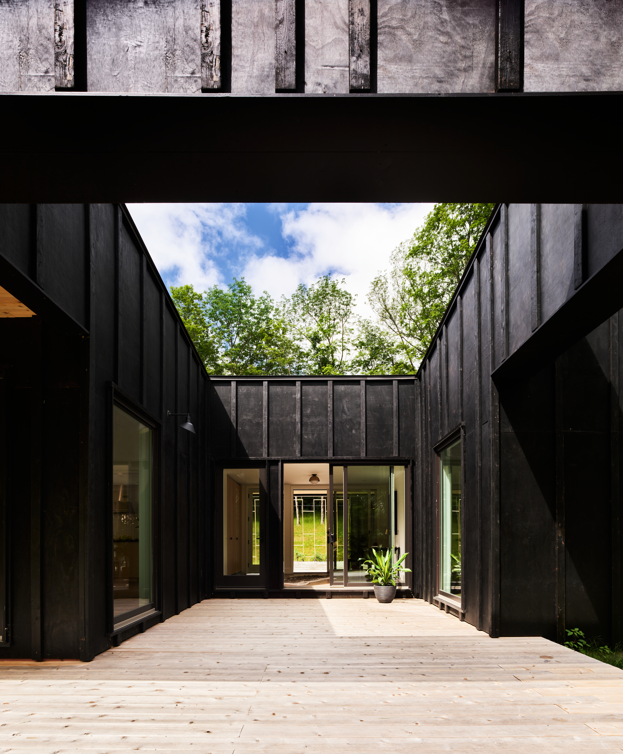
First, the house embraces its woodland location by blending the interior and exterior spaces. This creates a gradient (both visual and spatial) from indoor to outdoor,' says Alessandro.
The interaction with the stunning natural environment is achieved by carefully framing views. 'A single tree, the pond, the moving clouds, a foreshortened panorama below a cantilevered beam, a sloping landscape seen through a trellis wall, and courtyards with varying scales and levels of enclosure.'
The windows are calibrated to maximize views and let in direct and indirect natural light. For instance, the living room's northeast corner opens the room to a naturally fed pond. 'The entry foyer is fully glazed on two sides and the massing also creates various framed views from which to gaze at the landscape.'
Natural furniture and decor

The living room is the heart of the home, where the aesthetic is cozy yet simple and refined. Furniture is floated on a central rug, angled towards the centerpiece of the room - a jet-black fireplace made from locally sourced soapstone.
The floated furniture trick requires you to refrain from pushing all pieces of living room furniture to sit flush against the walls, pulling the furniture in to create zones and a cozy feel, embracing all sides of the sofas instead of hiding certain angles of your furniture. This keeps the room feeling intimate despite the masses of space, white walls, and high ceilings.
'The living room scale is rather large, measuring 17' 3" x 33' in plan, and has a very tall ceiling sloping from 11' to over 13',' explains Alessandro Preda.
'Moreover, a large portion of the living room is glazed with large windows that touch the floor. The design intended to create an airy and expansive space and connect this room to the forest visually and spatially. The furniture floats to maintain a free-flowing circulation on the living room's perimeter. This is essential to maximize the views and permit easy outdoor access.'
'Also, having the perimeter floor empty connects the wood floor to the exterior deck, which visually looks like a continuation of the interior floor.'
Wall paneling
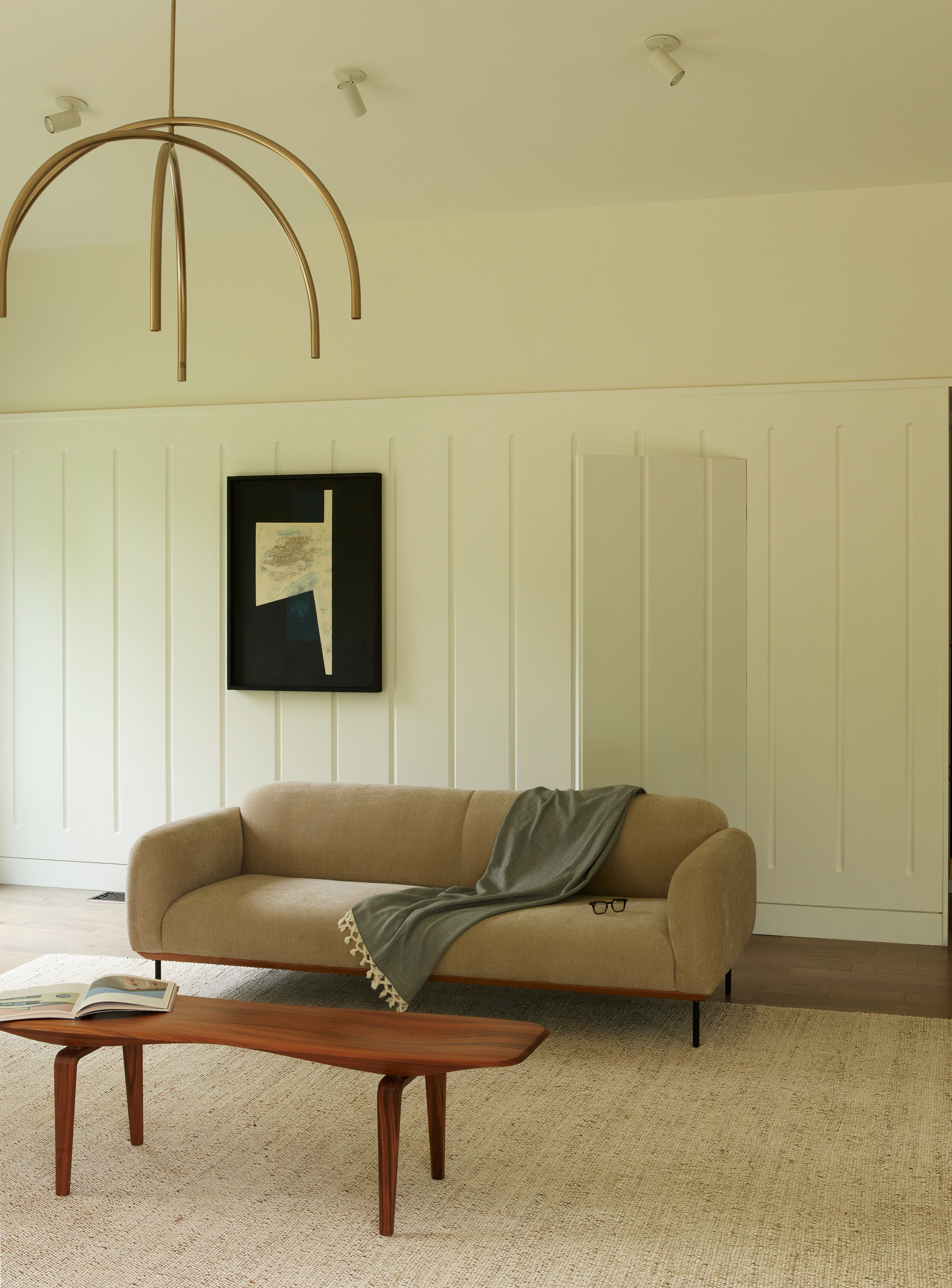
Wall paneling surrounds the outskirts of the living room, concealing a secret door leading to a powder room and the basement level. This seamless addition keeps the space calm and avoids too much visual clutter, appealing to a minimalist look.
This element hints at traditional wainscoting typical in the North East, and vertical fluted details mimic the trees outside, emphasizing the connection to nature. 'The patterning of the facade boards, batten system and interior paneling, with their verticality and occasionally irregular spacing, hints abstractly at the trees of the forest outside,' says Alessandro.
Overall, the interior material palette is refined, understated, and mostly specific to the region. White oak cabinetry and stained oak wood floor complement the off-white walls.
On the white walls, Alessandro has carefully curated artwork. The artwork was painted by the designer specifically for the project. 'The client did not have an art collection, but we felt it was important to have some abstract paintings on the wall. These paintings are part of a series of abstract, loosely architectural shapes that I have developed as a hobby in my free time. Up close, the paintings show material build-up and have texture.'
Minimalist decor
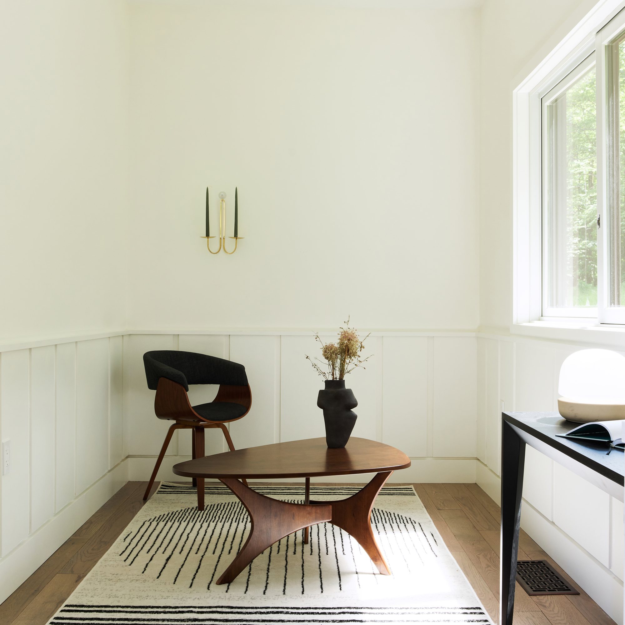
When it comes to minimalist decor and pared-back furniture, Alepreda designs and commercializes a line of furniture under the moniker Miduny. 'We prototype all furniture in our Brooklyn workshop and collaborate with Italian artisan to create small batches of unique products,' says Alessandro.
'Given our friendship with the client, in this project, we included several pieces of our own design, including the dining table, walnut bench, ebonized desk, console table, and stool. The mirrors were specifically designed and built for this project.'
Embracing the view
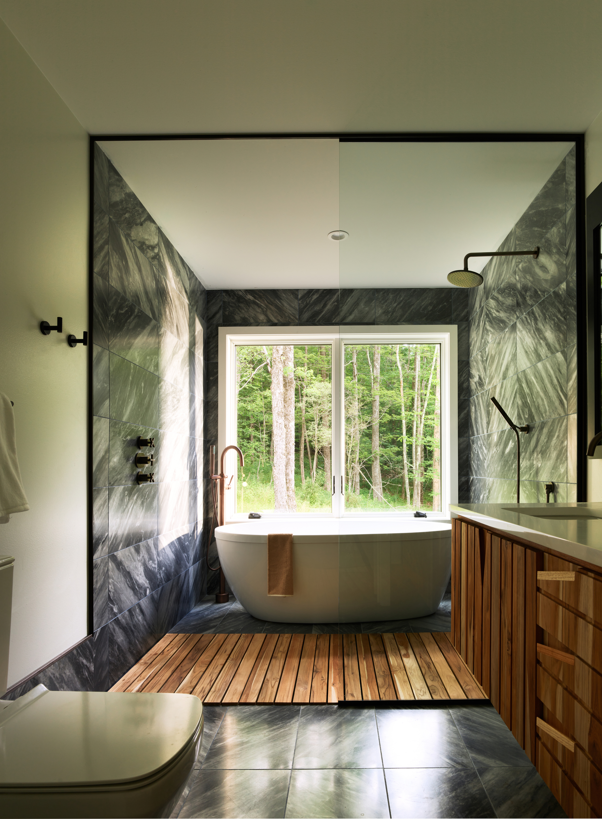
Bardiglio marble tiles clad the entire walls of this space, which has a spa bathroom feel, with teak on the shower floor and vanity. The soaking freestanding tub sits by a large operable window that opens fully to enhance the connection to the outdoors.
'The primary bathroom has a cave-like feeling,' says Alessandro. 'The use of a dark natural stone helps frame the window and propels the gaze toward the exterior.
'The bathing area beyond the glass partition houses a large shower and a tub. This area is fully-clad in stone, and geometrically it's a perfect cube. The simplicity of this shape is essential to maintain the focus on nature outside of the window.'
The color palette
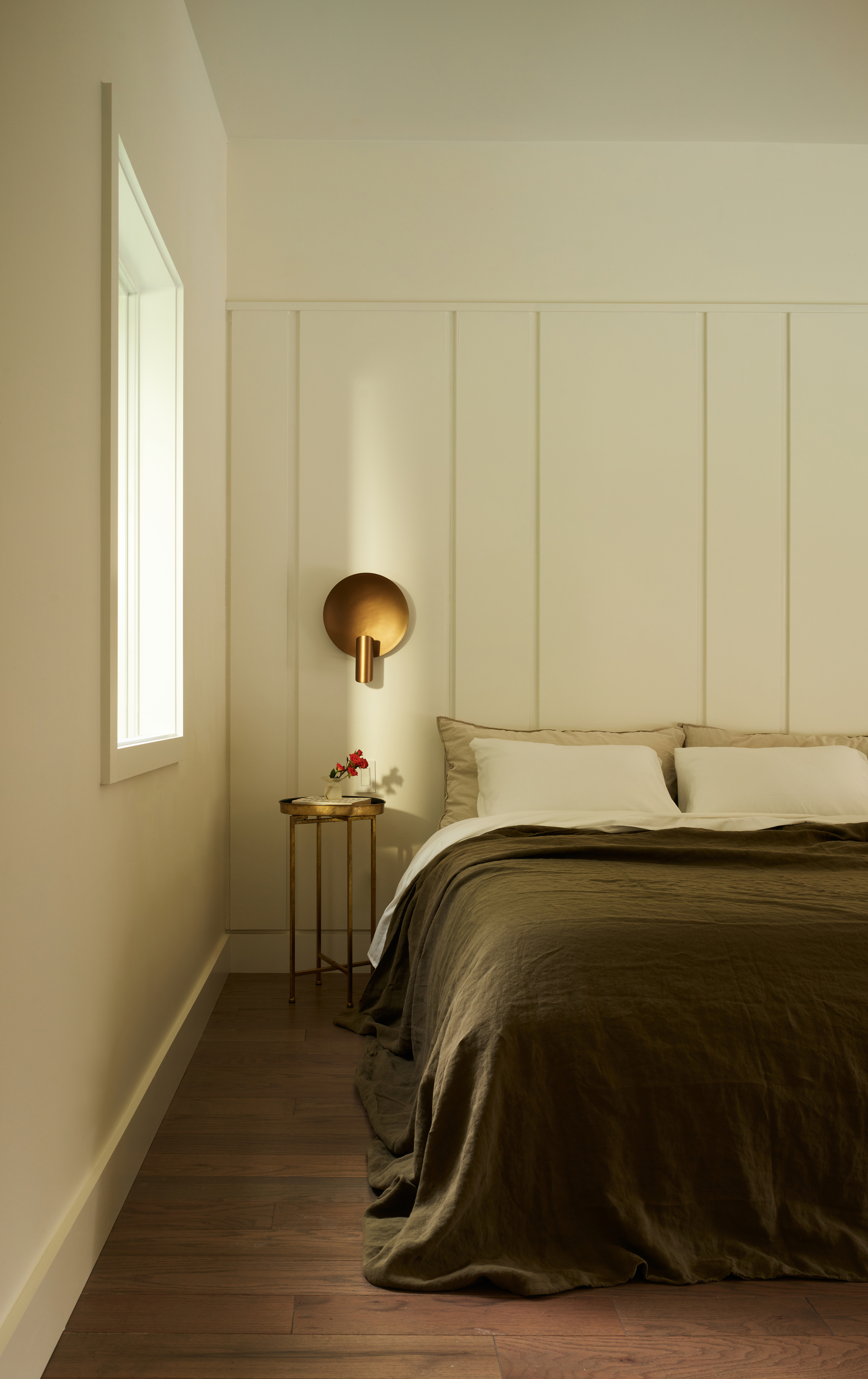
The palette of the home is neutral, with a pop of green from the trees radiating in through the windows. In the primary bedroom, paneling creates a headboard, and soft, moss-colored bed linen creates a cozy bedroom.
'The color palette has muted natural tones and subtle texture to provide a sense of tactility,' says Alessandro.
'The most common material in the palette is wood. The exterior is clad in charred wood and cedar. The interior wood floor has a warm brown stained oak floor. All walls are off-white, and some rooms have an off-white paneling system that gives walls a texture and tempo. Walls are kept neutral so as not to compete with the outdoor landscape.'
