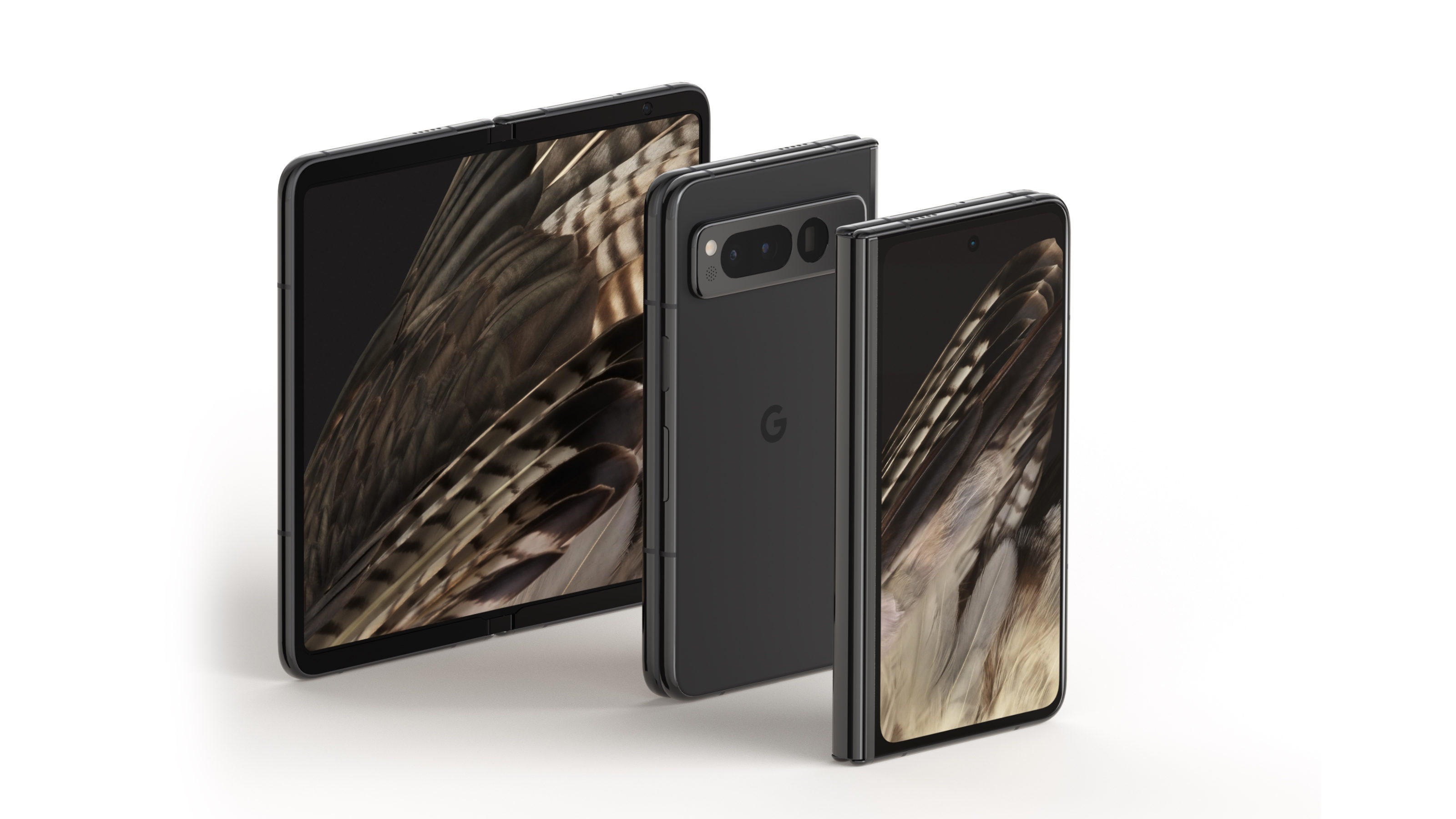
For a while, we were on the fence about foldables. The idea of shutting away that all-conquering screen made clamshell-style folding phones slightly more desirable, but phones that expand to twice their regular size? It seems excessive. After a few weeks with the new Google Pixel Fold in our pocket (following our Pixel Fold preview in May 2023), here’s what we discovered about this still niche approach.
For a while, it’s as if Google had similar misgivings. The Pixel Fold is the company’s first step into this technological minefield, gingerly following behind pioneers like Samsung and Oppo, quietly hoping that its rivals will have taken the hit on crucial elements like endurance and durability. Put simply, the Fold takes the Pixel design language and incorporates it into a three-screen device, 5.8in on the front, and 7.8in when unfolded into a squarish tablet shape.
Google Pixel Fold: pros and cons
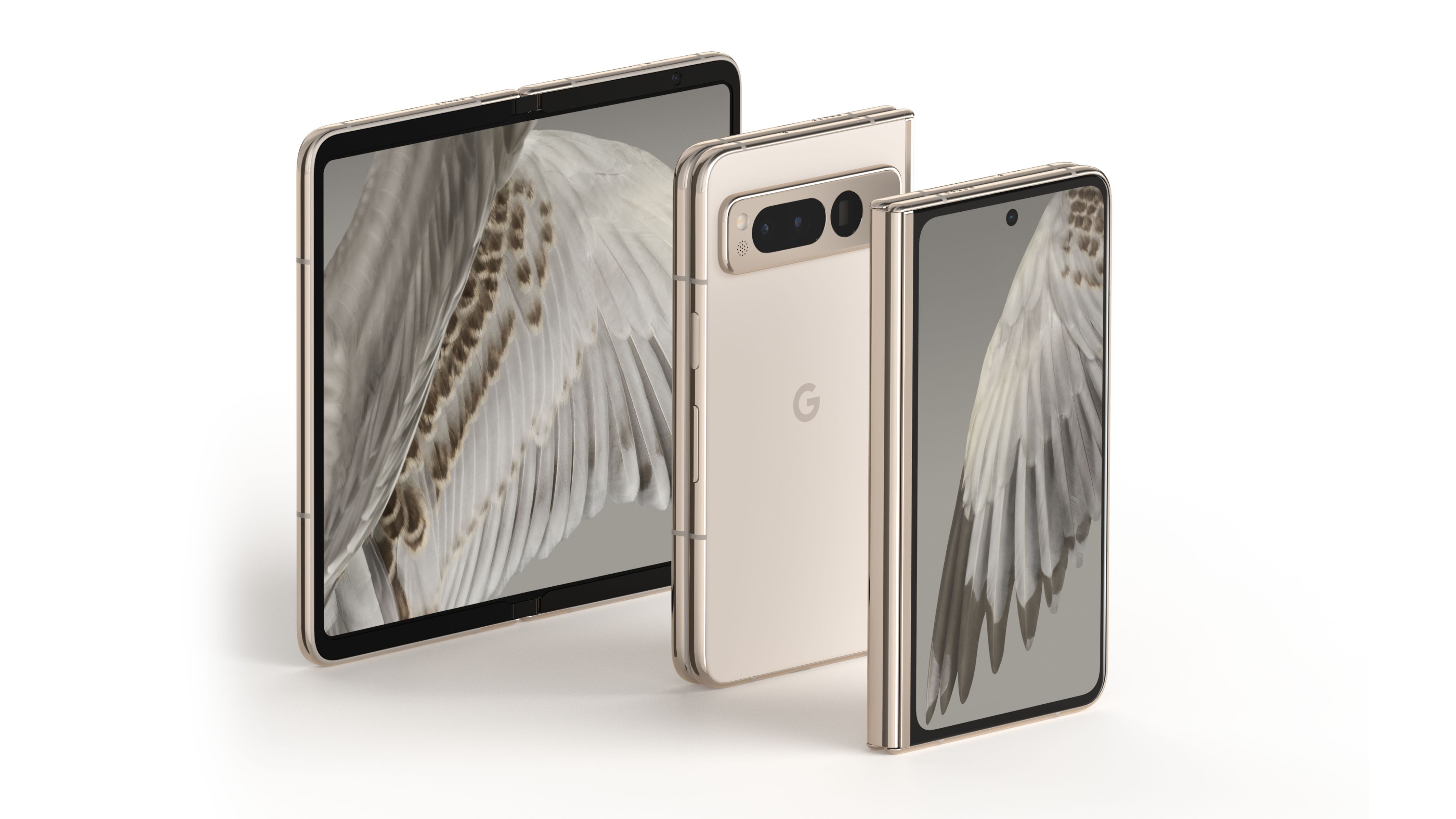
Now we’ve had a chance to live with the Fold for a few weeks, it’s time to weigh up the pros and cons of this new flagship device. In 2023, owning a folding phone still sets you apart. We’ve reported before on the ups and downs of the nascent foldable market, but the fact remains that nearly four years after Samsung took to the plunge and introduced a hinged screen, the consumer take-up for these flagship devices is still a fraction of the billion-plus smartphones sold around the world each year.
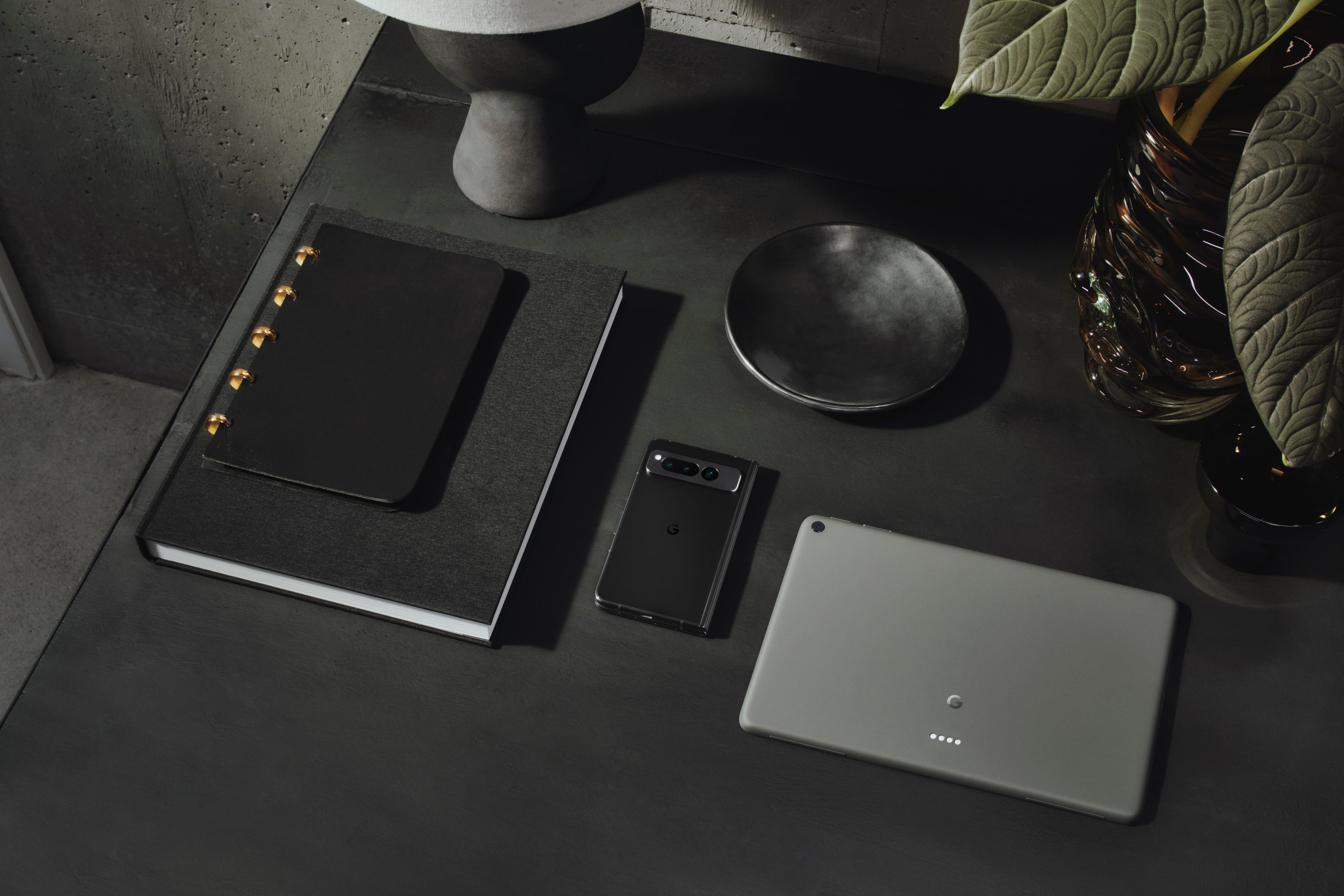
The Google Pixel Fold slots straight in at the top of the company’s hardware charts, a pricey item that’s meant to consolidate your digital life into one pocketable device. So is this a true flagship or still a work in progress? Our time with the Fold suggests it’s a device that reins you back from using its full potential 100 per cent of the time. Remember that the early, early adopters of touchscreen smartphones weren't always keen to whip out their black mirrored devices in public. It took mass adoption before people stopped getting side-eye on public transport for catching up with a box set on their commute. It’s a similar thing with opening up the Fold in public – you feel a little exposed.
What stops this from being frustrating is the quality of the external 5.8in screen and accompanying camera. In many respects, it’s almost too good, because the Fold is fast enough – and thin enough – to do most on-the-move tasks without flexing the larger screen size. Your screen activity becomes more focused as a result, with the luxury of the unfolded device best suited to downtime, not periods of manic focus.
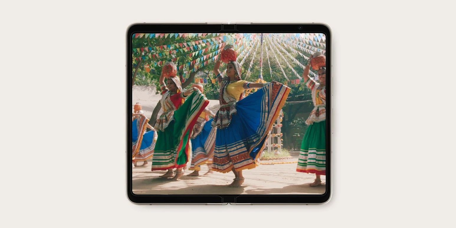
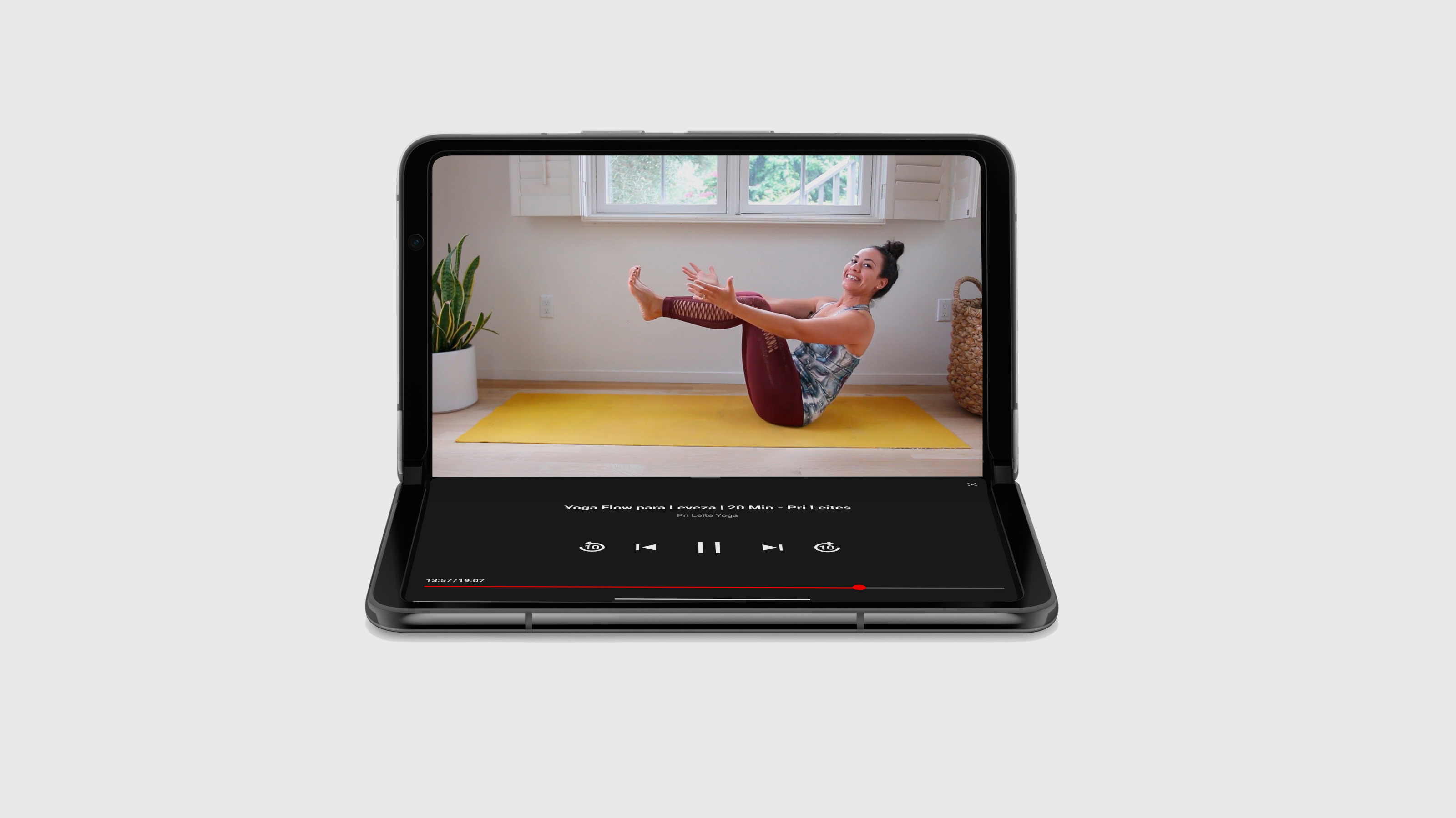
There are other benefits to the Fold. For a start, it is its own tripod, propping itself up for selfies, video calls or just watching a video. Half open, it serves as a decent micro-scale laptop, with the keyboard appearing on the bottom screen. Google’s apps have been rejigged to exploit the larger screen and split screen function – dragging and dropping a photo from Google Photos into Gmail, for example. The hardware design is magnificent, with a solidity to the stainless steel hinge mechanism, as well as a remarkable thinness when closed. It snaps satisfyingly shut, even though one is always mindful of the possible fragility of this relatively new technology.
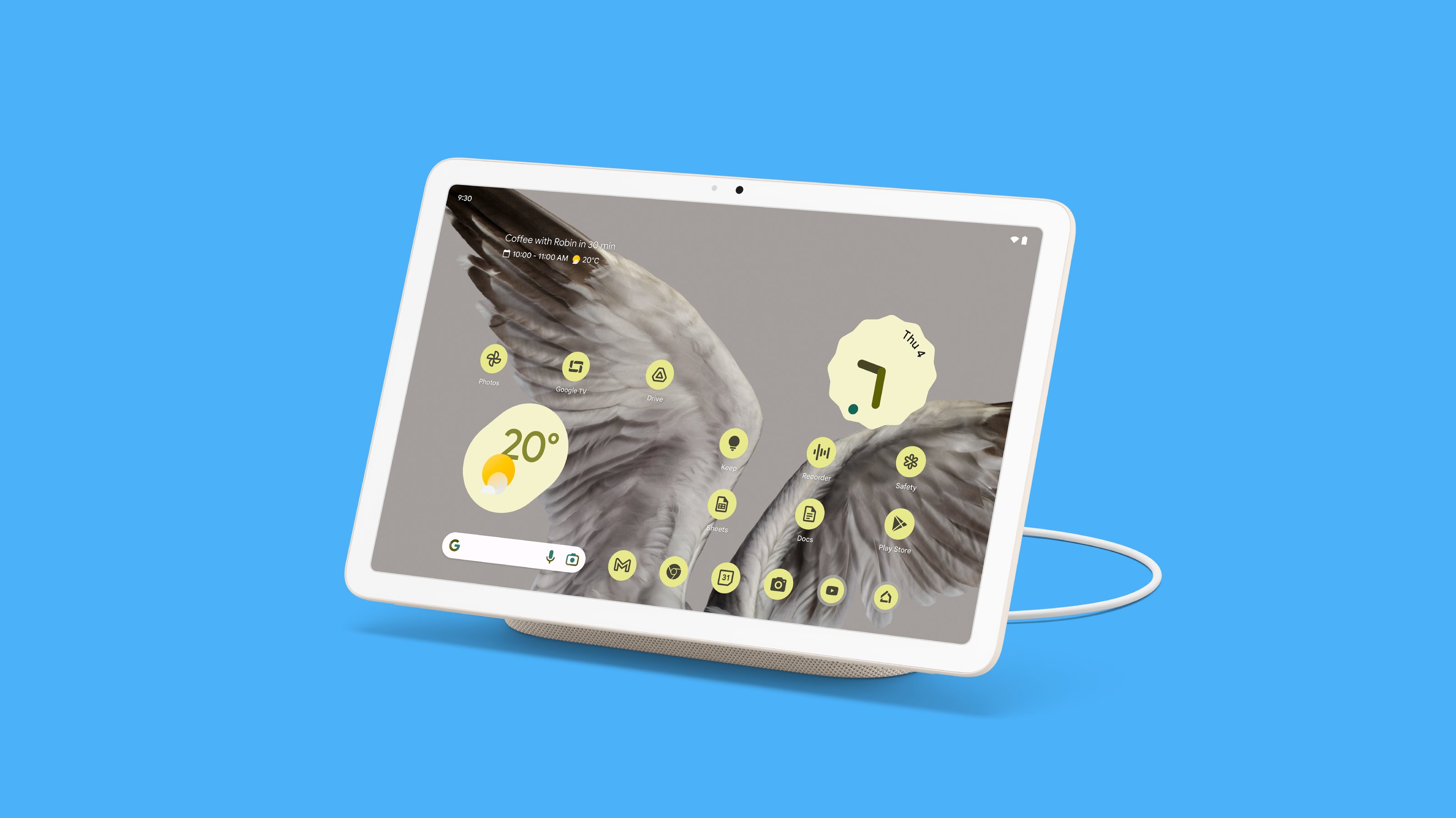
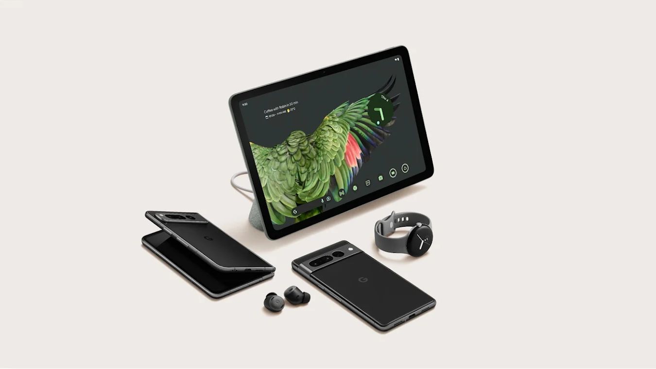
Pixel fans will be instantly at home. However, there’s no escaping the fact that you can acquire both the excellent Pixel Tablet (currently £599) and the latest iteration of Google’s smartest smartphone, the Pixel 7 Pro (currently £849) for less than the price of the Pixel Fold. If you’re deadly serious about cutting down on screen time, then products like Motorola’s Razr 2022, newly released Motorola Razr 40 and Samsung’s Flip series take the more logical compact clamshell approach to shut distractions away as much as possible. For early adopters who don’t like to compromise, the Google Pixel Fold has much to offer.
Google Pixel Fold, from £1,749, Store.Google.com
Behind the scenes at Google’s design studio with Claude Zellweger, head of Industrial Design for AR and Phones
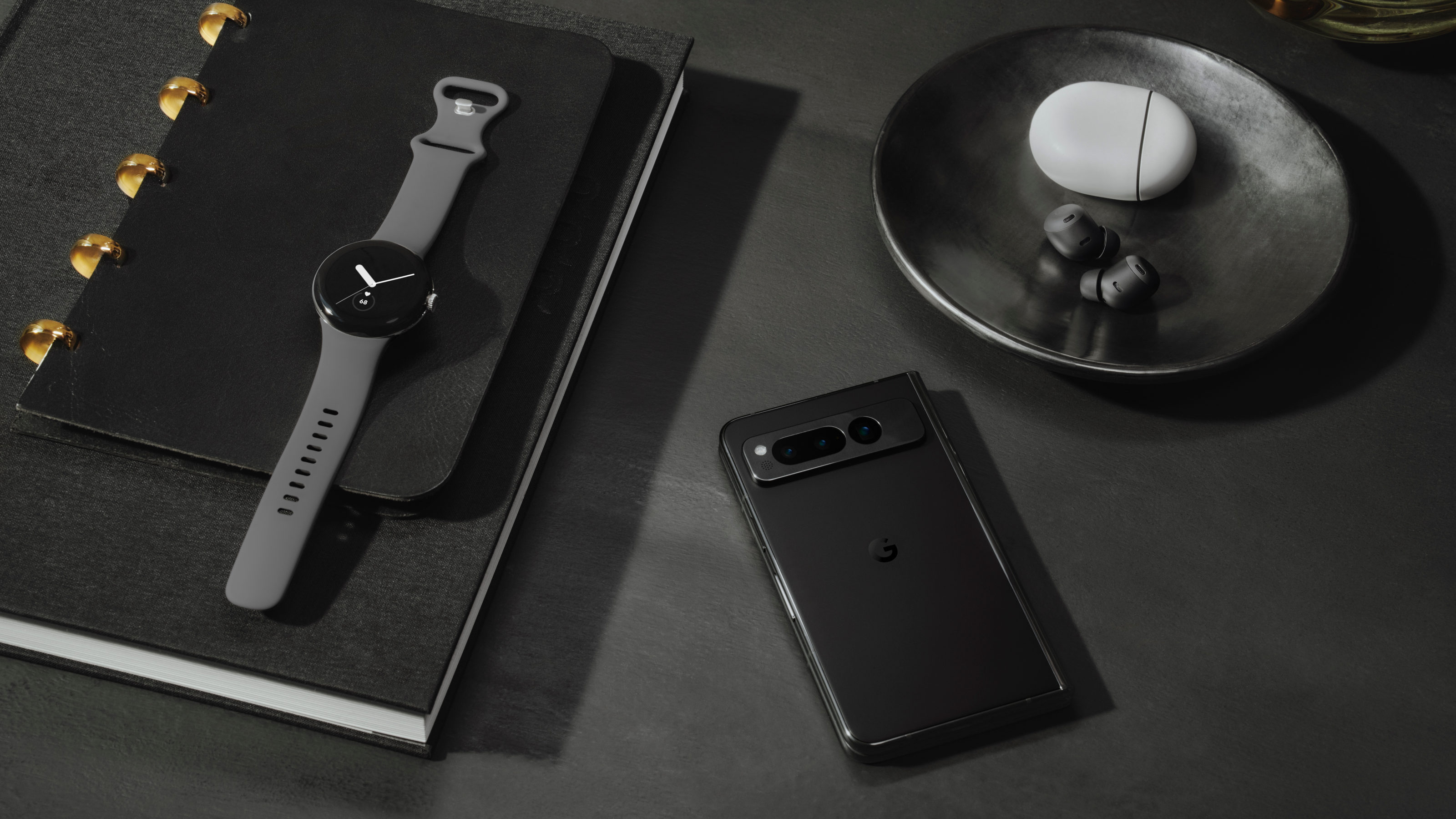
We spoke to Claude Zellweger, Google’s head of Industrial Design for AR and Phones, about the challenges of getting the Pixel Fold to market.
Wallpaper*: What was the primary hardware challenge for Google, given that other manufacturers have been making folding devices successfully for several years?
Claude Zellweger: We know – with Google’s services and capabilities – that we are uniquely positioned to deliver the best foldable experience. Our mission was to remove any friction for users to adopt this new and exciting product category. Historically, foldable devices would get you the benefit of a bigger screen, but with it came a clunky hardware experience. Our primary focus was achieving a size that matches the familiar proportions of a smartphone – we wanted the thinnest foldable on the market, without compromising great build quality. We loved the proportions of passports and used them as a blueprint for our design.
The compact yet rock-solid hinge had to be engineered to provide a satisfying, almost vacuum-like sensation when the device snaps closed. We wanted an element of surprise. The ‘spine’ of the hinge is made of stainless steel – we needed something that ticks both boxes in terms of fluidity and scratch resistance. But also something that looks and feels highly polished.
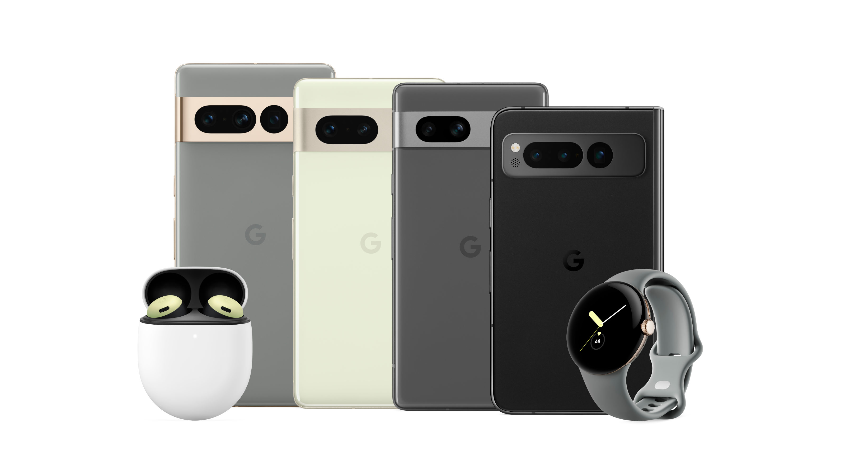
W*: How long was the design and development process and how many prototypes were built?
CZ: The total process was pretty lengthy and much longer than a typical smartphone given its a new category for us – close to five years in total. The hinge design in particular was a long dance between engineers and designers. It took a ton of iterations to get it extremely compact while retaining that satisfying experience when opening and closing the device. Halfway throughout the development we had a working product, but we ultimately decided to hold back as we felt we could do better. We had to make sure our first foldable would exceed market expectations.
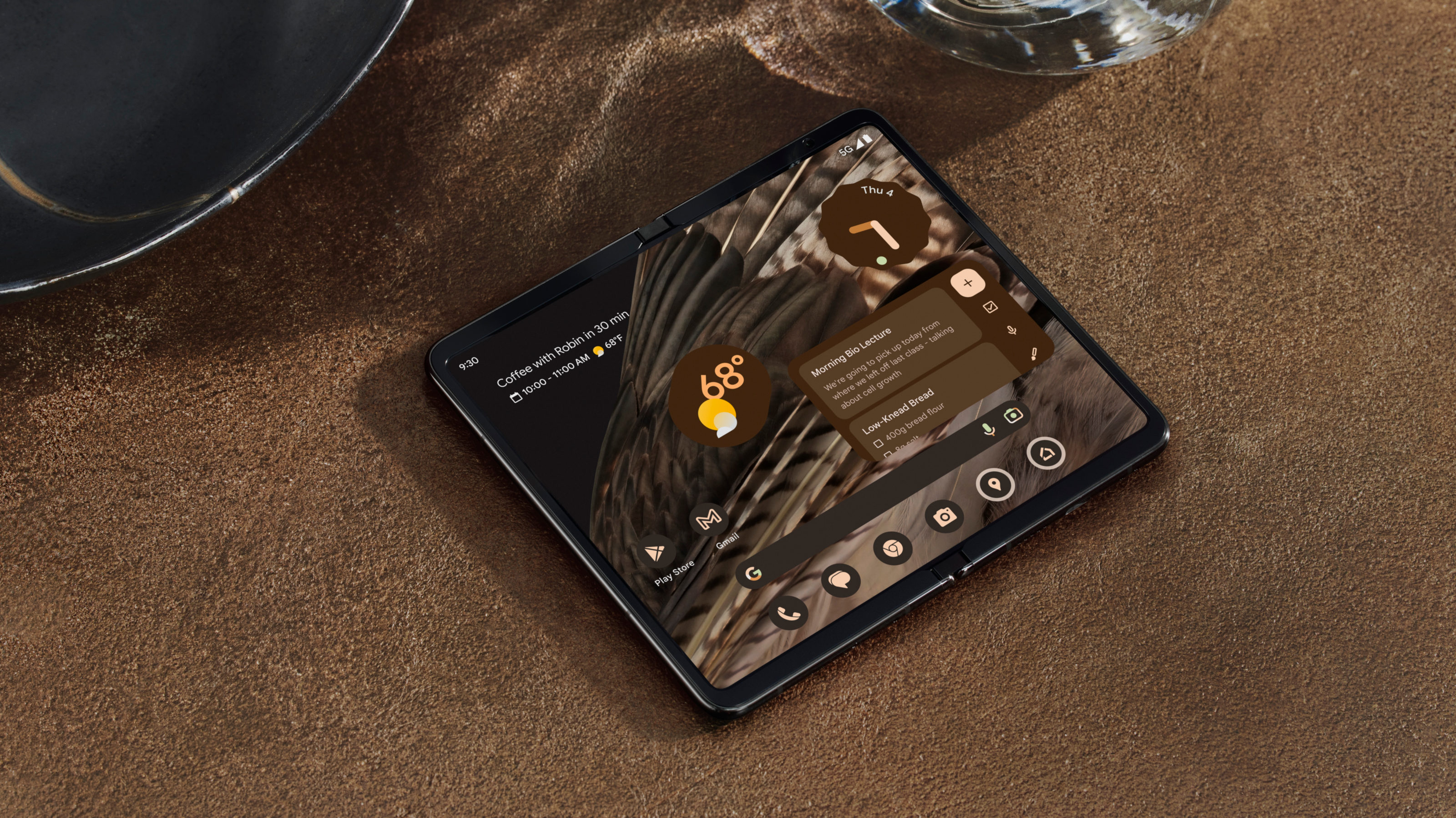
W*: How does the expanded screen enhance the Google software experience?
CZ: Rather than just adapting, we build our experience from the ground up for a large screen. Continuity is a major principle – not lose your place when you transition between postures – close, tabletop, dual screen. We know that people use foldables mostly when they are shut, so it was of course important to ensure that the user experience is seamless when the phone is shut. The ‘delight’ factor kicks in when users open the device, and suddenly they can watch their favourite movies or shows in a widescreen mode, or in tabletop mode.
W* Are there any compromises due to the fold? Conversely, are there any advantages that this format gives you?
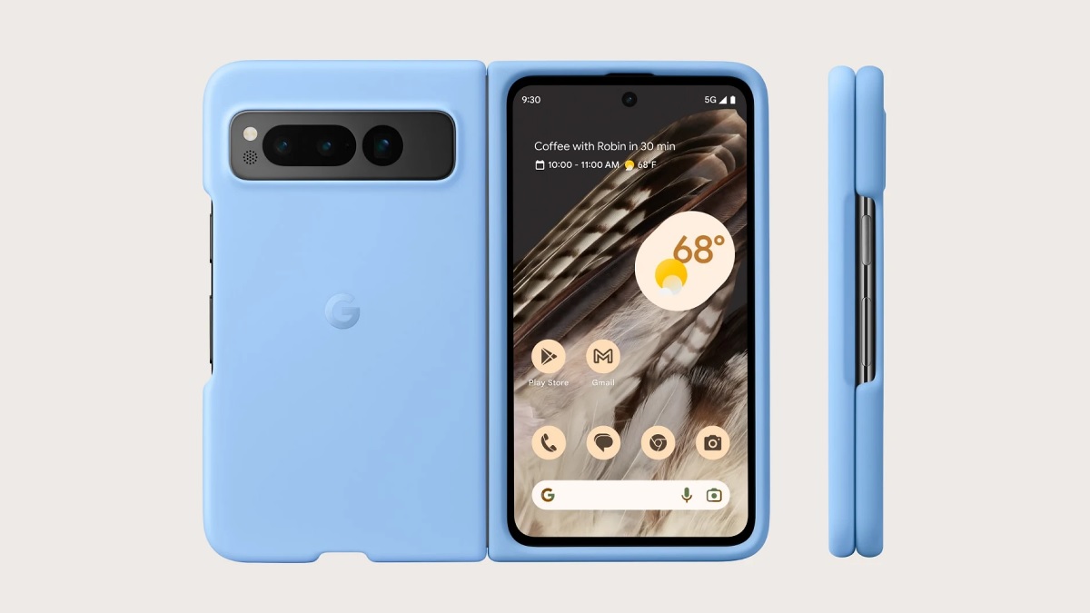
CZ: We wanted to make sure that the Fold had that distinct Pixel look, so we had to have discussions of how and where our camera bar would integrate into the device. Some key advantages of the dual screen include the rear selfie camera mode, which means you no longer have to compromise on quality for selfies with your friends. What’s more, dual interpreter mode (coming soon), will make the translation experience far more sophisticated when travelling. And clearly, who doesn’t love a larger screen when you watch a movie?
W*: Do you think foldable phones are still in a beta phase, much like the first wave of mobile phones in the 1980s?
CZ: It’s been incredibly interesting to see the increase in demand for foldables in the last few years, and I think that we can only assume that over time the devices will improve and also come down in cost, similar to mobile phones in the 1980s. In terms of utility, we’ve definitely gone past the novelty phase to where we see a sharp rise in users for whom foldables are their ’daily driver’. For me as a designer, what’s been really interesting is how colour and materials can shift user perception of what a foldable can be. For example, in my opinion, the Porcelain colourway on Fold really takes the device from a technology-first product to a product that feels warm, personal, luxurious, and most importantly, to a product that people can visualise as their day-to-day mobile device.
W* Would Google ever consider making a clamshell foldable?
CZ: Right now, I believe the form factor of the Pixel Fold is optimised for what Google is great at – productivity and entertainment use. Having said that, we’re committed to this category and are naturally exploring all options. Ultimately, the most beautiful and successful products must feel personal to the consumer, and have to fit seamlessly into their daily lives. Technology adapting to people, not vice versa. This is something that we really hone in on at Google, and I think will continue to be a priority for designers in every industry.
