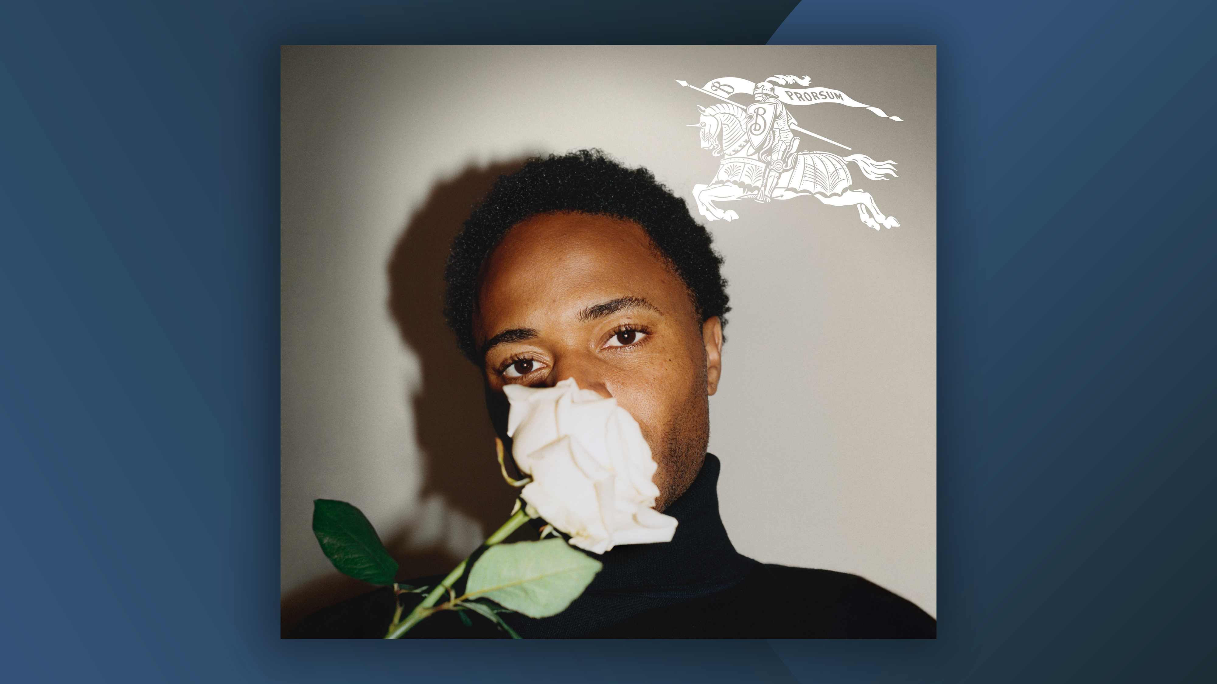
When Burberry dropped its latest rebrand back in 2023, we were particularly fond of the new logo. One of the strongest examples of the heritage logo trend we'd seen at the time, the return of 1901's 'equestrian knight' design signalled an overdue shift away from minimal, sans-serif wordmarks. But the designer of the previous logo has recently called the rebrand "reckless".
In 2018, Burberry revealed a new wordmark designed by Peter Saville. Derided by many as part of a minimal logo trend that some said was 'killing brands', the plain logotype was about as straightforward as it gets. But Saville thinks it was done away with too soon.