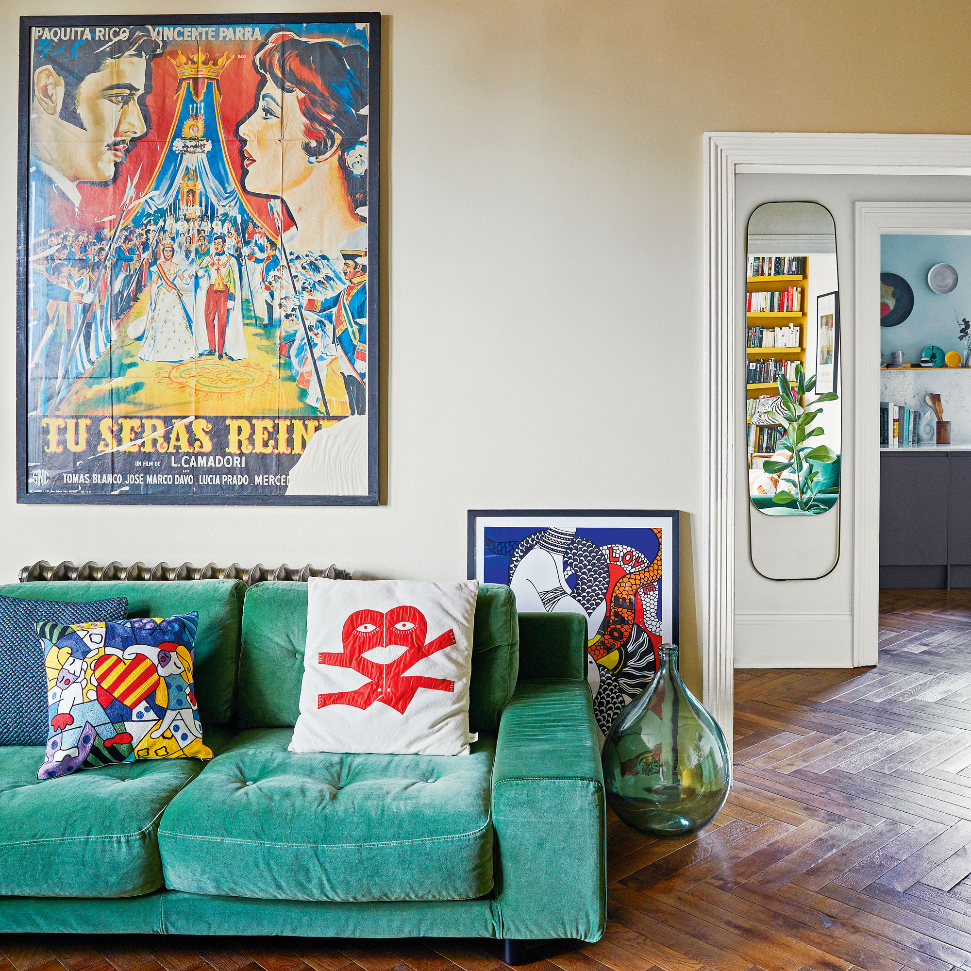
After spending the spring lockdown of 2020 confined to their London flat, this marketing consultant and interior designer, and her partner, an analyst for an energy company, were inspired to buy a home together where they could continue to take a break from busy city life.
‘We always thought we’d never leave London but, during lockdown, had enjoyed a quieter pace of life,' says the homeowner. 'We looked to St Leonards-on-Sea, in East Sussex, where we’d spent happy weekends and where several friends live.'
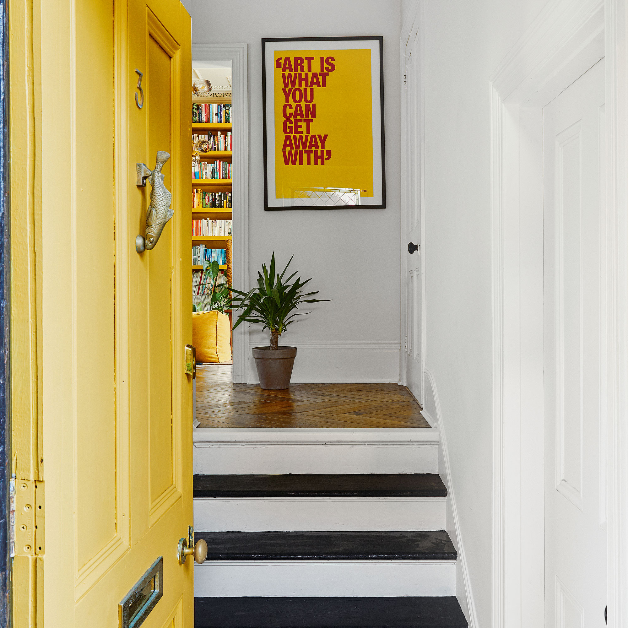
Hallway
Before
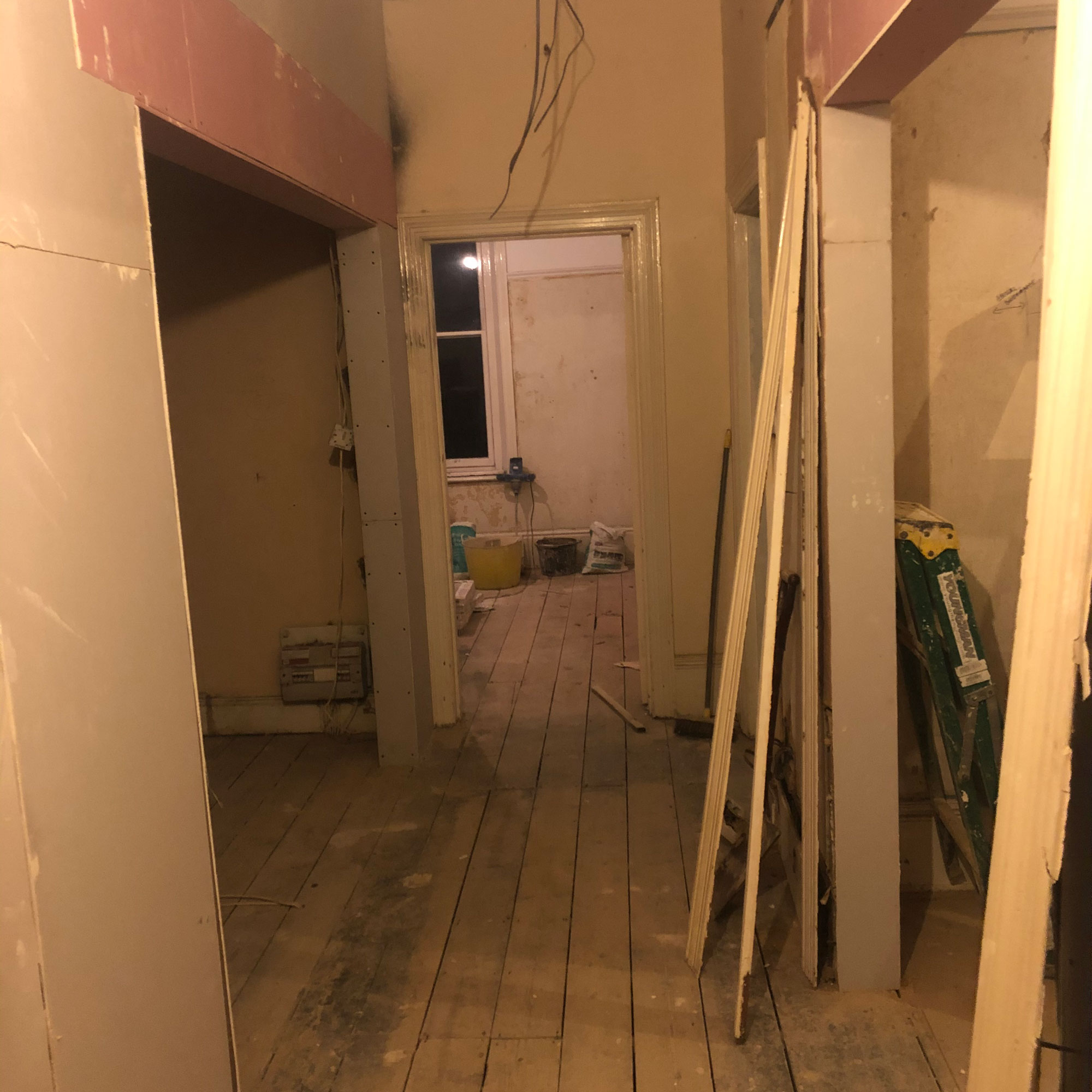
After
The couple discovered the right property, a two-bedroom first-floor flat in a shared Victorian building, after only a handful of viewings. ‘It was a glorious day and the flat was flooded with sunshine, feeling incredibly light and spacious and with so much promise.'
'We bought it from an investor who had done cosmetic work but it wasn’t in a good state of repair. However, it had stunning architectural details, such as bay windows and ornate ceilings and cornicing.’
Living room
Before
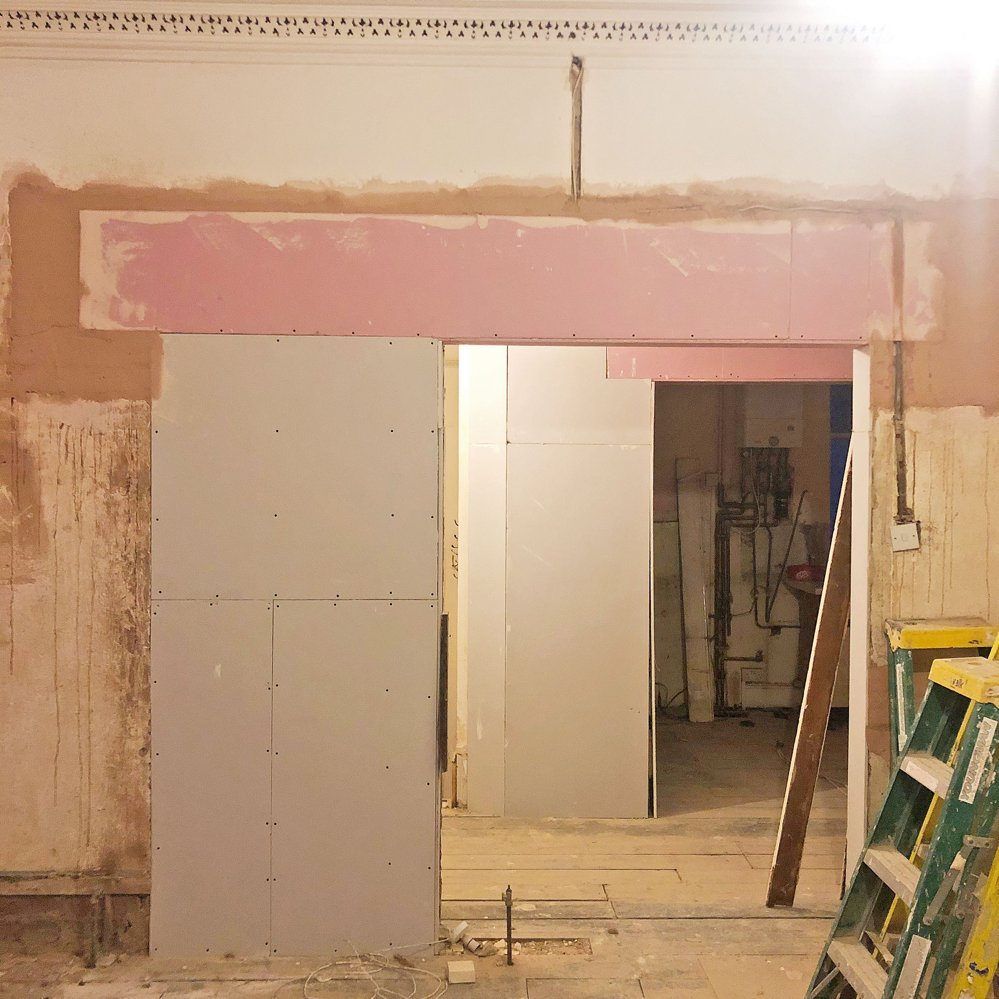
After

Following completion, the couple couldn’t move in straight away. The flat had no bathroom or kitchen, so they lived in AirBnBs for two months and used the time to reconfigure the layout.
They had always craved the parquet flooring, high ceilings and open-plan feel of classic Paris apartments, and wanted a similar look. ‘We found a structural engineer who put us in touch with a brilliant builder who sourced other trades.'
Bay window
Before
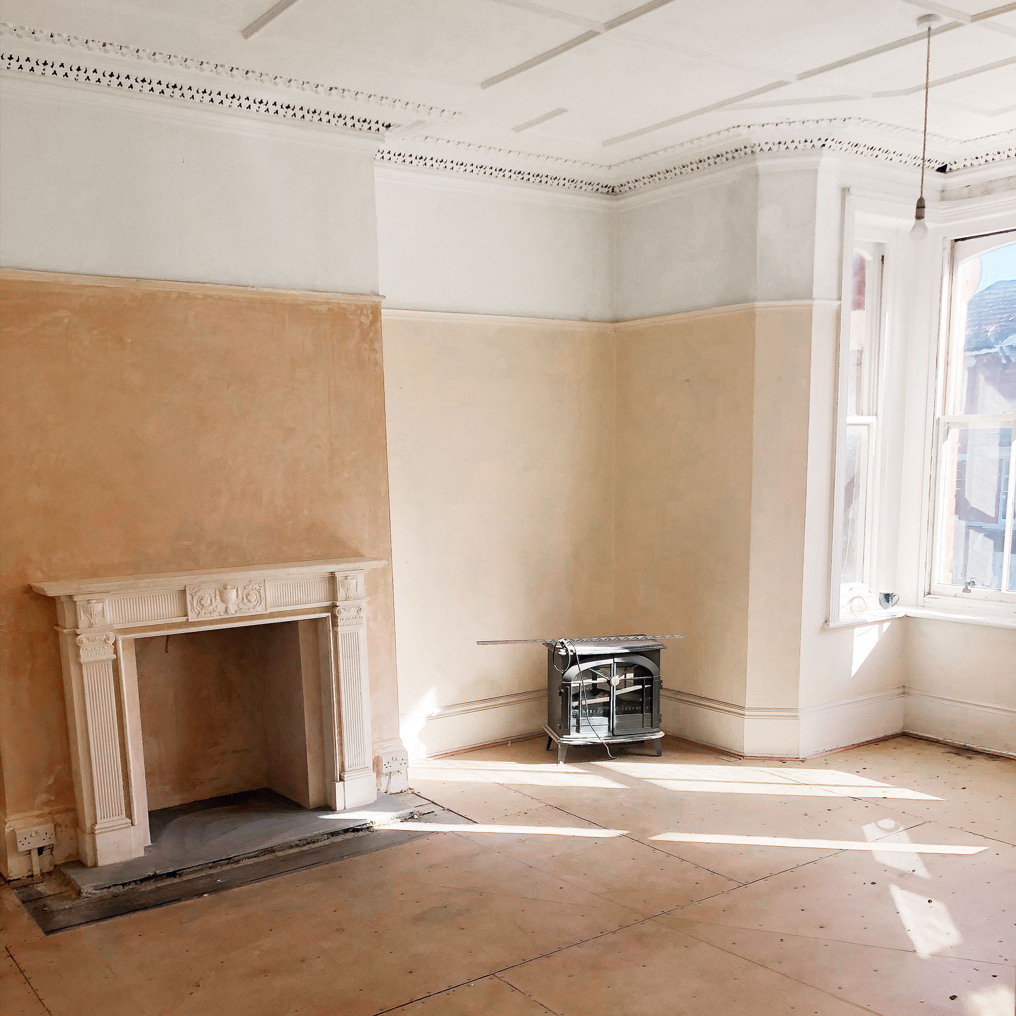
After
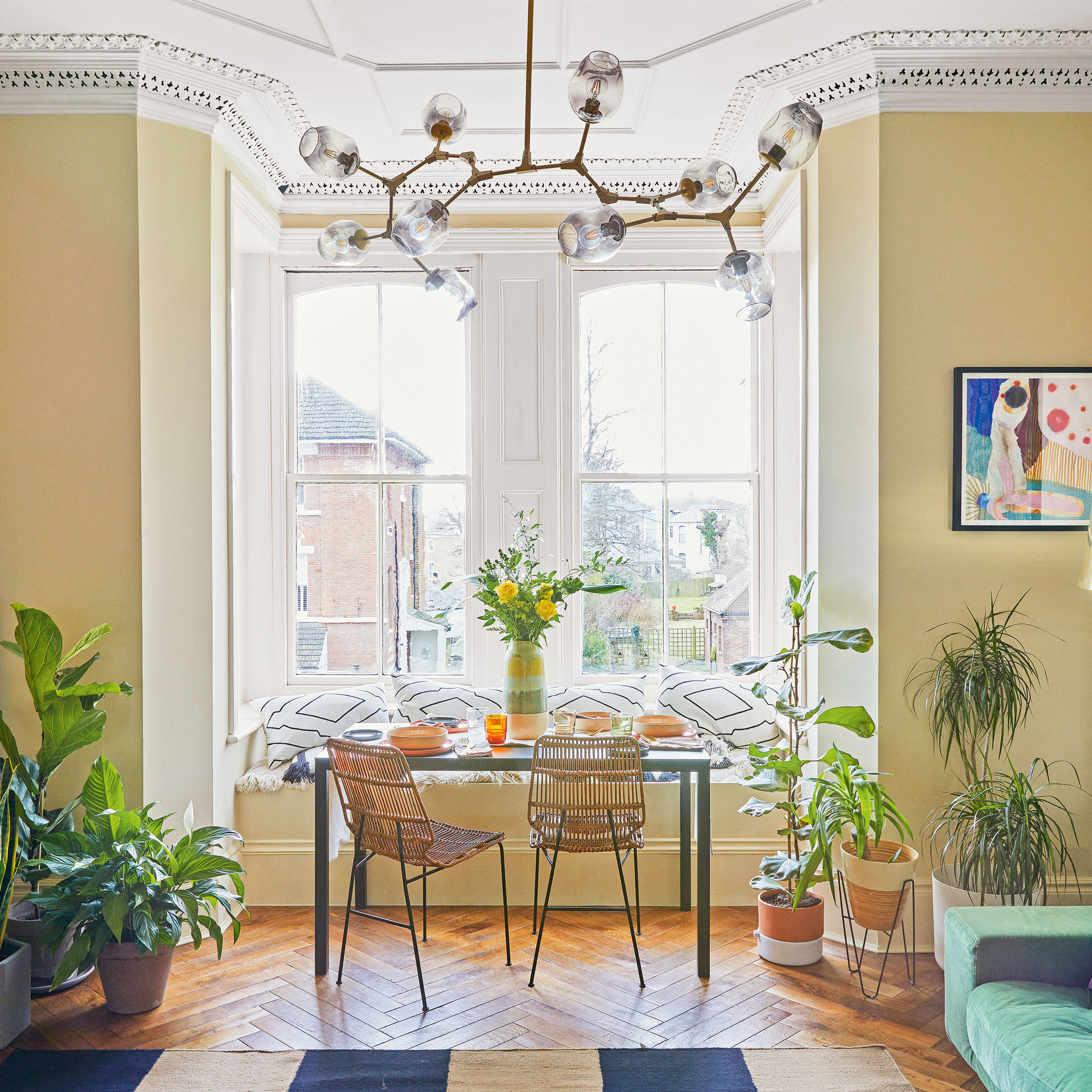
Initially, their plan was to relocate the kitchen into the second bedroom and have an open-plan living area at the rear of the property. But they realised that this side was north facing, with less light. ‘
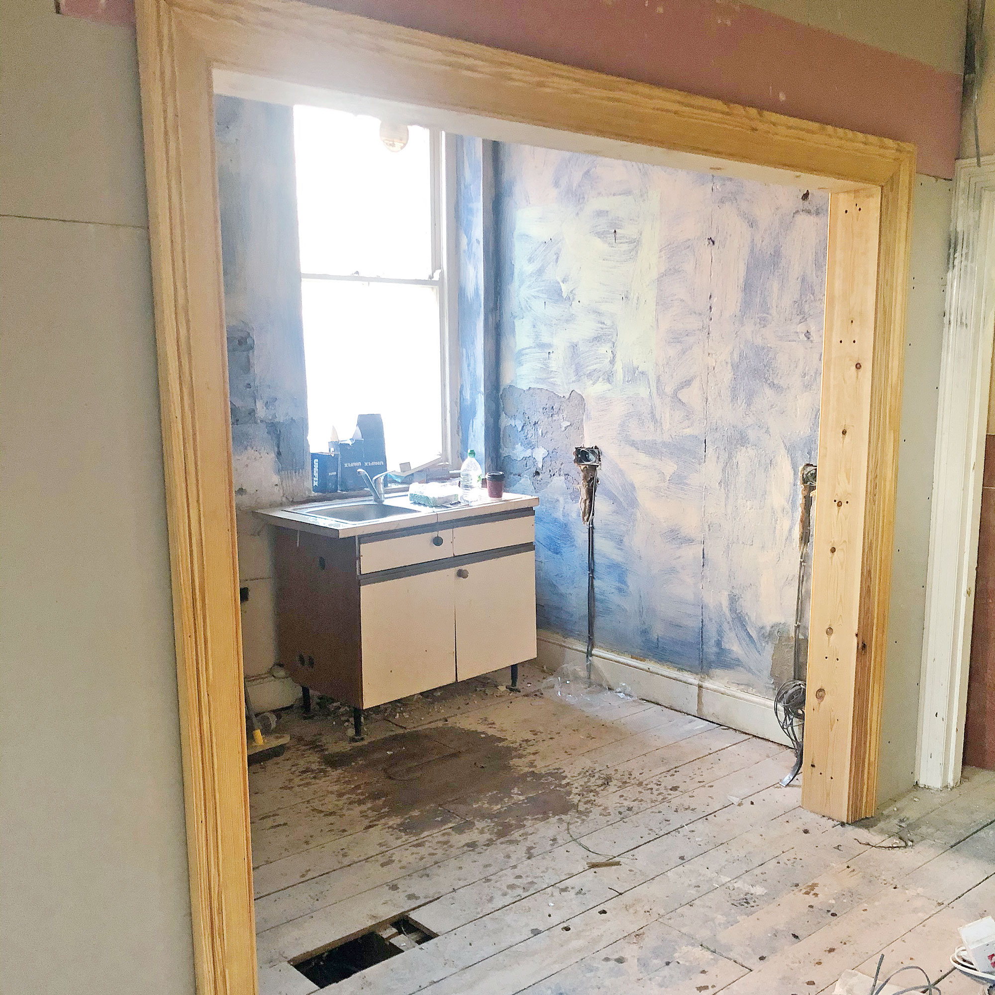
So instead, we opened up the existing living room wall, doubling the size of the doorway and taking out a portion of the kitchen wall to create an open feel here.'
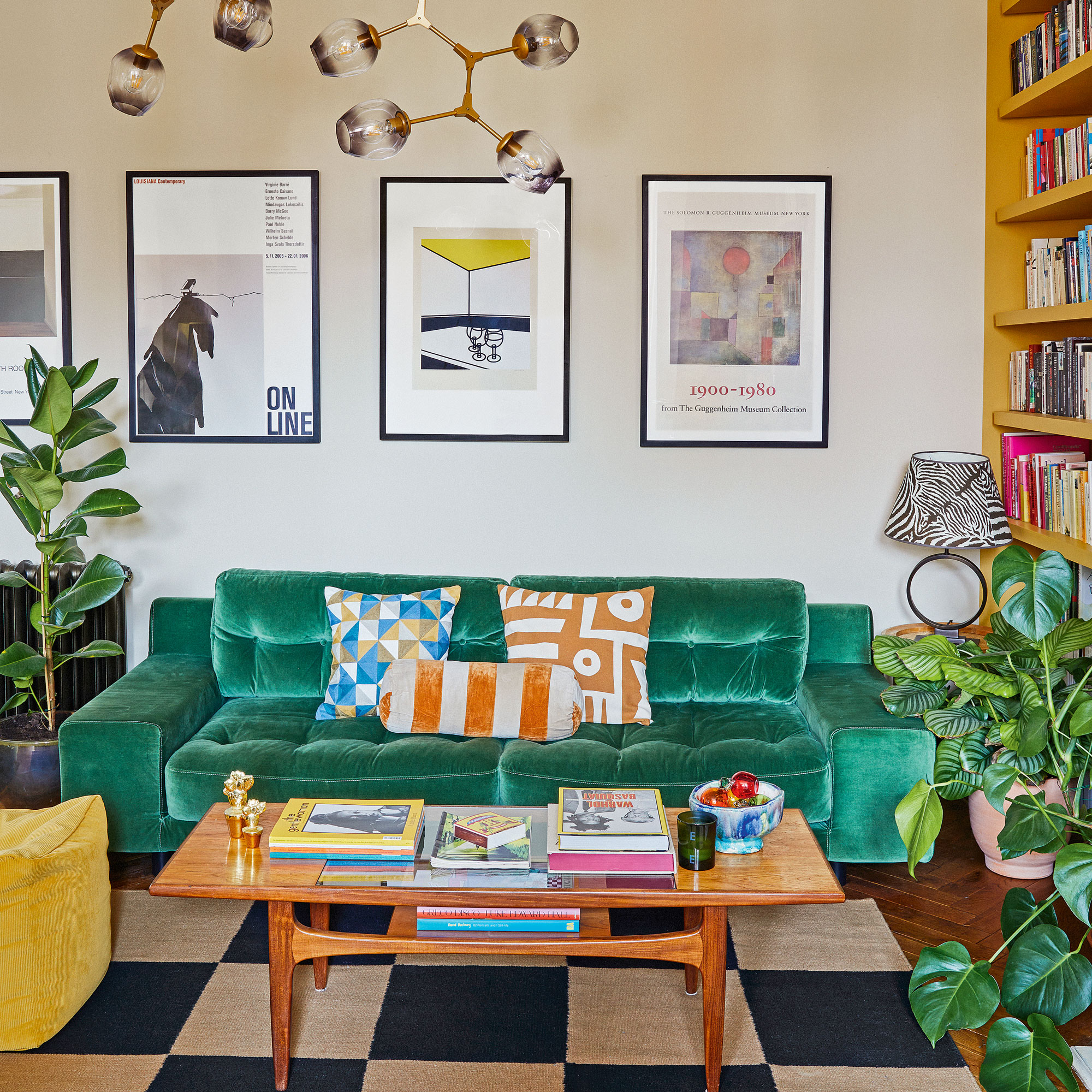
'As it’s a shared building we had to be careful, working with Building Control to ensure we met fire safety regulations. We were also very conscious of noise, so had layers of sound insulation put in under the new parquet flooring.’
Kitchen
Before
After
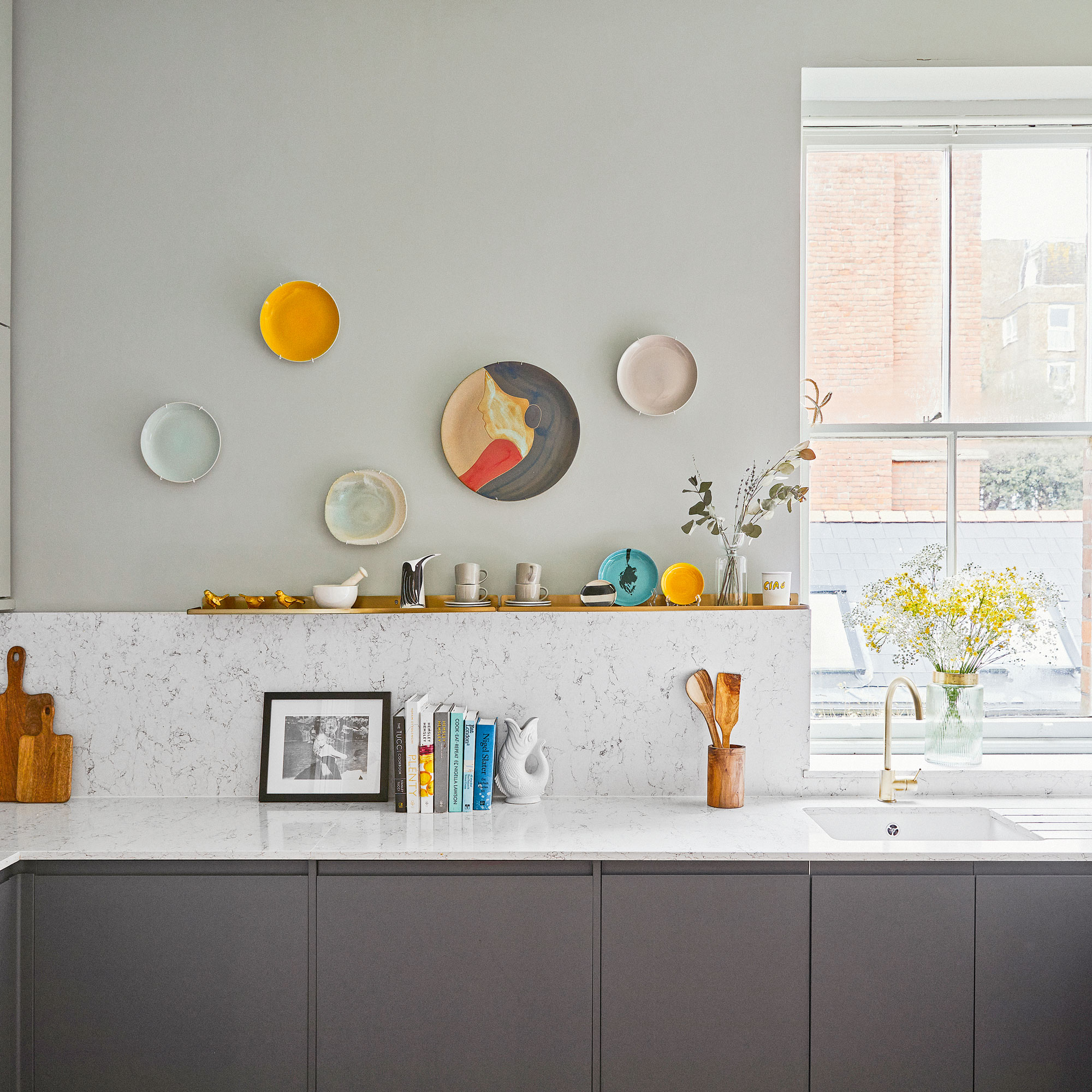
The renovation took three months, which proved to be a tricky time, as both of them were working from home. ‘We were lucky, however, that our builders were lovely and we all got on well,’ she says, ‘but I would never do it that way again.’As soon as the work was complete, she was able to flex her interior design muscles.
'One of the best things we did was use the free planning services available from the kitchen and bathroom suppliers. We worked with Howdens on the kitchen to maximise the available space and bring to life my design for matt graphite and duck-egg blue cabinetry.'
Office
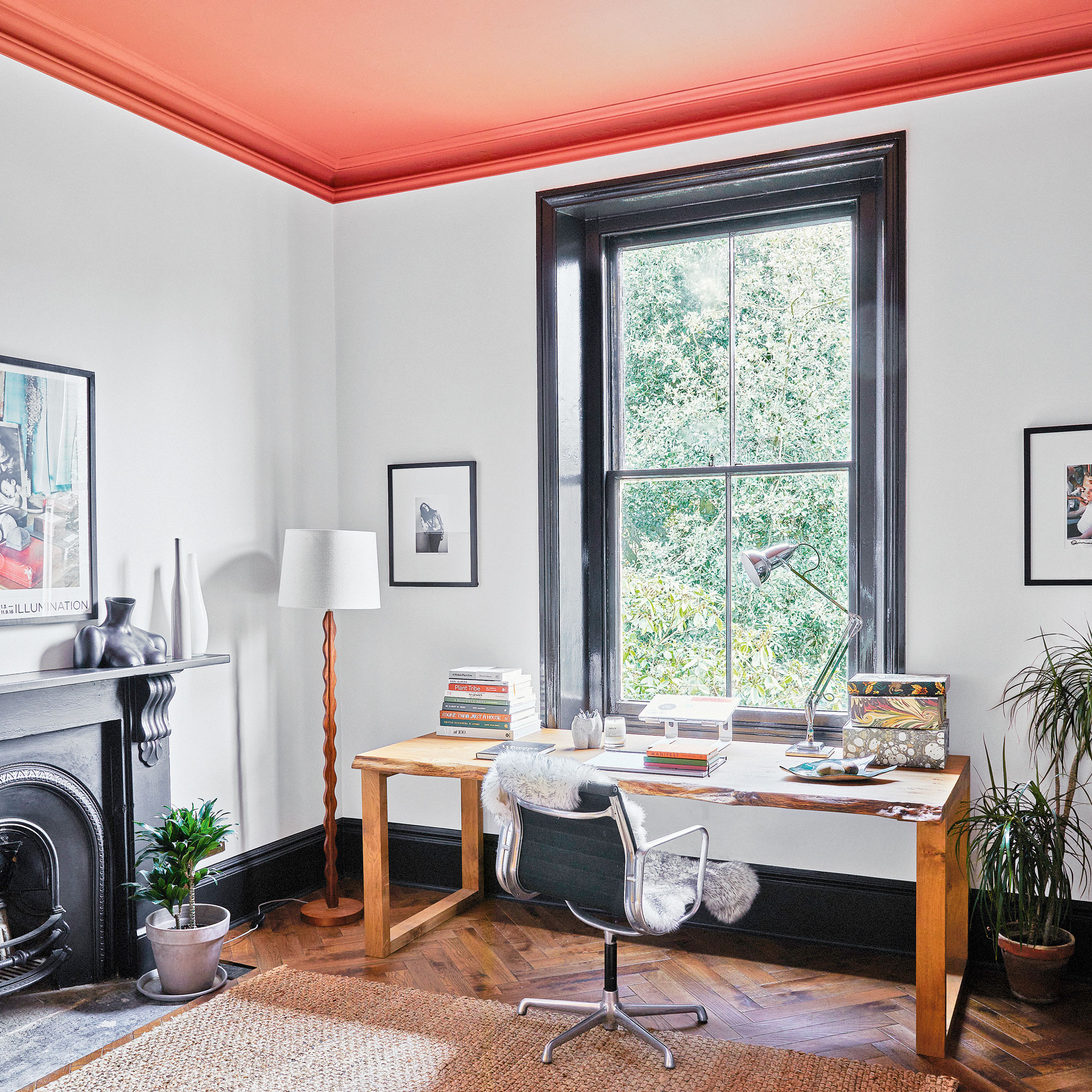
‘In the home office, I chose this vibrant terracotta colour for the ceiling as this north-facing room can feel quite cold. Now it is both a warming and energising space.’
Bedroom
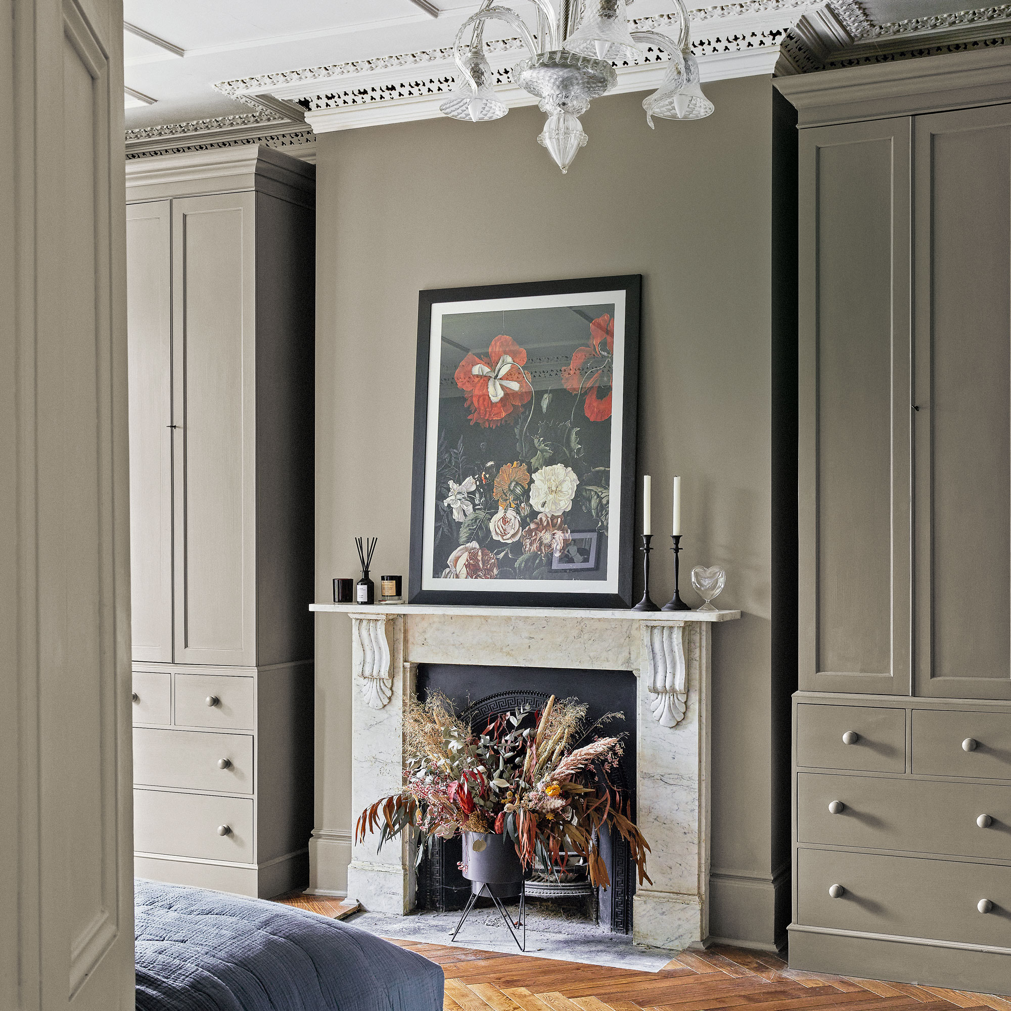
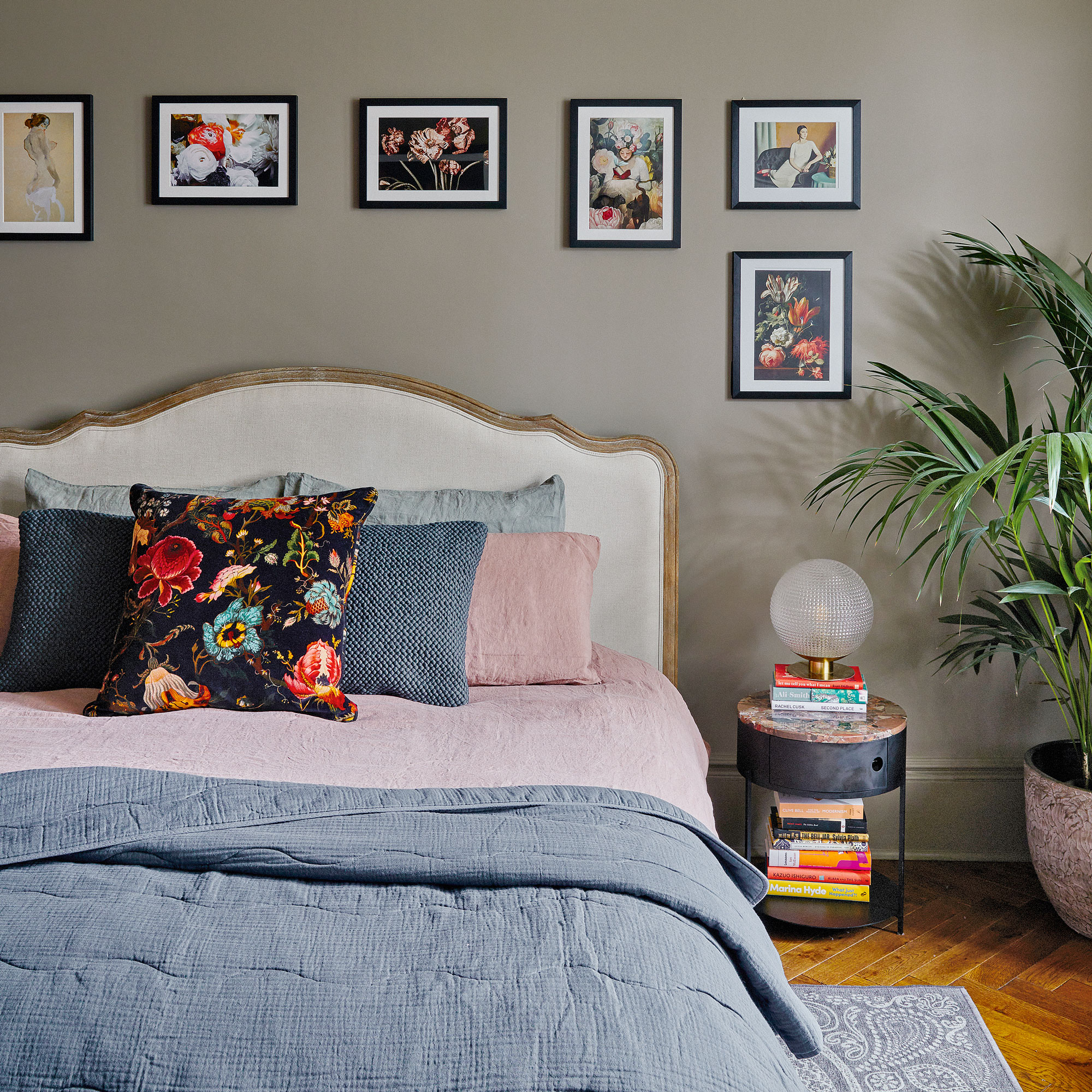
‘I wanted the bedroom to feel like a space where you are being wrapped up in a big cuddle. It’s not overlooked, and feels calming and secluded,' she says.
‘The framed prints were inspired by fabric from House of Hackney, which I used as a starting point for the scheme.’
Bathroom
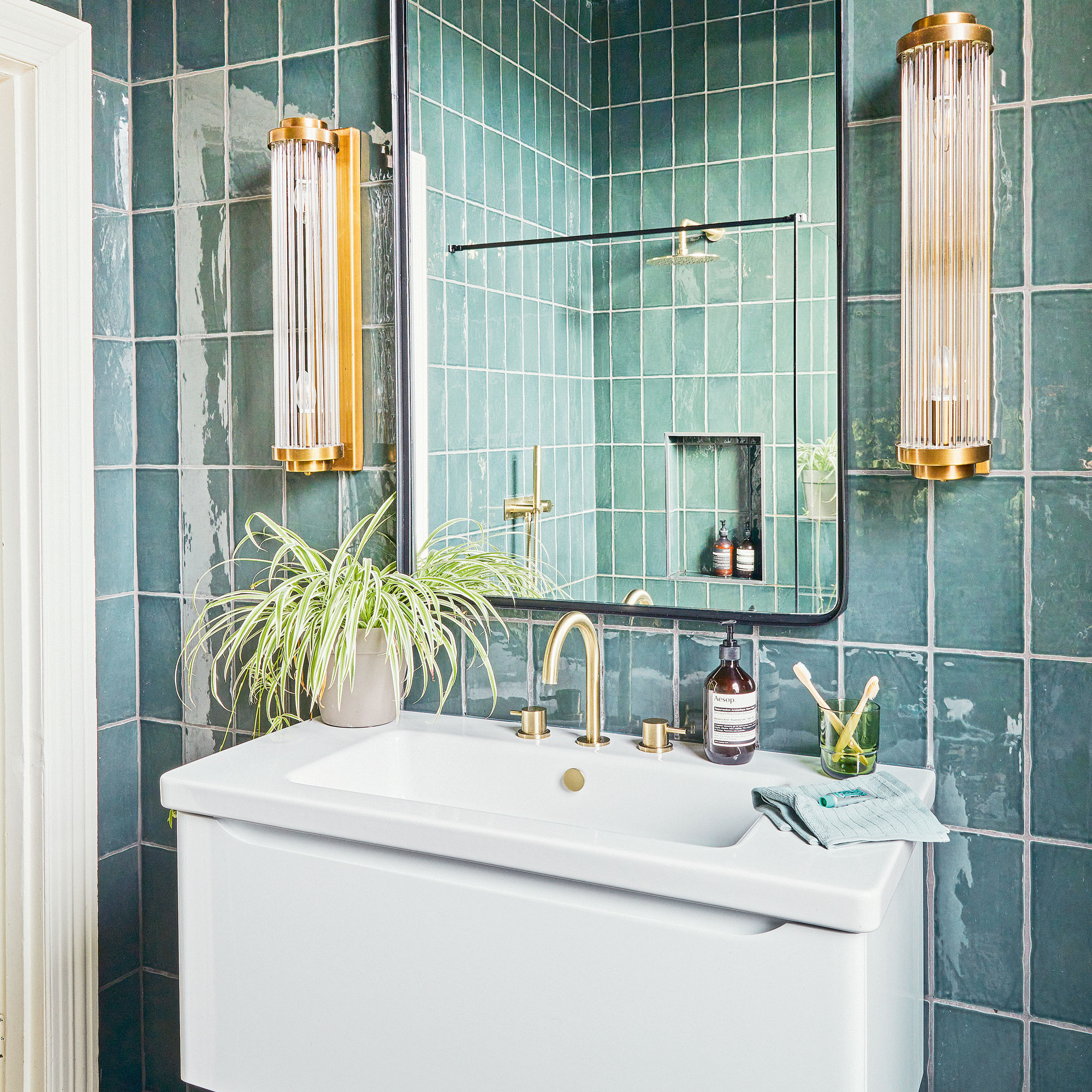
‘For the bathroom, we worked with a designer at CP Hart who planned the space using my mood board.’
'We loved the idea of a green bathroom and I think the tiles having a touch of grey has given it a unique twist, while the Art Deco-style lights add a touch of glamour.’


