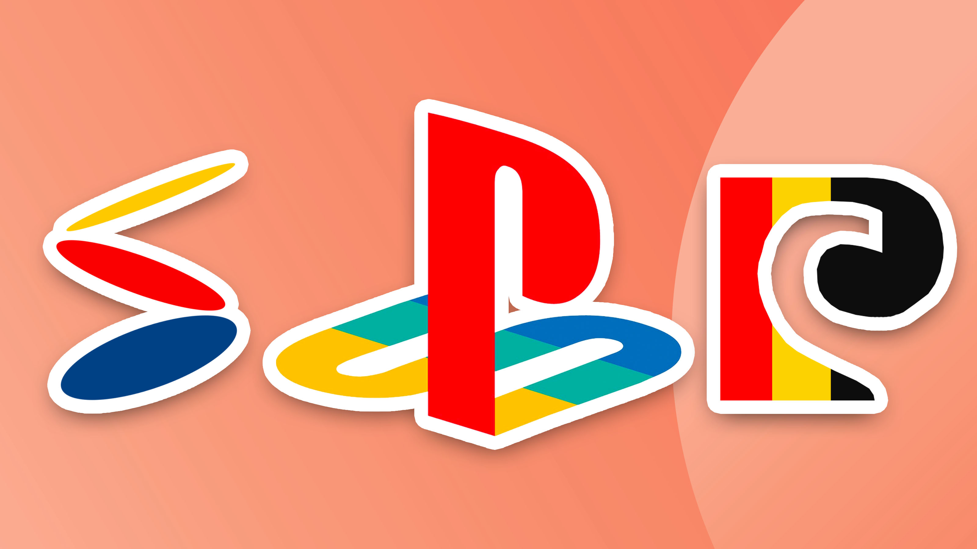
Nostalgia is at the forefront of PlayStation branding – those four bold colours paired with the familiar lettering is a combination any gamer would instantly recognise thanks to the logo remaining pretty much unchanged since the release of the first console. And now we get a glimpse at how this iconic logo came to be – and how different it could have looked.
Recently shared on Twitter, we have a detailed look at a variety of original concepts for the PlayStation Logo. Most are pretty similar to the design we know and love today, but there are a few bizarres picks that we're glad didn't make the final cut. (Looking for some other iconic branding? Make sure to check out the best logos of all time.)