Brian Woulfe’s projects always carry a certain warmth — a subtle, soft-focus richness that has become something of a signature. As the founder of Designed by Woulfe, he has perfected the pairing of subdued creamy hues with tactile, plush finishes — orchestrating airy curations and bathing his spaces in a golden glow.
There is an instinctive gentleness to his rooms — a sense of calm that comes not from minimalism, but from the careful tempering of color, so that everything feels both elevated and deeply comforting. Light in his schemes is never harsh; it’s refracted through smoked glass and onyx and marbled frames, all quietly and irresistibly opulent.
For this modern home, an apartment in Notting Hill, his starting point was to give that cream a little kick — turning the space into the visual equivalent of the most indulgent café au lait. "The palette is warm, a bit French," he says. "Being in this space feels like being given a giant hug."
The secret, he explains, lies in his shrewd color selection — a Designed by Woulfe signature. "We completely avoided white, so the softer pigments cradle you. In summer, the daylight makes everything glow; in winter, instead of dull grayness, you get wonderful comfort."
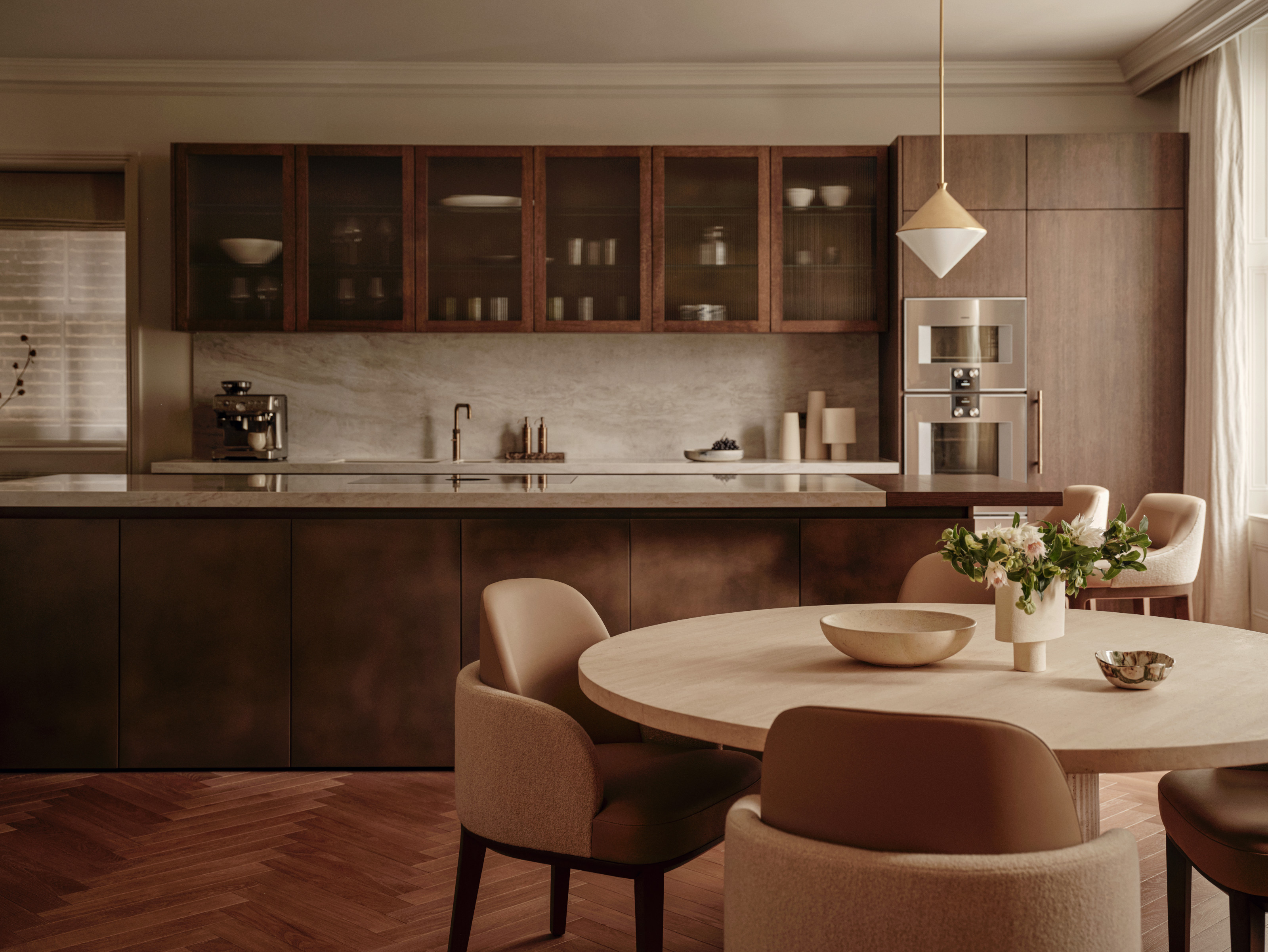
The Visual Comfort pendant in the kitchen is effective in its simplicity.
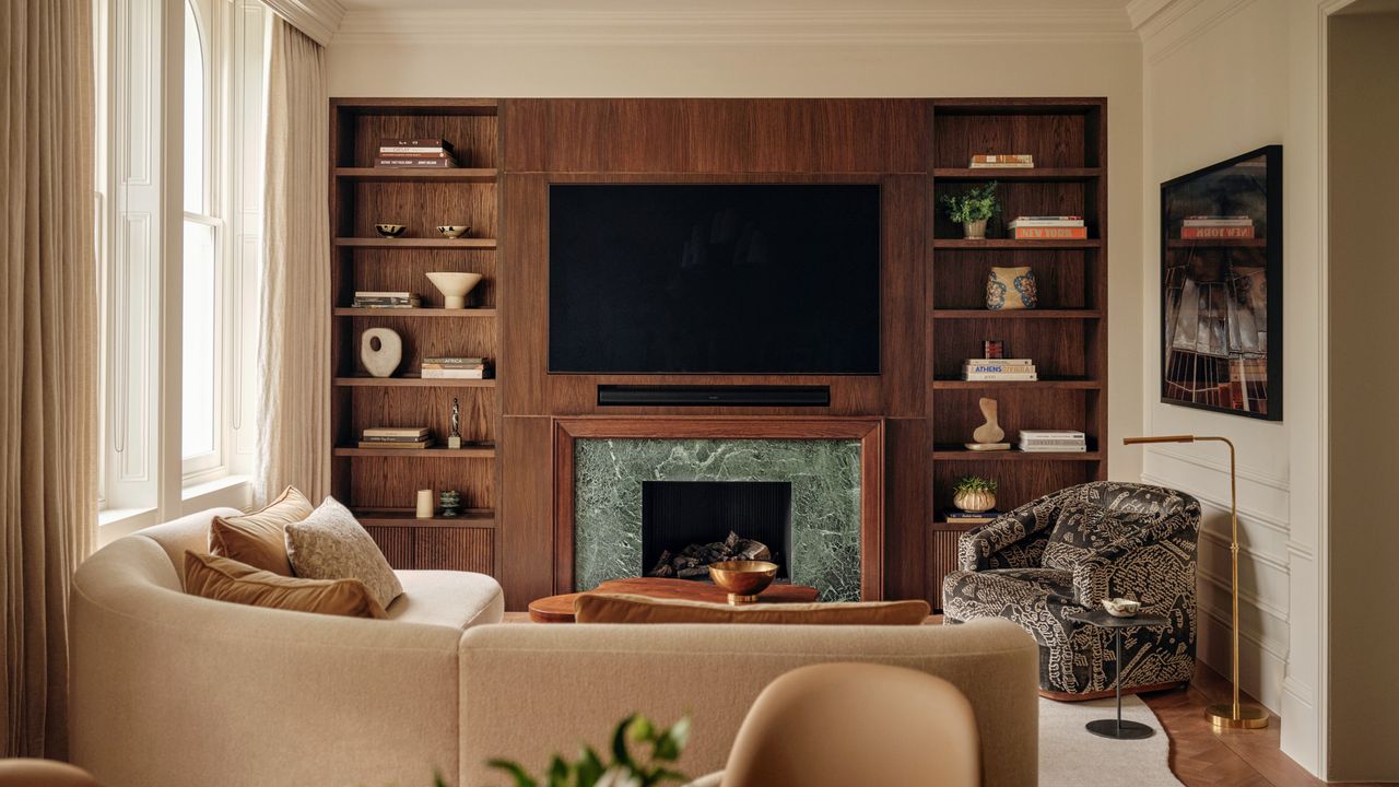
At just over 160 square metres, the apartment isn’t tiny, but it came with challenges — such as a dog-leg offshoot from the back of the open-plan living area that had once been the kitchen, as well as an overall lack of architectural charm. "It was essentially a blank shell," says Brian.
There was no ornamental character to fall back on — no original fireplace or dado rail waiting to be revived. So he added everything: new cornices, fresh paneling, even using plasterwork and trimless vents as curtain pelmets to disguise air-conditioning ducts. "We wanted to create a sense of quiet luxury without obvious flourish," he explains. "You shouldn’t be able to see how the room is working so hard."
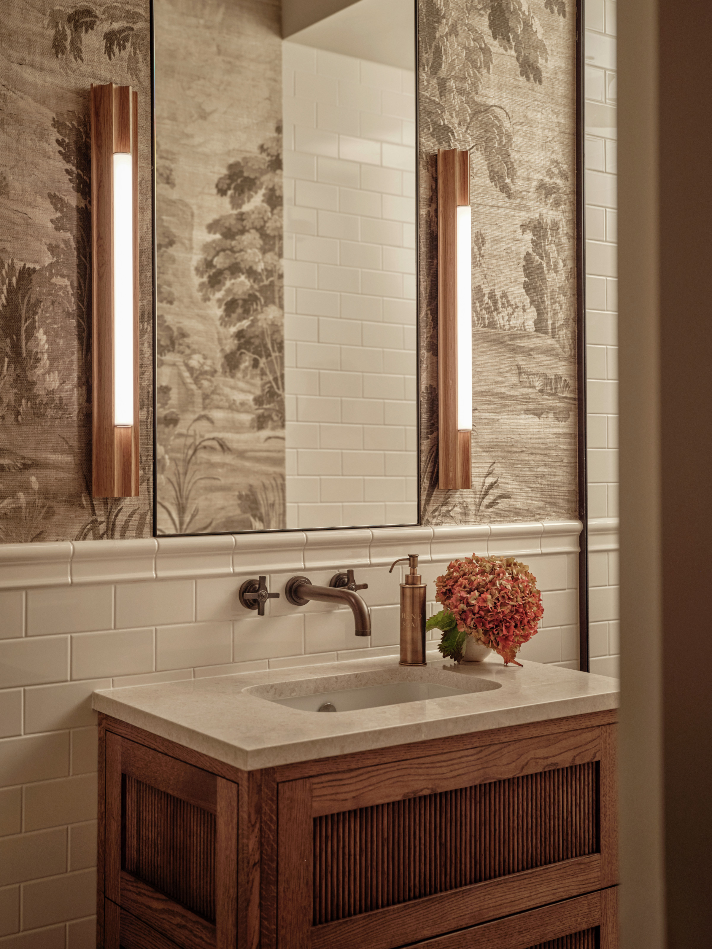
Effortlessly chic, this gold rib soap dispenser will add instant class to your modern bathroom.
And that awkward dog-leg? Brian reimagined the floor plan completely, turning it into an office area and pulling the new, modern kitchen back into the main living space. "Now there’s a direct line of sight between the two," he says. "Whoever’s cooking feels part of the room." The kitchen itself follows the same gently toned palette, with soft metallic notes and warm stone surfaces adding depth without disrupting the serenity.
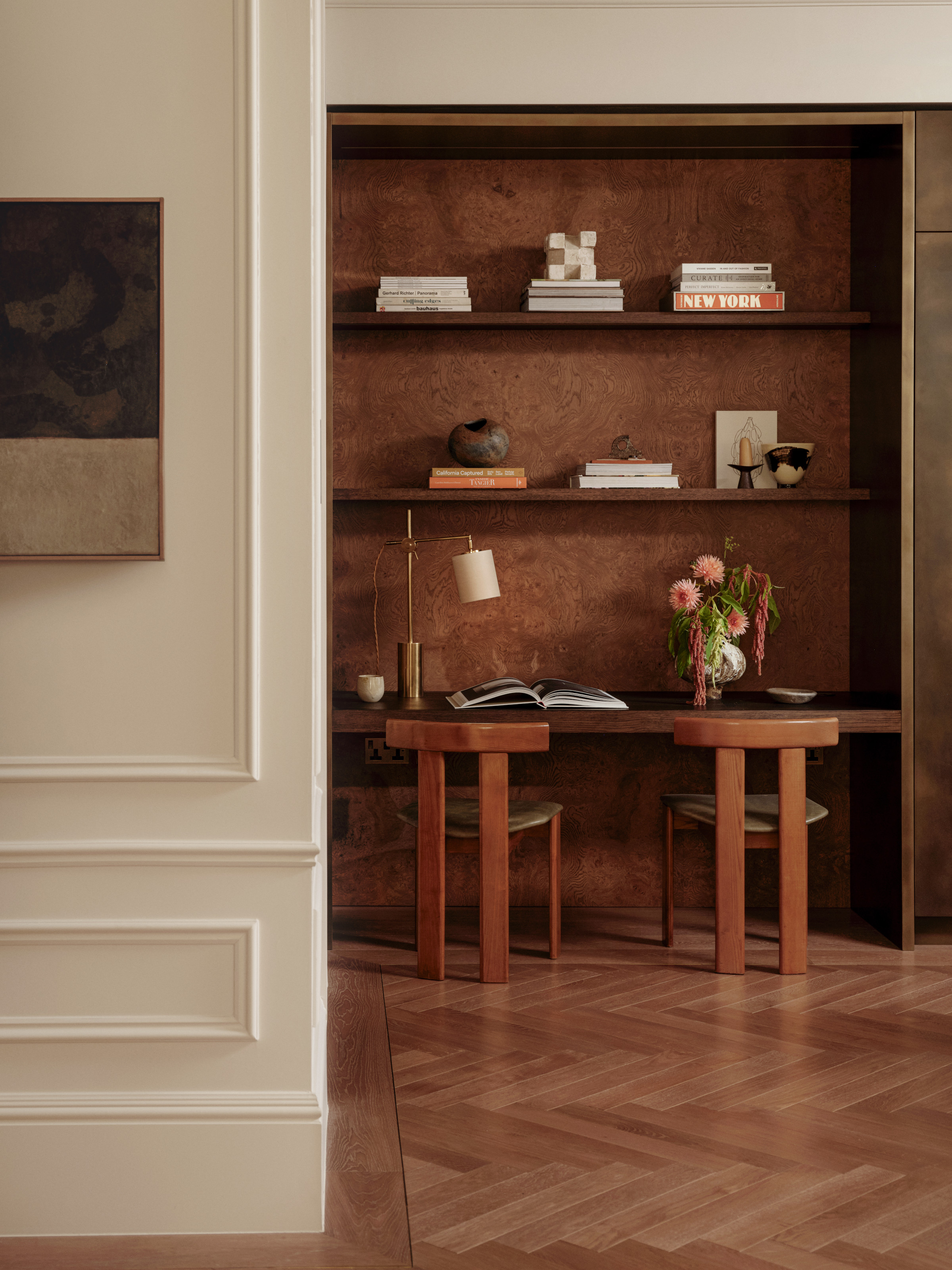
A sculptural chair with a rich wood frame and leather upholstery makes for the perfect seating for a study.
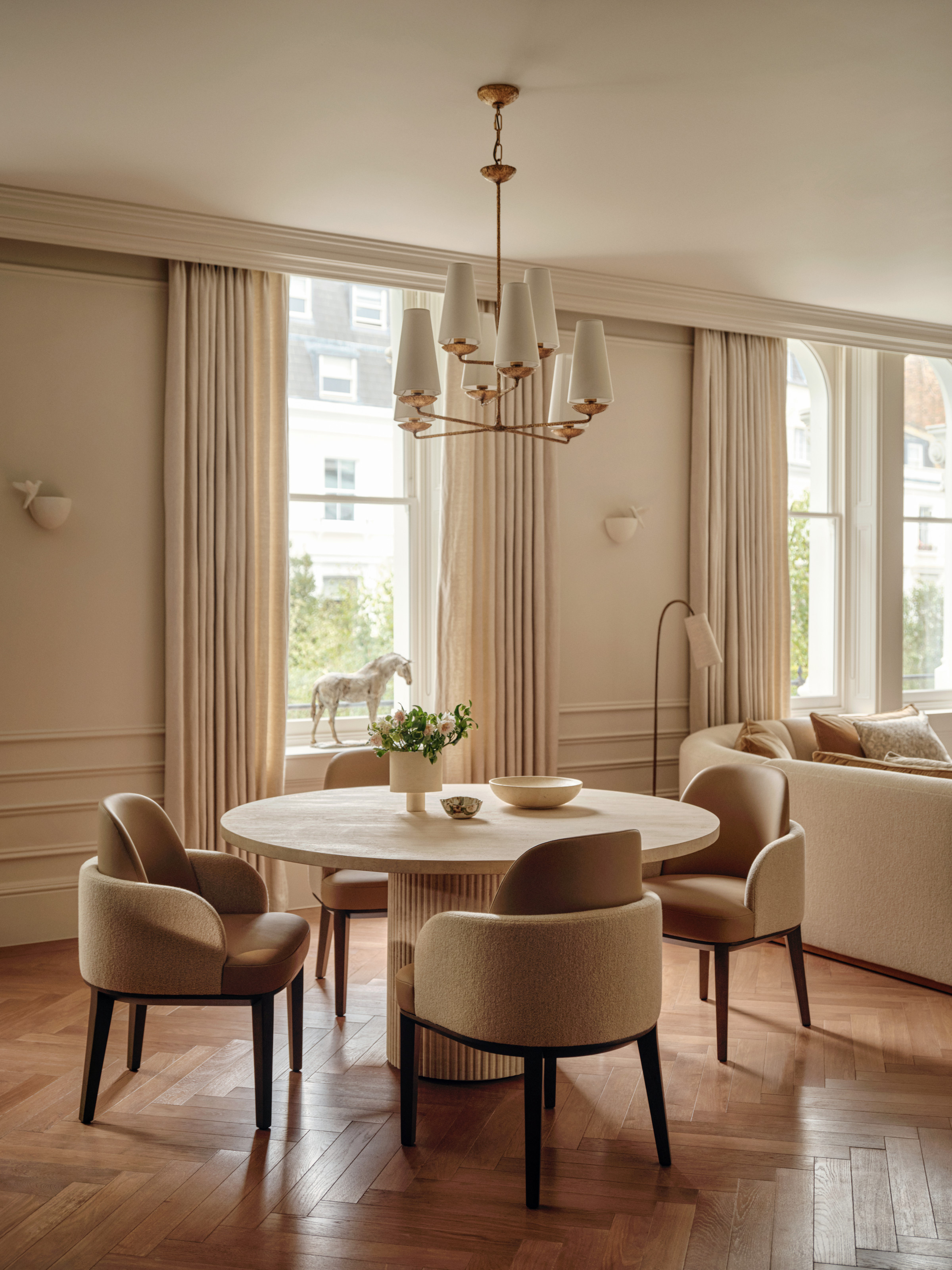
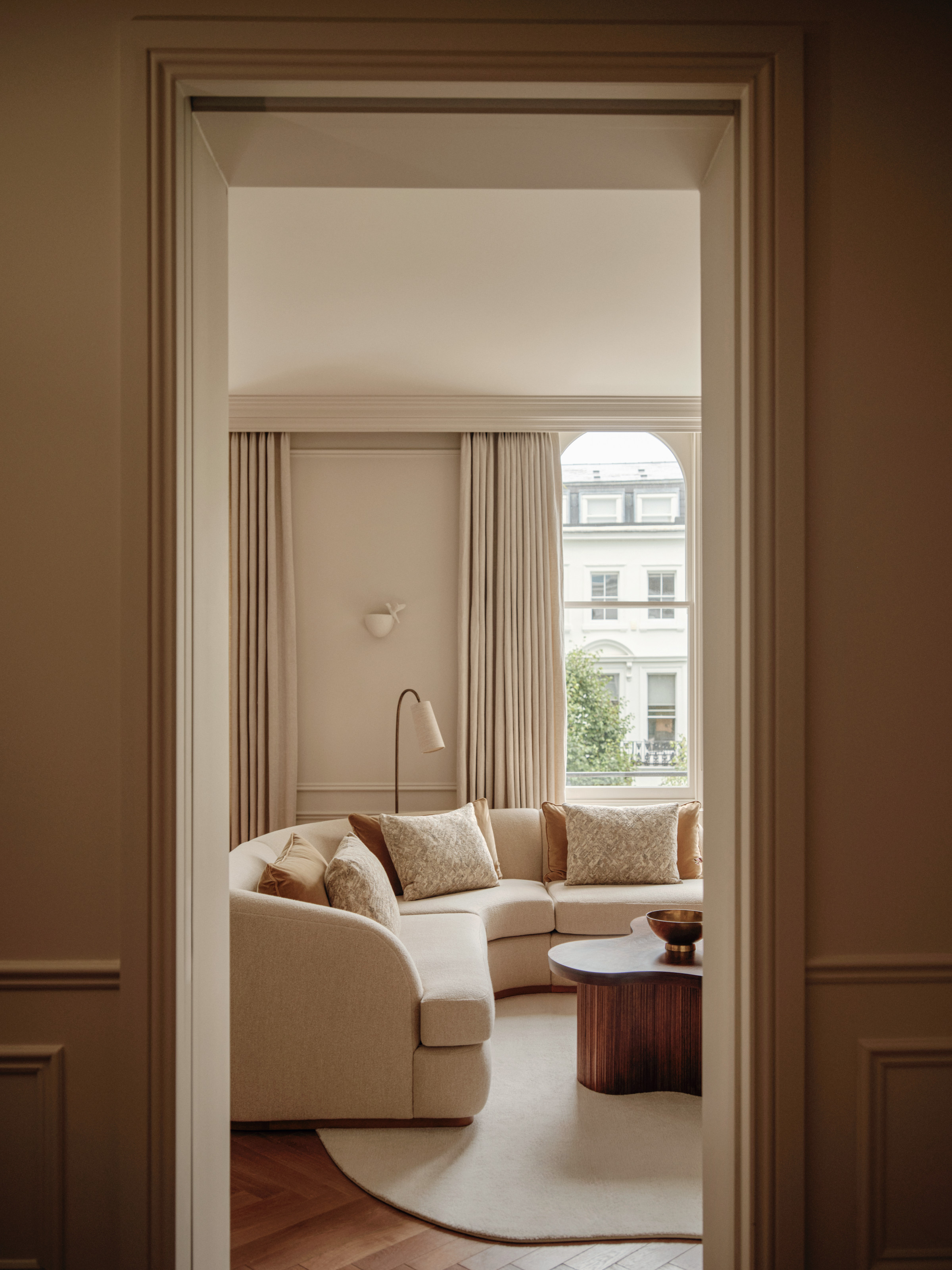
The result is a home with real cohesion — where each zone gently shifts through muted tone and texture, and the abundant natural light becomes the most flattering design element of all. "We used liquid metal on all the joinery, which gently patinas and catches the light," says Brian.
"Then there’s the geometric oak parquet, the metal inlay bars framing each room, and the ironmongery around the windows." These finely drawn details speak to one another, blending like the marbled swirls in a latte.
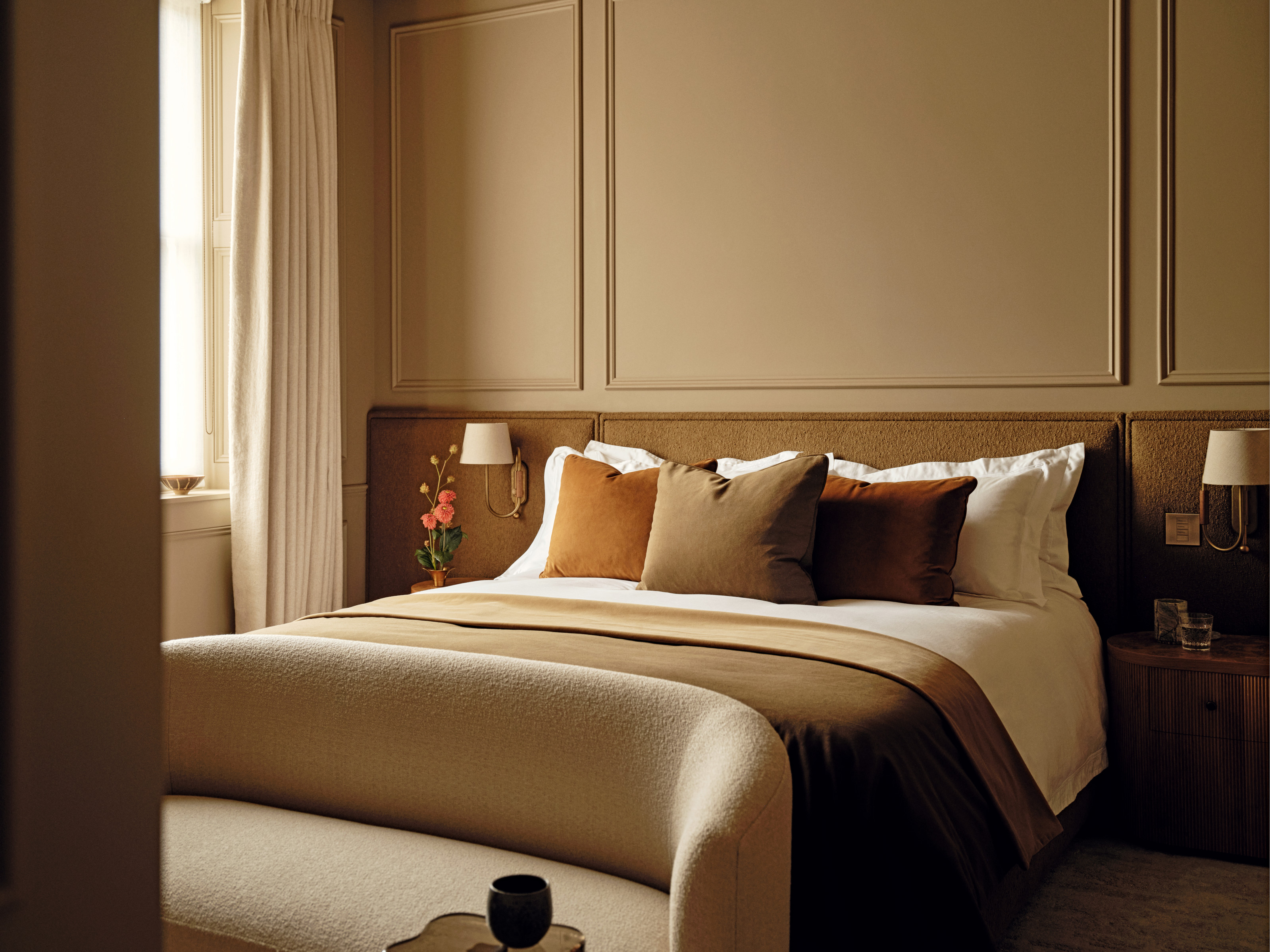
The result is a space that feels layered yet weightless, contemporary yet enduring. "The effect," says Brian, "is timeless — a harmony of amber tones where nothing ever feels flat."
For the latest home tours and design inspiration, sign up for the Livingetc newsletter, and it will be delivered straight to your inbox.