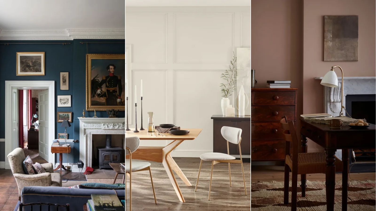
As the end of the year looms, we're reflecting on the most defining paint colors of the past twelve months by revealing paint brands' most popular shades of 2024.
While color trends this year range from daring reds to uplifting blues, it's neutrals that take center stage in this year's roundup. Warm whites have proven to be central to many homes and decorating styles; while plaster pinks and dark and moody hues earned their rightful place too.
Read on to learn exactly which paint colors came to the fore this year amongst leading paint brands including Benjamin Moore and Farrow & Ball.
Pure White, Sherwin-Williams
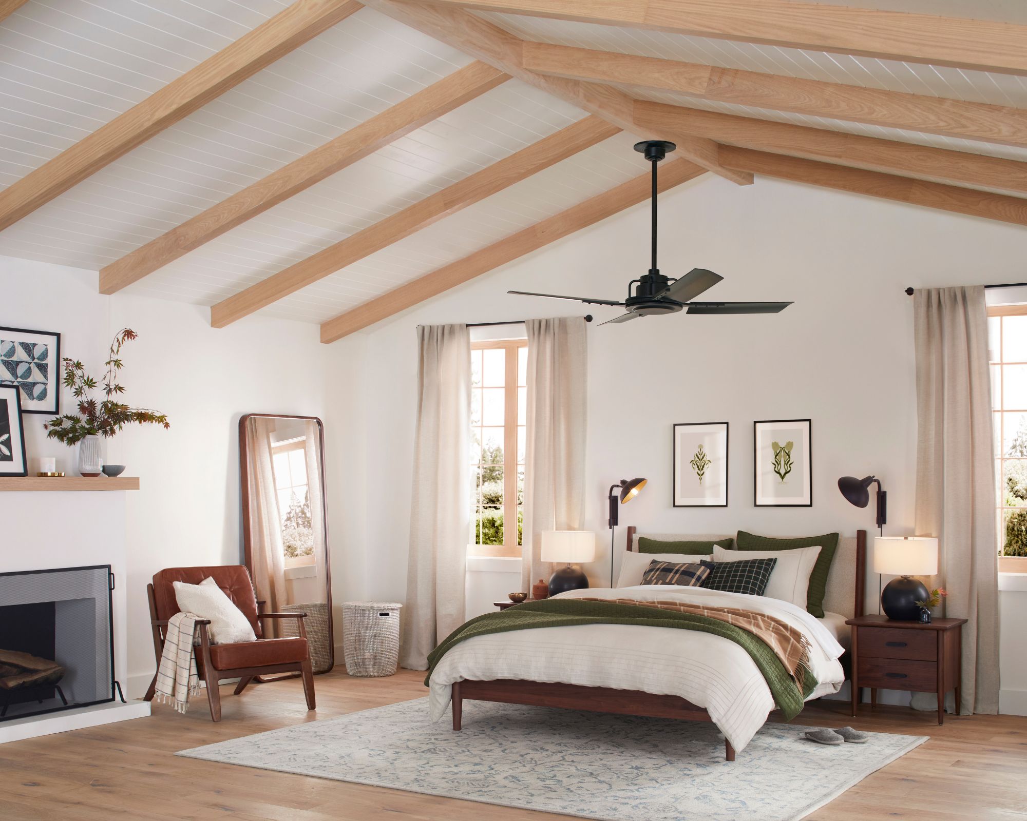
All three of Sherwin-Williams' top shades of 2024 are light neutrals, the first of which is Pure White, a bright white paint with a subtly warming feel.
'Year over year, season over season, this shade remains one of our top five most popular paint colors,' explains Sue Wadden, Director of Color Marketing at Sherwin-Williams. 'The versatile, bright white hue has the slightest yellow undertone that keeps it from appearing too stark. It's a timeless white that doesn't lean too cool or creamy, so it acts as the perfect neutral backdrop for any interior space.'
Agreeable Gray, Sherwin-Williams
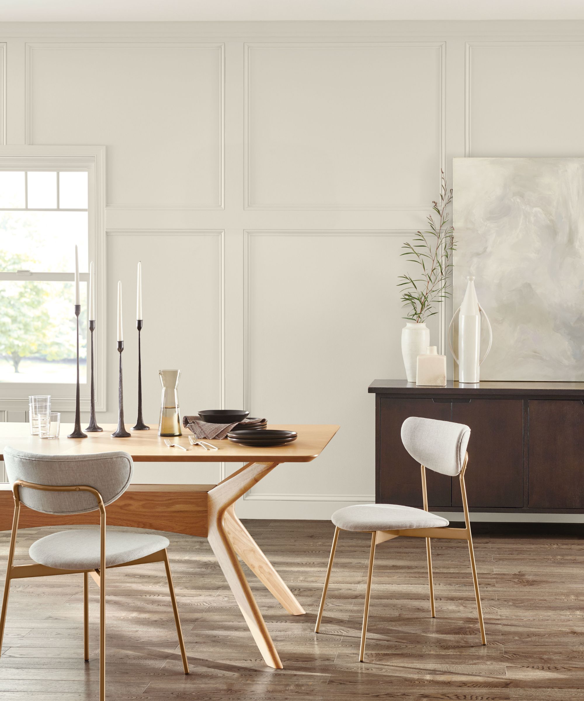
Next up, Agreeable Gray unsurprisingly claimed another spot within Sherwin-Williams' most popular shades this year – a gray paint with plenty of warmth that makes it more of a 'greige'.
'This shade continues to be a best-selling color because it’s the perfect complement to just about anything,' says Sue Wadden. 'With a beige undertone, this gray exudes a subtle warmth. It creates a light and airy yet cozy respite that can blend in with the rest of the home and decor.'
Alabaster, Sherwin-Williams
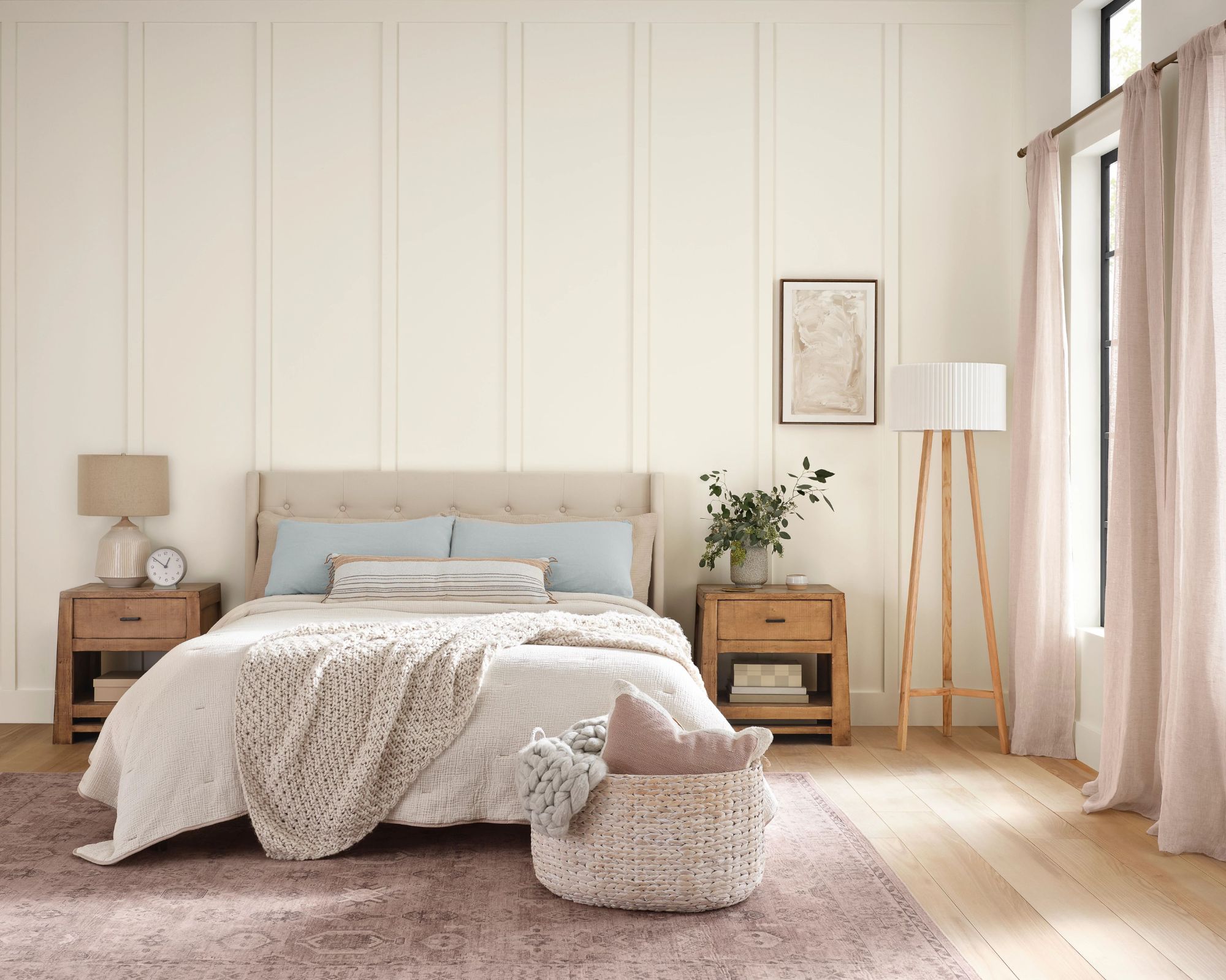
Alabaster was another of Sherwin-Williams' top shades this year – a warm white paint that's a continual favorite among designers thanks to its versatility and timeless appeal.
'When homeowners want the brightness of a white without sacrificing a warm coziness, they can try this soft, warm but balanced white,' says Sue. 'This shade pairs well with dark accents, such as trim or home decor, to create a moody and natural environment.'
White Dove, Benjamin Moore
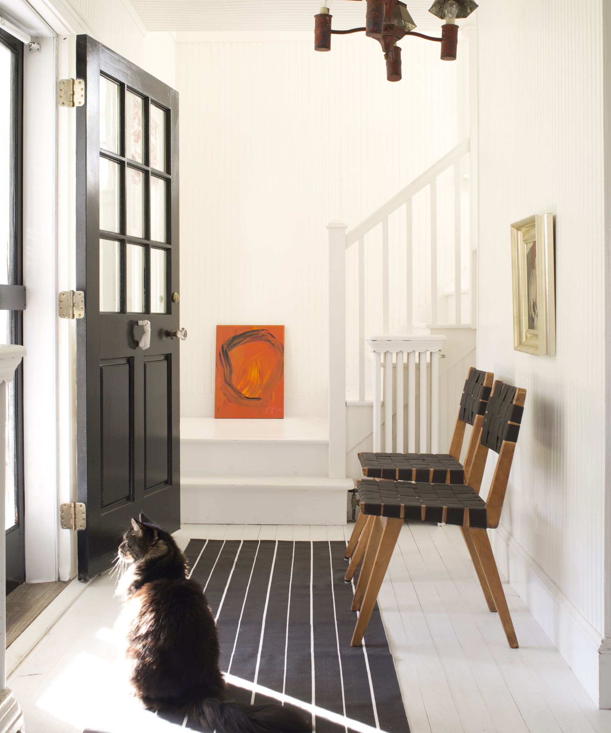
Following similar suit, Benjamin Moore's most popular paint colors of 2024 are all variations of white paints.
'The ultimate classics, whites and off-whites have once again taken top spot with White Dove, Swiss Coffee, Simply White, and Chantilly Lace our top four colours for 2024,' says Helen Shaw, Director of Marketing (International), Benjamin Moore.
White Dove, a classic white paint with a subtle creaminess makes for a go-to backdrop paint color, whether used to create a bright entryway or timeless kitchen color scheme.
Swiss Coffee, Benjamin Moore
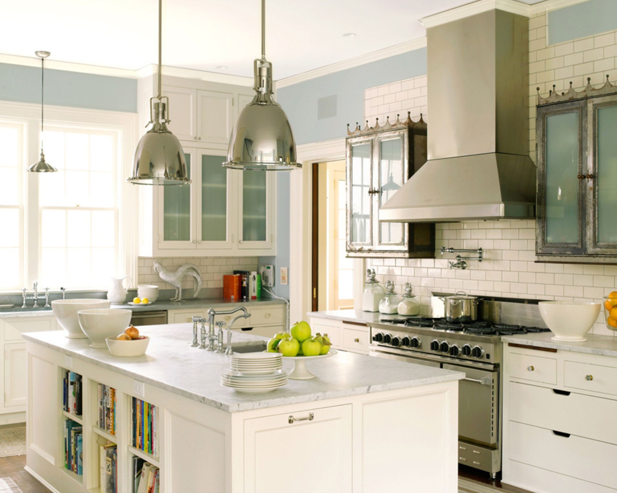
It's no surprise to see Swiss Coffee named one of Benjamin Moore's top shades of 2024. While some warm whites can veer too far yellow, appearing almost dated, Swiss Coffee feels balanced, making it a failsafe white paint, often recommended by interior designers.
Simply White, Benjamin Moore
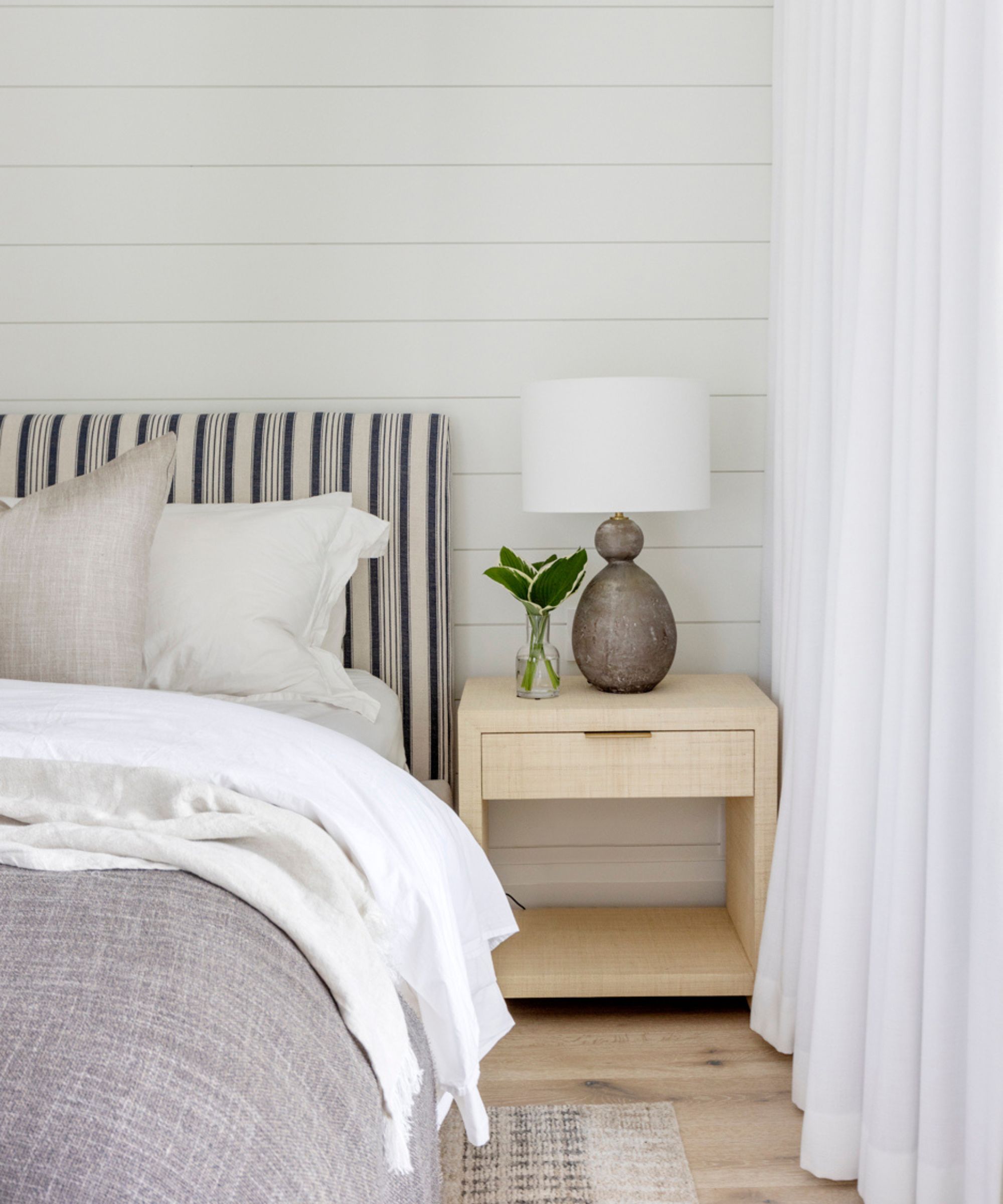
Next up for Benjamin Moore is Simply White, a classic white paint that makes a good all-rounder, as used in this relaxing bedroom designed by Knight Varga Interiors.
'The best white paint colors stand easily on their own as a design element or on ceilings and woodwork to harmonize with your chosen wall color, hence their popularity,' explains Helen Shaw. 'They are versatile, timeless, and have the power to make a room feel spacious and fresh.'
Chantilly Lace, Benjamin Moore
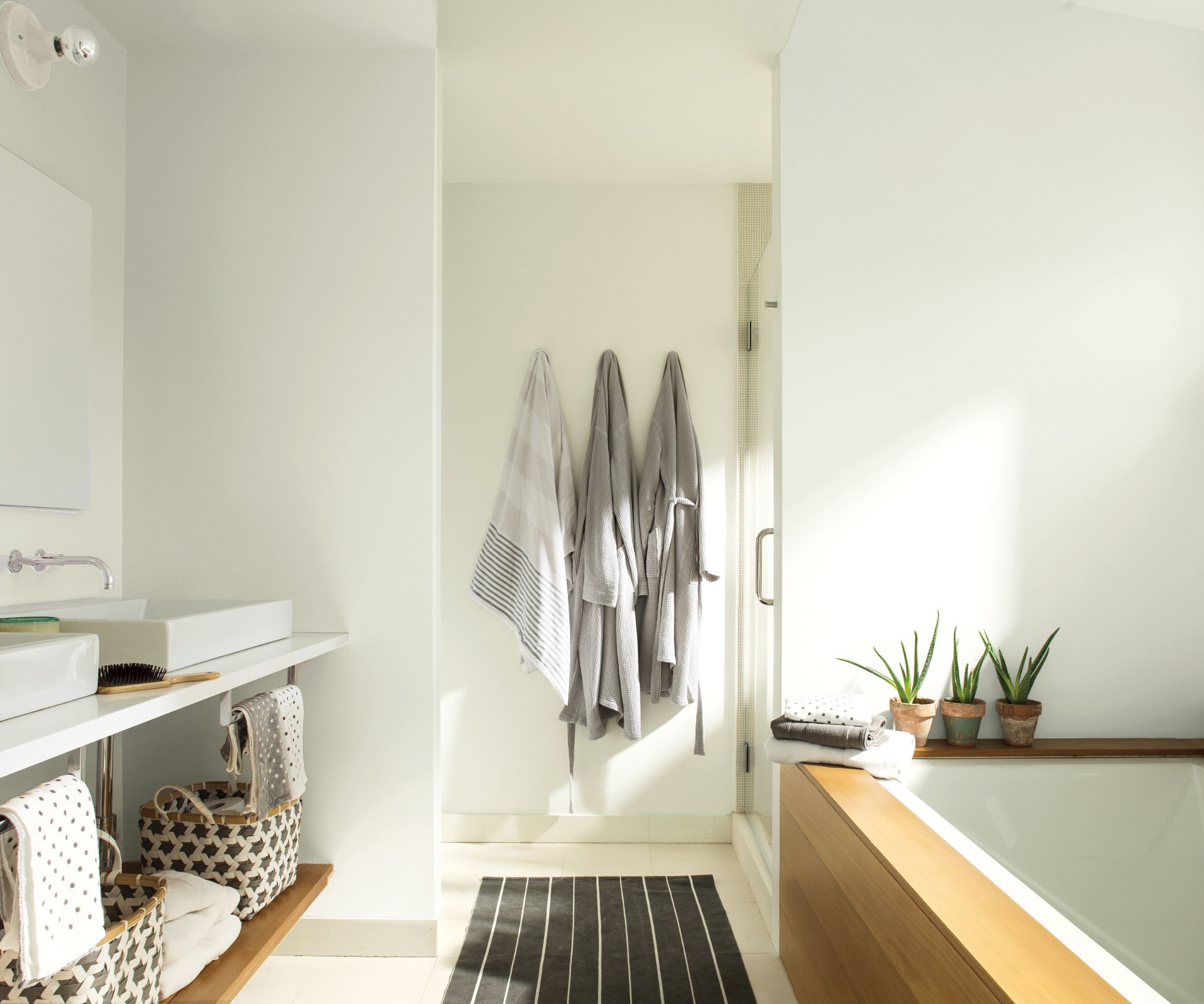
If you're after more of a true-crisp white with less warming undertones, Chantilly Lace is a popular choice, so much so it's another of Benjamin Moore's top shades of the year. As seen in this light and airy bathroom, Chantilly Lace works well to create an undisturbed backdrop that allows materials and decor to shine.
Hague Blue, Farrow & Ball
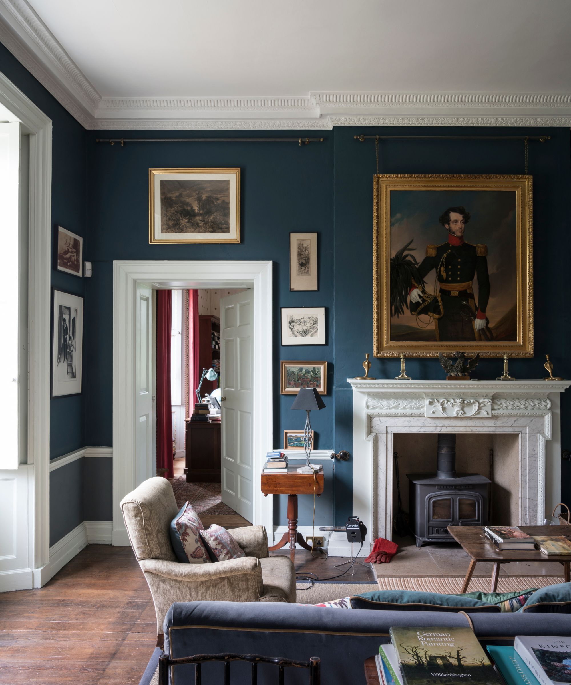
Veering away from the light neutrals to have claimed top spots this year, Farrow & Ball's most popular shades include bolder hues, beginning with Hague Blue, a dark blue paint with green undertones.
This year has seen so much appeal for bolder color choices, not least with color-drenching small rooms. Colors such as Hague Blue provide drama and depth to these spaces, without feeling too trend-led.
Railings, Farrow & Ball
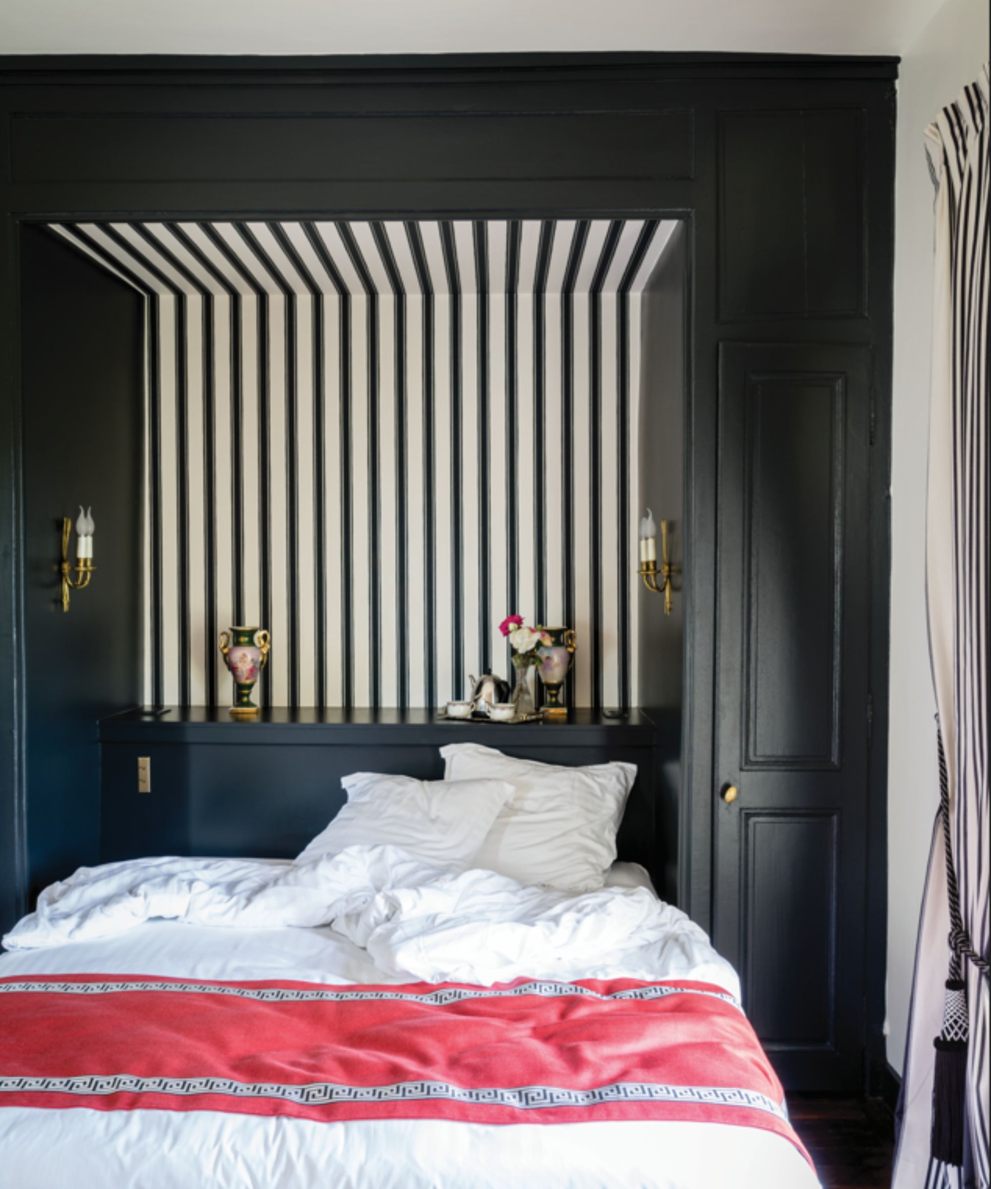
An even bolder Farrow & Ball color that comes within its most popular shades is Railings, an off-black with hints of blue. While black paint can feel daunting, the right shade can create the perfect moody and dramatic scheme, without overwhelming a room, as seen in this cozy bedroom.
Setting Plaster, Farrow & Ball
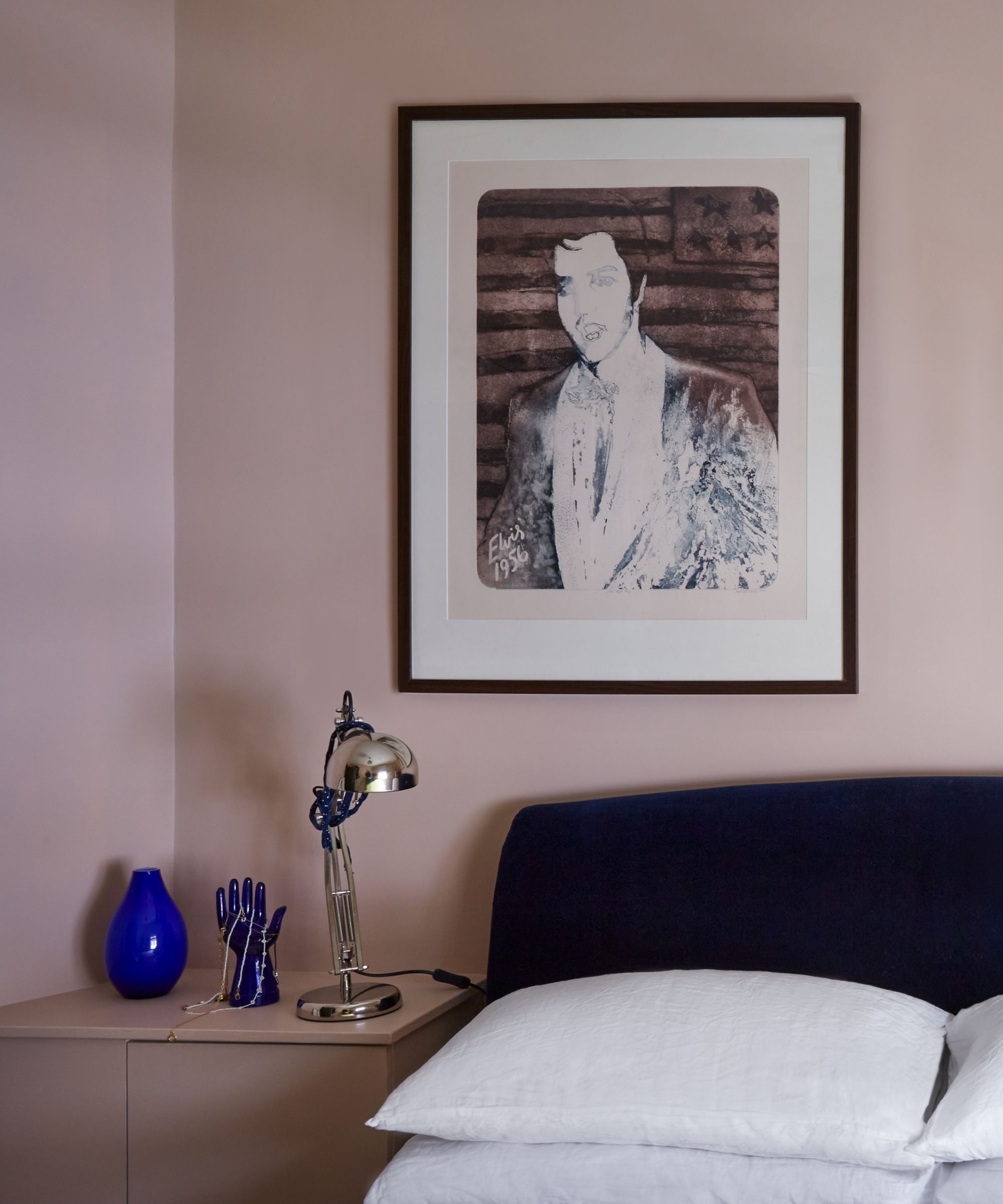
It's no surprise to see Setting Plaster come in as another of Farrow & Ball's most popular shades, a flattering, cozy plaster pink paint.
Mimicking the color of plastered walls, Setting Plaster creates a neutral space with more depth and a subtle moody feel, while avoiding the overly feminine feel of many pink paints. We've seen this popular shade in all types of rooms from kitchens to bedrooms, and fully expect its appeal to continue next year.
Mochi, Little Greene
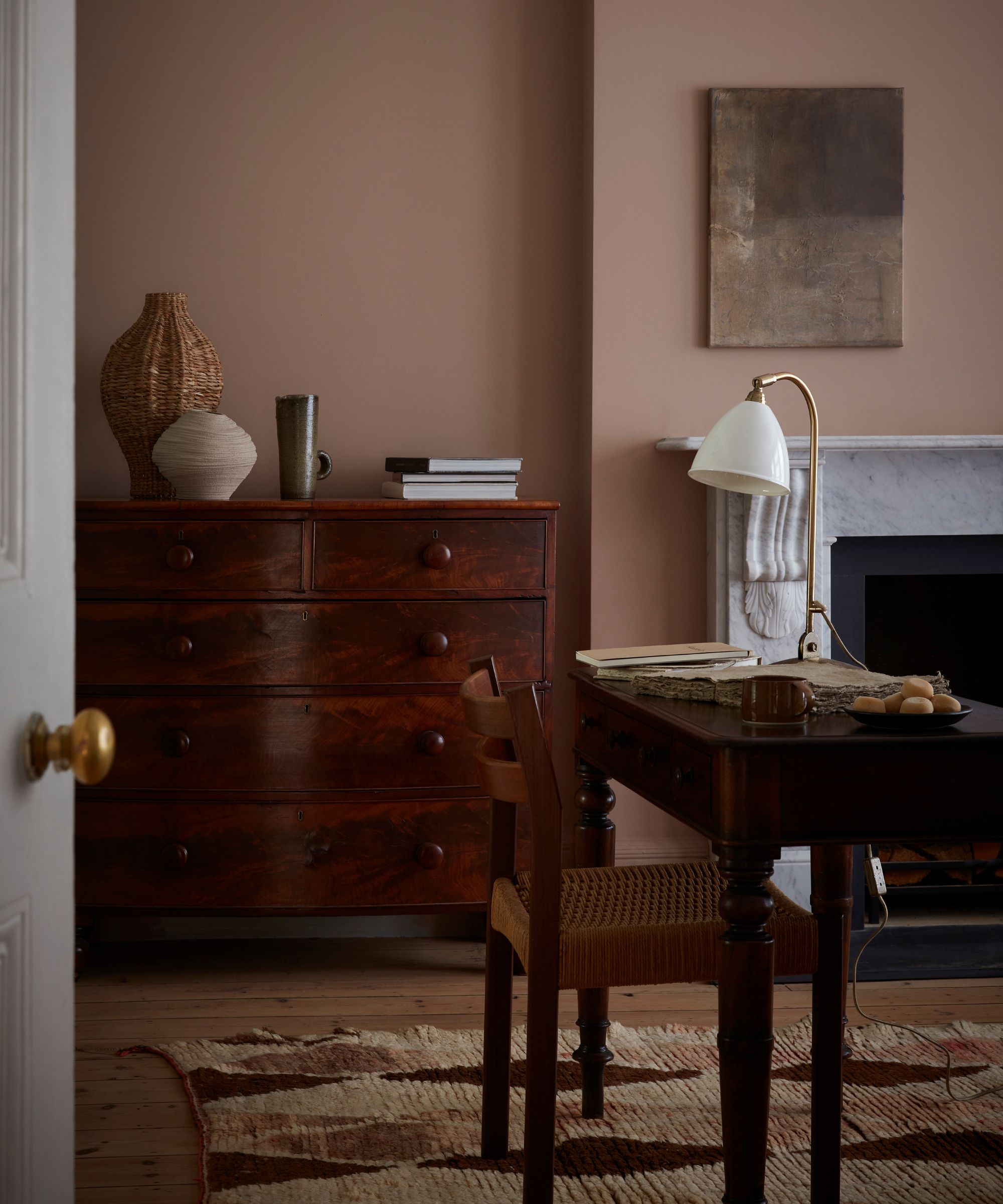
Little Greene's popular shades from 2024 also reflect a richer, bolder take on room colors, the first of which is Mochi.
‘Reminiscent of a natural plaster shade, Mochi will add warmth to a space and act as a neutral base for introducing bolder tones,' says Ruth Mottershead, Creative Director at Little Greene. 'With its soft, yet complex composition, this shade can feel both traditional and pretty or contemporary and comforting depending on the aesthetic, making it a wonderfully versatile neutral, perfect for many different areas of the home.'
Garden, Little Greene
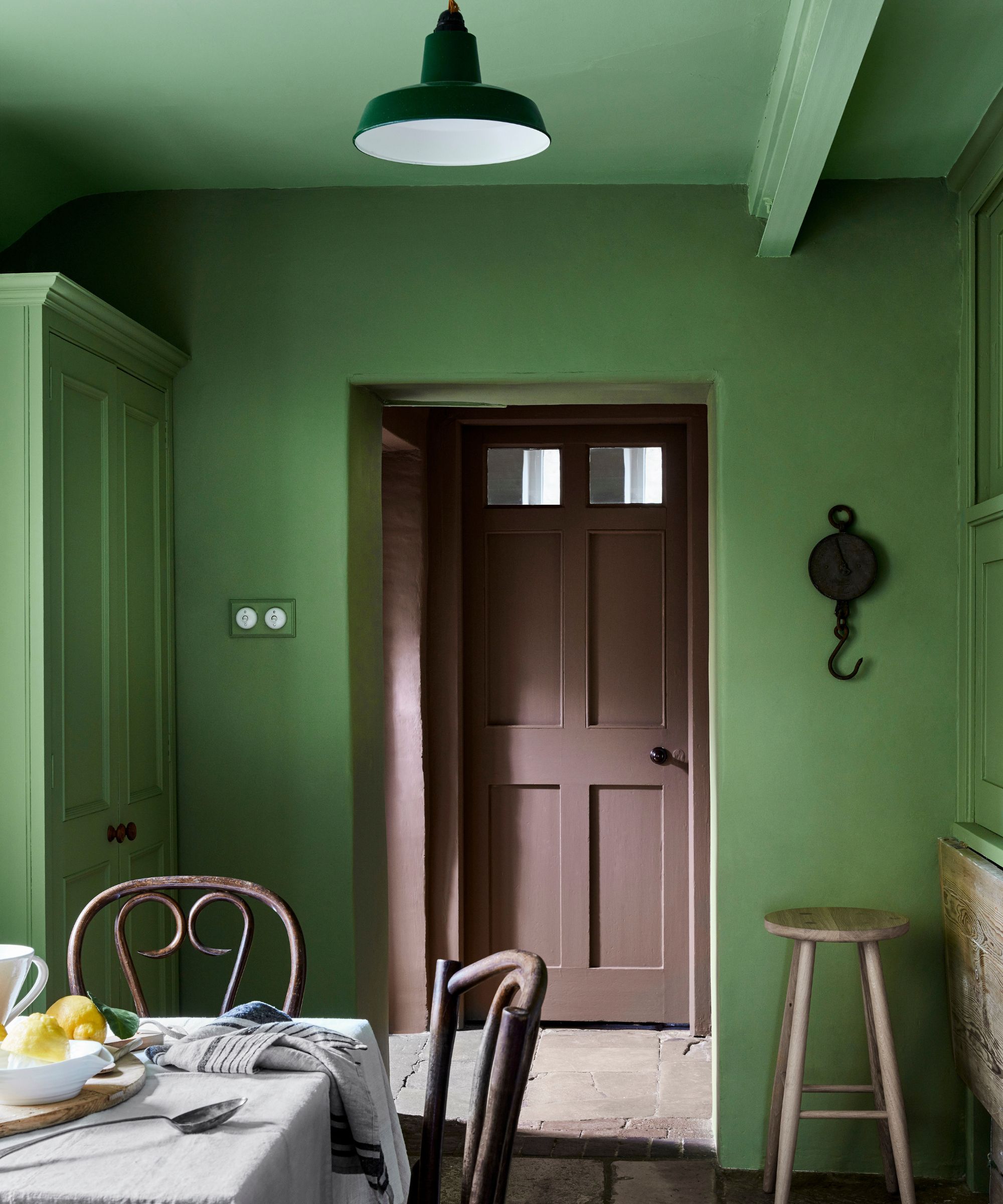
Another top paint of the year for Little Greene is Garden, a vibrant green paint used on the walls in this colorful kitchen.
'Soft green Garden sits comfortably in any interior scheme because of its relationship with the natural environment and our longing to bring the outdoors inside,' explains Ruth Mottershead. 'We feel soothed by green and its neutral base – it is neither too warm, nor too cool. It is the perfect tone for living rooms, kitchens, and dining spaces, with enough strength to create an impact and provide energy to a space but muted enough to provide a little peace within a room.’
Olive Colour, Little Greene
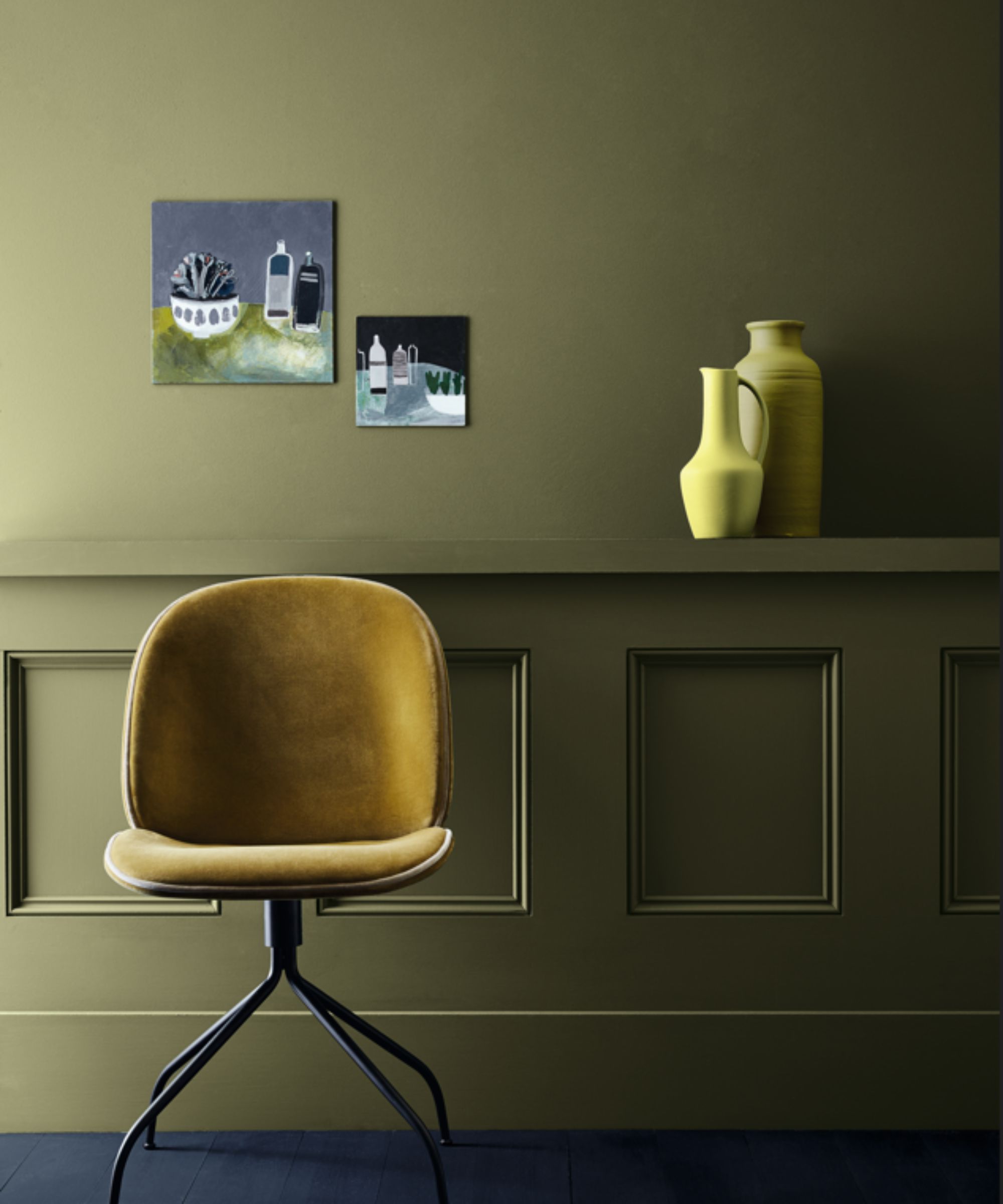
Continuing the theme of green paints, Little Greene's Olive Colour comes in as another favorite this year.
‘A very calming, positive shade with a timeless quality – it’s muted but not enough that it fades into the background, so it works as a foil for similar earthy tones, along with paler shades like creams and stone, and darker, richer colors such as browns, blacks, cherry reds, and ochre which can give a more dynamic effect,' says Ruth Mottershead.
While classic, light neutrals have been popular this year, there's also been a lot of appeal for moody, richer paint colors that feel aligned with the latest color trends. If you're looking for inspiration for your room color ideas as we approach the new year, these shades are a great place to start.


