Selecting the perfect paint color for your home is challenging, and it's one of the biggest decisions you'll make when refreshing a room. Even if you've narrowed your choices down to a single brand, there's still a seemingly endless list of colors to choose from – and in Sherwin-Williams' case, we're talking more than 1,700.
While picking out paint is a weighty choice for anyone, interior designers have quite a bit of extra practice. From their own homes to client projects, many are extremely well-versed in Sherwin-Williams shades.
To get a list of the experts' tried-and-true hues, we spoke with 12 designers, and they shared shades across the color spectrum. From Sherwin-Williams' best-selling paints to more obscure options, there's truly something for everyone – and every style of home.
What are the best Sherwin-Williams shades, according to interior designers
These are the paint colors that interior designers turn to time and time again, and they span the entire rainbow. Pick a color family (or browse the lot) to dive in to these tried-and-true shades that the experts love.
1. White paints

If you're wondering how to choose the best white paint, you're not alone – it's a difficult choice for just about everyone. White paint reacts differently depending on lighting and accent colors, so it's one of the hardest colors to pin down. Interior designers all have their go-to shades, but just a select few made it to their lists of favorites.
Glenna Stone, founder and principal designer of Philadelphia-based Glenna Stone Interior Design, says her go-to shades of white are White Flour and Origami White. She adds that these Sherwin-Williams hues are perfect both for accents like millwork or for entire rooms.
'They can easily hold their own or act as the perfect complement to other colors around them, and we appreciate their versatility. With Origami White, we suggest you use it as a neutral "background" to allow for the incorporation of layered colors through furniture and accessories,' says Glenna.
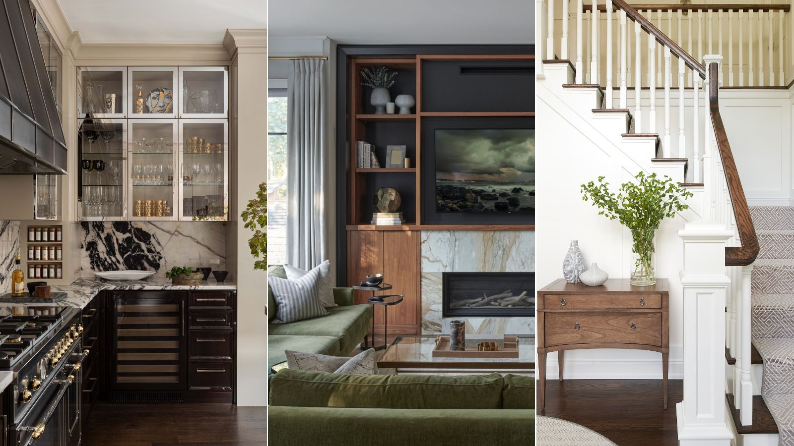
To 'brighten up a room with a crisp and clean color,' Glenna says she uses White Flour. She suggests pairing the shade with natural elements and textures for balance, as she did with this entryway staircase design, pictured above.

On the other hand, Devin Kimmel – award-winning architect and managing principal of Kimmel Studio Architects – picked one of Sherwin-Williams' best white paints as a go-to: Pure White. Along with Greek Villa, Devin says these white shades give a 'light and airy feel' and 'work beautifully throughout a home, creating a warm yet bright canvas.'
'They're perfect for walls, ceilings, and even interior moldings, adapting well to varying light sources, whether natural or artificial,' he adds.
Shani Risinger Core, founder and principal designer of Shani Core Interiors, often turns to the brand's Extra White – a pick she calls 'the very best white paint color.' One of experts' best paint colors for rooms without much natural light, this shade is incredibly versatile and easy to use, she says.
'It's the purest form of white with no hidden undertones and looks just as crisp on the exterior of a home as it does on interior walls – especially when a client has an extensive art collection we want to highlight. Cabinetry, trims and walls all look fresh with a coat of Extra White,' says Shani.
2. Gray paints
There's a seemingly endless supply of gray paints on the market, and that is partially because gray can range all the way from barely-there pigment to a dark, bold statement. Over time, designers have narrowed down the best gray paints, and the list has a bit for everyone.
Devin says that he loves to decorate with Sherwin-Williams' Drift of Mist, as it's adaptable, bringing just the right level of warmth. Dani Crawford, lead interior designer and senior associate of Kimmel Studio Architects, prefers the moodier shades, including Peppercorn as one of her go-to hues. She says this dark gray color 'offers rich charcoal tones without the starkness of true black.'
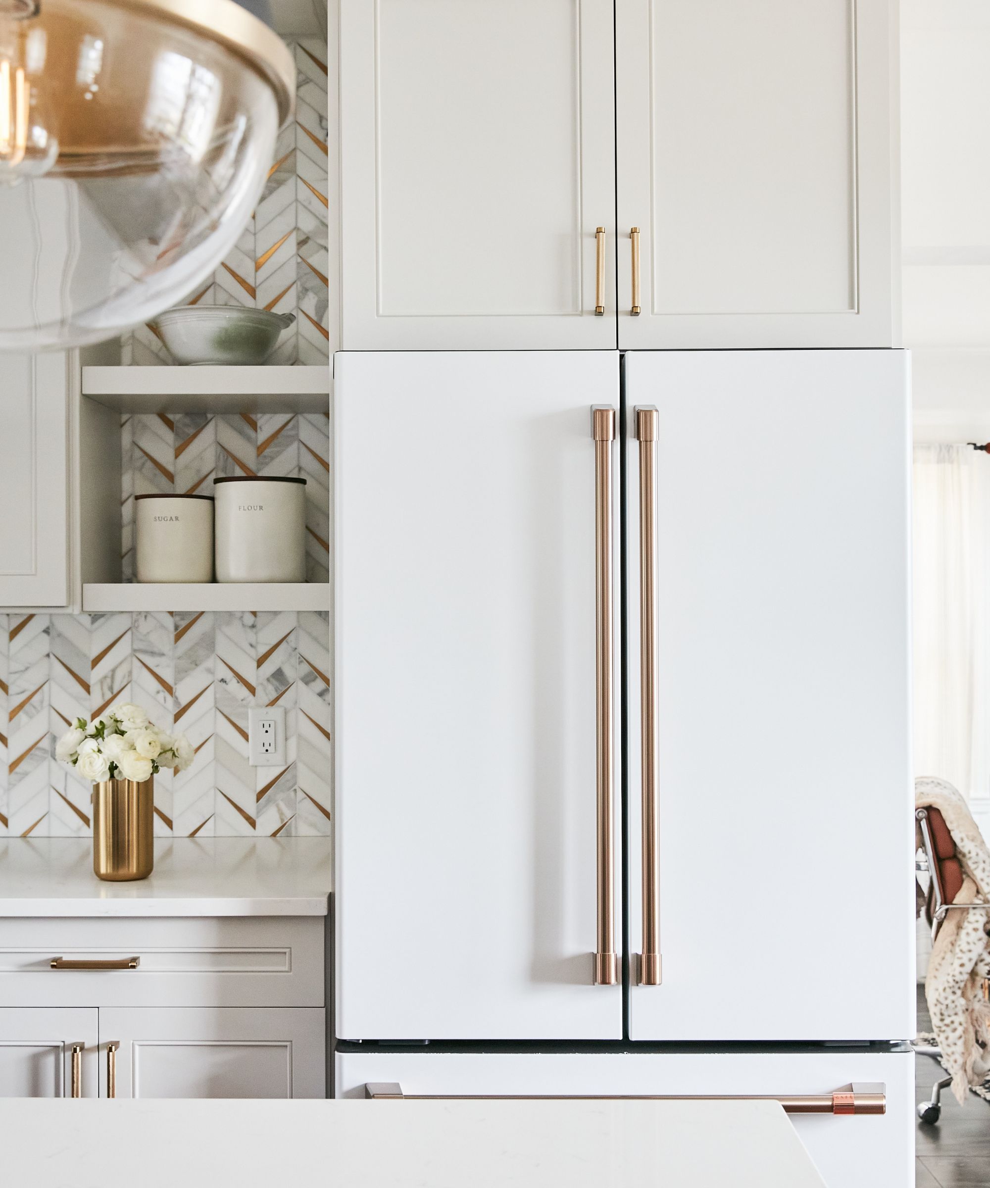
In this kitchen, designed by Nu Interiors, cabinetry painted in Sherwin-Williams' Mercurial offers enough warmth to balance out a bright white refrigerator, while keeping to a clean, neutral color palette. Nureed Saeed, owner and creative director of the firm, says this shade is one of the best greige paints she's come across.
'Mercurial is my go-to for the perfect greige shade – not too gray, not too white, not too beige, Mercurial is the Goldilocks of greige paints. I love it, especially for cabinetry but it looks just as fresh for walls and trim,' she says.
For Jessica Cinnamon, interior designer and founder of Jessica Cinnamon Design, greige shades do the trick. She often turns to Big Chill, sharing that its undertones 'pair very well with busier stones and other interior finishes.' She also uses Crushed Ice – 'a warmer gray that is both calming and inviting' – as a wall color quite frequently.
3. Black paints
Black paint can act as a bold, daring statement in interior design, but finding colors that go with black to create a cohesive design scheme isn't as difficult as it sounds. Many designers turn to black paint when they're looking to design a cozy yet impactful space.
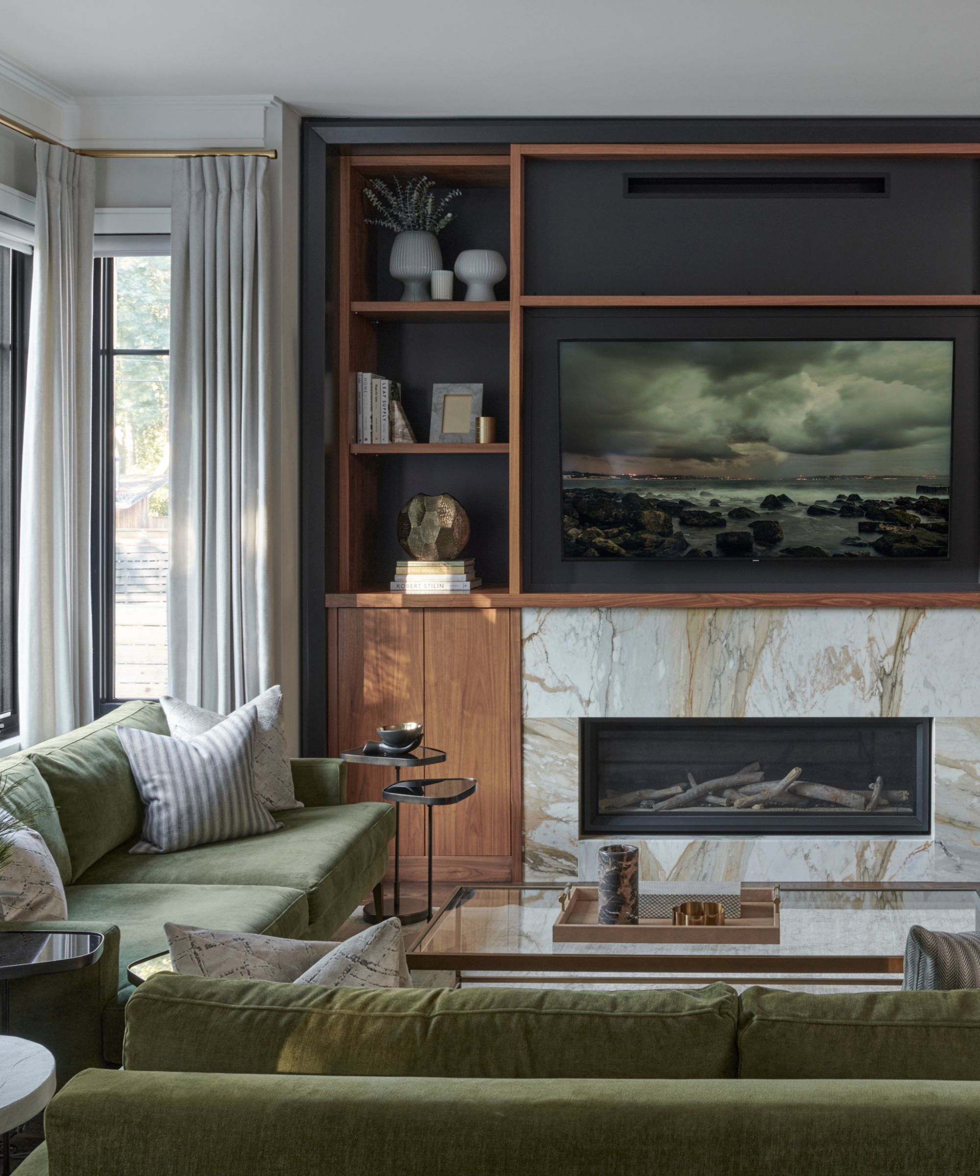
In this living room, Jessica used Sherwin-Williams' shade Black Magic to draw the eye to the built-in entertainment center and shelving. And though it works beautifully in this space, grounding the room's lighter colors and drawing the eye, Jessica says she's used this in different rooms across many projects.
Dani says Iron Ore is another go-to black paint, saying it adds 'depth and drama' to any space. And Taylor Lewis-Costa, interior designer and founder of Charlotte-based TLC Home, agrees.
'Iron Ore is a crisp accent that acts as a beautiful contrast to a number of light hues, most namely white. It adds immense depth when paired with light accents and ensures a space feels modern. It remains a favorite that I utilize often,' she says.
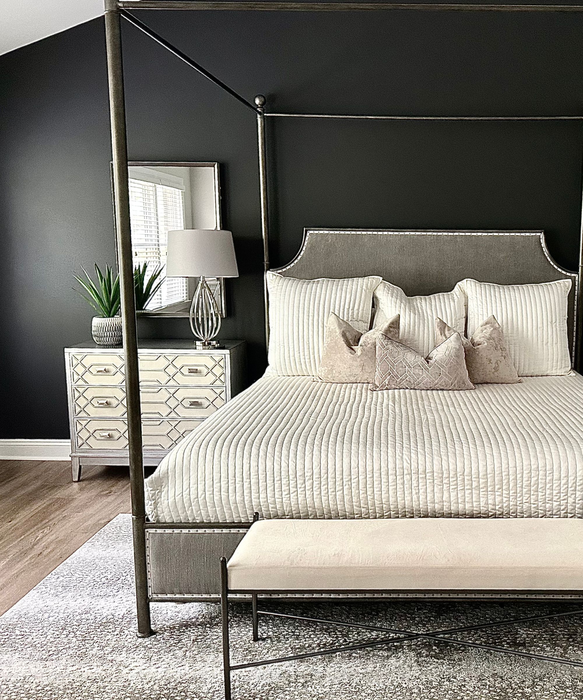
Sherwin Williams' 'beguiling black neutral' Black Fox is another of Taylor's favorites, and it's clear why – the shade borders on brown, bringing depth and visual interest in an instant. Taylor says the shade is a perfect blend of warm and cool hues, adding that 'it adds romance with a touch of masculinity.'
For Matthew O'Grady, director of Thomas Matthew Kitchens & Furniture, Tricorn Black has proved an 'intense and sophisticated shade that truly stands the test of time.' One of the best dark paints, he appreciates this shade for its versatility and ability to balance a space rather than overpower its other design elements.
'This rich black color is the perfect pick to make a dramatic statement. It can be used effectively to highlight accent walls, especially in rooms that have ample natural light. When dabbling with this bold hue, I often employ contrasting shades like crisp whites for moldings or vintage golds for wall accessories to make the color pop,' says Matthew.
4. Blue paints
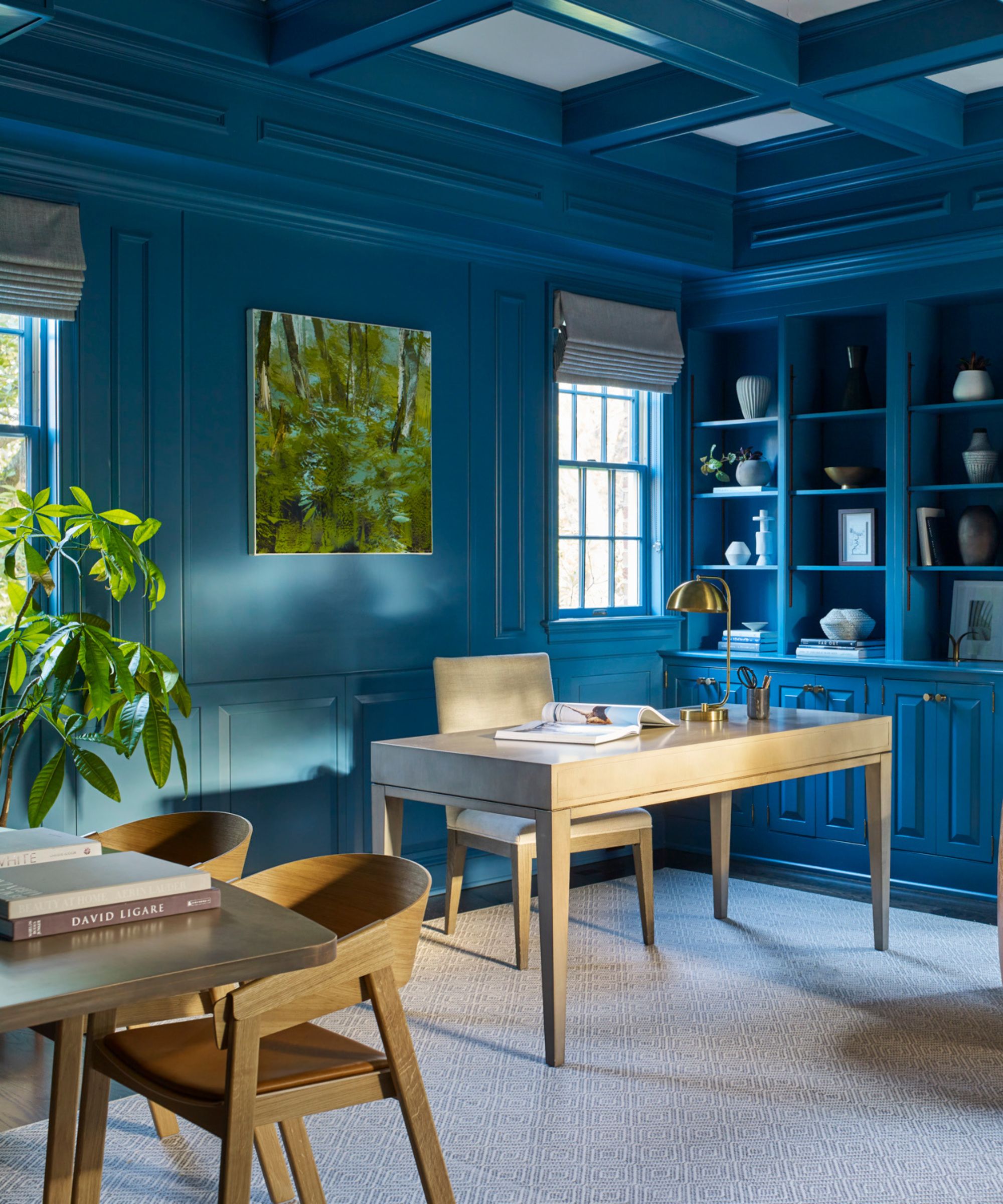
Blue is one of 2024's most popular colors, in part due to its versatility and wide range of shades. And the best blue paints span from barely pigmented to bold and exciting. In this home office design, Glenna used Sherwin-Williams' Turkish Tile, a bright, slightly moody hue, for a 'bold statement' that make the room a world of its own.
'This jewel tone makes a statement providing an unexpected pop of glossy color that can be carried to the ceiling for an added element of intrigue. A color like this can be used as an accent or in full rooms,' she says.
If you'd like to use blue as an accent color, rather than as a full-room hue, Jennifer Verruto – founder and CEO of Blythe Interiors – suggests taking a change on kitchen cabinetry. Combined with lighter walls, she says the hue Gale Force brings eye-catching color and depth to any space.
'Often, people want light walls but are willing to take risks in their cabinetry color. A darker hue, especially on lower cabinets, grounds the space and infuses a bit of drama,' she says.
Dani recommends Dark Night, a moody, slate-toned blue, 'for a touch of color intrigue' and 'a truly luxurious feel,' while Devin suggests Loyal Blue for 'a more traditional pop' of color. Both shades would work wonderfully in a moody living room design scheme.
5. Purple paints
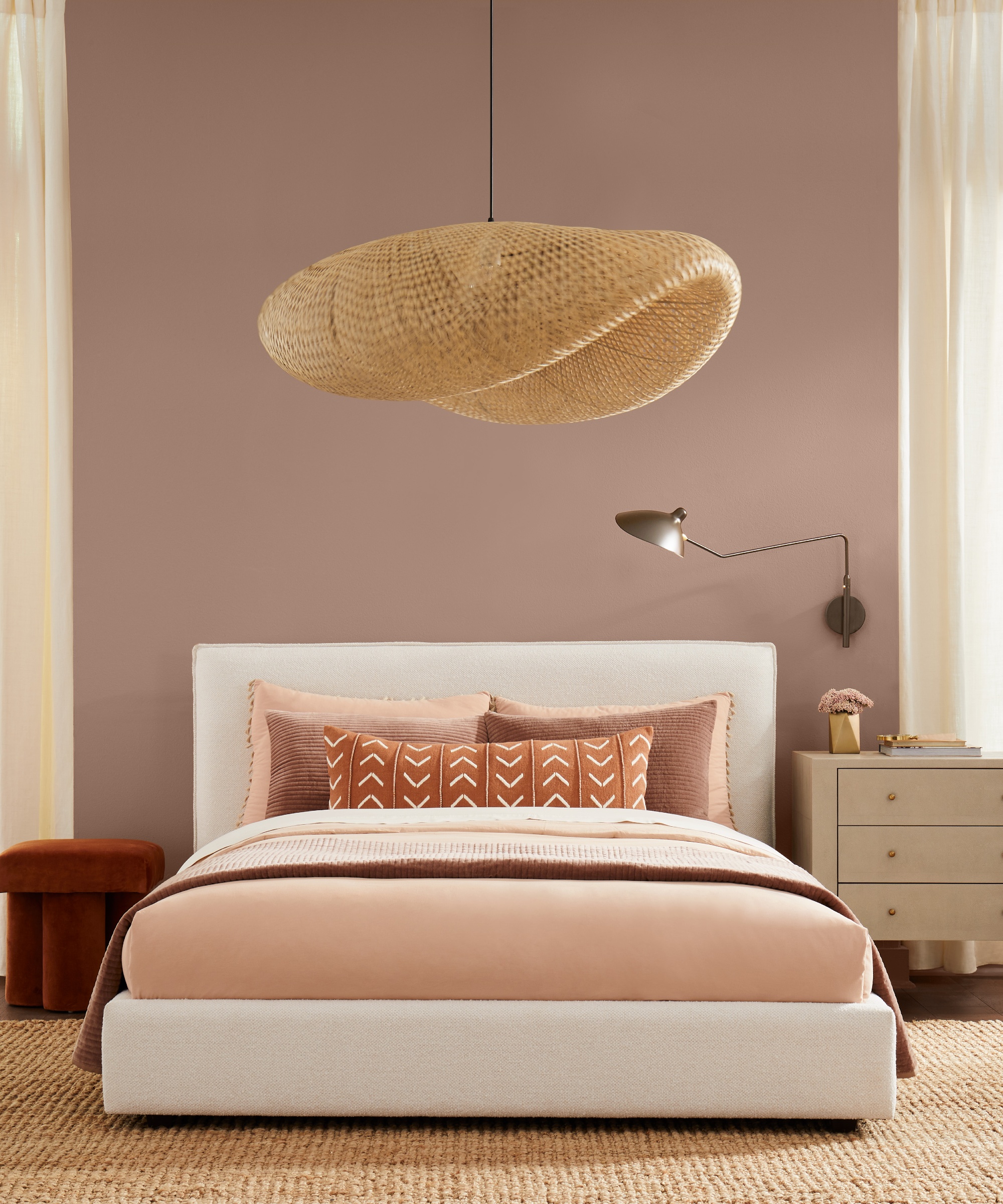
Though purple is less commonly used than blues or greens, it's an equally powerful color choice, especially in a living room, bedroom or powder room.
And if you're looking to decorate with jewel tones, perhaps picking up on the once-again-trending Art Deco style, purple paint might be just what you need. Devin suggests Plum Brown and Marooned as lovely, versatile options that bring a bit of drama and just the right amount of character.
'Not everyone shies away from color! Sherwin-Williams offers a stunning jewel-tone palette for those who love a bold statement,' he says.
6. Green paints
When it comes to the best green paints, there's so much to discover. From the best olive green paints, to the best dark green paints, to the best sage green paints, you can easily get lost in this forest of earthy hues. Luckily, interior designers have a few favorites, specifically from Sherwin-Williams.
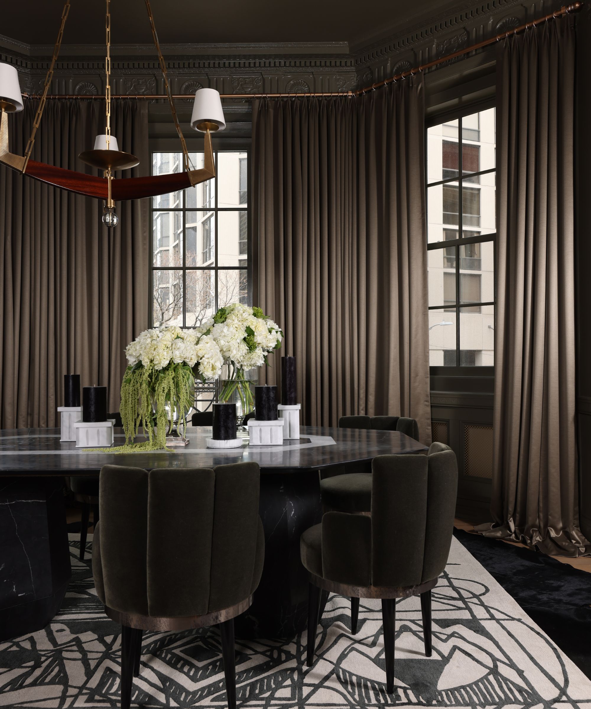
In this formal dining room designed by Donna Mondi of Donna Mondi Interior Design, Cocoon – a dark, green-gray shade – makes for a dramatic, moody environment. Donna says the defining hue has become one of her absolute favorite shades as of late.
'Photos don’t do justice to the true depth of this warm, moody green shade. Use this color to adorn your walls, ceilings, custom millwork and moldings, or even your furniture!' she says.

For a lighter take on green, Elizabeth Drake – founder and principal designer of Chicago-based Elizabeth Drake – says that Rain Washed and Piedmont make her list. She says these barely-there shades are her mainstays when she's in search of a 'blue/green, celadon color.'
'Rain Washed is just slightly more grayed down than Piedmont. They thread the needle of not too green-yellow, which can look peppy, and not too green-blue, which can look sad,' she says.
Alternatively, Matthew prefers Sea Salt, a shade he calls 'the embodiment of serenity and relaxation.' For colors that go with green, he suggests 'clean, white furnishings and light, natural wood for a modern, minimalistic aesthetic.'
'Its muted, soothing green-blue-gray undertones replicate the quiet tranquility of a beach on a cloudy day. It's a fantastic choice for bathrooms or bedrooms, where it can foster a calm, spa-like atmosphere. The balance it strikes between cozy and contemporary makes it a personal favorite of mine,' says Matthew.
7. Brown paints
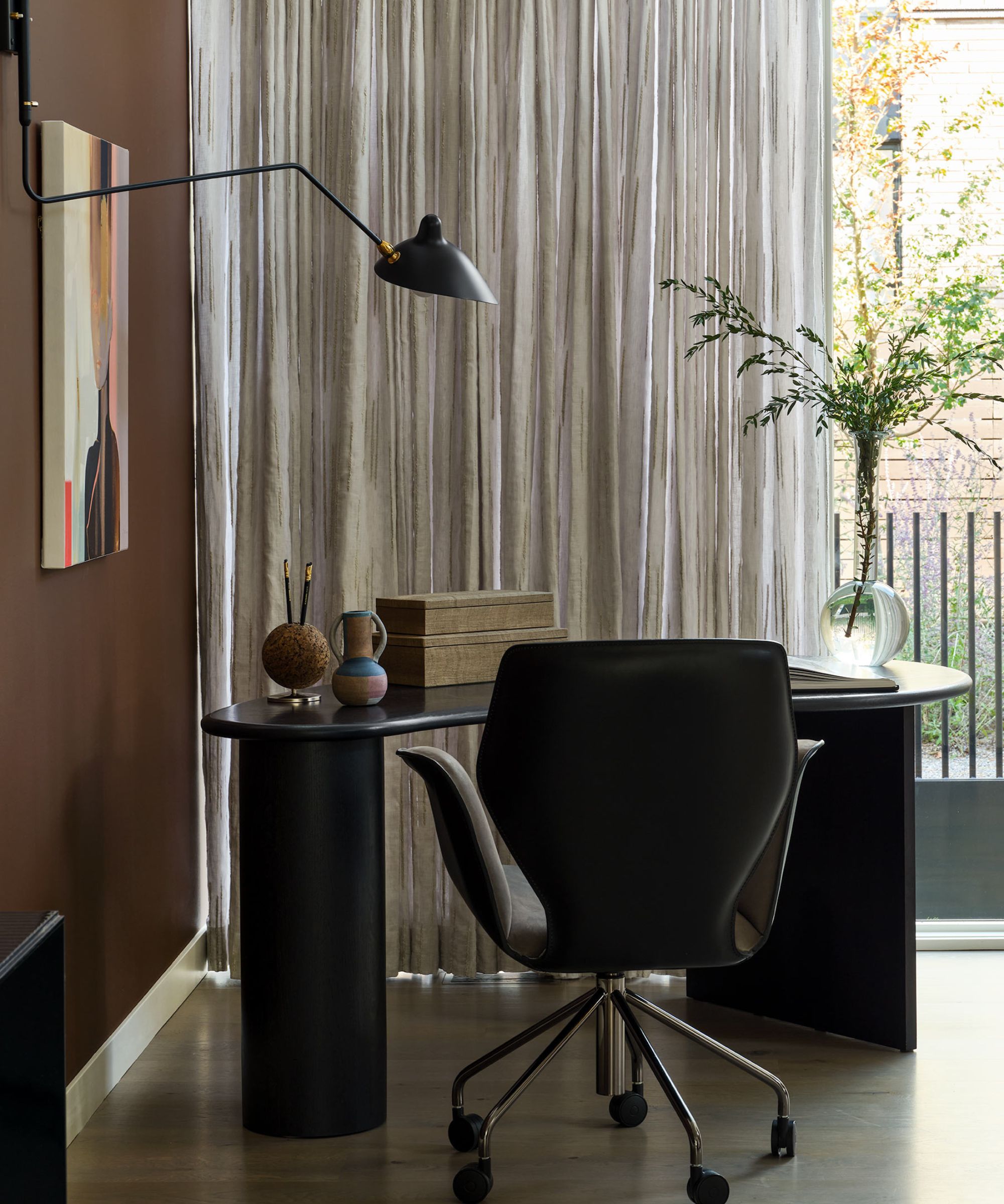
Brown is set to be interior design's dominant color trend in 2024, and we can't get enough of this comforting, welcoming shade. Donna agrees, saying that 'embracing bold colors is a design signature' at her firm. To her, Sherwin-Williams' French Roast, a deep brown with red undertones, 'lives up to the expectation.'
'This earthy red hue is the perfect choice to infuse a burst of color into any space, whether it be a Bauhaus-inspired, texture-filled living room or adding depth to a contemporary stairway,' she says.
In this home office, she used French Roast on the walls to form a lovely contrast with tall, bright windows and textured curtains. A house plant also pops against the dark, moody color scheme.
8. Neutral paints

Because the best neutral paint colors don't always fall into the categories of white, black or gray, we asked interior designers about their favorite on-trend neutral shades as well. And in this gorgeous kitchen, Donna chose Shiitake, a 'warm stone gray' for the walls and millwork. She loves the shade, calling it 'the ideal warm neutral paint color we've all been searching for.'
'This color is a true chameleon and will perfectly complement your warm wooden cabinetry while capturing the rich tones of exotic stone countertops! It serves as the perfect backdrop for any style of space,' says Donna.
Glenna adds Skipping Rocks, a versatile and non-imposing neutral, as a contender for her favorite shades. She uses the shade both as an accent for millwork and molding, and for entire rooms or areas of the home.
'Use Skipping Rocks for the fireplace surround and ceiling to ground the space, and highlight an accompanying color with more saturation,' she says.
Finally, Taylor adds that the brand's Agreeable Gray is a 'classic,' working in any home, for any personality: 'It can have subtle, pink undertones and work well in nearly any space. It will feel light and agile for whatever the room may unfold to,' she says.
It's clear that there's no shortage of color inspiration to be found within Sherwin-Williams' catalog, and if designers are using and loving these shades, they have the seal of approval. Pick your favorite and give your space a lovely spring refresh – you'll thank us later.
