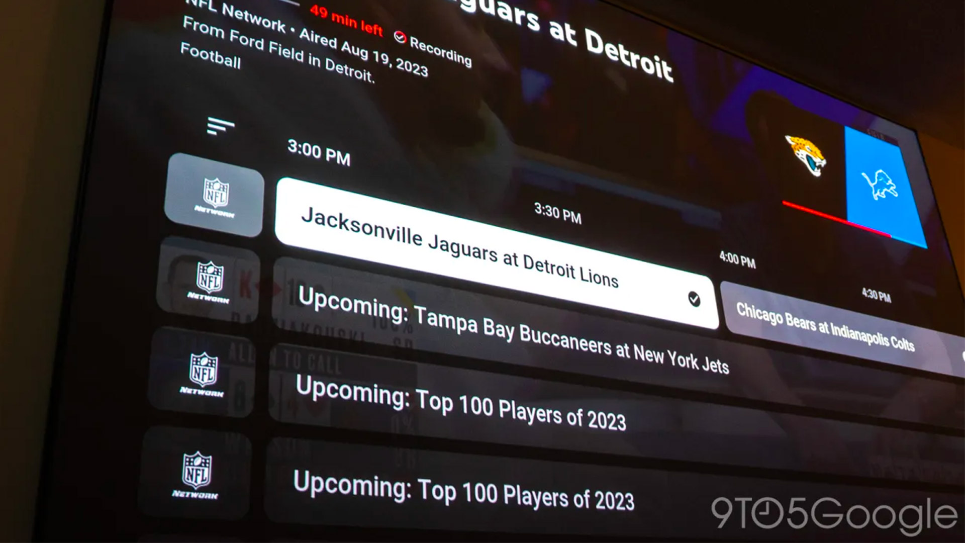
Earlier this year, Google updated the Google TV interface to make it much easier to find what you want. And now it looks like it's bringing the same interface to YouTube TV in a great free update.
The redesign was spotted by YouTube TV Redditors such as nathanburton27 (via 9To5Google), who posted a photo of the interface in action: "This guide kinda looks very modernized and I love it!". "Can't wait to see what the future holds," they added.
What's changing in the YouTube TV interface?
The image clearly shows that the YouTube TV app now has the same Live tab that we previously saw on Google TV. It's visually quite different from the current/previous interface.
In fact, it's much more like Google's other interfaces including not just Google TV but Android TV more widely. The menu is a lot clearer, with a darker background that makes the text easier to read.
At the moment, this design change only applies to the live sections of YouTube TV and Google TV, but there's no reason why it can't be rolled out more widely including to YouTube on the web.
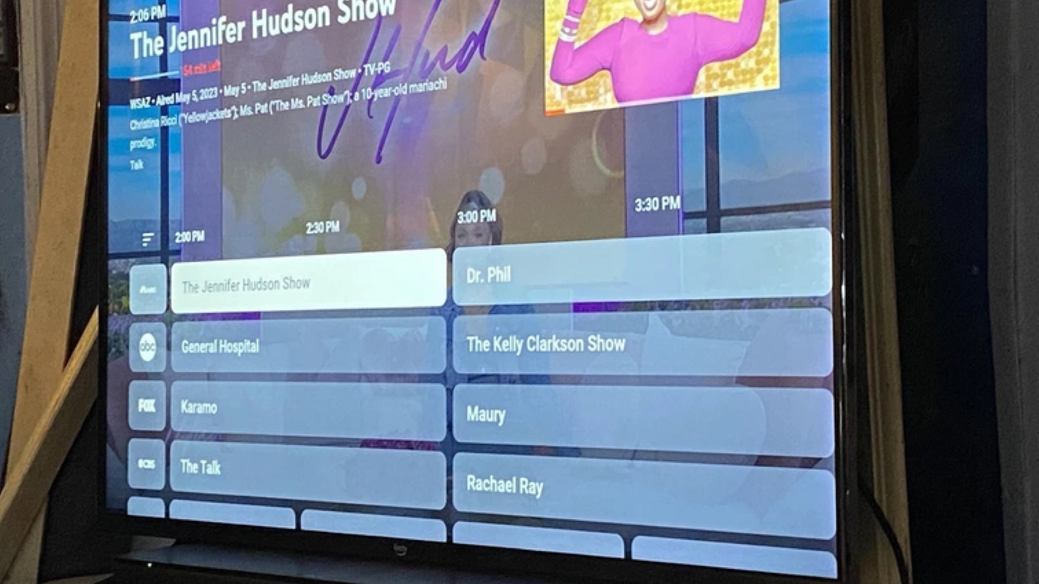
It's certainly proving popular on the r/youtubetv subreddit, where the comments are almost all positive. The consensus is that the new look is fresh, more modern and most importantly of all, more useful and readable.
Although, apparently there's not an option to increase the font size at the moment, which could be an issue for smaller screens or for users with less than perfect vision. But that's a relatively simple feature to add and I'm sure Google is monitoring feedback to identify such minor but important improvements for a future update.
This is definitely a big improvement. As we said in our story about the Google TV interface, which a lot of the best TVs use, smart TV interfaces are often very cluttered and the increase in home screen ads has made things even worse, so making things cleaner, more spacious and easier to read is definitely a step in the right direction.

