Whether you’re looking for authentic colors to decorate a traditional home, or you’re looking to introduce a touch of history into a modern home, vintage paint colors are a wonderful way to add charm and character to interiors.
Vintage paint colors are perennially popular with interior designers and there are a huge array of shades available inspired by historic colors. In fact, many paint companies take inspiration from period properties when formulating core colors and offer curated heritage palettes.
Just like modern paint colors, vintage paint colors do go in and out of fashion, so if you're a fan of vintage style and you’re looking to redecorate then you're in the right place as we've consulted the experts on what vintage paint colors are making a comeback this year.
What are vintage paint colors?
Vintage paint colors are generally used to describe colors of the past that are characteristic of a certain period or era. Today we are used to having ready-mixed paints available in an infinite spectrum of colors, but until the late 19th century most interior paint finishes were mixed by hand using ground earth, mineral, and vegetable pigments combined with various water or oil-based binders.
Colors made from earth pigments such as ochre, sienna and umber were commonplace simply because they were the most affordable and really available, while bright colors made from more prized mineral pigments were a luxury afforded only by the wealthy.
Since the 20th century, with the development of synthetic pigments and binders, alongside the use of white titanium dioxide which gives modern paints vibrancy and opacity, a wide array of vibrant colors have become readily available. Vintage paint colors are generally regarded as more mellow than today’s and as they were hand mixed they historically displayed a more nuanced texture when applied to surfaces.
Although one needs to be cautious not to over-generalize when it comes to the history of color in interiors, certain shades have come to be associated with different periods and eras.
During the Georgian era, pea green, sky blue and pastel shades were thought to be particularly popular, while the Regency period of the early 19th century saw a shift towards rich reds, greens and yellows. The Victorians were not shy with color and favored deep reds, browns and dark greens.
Fast forward to the 20th century and during the Mid-century modern period neutral backdrops were more common with bold color often introduced through art and furnishings in the form of primary colors as well as mustard yellows, teals and oranges. Light pinks, blues and corals were also popular.
Today the world is your oyster when it comes to paint colors. There are a wealth of modern paints available inspired by vintage colors and many paint companies including Farrow & Ball and Little Greene often look to period homes and interiors for inspiration when developing palettes.
When it comes to choosing interior paint colors the size of a room – as well as its orientation, lighting and function – are all important factors to consider, not to mention how they make you feel. Generally, it’s best to avoid trends when it comes to choosing paint colors for your home, instead look to colors that suit the architecture and make you happy. However, if you are embarking on a decorating project, looking at color trends can serve as great inspiration.
Which vintage paint colors are making a come back this year?
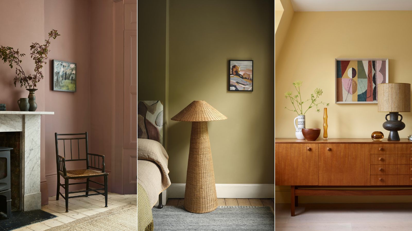
According to color experts, warm earthy shades are on the rise. Soft, mellow yellows through to rich mustard and golden shades with undertones of ochre as well as terracotta and brown are all growing in popularity.
Earthy pinks and peach hues reminiscent of fresh plaster and sunbaked Mediterranean buildings to the retro 80s interior are also making a comeback. Additionally, ‘grubby' greens which contain black and umber are having a revival, such as mossy greens and drab olives which conjure the interiors of the Victorian era. Perhaps more surprising is the resurgence of zingy acid greens of the swinging sixties and seventies.
‘The resurgence of vintage colors in interior design is a significant trend, blending nostalgia with contemporary aesthetics. This revival is not just about recreating past looks but reinterpreting them in fresh, modern ways,’ explains Francesca Wezel, color expert and founder of Francesca’s Paints.
‘Popular vintage colors are terracotta (our Marco's Terracotta from the Original Collection), ochres (Peter's Ochre Original Collection) and browns (Lavinia's Russet Donne D'arte). The return of vintage colors in interior design reflects a blend of historical appreciation and contemporary innovation, and to create spaces that are both stylish and personal.’
1. Light buttery yellows
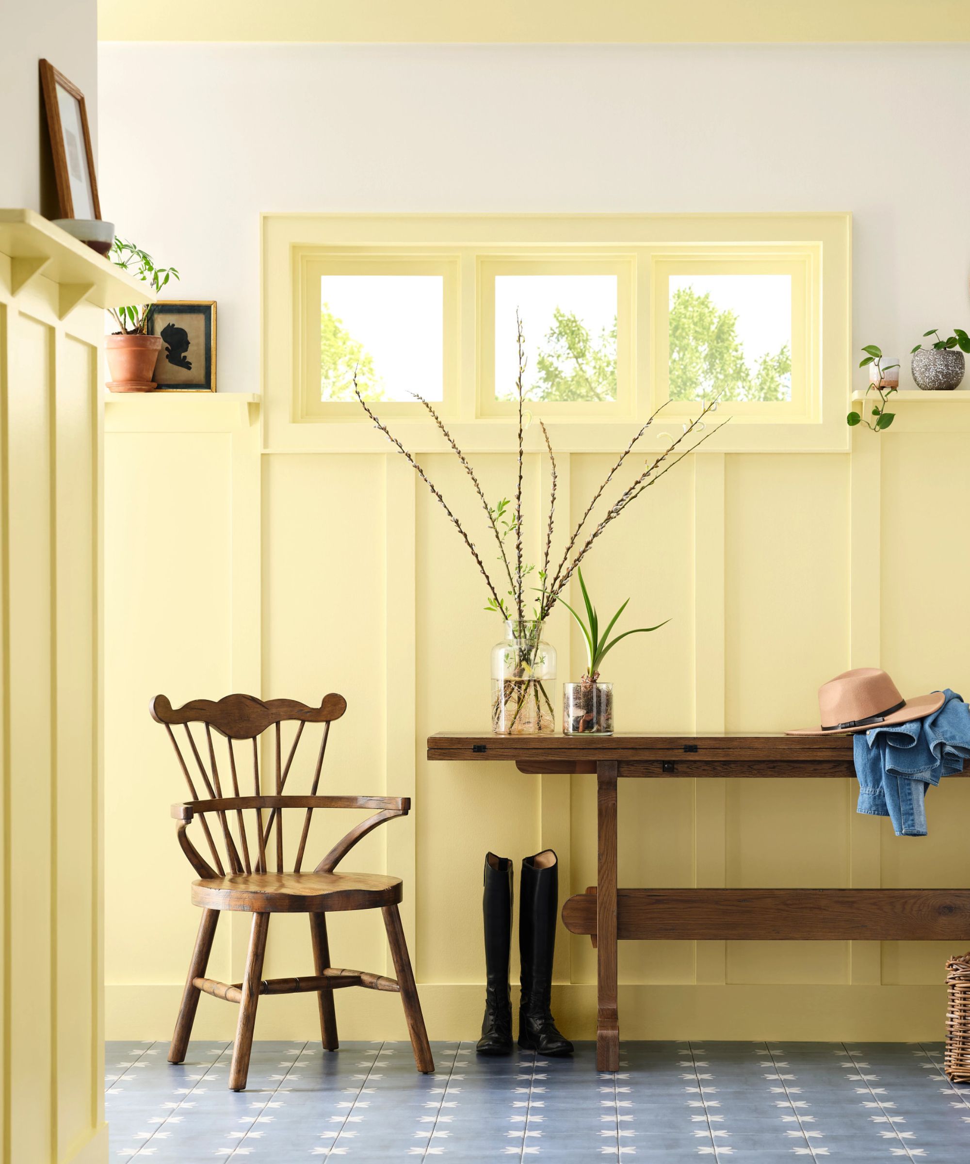
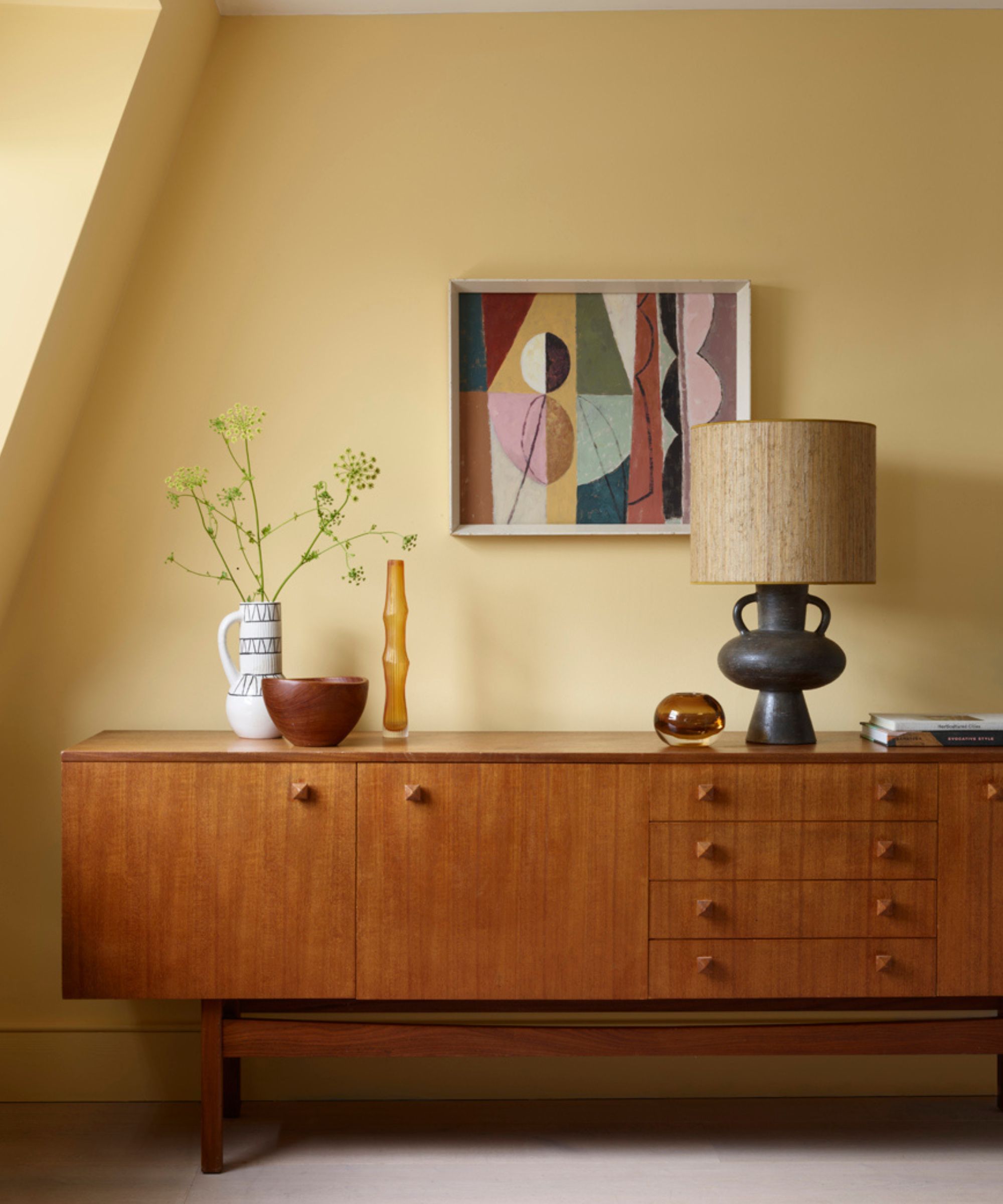
We’ve noticed a lot of buttery yellows popping up lately and the experts agree. Evocative of crumbling Italian buildings to 1950s kitchens, light creamy yellows are guaranteed to bring vintage charm while radiating spaces with a warm, uplifting atmosphere. They make a great choice for everyday spaces like kitchens or use them in hallways for a joyful welcome.
‘I love that we’re seeing a comeback to more retro-style colors lately, especially since they’re so fun and vibrant! One that stands out to me is the resurgence of yellow shades,’ explains Emily Kantz, color marketing manager at Sherwin-Williams. ‘While yellows have always been seen as vibrant and uplifting shades, they may take experimentation to find the right palette and colors for someone’s style and taste, making them an intimidating choice for homeowners.
In Sherwin Williams’ recently launched 2025 Colormix® Forecast: Capsules - its yearly trends forecast - several yellows are put in the spotlight, including the lovely Icy Lemonade.
‘It’s one of my favorites from the forecast,’ says Emily Kantz, ‘We’ve never highlighted a light and upbeat yellow shade like this in our yearly forecasts because we usually recommend homeowners go for deeper yellows in the home since they’re easier to work with. But now that we’re seeing a comeback for retro decor and shades in the homes, we came back to this shade because of how well it works either as an accent color on kitchen cabinets, or on all four walls in smaller rooms like a mudroom or an entryway – it really brightens up any space you place it in!’
Cara Newhart, interior designer and ambassador at Behr, has also tipped vintage pastel yellow as a shade set to make a comeback. ‘This shade was a go-to for vintage kitchens and is a perfect accent color since it’s bold enough to make a statement, but soft and warm enough to be liveable,' she says. ‘Behr’s Vanilla Ice Cream is a warm and cozy yellow with all the vintage vibes.’
2. Sandy and gold ochre hues
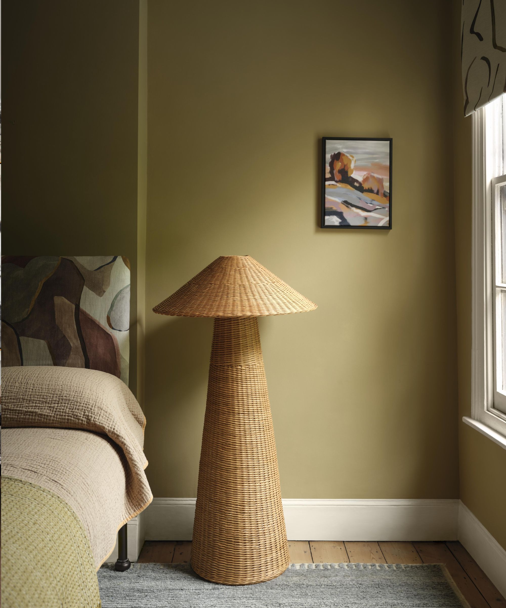
As we continue to seek spaces that feel grounding, comforting and connected to nature it’s no wonder earthy shades with undertones of ochre are growing in popularity. According to the experts, sandy, gold and caramel tones are set for a revival.
‘This year is all about adding comfort to the home and rebalancing with warm yet serene tones. Hues like Summerdale Gold are resurfacing as popular colors, offering a sandy tone that is both confident and calming,’ says Helen Shaw, director of marketing (International), Benjamin Moore.
A key color featured in its new AW24 lookbook, 'this grounded honey gold with hushed green undertones pairs beautifully with tactile materials, from wicker to appliqué, while acting as a relaxed foil to abstract pattern, painterly finishes, and other rich autumnal hues,’ adds Helen Shaw.
Rich yellows also feature in Sherwin WIlliams' color forecast for 2025 with Quilt Gold selected as a stand-out hue. Color marketing manager at Sherwin-Williams Emily Kantz describes the shade as ‘very reminiscent of the 70s retro design style and is an excellent choice as an accent color in the home to bring out a pop of color and playfulness in any room. We’re very excited to see how yellow comes back to life!’
3. Grounding browns
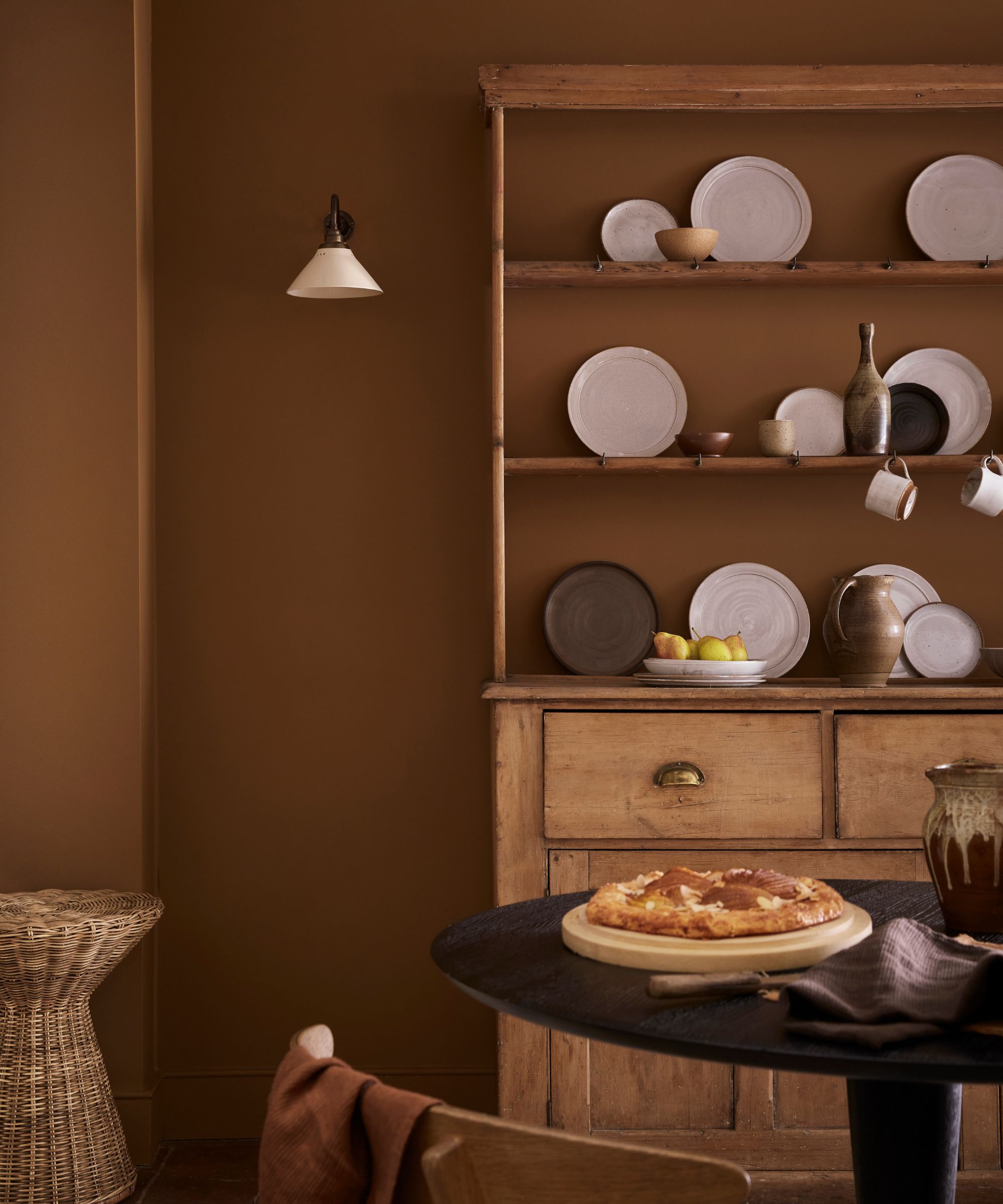
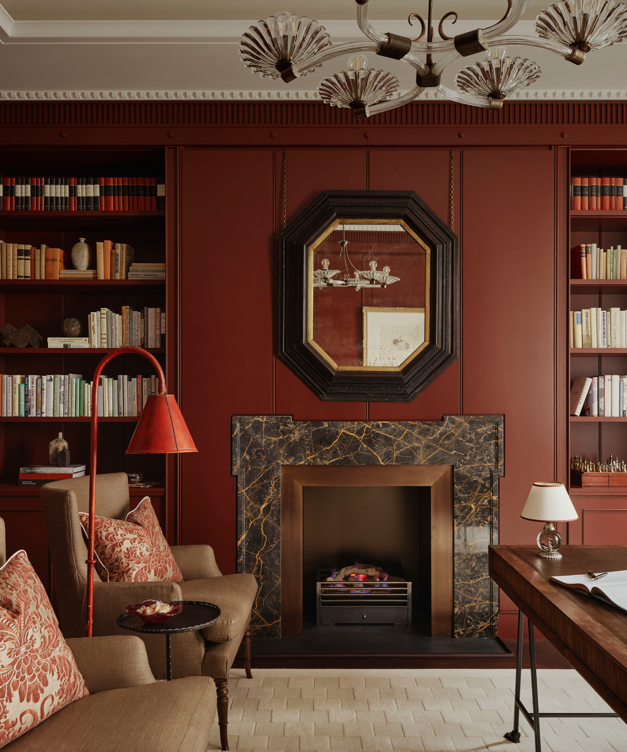
Similarly to the caramel and ochre tones, the rich sweet tones of chocolate and cinnamon brown as well as terracotta are proving irresistible this season for their ability to bring grounding warmth. Rich and cocooning they are perfect for infusing interiors with a moody, vintage feel from Victorian utility to retro 1970s vibes.
‘Gone are the associations of dated 1970s interiors, drab or dull spaces, browns are re-taking their rightful place in contemporary interiors. From the deep Chocolate Colour and sumptuous Muscovado, to the softer ochre-toned brown Galette or the elegant warm stone color Split Pink, these cozy, versatile neutrals are perfect for creating captivating, indulgent and inviting spaces,’ explains Ruth Mottershead, creative director at Little Greene.
‘This embracing of brown is a continuation of the trend we have seen shifting away from cooler grey interiors to a warmer palette of natural hues that deliver comforting, soothing schemes. The earthy yet refined nature of brown shades makes them the perfect backdrop for natural materials currently being incorporated in contemporary interiors, including wicker, rattan, warm woods and stone finishes.’
4. Plaster pink and peach tones
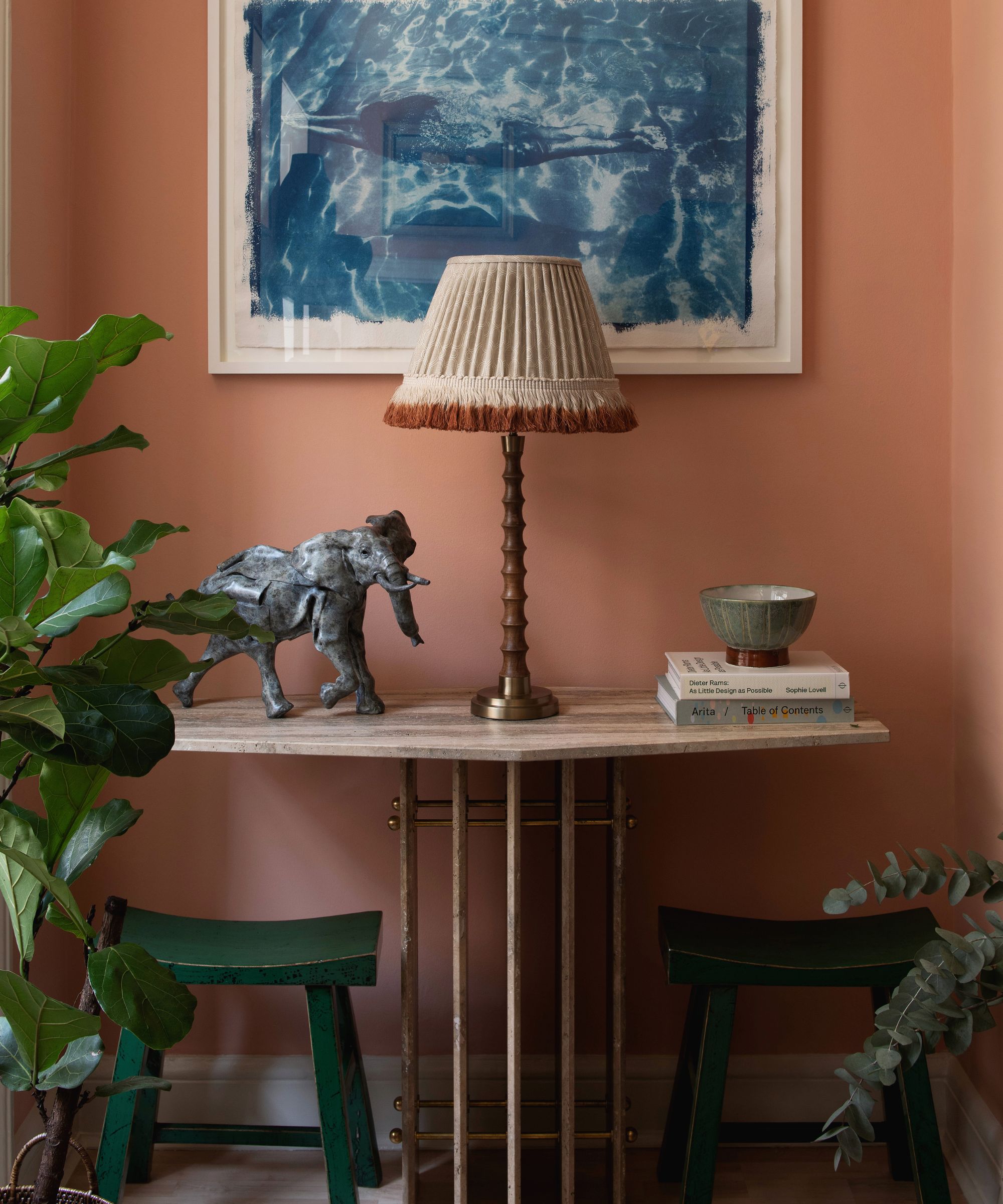
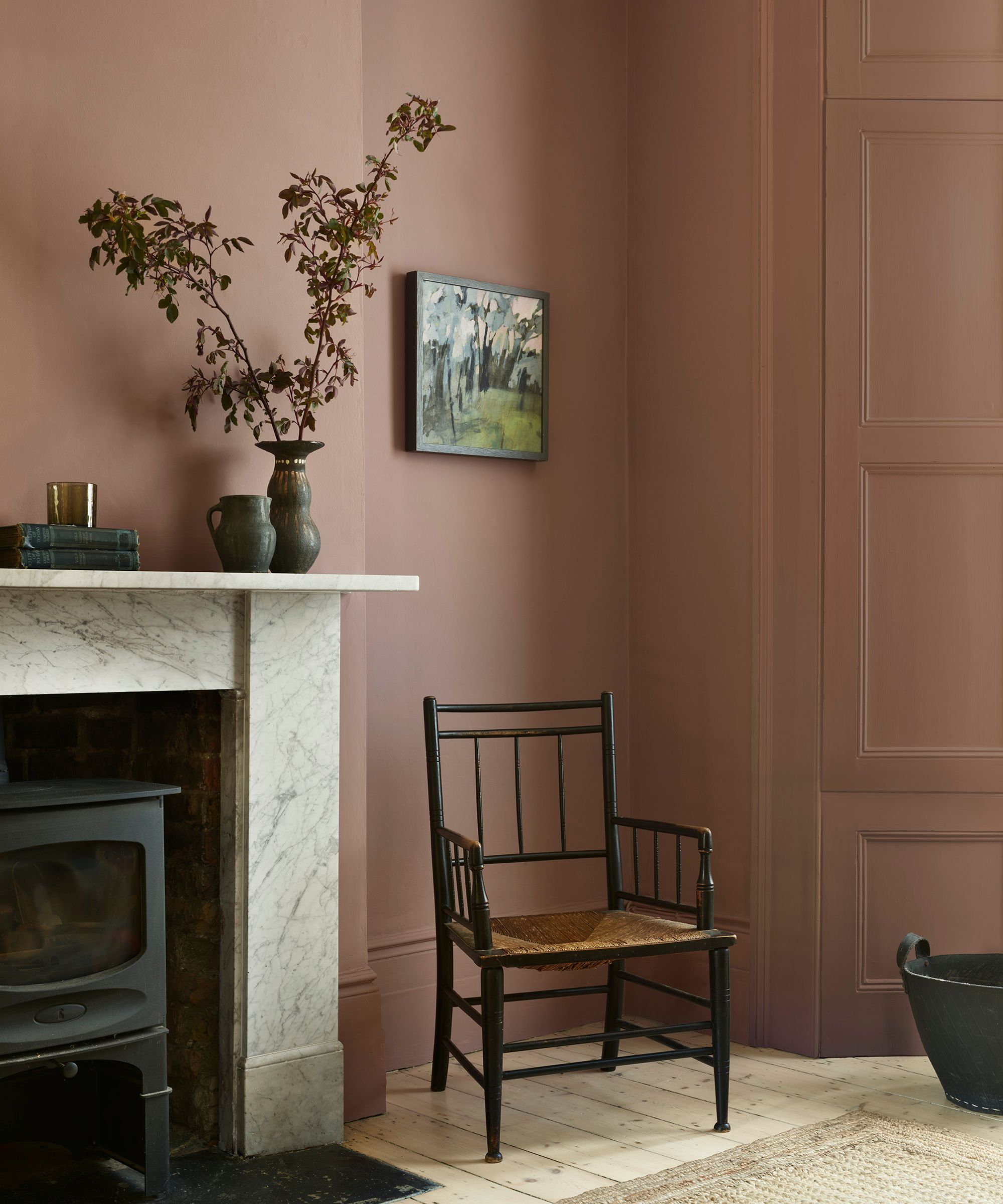
‘We are seeing a big ‘peach revival’ with these warm terracotta shades reminiscent of Mediterranean summers to 80s drawing rooms! Peachy colors bring warmth, rustic charm, and a touch of the Mediterranean to any space,’ says Milla Elder, Head of PR and marketing at Edward Bulmer Natural Paint.
‘Edward’s terracottas have an earthy undertone and are truly exquisite, they are packed full of the finest earth and mineral pigments so whether you go for a coral pink or more pinkish brown, these shades will create a soft, living finish that will flatter all lights and work and transcend time.’
To channel the trend for warming peach tones try Edward Bulmer’s Hespan which he describes as, ‘not pink, nor orange, just a beautiful soft color which warms up any type of room!’
Similarly, Patrick O’Donnell, brand ambassador at Farrow & Ball agrees that warm plaster and peachy tones see no sign of abating. ‘Earthy pinks have been doing the rounds for a few years now and for good reason. Consider them as a neutral and they will layer with almost any color (we’re talking Pink Ground and Setting Plaster here). They work in any room in your home, from the most flattering wall color for your bathroom, to an elegant living room, to a warm-blushed hallway. These colors are your best friends.’
5. Grubby greens
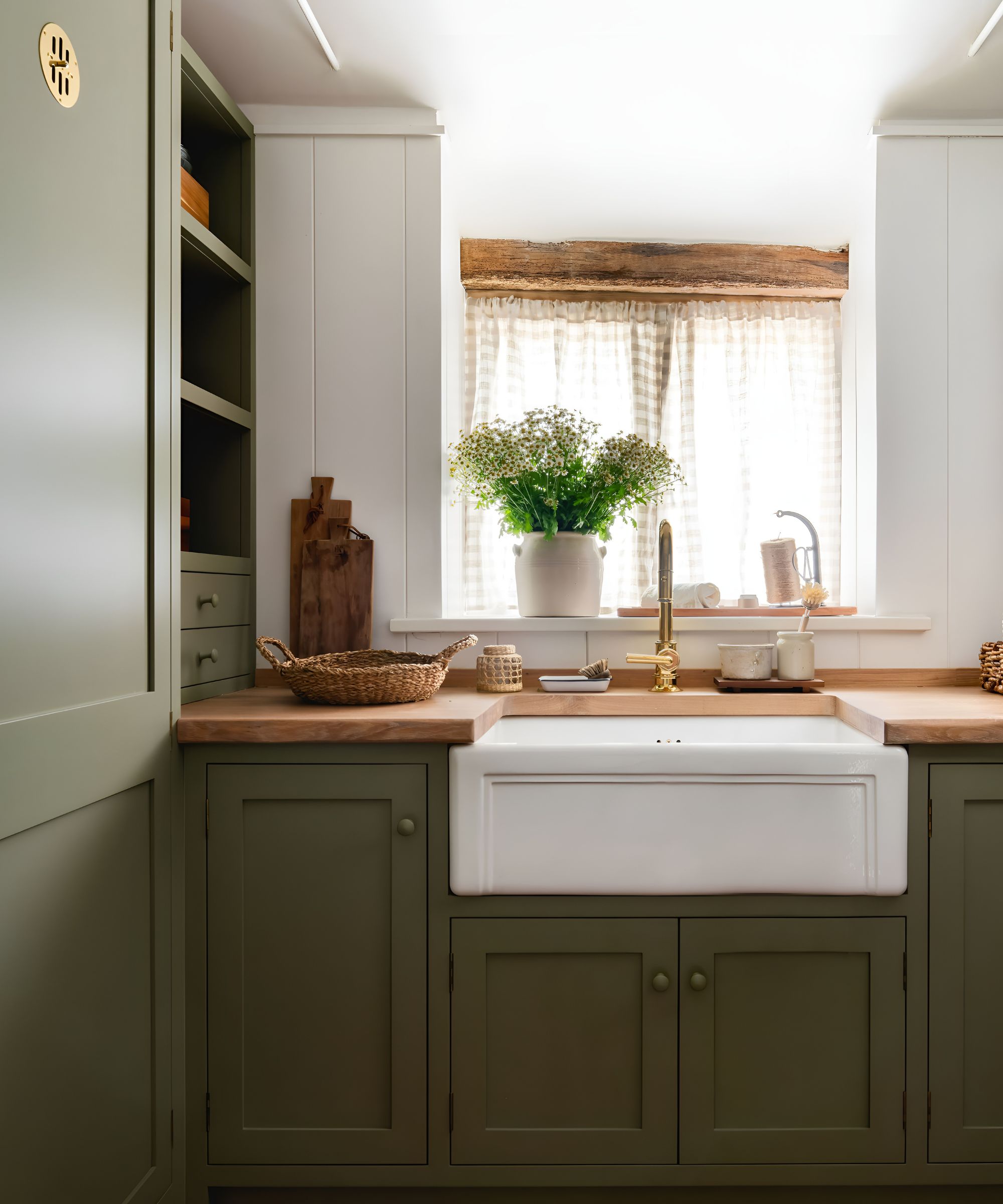
Earthy or 'grubby' greens as some have started to call them, are greens that have black or brown undertones giving them an aged look as well as a moody, mellow feel. COAT has recently released three new green colors perfect for those looking to reconnect with nature and create a nostalgic, grounding atmosphere including Jojo's Green pictured above.
'COAT has only been around just over three years, but even we’ve seen the shift in popularity from fresh greens to grubbier ones. By ‘grubby’, I mean those green shades with yellow or brown undertones – versus blue undertones, which tend to give a fresher green color,' explains Rob Abrahams, COAT's co-founder and CEO.
'We saw the same shift in whites and neutrals first, with people moving from cooler to warmer tones with an earthy feel. Greens are just following that same shift. A muted green color, whether dark or light, feels quite like a neutral in that it sits comfortably in the background without being too shout-y.'
6. Retro teals
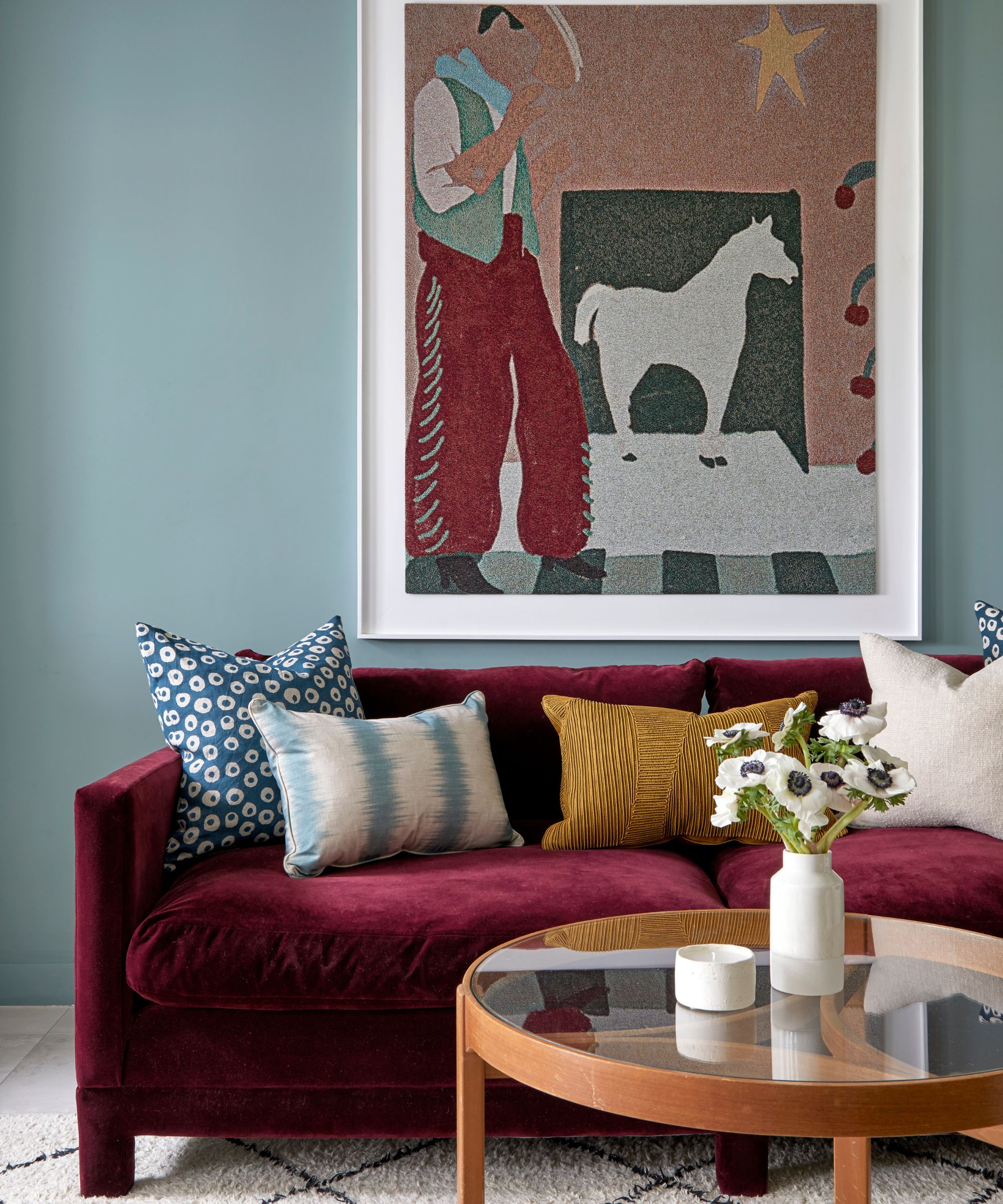
Tash Bradley, Lick’s director of interior design and color psychologist, has tipped Lick's Teal 01 as a great color for capturing a vintage feel alongside creamy whites. Popular in Mid-century Modern palettes, mellow teal blues pair wonderfully with on-trend earthy ochres and terracottas.
'Vintage colors are deeply nostalgic, they cocoon us and comfort us. This is because they typically have a heavy black pigment in them, giving them an earthy, grounding feel,' says Tash Bradley. 'Deep reds, burgundys, ochre yellows, creamy whites, and deep teals all have that vintage feel and are both luxurious and inviting. Buttermilk colors like creamy White 05 and Yellow 07 are gorgeous paired with rich burgundy or teals like Lick Teal 01.'
7. Acid Greens
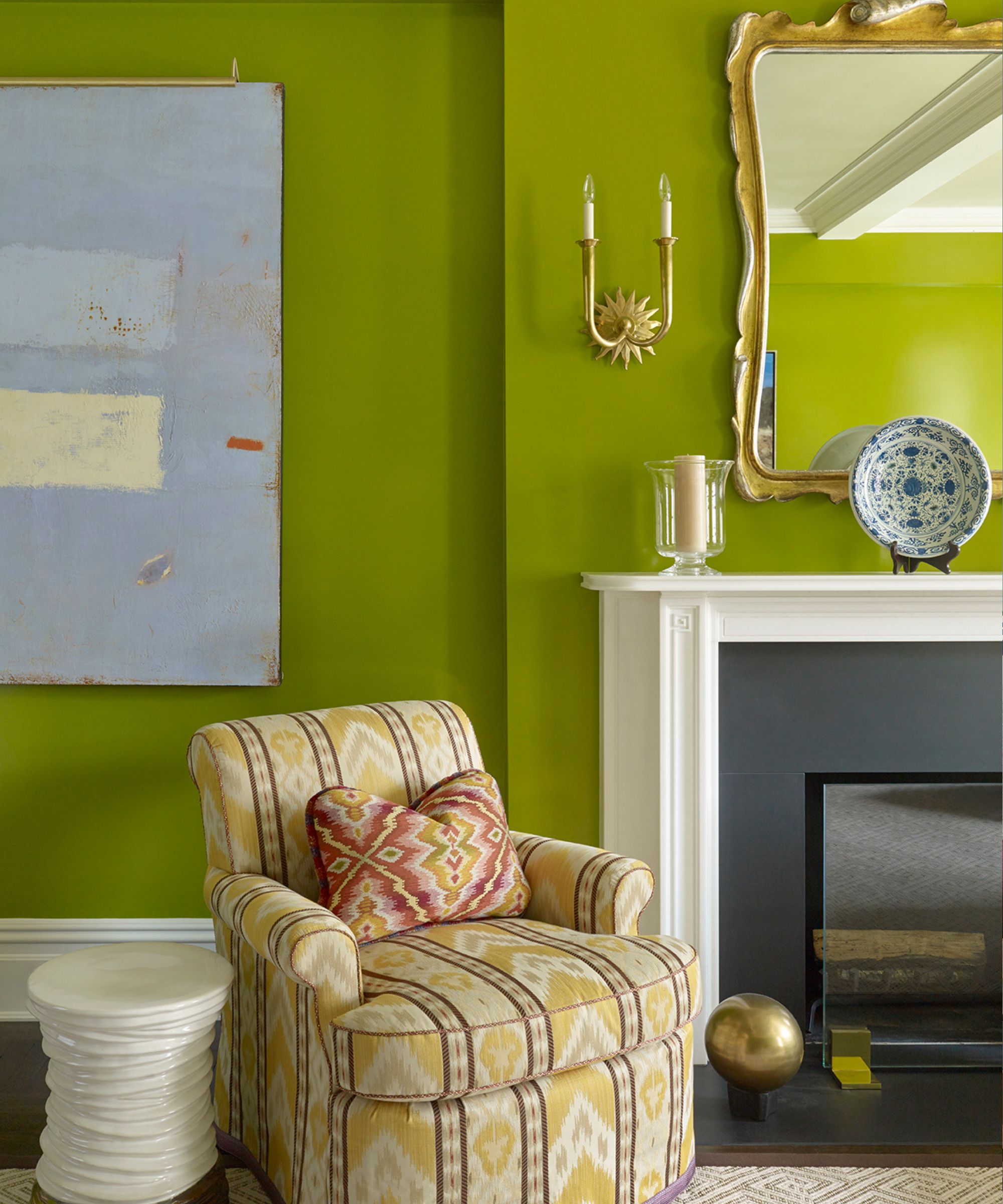
Fans of Mid-century modern style will be pleased to know that acid greens are on the rise. While not an easy color to decorate with, for the color confident they can make for wonderfully fresh and energizing spaces.
Patrick O’Donnell, brand ambassador at Farrow & Ball explains how ‘we are seeing the return of some vibrant 50’s and 60’s colors such as zingy limes like Acid Drop from our archive or the Kermit inspired green like Danish Lawn, again from our archive palette.’
Similarly, Cara Newhart, interior designer and ambassador at Behr, has tipped the zesty green shade as one to watch. ‘Shag green — reminiscent of lush shag carpets and vintage bathroom tile this classic lime green has been in and out of vogue at least once a decade and is an amazing color for adding personality and vibrancy to any space. Luscious Lime from Behr is a bubbly lime green that’s perfect for a vibrant accent wall or color-drenching a powder bath with a fun floral wallpapered ceiling.’
As when bringing anything vintage into your home, the result will always be timeless. Looking to the past for your color inspiration will ensure the scheme always works as a backdrop even as your tastes and trends change.
