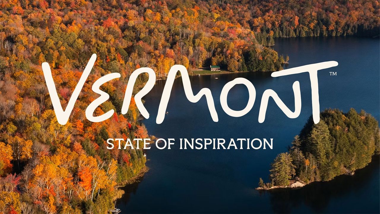
My first reaction to Vermont's new tourism wordmark by DNCO was suspicion. Initially, this loose, looping scrawl looked like something I could have knocked out on a napkin while waiting for my coffee. Not the output of a nine-month process involving a global place branding agency.
Admittedly – as fellow Creative Bloq writer Joe Foley pointed out in his news story – on closer inspection, the letterforms carry real intent. A winding road in the 'e', mountain peaks in the 'm', a moon over the hills in the 'o'. Yet even once I'd clocked all that, I still couldn't shake the feeling that it all looked like it had been dashed off in the time it takes to sip of coffee.