When variable fonts hit the design scene a few years ago there was a great deal of buzz and excitement. But there was also frustration, because it was a new tech that was fun to play with but not ready to use. Support for variable fonts still isn’t universal across all browsers, operating systems and software, but it’s getting there. So it’s well worth learning about them and considering whether they’re right for your projects (if not, see our list of free fonts).
In terms of design, the major benefit of variable fonts is their flexibility. We’re used to designing around fonts that come in discrete widths and weights, which can be limiting. If things don’t fit, or one weight looks too bold and the next option is too light, your only choice is to change your design. Variable fonts can solve these problems by making type as adjustable as everything else. Freed from these constraints, designers can be more creative than ever.
Typography Week is almost at an end, be sure to check out all our amazing type content.
What is a variable font?
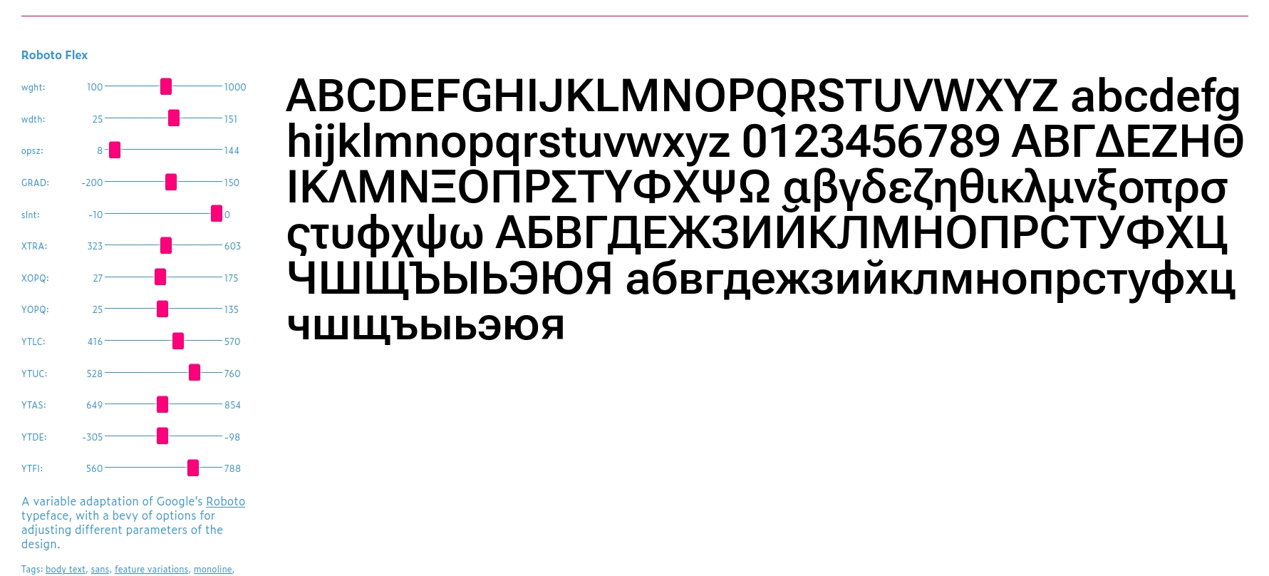
Instead of having a number of distinct widths and weights to choose from, variable fonts are adjustable across continuous axes. The easiest way to understand this is to head over to V-Fonts, a repository of publicly available variable fonts, and have a play around. Many fonts have sliders for just width and weight, but some have axes for many other properties. Roboto Flex, for example, has axes for 13 different properties.
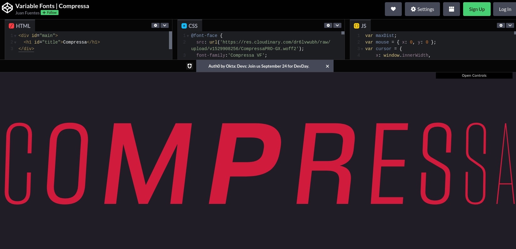
On top of this, variable fonts can transition fluidly from one style to another, which means you can use them to create animations. This could be something subtle such as text smoothly becoming bolder when you hover over it. Or it could be something more spectacular such as the example below, in which the variable font Compressa gets stretched and compressed as you mouse over the type. Creating animations with variable fonts is much simpler and lighter than the alternative methods you could use to create the same effect.
How is a variable font different to a traditional font family?
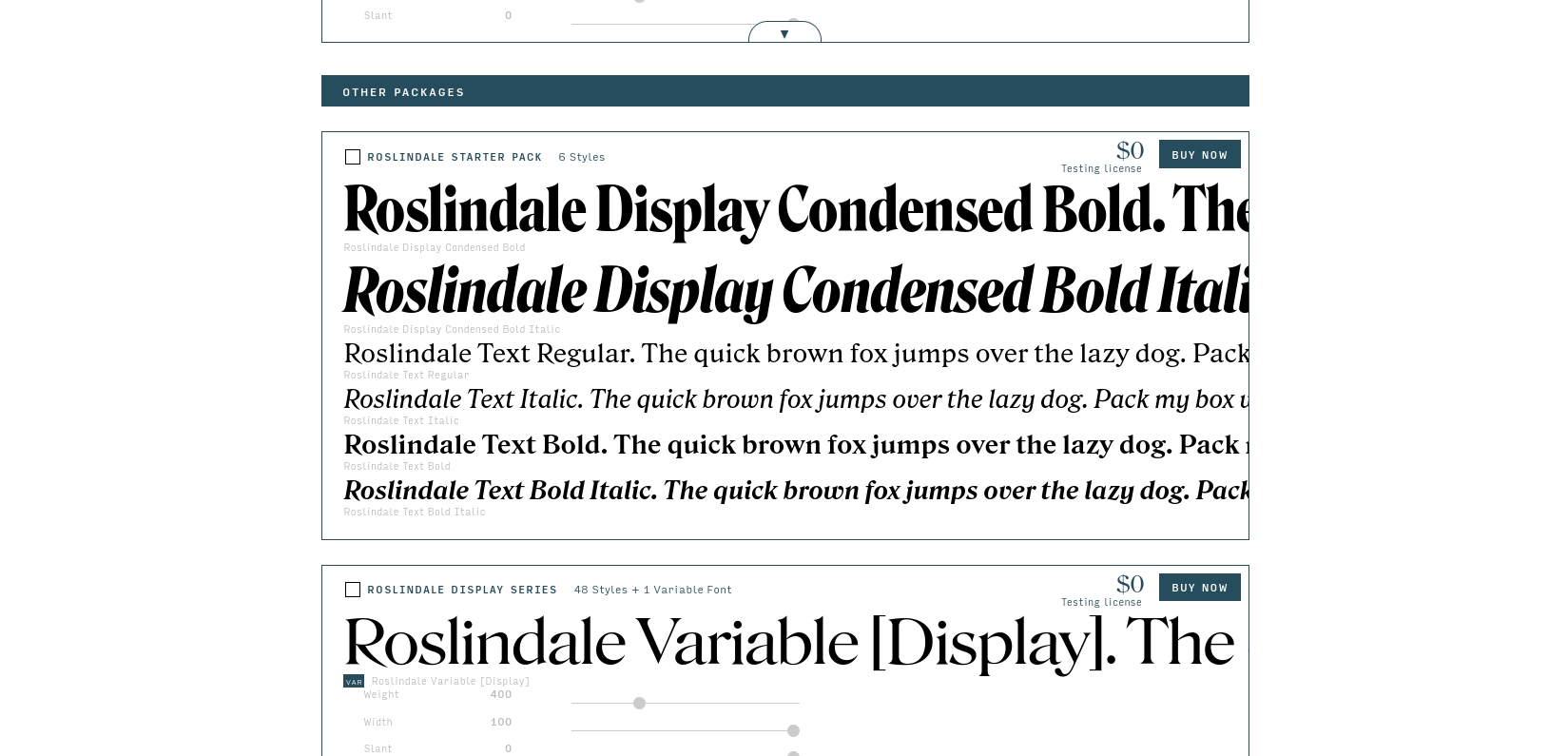
As you might expect, variable fonts are made very differently to the traditional variety. A major benefit of variable fonts is that they come in a single font file. With traditional font families, each width and weight exists as a separate file, and the website has to load that file for every single variant on the page. Having just one file that contains every variant makes the webpage much lighter, which can bring performance benefits.
Another important difference is that variable fonts are not universally supported by browsers, operating systems and software packages. Most browsers and operating systems do support them to a great extent, but there are caveats and complexities. These are considerations you will need to take into account when deciding if the benefits of variable fonts are worth your while.
When would I use a variable font?
In terms of design, the benefits of using variable fonts are clear. Their flexibility opens up all kinds of creative possibilities, and the animation capabilities offer a way to add dynamic, fun effects to your website without weighing it down.
It’s tempting to rush ahead with variable fonts, but there are important factors to consider. First of all, head over to CanIUse and this page on V-fonts to find out about the support limitations. Whether you choose to use variable fonts on your website will depend very much on what type of site it is and who your users are. For some websites, it might not be the end of the world if it doesn’t display correctly for every single user. For others, the extra testing, fallbacks and other work you may need to do to make sure it works in every scenario might negate the benefits of using variable fonts.
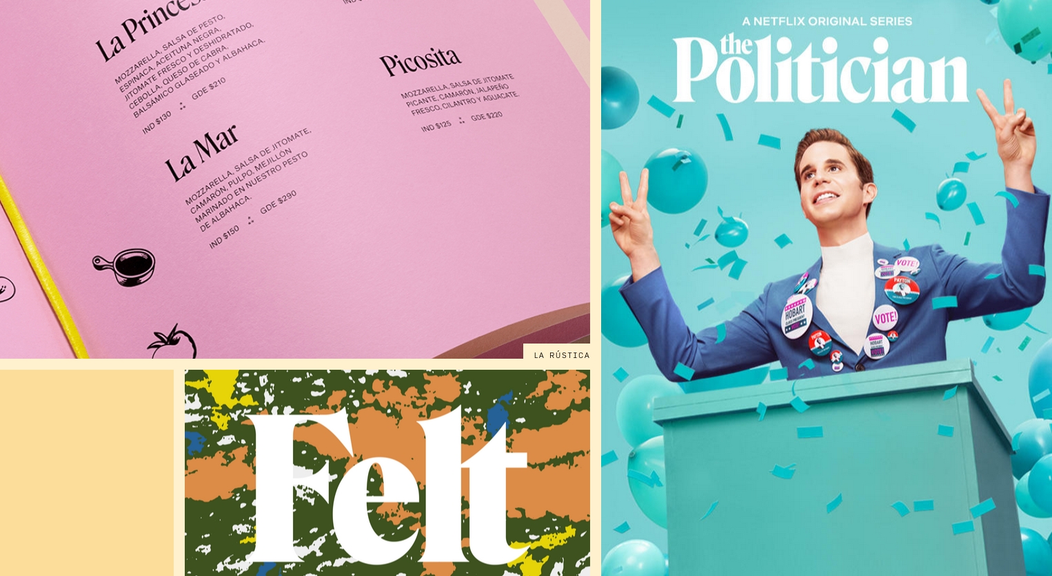
Another factor that might hold you back is that there are many, many more standard fonts than there are variable fonts. So you may not be able to find the style of lettering you want to use as a variable font. Quality is also an issue: many variable fonts are not made to the highest standards.
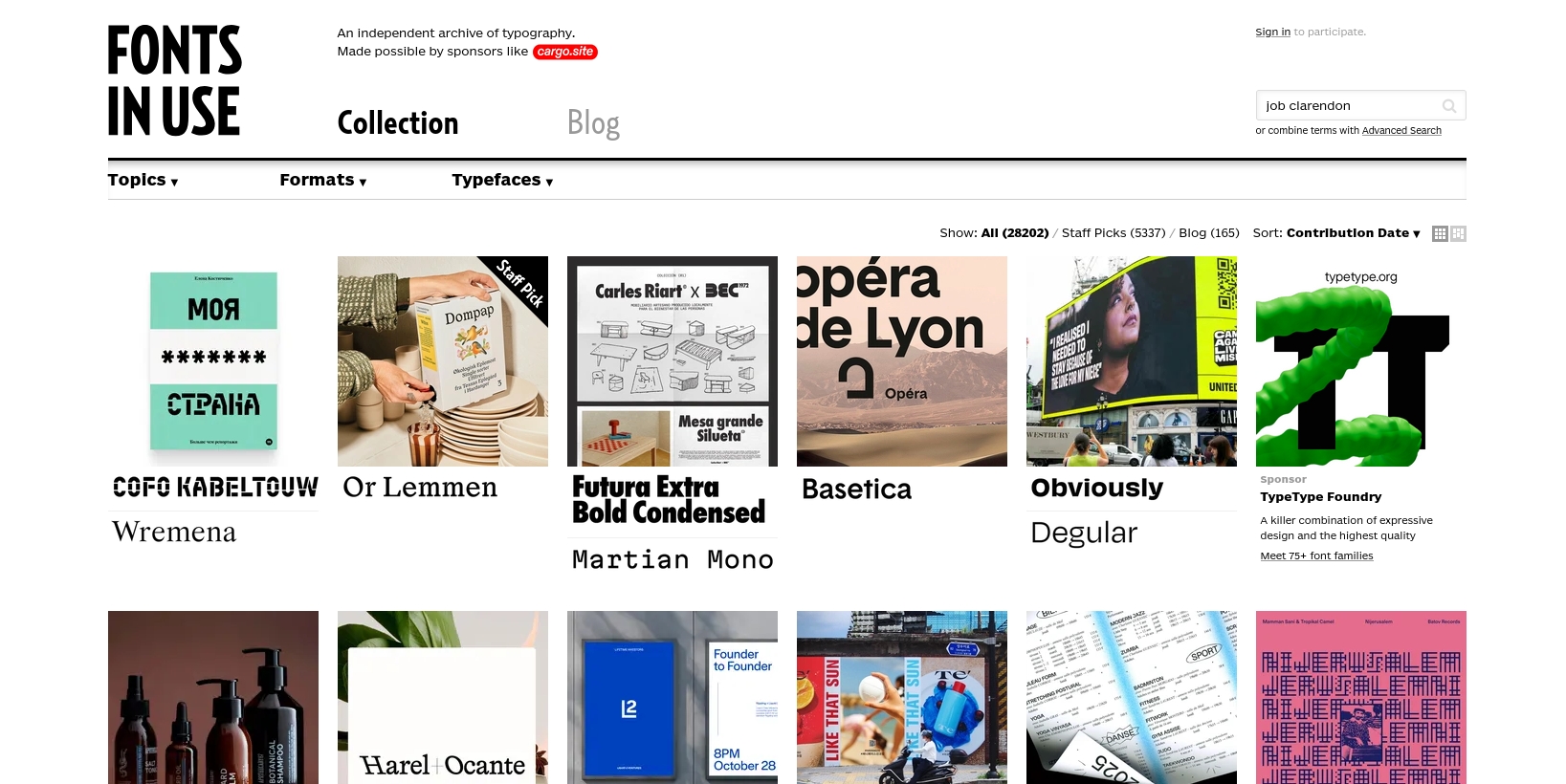
On the other hand, if you’re producing something that will be printed on paper or put out in a static format, the compatibility issues fall away. InDesign, Photoshop and Illustrator all support variable fonts, so there’s nothing to stop you from using them. Have a look at Fonts in Use for some inspiration.
Examples of variable fonts
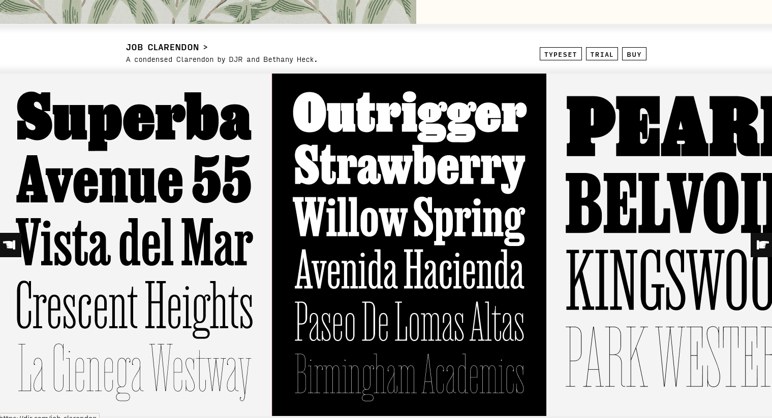
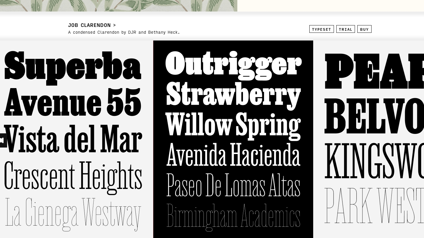
If you’re not a massive type nerd, head over to the sumptuous website of David Jonathan Ross and you might just become one. Not every font here is available as a variable font; click Buy next to the ones you’re interested in to see what you’re getting. Notice that you can get a free testing license if you just want to try them out on your computer.
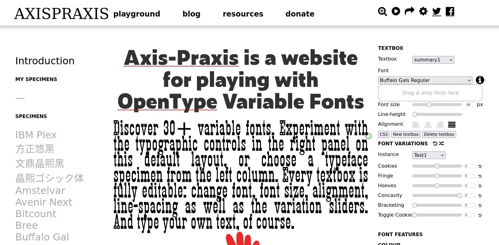
Axis-Praxis is an excellent resource for trying out variable fonts. Every part of the page is editable, so you can change the fonts and the text, and use the slider on the right to experiment with the axes of each font.
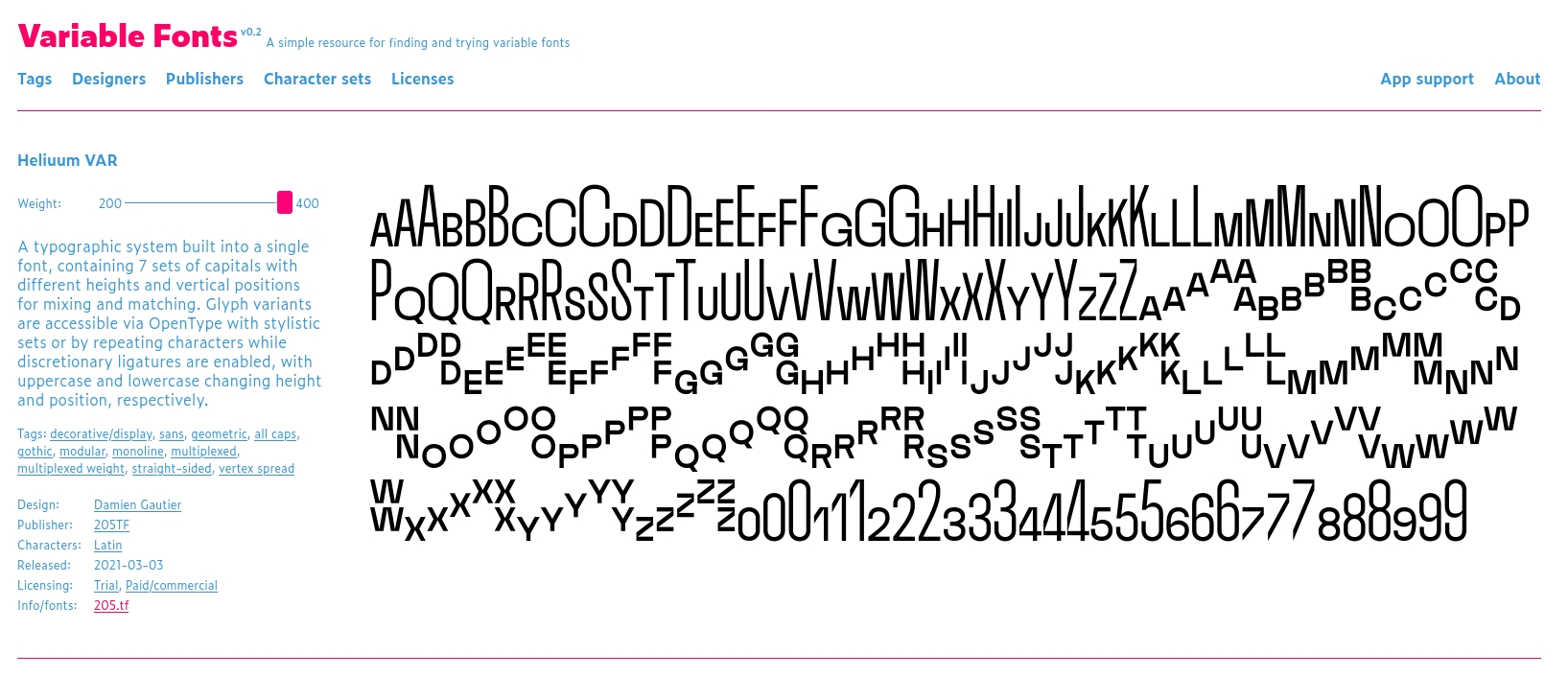
On the V-Fonts website you can find Heliuum VAR, which really showcases the power of variable fonts. It’s an entire typographic system within a single font. There are seven sets of capitals of various heights and positions, giving you the ability to be really creative with a single font file.
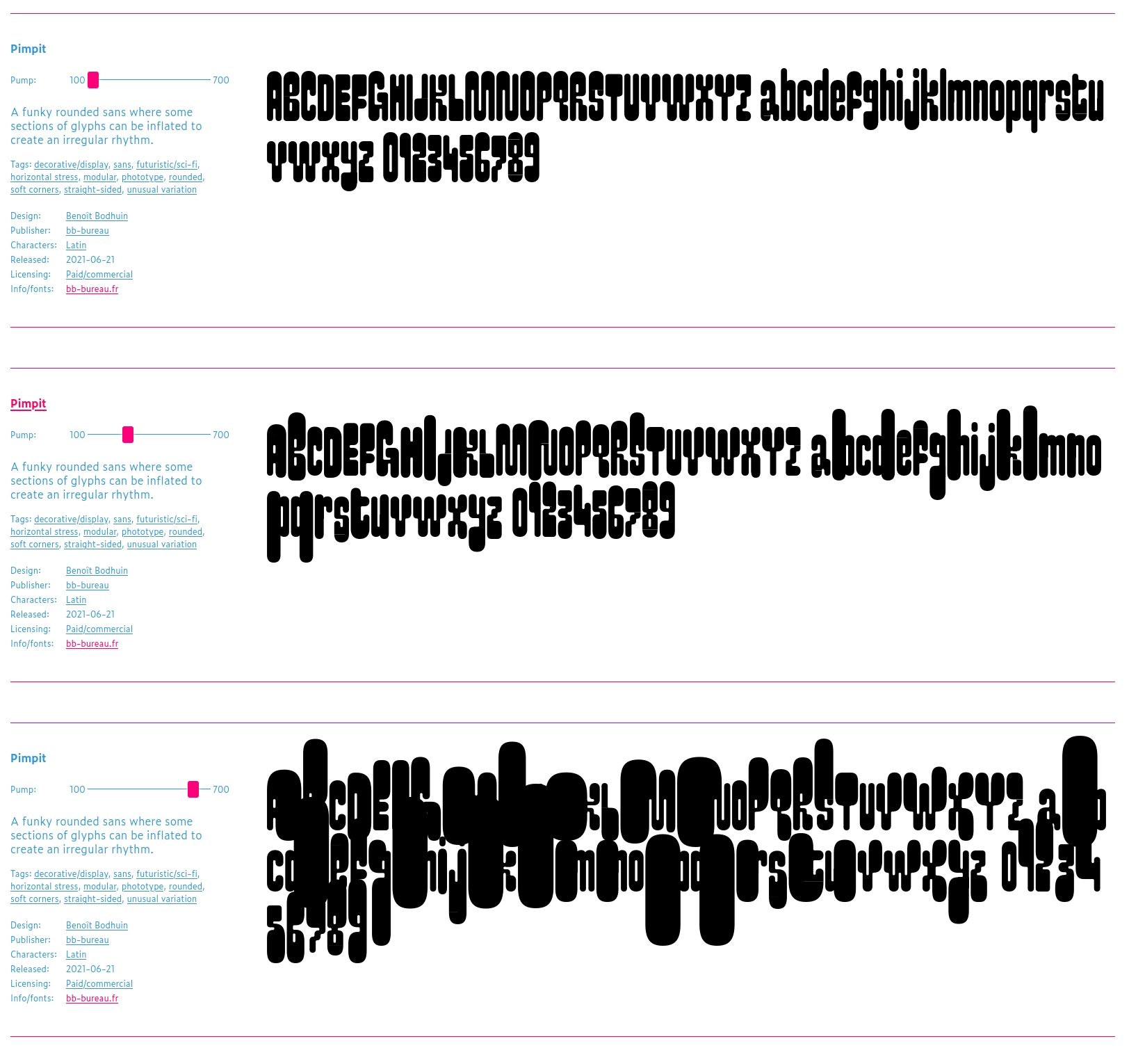
Pimpit, also on V-Fonts, is an example of an eccentric variable font whose appearance changes drastically as you use the “Pump” axis to inflate parts of the letterforms.
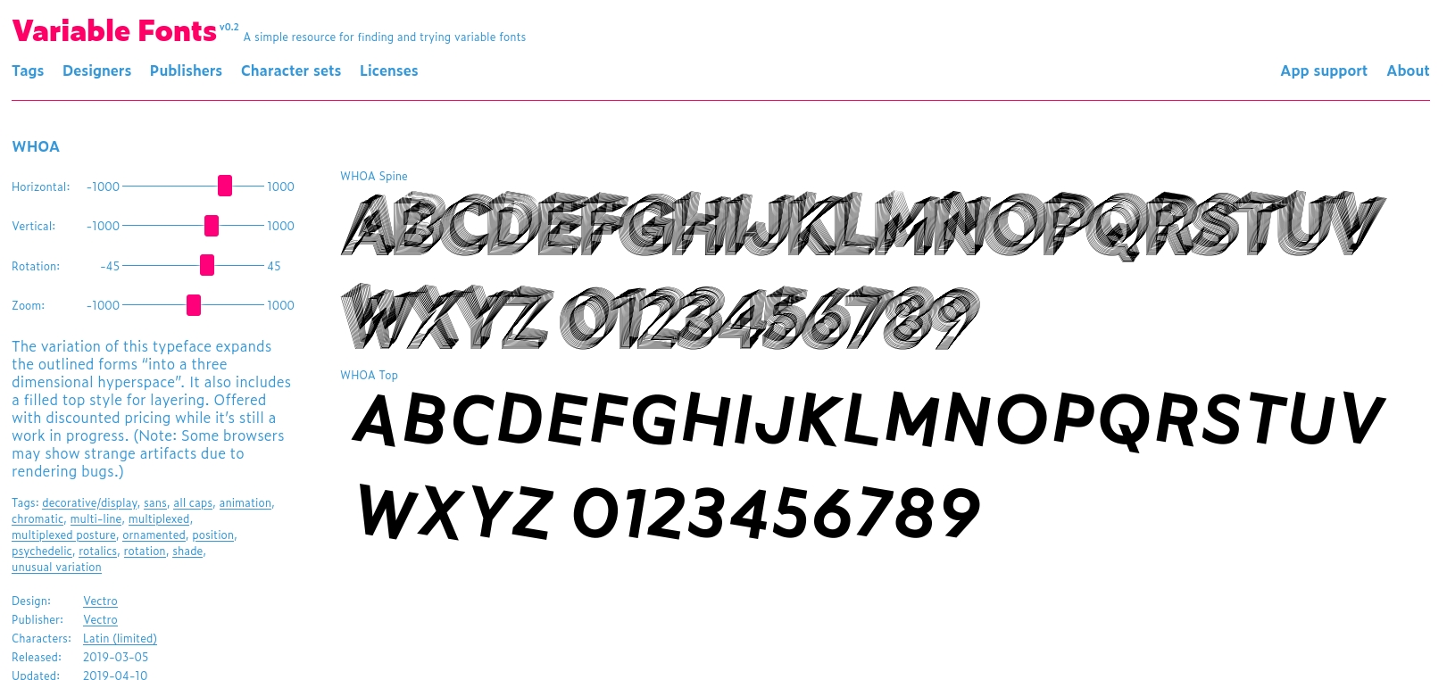
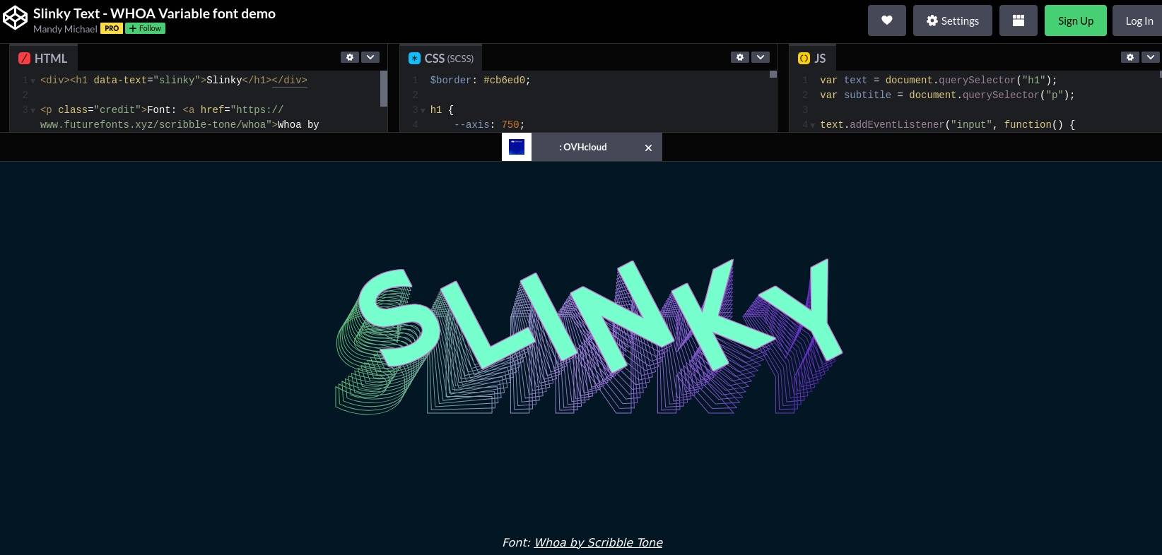
And then there’s WHOA, a variable font in which each letterform is drawn like a stretchable slinky spring. In the CodePen below, Mandy Michael has animated it so that the letters stretch as you move your mouse.
Hopefully I’ve made the case for trying out variable fonts sooner rather than later. We’ve already seen some amazing creativity in the way they are used, and no doubt in the coming years we’ll see even more.
Variable fonts are firmly in the future of type, but see what else our experts have predicted for the future of typography. And then see our brilliant typography glossary for anything else you need to clarify.


