
Valve is here with another big Steam "refresh" that sees its beloved decades-old storefront redesigned for the better, with detailed game information, entirely new sections, and more.
Late last year, the Steam store got a new look, and although it had users divided, it seems that Valve isn't quite done sprucing up its platform just yet – or ever, really, seeing as Steam has been out in the wild now since 2003 in some shape or form (you know, in case you didn't feel old already).
As Valve announces in its latest news update on Steam, folks can already opt into the beta and give the redesign a go… and honestly, I'm all for this one.
"The updated design is our latest work in making improvements across the Steam store, like the game page updates we made a few months ago," Valve explains. "The new layout aims to make it even easier for you to find new games by displaying more content and information. We're now displaying higher resolution game art for better visual clarity."
Sifting through the actual examples of Steam's so-called "refresh," I can't help but be impressed. First, Valve aims to make the "store home feel more cohesive." How? There's more information under each game, but it doesn't take away from the neat UI. Under the "Featured & Recommended" bit, we now have quicker access to info that highlights why a game is dubbed recommended for us, with a quick "micro-trailer" and sneak peek of adjacent games.
It looks very clean, in my opinion, and makes featured games less of a slog to browse. It's optional, too – we can always disable any animated marketing assets and micro-trailers.
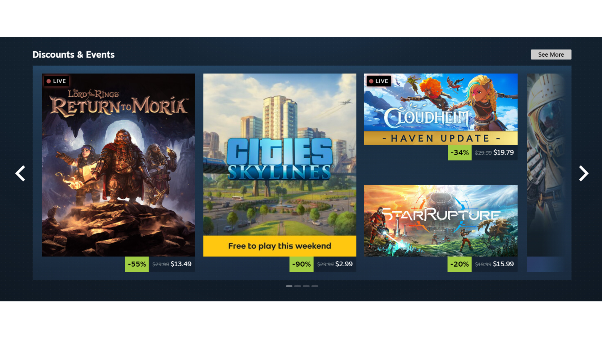
The "Discounts & Events" section also uses larger artwork, making everything look a bit brighter and, dare I say, nicer. That's not all, though. The dreaded Discovery Queue (perhaps just by me, as I only really ever use it to get seasonal sticker drops) is now available to use a lot more quickly… without ever leaving the page at all.
Infinite scroll is quite a bit more functional now as well, "to bring this part of the store home in line visually and functionally with the rest of the sections.
And, there are brand-new sections on the home page: "Your Wishlist" and "DLC for Your Games," so we can easily browse the best PC games that are relevant to us and our interests without having to navigate all across Steam or our personal profiles. I'm sold.
As Valve concludes, "We're constantly looking to make Steam better, and we make decisions based on data and feedback we receive," and I'd argue this redesign is reflective of that.
I'm not the only one to find it more comfortable, either, as comments show fellow fans dubbing it "gorgeous" and saying it's "a great change for Steam's slightly dated UI." I certainly agree – now, if you'll excuse me, I have a beta to go opt into.
Be sure to browse through our roundup of the most exciting new games coming this year and beyond for some fresh titles to wishlist on Steam.