Get all your news in one place.
100's of premium titles.
One app.
Start reading
Livingetc
Livingetc
Olivia Wolfe

Understanding Warm vs Cool Colors Is the Easiest Way to Prevent Interior Schemes From Feeling Flat — Here's How Designers Do It

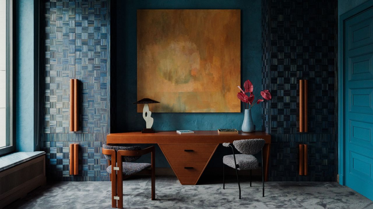
Image of a bright, teal home office with a luxurious aesthetic. There are floor-to-ceiling cabinets in a woven, monochrome teal design. With large orange handles. There is a large orange painting over the wooden desk with a triangular bottom. .

Picking a color scheme for your interior is easier said than done. It might seem as simple as picking your three favorite colors, but it rarely works that way. Typically, a case of poorly matched colors can be reduced to mismatched undertones placed side by side — a cool white with a very warm brown, for example. One way to prevent this is by understanding the difference between warm vs cool colors. But how?

Warm colors sit on the yellow, orange, and red side of the color wheel, while cool colors include the blues, greens, and purples. The former tends to create a feeling of comfort, coziness, and intimacy; they can make a space feel instantly more inviting and grounded. While the latter typically evokes a sense of calm and clarity, and is often described as refreshing or restorative.

Sign up to read this article
Read news from 100's of titles, curated specifically for you.
Already a member? Sign in here
Related Stories
Top stories on inkl right now
One subscription that gives you access to news from hundreds of sites
Already a member? Sign in here
Our Picks
Fourteen days free
Download the app
One app. One membership.
100+ trusted global sources.