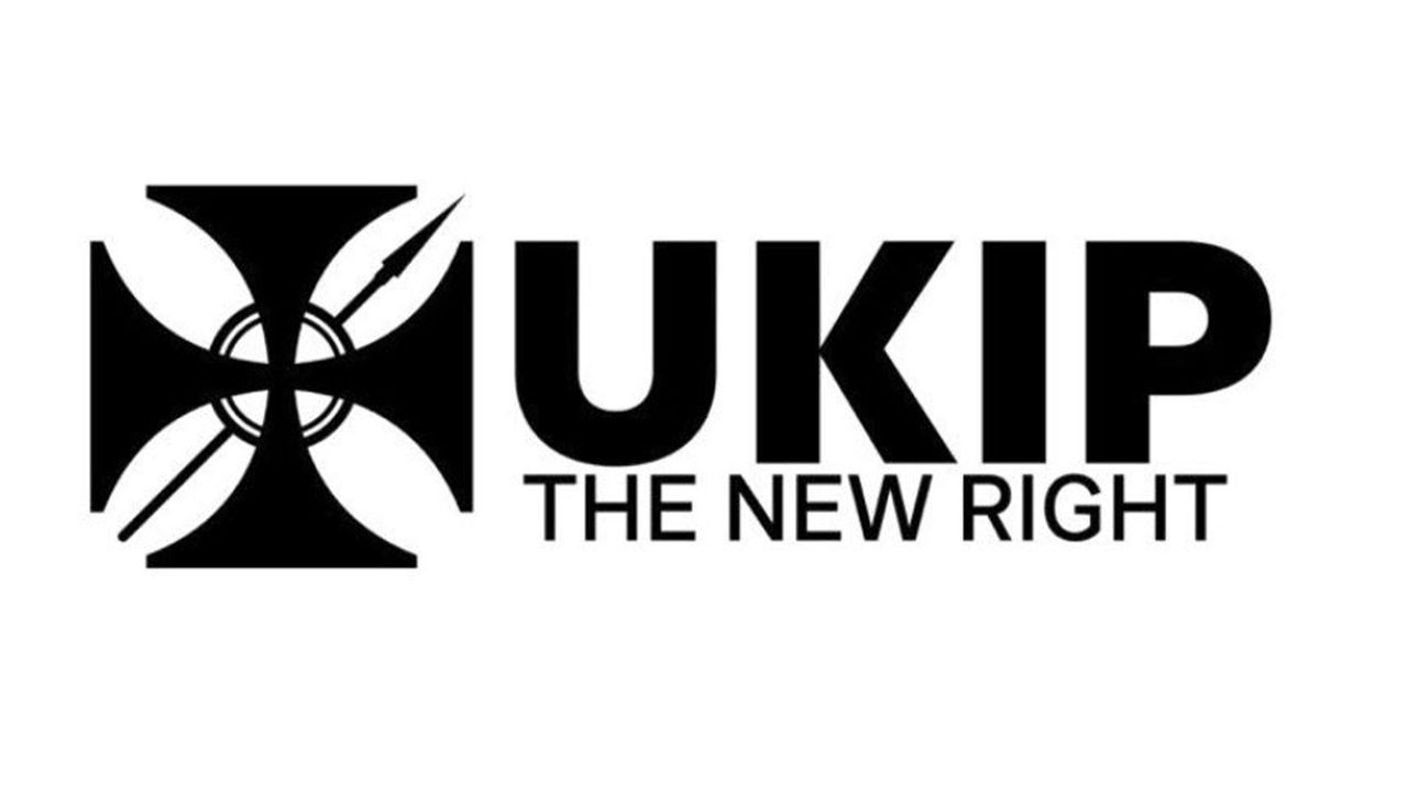
The UK Independence Party, commonly known as UKIP, has unveiled a new logo that has divided the nation. While the party contests that the design is rooted in religion, many have drawn some unsavoury parallels to extreme far-right symbolism, inadvertently turning the new logo into one of the most controversial rebrands in recent years.
While there are no strict rules for creating the best logos, controversy is not often the end goal. While UKIP's new logo continues to draw eyes on the party, it raises questions as to whether the design is a matter of patriotism and piety, or simply a statement of provocation.
NEW: @UKIP has submitted an application to the Electoral Commission to change its official logo.And it’s ever so slightly concerning… 👀 pic.twitter.com/Ux6yYe7Nb9January 12, 2026
The design itself features a stylised cross with a circle and spear motif in the centre. Depicted in black and white, the design has been criticised for bearing a striking resemblance to the Iron Cross – a medal associated with Nazi Germany. Across social media, critics called the design "disturbing" and "concerning", with one questioning whether it was "Unintentional, unbelievably thick, or full fat fascist?"
UKIP defended the design, claiming the logo was a reference to "The Cross Pattée" that features throughout British history, including the Victoria Cross. The party further defended the central circle and sphere motif, stating the design is a reference to "the holy lance" and "the Eucharist". Any criticism was touted as "outright offensive, ignorant and Christophobic."
Our new logo features the holy lance, the Eucharist and the Cross Pattée, to show UKIP’s commitment to reinstate Christianity into the heart of government.The Templar Cross/Cross Pattée is a powerful Christian symbol that symbolises spiritual victory and sacrifice.The Cross… pic.twitter.com/ADGbg2aOGCJanuary 13, 2026
UKIP's new emblem is currently being reviewed by the Electoral Commission and will have to be approved before it can be used. The subjective nature of art (we use the term very loosely in this case) will always leave things open to interpretation, as we saw with Sydney Sweeney's American Eagle advert. For more divisive designs, check out these disastrous rebrands and what you can learn from them.