To commemorate his newly formed "Board of Peace", President Donald Trump has revealed a brand new logo. It wasn't long before critics began tearing it apart, throwing around AI allegations due to its questionable design.
While there's no formula for creating the best logos, creatives can be scathingly opinionated when it comes to design. It's safe to say Trump's new logo has received a hearty roasting, proving that professional graphic design is essential.
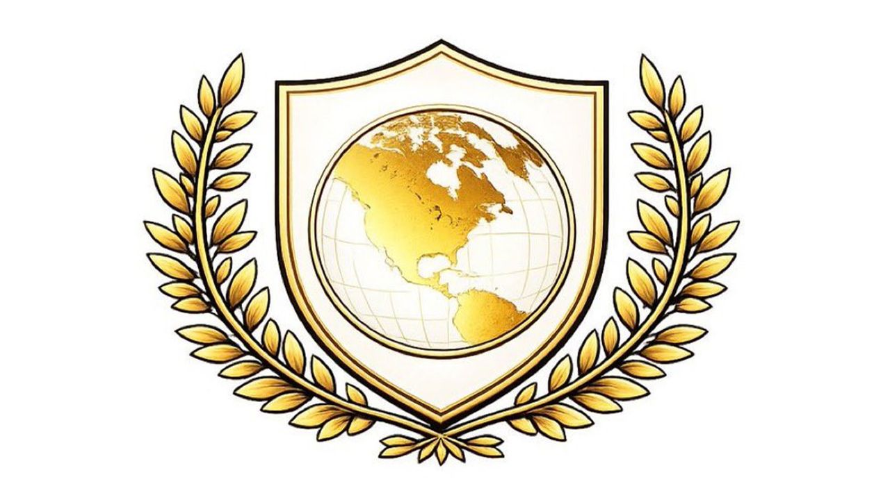
Sheesh the full-res version of Trump's Board of Peace logo somehow looks even worse.Mixing a clip-art wreath with a pseudo-realistic, geo-textured map is a graphic design atrocity.Big Microsoft Paint energy. pic.twitter.com/ZbIPod6hY7January 22, 2026
Featuring a shield, map and olive branch motif in Trump's signature gold (of course), the logo is innocuous at first glance, albeit amateur in presentation. One X user claimed the design was "Beyond parody", while another added, "Mixing a clip-art wreath with a pseudo-realistic, geo-textured map is a graphic design atrocity. Big Microsoft Paint energy."
Central to the logo is a laughably America-centric 'world' map, which features North America dominating the design. This bizarre design choice led many to suspect that AI was being used. "There’s no way that the Board of Peace logo was created by a graphic designer," one X user wrote. "Trump’s 'Board of Peace' logo is AI slop," another scathingly claimed.
Trump’s “Board of Peace” logo is AI slop pic.twitter.com/L51Njf32afJanuary 22, 2026
It's not the first time Trump's design choices have been called into question – his new White House logo ruffled feathers early last year for its on-the-nose patriotism. There's no denying that the new Board of Peace logo is quintessentially Trump. It's gold, garish and divisive, the very definition of the President's brand. Sadly, that does not automatically make it good.