Spoilers below for the second episode of True Detective: Night Country, so take heed if you haven't yet watched!
After two episodes, the fourth season of True Detective is already a third of the way through investigating its corpse-filled mysteries, all while setting up various connections with Season 1’s Rust Cohle. The latest season is a critical mixed bag, with the Alaskan-set storyline more or less viewed as being more successful than other elements. (Check out my personal gripes here.) But for all its genuine suspense and tension, Night Country caused some viewer confusion over that baffling A.I. wall poster in Episode 2 (available to stream now with a Max subscription).
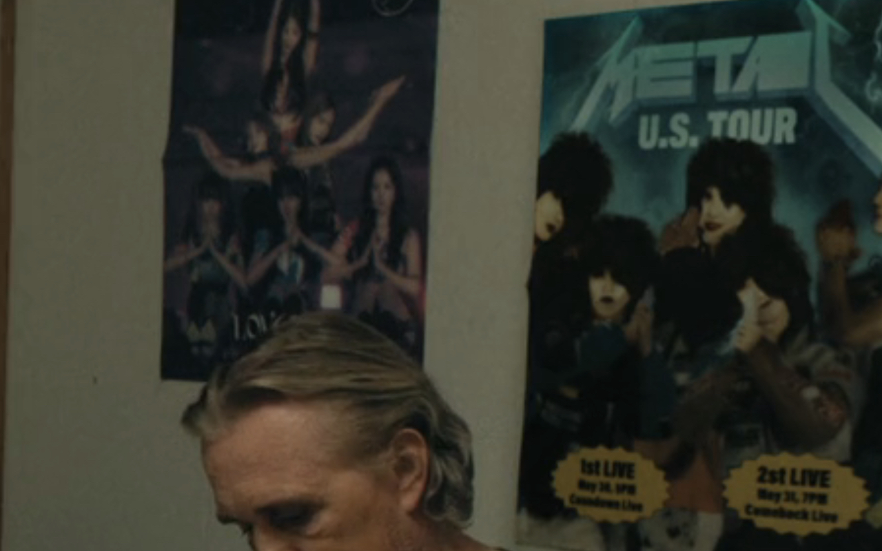
For those who may have missed it, the poster in question appeared whenever Kali Reis’ Navarro went to question Edward Fletcher’s Chuck Mosely, whose taste in music appears to be K-Pop and glam rock. Not the most bizarro combination, but when only one of the groups on display is legitimate (IVE), head-scratches are imminent, and though Night Country’s showrunner Issa López spoke up about the A.I. poster being an intentional choice, I’m not really sure it cleared anything up.
Issues With The A.I. Poster
Before addressing what this season's writer/director had to say about the poster, let's first point out just how silly the thing looks in the first place. Here are just a few questionable details:
- The band's name is just Metal
- The logo itself is broken
- The band members and their poses are kind of horrifying
- "2st" instead of "2nd"
- The inserts seem to show meaningless phrases "Coundown Live" and "Comeback Live"
Is it just me, or does it seem like a couple of the bandmates are in Charlie's Angels poses? And I'm more than a little unnerved by how their hair just looks like ushankas resting atop their blandly painted faces. In some ways, it's kind of awesome, but maybe not the kind of thing a True Detective viewer is expecting to see.
What The Showrunner Said About The A.I. Poster
Even if plenty of audience members likely glazed over what was hanging on the wall during that quasi-interrogation scene, quite a few who did notice it hit up social media to share their flabbergasted-ness. One viewer questioned the decision on X, saying that the shoddiness of the image disrupted the immersion, to which López responded by saying:
The idea is that it's so sad up there that some kid with AI made the posters for a loser Metal festival for boomers. It was discussed. Ad nauseam.
I can totally understand why she didn't echo the "ad nauseam" discussions had about the poster within her tweet response, and she gets credit for responding to the online criticism at all, since social media can wreak havoc on anyone's mental health. All that said, I dunno if I understand.
There's something genuinely intriguing, and potentially disturbing, about a group of isolated brainiacs using A.I.-created designs to decorate the entire Tsalal facility, with walls plastered in examples of not-quite-reality. Even if it all of them were just mock-ups of KISS posters and album covers. But since only the one example exists here, Issa López's explanation feels incomplete.
When someone else brought up the errors on the poster, the showrunner replied with:
Exactly! Chat GPT came as.we were shooting. So, we were-- feeling not kind towards AI.
Still, the meaning isn't quite clear. In that I'm not sure if she meant the show was trying to hold A.I. in a negative light by showing its limitation, or if the limitations themselves are what she and the creative team weren't feeling kind about.
Another viewer asked her to clarify the messaging about metal and boomers when the other poster was for a K-Pop band, and López said:
It is. There was a line in the scene about his daughter liking K pop-- but it just dragged the scene down, so I cut it.
Again, not quite addressing the question while provoking further questions by what she did say. But at least we know Chuck has a daughter who likes K-Pop, I suppose. Since that will obviously become a major plot point in Season 6 or later.
For now, though, it's unclear whether or not we'll see anymore A.I. "art" from the HBO series, but the best way to find out is to tune in each Sunday night on HBO at 10:00 p.m. And head to our 2024 TV premiere schedule to see all the human beings and otherwise that'll be on the small screen soon.
