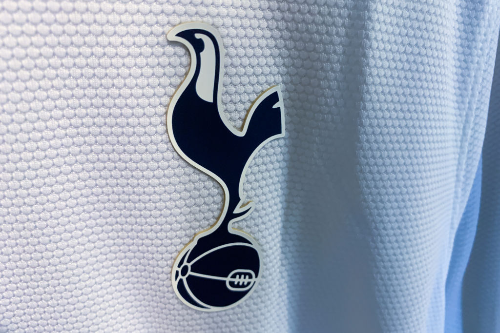
Tottenham Hotspur have made a surprise change to the club emblem as part of an ongoing club rebrand.
The change, while only subtle, alters the logo that has been used for the past two decades and represents their wider heritage.
Spurs are far from the only Premier League side to change their badge in recent years, with Aston Villa, Manchester City and others making significant alterations. But the change has already left some fans uninspired.
Why have Tottenham changed their club logo?
The club have removed the Tottenham Hotspur text from underneath the cockerel which features on the badge. In addition, the objects now appear in a darker shade of colour to complete the new look.
In a statement, the club said: "Welcome to our remastered brand identity, embracing our rich history and unmistakable heritage.

"Created with the input of over 300 players, staff and fans to fully understand what Tottenham Hotspur means to them, our new identity enables a more playful, daring approach for the Club’s brand across the multitude of platforms on which it now features, with a particular focus on clarity in digital environments.
"The world-famous cockerel stands prouder than ever and is supported by a silhouette version, along with the reintroduction of the THFC monogram and new colours, patterns and hallmarks linked to the club’s heritage."
The new logo has had a mixed response, with some supporters on X (formerly Twitter) describing the rebrand as “pointless”. Plenty of fans have noted how the cockerel looks almost identical, as the rebrand is
Spurs originally changed the club badge back in 2006, with an aim of modernising the club's image. This saw the previous heraldic shield design removed, with a sleeker logo featuring the cockerel standing on an old-time football widely welcomed as a replacement.
VIDEO Why Man United Wanted Ruben Amorim So Badly
Spurs aren't the only club undergoing a redesign of their club badge. Ajax announced earlier this week that they would be returning to their original, detailed design, which served the club until 1990 - a decision that received a popular response from fans.
In FourFourTwo's view Tottenham should be commended for consulting fans before making changes that can impact the club's wider identity. However, in this case the changes to the logo are so minimal, the rebrand appears unnecessary.


