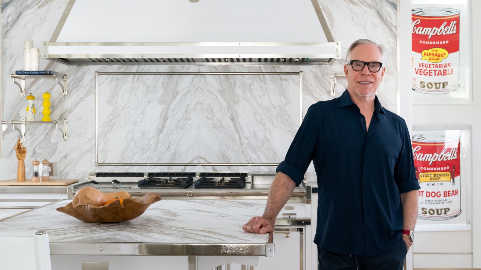
It may seem only right that Tommy Hilfiger, a designer defined as a pioneer of ‘classic American cool,’ has a kitchen that matches his aesthetic. This is where luxury manufacturers Officine Gullo and designer Cindy Rinfret (of Rinfret Ltd) come into play.
Hilfiger and his wife Dee turned to the design duo to create a custom kitchen in their private residence in Palm Beach – and the result perfectly represents their elegant, eclectic, and iconic style. Every detail was intricately crafted to reflect the taste and personal needs of Tommy Hilfiger and his family. The secret to success? Let's start with the color scheme.
It's hard to look at the space without immediately taking note of the white kitchen palette – led by matte paint paired with satin nickel finishes and the star of the space, Calacatta Cremo marble from Antolini, which creates a bright and spacious atmosphere.
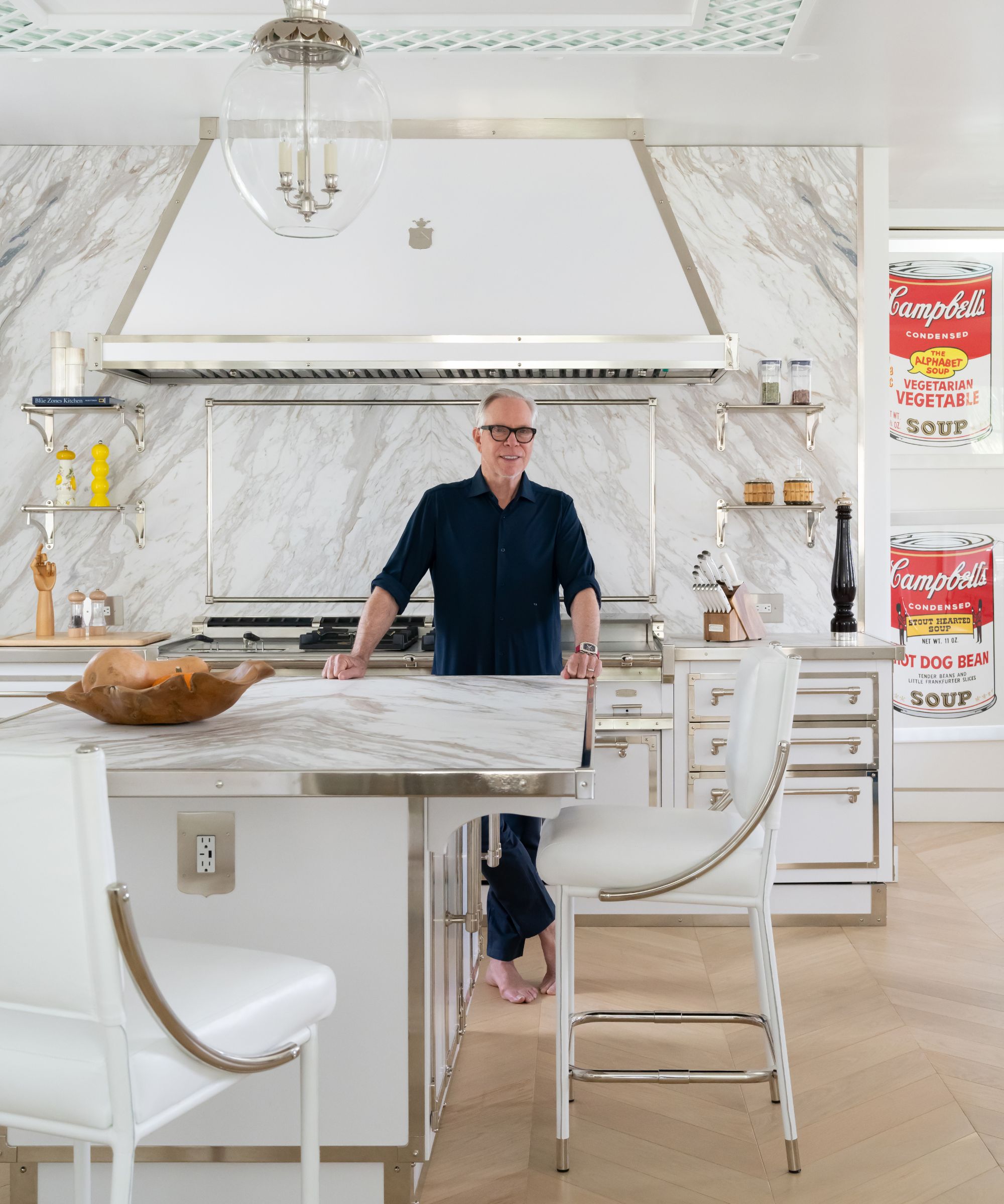
White is an eternally classic kitchen hue, which alone is enough to justify its choice. Timelessness aside, though, Cindy Rinfret explains that the home's wider scheme also influenced their color decision.
'White is classic and accented by the beautifully polished nickel strapping, which was a scheme that did not compete with the beautiful Florida vistas out the windows in this kitchen,' Rinfret says in an exclusive interview with H&G.
'The adjacent dining room has white lattice detailing, and we continued that into the kitchen with a beautiful lattice detail on the ceiling with gorgeous Charles Edwards lights to compliment the beautiful strapping on the cabinetry. The lattice detail from the dining room was also executed on the glass cabinets with this etched lattice detail by Officine Gullo. Hilfiger loves timeless and classic, and this kitchen is functional and beautiful. you will never get tired of being in this beautifully detailed space.'
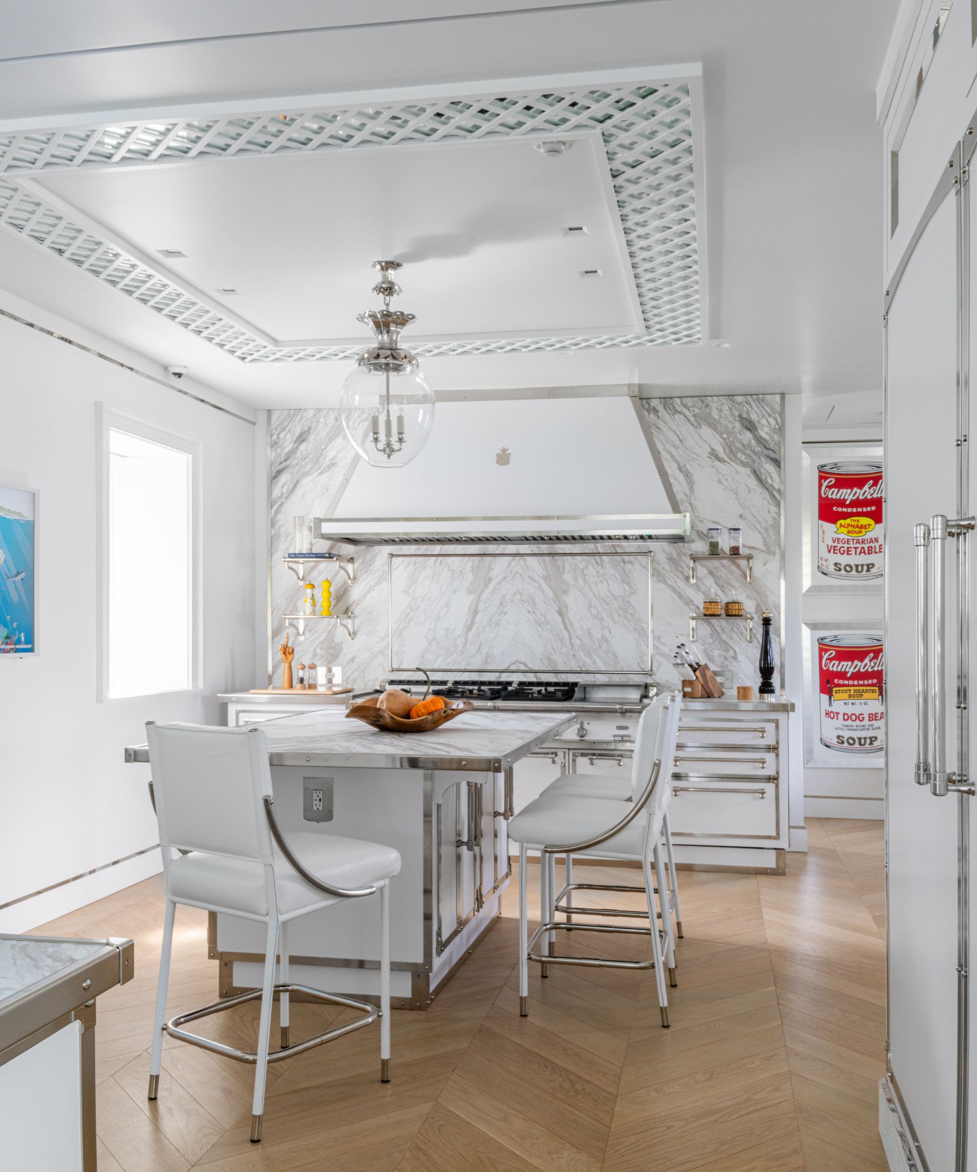
Alongside the kitchen color palette, Rinfret ensured the room would stand the test of time with strategic material choices.
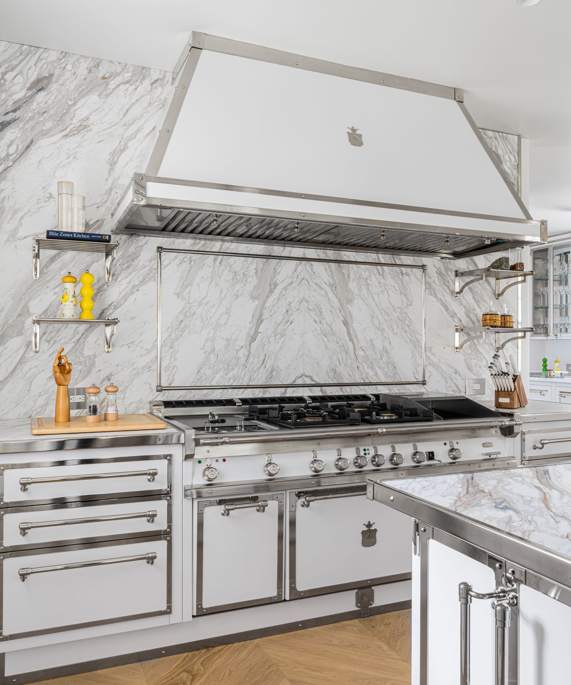
'All the materials used, as beautiful as they are, are very durable as well as gorgeous. From the stone to the stainless countertops, all are classic, and I call this kitchen "The Ferrari of kitchens" – classically timeless,' she says. Arguably, the Officine Gullo Professional cooking range is a central element of the kitchen, equipped with an electric pasta cooker, four burners, a frytop, and an electric oven. However, in front of this cooking area, two large work islands underscore the kitchen's practicality and versatility.
Complete with sizeable countertops, these islands provide ample space for preparing elaborate dishes or hosting friends during special occasions, courtesy of the side seating. At the ends of the island are glass-fronted display cabinets, adding an extra touch of elegance.
'This kitchen was a long alley, so we broke it up with two islands, but the perspective from each end of the kitchen is balanced and beautiful,' Rinfret says.
'The book-matched stone on the front island leads your eye to the gorgeous backsplash edged in a polished nickel frame above the gorgeous Officine Gullo stove. The stone is framed in nickel trim like a piece of art (which it is). A galley-style kitchen is always very functional, and all appliances are at arm's reach. There is also a back scullery kitchen area for prep and clean up.'
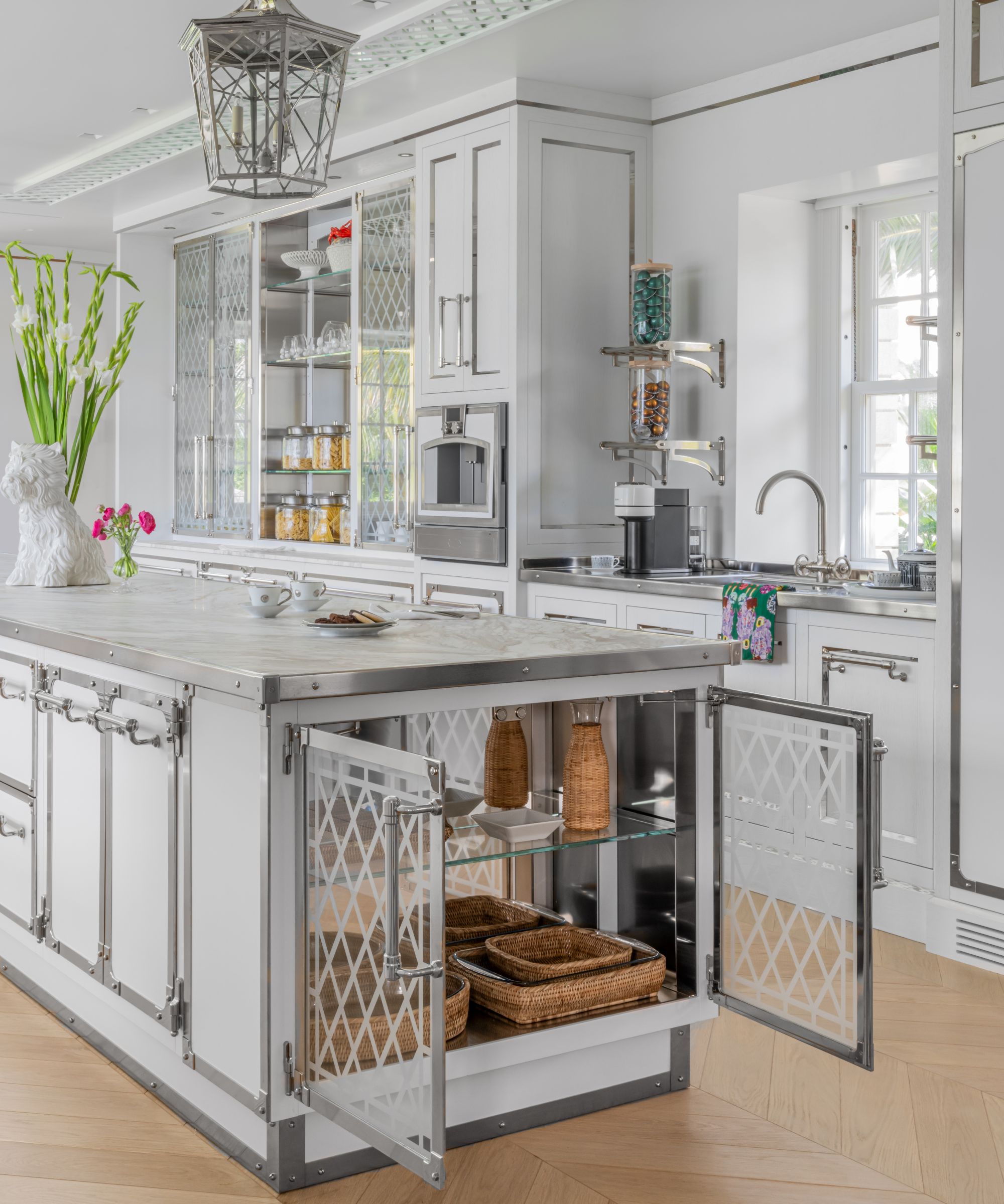
As in all kitchens, details make a difference, and Hilfiger's kitchen is full of them. Every corner is indeed a small masterpiece of design and craftsmanship, meaning it's hard to choose a stand-out feature. For Rinfret, though, some stand out among her personal favorites.
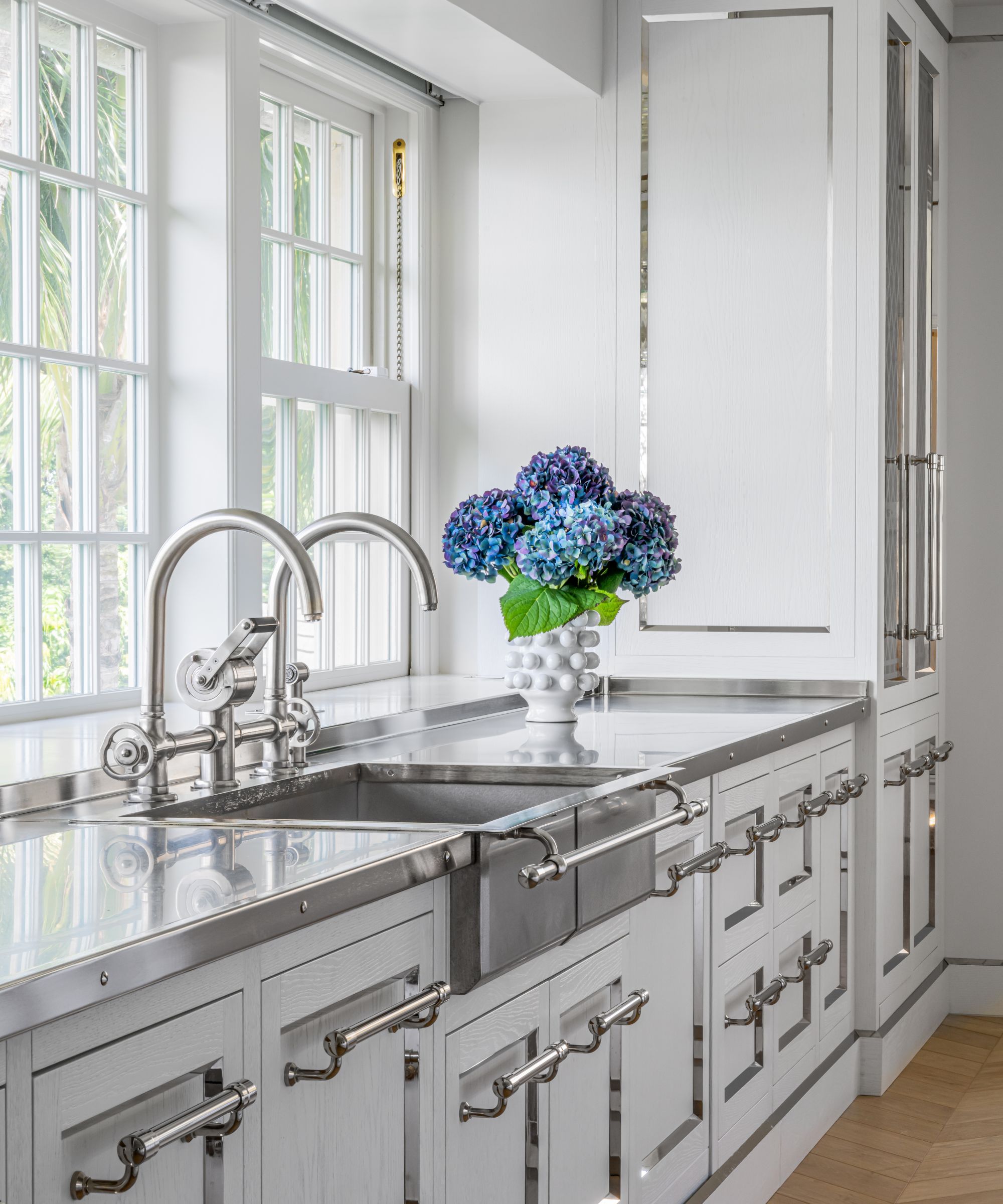
'I think the combination of the materials of white-washed wood, polished white enamel appliances, and nickel strapping is like jewelry,' she comments.
'I personally love the addition of taking this large ceiling and adding the trellis detail (with a mirror) above each island. It adds an unexpected detail and defines each work area but is a touch of glamour. A kitchen should never feel utilitarian but like a room you want to entertain and spend time in.'
Shop H&G's white kitchen edit
It's possible to create an element of Hilfiger's kitchen in any space – we just need to master the right details. Begin with this handpicked pieces, inspired by the designer's space below.
Keep drinks cool with these creamy marble coasters, which come in a package of 7.
This handcrafted marble bowl can serve as a catchall or a holder for kitchen utensils.


