Another week, another new social media platform. TikTok appears to have quietly made a very limited launch of another new Instagram alternative. This one's called Whee, and TikTok seems to have taken inspiration from its rival in more than just the UX design.
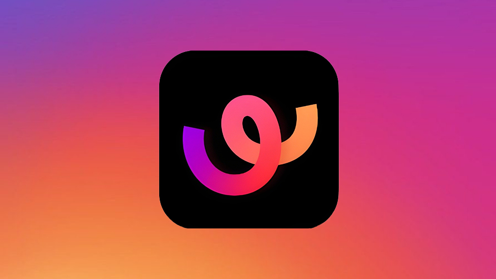
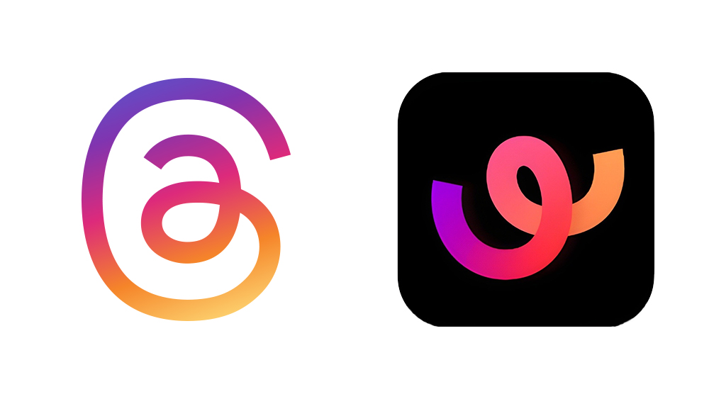
Early adopters who found the app in the Play store in certain countries were surprised to see that the Whee logo design looks more than a little familiar with its cryptic looping curved line and gradient colours. In an increasingly crowded market of social media apps, making a new one look like Instagram Threads is an odd move, and it probably won't make it to our pick of the best social media logos.
It's a strange time for social media at the moment. The former Twitter took a nasty turn after Elon Musk's acquisition, and a lot of people are clearly exasperated with Instagram and looking for alternatives. But people are also wondering how many social media platforms we really need.
Instagram launched Threads as an alternative to Twitter almost a year ago. More recently, Cara has taken off as an alternative to Instagram, picking up a lot of artists amid the scandal around Meta's AI policy. TikTok had already launched a more general Instagram alternative in the form of TikTok Notes. Now it's added another, this time for sharing photos with friends and family only.
So Instagram copied TikTok by adding Reels, and now TikTok is copying the original Instagram. Twice. In its description on the Play store, it suggests that Whee's focus on sharing with smaller, personal groups of friends will allow people to truly be themselves rather than feeling that they have to perform for the public at large.
But really TikTok? That logo design? The looping curves of the Whee logo recalls the Threads icon and the rainbow gradient of Instagram itself. Presumably it's meant to be a 'W' for Whee, and it uses a black background like the TikTok logo. But it seems almost impossible that it could be by accident that the design looks like a broken Threads logo, almost as if it's mocking Instagram's text-oriented add on.
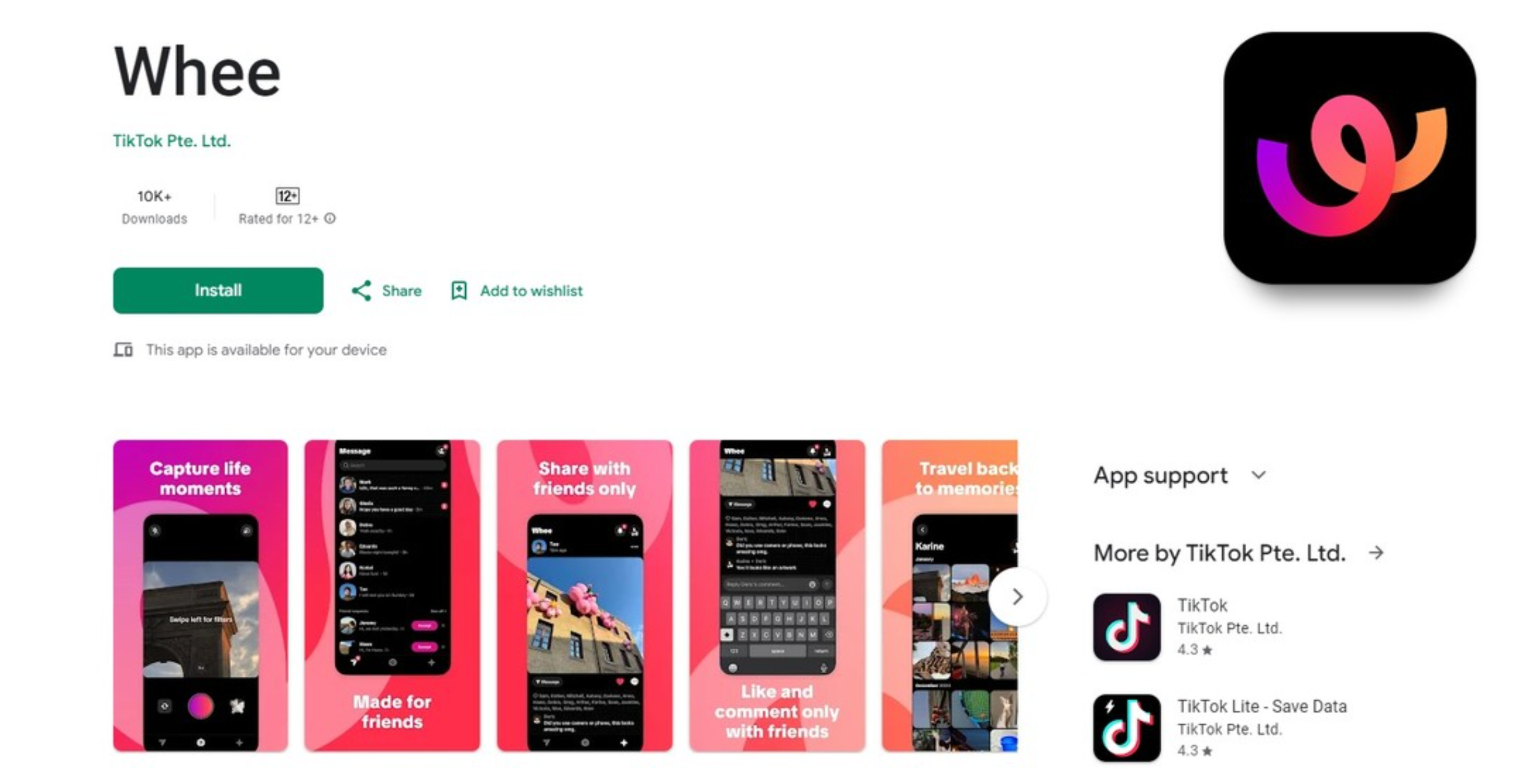
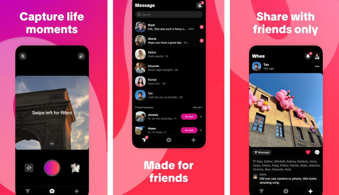
The listing on the Play Store describes Whee as the “best place for close friends to share life moments”. It says: “Whee is a new social app created to keep you connected with your close friends through life’s spontaneous moments. Capture and share real-life photos that only your friends can see, allowing you to be your most authentic self."
The UI appears to be fairly similar to Instagram's: there's a feed, direct messages, and a button to make a post. You can share pictures, and like and comment on those shared by friends, although strangely, it appears that it's not possible to add captions to photos.
Whee appears to be Android only for now, and it's not clear how many countries it's available in since neither TikTok nor its China-based developer ByteDance has made any official announcement nor responded to queries. Artem Russakovskii of Android police reports that the app is at least available in Australia, Turkey, Thailand, Pakistan and possibly in up to 12 countries.
TikTok had already started rolling out a different Instagram alternative called TikTok Notes in the US and Canada back in April. That app's also very similar to Instagram but allows users to write headlines as well as captions for the images they post. It seems a strange move to launch two Instagram alternatives in as many months. ByteDance clearly sees the current disaffection with Instagram as an opportunity, and it may be that it's testing the waters with multiple apps to see how they're received before deciding whether to roll out either of them globally.
With the exception of upstarts like of Cara, it seems we're moving towards a social media system in which three main players each have similar competing platforms All we need is for TikTok to add a text-based platform like Twitter and for X to launch a video-sharing platform for fascists.
For more on social media logos, see our piece on the YouTube logo history and the Twitter logo history.

