The wheels of interior colors keep spinning and fresh hues take center stage in our homes every year. While some fade away, there are certain colors that we come back to again and again, and like a good wine they only get better with time. These are the colors that the best interior designers rely on when looking to give that timeless appeal to a space. Some of these colors naturally lend themselves to a sense of luxury, and it's no wonder some luxury fashion houses have claimed them as their own.
Be it through accents dotted here and there, or impactful pieces that become a focal point of design, there is one particular color trend that is having a moment and it feels just right for now.
Rooted in history, so-called "Hermès orange" is a staple of luxury and an instant reminder of the French fashion house bearing its name. We’re seeing it more and more in interior schemes looking to create an elevated look that make a statement. It brings character to a space but is not too loud. Bold but elegant, its warmth is rich and inviting, pulling you in and creating a welcoming feel.
I’ve spoken with experts in design to tell me how they incorporate Hermès orange into their schemes, and how you can use this color to elevate your space right now. Here’s what I learned.
Why is this color synonymous with luxury?

Even if you’re not familiar with the fashion brand, Hermès orange is instantly recognizable. Its warm tone is a nod to its equestrian beginning as saddle maker in Paris in the nineteenth century.
‘This color is associated with luxury and has a heritage feel,’ Dan Mazzarini, principal and creative director of BHDM Design and ARCHIVE by Dan Mazzarini, tells me. Although we have seen it used in one tone or another by other brands such as Louis Vuitton or Bottega Veneta, Dan believes it is most closely tied to Hermès. ‘The color is synonymous with Hermès specifically – they practically own it. As soon as you see the bold hue, you think of the brand.’
For Crystal Blackshaw, principal and owner of Crystal Blackshaw interiors, orange is having its day in design, and it can exude a lot of different feelings. ‘It can feel young, fresh, fun, luxe, sophisticated, or even vintage Mid-Century modern. It all depends on the shade and the context.’
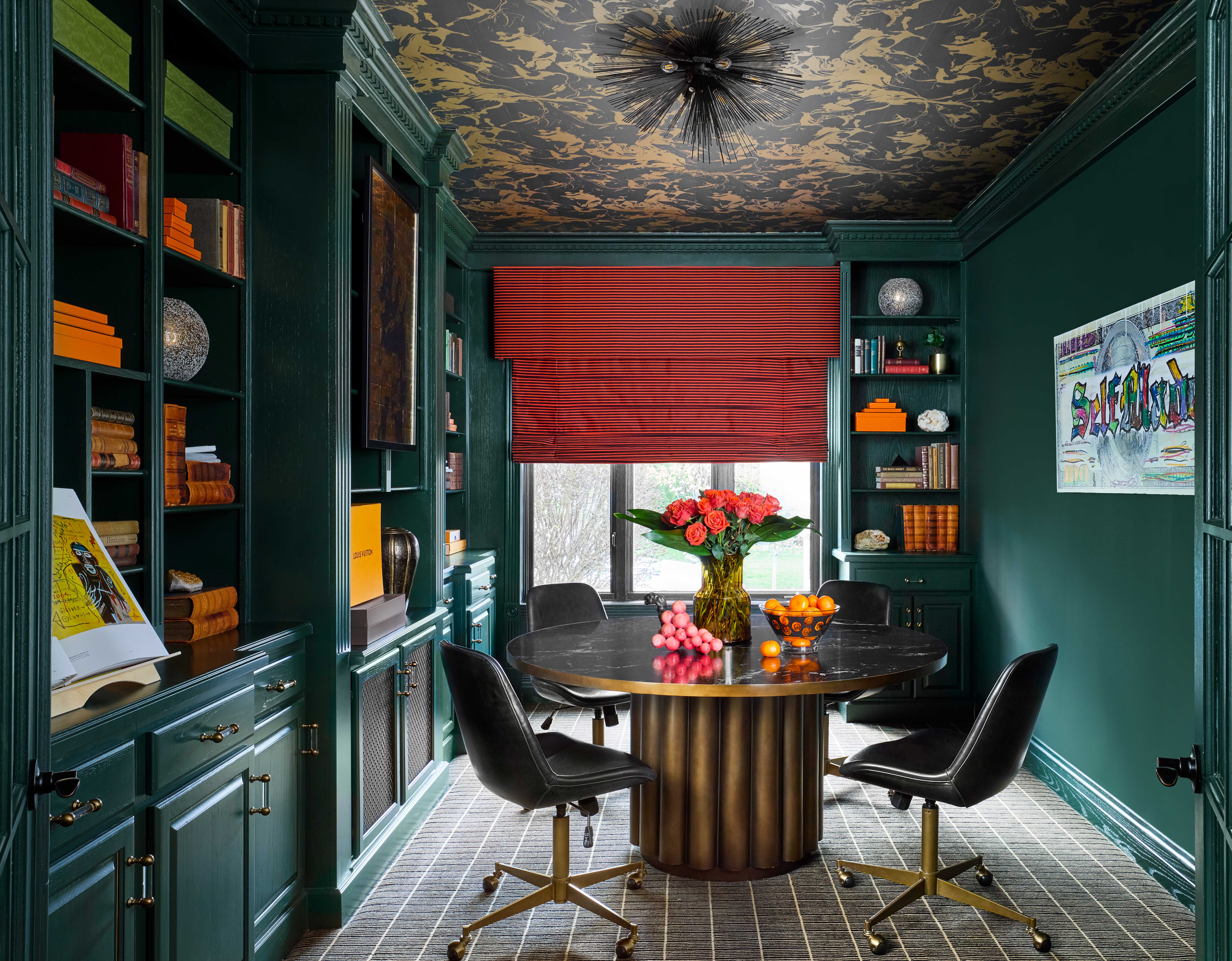
In this modern farmhouse project Crystal created a luxe feel and used this orange as a pop throughout. ‘In the moody contemporary office, I used orange to brighten up the forest green shelves so your eye would stop throughout the space and focus on different elements rather than glaze over the room in one fell swoop. Most people will recognize those particular orange boxes so the viewer understands the level of fancy the client has for the space,’ the designer says.
How can I style this color in my home?

If used in large quantities Hermès orange can be a bit overpowering. It is a strong color, afterall. It keeps its luxurious feel best when balanced out with more neutral tones.
Patrick O’Donnell, brand ambassador for Farrow & Ball tells me that ‘orange is essentially energizing, so it’s great for creatives and extroverts but possibly not a color for those seeking to switch off from the white noise of daily life.’
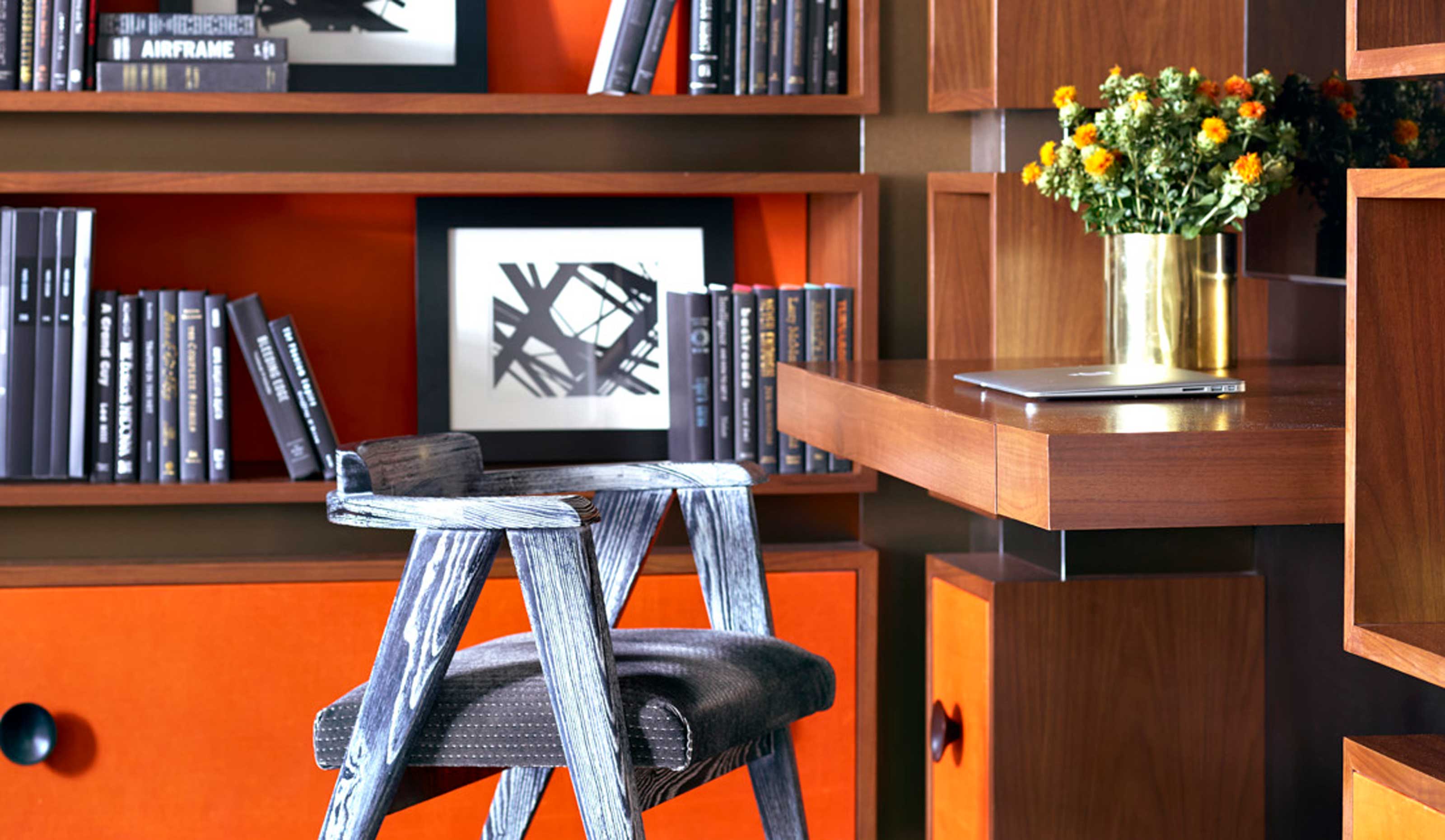
‘If you’re working within a warm palette, try saddle tan, and for a cool palette try charcoal or black. These combinations scream luxe,’ Dan Mazzarini tells me. If you need more inspiration on what colors that go with orange, the designer advises to reference the brand’s watches. ‘They have great color combinations that are easy to live with while letting the orange resonate and take center stage.’
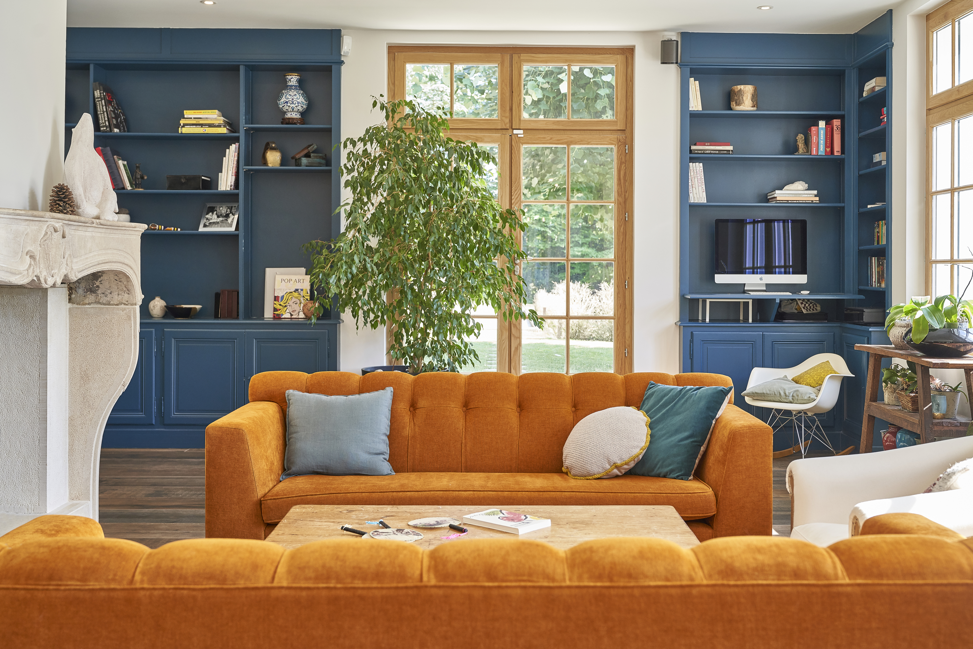
In this beautiful living room by Manu Bauzá, partner and interior designer at Bloomint Design, orange is paired with blue to reflect the inspiration from the natural surroundings of the house, and the colors that the changes of seasons offer.

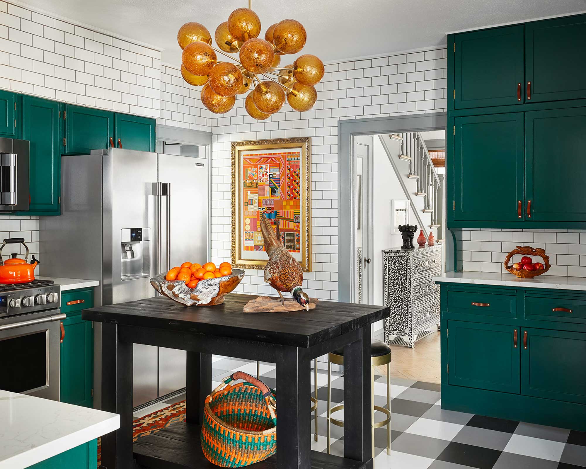
Interior designer Crystal Blackshaw uses orange as an accent color to take the eye around the room. ‘I'll use it sparingly and very strategically to create interest and vibrancy to certain areas that I want the client to notice. It's a potent color and when used well it can elevate a space nicely.’
If you're finding this particular shade is feeling a little intense, turning down the dial won't necessarily lose the expensive feel of this shade. ‘When choosing what orange to use go for more nuanced shades such as burnt orange, or towards the brick / spice end of the spectrum,’ advises Patrick. For a glamorous feel, the color expert suggests spraying walls or cabinetry in full orange gloss and keeping it balanced with a rich brown on your trims.
Whether you opt for details that catch the eye in this rich Hermès orange color or go bolder with a full piece of furniture in this hue, remember to keep in mind the balance with natural tones that ensures you won’t lose the luxurious effect.


