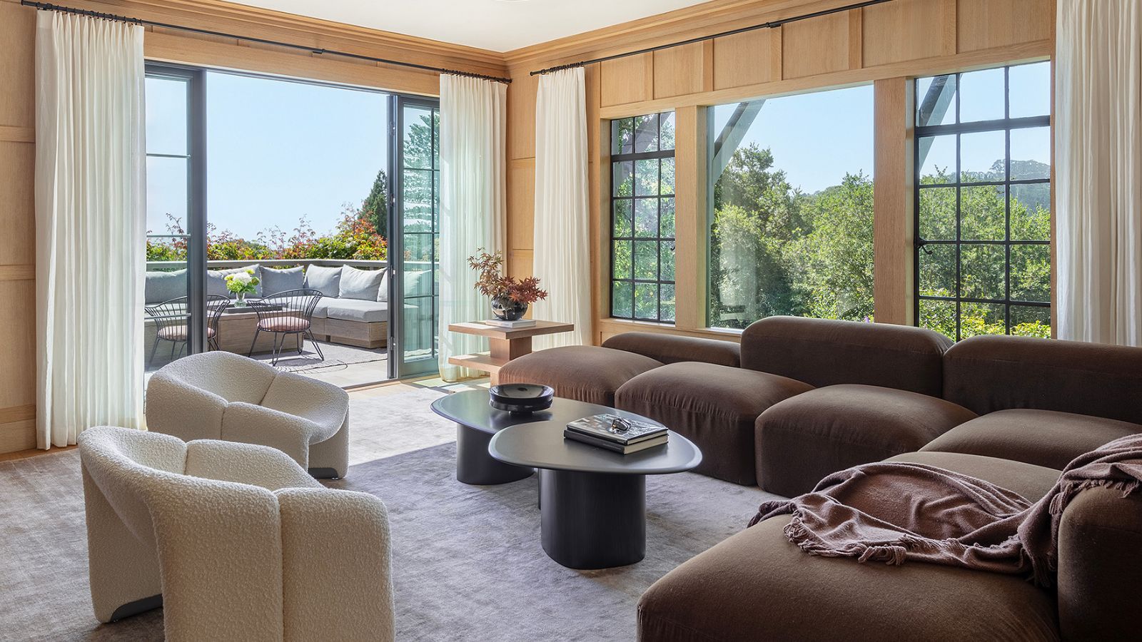
Finding a Tudor-style cottage, built in the 1920s, complete with all the charm, and beautiful views of San Francisco, the Golden Gate Bridge, and Mount Tamalpais is of course the dream. However, the reality of... characterful let's call it, properties can be quite different.
While original features are on many interior lovers' bingo cards, they can be tricky to work with, as they are often not designed for modern-day living. So when the owners of this cottage made the purchase, they took a hot second to revel in the charm before bringing in Richardson Pribuss Architects to take on the challenge of maintaining all that character while adapting the house design for modern tastes, and modern life.
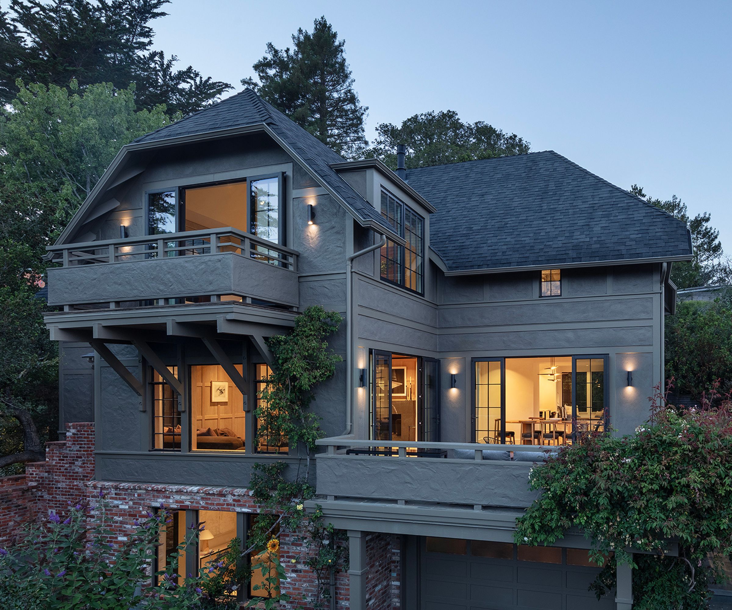
Originally built in 1929, the home had great bones, that's clear to see even post-remodel and it's what drew the owners to the property and the architects to the project.
'We were drawn to this project because the house was located on a spectacular site, with great 'bones' and views, and the clients were lovely,' explains Heidi Richardson, Design Principal at Richardson Pribuss Architects.
'The clients came to us since they were initially considering renovating their grandparents' house, which is located across the street from one of our firm's recent projects in Downtown Mill Valley.'
'However, the clients subsequently found this current house fell in love with the location and views, and called our firm to help renovate while retaining the original style and charm.'
This project actually didn't begin as the huge overhaul it eventually became. 'Initially, the clients only wanted to reconfigure the upper level to accommodate a new primary suite by moving around the bedrooms and making space for the primary bath,' continues Heidi.
'The 'great moment' came when we decided to anchor the primary bath to the east rather than the west side, which opened the primary bedroom to beautiful San Francisco Bay views. We added a raised ceiling that exposed the underside of the existing roof rafters. We also added two large dormers in the primary bedroom to increase the light, airflow, and views.'
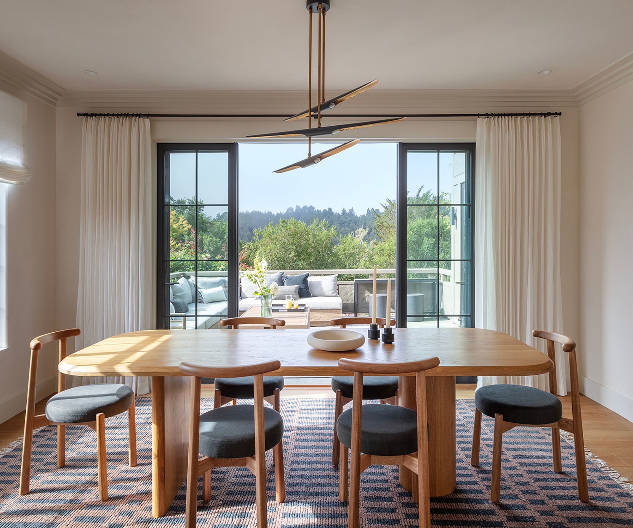
'We also enlarged the kitchen and modernized the space for the clients, who love to cook and entertain. But the most impactful change was rescaling the top floor and converting an inefficient corridor to a walk thru primary closet leading to the new primary bath,' adds Heidi.
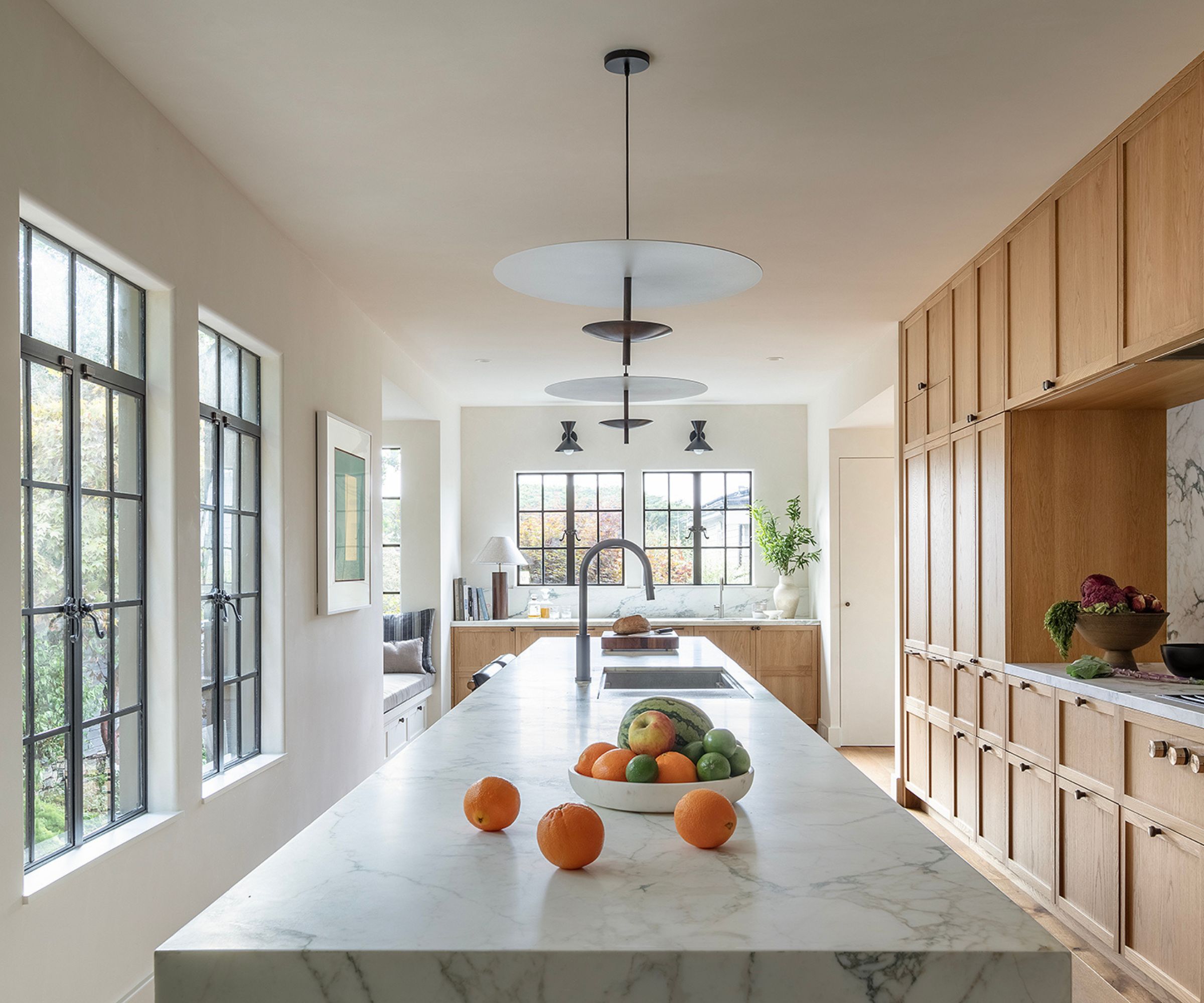
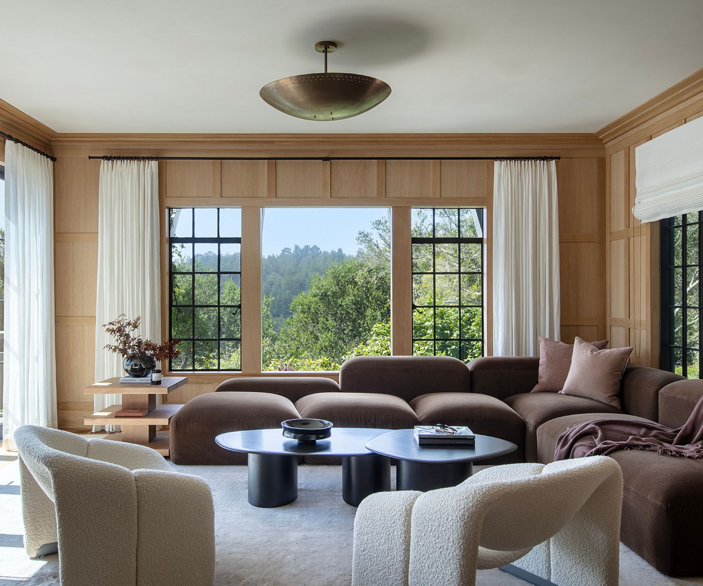
'Through the numerous remodels over the years, we could see that there was also an opportunity to 'fix' the floor plan and modernize the flow,' says Heidi. 'We kept true to the original Tudor styling and maintained the smaller, cozy rooms, which meant that we didn't blow out walls or create huge living areas to respect the Tudor era.'
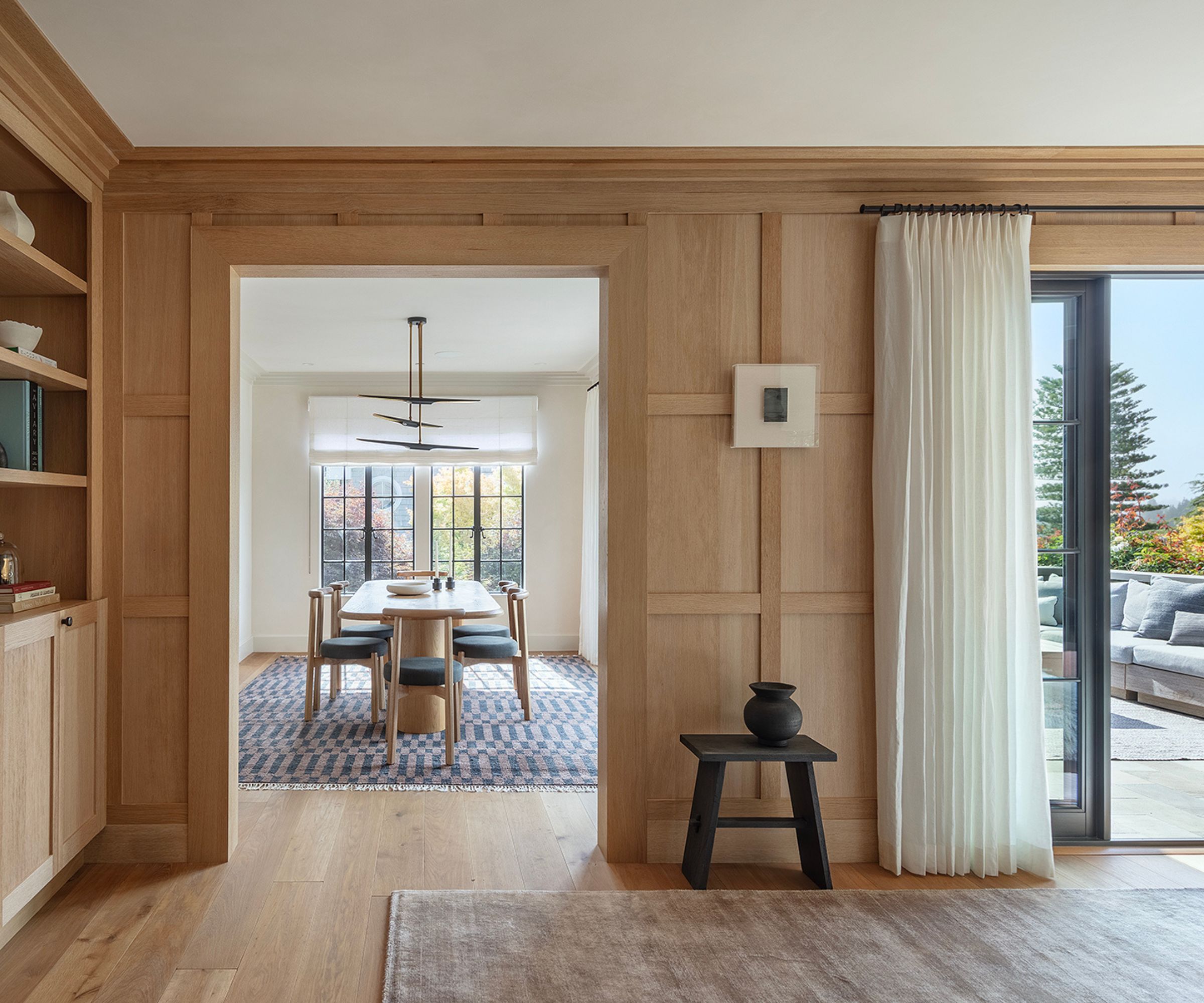
The most important thing from the very beginning of the project was to maintain that character that both the homeowners and those working on the property loved. And this went for both inside and out.
A huge part of the charm of this property is in those windows. And RPA of course kept those original steel windows where they could be salvaged, even repurposing them from other parts of the property to add more windows along the exterior-facing wall, to double the amount of natural light in the more lived-in rooms.
'It was important to keep the original Tudor style charm, which involved keeping the original steel windows and maintaining the roof lines. We had to dance around keeping the same window style, so incorporated some Aluminum windows in the larger opening,' explains Heidi.
'We also thoughtfully related the house more to the outside since the prior owner was a master gardener, and the rose bushes and grounds were an important part of the house's location and styling.'
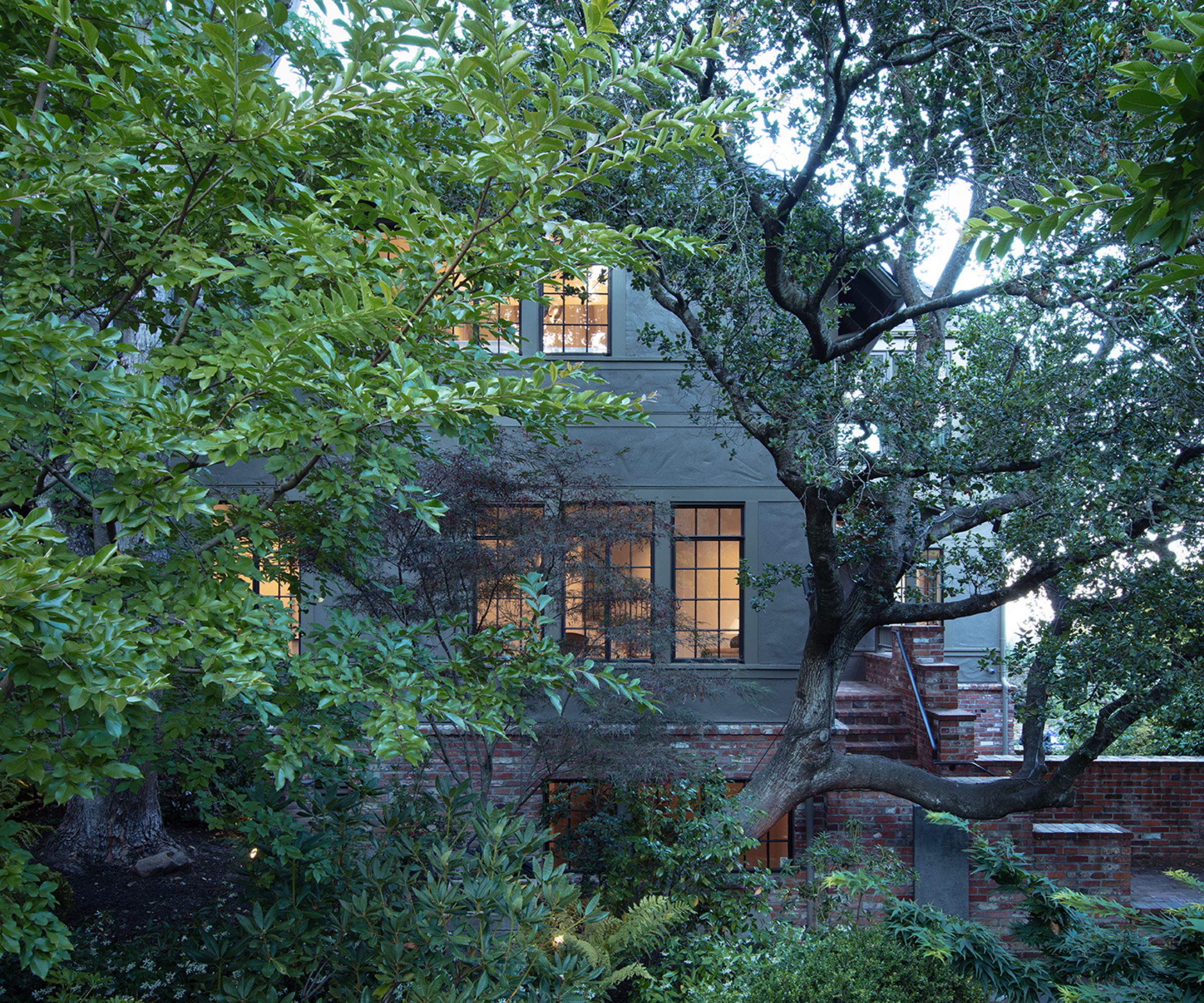
Heidi describes the style of the finished project as 'Neo Tudor' – 'The clients describe the house style as contemporary 'Coventry Cottage'; we describe it as 'Neo Tudor' since we retained the house's original Tudor style and charisma while introducing a more modern attitude.'


