While doing a little digging into what moods, color schemes, and design elements we can expect to see shine in 2026, trend forecaster Rebecca Goesling, director of design at Goesling Group, introduced me to the concept of 'chromatic tension'. It's a technique that introduces unconventional color combinations to energize spaces and create a clear sense of character and mood. And according to the expert, it's essential.
As neutral-drenched spaces take a back seat and color palettes become more saturated and rich, chromatic tension underscores the importance of keeping contrast prominent when decorating with color. While soothing tones are critical in creating comfort, it is equally important to awaken the senses and mind through our interior design.
"A lack of tension can not only dull discomfort but also joy, inspiration, and a myriad of other experiences along with it," says Rebecca. "A healthy dose of challenging material in a space — applied in the right way at the right time — ignites action and releases emotions." So, look around. Is your space lacking the right color balance? Here's how this cool color trend could help.
What Is Chromatic Tension in Interior Design?
"Juxtaposed hues, whether that be colors that are complementary or done in opposing saturations, can cause a pulsing or vibrating sensation, leading to what we are defining as chromatic tension," explains Rebecca Goesling.
However, chromatic tension is more than just mixing bold colors in a space. "It is the use of color to create visual restlessness," says Rebecca. Yes, looking to the color wheel for complementary color combinations is a good place to start, but the main goal is to dramatize the dialogue between the hues, tints, tones, and shades used within a single space.
For example, using a color blocking technique, while bold and eye-catching, doesn’t necessarily create tension. It can be done in analogous hues (red to orange to yellow), similar tints (all pastel), or harmonious saturations (all mid-tones), but "Chromatic tension requires some amount of dissonance," says Rebecca.
How to Use Chromatic Tension in Interiors
You may presume that chromatic tension requires you to commit to bold colors on your walls to work, and while it does (and is a true maximalist way in), it can be applied in subtle ways.
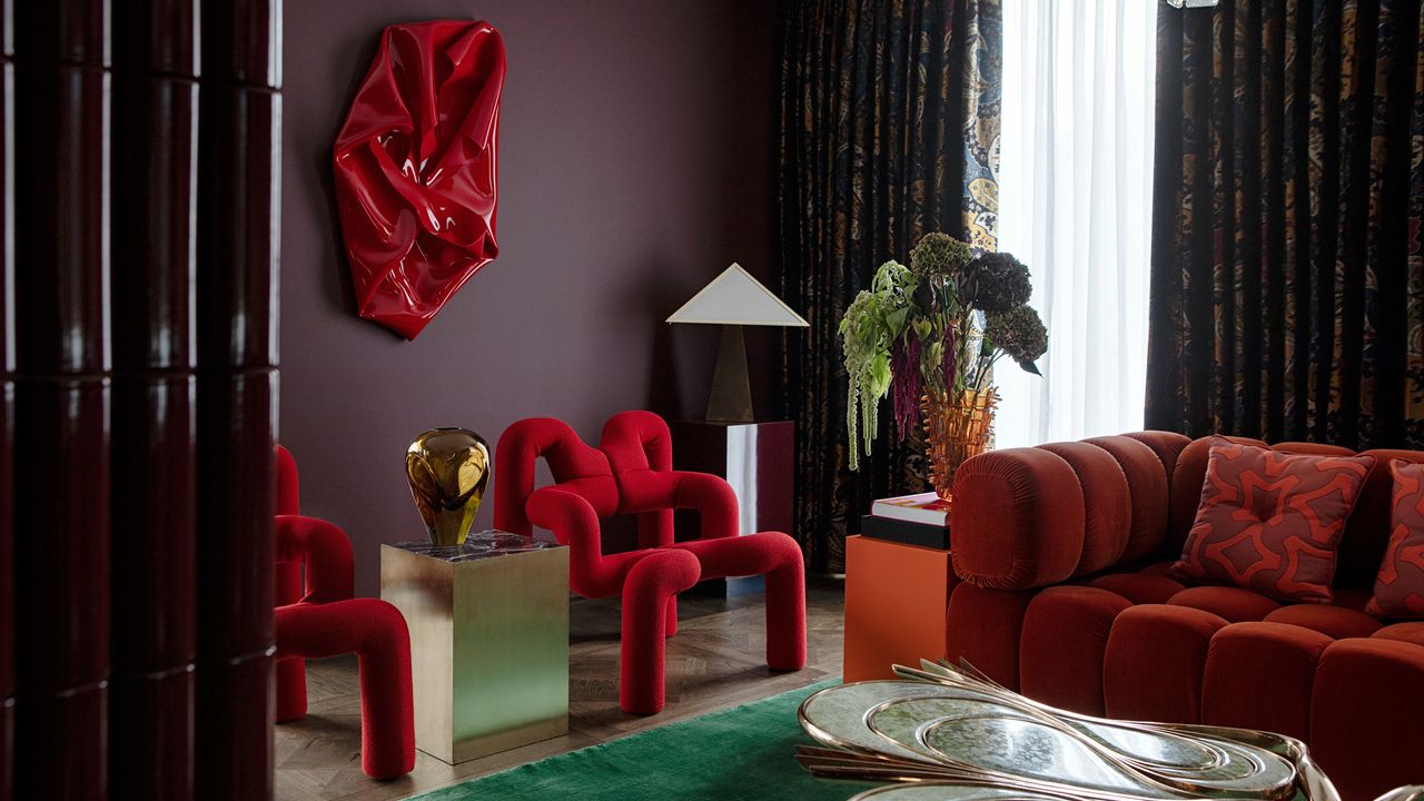
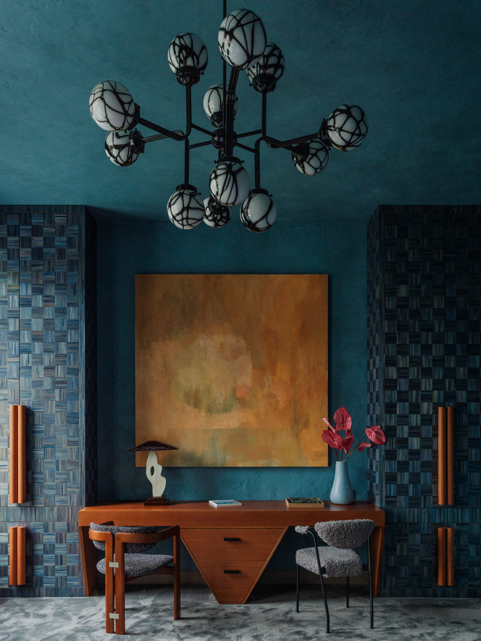
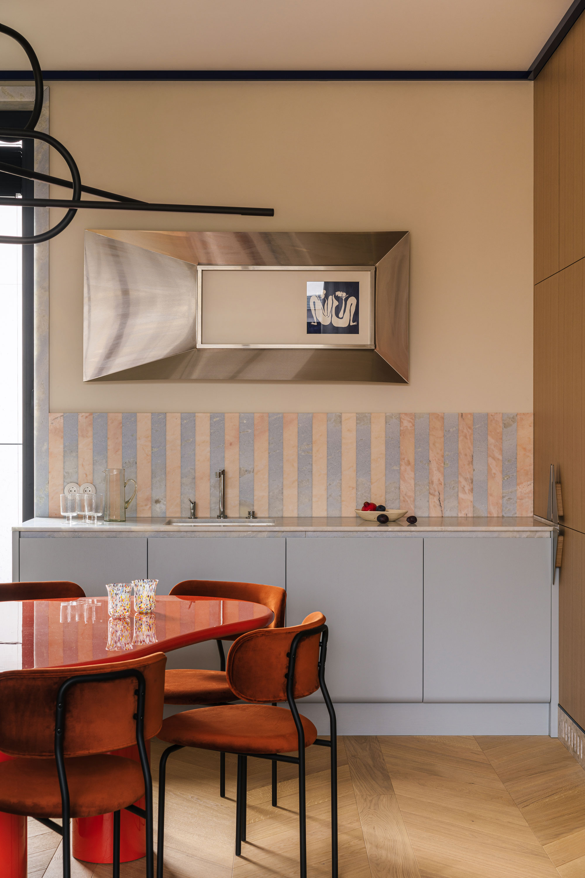
Take an unexpected piece of colorful hardware, a purple sofa in an earth-toned room, or even simply juxtaposing throws and pillows. Chromatic tension uses color to create contrast in design and to energize the room in a livable way — this is the fundamental core of the technique. The way you layer color should feel shocking, coupled with a satisfying 'eureka' moment.
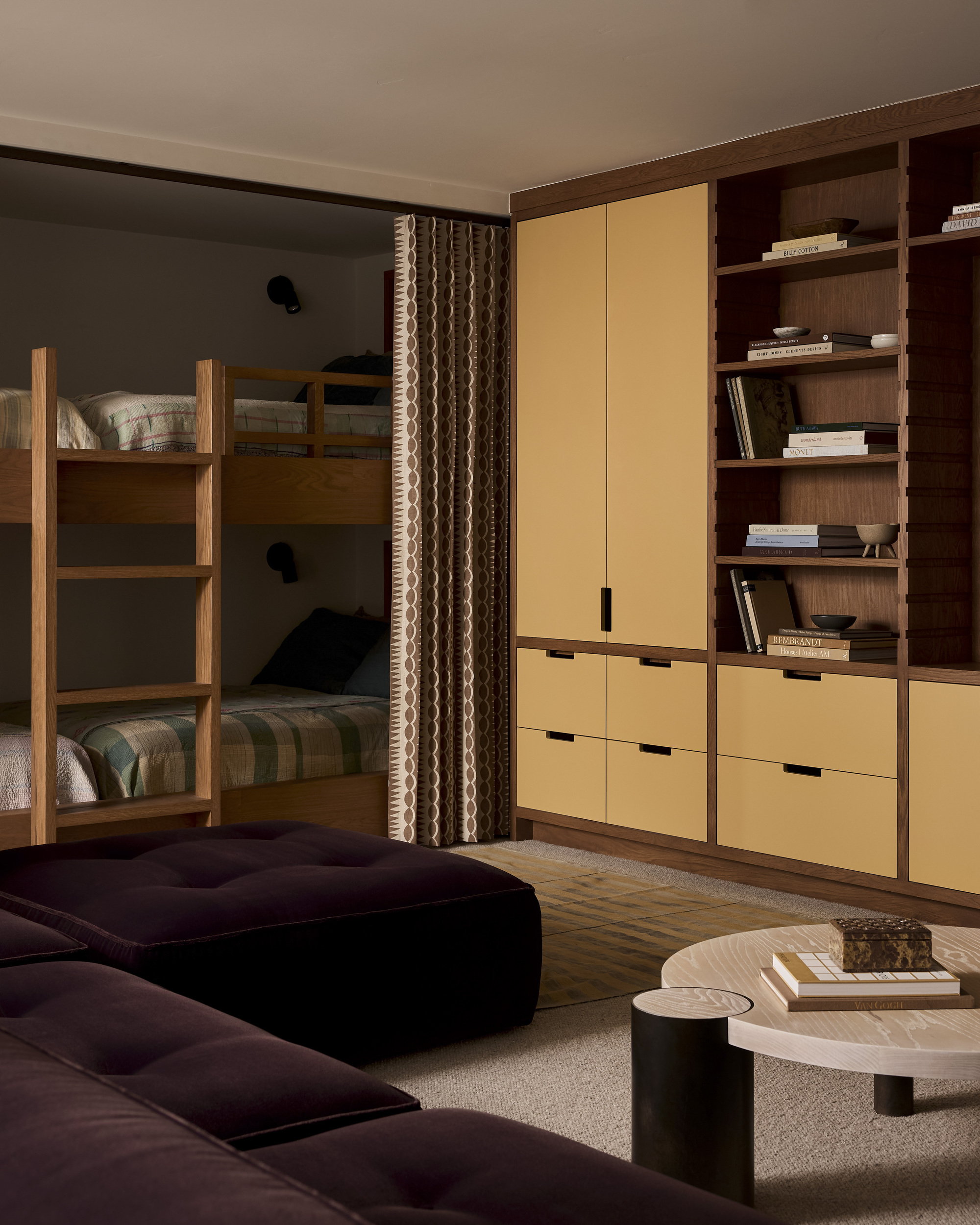
"It's combinations like satin periwinkle and velvet chocolate, high gloss chartreuse with matte baby blue, matte tangerine next to metallic moss, or magenta with a surprisingly earthy counterpart such as mushroom coming into the conversation," says Rebecca, on the combinations she's most excited to see in 2026.
They all share an energetic, emotional hue balanced by a pragmatic, grounded color — "Striking a balance of frenetic emotion with soft, earthen color palettes," she adds. Yet, as described, playing with contrasting materials can really elevate these color palettes into a whole new dimension.
Below are a few decor ideas to kick-start your chroma-increasing color journey. The key is how you mix and match them.
The chromatic tension technique is a bit like the unexpected red theory or the strategic neon trend, as it seeks a way to use color that experiments, excites, and has room to evolve. Will you dare to add a little intrigue to your interior?