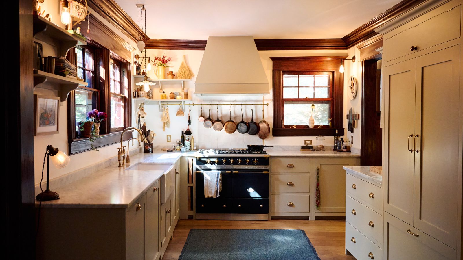
Located an hour outside of Manhattan, this New Jersey kitchen designed with deVOL Kitchens cleverly marries rustic and modern details for a kitchen that's full of character, yet doesn't compromise on function.
A fairly small kitchen, its design was carefully considered to maximize space while crucially, wall cupboards were avoided to ensure a light and airy feeling throughout. The contrast of modern finishes, namely Carrara marble, with the prominent rustic wood, results in a space that's full of intrigue.
To learn all about the design of this charming Shaker kitchen, we spoke to deVOL Kitchen's Creative Director Helen Parker, who talks us through the core design choices of this unique space.

'This kitchen is deceptive, it has openings at both ends of the room, one to a pantry and the other to a dining area,' explains Helen. 'This helped the room feel spacious because it was part of a bigger area, family dining room, comfortable seating, and wonderful outdoor views. Incorporating a large range cooker and Belfast sink shows just how much room there really was in this kitchen, yet it still felt atmospheric and full of character.'
Balancing the room's original features by carefully integrating newer additions was fundamental to the design of the space. Through considered kitchen color choices and kitchen countertops, the contemporary finishes pair beautifully with the old wooden elements. Helen elaborates: 'This was a combination of wonderful original features and a simple cupboard choice that was finished in a light paint color with Carrara marble kitchen countertops, ensuring acknowledgment of authentic features and introducing furniture that was new, but so simple in its look, that it only enhanced the room rather than being a distraction.'

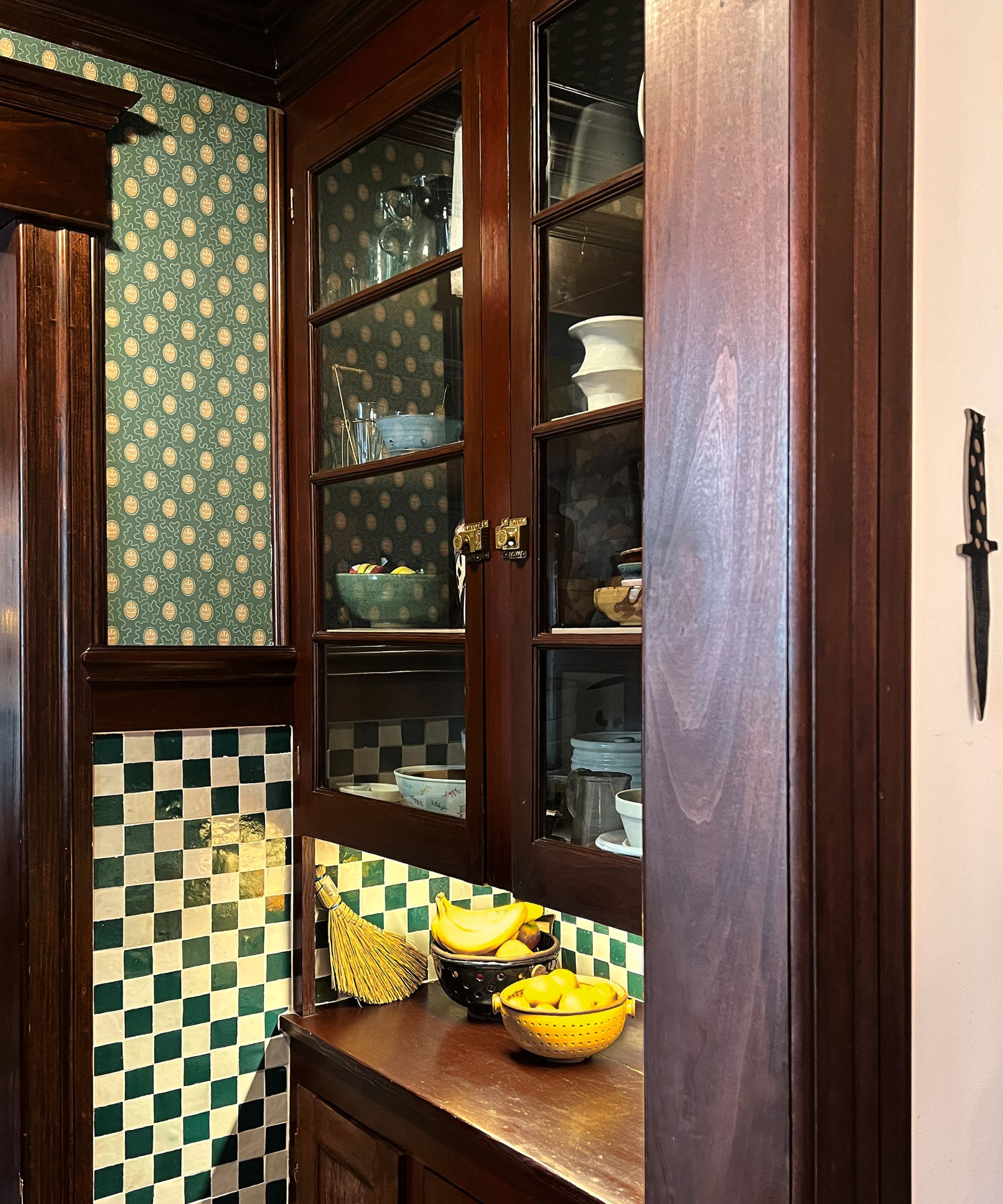
Separate from the main kitchen, a pantry was also considered in this kitchen remodel. A smart way of effectively providing extra kitchen storage space, the pantry is not only an efficient space but continues the kitchen's running theme of traditional, natural materials.
'The original pantry was such a bonus and so full of personality, it allowed the customers to store much of their crockery and ceramics in beautifully restored dark wood cupboards, making them look even more delightful,' Helen explains. 'This additional room made it much easier to keep the main kitchen simple and free of wall cupboards.'

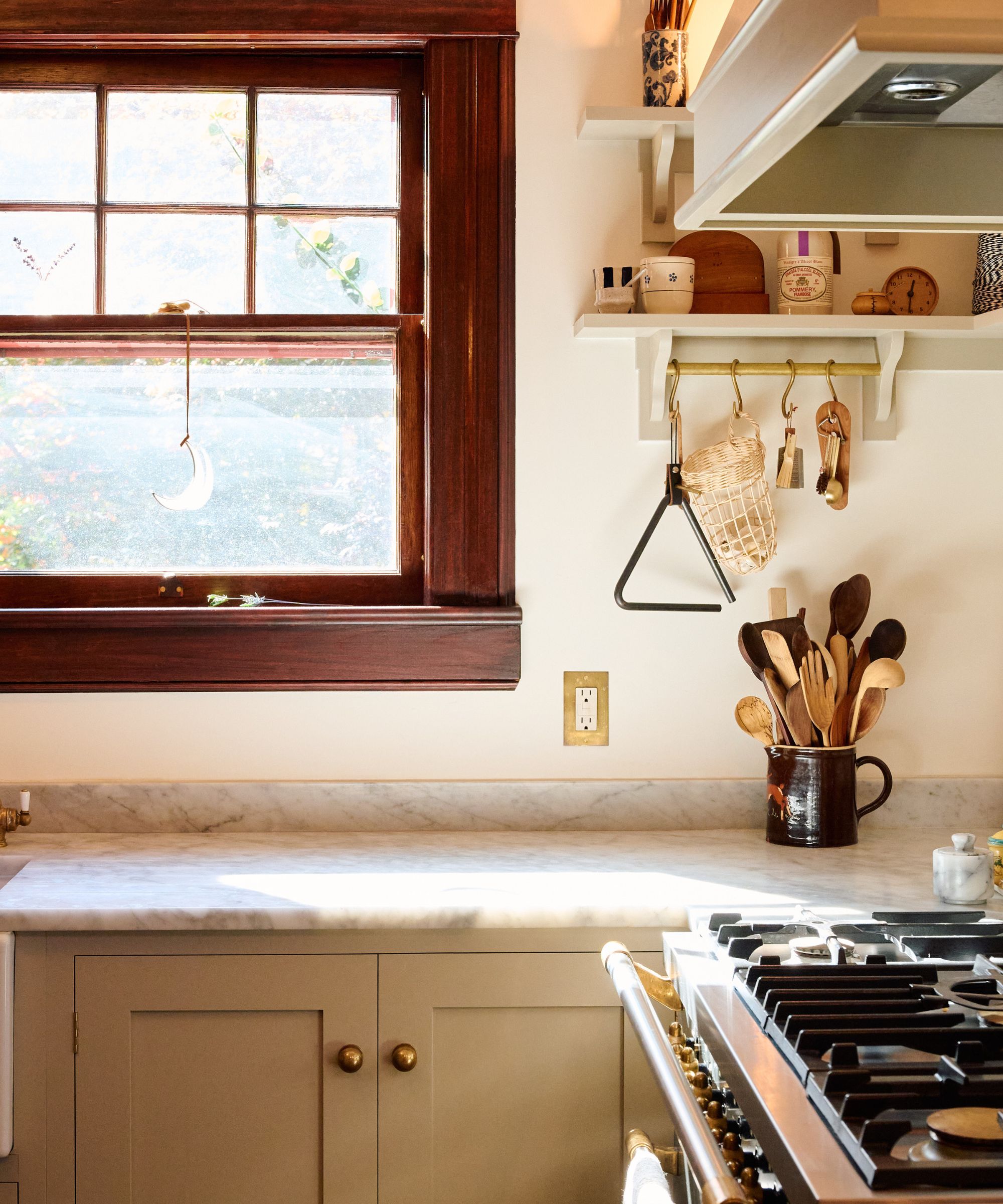
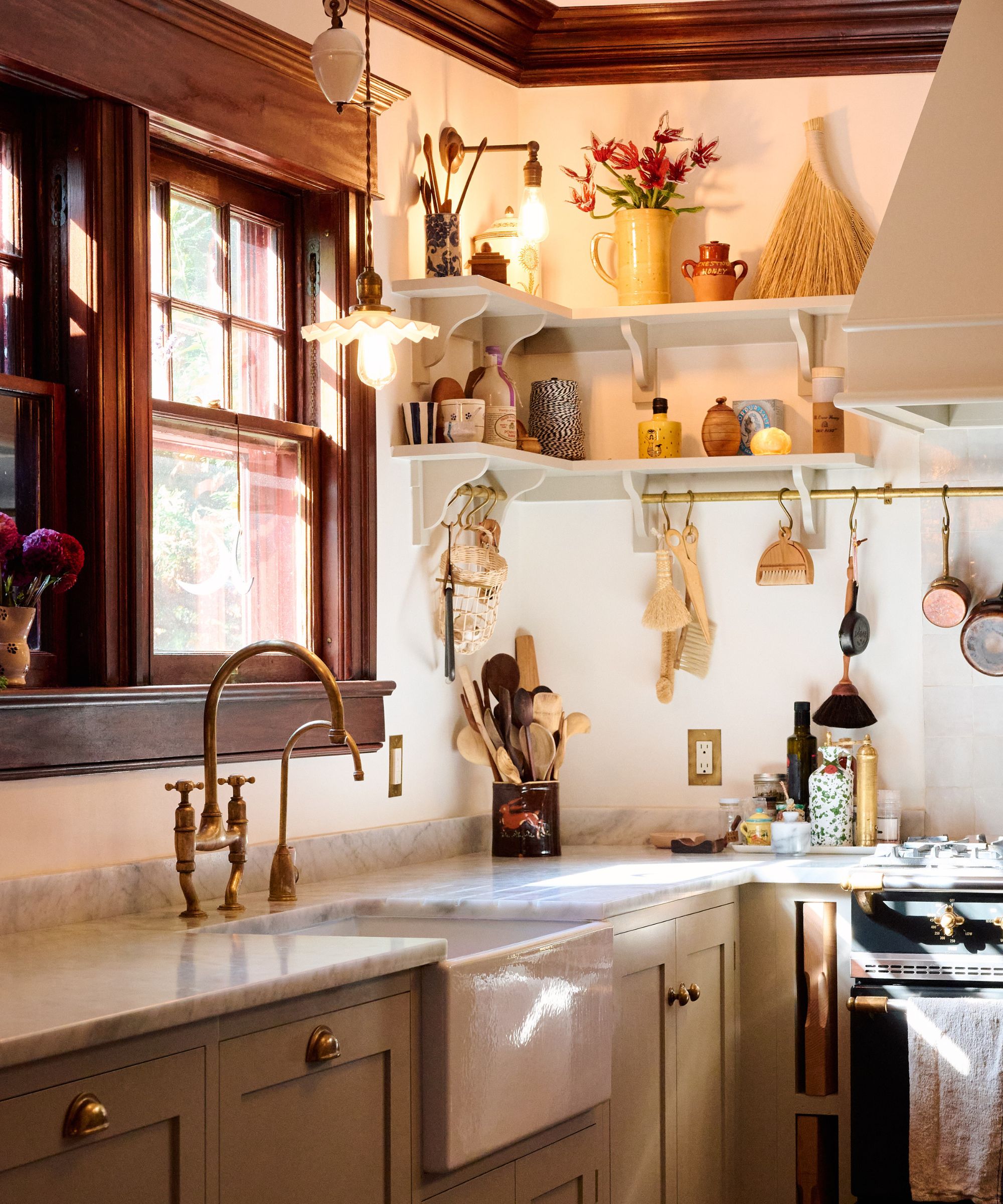
Keen to ensure the design of the space only enhanced the standout original windows, the kitchen shelving was cleverly designed to fit around them, while adding brass rails further reflected its rustic feel, as Helen explains: 'The stunning windows in this house were such a beautiful feature, so it was very important to keep them as the main focus in the kitchen, so understated painted Shaker shelving and aged brass rails were designed and fitted around the room to give extra storage and display for the customers' collections of quirky and unique vintage finds and copper pans.'
Rather than choosing bulky wall cabinets, the open kitchen shelving allows for a much more delicate look and maximizes the room's natural light. It also allows for decorative and functional items to be displayed, leaning into a slightly eclectic look:
'Open shelving was a great option here and so much more pleasing than heavy wall cupboards that would have blocked the light from the windows,' says Helen. 'Open display is perfect for everyday objects and being able to see all your precious and sentimental possessions together and on show – it gives the room its own unique look.'
Looking to make some design upgrades to your own kitchen? This guide by deVOL explains all, helping you to make design decisions for a stylish and practical kitchen.
Through thoughtful design choices, this modern rustic kitchen shows how contemporary elements can work seamlessly in a home that's full of old character. The shaker-style kitchen cabinets bring the room to the present day as a functional family home, while historic details remain the star.


