Browsing Reddit on my iPhone used to be an enjoyable experience. Not by using the official Reddit app, you understand – that was (and still is) a nightmare – but by using the much-beloved Apollo app. Yet since Reddit jealously forced Apollo’s developer to shutter the app, I’ve been left in something of a no man’s land.
Using the Reddit app isn’t really an option, as it’s so full of ads and irritating design features that I’ve long since given up on it. But the other alternative – browsing the site in Safari – has its own problems, mainly relating to those incredibly annoying nagging pop-ups that beg you to launch the official app. We’ve been over this Reddit, your app sucks, I’m not going to use it.
For a long time, I was at a loss for what to do. Until, that is, I discovered a handy little Safari extension called Sink It for Reddit. Install this app, tweak a few options, and your browsing experience is freshened up and made a whole lot more bearable. It’s not quite as good an experience as using Apollo was (but then again, what is?), but it’s lured me back to Reddit without requiring me to shore up the official app’s download count. That alone is a win.
What does Sink It for Reddit do?

Sink It for Reddit automatically removes all of those annoying banners telling you to try the Reddit app. These sections take up significant portions of the screen and interrupt your browsing, but with Sink It for Reddit, they’re gone in a flash.
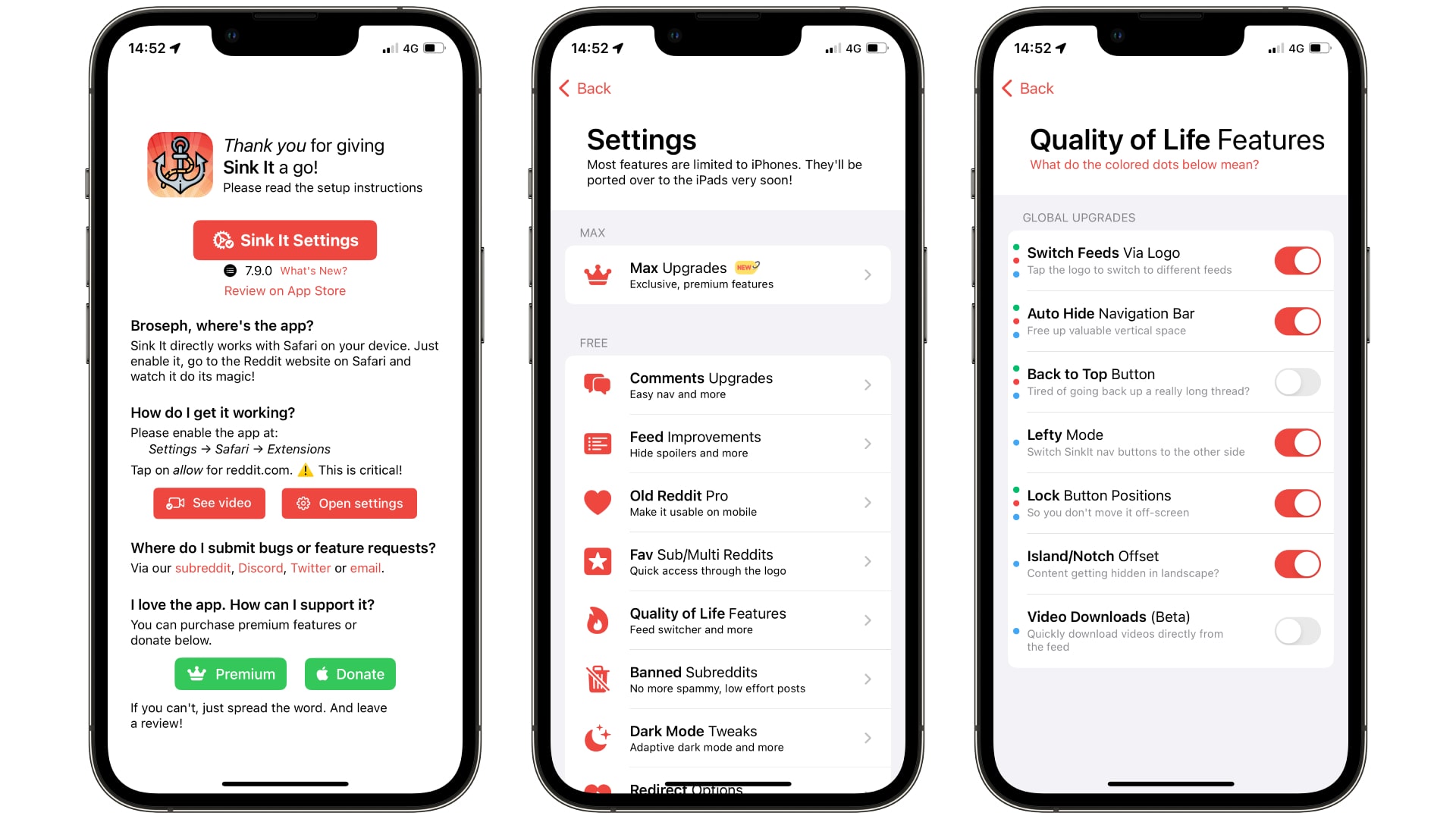
But it offers much more than just automatic banner banishment. You can block ads and promoted content, hide the navigation bar for a more immersive view, add a ‘back to top’ button so you don’t have to endlessly scroll upwards, and much more.
Some of my favorite tweaks relate to comments. I love that Sink It adds color coding to comment threads, making it very easy to keep track of who is replying to whom. You can add a button that scrolls to the next parent comment in a thread, automatically collapse auto-mod posts, and show images inline instead of seeing
There are a bunch of other improvements found in the app, and combined they make Sink It an all-in-one fix-up shop for Reddit. I’ve gotten so used to some of its tweaks that I occasionally forget that they’re not native features, that’s how good it is.
The same developer has also launched Sink It for Twitter/X, which takes a similar approach of nuking X’s most irritating features and making the experience on Safari much more pleasant (well, apart from all the weirdos and vitriol, but that’s well beyond the developer’s remit).
As great as Sink It for Reddit is, it doesn’t quite hit Apollo’s level of greatness. But in a world where Reddit is cracking down on almost any competitors to its own (frankly awful) official app, it’s a welcome addition to my Home Screen. If you’re sick of the way Reddit works but still love its content and community, it’s a great app to try.
How to use Sink It for Reddit

- First of all, open the Settings app and go to Safari > Extensions. Tap Sink It for Reddit, then enable all the toggles. Make sure reddit.com and Other Websites are also set to Allow in the Permissions section
- Now, open Sink It for Reddit and tap the red Sink It Settings button. Here you’ll find all of the app’s tweaks divided into categories
- Try tapping the Comments Upgrades button. Go through the list of adjustments and enable any that catch your eye. All your changes are applied automatically, there’s no Save button you have to press. You can now go to the other settings sections and make any changes you want
- While most settings are enabled or disabled using a simple toggle, you can also add to your lists of favorite subreddits and banned subreddits using the relevant sections in Sink It’s settings
- You’ll notice that some settings have colored dots next to them. These indicate which version of Reddit the features are supported on. Green dots refer to the new unified user interface (UI), while yellow ones are for old Reddit only. Red dots work for both old and new UIs on desktop, while blue dots denote support for both old and new UIs on mobile


