The great thing about living in a property for a while before attempting to make changes to it, is that you can really appreciate what works and what might be lacking from the existing set up.
The homeowners had been in their four-bedroom Victorian house for 13 years before their three children were born, and knew the building inside out. This meant that when it came to their kitchen extension, they were able to make informed choices, and marry them with playful design considerations. The finished project goes to show that good design can make the most out of any space.
Rethinking the layout
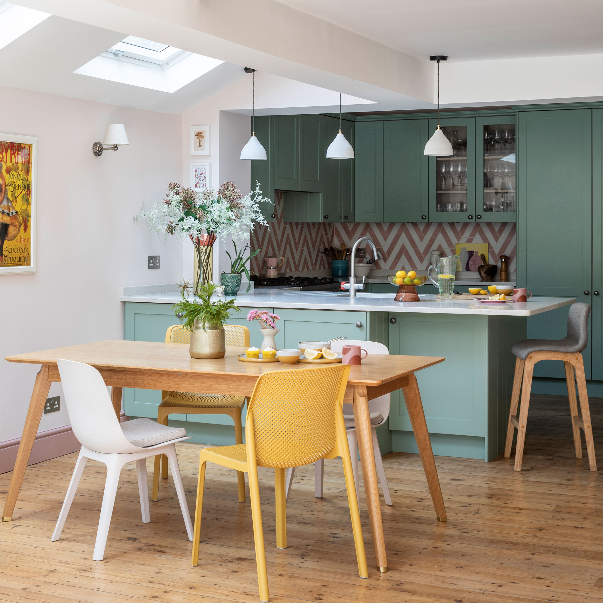
‘The existing layout didn’t use the available space to its maximum capacity,' they explain. 'We wanted to reconfigure and add space. It was a typical Victorian property with a front room and dining room, a long hallway and a galley kitchen to the side. The dining room became a dumping ground.'
‘The kitchen itself was okay until we had our third child. There wasn’t enough room to have five chairs around the table, and we couldn’t have guests around. We knocked the dining room into the side return, so we now have one big space. We wanted to stay here because it’s a very nice street and we have great neighbours. The children love their school.’
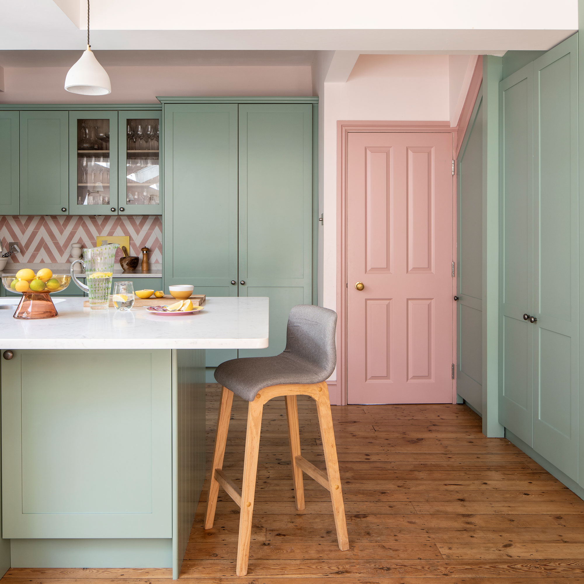
‘We only went to the side, not the back, as we didn’t want to lose any garden – we are always out there during the summer. The project wasn’t about making the house bigger – it was about making the space work better. Plus Rooms was the only company that suggested knocking through. If we didn’t, we wouldn’t have used the space half as much.'
Challenging times

'We started in Feb 2020. The team removed the walls and installed the roof, then work ground to a halt due to the pandemic. We had a temporary kitchen in the front room. We were working crazy hours and living in the loft room. Then we got Covid and couldn’t go out and get food!’
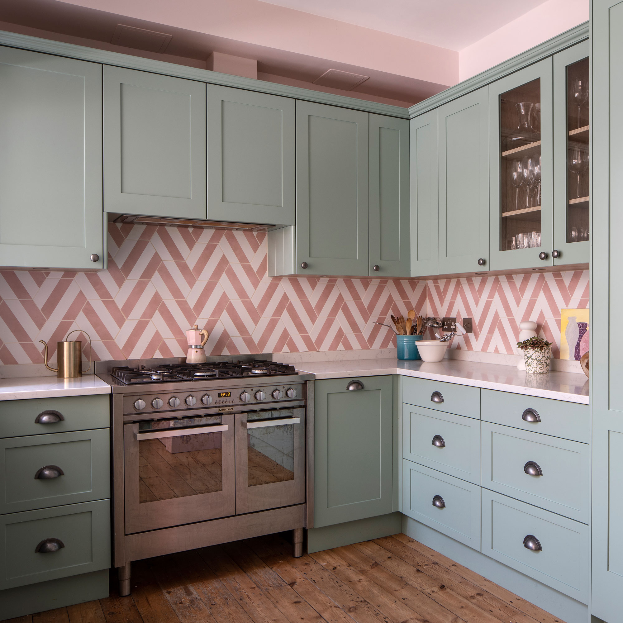
‘The kitchen was made by our carpenter and spray painted. We wanted a run of cupboards hosting the pantry and washing machine. A high-end kitchen wasn’t in the budget, and it would’ve been a challenge to find one from a regular supplier. It’s worked out great; every millimetre of space is used.'
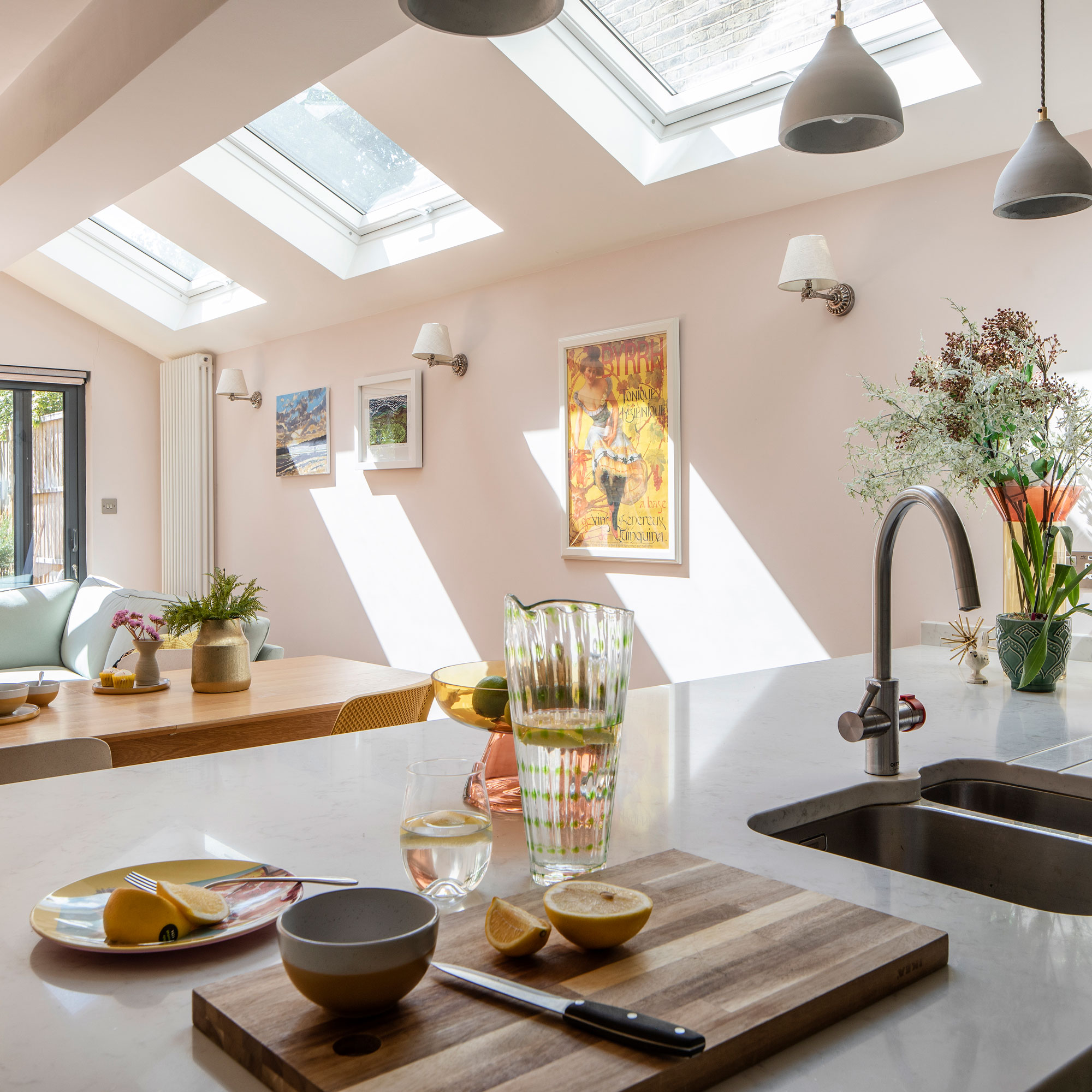
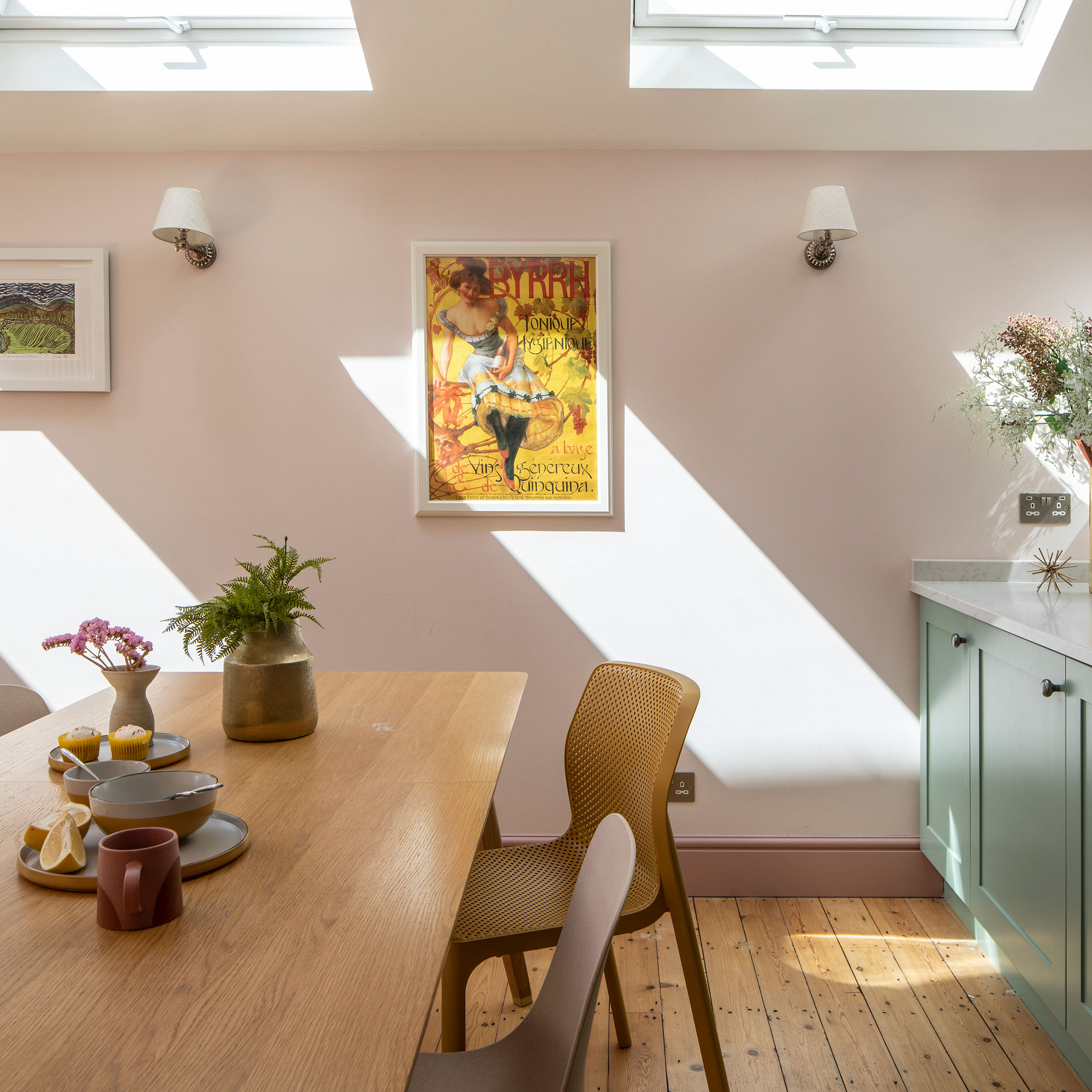
‘We also worked with an interior designer, Elie Lyon of Wildcat, to help with the layout and colour scheme. Her ideas were brilliant; she encouraged us to try new things and visualise them in a different way. We worked out where the light came through to see the best type of green for the units, and then matched the pink hue to them.’
Enjoying the outdoors
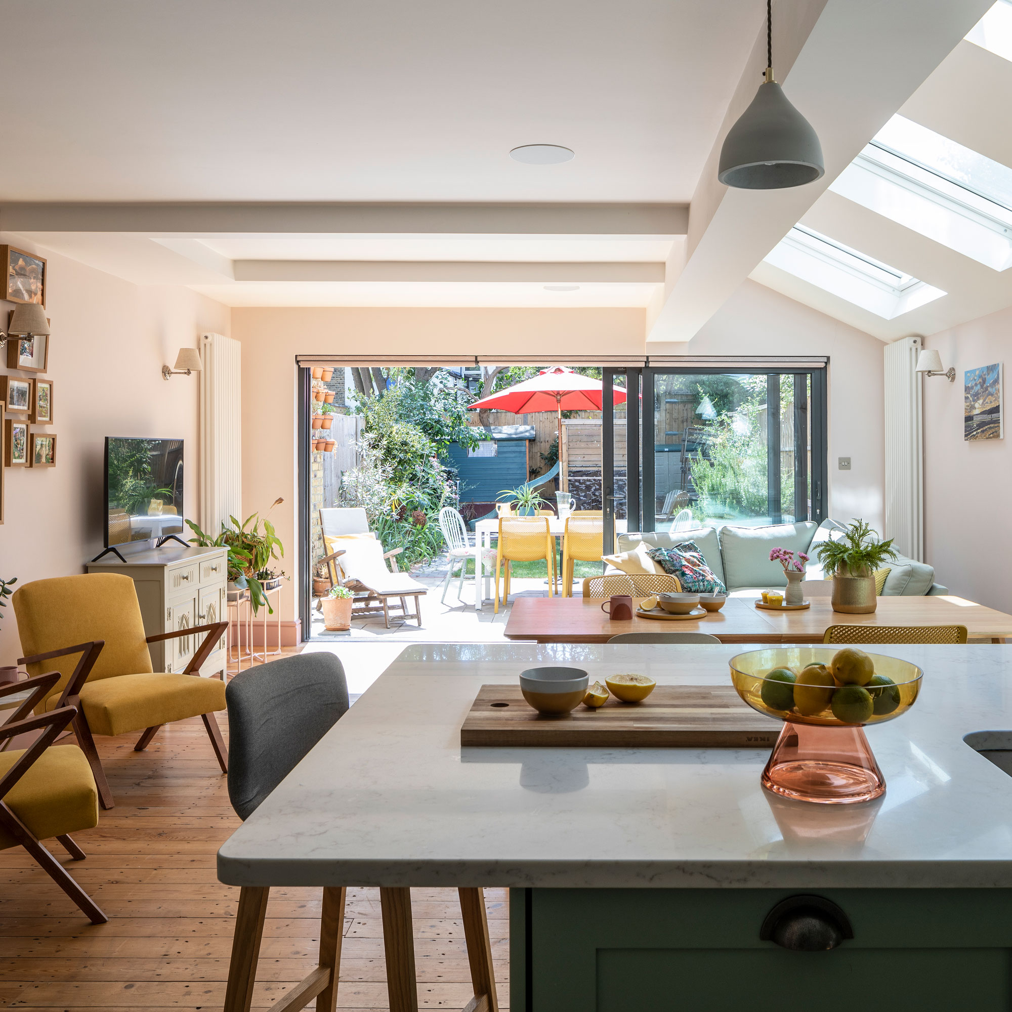
‘As walls were coming down, we saw this as an opportunity to run an internet cable under the floor as the broadband in the back room wasn’t great. Now it’s got strong Wi-Fi. We also have built-in speakers.'
‘In the summer, the sliding doors are constantly open. We had to decide between bi-folds, sliding and Crittall-style, and while we love the latter, we were being pragmatic about the amount of time we’d have them open or closed. Part of the glazing is static, but we knew we’d have an L-shaped sofa so it wouldn’t matter. Because we were designing from scratch, we could put a cat flap in. Plus Rooms helped project-manage this and suggested where to place it so you can’t see it.’
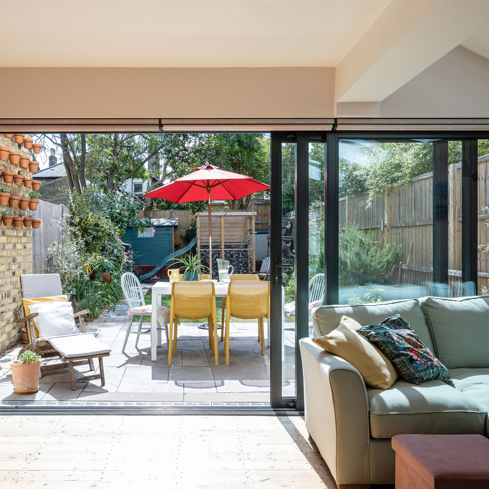
‘In the summer, we spend all of our time by the sliding doors to the patio. We have the doors open and it feels like you’re sitting outside. As the kids grow older, we each have our own spaces.'
‘We like entertaining, and when we have people over for dinner, it makes it easier having the kitchen set back as you don’t have people in front of the oven when you need to access it. Before the changes, we used to have to walk down the corridor and take three or four trips to the kitchen and back. It’s just a lot more accessible with this setup. We don’t feel like we’re on top of each other anymore, and we’re using the square footage of the house much better.’


