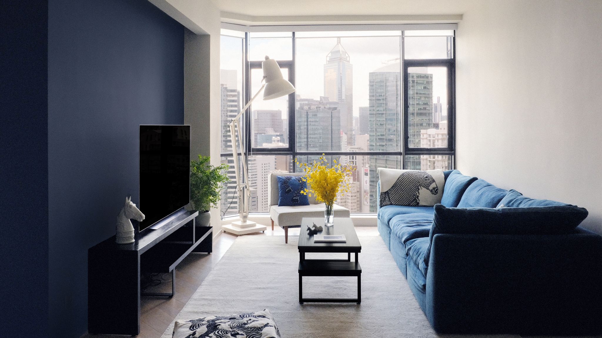
The requirements of modern living pose numerous challenges to our homes. The need to live, host, work, and rest in one space that often has its spatial limitations requires creative thinking and a robust design vision to achieve a space that is as multi-functional as it is beautiful, and as welcoming and suitable for guests, as it is private and a personal sanctuary for calm and relaxation.
When a Team Hong Kong equestrian was looking for a permanent abode after years of traveling to train and show-jump in Europe, the need to create a home base that showcases the owner’s love for horses and is suitable for entertaining, as well as growing a family became prevalent.
The apartment located in Hong Kong’s prestigious Regent On The Park estate went through a transformation that involved opening up the space to allow for the natural light to flow and make the best use of the stunning views, while the equestrian-themed artworks created a truly personal space for the owner. The result is a modern home suited for city living that tastefully showcases the owner’s love for horses.
An apartment filled with light and gorgeous views
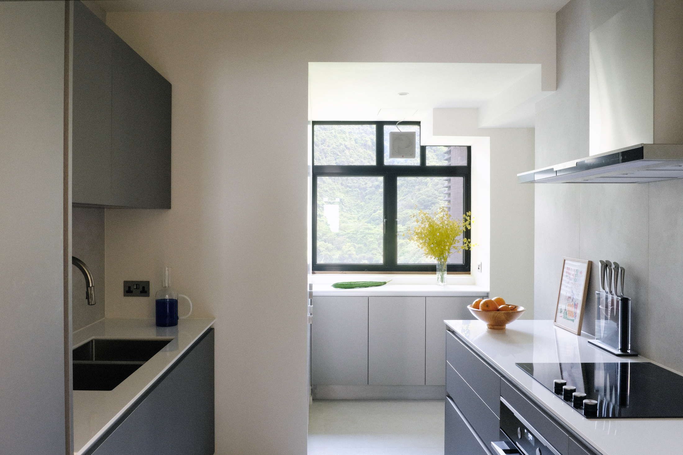
The apartment featured impressive city views and big windows that allowed for natural light. They only needed to be enhanced and a pathway created for light to be bounced throughout the space for a pleasant flow. London and Hong Kong-based architecture office Kasawoo, in charge of transforming this home, started by opening up the holed-up kitchen by introducing a concealed pocket-door detail which creates an open, connected space perfect for cooking and serving. By opening up the back wall and connecting the kitchen with the rear utility/storage area, Kasawoo was able to introduce natural light and views into the kitchen, enhancing the quality and usability of the space.
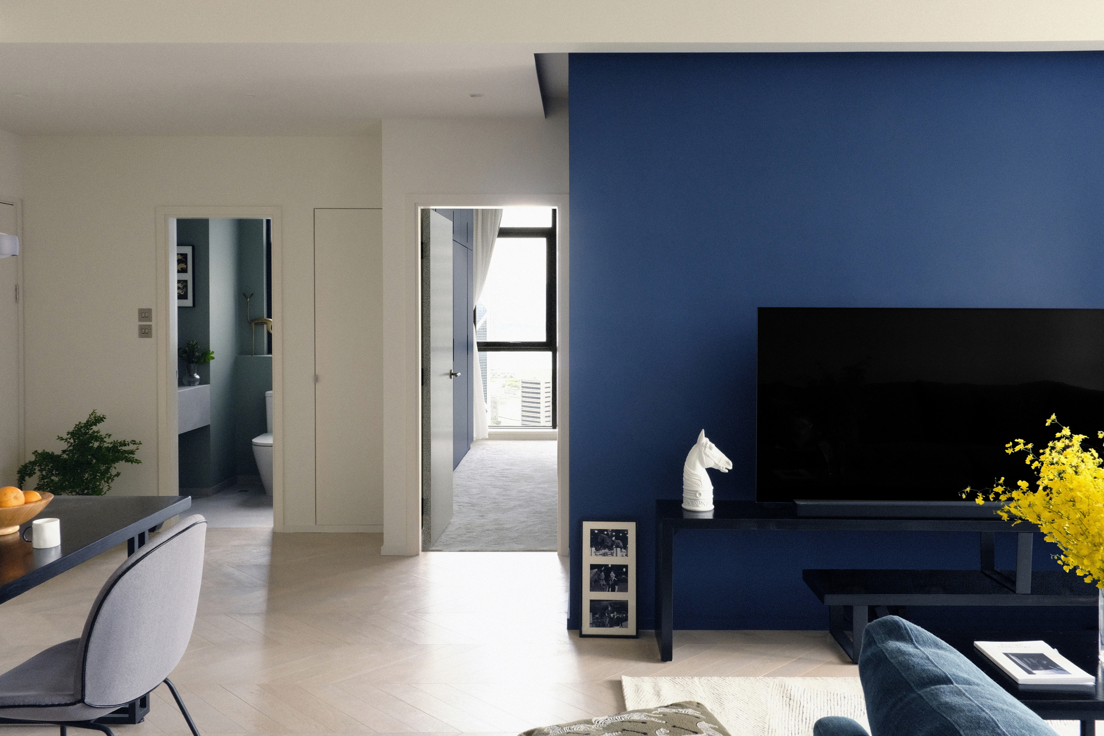
Darius Woo, Kasawoo's Managing Director, decided to bring in engineered oak wood flooring in a Herringbone pattern and whitewash finish in the living room, complementing the white walls and creating a light and airy palette that beautifully frames and highlights the skyline view seen through the large window. The accent wall is blue, a color loved by the owner, but that is also seen in the distance from the windows of the outside buildings, in this way creating a visual indoors / outdoors connection, that further adds to the illusion of space and lightness.
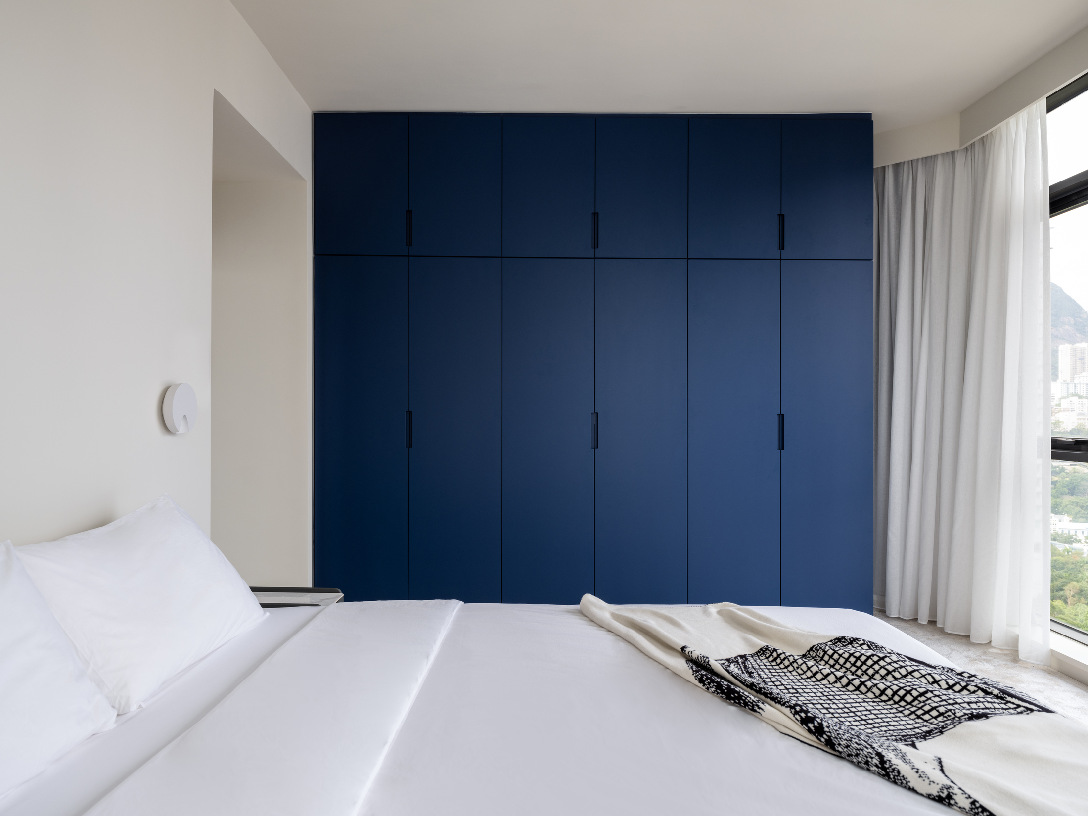
The scheme of white walls and a deep blue accent was carried through to the master bedroom, where the fitted wardrobes are in the same custom shade of blue as the feature wall in the living space. In the guest bedroom, old fitted wardrobes were removed to create more space and airiness that accommodates an open studio space and piano room for the owner, when she needs privacy. Throughout the home, Kasawoo’s material strategy was to pair neutral palettes with a pop of color/pattern in every room, while making the best use of the spectacular, famous views of the housing estate seen from the 23rd floor. It’s safe to say this was a mission accomplished.
An equestrian theme brings character to this space
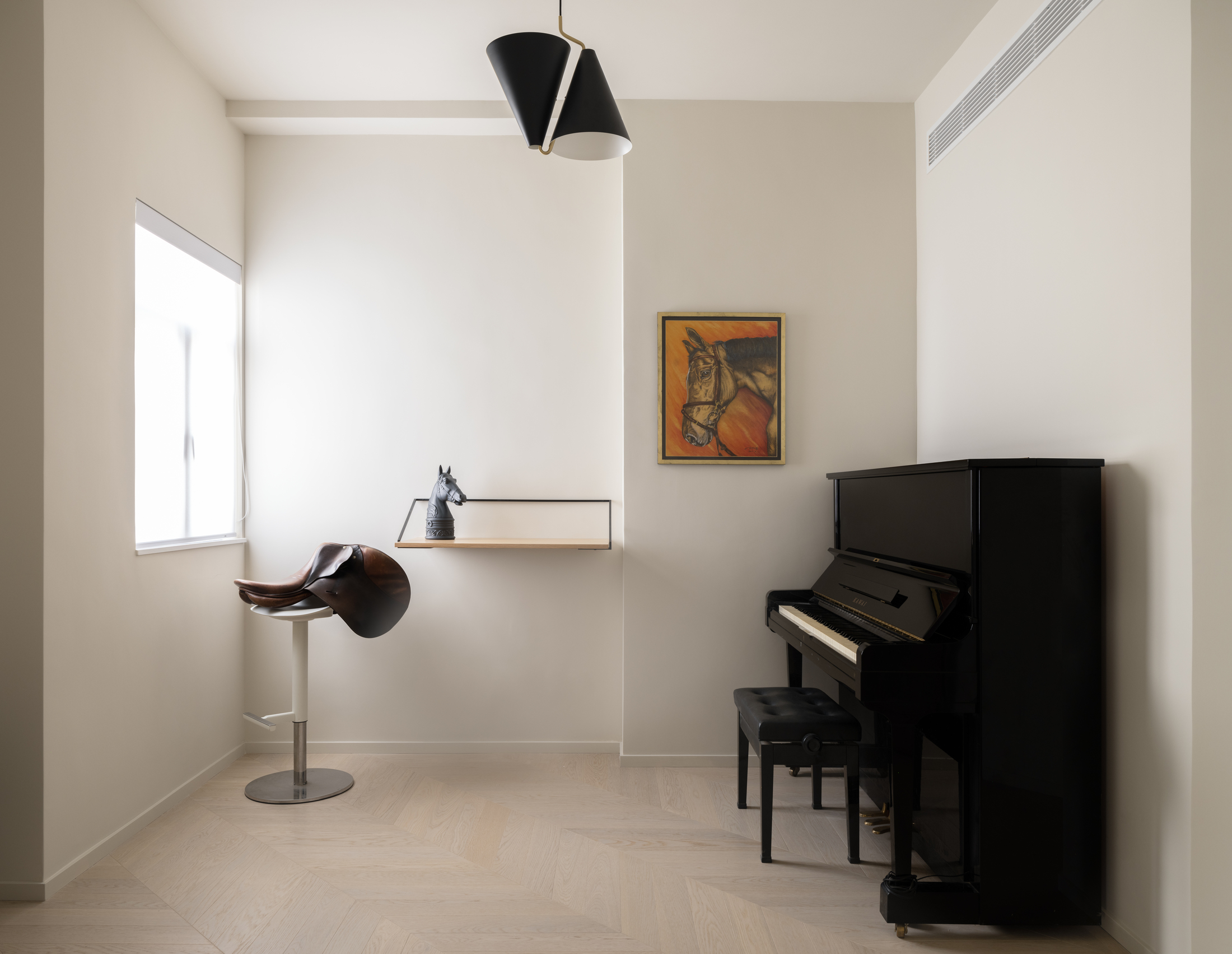
The owner, a Team Hong Kong Olympics equestrian, wanted her home to reflect her lifelong passion. Kasawoo made a strong point of therefore incorporating artworks and design elements that would celebrate it. ‘Given her lifelong passion for horse riding, Raena loves anything horse-related. As such, over the years she would collect decorations and memorabilia that she finds interesting,’ Darius tells me. Some of the highlights in the home include a saddle in the study room. ‘This is the owner Raena’s favorite riding saddle. It was the saddle she used at the World Equestrian Games 2014 where she was the first ever representative from Hong Kong in the show jumping category,’ adds Darius.
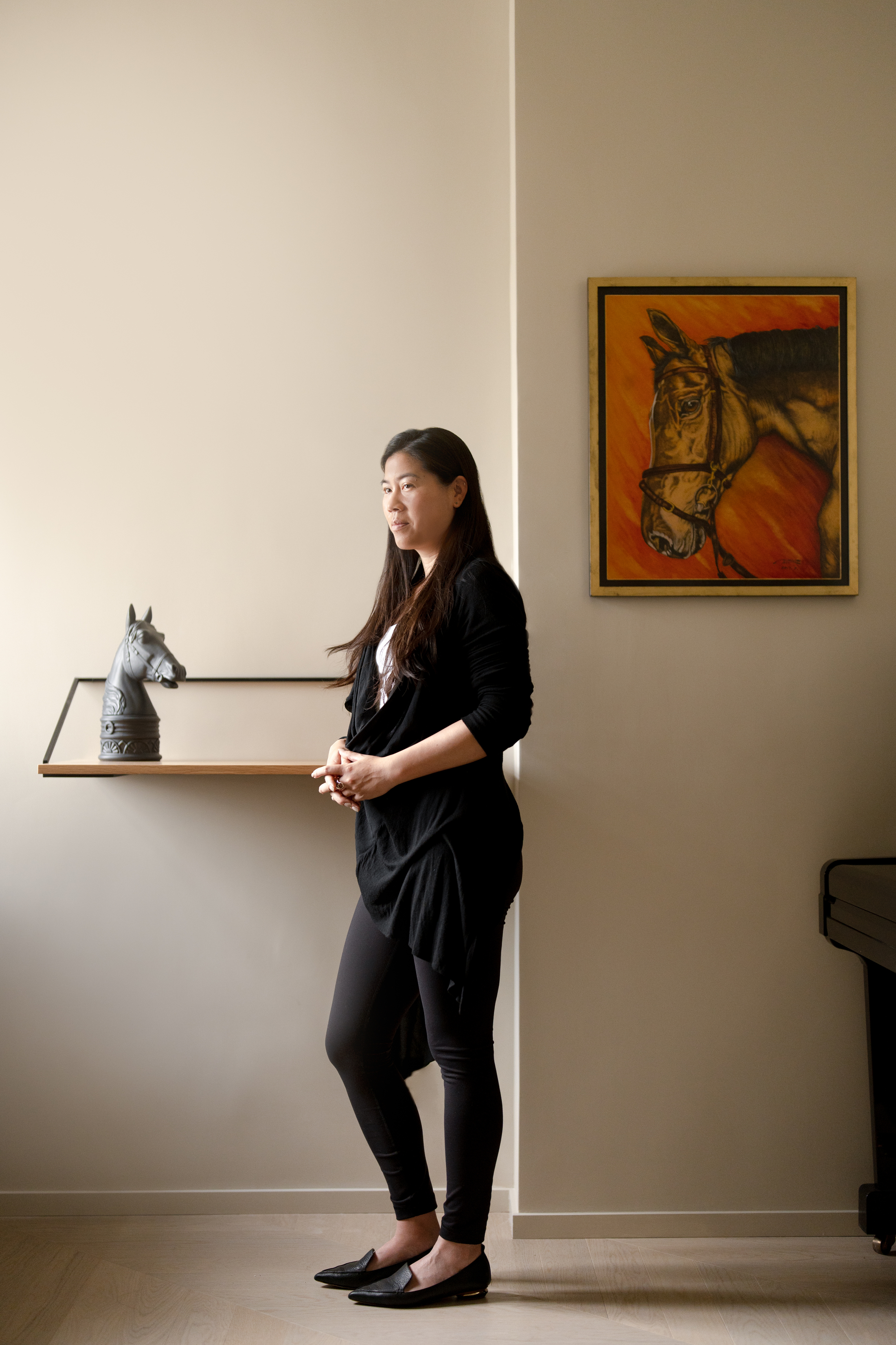
And it doesn’t stop there. Like a living museum of collected personal memories, the home is a celebration of a life-long passion. ‘The artwork in the study room is of Orphee du Granit, Raena’s favorite and most successful horse. She rode this horse at the World Cup Finals 2013, World Equestrian Games 2014, Asian Games 2018, and Team Gold and Individual Bronze medallist at the Asian Championships 2019. The artwork was painted by Ming Chow, a friend of her father, as a gift to commemorate Raena’s and Orphee’s achievement together.’ What a joy and an example of the real purpose of a home, to be a sanctuary where we surround ourselves with the things we love most.
A minimalist home that is both welcoming and private
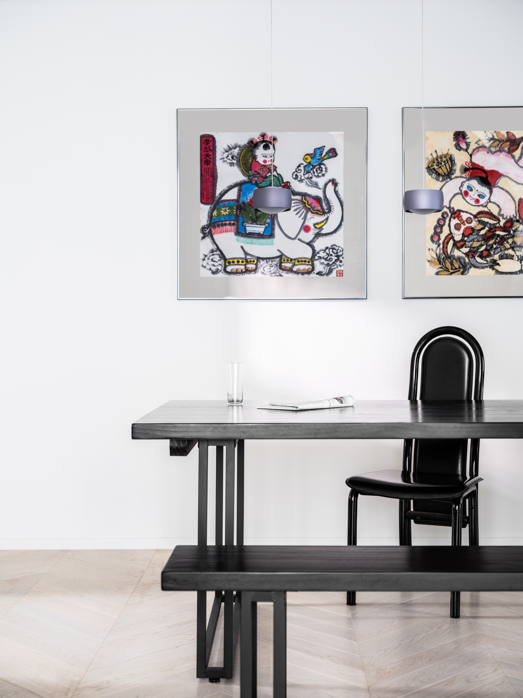
The look of this modern home is an example of minimalism, but by no means does it lack warmth. The space was created with a feeling of comfort in mind and a welcoming atmosphere, where the owner could host. I asked Darius what his secret was to ensure that a minimalist space stays inviting and warm.
‘We think the secret to making sure a minimalist space stays warm and welcoming is to always pair clean lines and neutral colors with a pop of ‘surprise’, be it a complimentary contrasting color, a subtle change of texture, or an interesting pattern. The trick here is to ensure the application of the special material or color does not overwhelm the space. A general rule of thumb for us would be to maintain a ratio of 80% neutral and 20% surprise.’
I love this concept of applying a ‘surprise’, which is so well executed in this space. Keeping the 80/20 ratio ensures that these elements of surprise are highlighted and don’t get lost amongst other pieces of decor. They have room to breathe, get noticed, and be admired. The architecture practice further enhances a welcoming feel by applying subtle personal heritage nods to their design. Darius explains: ‘For example, the green porcelain triangular profile wall tiles we used in the powder room which resemble a bamboo forest not only enhance the experience and visual interest of the space but are also a subtle nod to the Chinese heritage shared by us and our client.’
Kasawoo managed to take a space and transform it into a truly modern home where light flows freely, impressive views are highlighted almost like art, and made an integral part of the design. Most importantly they have created a very personal space where heritage and history are celebrated within a perfectly balanced minimalist design.
Get the look of this light-filled apartment with these buys
Price: $1,495
Recreate the look of this apartment's living room with this floor lamp. It's minimalist in design but its oversized shape will make a statement.


!["Once the [Rainbow Flag] Cat Is out of the Bag, the Ball Game Is Over"](https://images.inkl.com/s3/publisher/cover/212/reason-cover.png?w=600)


