
Having lived in the heart of Manhattan for several years, the talented young interior designer Arianna De Gasperis — who helms And Studio — knows the West Village very well. She had always dreamed of designing a project there. "I think inadvertently a location influences the design of a home a bit," she says. "This neighborhood expresses a more laid-back approach, but it has a patina and is also a bit luxurious at the same time."
It took a single phone call for the interior designer and the owners of this typical New York brownstone to feel they were a good match to work together to re-imagine it with a modern transitional style.
Price: $299
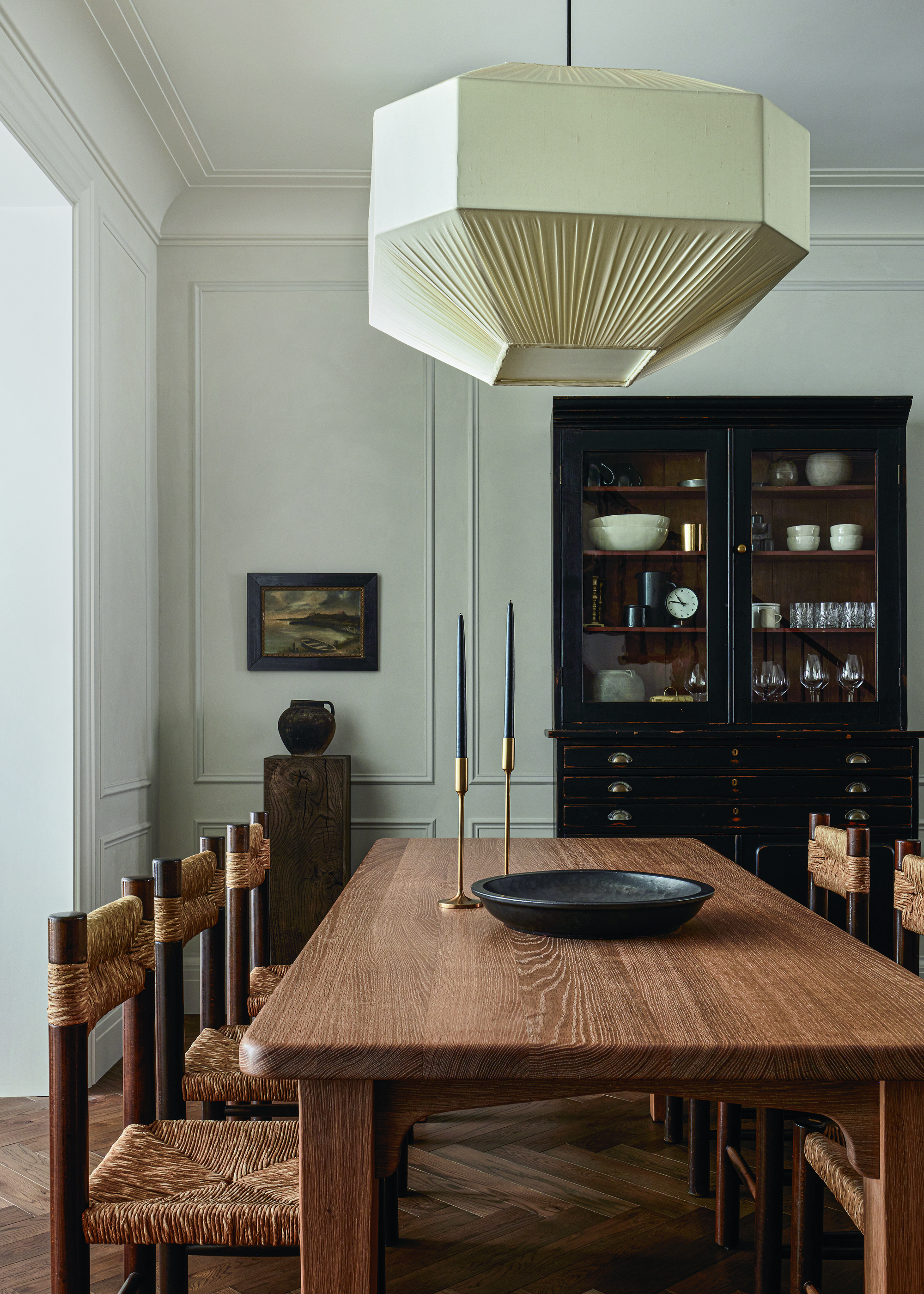
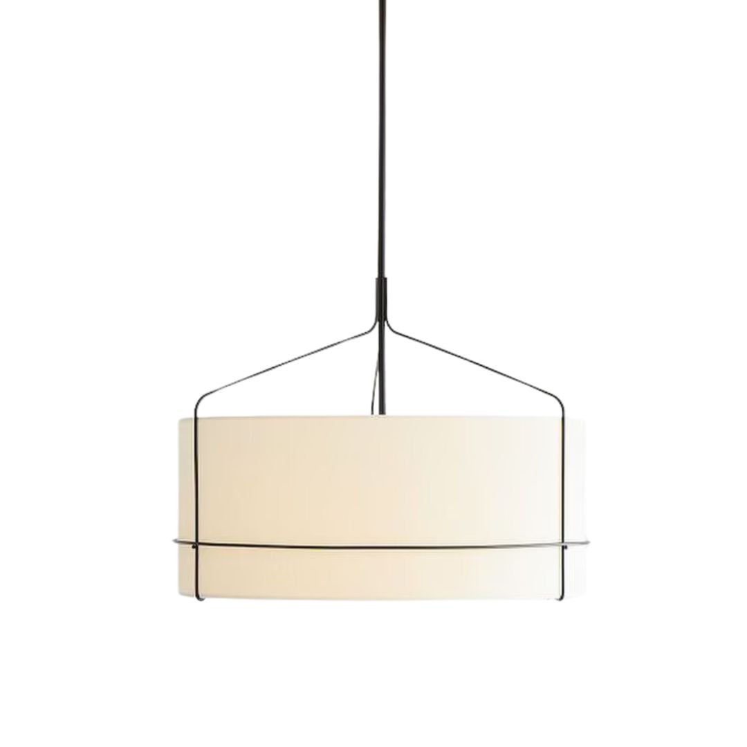
This statement hanging pendant light adds an extra dimension to your dining space, and the white linen lampshade can effectively offset dark-toned furniture.
Price: $395
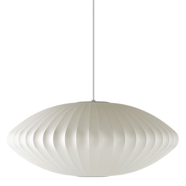
An iconic bubble lamp design brings some minimalist excitement to elevate your space.
Price: $199
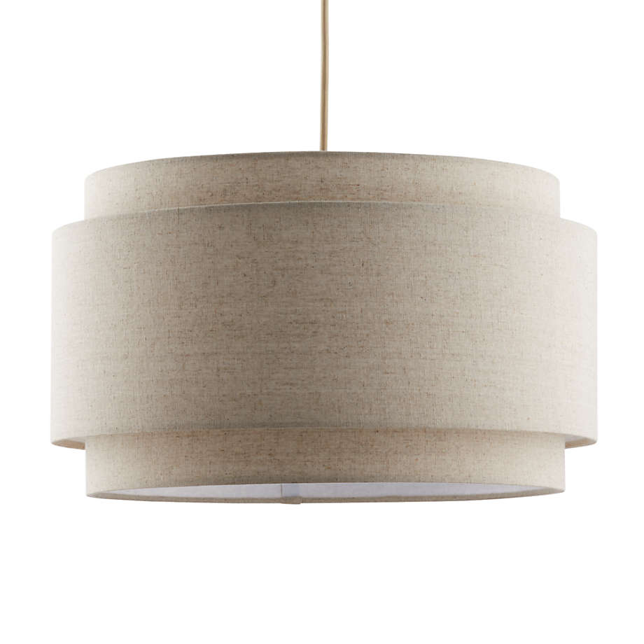
Using a simple design, this double-layered lampshade effectively adds a timeless statement to your living space.
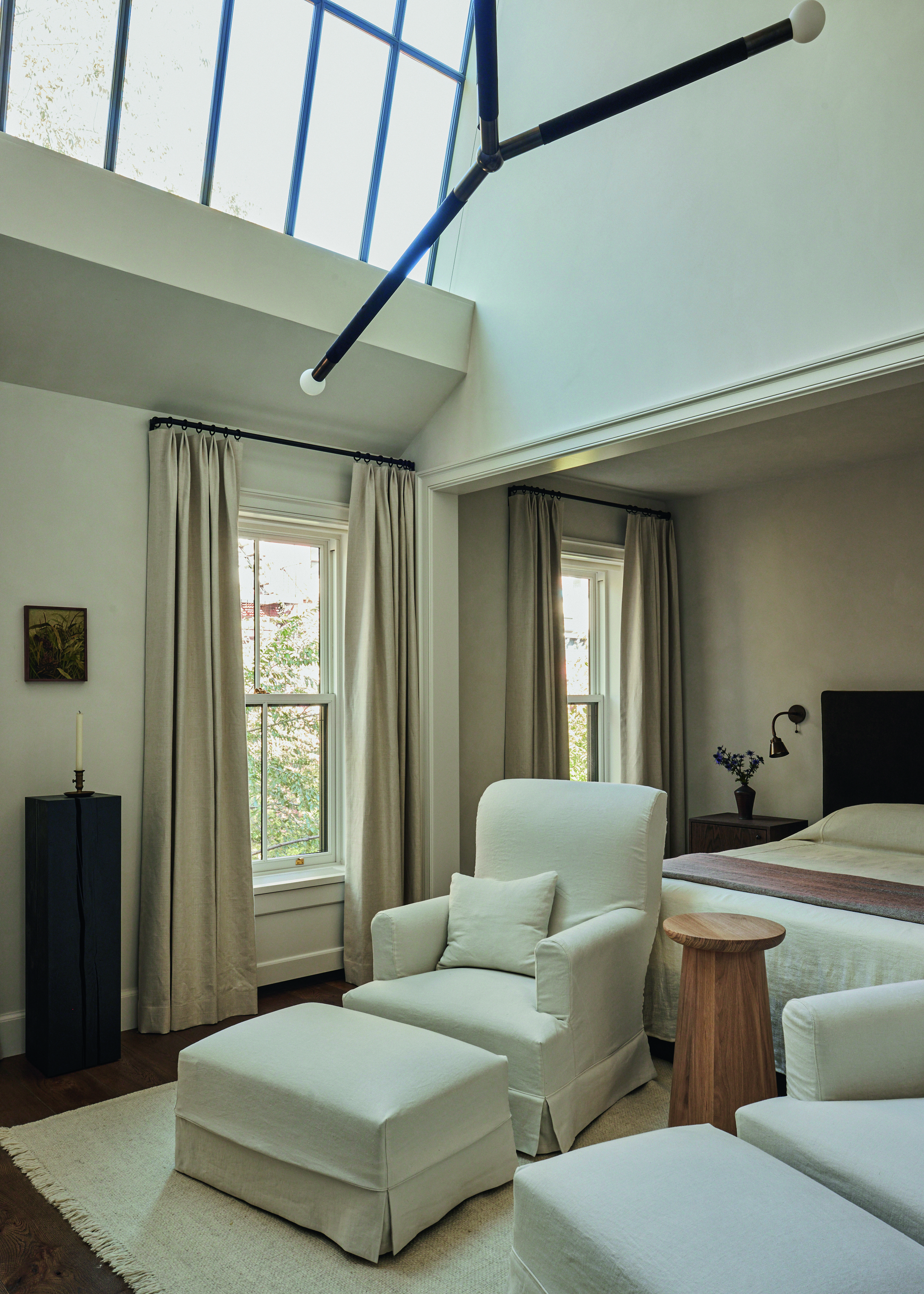
Dating back to 1867, the four-storey house spans over 486 square feet. And while the Elizabeth Roberts Architects team took care of the major structural work – introducing more light with the installation of a skylight in the primary modern bedroom, for example – Arianna began work on designing the rooms halfway through renovations.

As the homeowners are particularly fond of Belgian interiors, this reference quickly became the main source of inspiration. Arianna reflected on the work of the influential designers Axel Vervoordt and Vincent Van Duysen to develop her own vision for the house, where natural materials such as raw and old woods; warm fabrics, including earthy-toned linens, and brass details combine in every nook.
"We wanted the home to be comfortable, but also feel clean and simple," says Arianna, who has successfully created a quiet refuge in the middle of the bustling metropolis for this young family of four. "We were guided by European finishes and we attempted to find richness through a balance of various natural materials."
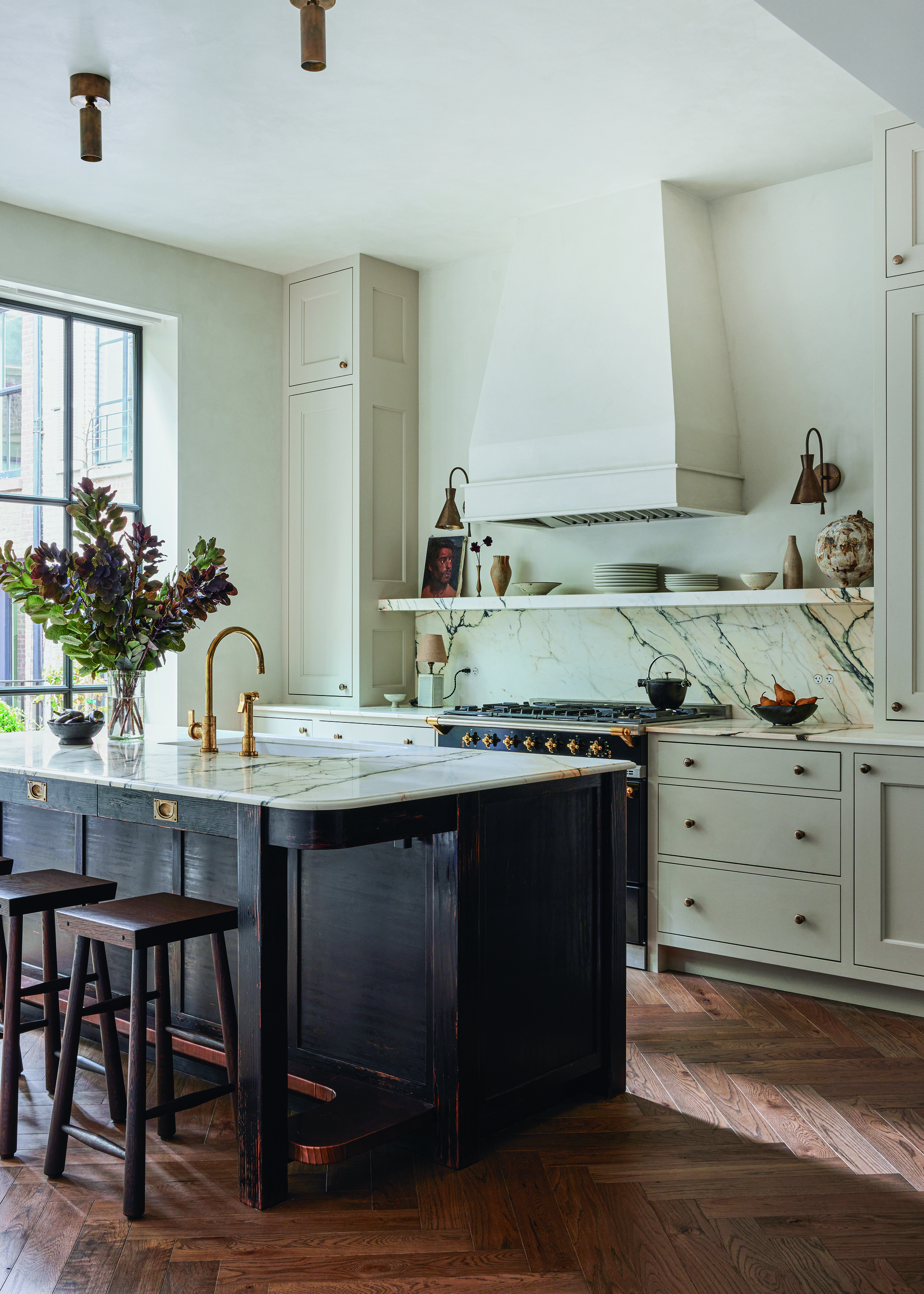
A deliberately neutral color scheme blends with these character-filled materials that will gain further patina over time. Texture is omnipresent – particularly on the walls, which are all covered with Roman Clay plaster from Portola Paints, adding even more subtle depth to the spaces.
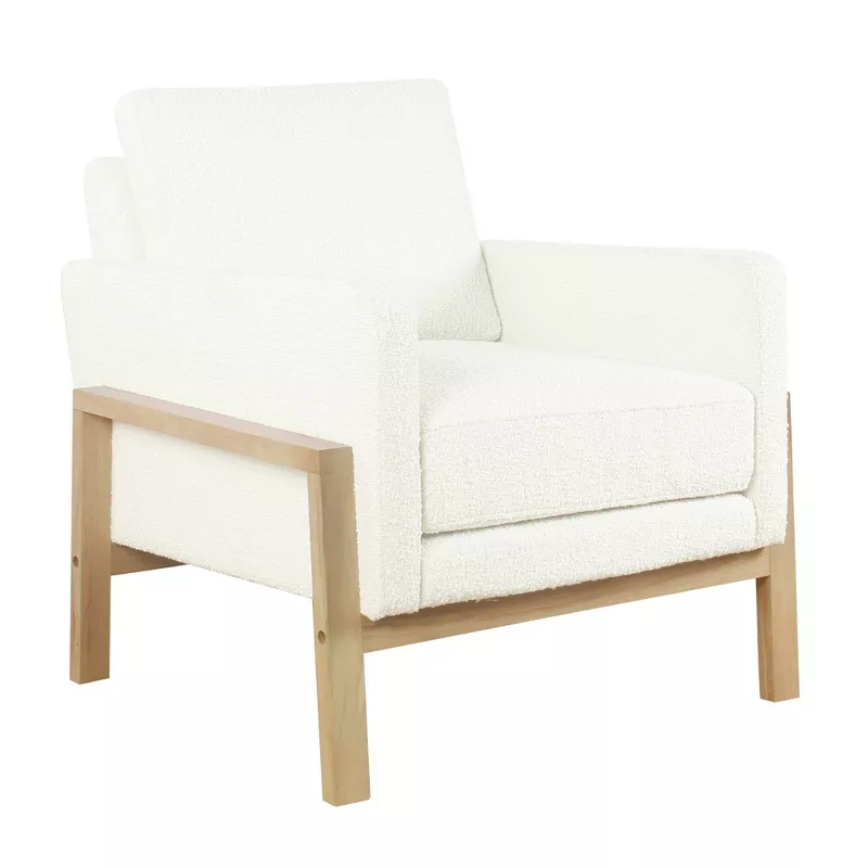
Price: $239.99
Get the look of the bouclé armchairs in this living room: the cream bouclé brings a touch of cozy, quiet luxury, while its wooden frame ties in with the natural materials throughout the house.
Arianna also carefully selected the furnishings, lighting and decorative accessories to provide functionality, while introducing a raw beauty through the simplicity of the pieces.
"Each item was chosen with a lot of intent," she says. "A lot of them are antique and any that aren’t, are antique-inspired." To create further light and shadow effects, Arianna also looked to Dutch still lifes – in particular, the paintings of Vermeer. The subtlety of this marriage of old and new gives this home its personality and it exudes calm. "We wanted the space to feel lived in even though it was a gut renovation," says Arianna.

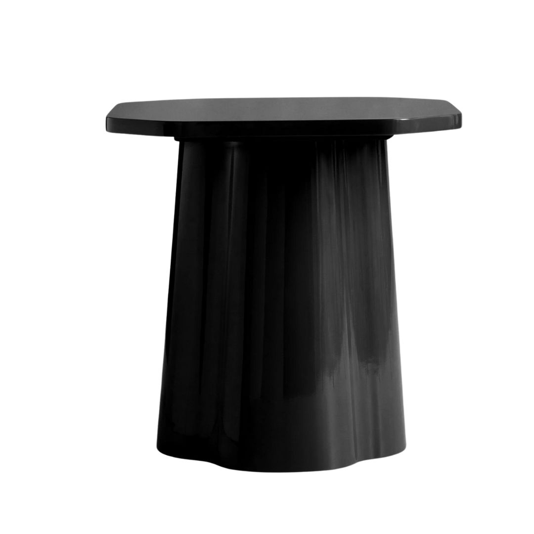
Price: $648
Emulate the same raw beauty of this NYC home with the natural texture of this nightstand, elegantly finished with a wood veneer.
And while the designer may have looked to the past for some of her inspiration, she was also very mindful of contemporary needs. "We found ways of pairing classic design with functionality — such as the custom panel, also finished in Roman Clay, to conceal the electronics – offering tasteful solutions without compromising the holistic design," she explains. "And I was pleased when the homeowner told me that she was open to using color on the sofa. Since the space is so neutral, I really pushed for the rust-colored linen and I am very happy with how it turned out."
It is these nuances that have resulted in this gentle, warm, inviting space where time seems to stand still.


