Get all your news in one place.
100's of premium titles.
One app.
Start reading
Creative Bloq
Creative Bloq
Technology
Tom May

This new typeface is perfect for a society that's done with shouting

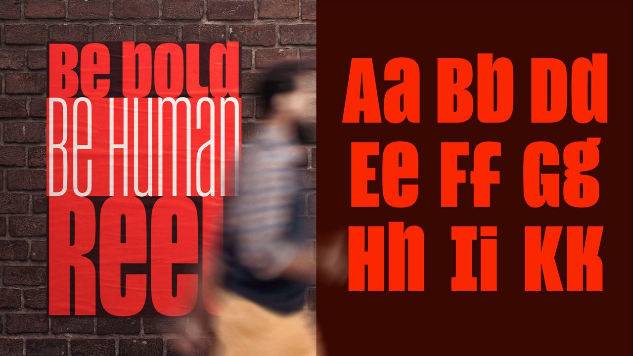
A split image showing a poster on a brick wall with red and white typography on the left, and a sampling of red uppercase and lowercase letters from the typeface on a dark brown background on the right.

For years, ALL CAPS has been the default setting for impact. It's bold, it's loud, it's everywhere, from political slogans to Instagram captions. But that ubiquity has a cost: when everything shouts, nothing stands out, and the tone of voice it carries has started to feel less like confidence and more like aggression.

Now, type designer Jamie Clarke has come up with quite a clever answer. His solution isn't to abandon capitals, but to rethink what they're for.
Sign up to read this article
Read news from 100's of titles, curated specifically for you.
Already a member? Sign in here
Related Stories
Top stories on inkl right now
One subscription that gives you access to news from hundreds of sites
Already a member? Sign in here
Our Picks
Fourteen days free
Download the app
One app. One membership.
100+ trusted global sources.