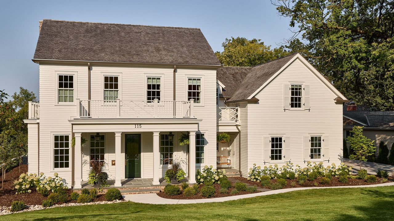
Open-concept living, neutral color schemes, and sleek silhouettes are hallmarks of new homes, but this Minnesota project goes against the expected. Thoughtfully designed to pay homage to the traditional layouts of historic homes, it encapsulates a sense of formality while serving as a truly functional family home for modern living.
The interior designer Krysta Gibbons of Kipling House Interiors designed the home for her own family, including her three daughters, imagining the floor plans herself and completing the vision with the architectural expertise of Murphy & Co. Design.
'The house was designed to emulate a 1920s New England Colonial, which is indicative of the existing homes in the neighborhood,' says Krysta. 'Every effort was made to have the new house design quietly blend and fool even the most discerning to believe it was 100 years old.'
'The challenge of new construction in an established neighborhood is to be humble,' wagers Krysta. 'Architectural style, material choices, and scale need to be carefully considered in context to the neighboring homes.'
The home is located in an enclave of St. Paul, Minnesota, where Krysta and her family previously lived while reimagining a 1924 fixer-upper. 'We loved our neighborhood and took such pleasure in admiring every old home on our daily dog walks – our ultimate goal was to return the favor and build a new home that the neighbors would appreciate and add value to their own homes. We did this by keeping the footprint relative and taking cues from our surroundings.'
But it wasn't just the home's exterior that had to respect the tradition and history of its surroundings: the internal layout feels far more reminiscent of centuries-old homes than that of a new home.
'We wanted to build a home that was incredibly thoughtful and not an overbuild – where every space was intentional and useful, versus the “once a year” space. The floor plan is based on homes of the 1920s, as seen in the hierarchy of spaces (formal dining in the front of the house with pantries in the back) and the quirky vestibules leading to a cozy office and girls’ lounge. We created charming moments throughout that exemplify the feeling that the home is historic, versus a new build.'
Within each of these thoughtfully imagined rooms, the decor feels sentimental and soulful. Vintage and antique furniture are central to each room, while the color schemes add richness while maintaining a relaxed and timeless feel. 'From paneled walls to 16 different wallpapers, the result is a home that feels elevated and personal.'
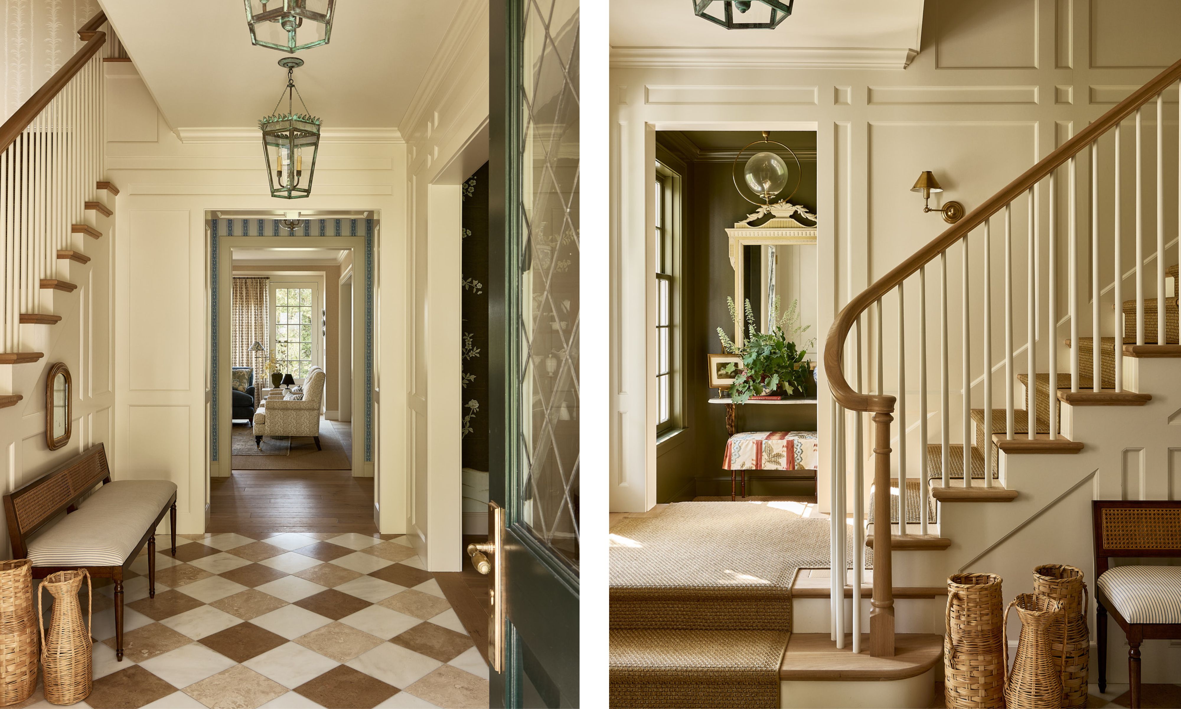
Neutral colors establish a moment of calm in the entryway, described by Krysta as 'a formal first impression that sets the tone for the abundance of color and pattern in the adjacent rooms'.
While the color palette is restrained, depth is added with the layered natural materials and textures, not least the three-stone checkerboard flooring: a combination of Carrara, Crema Marfil, and limestone, sourced by Kate-Lo Tile.
'Custom lanterns in a verdigris finish bring an element of the garden into the home,' adds Krysta.
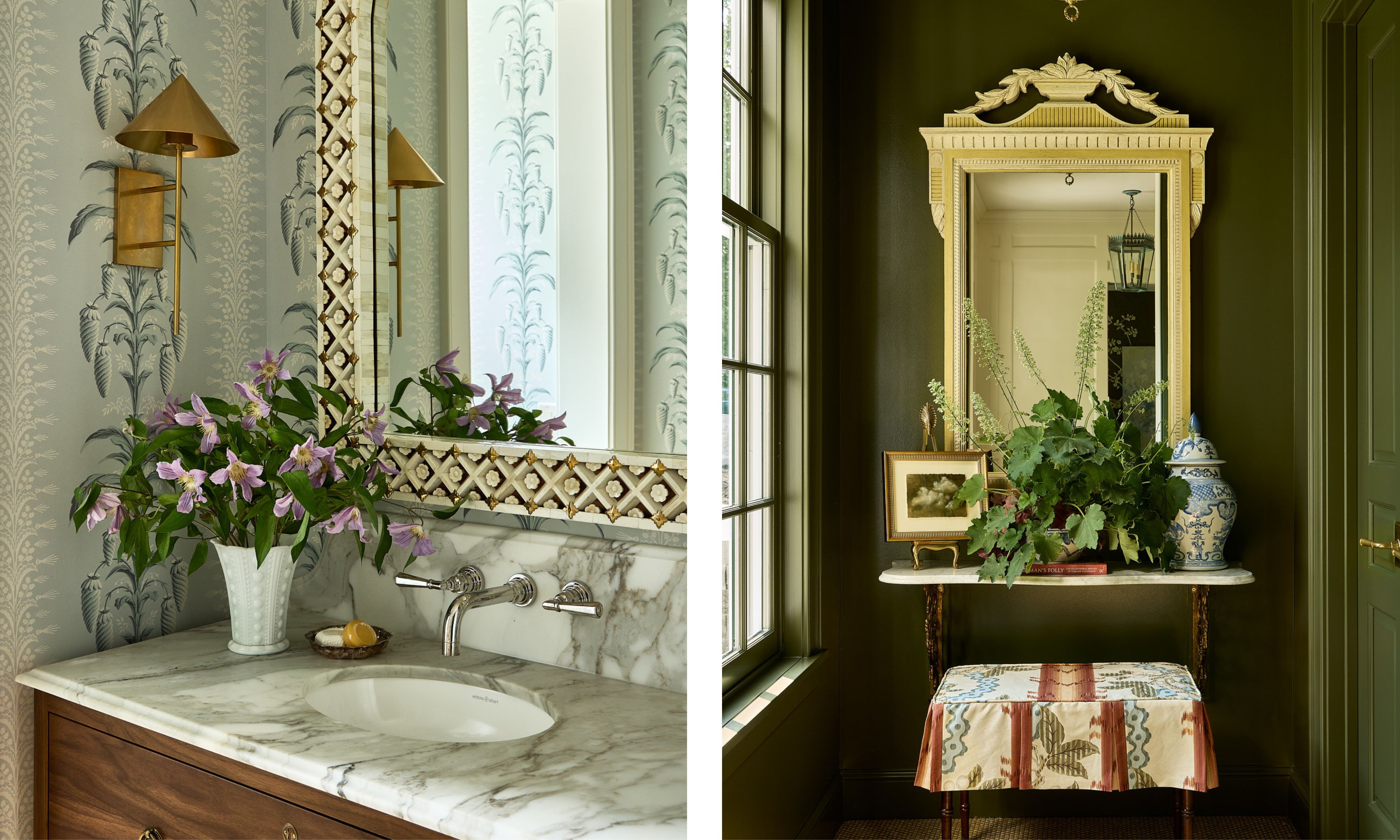
'A pineapple motif wallpaper (the Southern sign of hospitality) creates a cheery space with a handsome custom-designed vanity on turned legs,' says Krysta of the powder room.
The office anteroom, which leads from the entryway into the adjoining home office, is 'swathed in green, echoing the muralled wallpaper of the dining room.'
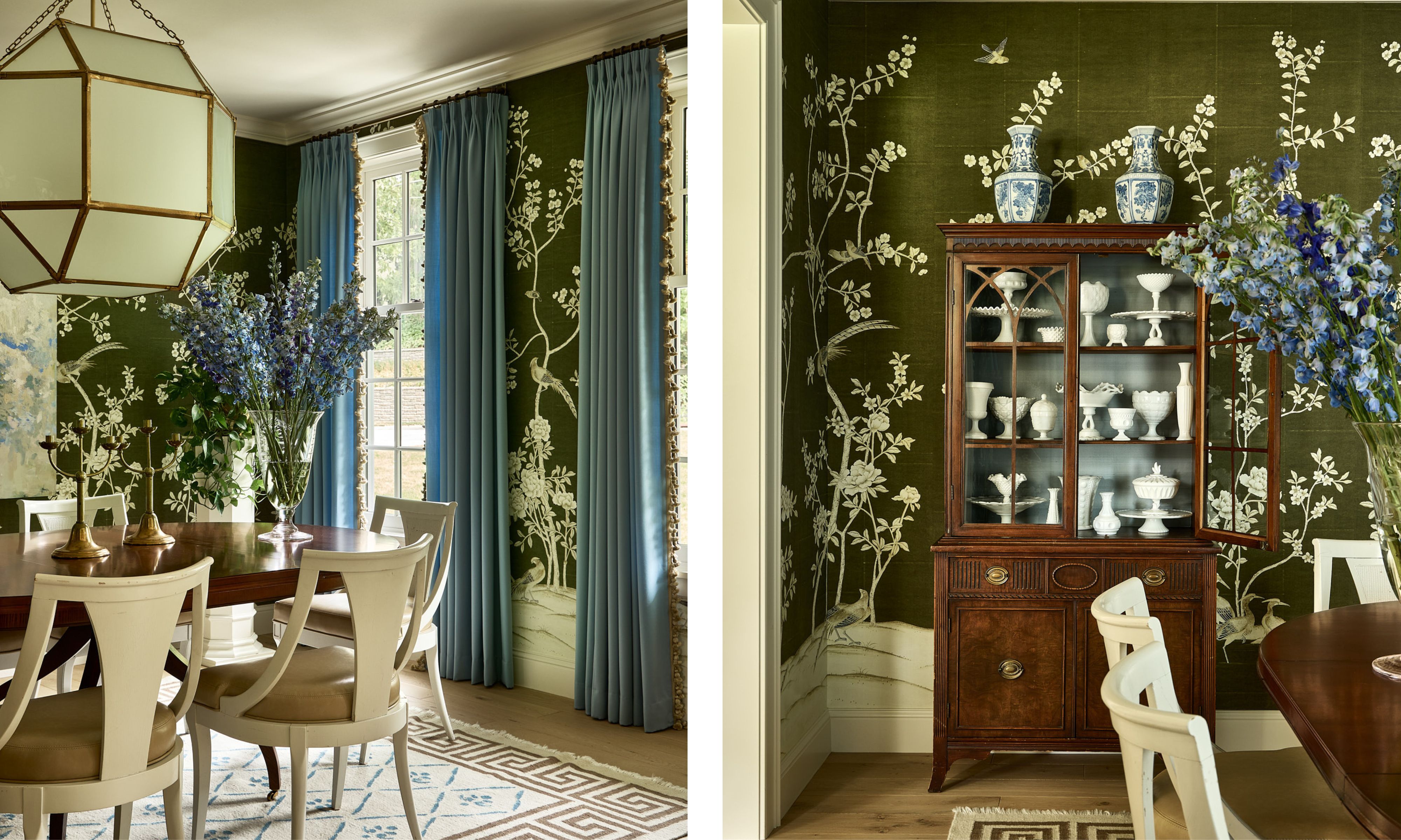
'We fought the new “open-concept” with all our might,' says Krysta. 'I prefer spaces to feel intentional, which just so happens to lean into the story that this is an “old house”.' It makes sense then that this home has a formal dining room, rather than the open-plan kitchen-dining spaces commonly found in new homes.
The custom wall mural brings whimsy and pattern to the space, while the mossy green and cornflower blue color scheme feels both traditional and fresh.
The vintage furniture, from the dining chairs (which were reupholstered with faux leather) to the antique china hutch, adds a sense of formality to the room, while the room is balanced with more contemporary details. 'The scale of the lantern fixture and the commissioned artwork provide a modern juxtaposition to the traditional room,' says Krysta.
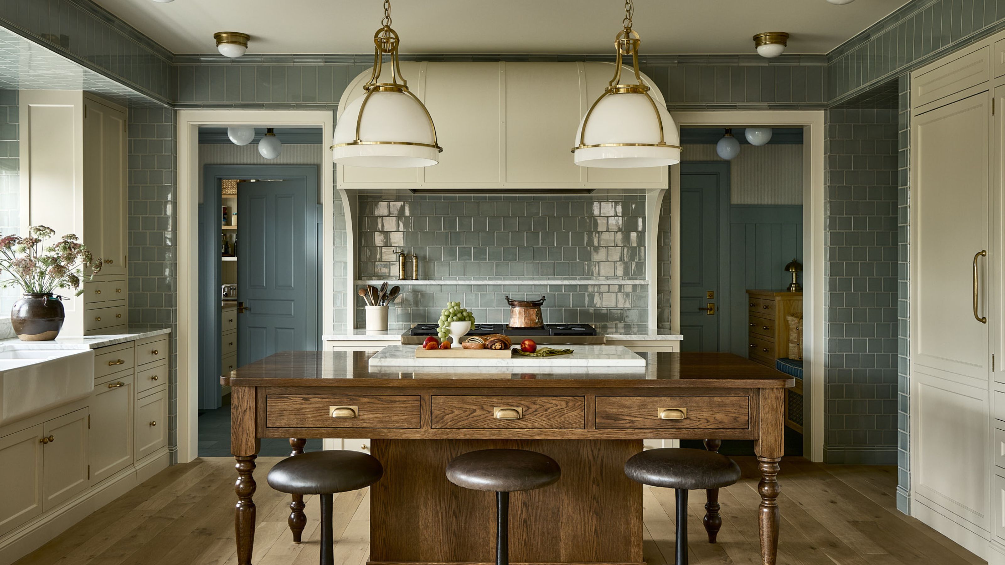
'The floor plan started with the kitchen, and it is one of my favorite rooms,' says Krysta. 'I love to cook, and we eat meals as a family almost every night – so having a space that is incredibly efficient while beautiful is a treat.'
'The kitchen was inspired by the working kitchens of estates from the turn of the century, as seen in the large cooking hood, tiled walls, and scullery-style kitchen island with a baker's rack inserted. I love how this highly functional work zone feels more like a living room.'
The details were key to achieving the vision for the kitchen. Krysta says that she 'worked tirelessly on the tile and cabinetry details to emulate a “working" kitchen, inspired by the period homes of Newport, Rhode Island.'
The kitchen lighting ties the scheme together, further enhancing the lived-in feel. 'Decorative light fixtures were favored over recessed cans to hark back to the era in which the house is hoping to emulate.'
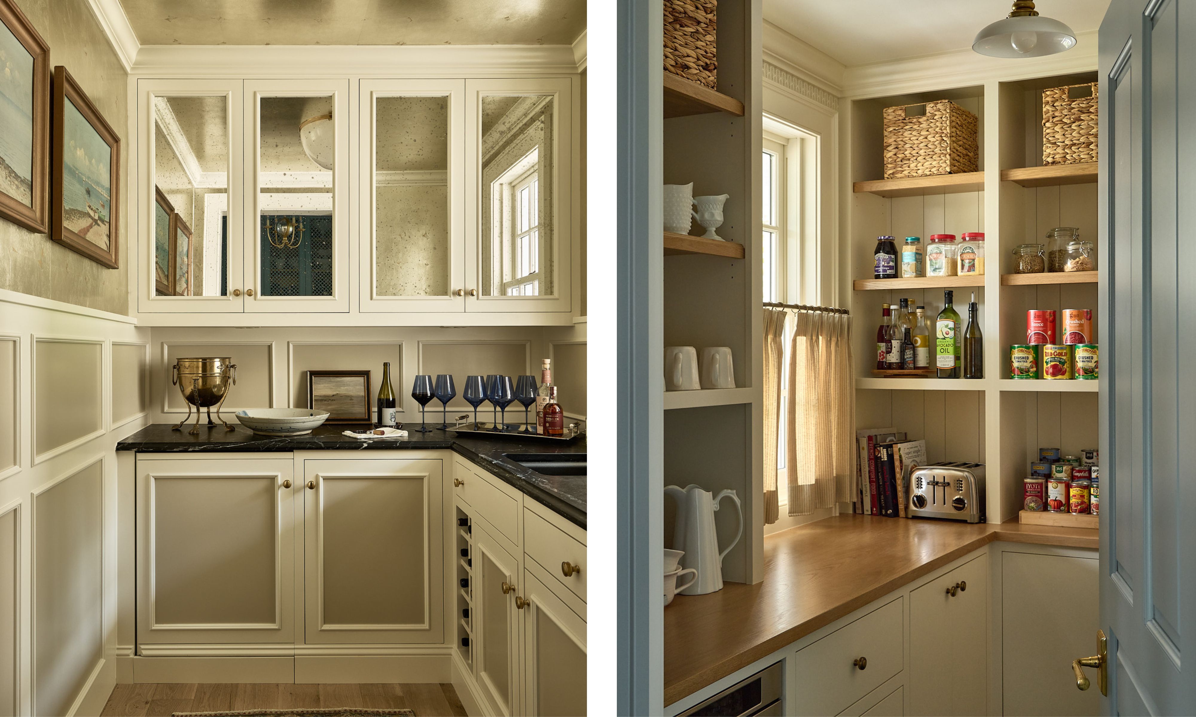
The butler's pantry is 'a jewel box of a room with a nod to the Hall of Mirrors, with antique mirror cabinet doors and silver-leafed wallpaper on the walls and ceiling,' explains Krysta. Slate countertops add depth and contrast, while the light neutral paint colors (Benjamin Moore's Soft Chamois OC-13 and Grant Beige HC-83) keep things timeless.
In the food and coffee-station pantry, oak countertops are teamed with Benjamin Moore's Soft Chamois, while a cafe curtain adds softness.
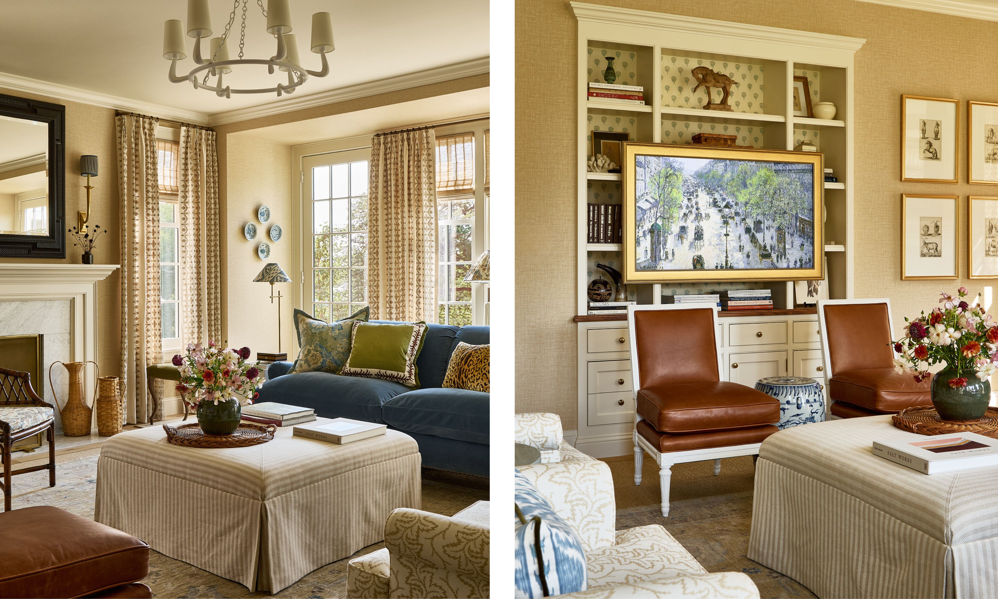
The great room is as functional for day-to-day family life as it is for entertaining guests. 'The furniture plan is centered around a large cocktail ottoman for feet-up living,' says Krysta. 'The room can comfortably sit up to 11 with ottomans tucked away and a pair of slipper chairs that just barely clear the television that is mounted on millwork and disguised as art – anything to avoid the tv over the fireplace.'
The living room color scheme favors soft and warm neutrals, while pops of color add interest. 'The blue velvet sofa matches the blue of the dining room drapes and contrasts with the fern printed linen of the lounge chairs and handsome leather on the more feminine slipper chairs.'
'Embroidered drapery provides added interest and stands out against the grasscloth-covered walls.'
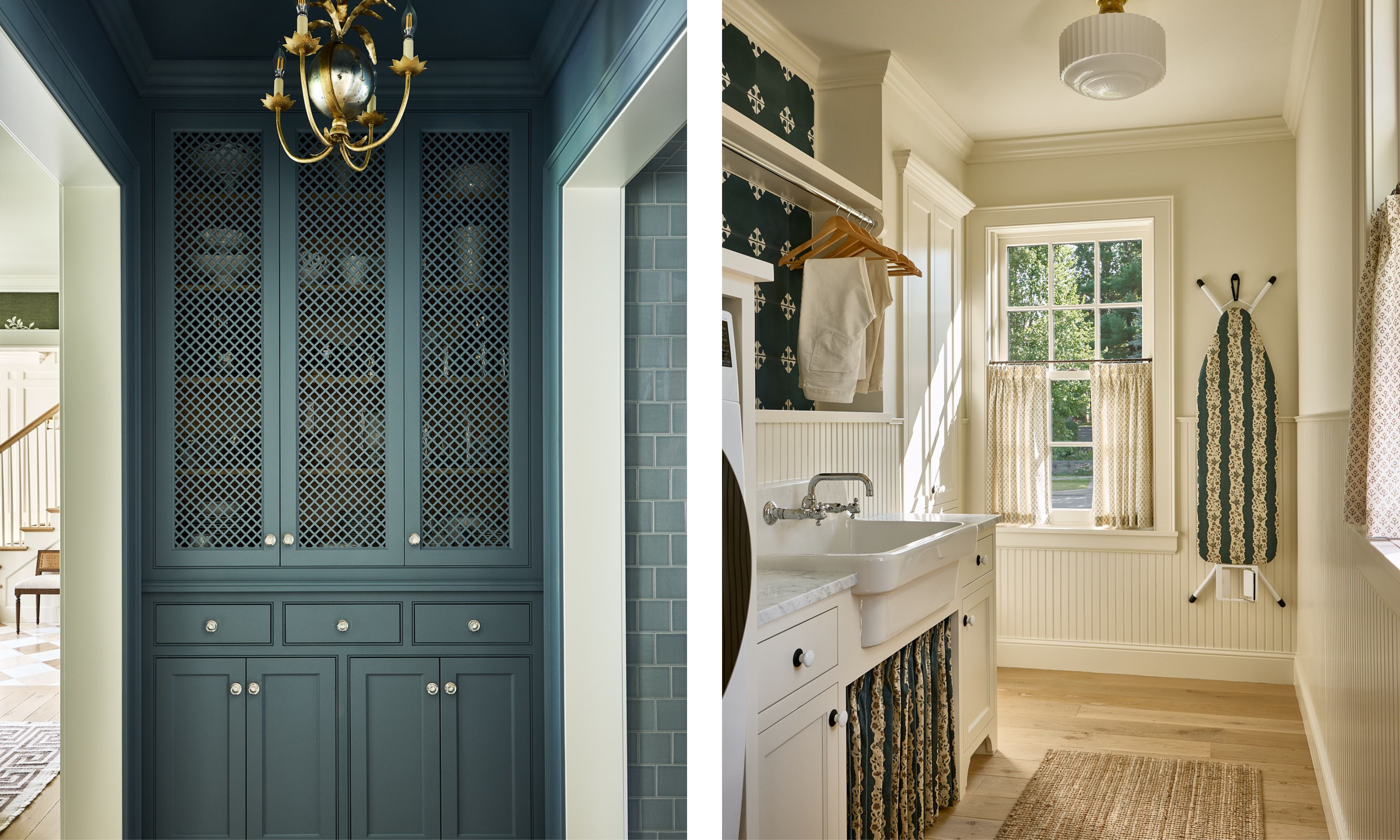
'I could also equally argue that the laundry room is my favorite,' says Krysta. 'From my previous dungeon basement laundry to this light-filled and cheery space, it was certainly a dream realized.'
'The Jasper-covered ironing board makes me smile every time I walk in – which is decidedly more frequent now that I have a beautiful room to do laundry in.'
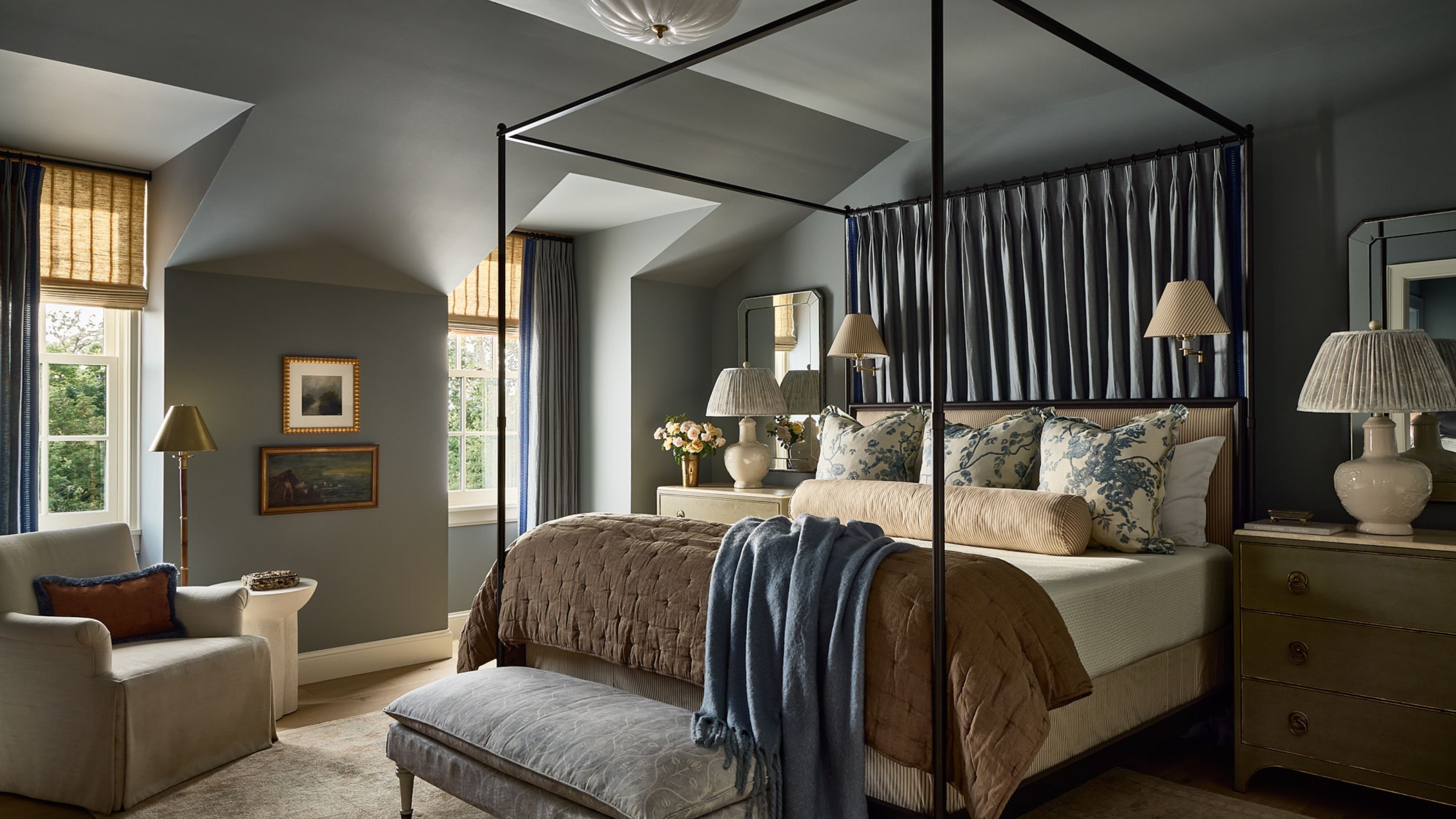
Color-drenched in a grayed shade of blue, Benjamin Moore's Adagio 1593, the main bedroom takes on a moodier feel than the living areas, while the muted hue lends a calming feel.
Warmth is added through the array of textiles, from the fabric that hangs above the headboard to the layered window treatments, while pattern brings movement through the blue floral Euro pillows.
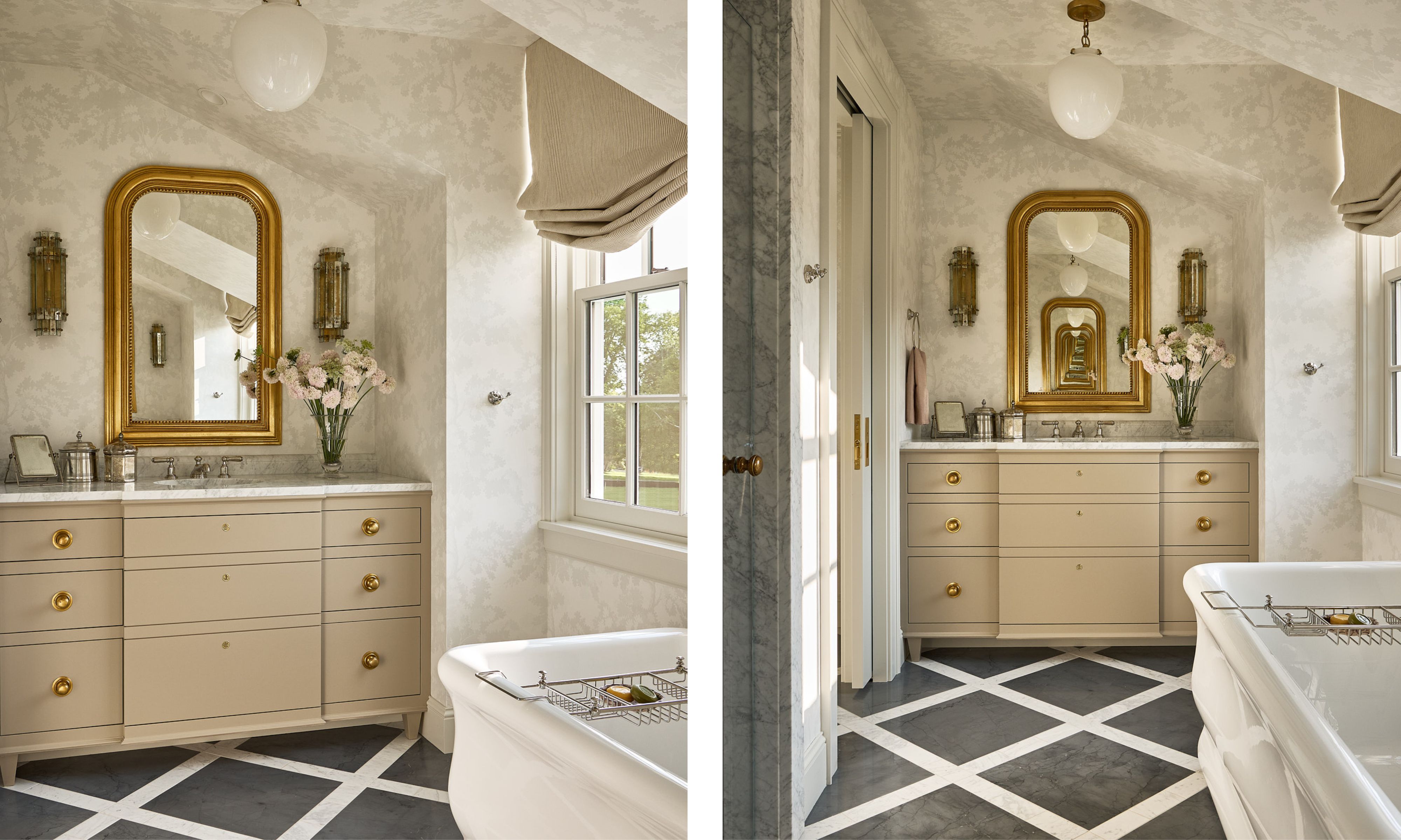
Neutral bathrooms are a classic choice, but this one proves that they can feel just as exciting as colorful schemes. The flooring is a mix of Bardiglio and Carrara stones and adds contrast to the room's lighter materials, while referencing the lattice details of the home's exterior.
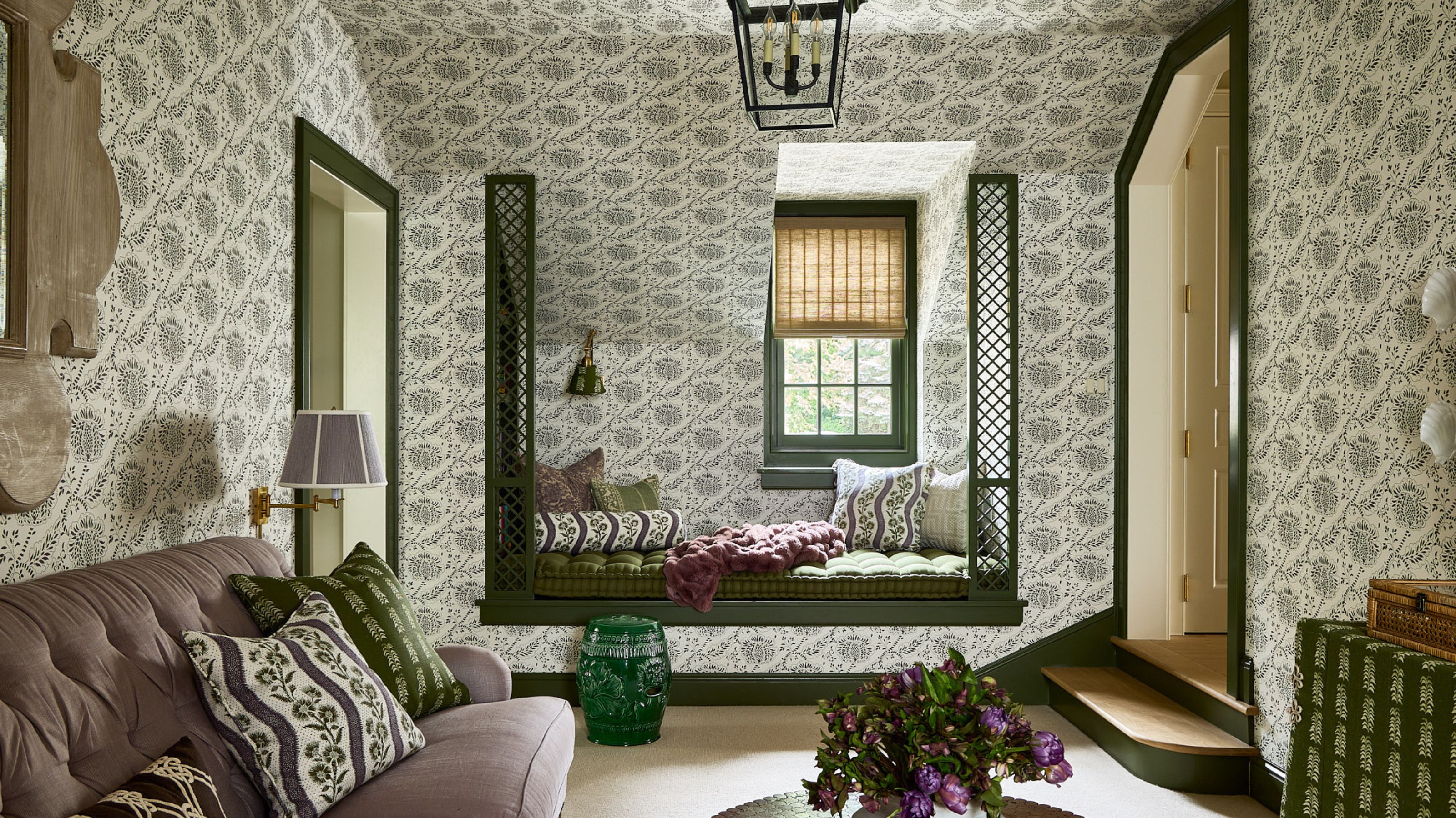
'When planning, this space was too large to be a hallway, and too small to be a bedroom – thus it became the girls’ "lounge”,' explains Krysta. 'It's where they roll out of bed on Saturday mornings to watch TV, hang out on their phones, and play games.'
The green trim nods to rooms such as the dining room, while the wallpapered walls give it its own identity, along with the pops of mauve, which feel feminine but grown-up. 'The daybed bookshelf is wired to charge their devices, and serves as an extra bed for sleepovers.'
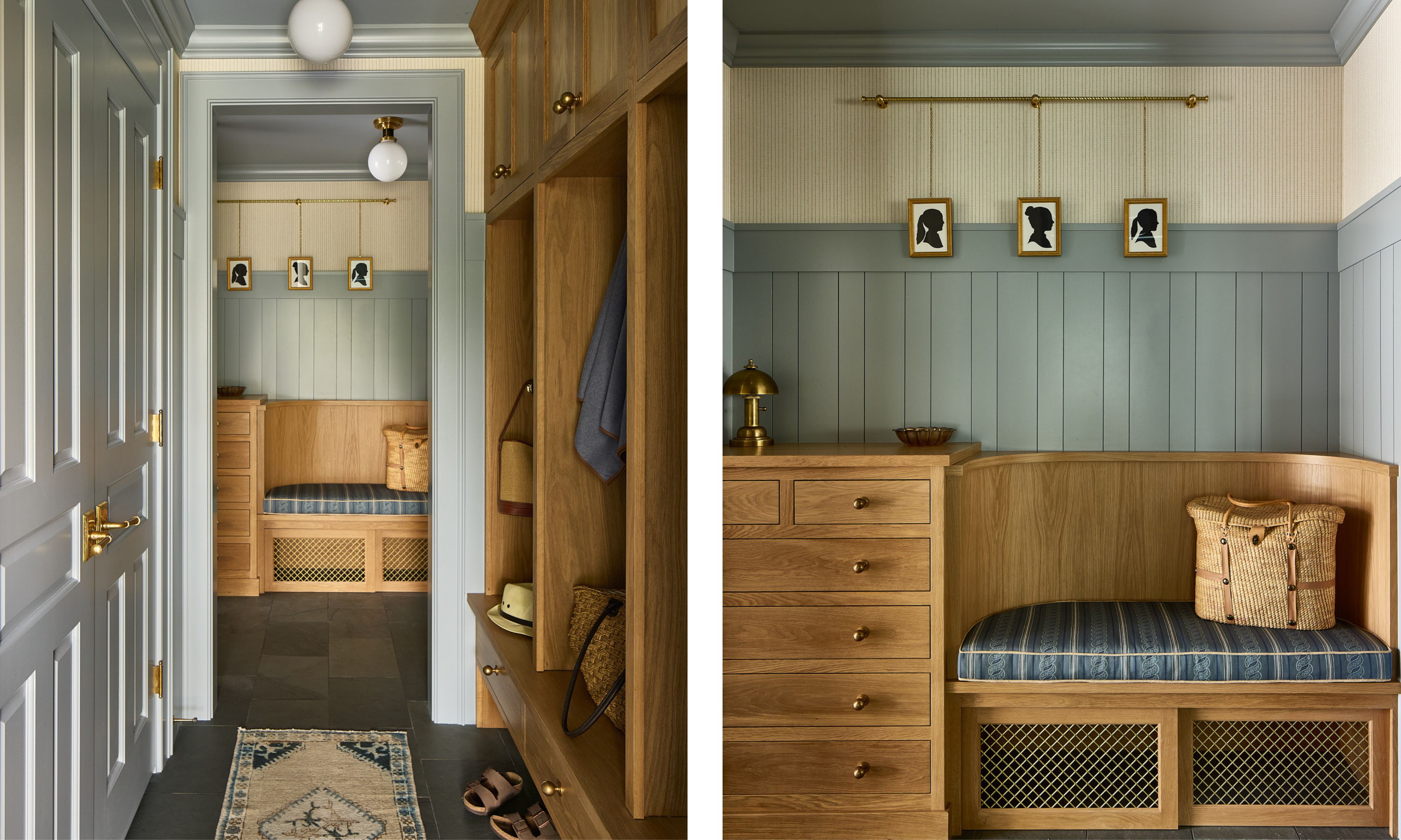
A calming shade of blue – Benjamin Moore's Blue Springs 1592 – adds balance to the warm-toned wood in the mudroom. 'This room is a workhorse with a drop zone, curved bench with a puppy kennel below, and locker storage with durable finishes that take the beating of Minnesota winters,' says Krysta.
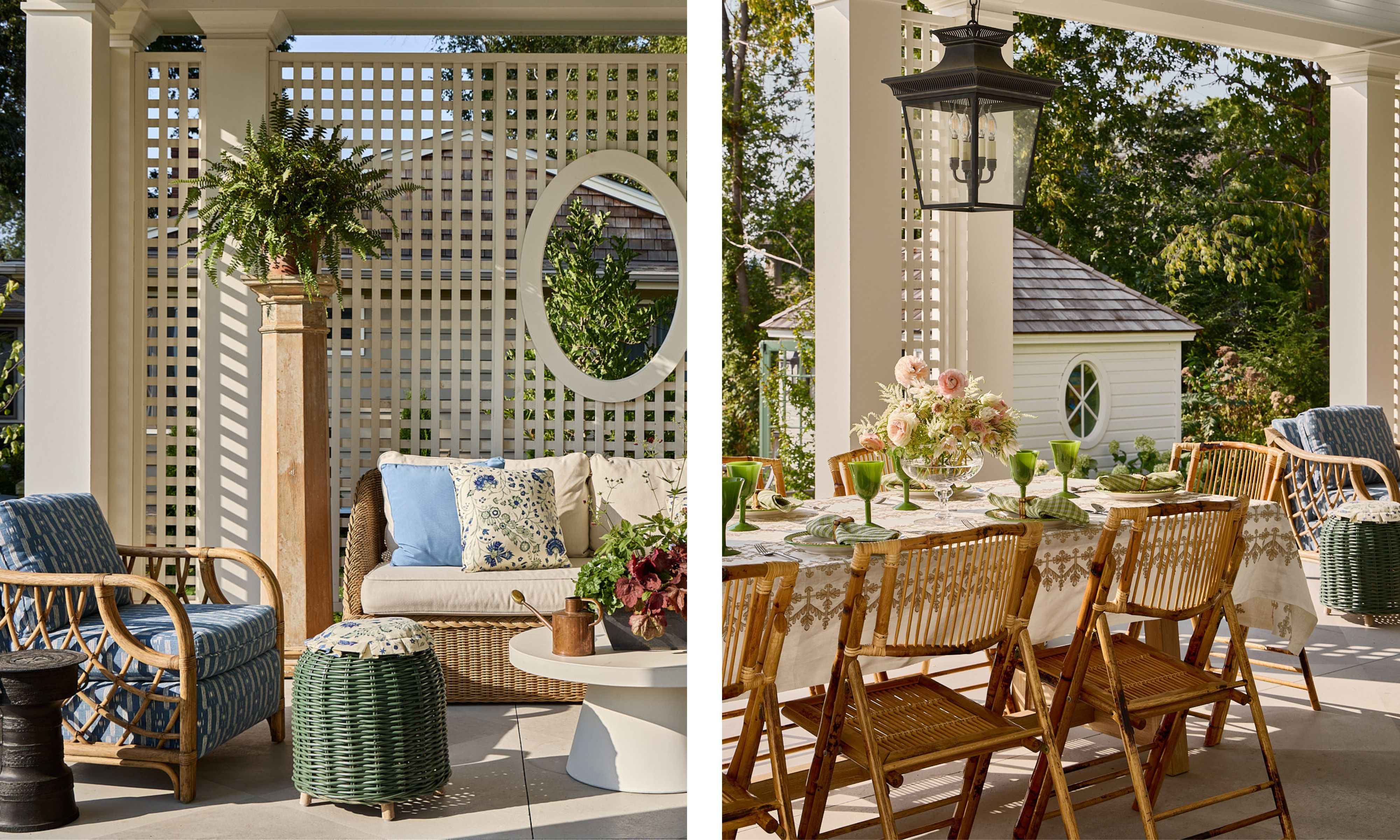
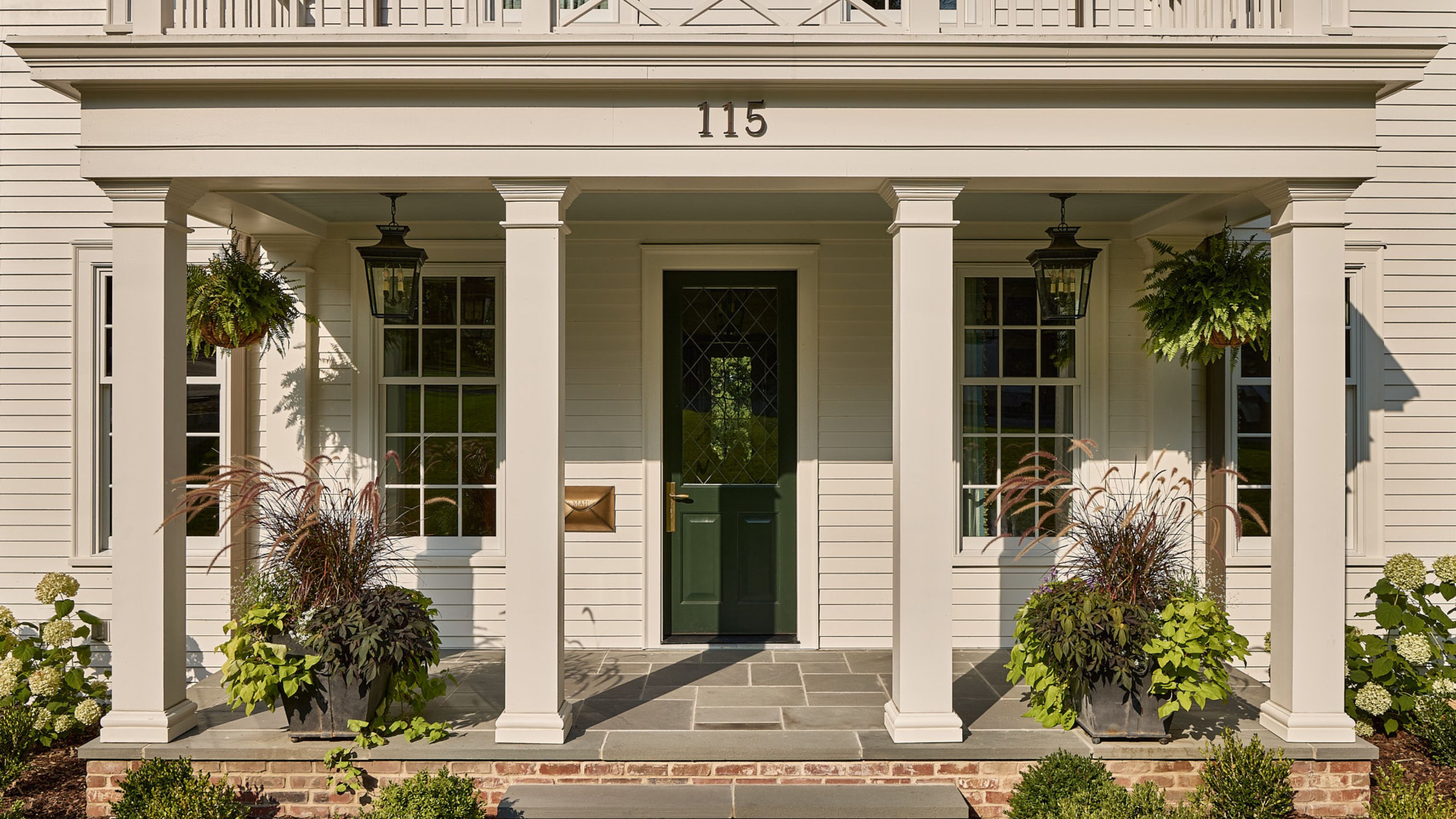
The outdoor spaces are just as important as the home's interior, providing an oasis for the much-awaited summer months. 'To live in Minnesota requires true dedication,' says Krysta. 'When the temperature warms up, the entire state is out in unison. We suffer through the cold because once it gets warm, there is no better place in the world to be. The house features two front porches and a back veranda – all of which are thoroughly enjoyed in the warmer months.'
The veranda provides an outdoor dining room and living room. 'The lattice details of the architecture seen here are repeated on the exterior balconies and tile details throughout the home, coining the house the “Lattice House”.'
The columns add extra flair to the veranda, which were salvaged from Krysta’s childhood home. And while pretty details lead the way, it is 'paired with an abundance of rattan and iron, making it suitable for the elements.'
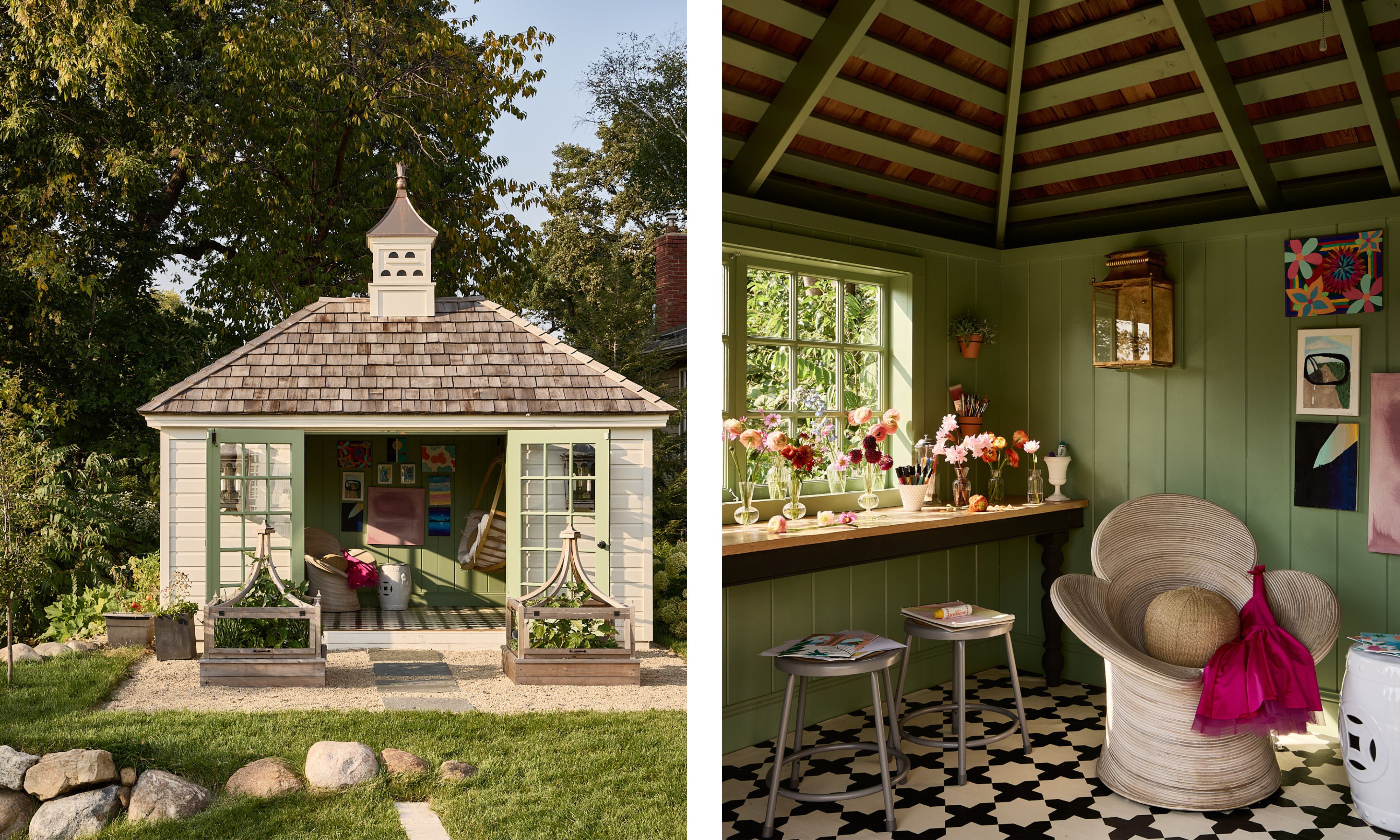
'Inspired by my own childhood playhouse, I wanted my girls to have a place all their own to create and be silly,' Krysta says of the garden room, which continues the green theme with its color-drenched walls. 'This was also a convenient place to fulfill their wish of a swing in the house.'
'Designing such an intentional home with just the right amount of space means that we can all find our own place for quiet and privacy, but more importantly, the house offers larger spaces that encourage time to gather,' says Krysta. 'I find my children are spending more time together in this house because we designed spaces just for them, which warms my heart. This, combined with the efficiency we experience now that we have dedicated storage for life’s errands, continues to prove that building was the right decision.'
'When did you do the remodel?' is a question often asked by guests who come to visit Krysta's family home – perhaps the most telling sign of its success.