It was one of California's classic modern Mediterranean-style homes. Built in 2018, in Danville, CA, it was all yellow-painted exteriors, rock heavy embellishments and baroque columns. The owners, a family of six, were looking for a way to update the space but didn't want to strip away the character of the original house design.
Interior designer Lauren Evans soon got a feel for what the family was hoping to achieve with their redesign and drew up plans to transform the dated baroque Mediterranean-style property into a contemporary, Santa Barbara, California indoor/outdoor style home, with a nod to Spanish architecture and aesthetic.
'They wanted more of an earthy monochromatic palette both cozy and kid-proof, but also sophisticated enough for long-term adult entertaining,' the designer says. 'The home was fully remodeled in some areas and newly built in other areas.'
Take the tour as designer Lauren Evans explains how she achieved the perfect balance of old and new world styles in this elegant and comfortable home.
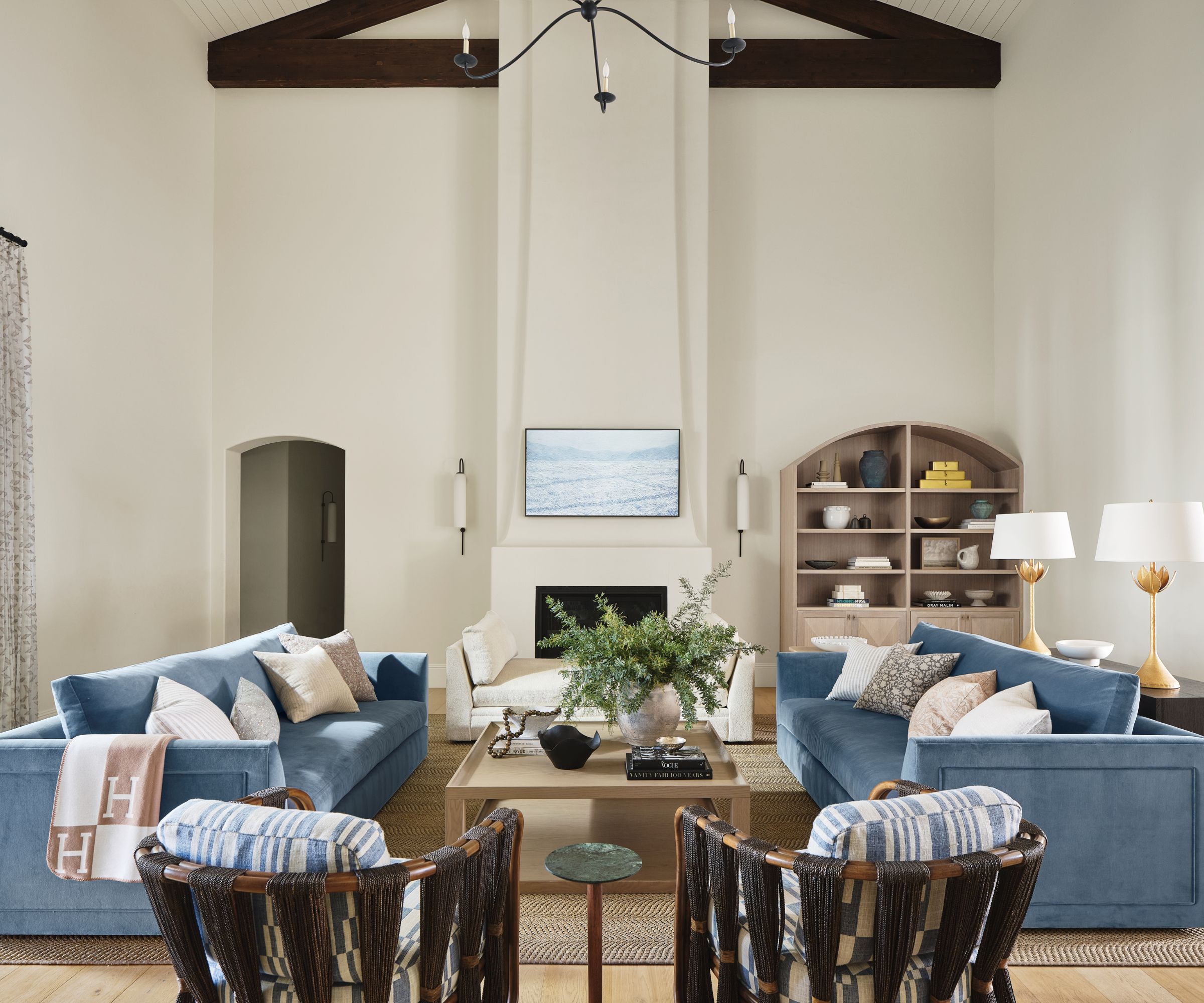
Lauren's living room ideas for the great room were dependent on overcoming a major design and installation challenge, creating a working fireplace on an internal wall.
'This great room deserved a great fireplace. It was so obvious right away when we walked through the front door, that it was the thing missing,' recalls Lauren. 'So we had to imagine, sketch, and then create a 25’ creamy white Venetian plaster adobe style fireplace. It was not an easy task incorporating all the desired curves and differing depths while also maintaining code, heat restrictions with plaster, appropriate scale for room, decor depth needed, and room for the exhaust pipe needed behind everything since this was not an exterior wall.'
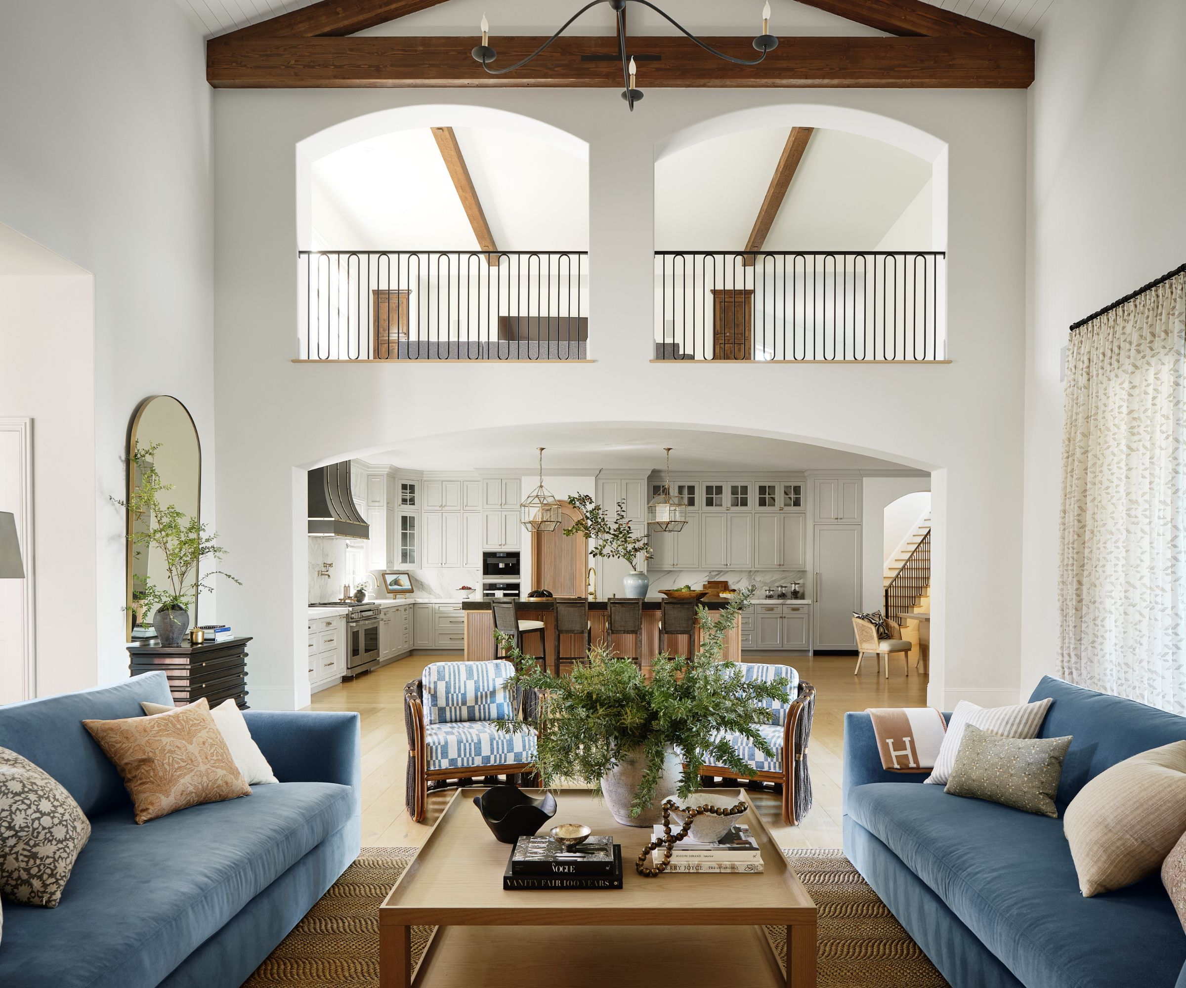
The great room is now the designer's favorite room. Besides that hard-won fireplace, there are many other special design details she picks out here, all playing their part in giving the space its modern Spanish/Californian vibe.
'The ethereal sconces designed by Nicci Kavals in Australia, the carved iron railings, the grand arched glass and iron front door to the 18' of hanging sheer geometric patterned drapery by Dedar from Kneedler Fauchere,' the designer says. 'It is a space that embodies light, spatial grandeur, curved lines, and lux textured materials.'
Finding the right living room sofa took careful sourcing and Lauren chose a matching pair from Evars Collective, with occasional chairs from Palecek, a custom coffee table by LEI, and a rug from Fibreworks.
Rather than remove the classic Mediterranean arched openings and ceiling beams, designer Lauren has added extras.
'To maintain and highlight the old world feel and the home's Spanish characteristics, we kept and consistently added exposed wood beams, arched doorways, curved and plaster-made architectural features to walls and the new fireplace, as well as Spanish inspired tile, iron, and wood,' she says.
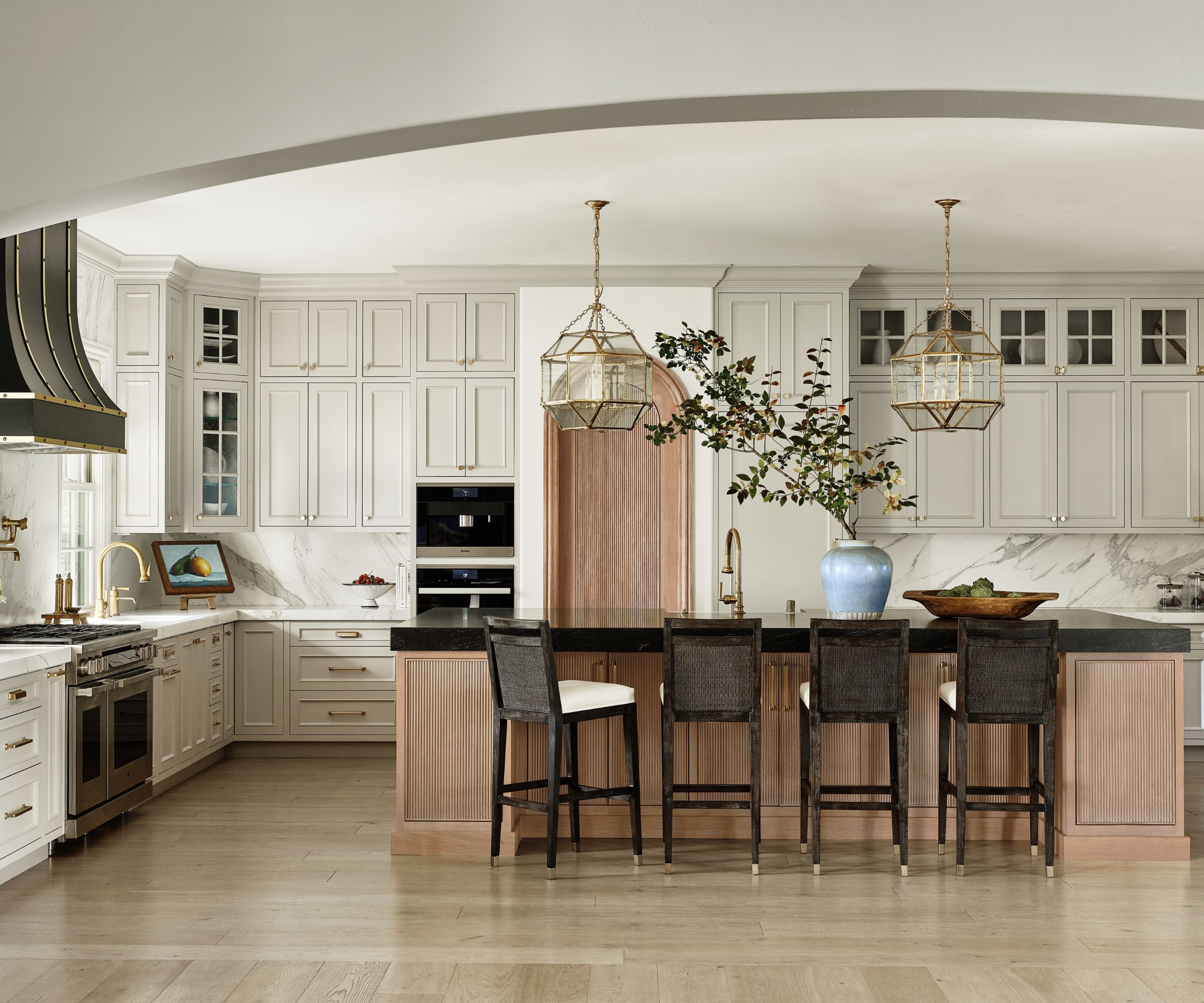
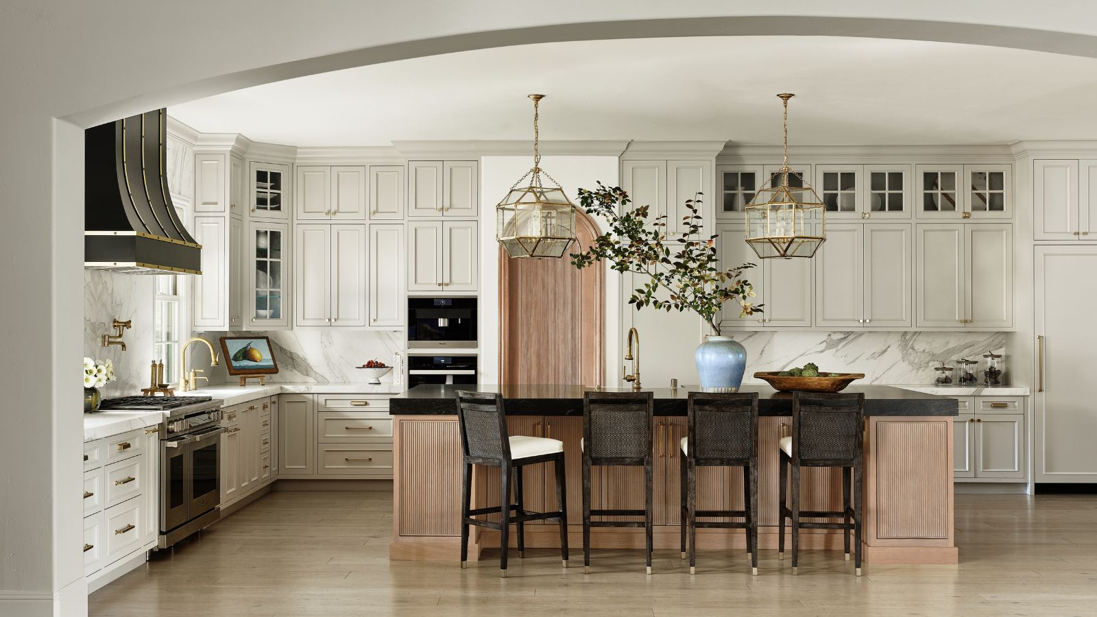
The designer's kitchen ideas brought about a dramatic transformation.
'The previously mahogany wood, copper and granite heavy kitchen was replaced by white and gray calacatta oro gold honed marble, brass hardware and fixtures; and light oak and creamy greige cabinetry,' says Lauren.
The entire bottom floor of the house, which was previously covered in a heavy Italian-inspired slate tile, was replaced by wide plank light oak flooring. 'It added so much light and warmth to the grand space where so many common areas collide,' adds Lauren.
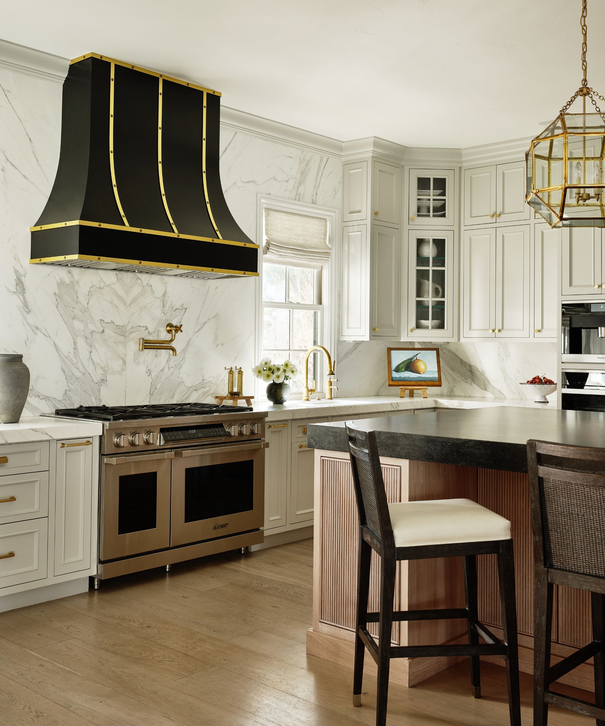
'The light oak arched reeded pantry door and the butterfly pattern, the book matched calacatta marble backsplash just above the kitchen range are my favorite features in here,' adds Lauren.
The impressive brass-trimmed extractor hood is from Hoodsly, the lighting from Visual Comfort and the island stools are from Palacek.
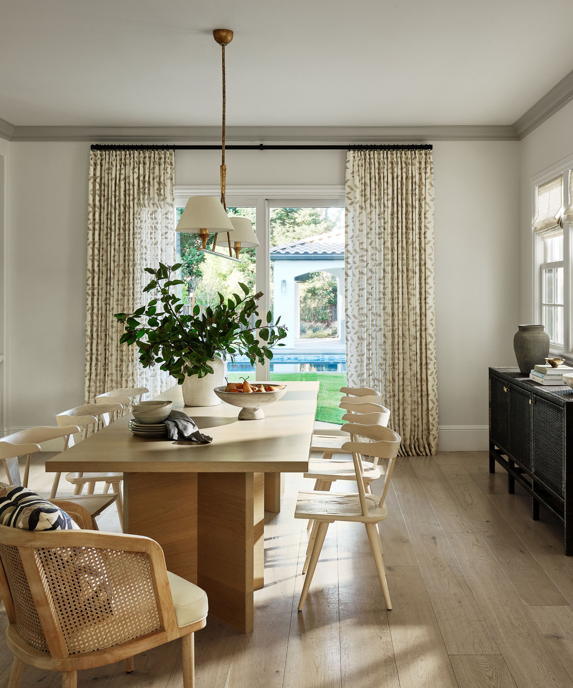
The focus of the dining room was to emphasize the view through the picture windows and capture the essence of California's indoor-outdoor lifestyle. Furnishings here give the room a lightness of touch, so the wide plank flooring is continued from the great room and kitchen, and topped with a custom pale wood dining table from LEI and chairs from Four Hands.
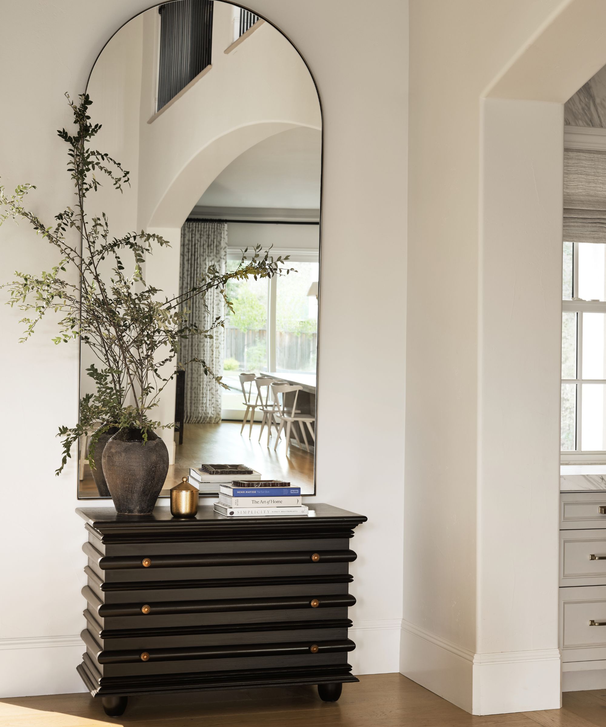
This small corner of the foyer, is open and bright, with a monochrome palette, and beautifully crafted details, including this chest from Noir, and an arched mirror from McGee & Co.
The space is a good introduction to the home's more contemporary styling, and sums up the new look Lauren envisaged after meeting the owners for the first time. 'I knew they would be more attracted to the cleaner, more simplistic black, white and charming Montecito Spanish vibe/CA casual, indoor/outdoor style home,' she says.
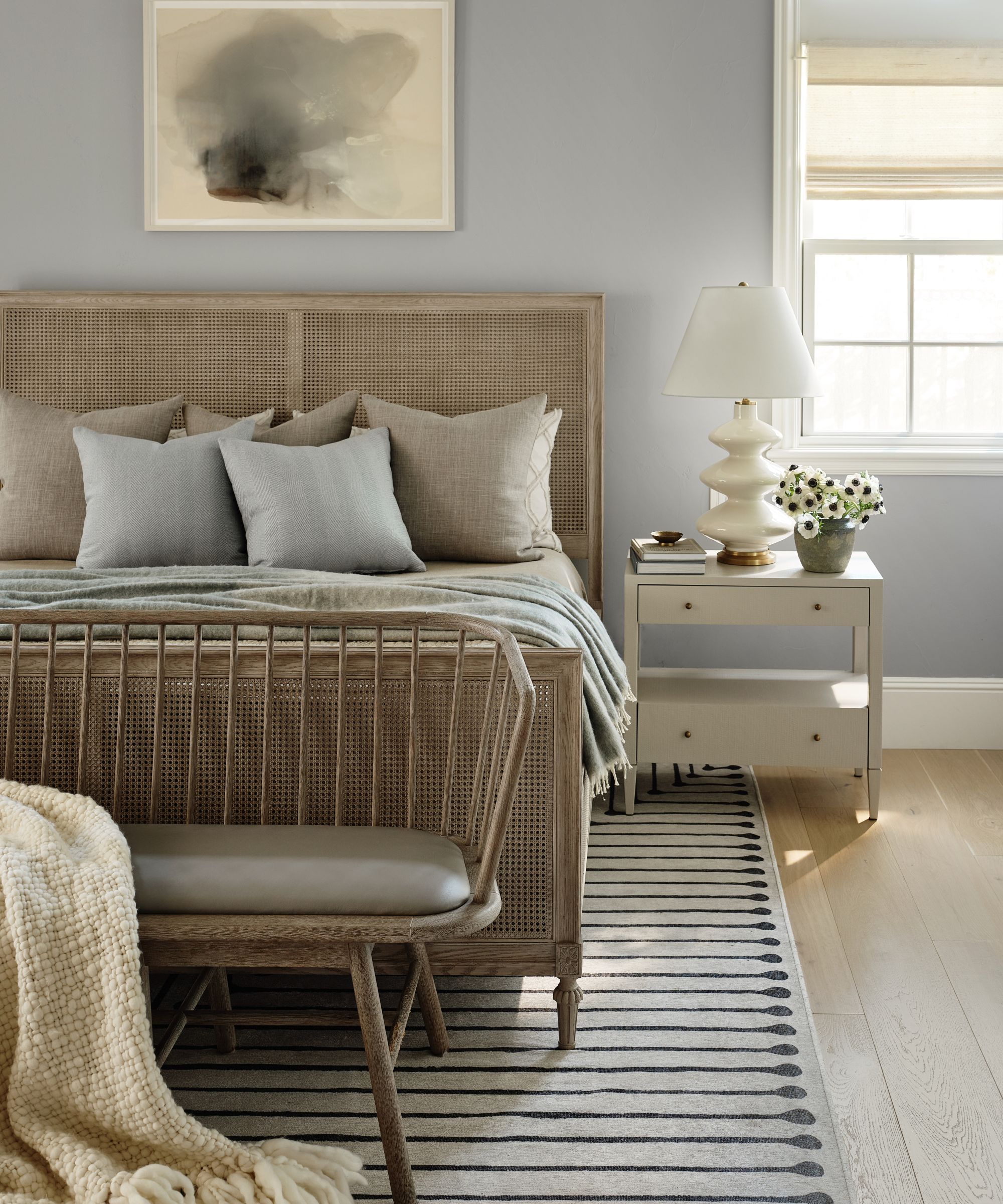
The main bedroom was in good shape, explains designer Lauren. 'This just needed a light facelift with the swap out of paint, lighting, new fireplace and mantle, new flooring and furnishings.' Anyone looking for bedroom ideas for a cool, calm scheme could take inspiration from the tranquil blue grays, and sandy neutrals that work well with the new wood flooring.
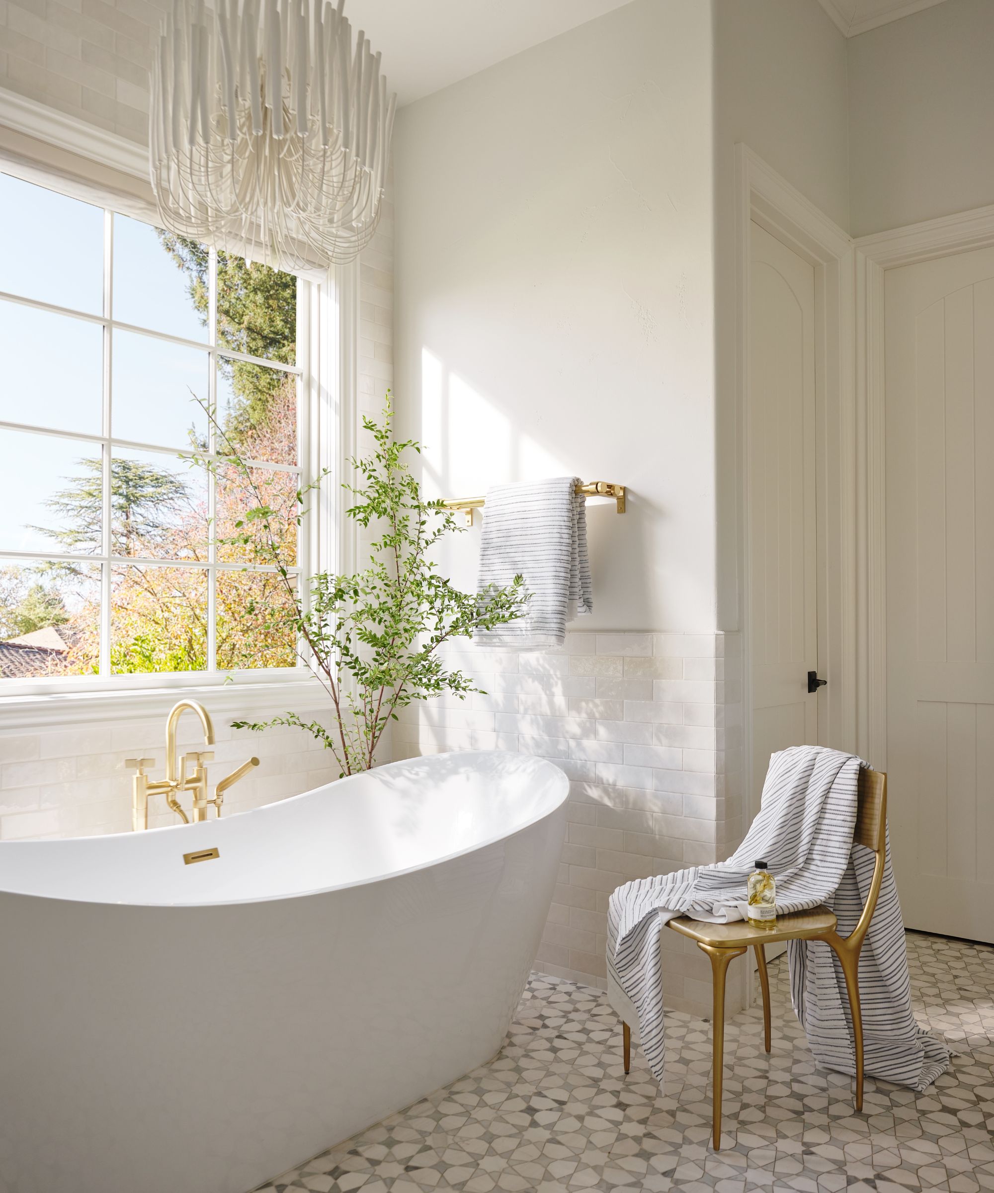
It was a different story in the primary ensuite, which needed a lot of work, as designer Lauren explains.
'This room was completely gutted and transformed from a shower and bathtub room enclosed by rock walls to an open floor plan with a glass enclosed shower and freestanding tub,' says Lauren.
Among the bathroom ideas we're keen to copy are the chandelier from Arteriors, and Lauren's favorite Viviano floor tiles which have freshened the space.
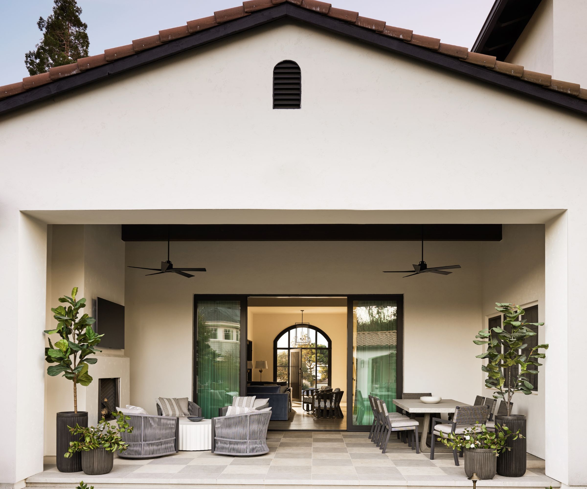
This fun outdoor space was a key part of the designer's plan to fit the home for a truly Californian indoor-outdoor lifestyle, however, it required a major redesign.
'The outdoor living room or loggia beyond the glass sliding doors was gutted and rearranged. A heavy outdoor rock fireplace acted as a fourth wall and obstructed backyard views, so this was removed,' explains Lauren. 'A new adobe style fireplace (to echo that in the great room) was added on the far right wall opening up the entire space. Gray and cream 24" engineered stone tiles were laid in a classical check pattern to create a transitional and fun statement floor in the loggia.'
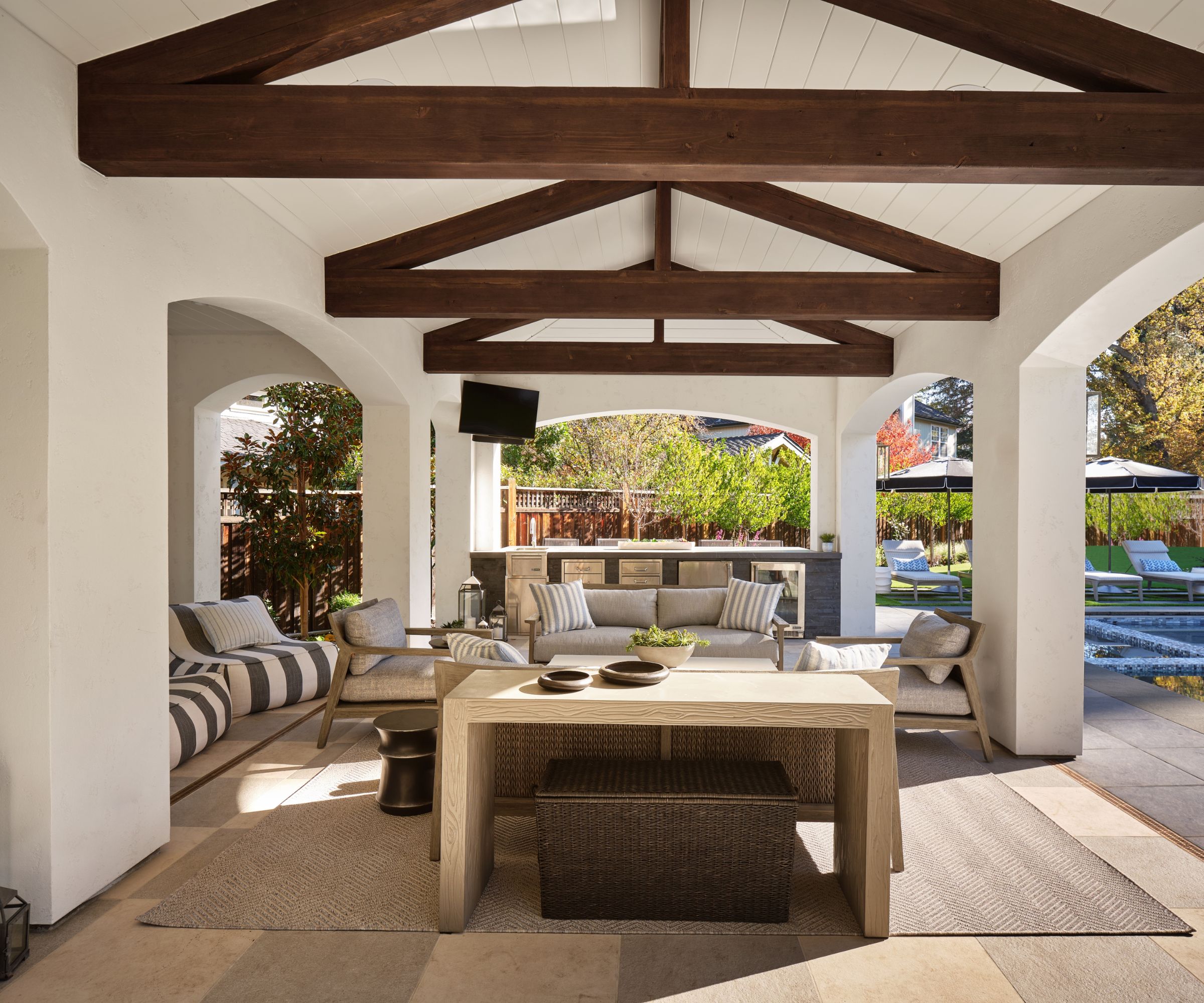
Anyone looking for backyard ideas will find plenty to inspire them in this beautiful poolside setup.
The gray, black, and cream palette of the house continues throughout the backyard which was a total renovation in itself.
'A new pool, outdoor kitchen, and pavilion as well as an entire landscape redesign was all a part of the remodel project, thanks to the collaborative team of architects, builders, and contractors,' says designer Lauren. 'There was no question the pavilion needed to match the house with the Spanish barrel tile roof, newly selected white paint, black modern sconces, arches, and exposed beams. We wanted the backyard to feel sexy while also maintaining sustainability for this family of six and all their extended family and friends.
'We specified materials that were dark to play against the creamy white exterior buildings, and hide dirt; but we also chose materials that are poor conductors of heat to avoid scorching hands and feet on hot days. In general, we leaned into materials that could handle the extreme temperature changes,' adds the designer.
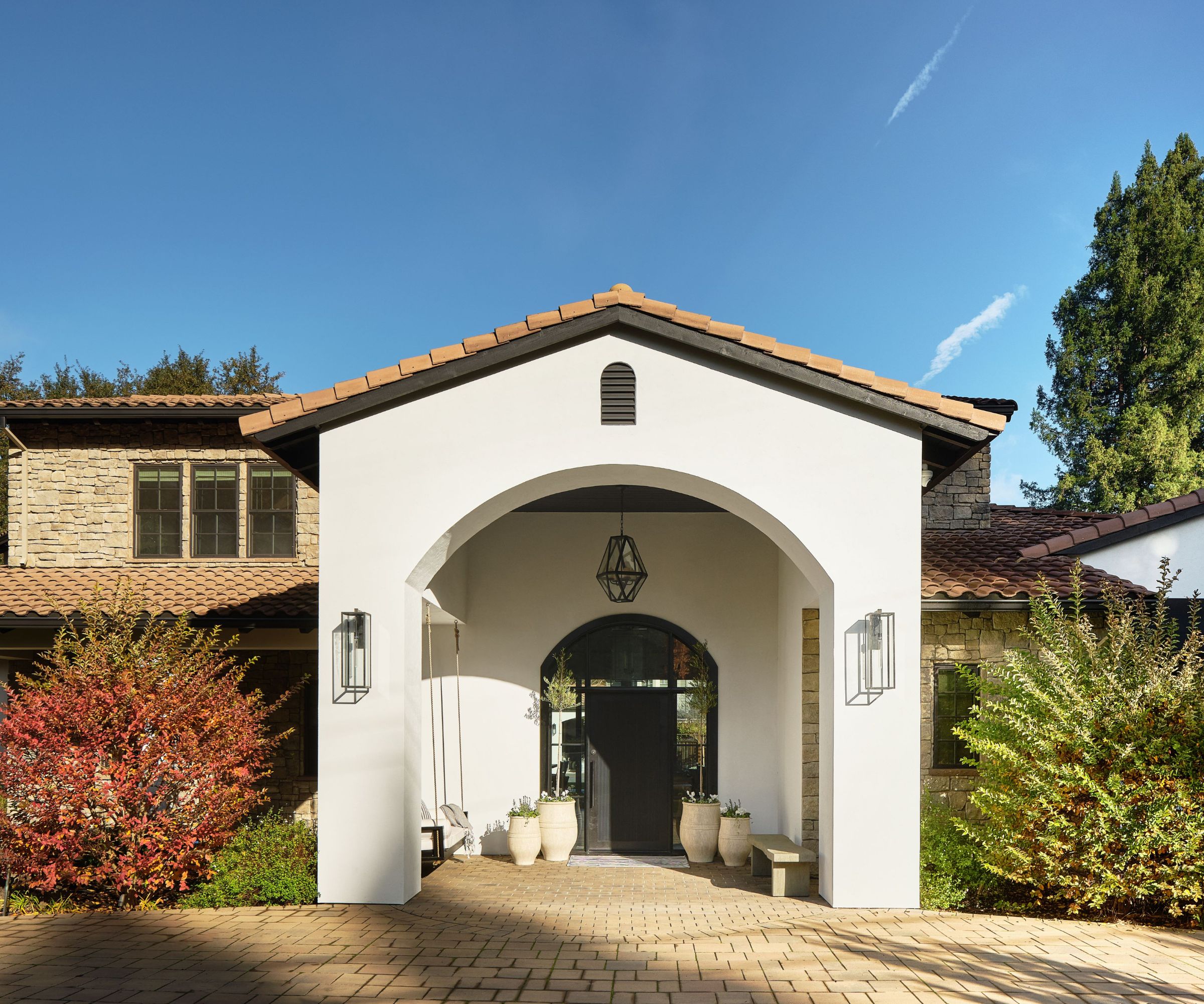
The front of the house has been transformed, yet Lauren and the team have succeeded in retaining the appeal of its Mediterranean-style construction.
'We changed the front door from double carved cherry wood doors to an arched glass, iron, and reeded wood door with flanking slide light panels, designed to bring in more light while also adding privacy. It created the more modern, rustic, and charming combo needed to pull off this modern Spanish meets California vibe.'
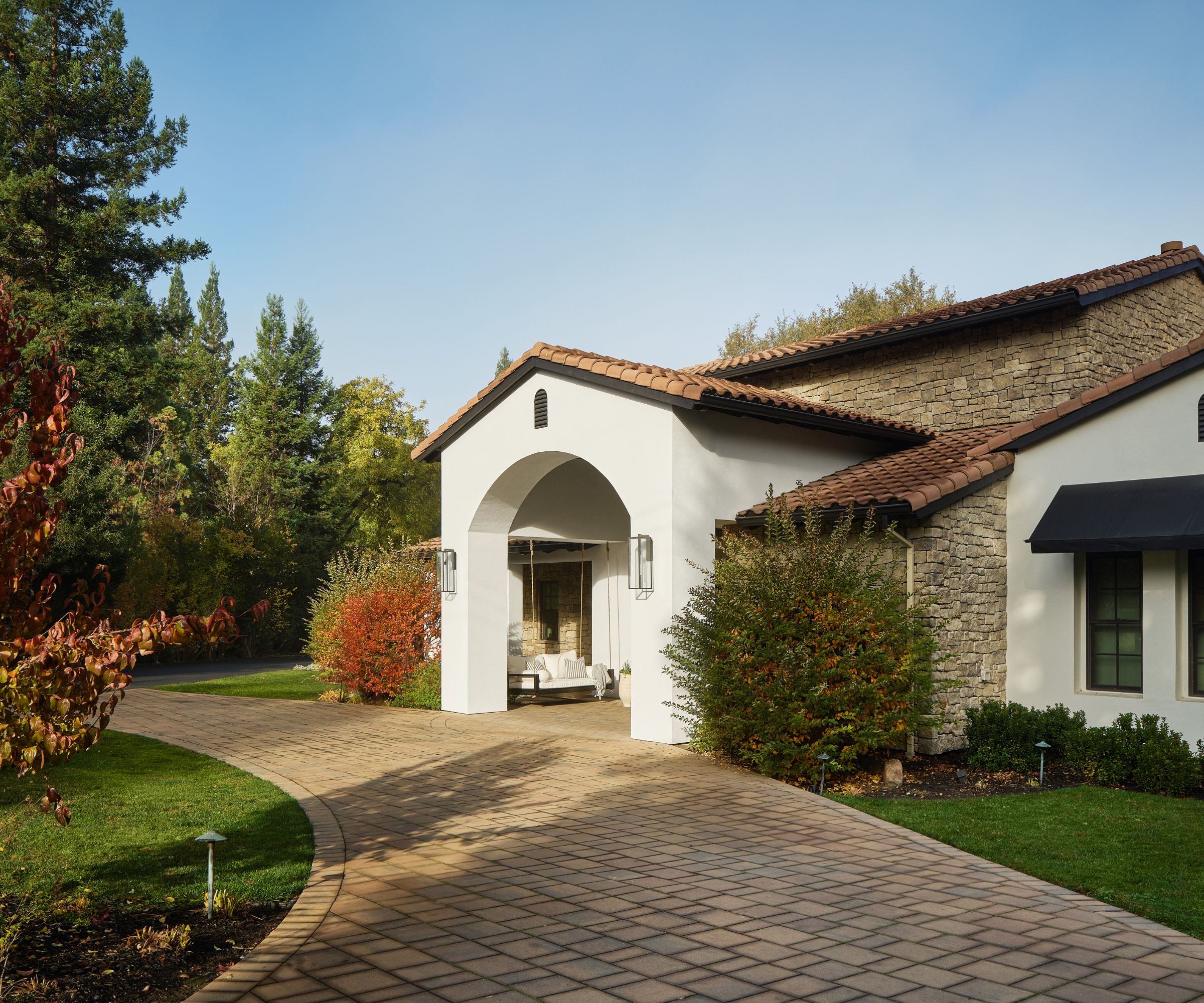
There's no arguing with that. Lauren's changes, inside and out, have breathed new life and style into a dated home. By tackling some of the low points of the original build and putting right some of its oversights, this inspiring redesign has created a winning blend of old-world and new-world styles.
There's a new-found elegance about this house but it's comfortable too, making it the perfect setting for relaxed family life and indoor-outdoor living.
Interior Design: Lauren Evans Interiors
Architect: Peter Koenig
Contractor: Steve Benkly
Photography: R. Brad Knipstein
Styling: Rachel Forslund


