I've never been to Japan, so the design of the railway system isn't something I've given much thought to, but today the West Japan Railway Company (JR West) has announced a rebrand, and it's piqued my interest.
The new brand, by Saffron Brand Consultants, positions the Setouchi region as Japan's 'third destination', behind Tokyo and the Kyoto-Osaka region. The Setouchi area offers visitors a slower, more considered way to experience Japan when compared to more traditionally popular regions. And the result is beautifully calming, quite the opposite of the British Railways logo.
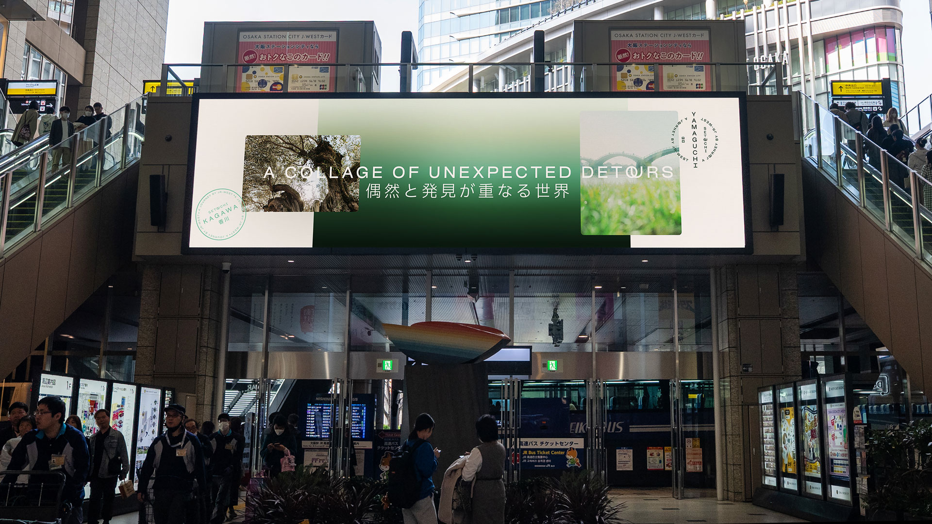
The work is part of a drive to strengthen the region's appeal to foreign tourists.
It also builds on the Setouchi Palette Project, launched by JR West in 2018, which aims to revitalise the Seto Inland Sea region.
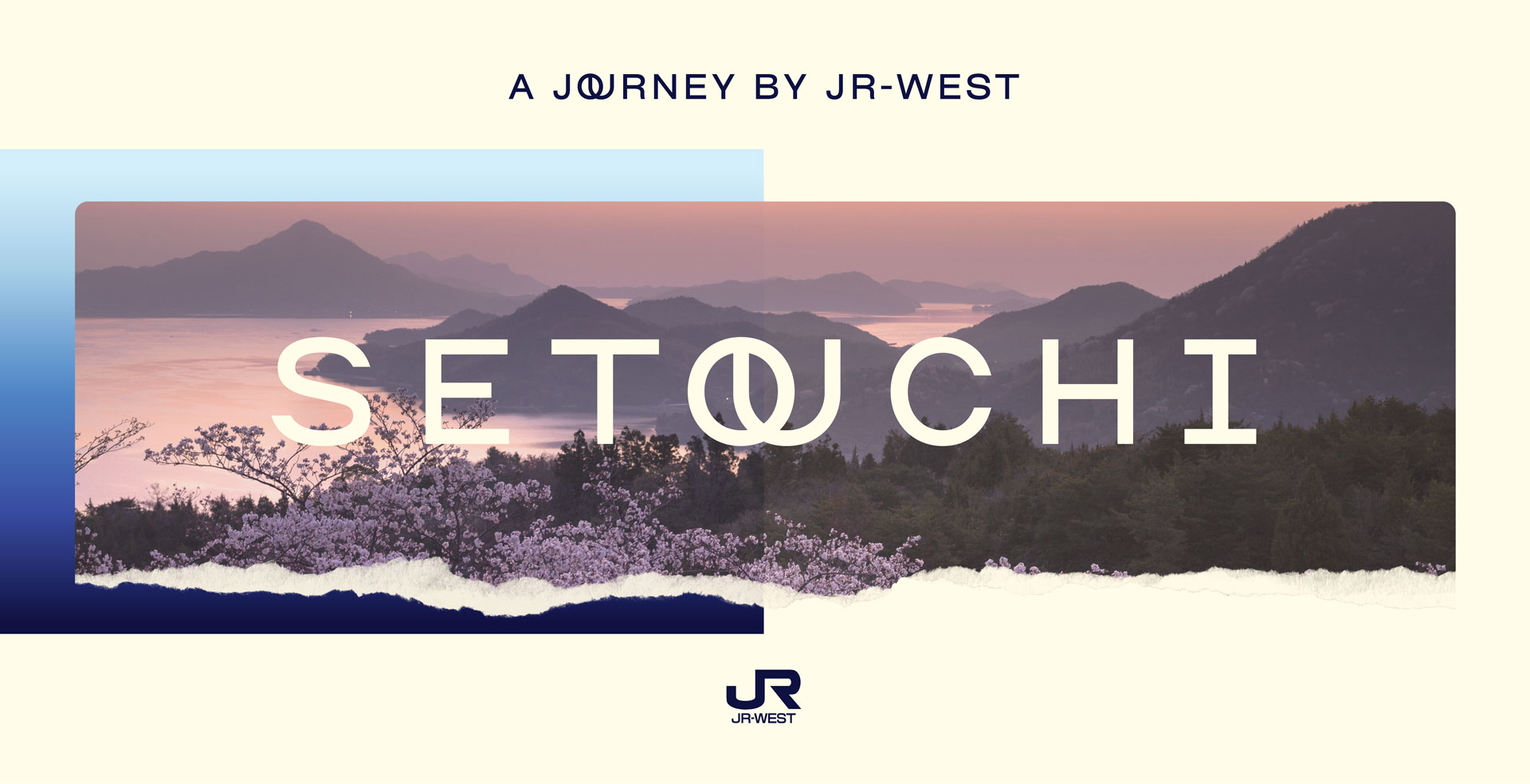
The new strategy's core premise is 'Where the extraordinary hides in plain sight', which was shaped by the beauty of the Seto Inland Sea and its over 700 islands. Setouchi is all about a welcoming spirit inspired by the connection between land and sea, and this shaped the brand strategy, which focuses on the experience of travel rather than just the destinations they visit.
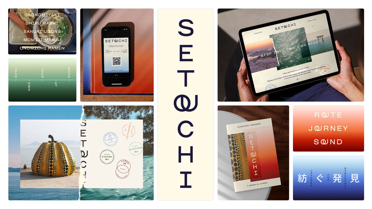
The new brand includes brand strategy, audience personas and a verbal and visual identity system, including a new logo, colours, type, motion and more.
I personally think the branding looks inviting and embodies as sense of serenity. The overlapping 'o' and 'u' adds interest and makes it more memorable while the colour palette adds to the sense of calm.
Find out more about Saffron Brand Consultants.