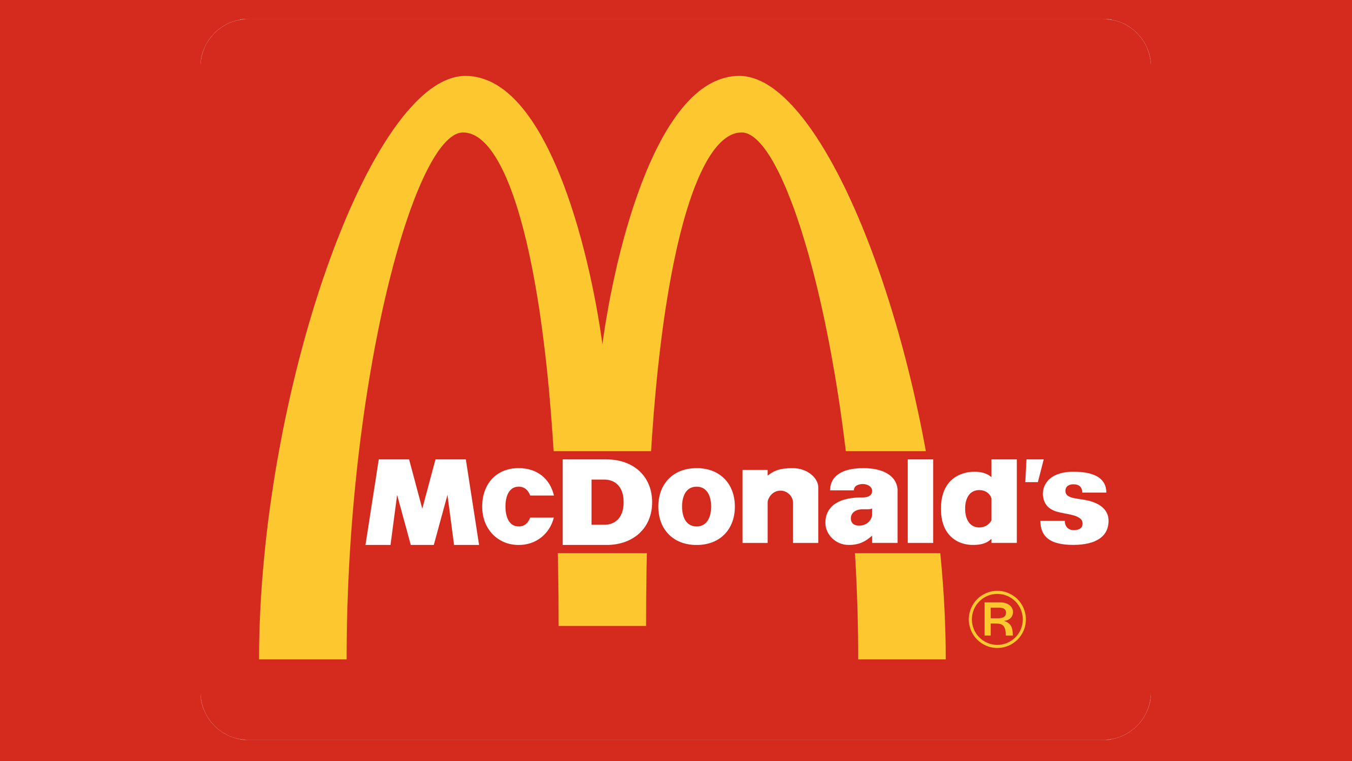
The colours red and yellow have many associations, but when it comes to food, these colours tend to be most linked with fast food chains. McDonald's, Burger King, Pizza Hut and more all use red and yellow in their branding, but there may be more to it than just a case of one copying the other.
Karen Haller, behavioural design consultancy owner and colour expert, reveals that red triggers stimulation, appetite and hunger, attracting attention, while yellow triggers feelings of happiness and friendliness. When you combine them together you get speed and quickness, ideas that fast food restaurants want to be associated with. (For more tips on colour, see our piece on colour theory or our how to design a logo guide).

"Yellow is also the most visible colour in daylight, which is why the McDonald's 'M' can be seen from a far distance," explains Haller.
Haller also notes that things may be changing, slowly, in this space. McDonald's have changed from red to green in some of their stores. "Notice the feeling this gives," says Haller. "Green elicits the feelings of nature, natural and environmentally friendly. It's no longer about rushing in for a quick bite to eat."
We have yet to see other fast food brands adopt this trend, but we wouldn't be surprised to see similar moves from other brands as customers become more eco-conscious and ideas of fast food start to raise questions – in the way that people are becoming more aware of the downsides of fast fashion, for example.
For more on this trend, read Karen Haller's blog post.


