No room plays quite as significant a role in your daily routine as the bathroom. The first place you enter in the morning, and the final stop before retiring to bed, your bathroom design has to strike the balance between energizing and relaxing, and no shade achieves that quite like a lick of butter yellow paint.
The standout shade in both fashion and interiors last summer, the sunny hue felt practically inescapable in 2025. But now, one year on, the color is finding new life as the designer's go-to for bathrooms. Warmer and more characterful than a flat off-white, yet still comfortingly neutral, having a butter yellow bathroom is an easy way to add brightness and personality to your space without becoming overwhelming. With its joyful connotations of childhood summers and sun-soaked, ice-cream-filled days, there's an undeniable happy factor to the hue, and who doesn't want a bathroom that brings a smile to your face?
As interior designer Pernille Lind puts it, "It creates a space that feels instantly warm, inviting, and nostalgic, while still feeling entirely fresh." There's a unique appeal in this shade, and while this sunny warmth would be welcome all year round, in these summer months, it feels particularly appropriate.
Why the Designers Love It
Choosing the right bathroom color isn't always an easy task — you need something that feels uplifting and invigorating enough to get you started for the day, while still being calming enough to provide a comforting refuge before bed.
As color psychology shows, the colors we surround ourselves with can help to shape our moods and daily experiences, and considering the vital role our bathrooms play in our daily routines, bathroom color psychology becomes all the more important. It's with this in mind that many designers are opting for this sunny, bright shade in these spaces.
As Mike Whitfield, interiors expert at Lusso, explains, "Butter Yellow is a mood-boosting color, combining the happiness of yellow with a muted pastel tone. This makes it ideal for bathrooms, as it contributes to the overall mood and wellness."
Reflecting our growing appreciation for earthy color palettes and shades that refer back to nature, there's an obvious appeal to this happy shade. "It makes a space inviting, as it’s associated with sunlight and fresh blooms, which aligns with the interior trend of connecting with nature and bringing the outdoors in," notes Mark. And in the summer months, when natural light will serve to intensify the warmth of the shade, this only rings truer.
There's a specificity to the charm of butter yellow, too — more subdued and creamy than a regular pastel yellow shade, it acts more like an intensified version of an off-white, cream colored bathroom, which can often feel slightly boring or uninspired. Interior designer Amy Stoddart chalks this charm up to the memories this shade evokes, taking us back to a childlike frame of mind.
"The key behind the popularity of these colors is that they’re comforting, nostalgic, and familiar, conjuring warmth, flavor, and texture in a way that flat color codes never could. Butter Yellow feels softer and more inviting than just pale yellow," notes Amy. And this comes down to the subtle depth of the shade.
How to Style a Butter Yellow Bathroom
That being said, butter yellow isn't exactly an easy win; the sunny shade can quickly turn saccharine when styled poorly, so to get it right, you'll need to give it some careful thought and planning.
The key lies in finding ways to counteract the natural tweeness of the shade. As Grazzie Wilson, from Ca'Pietra, aptly points out, "Butter yellow can go wrong very quickly if you let it become too cute, so I would always give it a bit of structure."
You'll need to find ways to bring some texture and movement into the design, and one effective way of doing this is through your bathroom tiling. "In a bathroom, tiles are a much better way to use it than paint because you get variation, shine, shadow, and all those tiny changes that stop the color from feeling flat," says Grazzie. A pale yellow zellige tile can bring just the right amount of warmth and brightness to your bathroom, even if it's only used as a trim or backsplash.
Having said that, a bathroom tile isn't always the best option for those with a tendency to change their mind. As much as you love butter yellow right now, there's always the chance you'll go off of it in the next few years, and opting for something as permanent as a tile could land you in a tricky predicament.
This is exactly why Sandra Baker, known as The Idle Hands on Instagram, says, "Using a butter yellow paint is the best way to incorporate it into a bathroom for commitment-phobes, as it's easily changed if you have a rethink in a few years." And with so many excellent choices out there, this is by far the most customizable approach. But, Sandra adds, "If you're in for the long haul, then I've seen some absolutely amazing vintage WCs and sinks in butter yellow, which would be so fun to use in a bathroom."
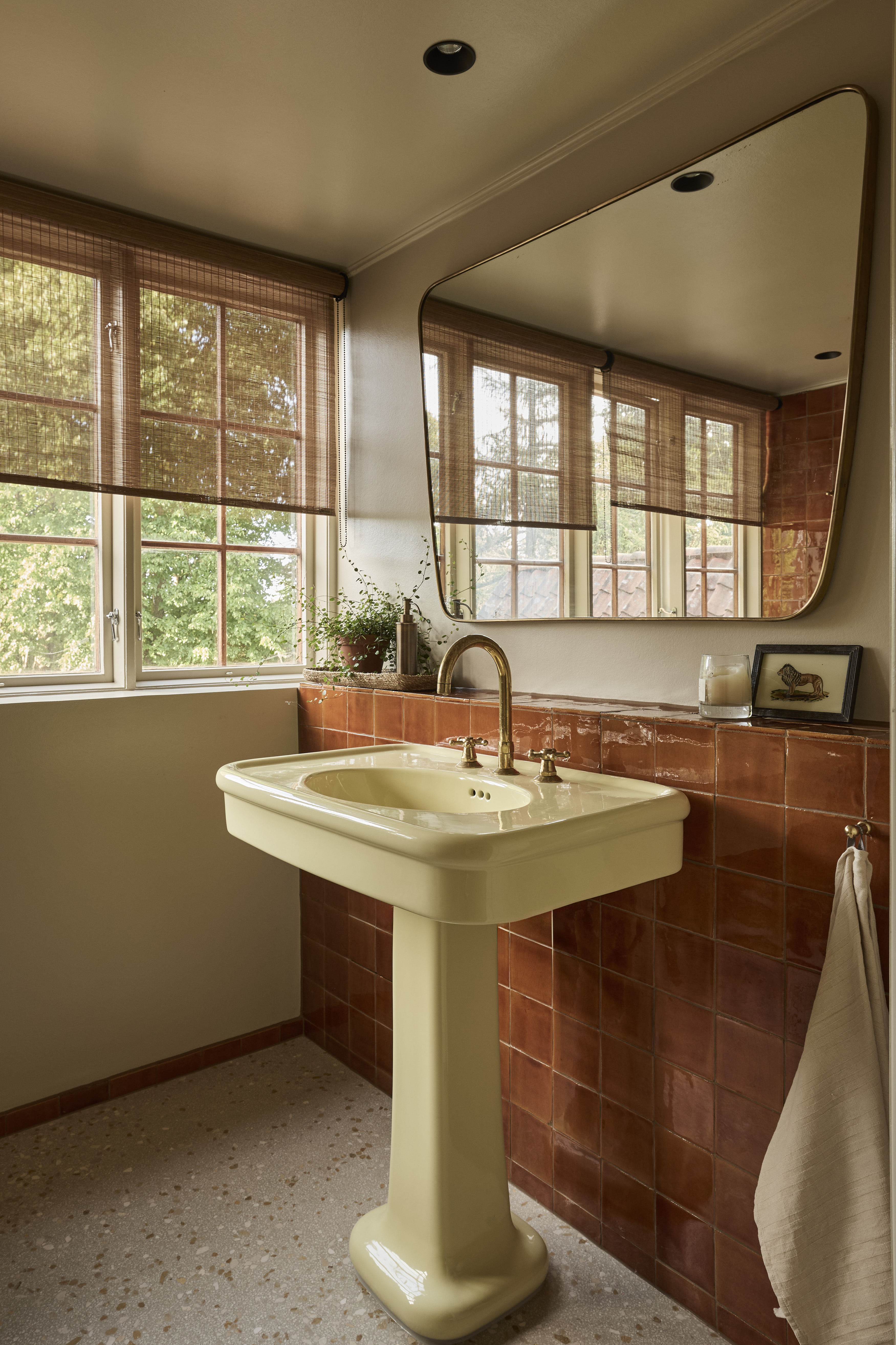
There is an inherent vintage feel to the color, making it a perfect choice for bathrooms with traditional features, and a butter yellow freestanding tub is an excellent focal point for a vintage-inspired design.
This gentle, antique warmth is what dictates the styling for many designers, picking out materials and bathroom finishing touches that play into this aura. This was certainly the approach that Pernille encourages, saying, "To lean into the era and the softness of the shade, I recommend a styling approach that feels soft, tactile, and subtly feminine." She suggests seeking out sheer linen blinds for your modern window treatments, like these lovely linen cafe curtains from H&M, and layering "plush cream and off-white towels to add texture and luxury."
Perhaps the best way to play up this vintage effect is through your hardware, though. Both Sandra and Pernille recommend using antique brass sanitaryware and accessories, noting the metallic finishes' ability to add even more warmth and texture to your design.
Practical and decorative, this antique bronze double towel hook would look lovely in a butter yellow bathroom.
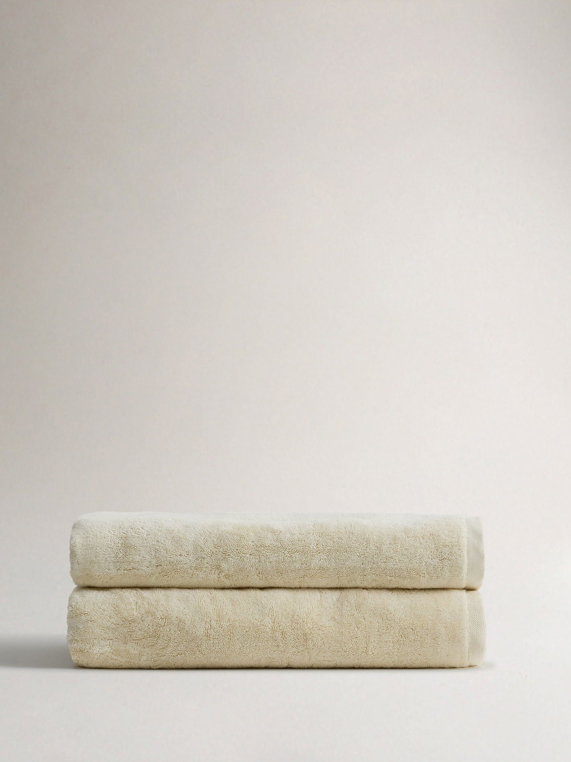
The perfect shade for a butter yellow bathroom, these luxurious, plush large bath sheets are the finishing touch your bathroom deserves.
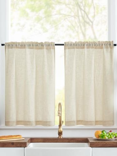
Add some more texture and vintage charm with these linen cafe curtains. By only covering one half of the window, you still get that lovely natural light you need, with a touch more privacy.
The Best Colors to Pair With Butter Yellow
Whether butter yellow is the highlight of your room or merely an accent color, the shades you choose to pair it with will play a huge role in the overall effect of your space.
Generally speaking, the experts recommend opting for a light, neutral color scheme; nothing that's too harsh a contrast, or that will compete against the yellow for attention. "Instead, keep the surrounding palette lighter and more harmonious," suggests Pernille, adding, "It works best when you keep the accent colors in lighter, neutral tones, allowing the butter yellow to remain gentle and balanced."
Think about the colors you'd naturally find it with for a calming palette. Or, for a vintage look, take inspiration from historical color pairings. "I highly recommend pairing it with creams, rich browns, dusty blues, or other period-appropriate pastels of the same saturation," says Pernille. "These tones complement the warmth of the yellow without fighting it for attention."
Search for muted, subdued shades that complement the gentle warmth of butter yellow and help keep it from feeling too kids' room-esque. "Limestone, putty, soft taupe, pale oak, and old brass all work because they make the yellow feel more grown-up," says Grazzie.
There is also scope to play around with some more vibrant shades, if that's more your style, but this approach will require more care. For example, Grazzie says, "If you want something a bit punchier, a muddy green or chocolate brown is a brilliant partner, but I would use it sparingly, perhaps on a vanity, mirror frame, or painted woodwork, rather than turning the whole bathroom into a color chart."
It's also best to specifically look for muted variations of these colors, with Pernille saying, "I would specifically avoid using vibrant blues or sharp greens, as they can easily clash with the soft, vintage nature of the yellow."

Somewhere between cream and butter yellow, sweet cream is a warm, natural shade.

Slightly dustier and more muted than other butter yellows, Hay is a great choice for small bathrooms.

Muted by brown and gray undertones, this creamy, pale yellow brings just the right amount of brightness.
It's not only in the bathroom that this shade shines, though. In fact, one of our favorite places to see this sunny color is in a yellow kitchen — you'd be shocked at just how elegant it can look. And for more design ideas, subscribe to our newsletter.