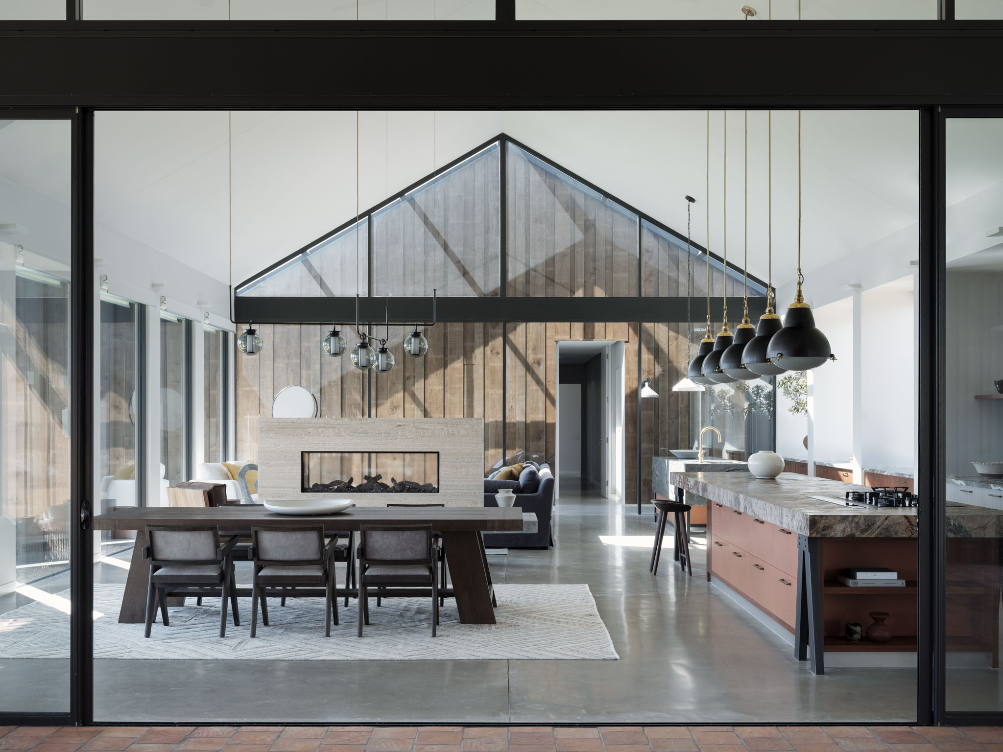
In a new, architect-designed building, there can't be many challenges in decorating the rooms, right? After all, for this "barn-like" building, designed by architects BVN and CK Design, the size, layout and the proportions of the room are pretty much all you could dream for.
But, what it lacks in pokey rooms and awkward corners, designing a modern home on this scale comes with its own challenges, as design studio Luchetti Krelle, who undertook the interiors for this project, only know too well.
The central living space, with its pitched ceiling, is an impressive if not intimidating prospect. Flanked on one side by the rest of the family home and on the other by guest quarters, it's connected to the rest of the house by glass breezeways, which lend an indoor-outdoor quality to the spaces through architectural glazed gables.
The question is: how do you decorate a space like this and make it cozy, make it comfortable and make it welcoming? We spoke to Rachel Luchetti, co-founder and principal of Luchetti Krelle, to find out more about the approach to making open-concept living in such a space appeal to how we live in 2024.
A kitchen of two halves
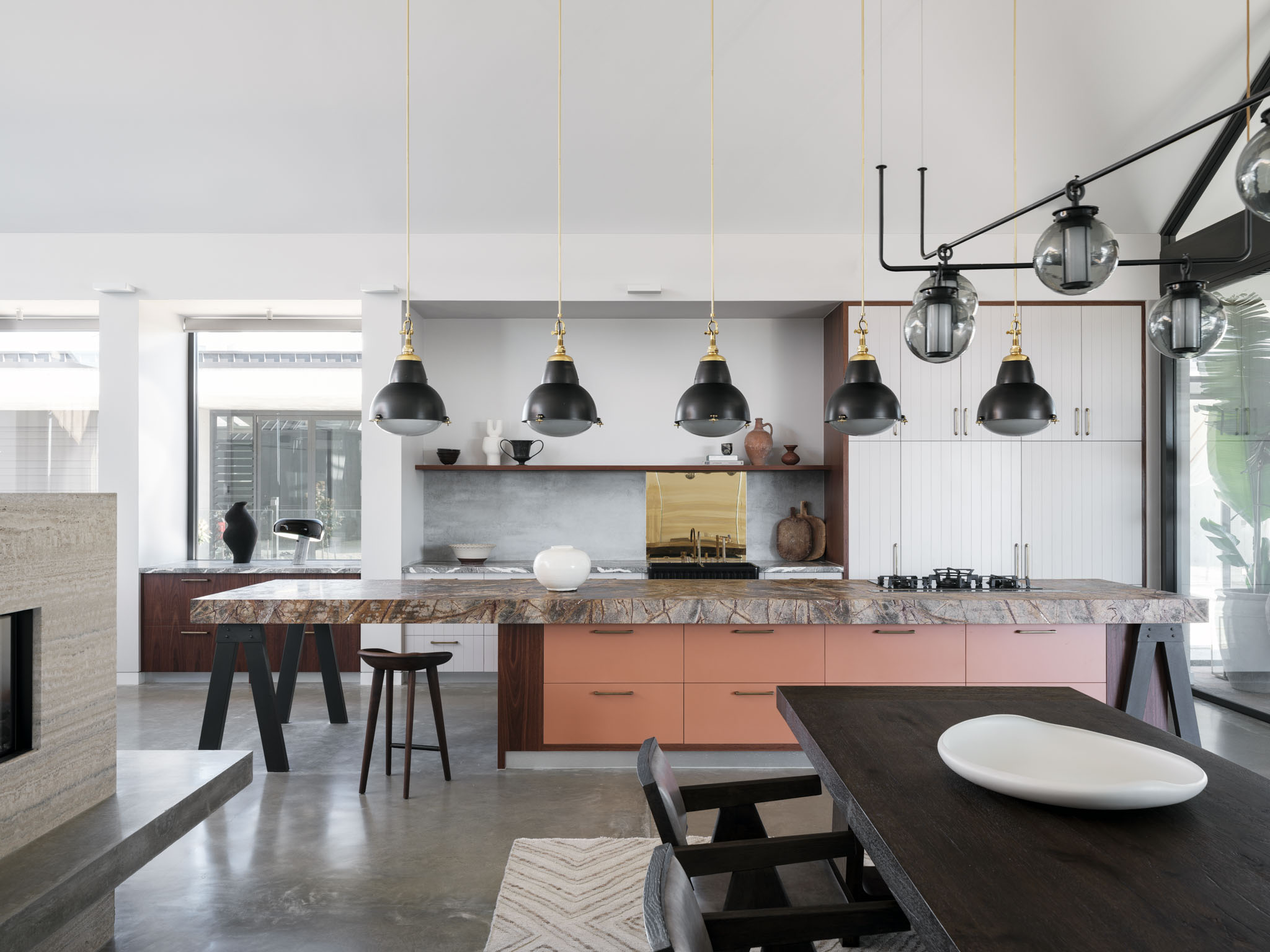
Instead of breaking the space down into three equal areas (for living, dining and cooking), the room allowed for functionality of the kitchen to be stretched, creating an extended kitchen-entertaining design that fills half of the room. 'The kitchen straddles the expanse of the living area, though we split it into two zones: the general meal preparation area (near the dining table), plus a coffee and bar service area abutting the lounge setting in line with the kitchen island,' Rachel explains.
It's a modern kitchen layout that not only works well aesthetically, but suits the purpose of this home — a country escape for a property developer and their wife, designed for relaxation and entertaining. 'Within the kitchen hub, there’s plenty of space for several people to step in and prep meals together, and the clients love having their own ‘private Idaho’ towards the lounge area to prep drinks,' Rachel explains.
In the prep area, a vast kitchen island extends the length of the countertop, offering a generous space for casual dining. 'The challenge was scaling the kitchen’s proportions so they didn’t look and feel dwarfed under the high ceiling,' Rachel explains. 'Yet large in scale, nothing appears chunky and unrefined because of the exacting ratios and all the attention to detail.'
The materials on this side are warm and engaging, bringing that sense of coziness and comfort to a space that could potentially, with its polished concrete floors and gallery-like walls, feel a little stark.
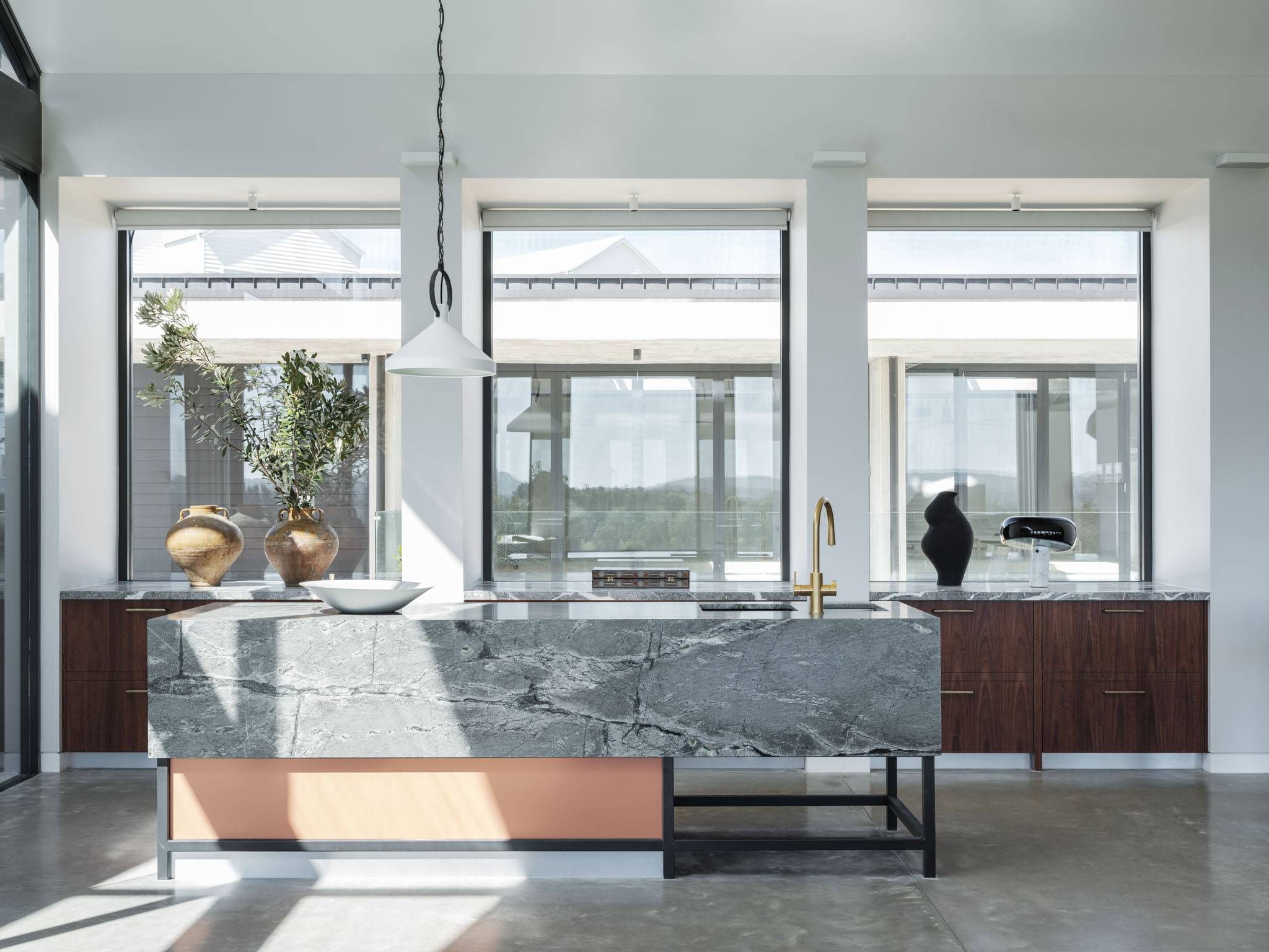
While linked through shared materials, the "drinks" kitchen takes on a more monolithic form. 'Given it’s light grey shade, the island bar is clad with a more dense application of stone that the kitchen proper’s to grant it a weightier permanence,' Rachel says, 'especially as it’s set upon slim metal frames which elevate its sophistication.'
A sense of separation
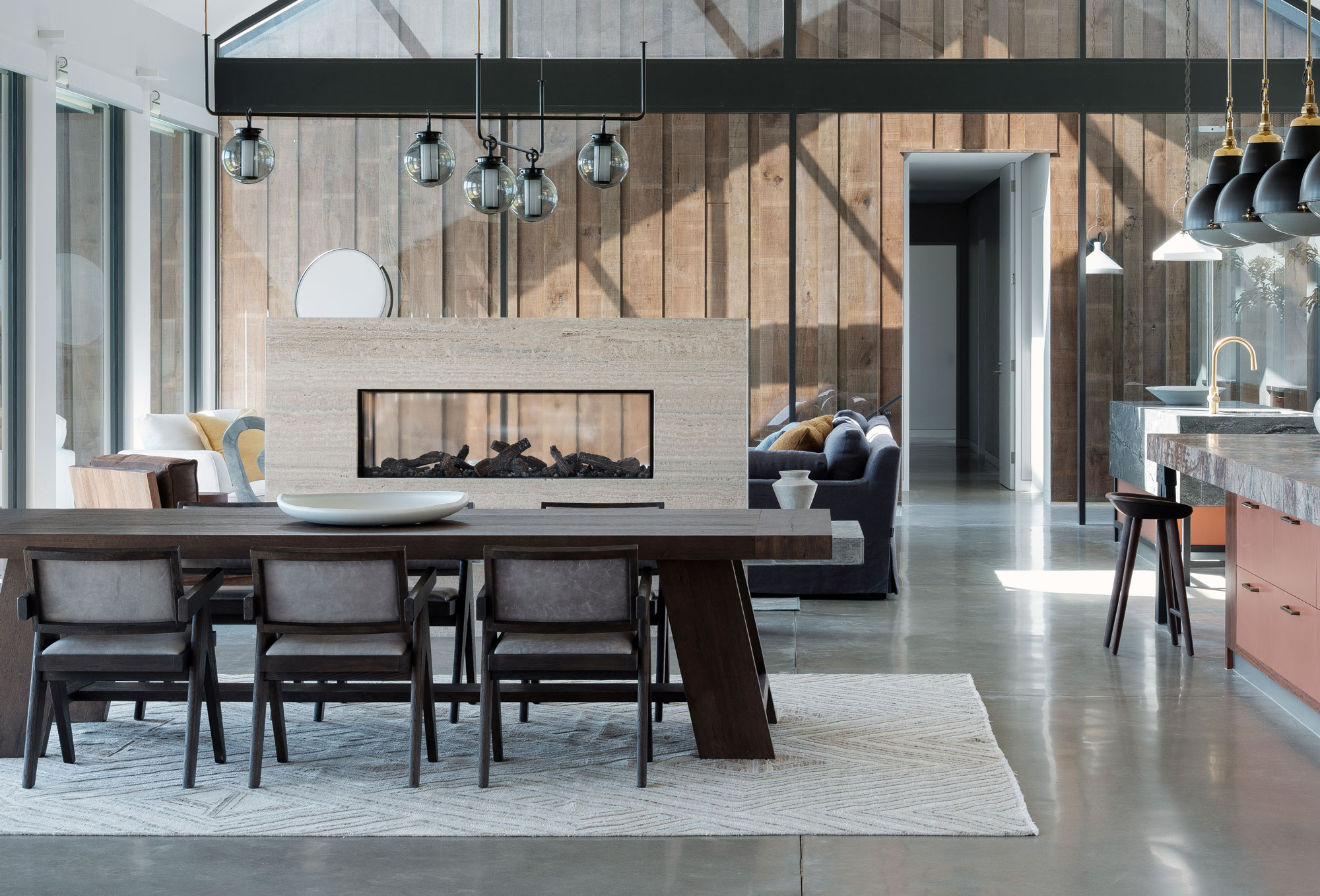
With its high ceilings and largely-glazed walls, further interventions were required to achieve a space that felt homely enough that the house felt like an escape. 'The challenge was determining the layout and foundational materials that would convey a warmth within the bold architectural envelope of the new build,' Rachel says. 'Given the living space is really open and generous, beneath the high pitched ceilings we wanted to create a sanctuary that enhances interaction with family and friends, yet retains intimacy when required.'
The solution came in the living room fireplace, used in some aspect as a room divider for a 'broken-plan' layout that zones the open-concept spaces. 'We installed an Esse wood log gas fireplace for both convenience and rural appeal in the center of the space, aligning it towards the expanse of glass to encourage ease of passage from the kitchen island to the bar island,' Rachel says. 'We framed it in travertine to add a golden tonal warmth, but not draw too much attention to it. Whilst it lithely subdivides and cozies the room, it’s freestanding so that the vertical timber cladding in both breezeways that visually frame the great room can be viewed, and sunlight can filter throughout. Equally, the burning logs can be appreciated from the dining table and lounge area. We also added a concrete seating perch around its base to tether it tonally to the concrete floor.'
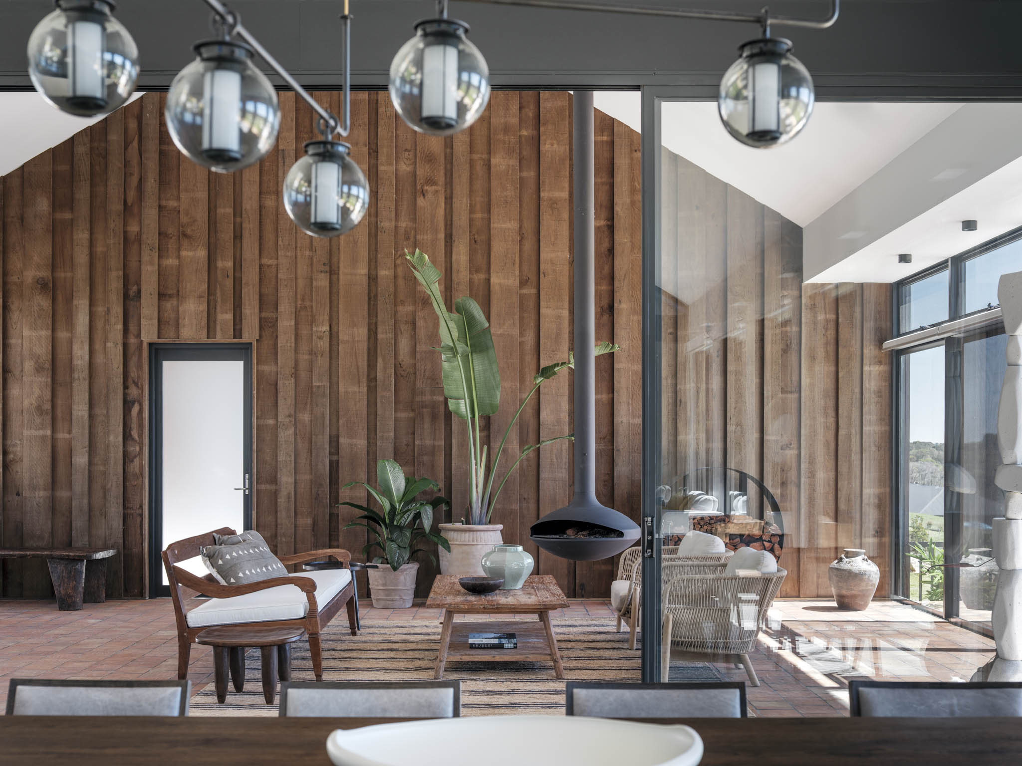
The glazed breezeways are another example of both how separate-yet-connected spaces can be created, and how materiality can add to the warmth of the design. On either side of the living area, a natural timber cladding adds an interesting texture to the space, almost reminiscent of log cabins.
'We used shiplap band-sawn Spotted Gum,' Rachel explains. '[The cladding's] vertical application enhances the scale of the main living space, yet the nature of the timber and its non-exact board widths and undulating rhythm add a natural, cossetting appeal.'
Between the living area and the guest bedrooms, there's another small sitting area, with views out over the landscape and access to the exterior deck and dining area.
Bringing comfort to the industrial
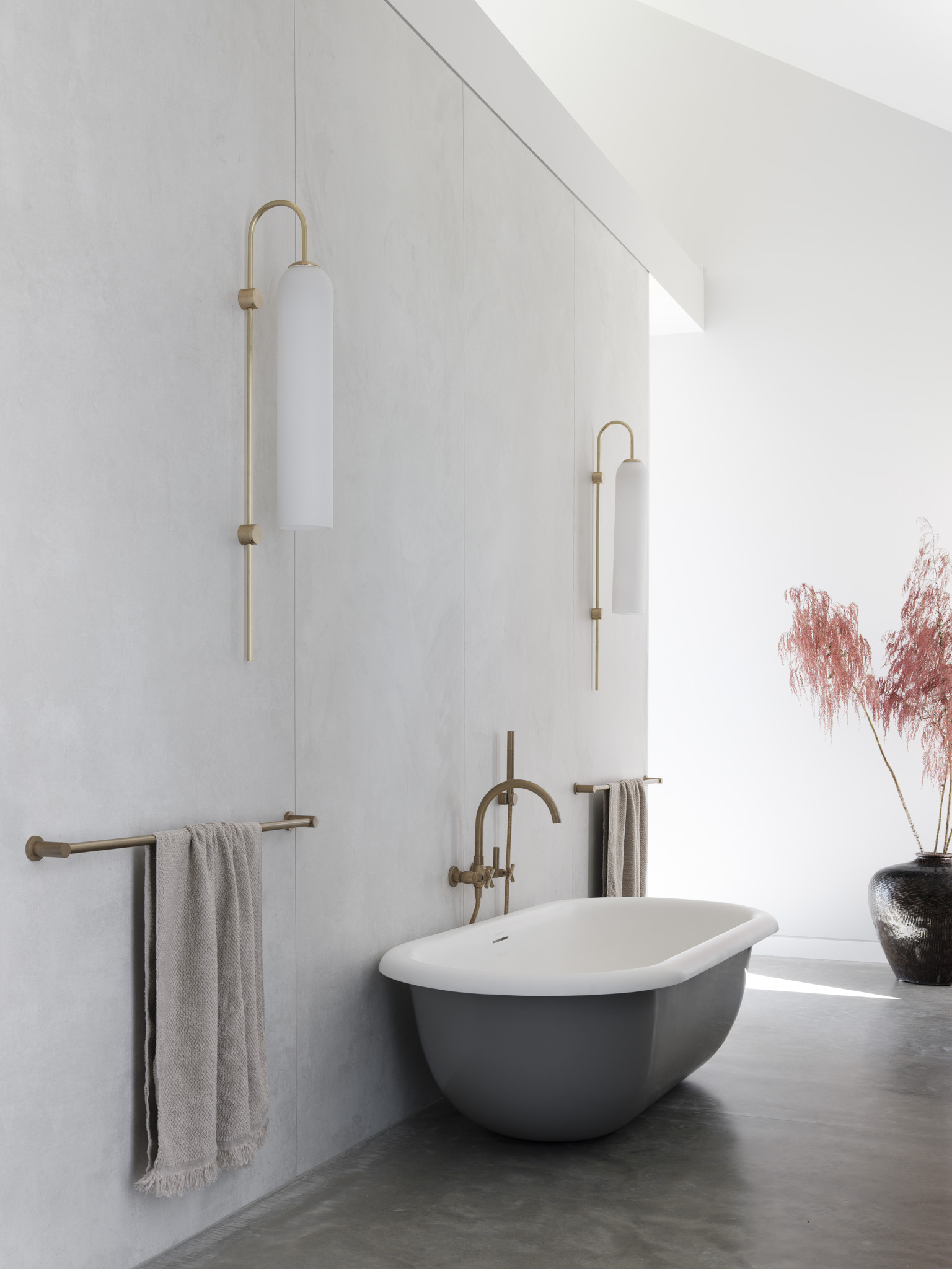
From the flooring to the exposed concrete kept in many of the building's other rooms, the brutalist interiors also needed to be accounted for in the quest for comfort in the interior design.
'It’s all about balancing the stark brutalism of a concrete floor’s foundation plus its cool grey shade with texture and pungent tones to add warmth and vitality,' Rachel explains. 'We balanced the grey with generous swathes of aminated stone and applications of Rich Spotted Gum and Blackbutt timber joinery to provide the soul.'
'We also offset the floor’s mild tone with alchemic features including tapware, brass pulls and splashbacks (in both the kitchen and cellar bar area downstairs),' Rachel adds. 'The cellar bar also features lilac joinery, adding a soft appeal.'
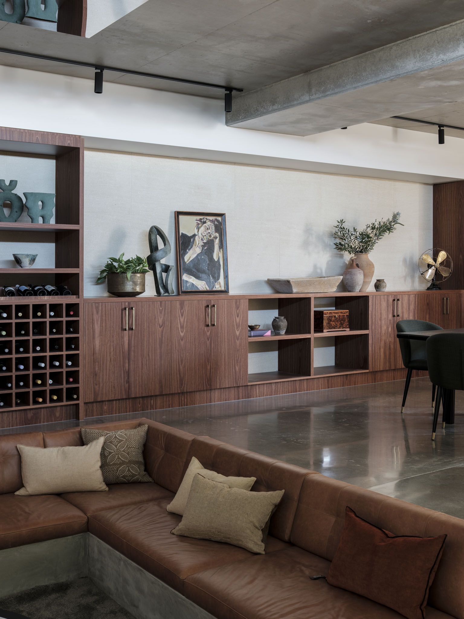
If faced with a similar home to design, Rachel has some advice you can follow. 'You can add color and texture to break up expanses of concrete flooring via rugs,' she says. 'We also, selected oversized, plump sofas and armchairs in the living room to counter the severity of the material (including a steel blue sofa and deep marine and saffron throws to add tonal variety), also designing a sunken lounge in the cellar with buttery soft leather seating in a warm caramel shade.'
It's how this home, with its crisp, modern architecture, still feels like a welcoming country retreat. The success in how you do open-concept and contemporary design well is all in the balance.
Get the look
Just like this home's kitchen island countertops, brown marble is an elevated way to add warmth to an interior scheme. Here are some of our favorite finds.


