Oh, we've seen pink in the home. Millennial Pink, Rose Quartz, Sakura Blush... But there’s a new approach to decorating with pink on the horizon, one where it’s sneaking into our decorating schemes stealthily, without the fuss and flounce of the more performative pinks gone by. So the big question is: How can we decorate with pink without it feeling too delicate, child-like, or overly saccharine?
The hues we’re using now aren’t like classic sugary, pretty pink tones at all; they’re more under-the-radar, veiled in a grayness, a layer of white, or a hint of another color that makes them blend in and seem pushed back and a little aloof. Yes, we notice them and are immersed in them, but they’re not shouting from the walls. Pinks have become peaceful, steadying, rich, and monumental.
The new pink trends don’t dominate or jump out from the room; instead, they come across like something natural, as part of the space’s architecture, or more like a feeling rather than just a visual. They’re still expressive, and they still have an essence of cherry-blossom-rose-petal delicacy, but these pink tones also ground and calm us.
So, how do we actually decorate with pink these days? Here are five all-grown-up ways to fold this quietly confident hue into your home, making it modern, grounded, and wonderfully natural.
1. Pair Pink With Statement Materials
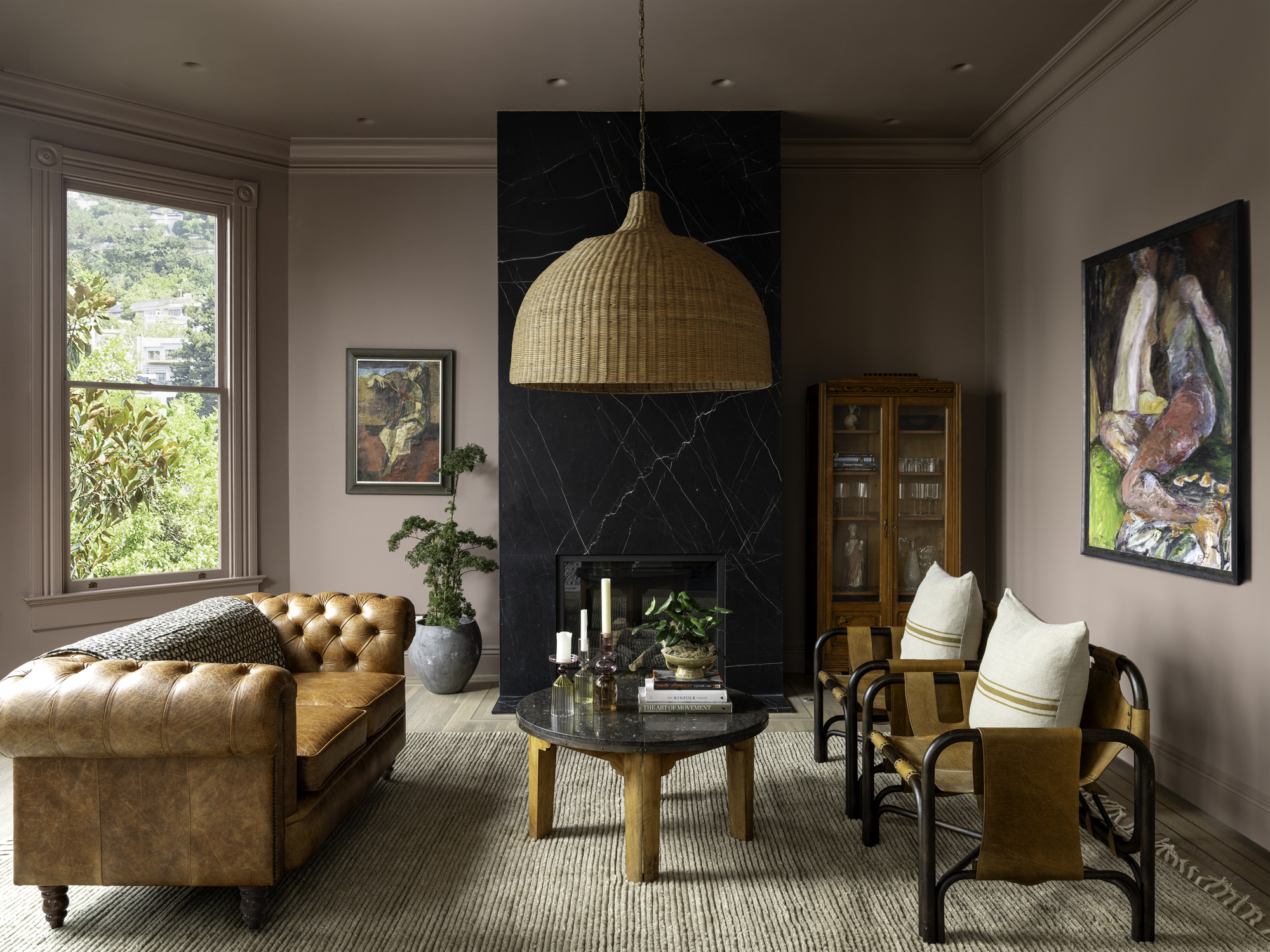
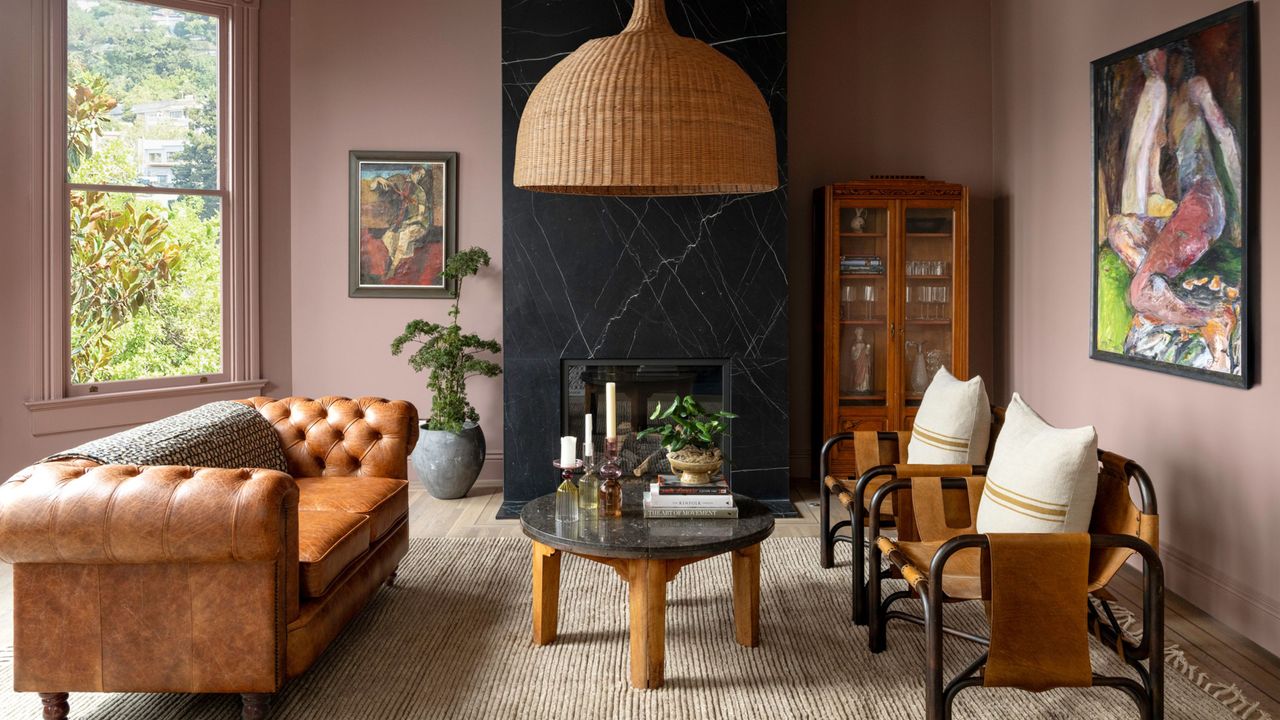
Pink mixed with impactful naturals such as statement stone, rich leather, heavy linen, dramatic timber, and rattan, creates a dual reaction — the natural materials, usually so bold, rough, and weathered, are made gentler and easier to live with, while the pink becomes more rugged, earthy, and elemental. The result is a sophisticated, multifaceted space that feels delightfully contradictory, as well as balanced.
“The combination of the color and materials works so well in this space because of the balance of contrast and warmth,” says Thecla Glueck, founder and lead designer of California-based interior design studio Thecla Glueck Design, who drenched the space pictured above from trim to ceiling in Farrow & Ball’s Sulking Room Pink to soften and take the edge off the black marble fireplace. “The rich natural elements keep the pink from feeling sweet or precious, and create a beautiful tension — the space feels calm, grounding, and really easy to be in.”
"Decorating with pink signals a willingness to move beyond the expected,” adds Thecla. “The key with pink is to harness its nuances. Go for muted, subtle shades such as the clay-tinted or muddy — these softer, earthier tones balance bringing the color, warmth, and quiet elegance into a room that makes pink so compelling.”
2. Treat Pink as a Neutral
Implementing pink as a neutral makes the most of its inherent warmth. A tempered-down pale shade behaves much like a traditional neutral, bringing a hint of heat without dominating a scheme, reminding us of the organic, smoothing the space, and diffusing light. Across larger surfaces, it forms a foundation that’s welcoming, understated, relaxed, and quietly characterful.
Proctor & Shaw Architects coated the entirety of a room, pictured above, from walls and ceiling to doors and trim, in a pale pink reminiscent of plaster, making it feel part of the house’s architecture and history while creating an updated narrative. “The muted color works so well as it is in tonal harmony with the white oiled oak furniture and floor,” John Proctor, the studio's director, explains. “The monolithic pink is a backdrop rather than a statement. The shade unifies the walls, ceilings, and original intricate plasterwork, which helps tone it down and synchronize it with the plainer, more contemporary joinery. It feels grown up.”
“Light pink is lovely because it blends warmth with softness," he adds. "It’s emotionally gentle, visually calming, and strongly tied to themes of care, as well as reminding us of the beauty and renewal of nature.”
3. Contrast Pink and Crisp White
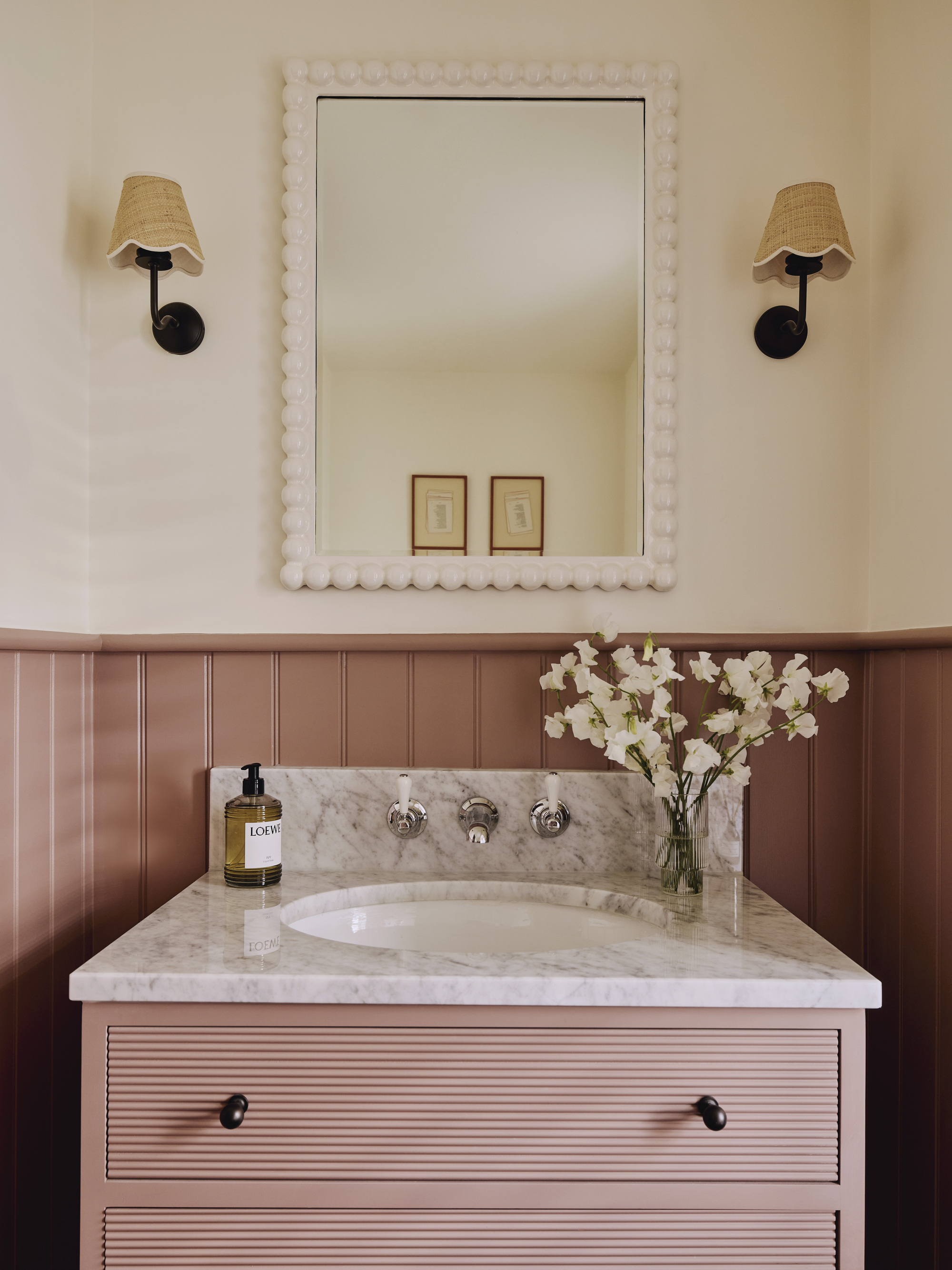
As a color that goes with pink, teaming it with a slick, pristine white merges its warmth with brightness, the white framing the hue to bring clarity and keep the palette refined. White stops pink from becoming too sweet, lending it finesse and creating a space that’s polished as well as approachable.
“With pink, an ‘everyday’ room is transformed into one that feels fresh and exciting, with a playful, uplifting energy that really enhances the scheme,” Jack Simpson, founder and creative director of London-based design studio and real estate developer Nomad, explains.
The firm enlivened a small bathroom with Sulking Room Pink set against the lightness of Farrow & Ball’s School House White. “The pairing of the pink with crisp white brings clarity and necessary contrast to the space, the gentle heat of the color sharpened by the clean backdrop, while infusing the room with brightness and light-hearted personality,” says Jack.
4. Using Pink in the In-Between Spaces
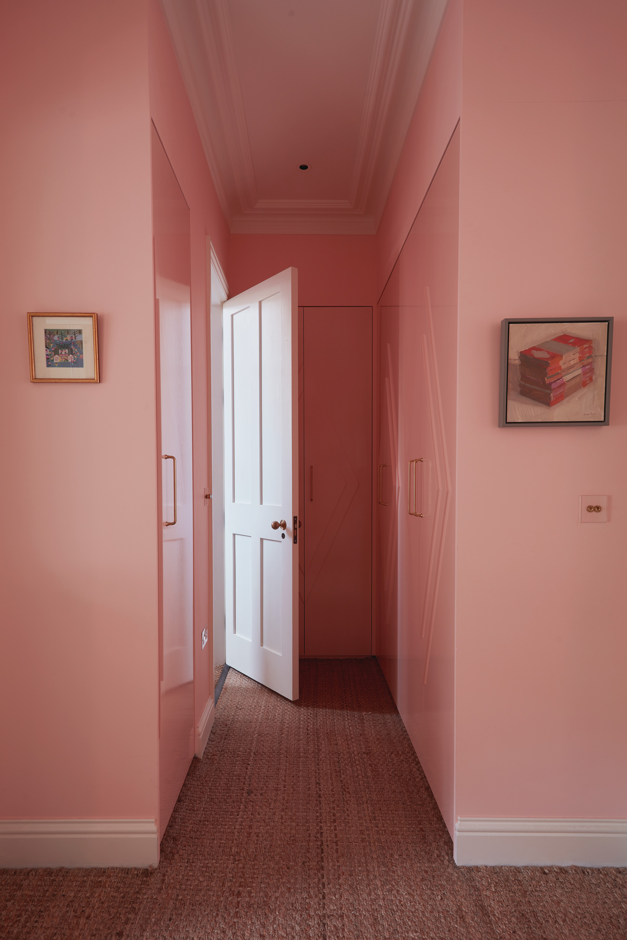
A wash of pink transforms transitional spaces — corridors, entrances, landings — often functional and overlooked areas, from I-don’t-remember-walking-through-there into something that sets the directional, full-of-surprises tone of your home.
“Intense pinks are perfect in hallways and other transient spaces; they make a strong first impression, and because we’re never in them for too long, we’re unlikely to get bored,” explains Alice Bettington, co-director of London design practice Golden, who decorated the hallway pictured above in Mylands BYR177 with 20 percent white. “Decorating with pink in the hallway expresses assurance and playfulness," she adds. "It’s often an unexpected choice in communal areas of the home, and pink here can be energizing and welcoming.”
“Pink is both flattering and calm to live with, and is often an unexpected color, so it brings a sense of confidence to a space,” Alice adds. “Use pink casually rather than as a statement color to give it authority and avoid it feeling like a novelty. Try a shade with yellow undertones, which come across as less sugary and are easier to integrate into schemes.”
5. Layer Pinks for a Cocooning Effect
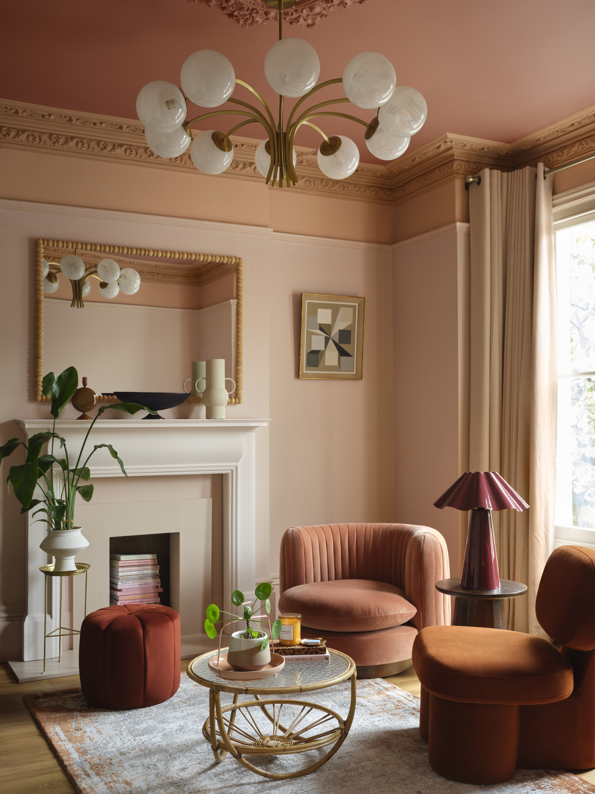
Using a medley of pinks together may seem intimidating, but with an already pushed-back color, it couldn’t be easier. A neutral, plaster-like tone should dominate, accented by shades that come from roughly the same area on the color wheel, but have notable differences. Layer them together in one space, and the room takes on a dynamic richness as each tone dances off and reinforces the others.
“Pink’s spectrum, from the delicate to the rich, makes it ideal for layering — a soft hue on the walls, a mid-tone on cornices and upper walls, and a warm terracotta ceiling,” Helen Shaw, color expert at Benjamin Moore says of the room pictured above, layered in the brand’s powdery Queen Anne Pink HC-60, the sunset shade of Myrtle Beach 061 and the earthy Firenze AF-225. “The effect is instantly cohesive and cocooning, perfect for those seeking depth and personality in their interiors without relying on bold, high-contrast colors,” she adds.
“What makes pink especially relevant now is its ability to feel both modern and sophisticated, playful yet grounded, easily bridging the gap between minimalism and maximalism,” explains Helen. “At the moment we’re embracing 'quietly colorful' pinks — subtle, comforting hues with depth and warmth.”
And we've got plenty more pink color palettes to use as inspiration if you need them. Otherwise, make sure you're signed up to Livingetc's newsletter for more tips and tricks.