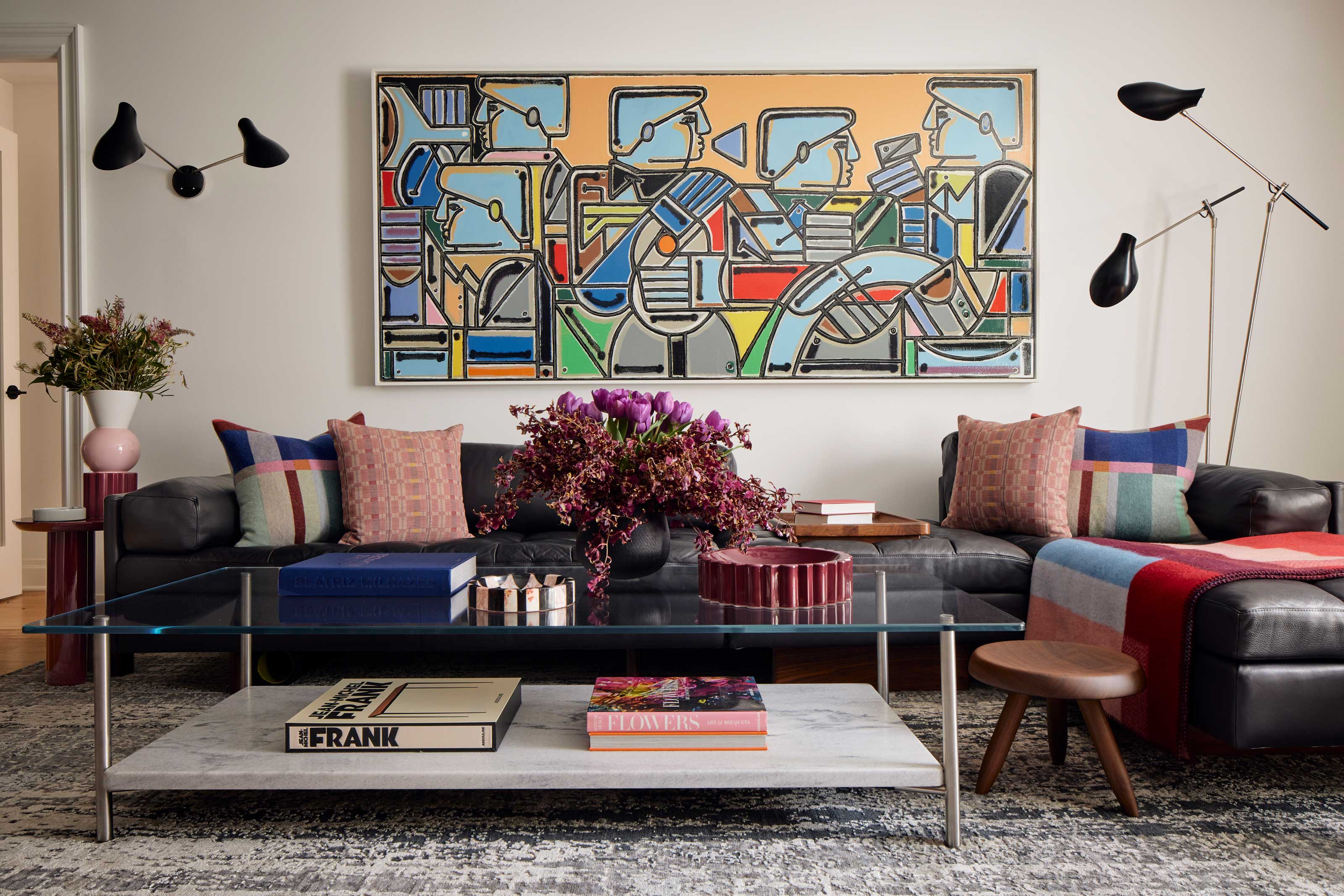
There are certain design ‘rules’ that most of us go by when curating our personal spaces. Interiors in neutral palettes and muted tones have been having a moment for a while now, especially for small spaces. It’s the perception that they are more calming, comfortable, and easy on the eye and most of us find it safer to gravitate towards them. It’s the thought that a smaller space needs light colors to make it appear bigger. Equally when it comes to furniture there’s the conception that larger pieces only suit a large space, and vice versa.
The tour of Justin Charette’s Gramercy Park apartment is a breath of fresh air. It will make you reconsider the ‘rules’ you might have been following and show you how you can create a sense of space, light, and grandness by thoughtfully curating your colors and furniture even if you don’t live in the largest of homes.
‘I wanted to break away from the overabundance of beige-only spaces on social media,’ the designer tells me. ‘Often, clients think smaller spaces require smaller scale pieces of furniture, and I find the opposite to be true,’ he adds. And I’m intrigued to find out how he approached designing this modern home instead.
A different approach to designing small spaces
While decorating with neutrals has its own beauty and purpose, we’re starting to see a shift from designers moving towards creating more impact and using interior elements as an outlet for self-expression. That is often achieved through color.
‘As a designer I get a lot of requests for neutral spaces and feel like Instagram has gravitated toward them for too long,’ tells me interior designer Justin Charette. With his Gramercy Park apartment he decided to go in a different direction and offset the grey New York landscape. ‘I wanted to pop up the volume on color, and create a fun, joyful space among the concrete jungle’.
The designer goes on to bust a long-standing myth when it comes to selecting furniture for a rather small space. ‘Adding large scale pieces helps make a space appear and feel larger, and adds a sense of grandness, even to an otherwise fairly small apartment,’ he tells me.
Now that we got our views on color and scale starting to shift when it comes to what we deem as ‘the right way’, the designer goes into the details of how he worked these elements into his space.
Price: $100
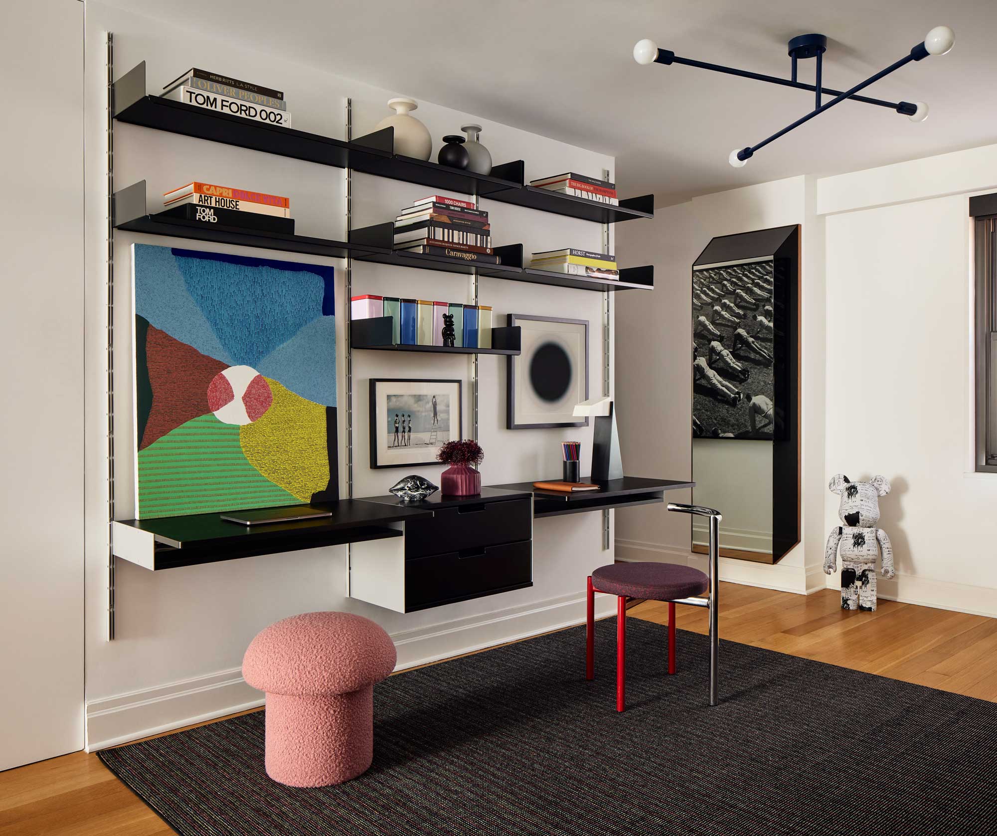
Justin's pink mushroom ottoman is a vintage find from 1st Dibs, but for a similar look, check out this rust-colored design by Justina Blakely.
Turning up the volume on color and scale
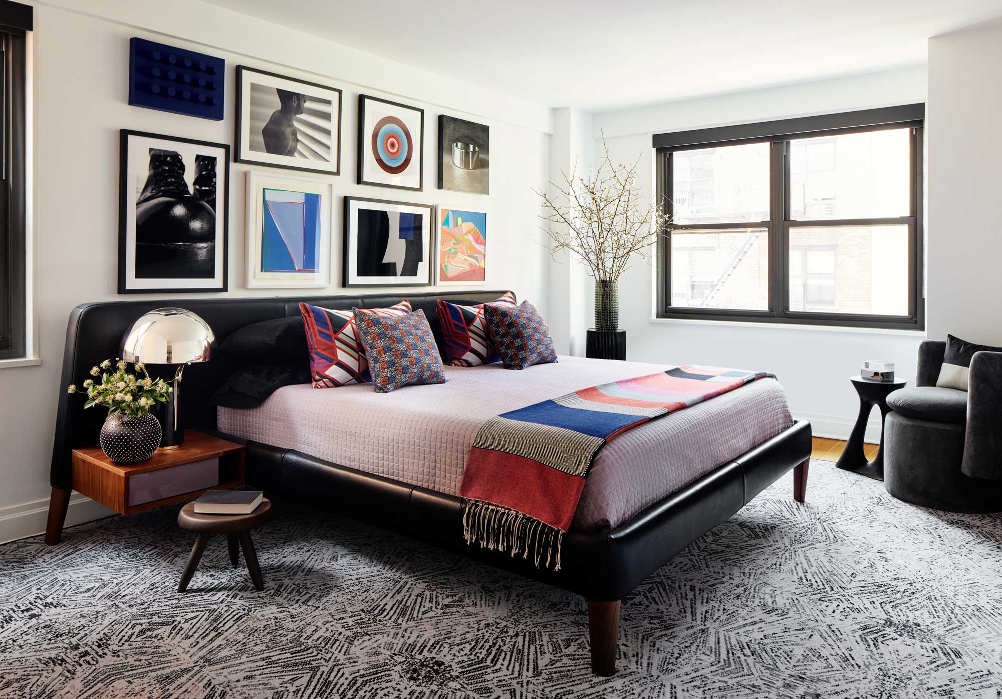
A sense of real character is achieved through the curation of unique items that hold their own but are equally beautifully immersed in the overall design of the small apartment. There’s a clean, fresh look to this interior that feels spacious and light. You can’t help but notice the pops of color dotted throughout that elevate the rooms in such a joyful way. ‘I went on a trip to Mexico City and found a colorful throw. This served as a jumping-off point for the space,’ says Justin.
A sense of playfulness and confidence stands out. There is a method to what seems like a very natural display of colors and shapes. The designer decided to have the larger scale pieces of furniture mostly neutral or black, leaving the opportunity for any change of mind or mood. ‘For example, the media credenza has sliding doors that are now red. These easily pop off and can be sprayed a different color. I originally had the doors in a black, and I will likely change them again in the future.’ It feels very now the idea of such freedom and versatility within a space that can change and grow with you and reflect your evolving mood and aesthetic.
When it comes to scale, the designer tells me that no matter the size of a space, he prefers to select furniture that’s the maximum size. ‘Especially regarding the length of the pieces,’ says Justin, who advises however to make sure that your pathways stay open and functional. Interestingly, he adds that the biggest concern in smaller spaces is the weight and depth of the pieces. ‘I like to make sure there is a good amount of furniture on feet, for example the open bedroom frame in my bedroom. This creates a sense of air and space throughout the home.’
Using color to impact the space
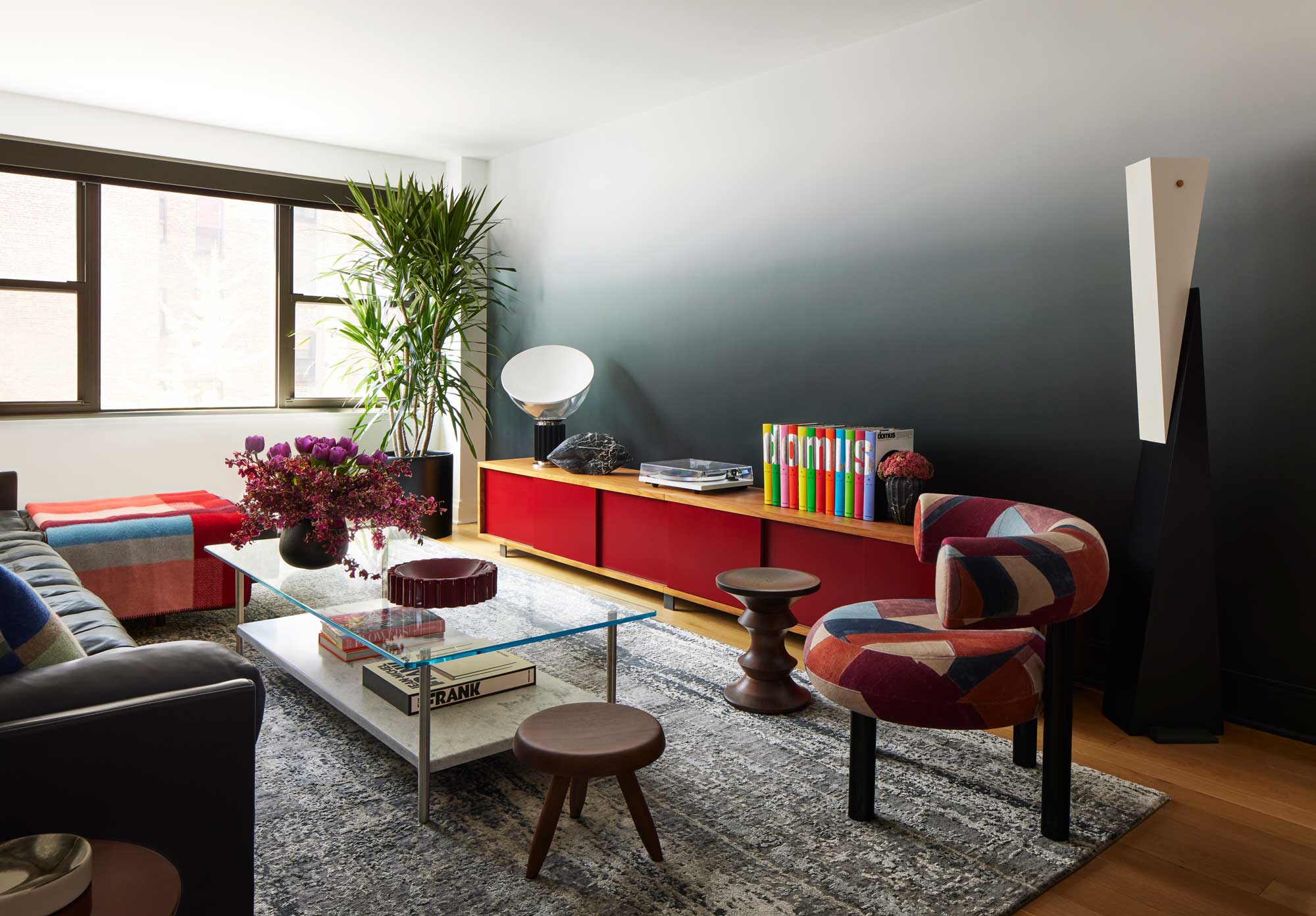
There was intention behind the use of black in this apartment as a central color to impact the perception of space. ‘While this is a dark color, it brings continuity to the entire apartment and keeps it from feeling choppy. It’s found in the furniture, tiles, door hardware throughout, and is even the color of our front door.’ It might sound like a lot, but it’s impressive how the space so easily holds its lightness.
The ombre wall in the colorful living room catches your eye, and makes a statement of its own, yet not in an overpowering way. It complements, not distracts, and fits into the whole seamlessly. Although not the biggest fan of accent walls, in this instance Justin thought it was necessary. He talks me through his thought process. ‘The wall across from the ombre wall already had a large piece of art. I didn’t want another artwork to compete with this, and I thought mirrors would reflect too much light from the nearby windows.’
The designer adds that there was also the extra advantage of the ombre creating a sense of height in a relatively short space. While a wallpaper would have created a harsh line from paper to paint, he says the black-to-white ombre blends in beautifully with the white ceiling. The transition is subtle, adding a softness to contrast the apartment's more graphic qualities.
‘Color is mostly found in accents, art, and items that can easily be moved or changed out. I always think the larger investment pieces should be more neutral so you can grow with them. I also like adding color in small ways, like the pink kitchen ceiling. This is an inexpensive way to add color/impact and isn’t a huge commitment if we change our minds,’ explains Justin.
The designer’s goal for the space was to embrace color in meaningful ways and judging by the look and feel that resulted - light, fresh, joyful - it sure reads as a success.


