If you’ve tried and tried but haven’t managed to get that look together where you have multiple patterns in a room, and somehow they work perfectly, read on because this is a game changer.
You want the patterns to work well together, but not be too alike that they look boring, nor too different that they start making no sense next to each other. It’s an interior design head-scratcher, I know. And it can get even more complicated if we start getting into pattern drenching.
But here it is, the quick and easy, two-step guide on how to make it work successfully by an interior designer who’s mastered the style and is sharing his tips with us. In a Martyn Lawrence Bullard interview, he tells me what he does to get it right. Every. Single. Time. And you can too.
How the colors work
First things first, you must always have one color that is running throughout, which ties it all together. Here’s how Martyn Lawrence Bullard explains it.
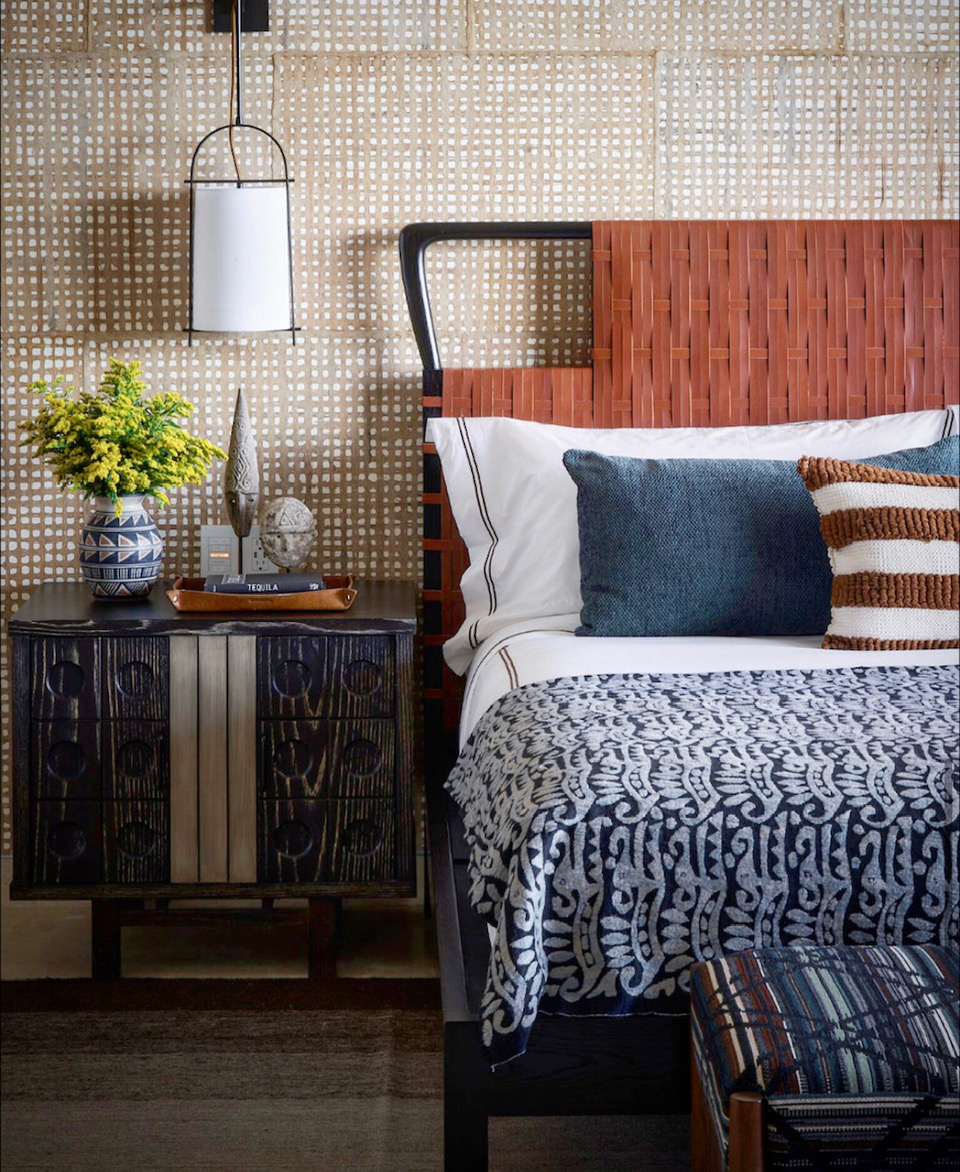
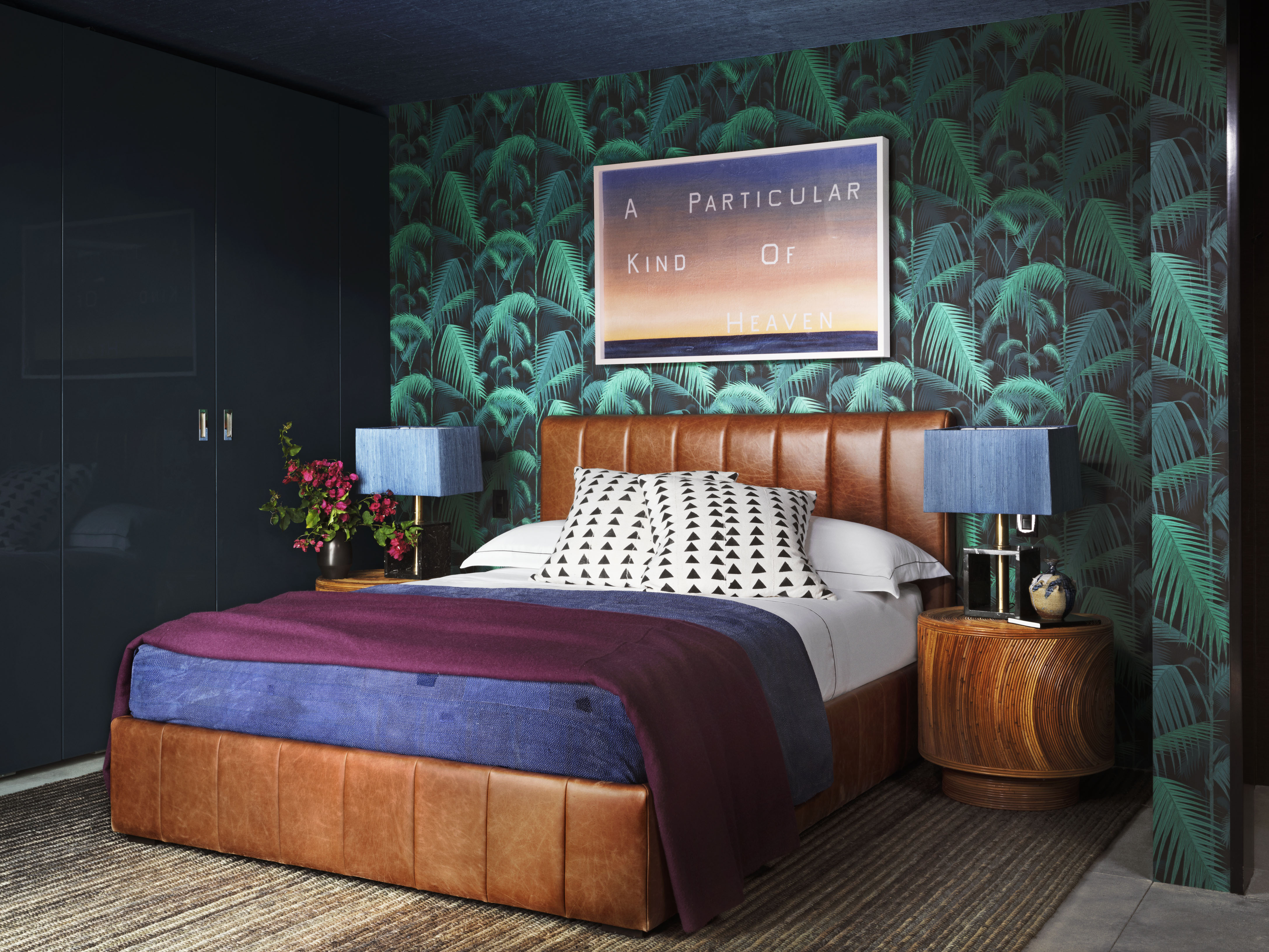
‘If you have a pattern that's red, green, and blue, you want to make sure that the coordinating pattern that you mix in has one of those colors. Maybe it's blue and brown, maybe it's blue and green together. It's very important to always find a lead color within your palette that you continue.’ Take inspiration from the colors that go with blue in this instance to round out your scheme.
You’ll be seeing the most of this color so make sure it’s the one you also like the most, and that sets the mood of the design.
Price: $138
If you're nervous about mixing prints, start small and play with your throw pillows, blankets and bed linen in different patterns.
How the scale works
The next step is to think about scale. This is especially useful for any wallpaper ideas you might have. Being mindful of scale is vital when mixing patterns.
‘To mix two large patterns together usually isn't as successful as mixing a large pattern and a small pattern and then something that's either a stripe or a geometric. So what you achieve is this different experience of scale within the layering,’ explains Martyn.
It’s a way to keep the look dynamic and interesting, if you will, by playing with different-sized patterns.
Price: $42.99
When mixing prints, think of your accessories. They can make a statement too, no matter their size.
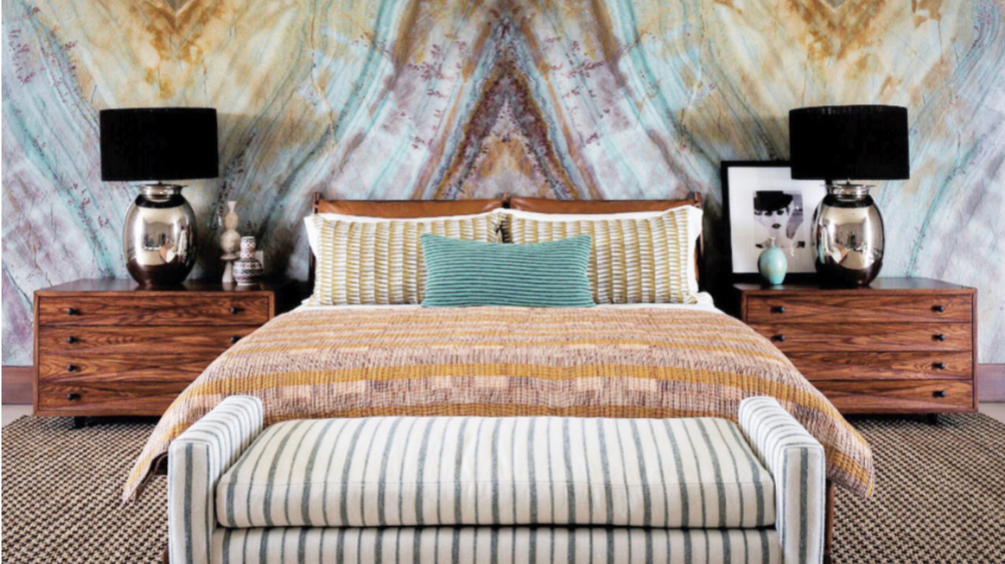
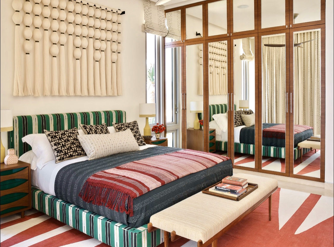
How to mix color and scale successfully
If you’re looking for inspiration, or an example of how it all works, here is Martyn Lawrence Bullard’s go-to combination, and it's about what patterns go with stripes.
‘I love a large floral, a small floral, and then a stripe together. I always think that there's a really wonderful balance to the eye within that. And then pick one colorway that is continuous throughout those, so they really seem to blend and merge together. This is a very sophisticated and very easy way to mix palettes and colors,’ he explains.
It does sound nice and easy when you think about it like this. Remember, pick one color which runs through all your patterns, and play with different scales to keep the look dynamic.